In-Class Model Studies November 8: Tertiary Colours
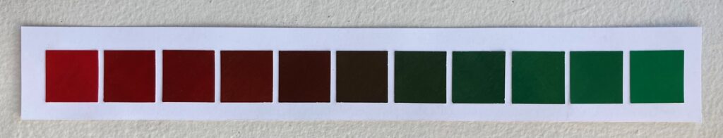
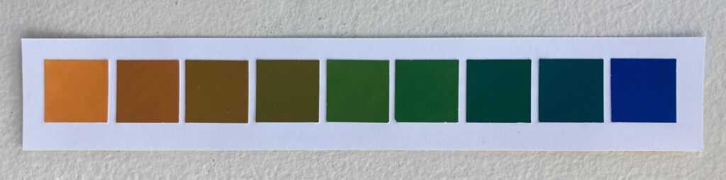
Complementary Colour Scale:
I was debating whether to use orange-blue or red-green pairing of complementary colours for my final work, so I made a version of the colour scale for each pair. Took them in for Elizabeth to see in person as my photos don’t seem to capture the colours accurately, but here are a couple of photos anyway:
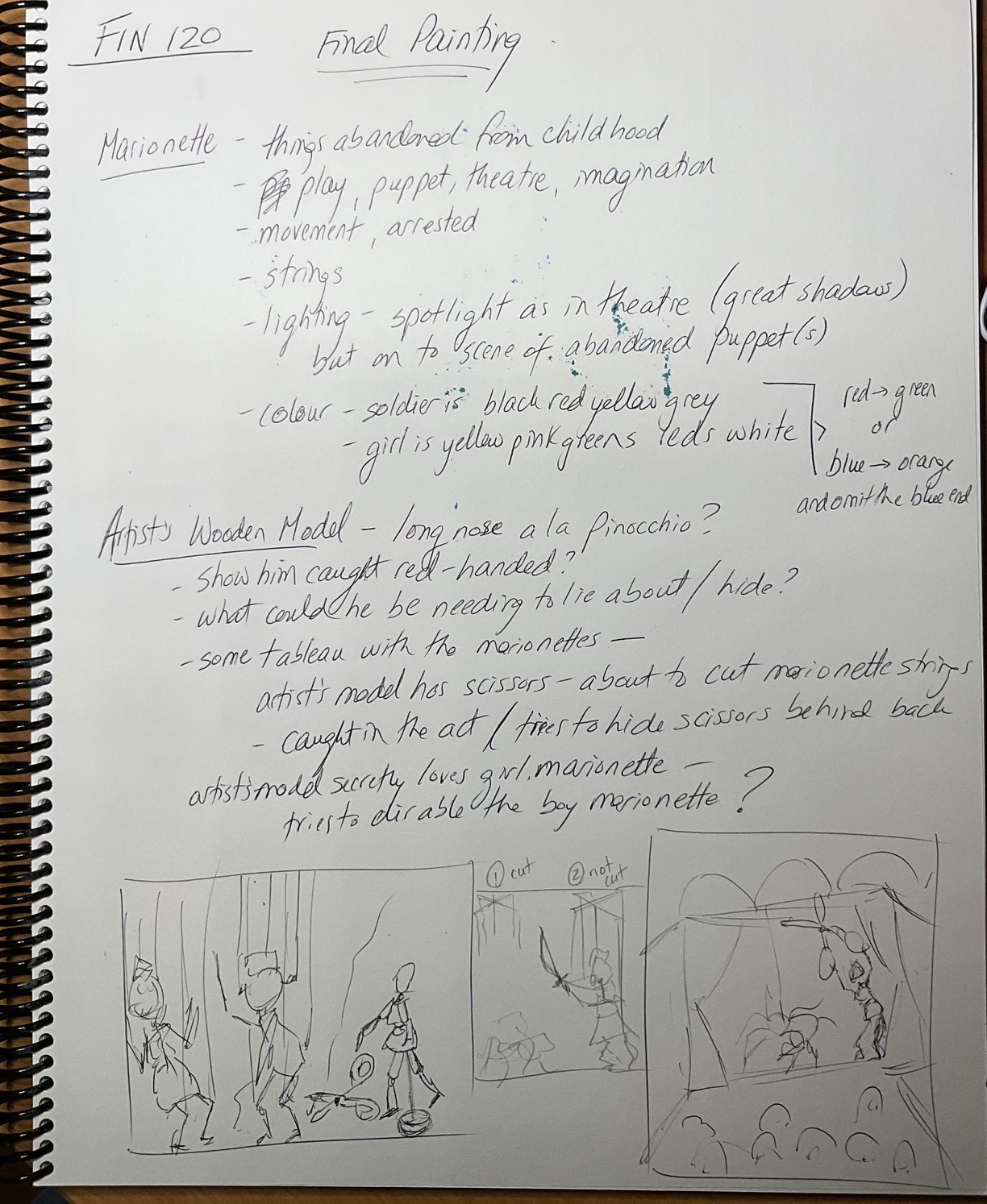
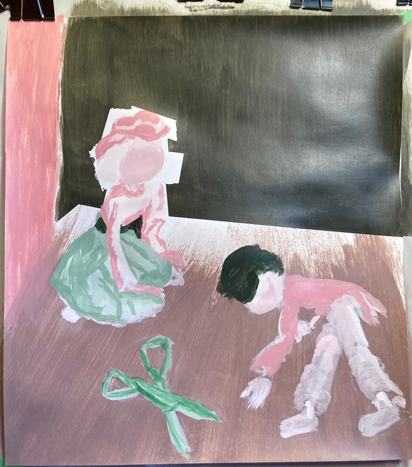
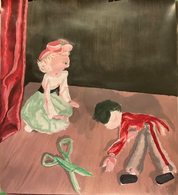
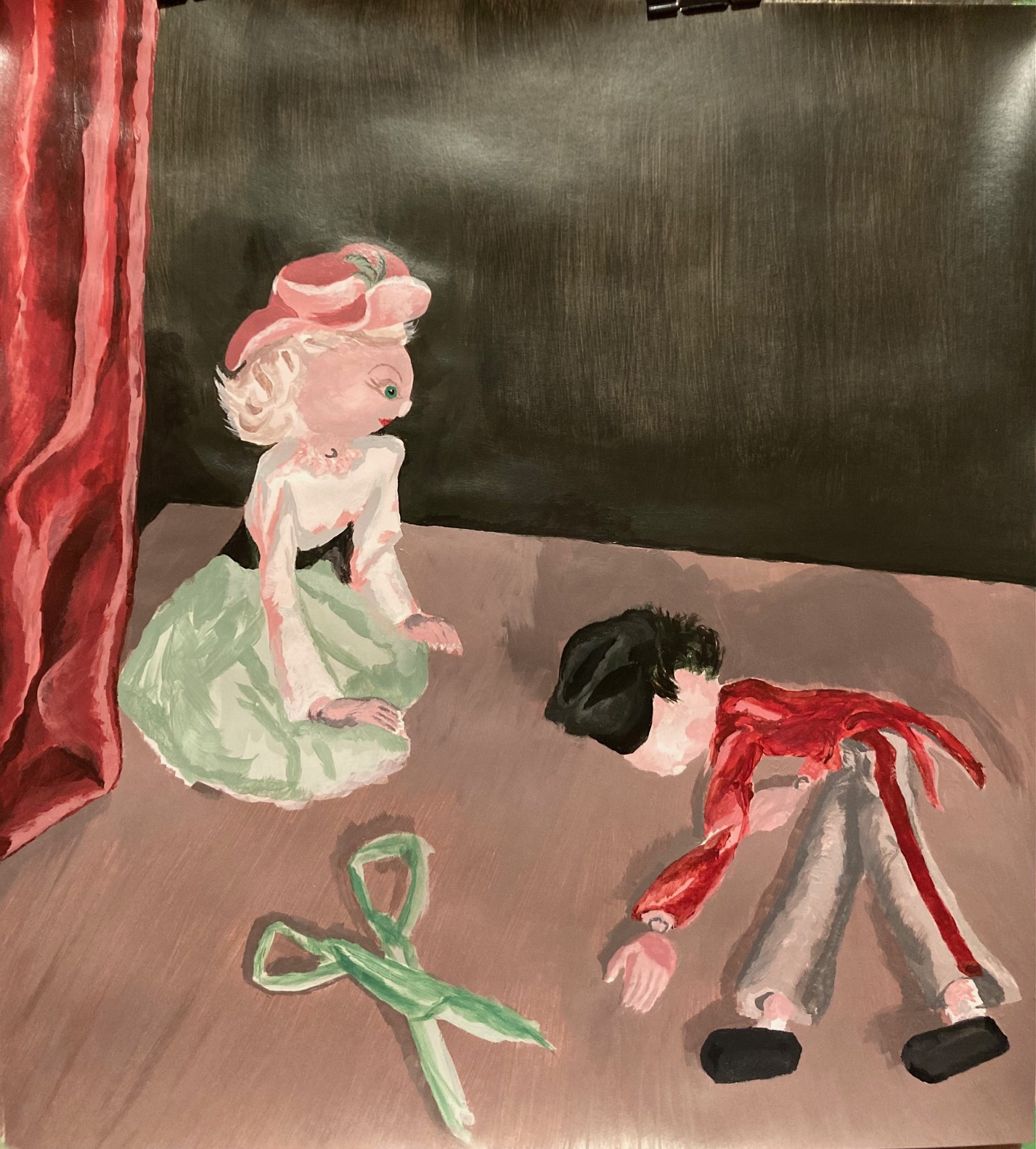
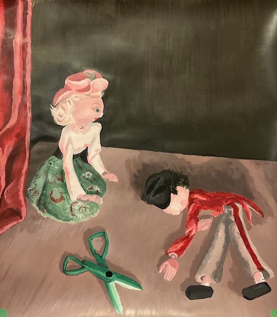
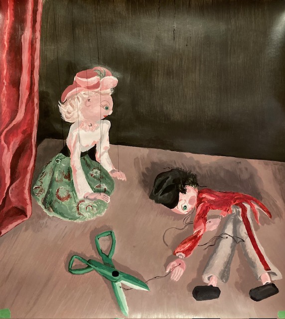
FINAL PAINTING UNIT 3: We were asked to paint from life, a still life or a scene, indoors or outdoors, something meaningful to us. For colour, we were to pick a complementary pair and then mix all our neutrals from those two colours, with small amounts of white and black permitted. I chose red and green, as it best suited my subjects, which were childhood marionettes I found at the back of my closet — a soldier in red and grey, and a maiden in green and pink. As you will see below, I brainstormed on paper first, then set up a marionette “stage” in my office, testing out various lighting options, and looking for a scenario that would be playfully dramatic… here goes…
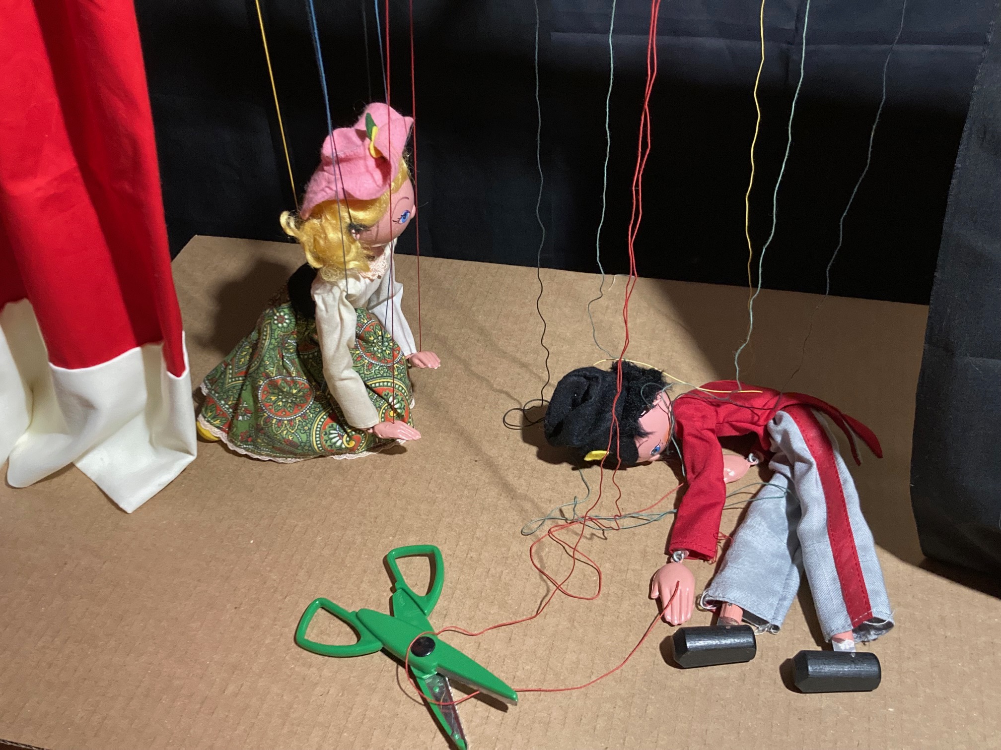
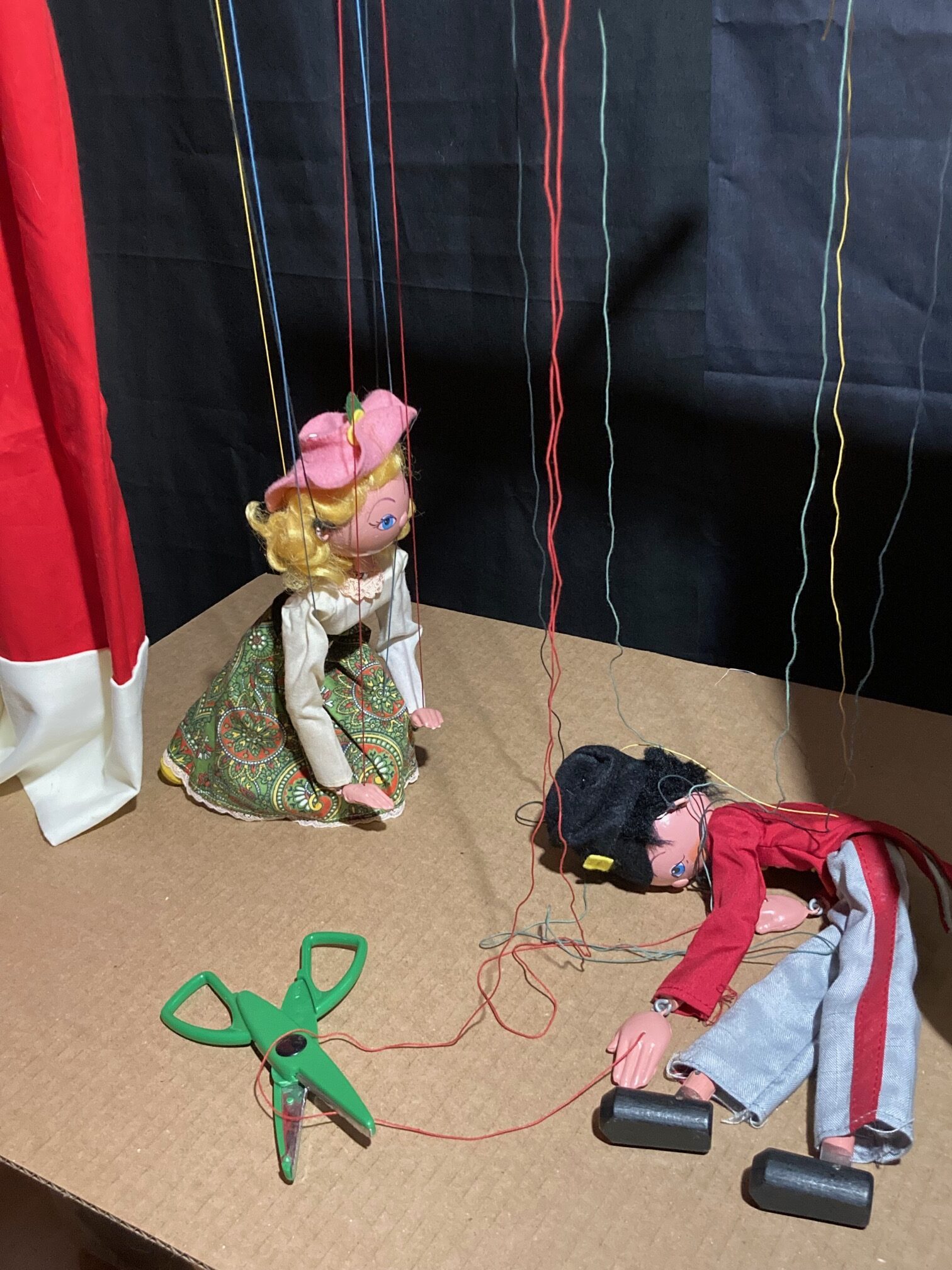
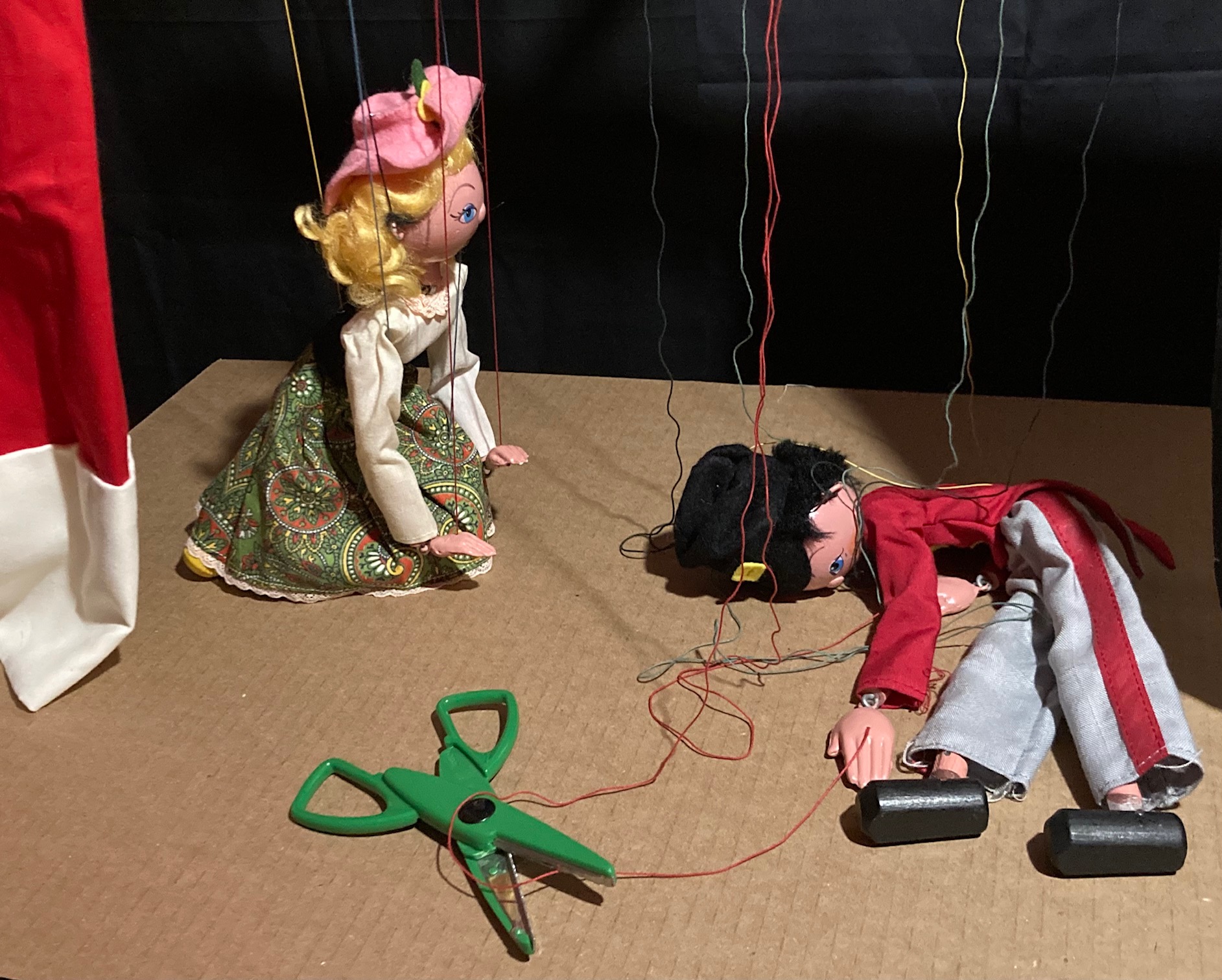
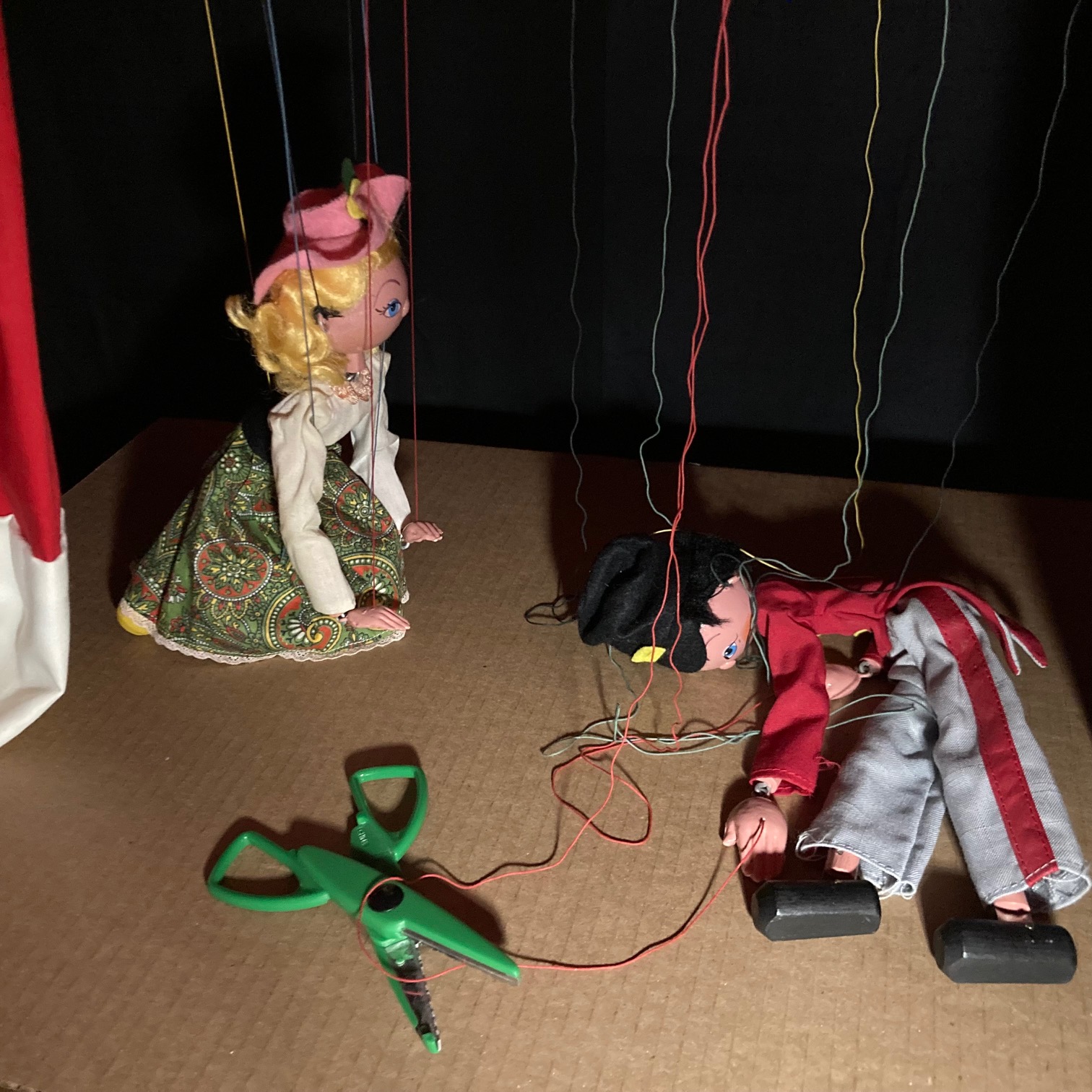
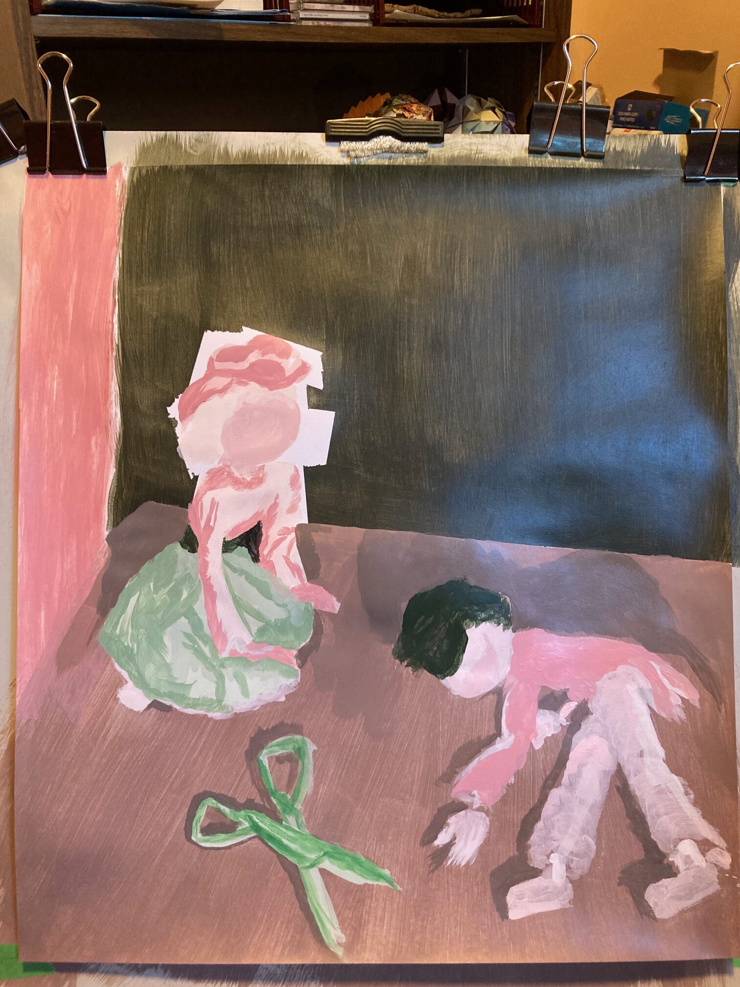
Now I had to think about how to paint it. Settled on 18″ wide, 21″ high. See below an image of the set-up with my easel and the “staged” still-life. Sat on the floor on a meditation bench for much of the painting, to keep at same level. Also limited the lighting so I could keep the spotlit stage lighting with minimal conflicting light sources — the disadvantage was painting on dimly-lit paper, though in some ways helped me to think in broad contrasting colours for my initial layers. At the end I needed to light the room to see details, and sat up at my desk for best view of the paper. Used the photo to help me with shadows at that point.
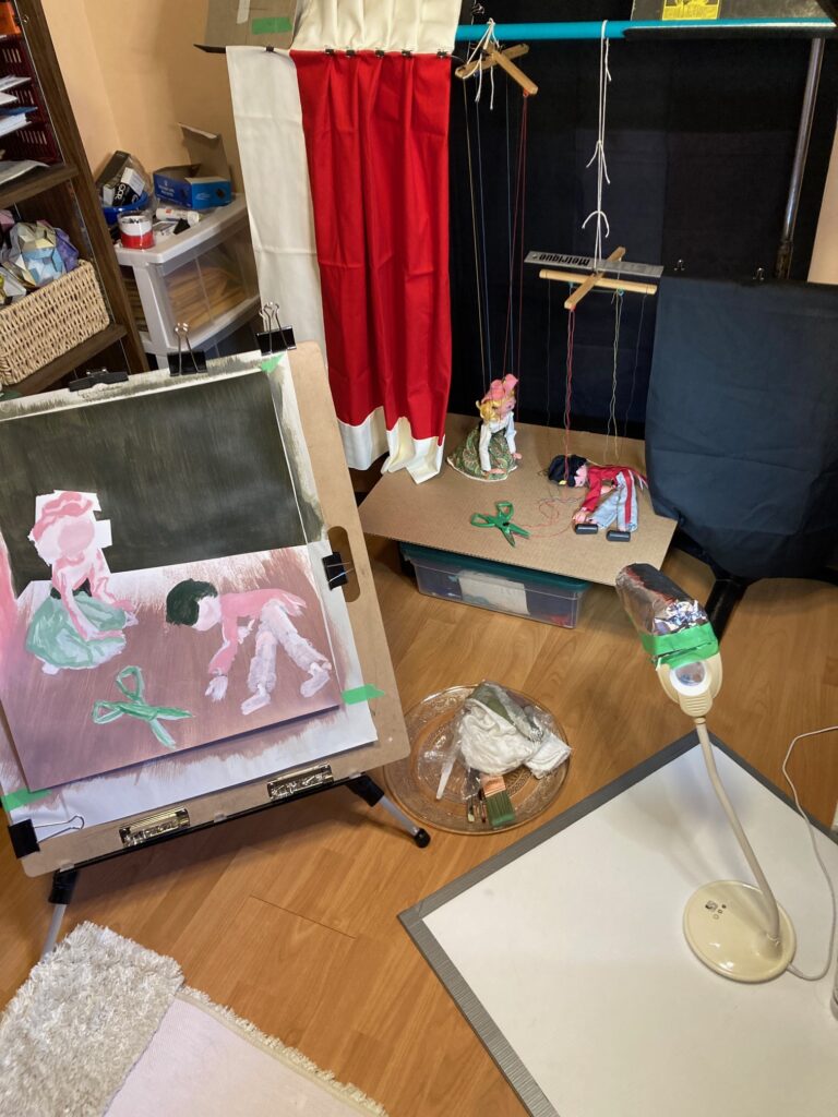
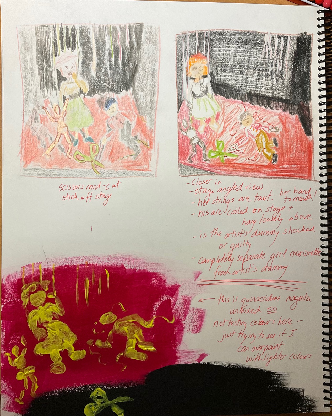
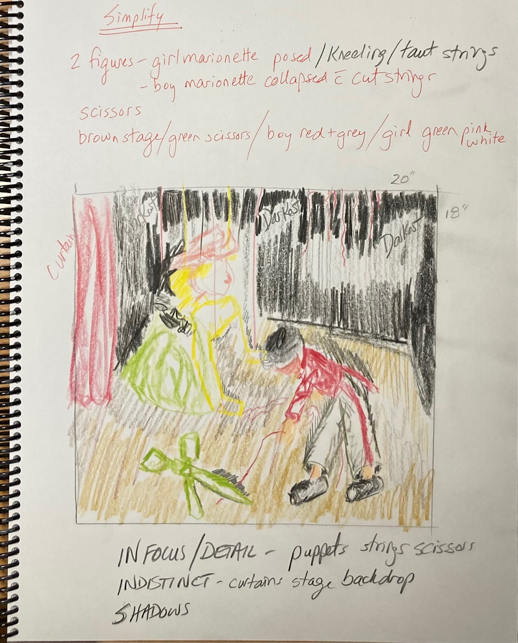
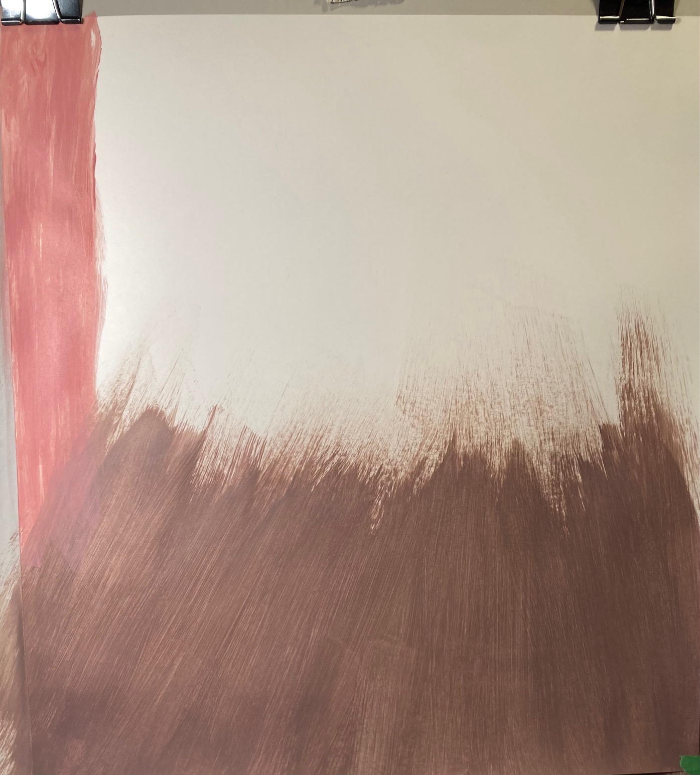
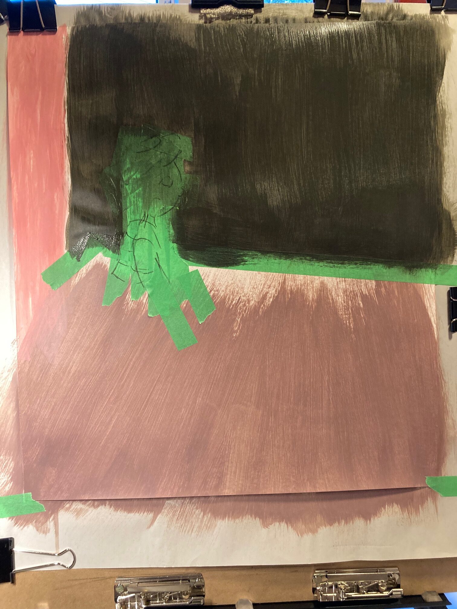
Decided to use pale and washed-out versions of the 3 background colours to begin — light brown “stage floor”, dark green/black backdrop, and red curtains (ignore the white trim in the photo). The puppet on the right will not show all its strings, they will hang as if cut with the scissors. We shall see if it works. I did a few tests to ensure I could paint the strings over top of the very dark background. Fingers crossed, should work. And now… some process shots over about 7 days of painting, a bit at a time…

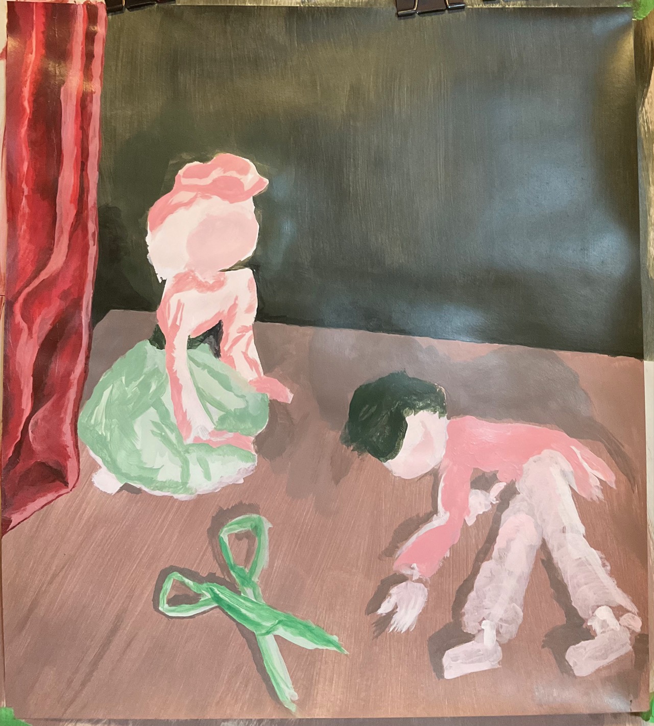
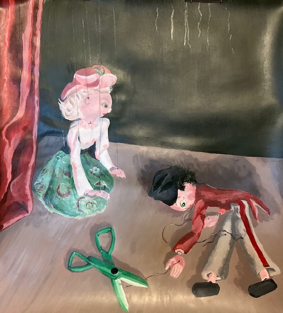
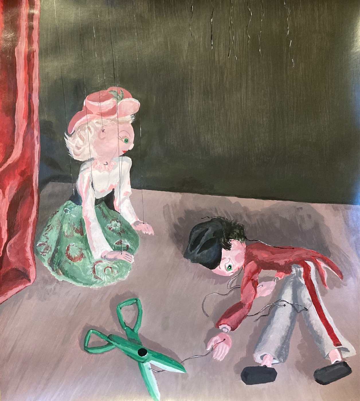
Comments and suggestions from the critique: appreciation for the texture of the strings, needed to touch them to see if they were actual threads; appreciation for the narrative, several people gave their imagined storyline for the scene; appreciation for the smooth colour transitions and for the choices about the dramatic lighting. Things to improve or consider — vary the texture on the black backdrop; try a white border to add to the sense of framing a stage; consider different colour for the scissors (a neutral? or a metallic quality?) to mess with the really even amounts of red and green I’ve used, stretch beyond that harmonious 50/50 ratio.
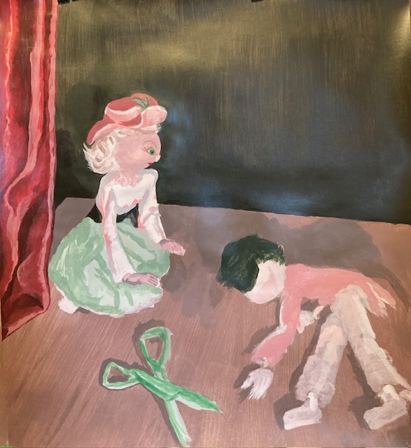
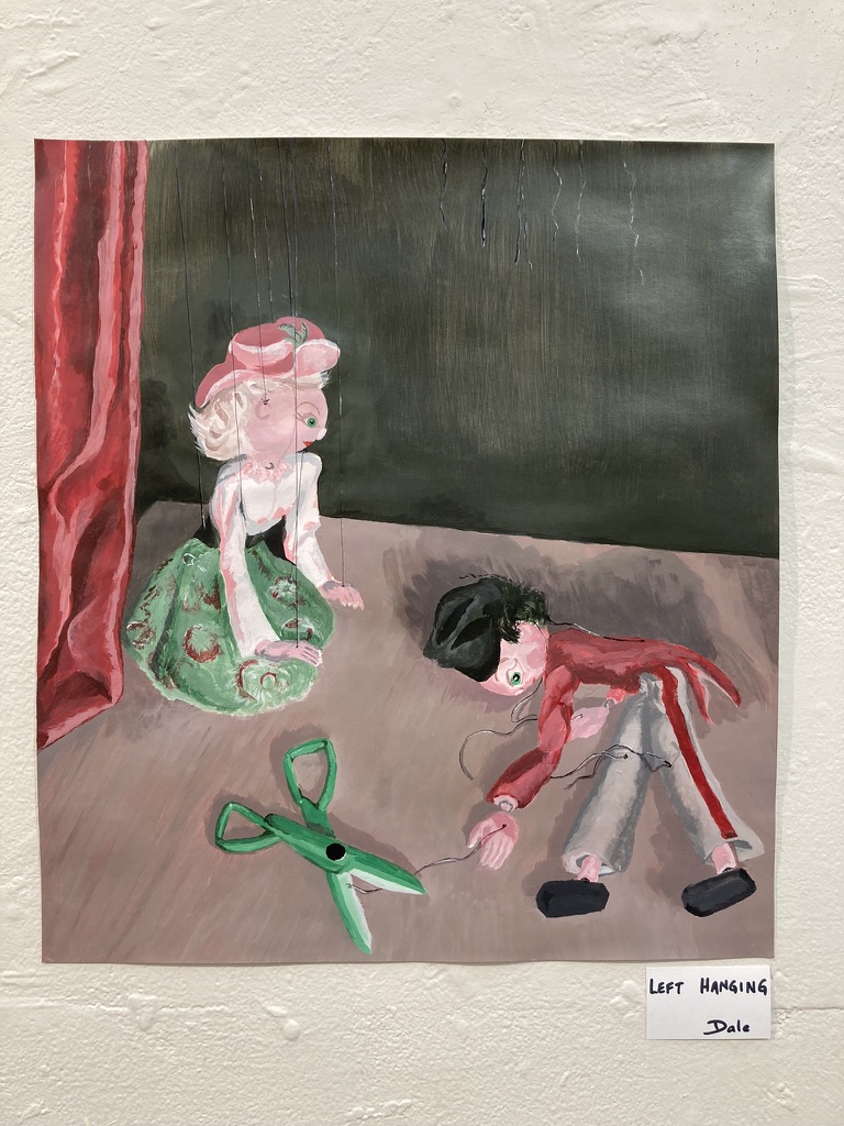
INTENTION AND REFLECTION: I titled the work “Left Hanging”. My intention with the work was to present a provocative yet ambiguous scene, dramatically lit, with implications of disaster or murder or lost love or lost childhood or… or… or… (whatever else the viewer could imagine!). I used the marionettes to abstract from direct human parallels, allowing viewers to exercise their emotions by proxy — I guess this is what puppetry has always done. In terms of colour theory, I chose to limit my palette to the complementary colours red and green, and all the neutrals in between, with additions of white for lighter tints and black for darker shades. In the end, I used a thread of pure-black india ink for the puppet’s strings, and embellished it with light and dark grey highlights, mixed from black and white only — every other item on the page included red and green in varying amounts. I used a “harmonious” mix of roughly 50/50 red/green in the finished appearance of the work, which in retrospect is a strange choice for a scene that I intended to be dramatic and provocative. I learned a lot about mixing tints and shades — much harder than I realized to reproduce from one time to the next, and it would have been impossible to keep every iteration of my colours. As I was working through the project, I might need to add more shadows on the stage, the clothing, or a face, but couldn’t develop the same tint or shade I had the last time. For the stage, it changed from being a fairly consistent colour (like a brand-new stage!) to a mishmash of streaks and colours that aimed generally to have the right mix of shaded and lit areas, looking in the end more like a worn wooden floor might look, not a bad effect as it turned out. It would likely have been a good idea to do more of that with the backdrop wall as well. Next time!