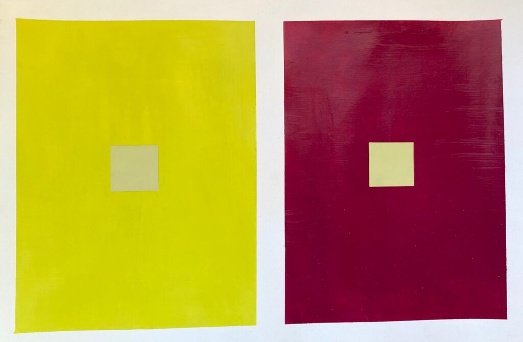
COLOUR INTERACTIONS: Digital The first week we generated digital versions of Josef Albers’ Interactions of Colour trick: Make two fields of colour and apply a small area of a third colour in each field, with the aim of getting that third colour to look like a different hue in each context. Here are my four trial runs at it…
Colour-Interactions-Dale-Samples.FINAL_COLOUR INTERACTIONS: Painted. Four small painting projects this week. First, make a painted copy of the one of the digital studies of last week. Then, a second version of that study with some added colour bars/swatches to further push the illusion of a change in hue. The next two exercises worked with simulated transparencies, in which shapes of different colours are painted on a page such that they overlapped. The overlapping portions are painted with a hue that is a mixture of the two parents, experimenting with the proportions in the mix to get the best illusion of transparency. I think I repainted each overlap zone at least twice, and in one case 6 times, to get a colour that seemed to work! The final exercise was meant to include repeated shapes that shifted in their degree of “transparency” across the page.

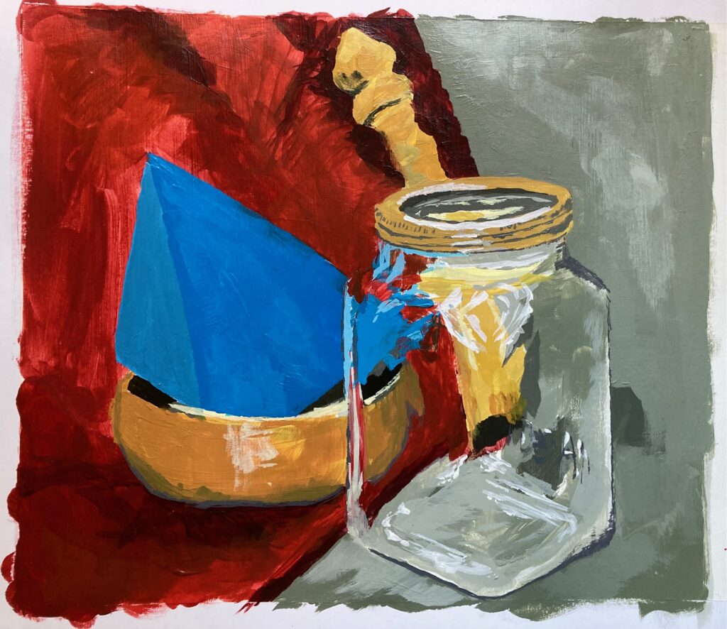
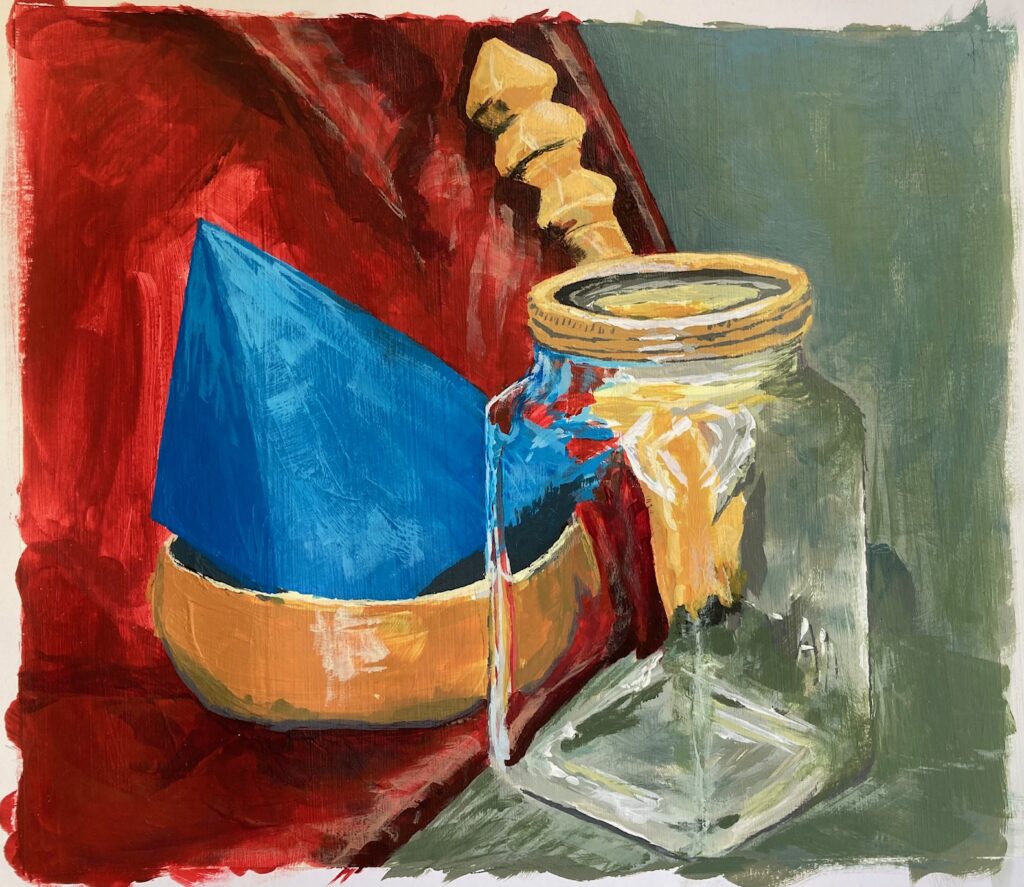
PAINTING GLASS OBJECTS (Simulated Transparency): This week painting a glass object positioned in a still life with colourful objects through it. Note the change in hue (sometimes lighter, sometimes darker) when the object is seen through glass rather than directly, and learn about the distortion of the object as it is seen through glass rather than directly. I am very slow at mixing and applying paint so I completed a small portion during class and did the remainder at home with a reference photograph to get the lighting. A huge amount of trial and error. See below — the reference photo and a couple of in-process photos, then the final version.


Glazes (Actual Transparency): On a gessoed paper I made a white/grey/black underpainting, abstract swirls. Once dry, applied yellow glaze, then blue, then red, allowing drying time with each. In the end, I preferred the painting after only two glazes, but I am glad I went on to do the red layer to get better information about how the glazes mix with each other, obtaining intermediate oranges, greens, and violets. See below, the penultimate and the final versions…


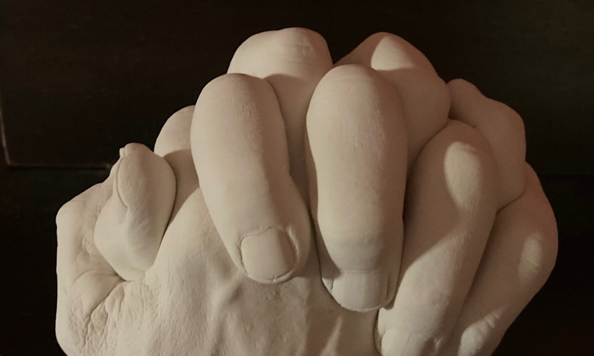
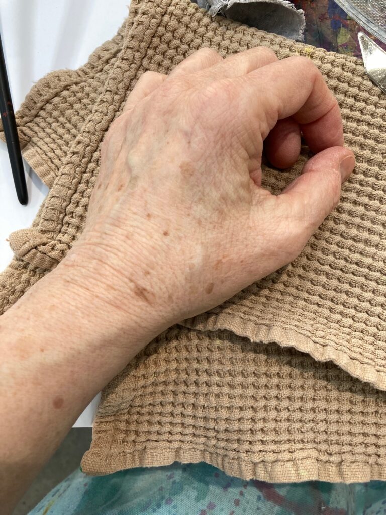
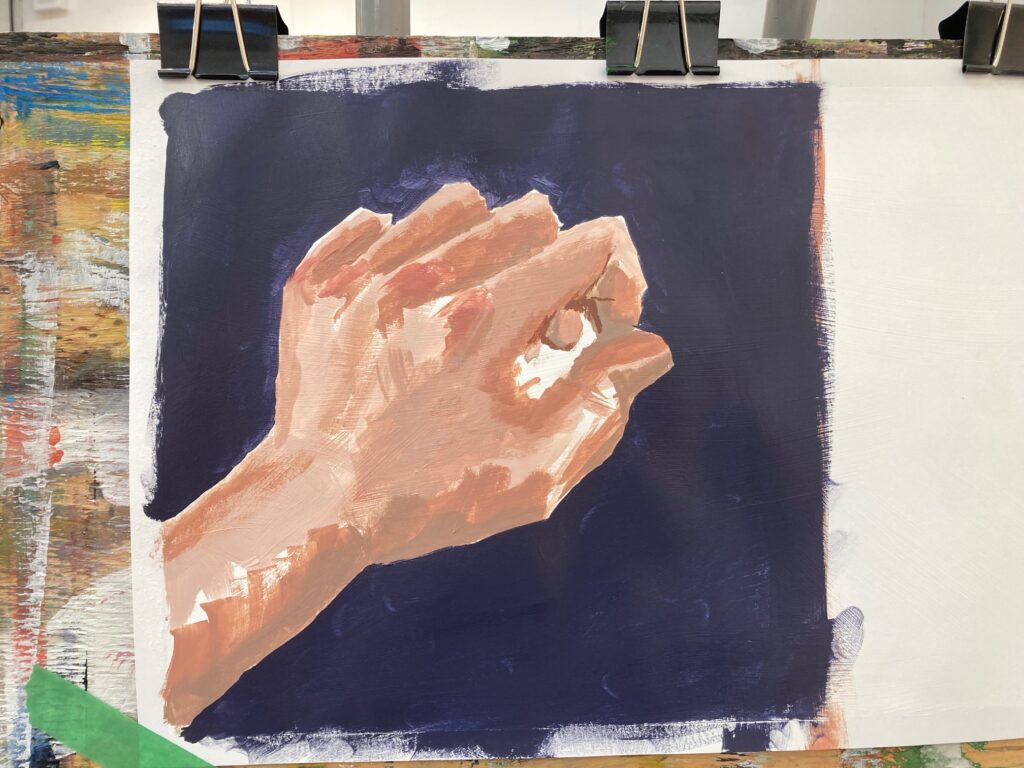
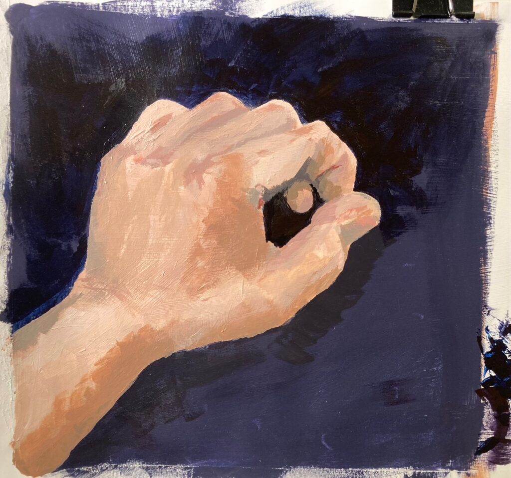
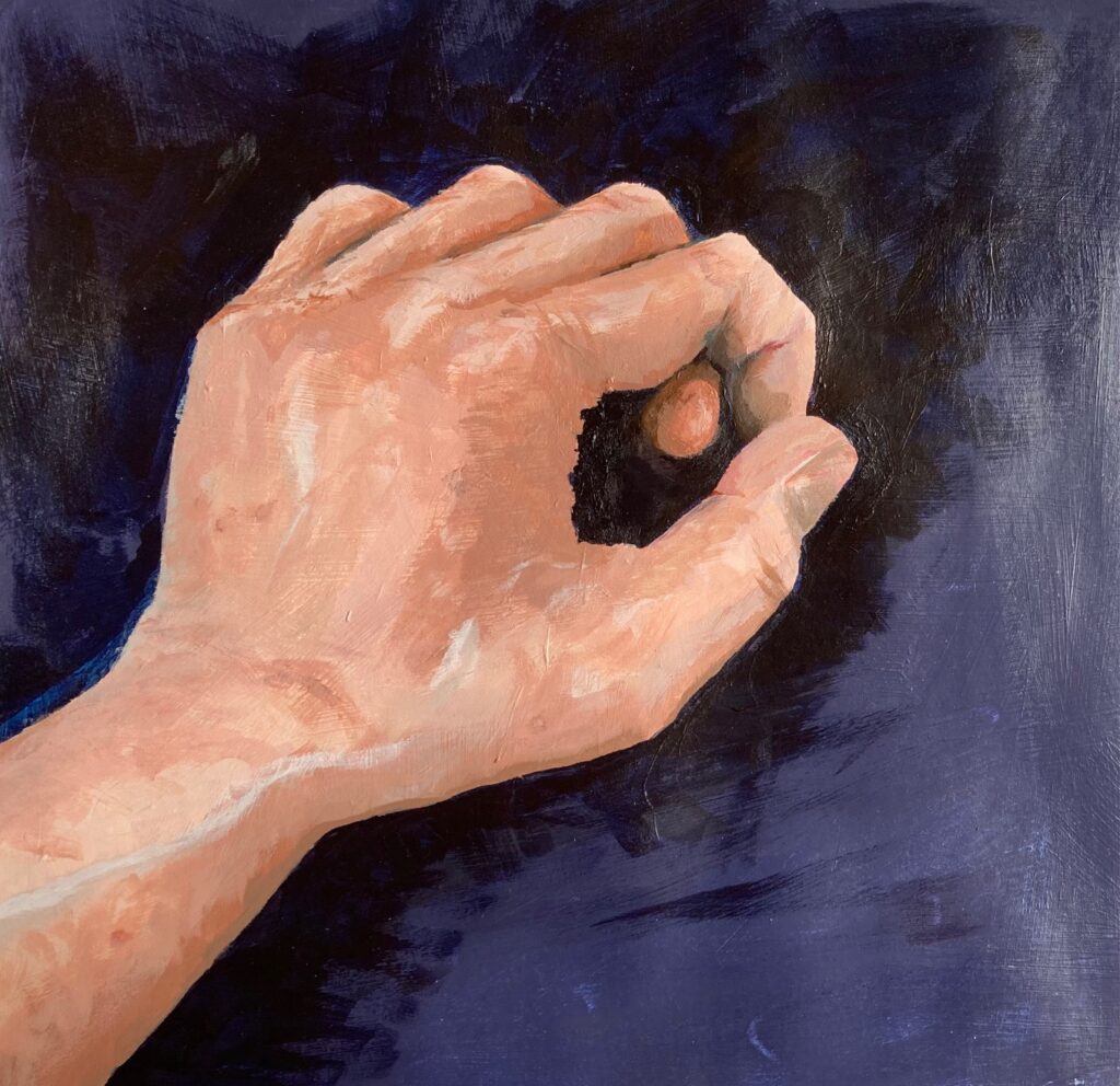
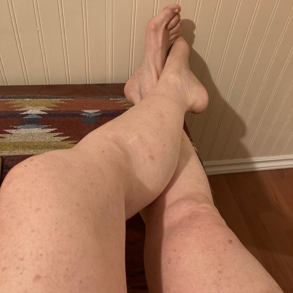
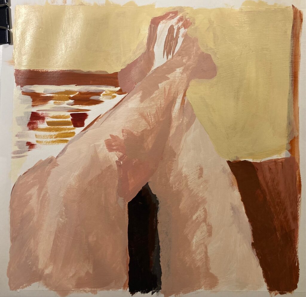
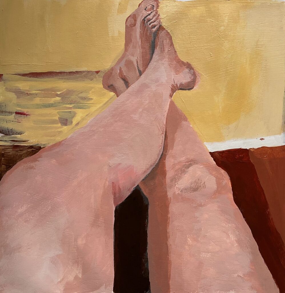
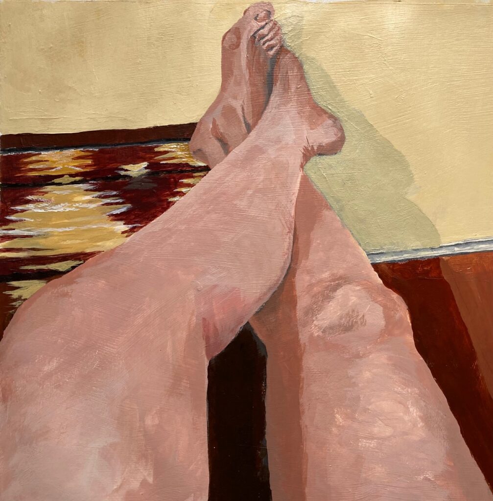
Earth Tones and Skin: This week we were to start in class and complete at home, a painting of our own hand, after tutorial on mixing skin tones. See below — a reference photo for my hand (to preserve the in-studio lighting) and several iterations on the way to final. Also, at home we were to paint a different body part with focus on skin tones. I chose a foreshortened view of my legs stretched out in front of me, propped up on a bench that was covered by a colourful woven cloth. Again, a couple of views in progress plus the final.


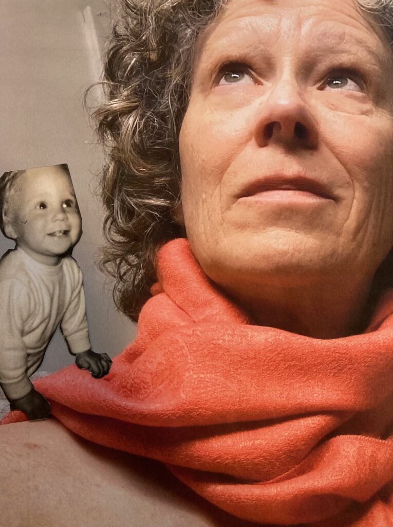
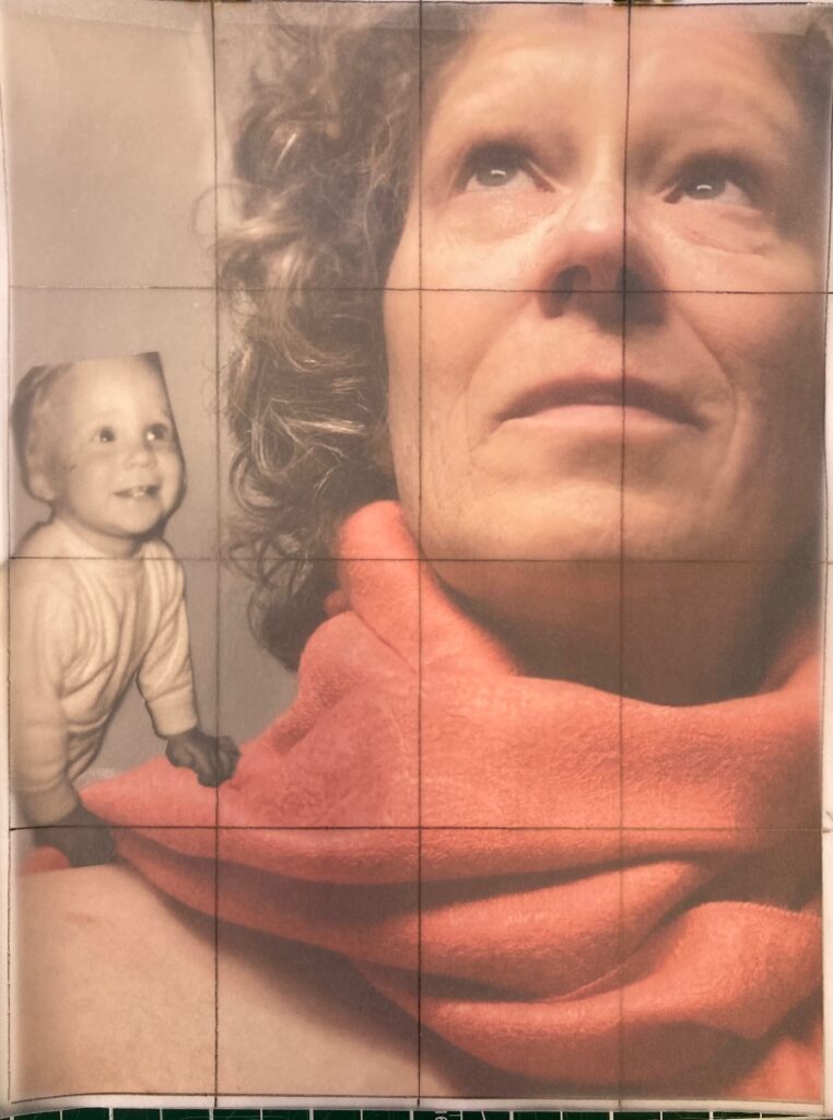
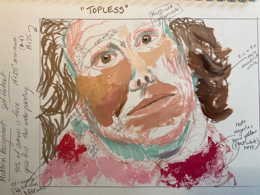
Self Portrait: For this assignment we were meant to undertake a creative self-portrait, an invitation to include a narrative or context that provokes interest / personality. The face is meant to occupy at least 40% of the scene, with a focus on mixing colours for convincing skin tone. We were asked to include an underpainting of a dark colour mixed with white for monochromatic value range. I chose to use the red-brown colour of burnt umber mixed with quinacridone magenta. Below are images for my brainstorming ideas, some reference photos, and several stages of the work in progress. My theme was “topless” — in the sense that the top of my head is missing, and that I’m wearing no shirt. The being on my shoulder started out as one-year-old me, from an old photo, but over time morphed into the mischievous imp of the final work, an eager foil to the preoccupied adult. Undecided on the title at this point — Considering “Topless”. Considering “Imp”. Considering “Mischief”.


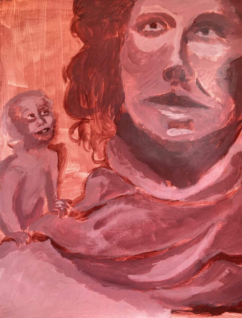


Critique Day — took a photo in studio lighting, see below. Group discussion as follows: On initial viewing with no input from me and no title provided, people commented on the warmth of the colours, the uncertainty of the relationship between the two figures which left people curious (which was attractive) but also confused (which was more offputting). The small being was described as fairy-like, not of this world, like a character from a. magic realist CanLit source, one person wondered if it was a younger version of me. People wondered why the big figure appeared disengaged from the small being which was earnestly engaged. Technical feedback — eyes well realized except too uniformly light in shade, make upper eye darker; liked the shift to light-coloured background top of canvas; what if the background was a cooler shade maybe green or blue; nostrils needed more gradated shading, too suddenly and deeply black; also too black in shadows of neck and in upper eye socket. Hair working even though lacking detail it still conveyed depth. Scarf well conveyed.
