LIST PAINTING 1:
Subject = entryway floor.
Colour = neutrals with accents of saturation.
Application = large brushes — I used the short and long surfaces of two very coarse-bristled brushes, a 2-inch and a 3-inch. I also ended up incorporating some dry brushing techniques, to get stippled effects on the wall shadows, carpet, fuzzy parts of slippers.


LIST PAINTING 2:
Subject = make a collection of something. Paint it. Mine was jars and tubes of paint.
Colour = split complementary harmony. I used yellow, orange, and violet-blue.
Application = scraping. I used 1.5-inch and 4-inch drywall scrapers, plus a credit card with teeth cut along one edge. I used generous amounts of acrylic matte medium, and started the trial paintings and also the final version by paintbrush application of yellow on the bottom half(ish) and orange on the top half(ish), before starting in with the scrapers. The blue paint was entirely applied/removed by scrapers.


LIST PAINTING 3:
Subject = view from my window
Colour = use all dark values
Application = washes/staining


LIST PAINTING 4:
Subject = started out with “open a drawer and paint its contents” (my sock drawer), which I rendered in my sketchbook using a polychromatic harmony colour scheme, but didn’t like how it turned out. Then shifted to “find 2 objects that are absolutely different from each other” (a sock puppet and a roll of paper towel) and did complete this one on gessoed paper but on completion I thought the paper towel was the most interesting part. So I did one more version as “paint something boring” (roll of paper towel).
Colour = after an initial stab at polychromatic harmony, I shifted to all light values
Application = impasto (brushes and palette knives). I had a lot of false starts, as noted above under subject. I have difficulty translating stuff I already know about form and value into the use of each new application style I try. My initial ideas about really thick gobs of bright coloured paint for the socks in my drawer looked like… thick gobs of paint that had no relationship with each other. Anyway, a few tries later I landed on my boring paper towel. Below, see a couple of my ideas with their sketches or paintings, as well as the final one.


List Painting 5:
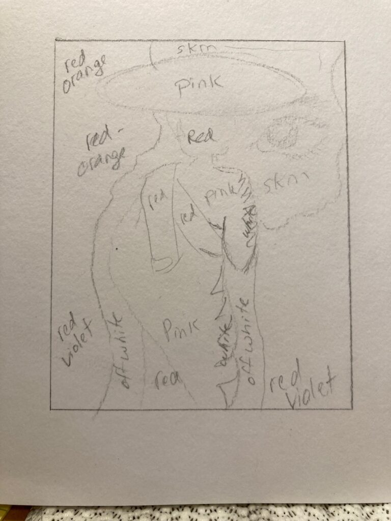
Subject = Make a 2″ by 3″ collage. Paint it. I modified mine to 2 x 2.5″ so it would scale up to a 16×20 finished product. I used magazine cutouts of a monk, a girl’s face, and two views of a rock wall. Below, see the original collage and some of my planning notes…
Colour = analagous. I used Red, Red-Orange, and Red-Violet
Application = wet in wet blending. This was a good challenge for me as wet in wet meant deciding in advance about what hues I would mix then being decisive about how to applyl and blend because they dry fast. I did the painting in sections to allow this to happen. Also, I chose a new-to-me surface for this work — tried out a canvas for the first time.


List Painting 6:
Subject = Make a painting that visibly includes letters, words, or numbers
Colour = tetradic harmony (red orange blue green)
Application = glazing. I was after a graphic design / psychedelic poster mash-up. Used the symbol “&” and letters to spell “ampersand” and went at the design without a lot of planning, other than an initial decision to make a stencil of “&” so I could trace it several times on the paper with the same shape, then free-handed the rough-hewn letters, and overpainted with grey tones and some full-pigment yellow before starting the glazing process. First layer was yellow glaze then subsequently 7 or 8 layers of red and blue to gain various shades of orange, green, blue and red (with the odd tinge of violet). I learned a bit about the downsides of free-wheeling with something that was envisioned as graphic-design-informed… seemed to end up with too many ideas in too small a space! But also learned a lot about layering glazes, and ended up pleased with the playfulness of the shiny and textured surface. See below — one of my sketchbook notes pages, and two photos of the final product, one that features the composition and one that features the reflective shine of the work.


