PROJECT 1: TRANSFORMATION
Choose 2 pieces from previous NIC classes, one that is my favourite and one that I dislike.

The Favourite: Rapt is a charcoal drawing I did early on at NIC. This is not technically fantastic – eyes too small, hair kinda weirdly same throughout, and as a self-portrait it misses the mark on being an ideal likeness with full realism. But I like it because it realized the plan I had in my mind; it feels thematically worked out and followed through; there are interesting negative shapes and full key shading; it is overall darker in tone than I’d wanted but I am satisfied with the depth of form; the face is the focus but the hand and pencil matter to the scene and are well realized; I like the fit of the title to the work and its idea.
The Disliked: Unremembering is a drawing in charcoal, graphite, coloured pencils and ink. I think this was an interesting idea but so unevenly executed. I’m unhappy with the wonky proportions, which were unintended: giant man with a huge head, small woman with tiny hand, tiny piano, gigantic bottle and tiny champagne glasses that float instead of rest. The room is a screen shot from Casablanca (minus Sam at the piano and with the addition of sheet music “As Time Goes By”) which I rendered in less detail than the people. Then imagined the room being slowly filled in by drifting sand (it is a desert and, you know, the sands of time) and also being gradually erased (and the people being erased too). It’s a bit unclear whether I am talking about forgetting/erasing that is deliberate or just the result of memories becoming hazy over time – perhaps both. I was timid about colour, and about realizing the sand. I’m glad I took the risk with ink on faces and hands but that meant I couldn’t address the proportions once I’d drawn them.
FEEDBACK and COMMENTS January 22 from peers and instructor: specific appreciation for the perspective in Rapt, and for the chaos and erasures in Unremembering.
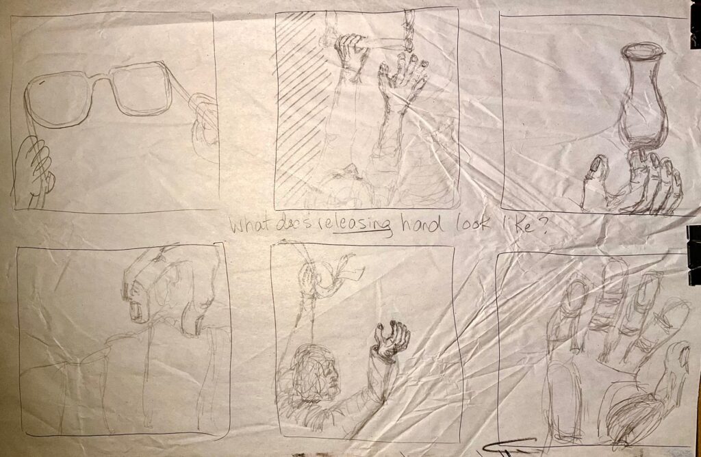
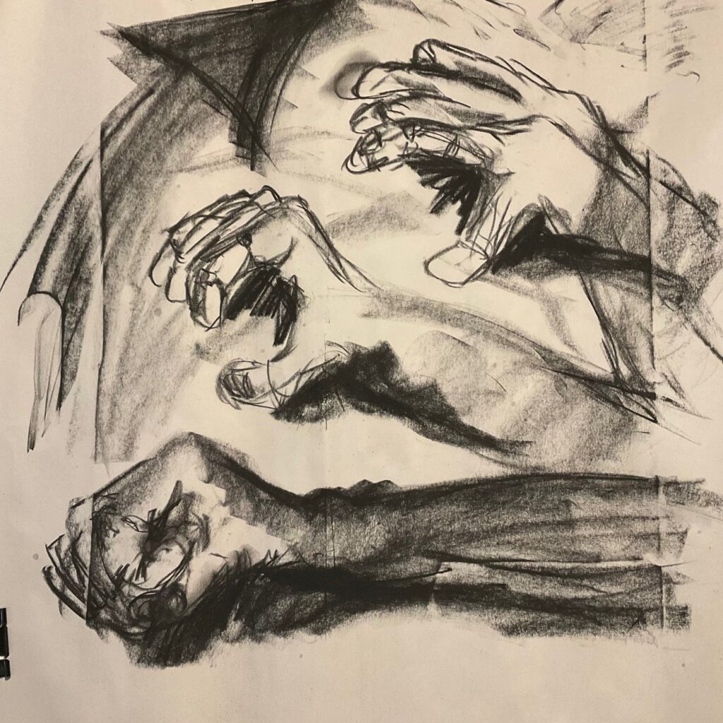
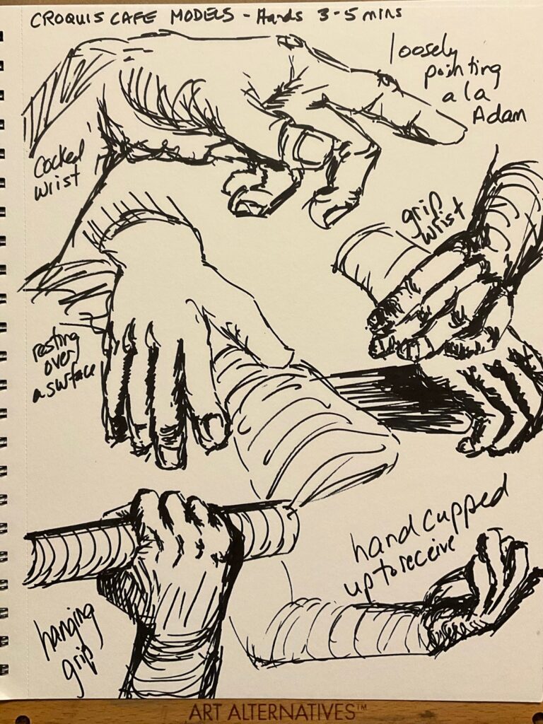
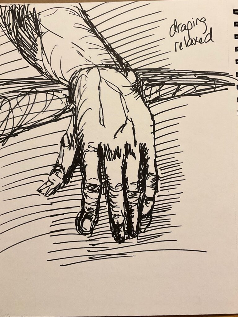
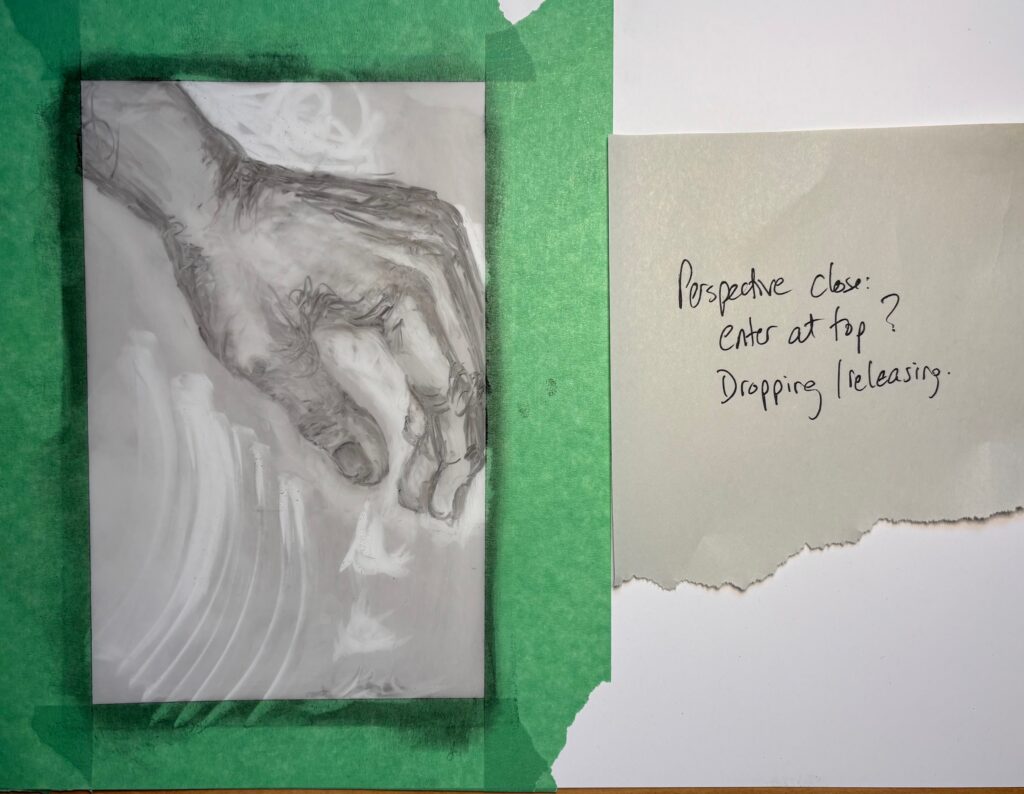
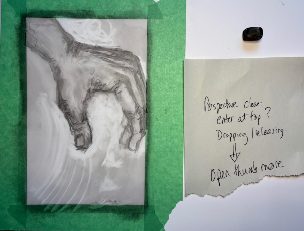
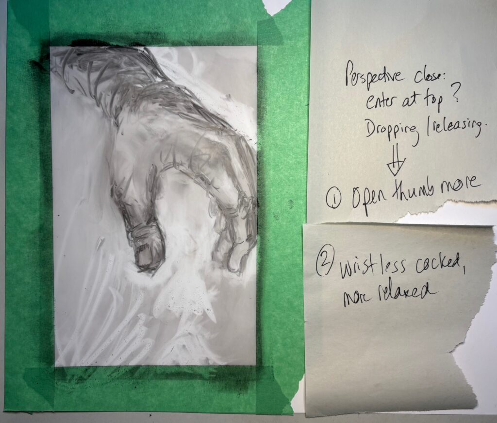
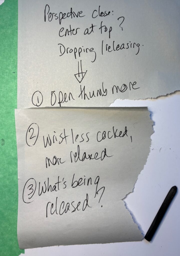
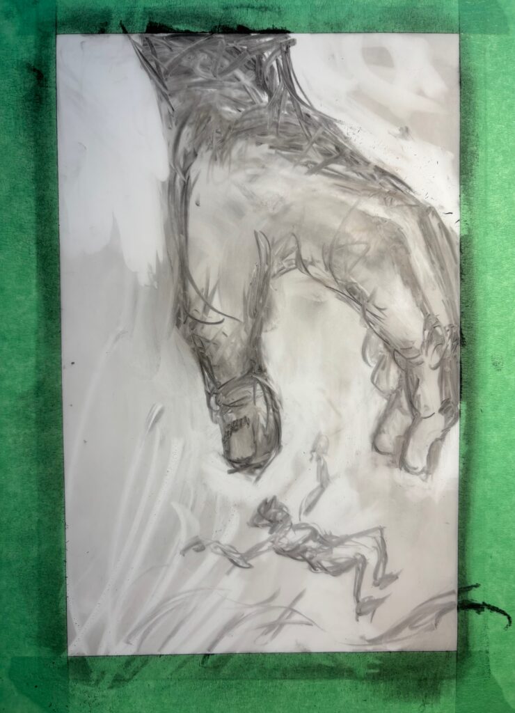
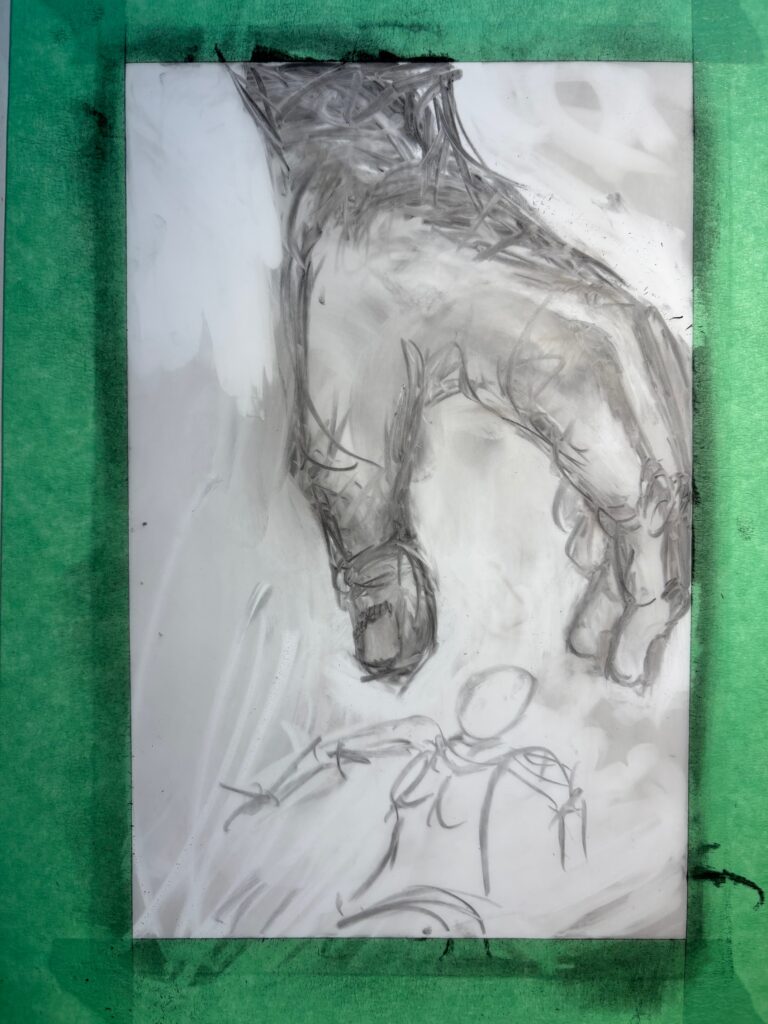
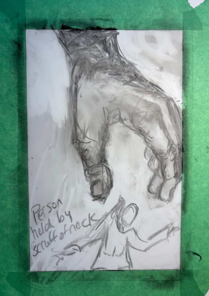
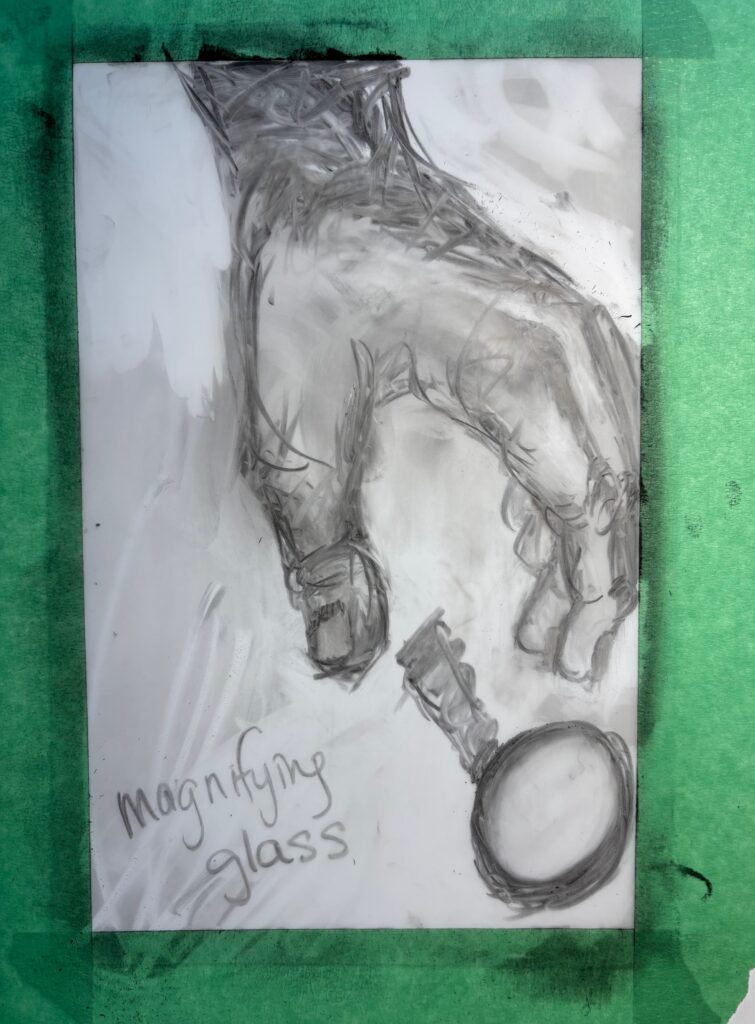
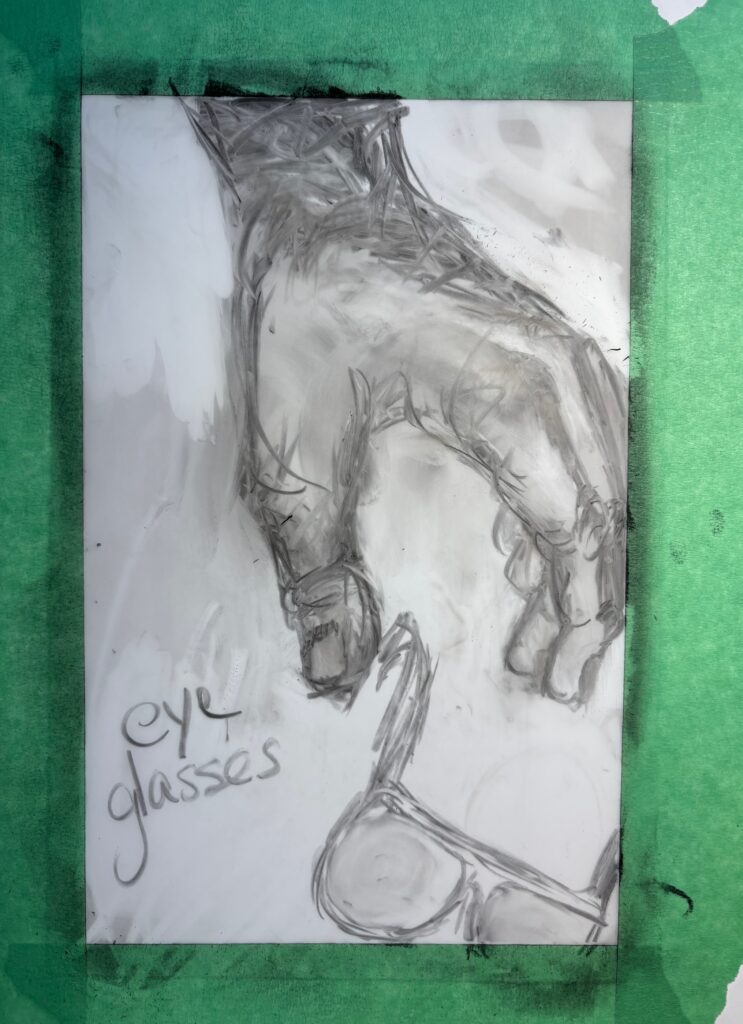
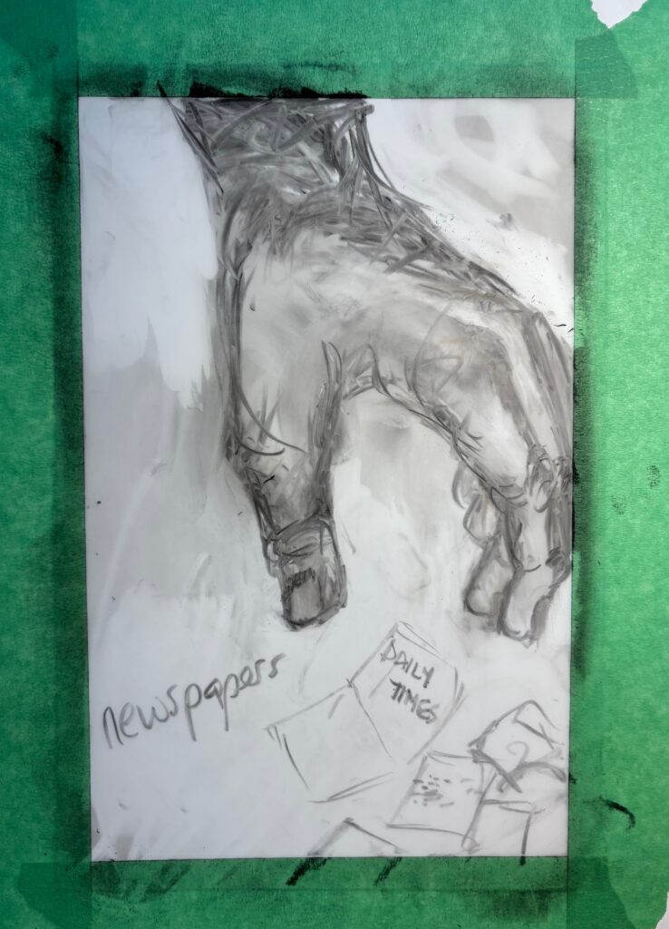
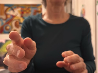
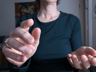
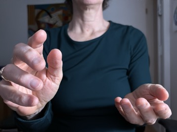
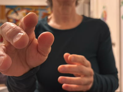
VISUAL BRAINSTORMING: a starting point for hands, composition, and erasures…
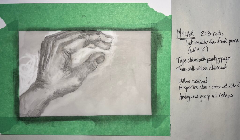
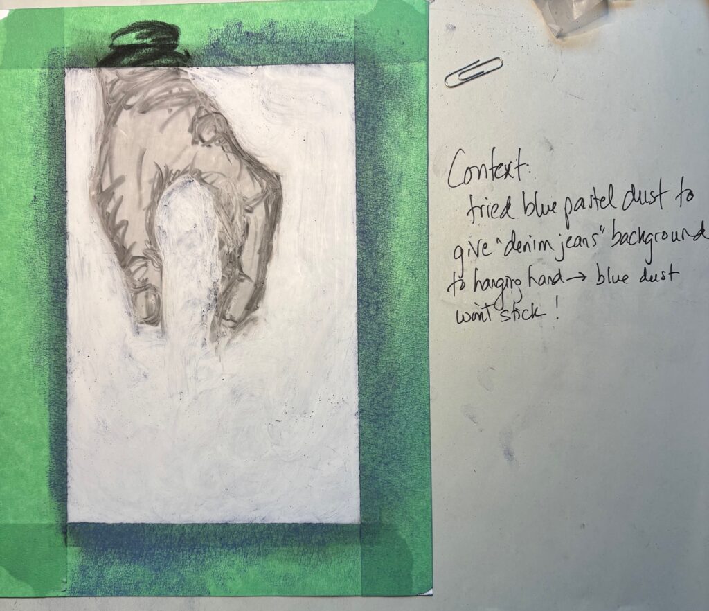
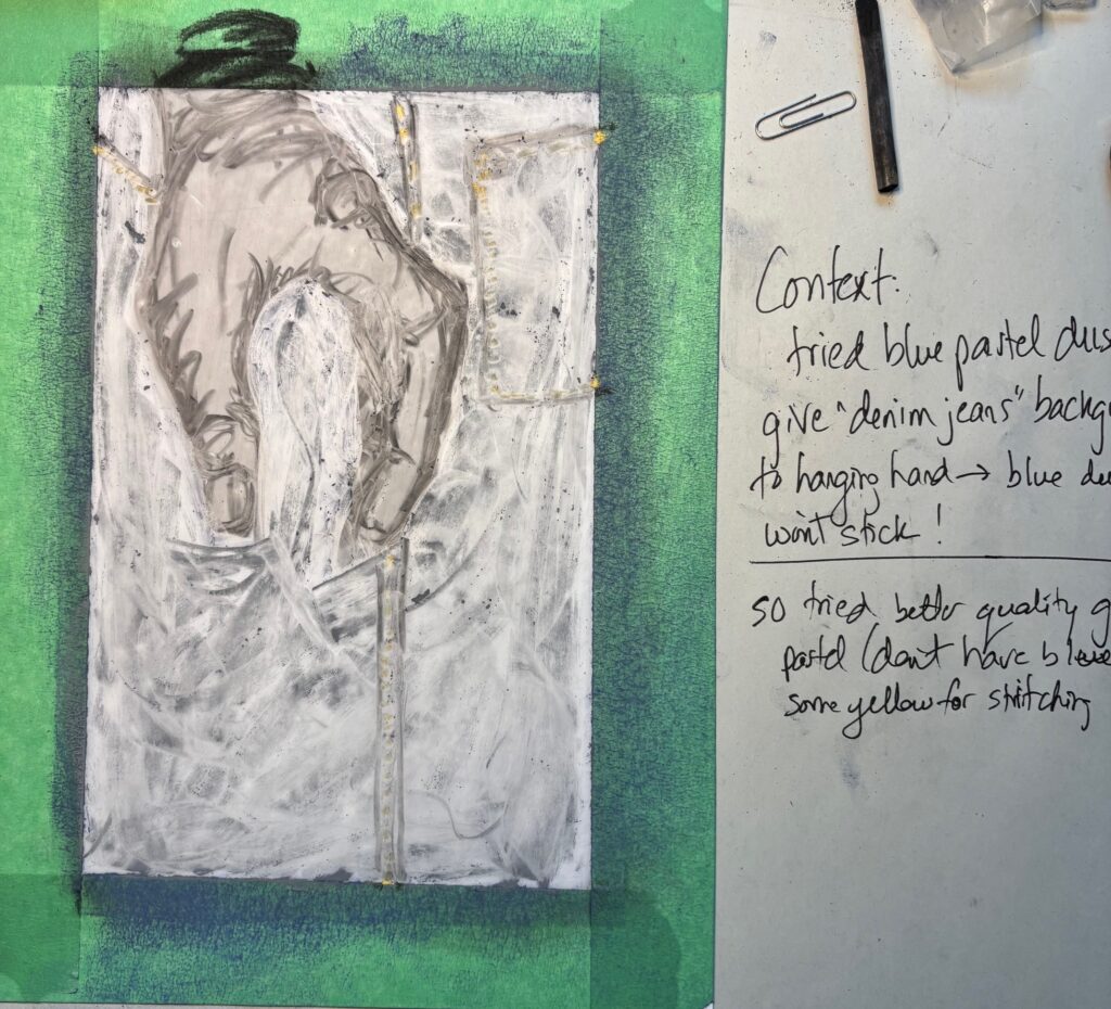
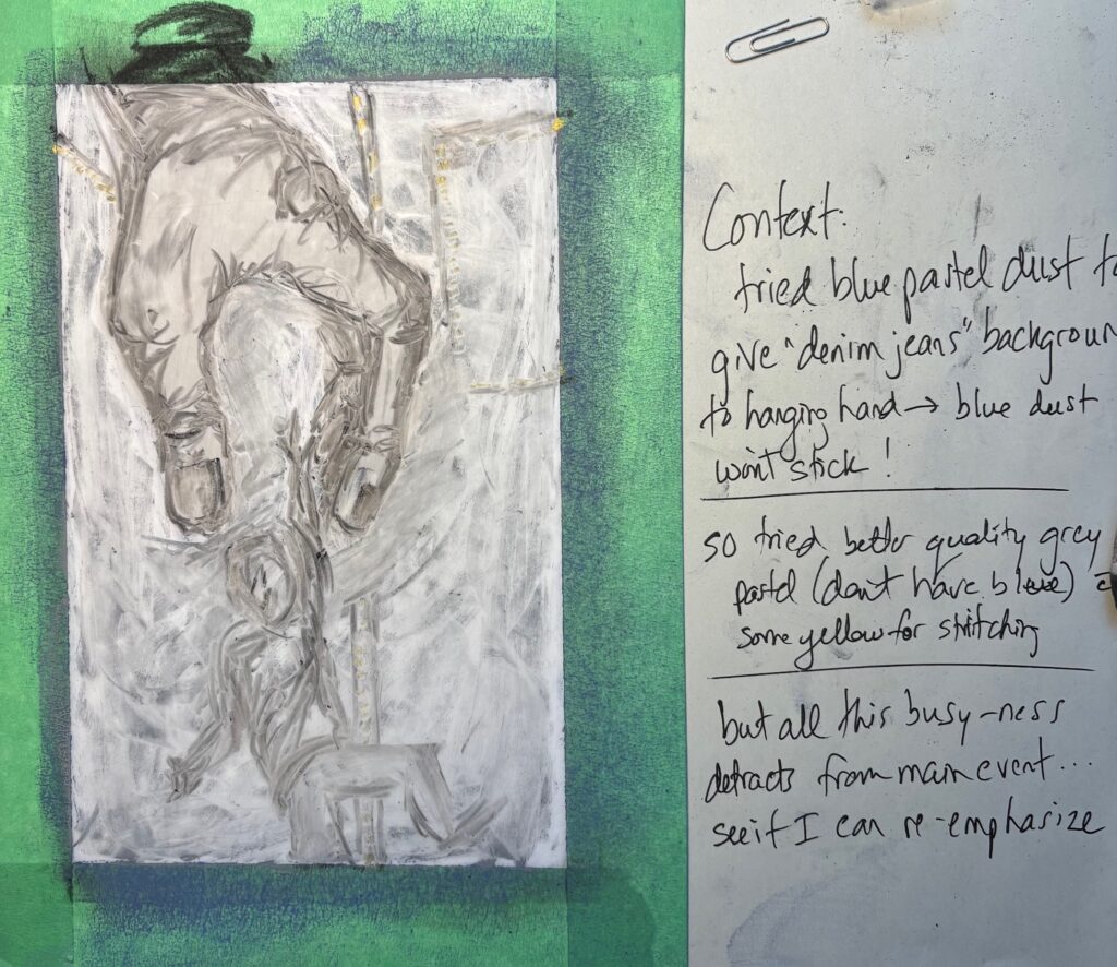
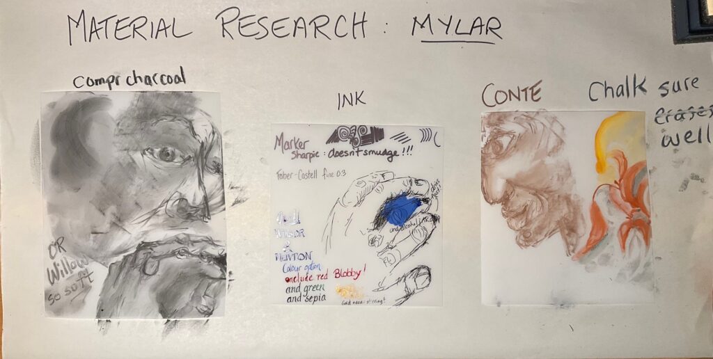
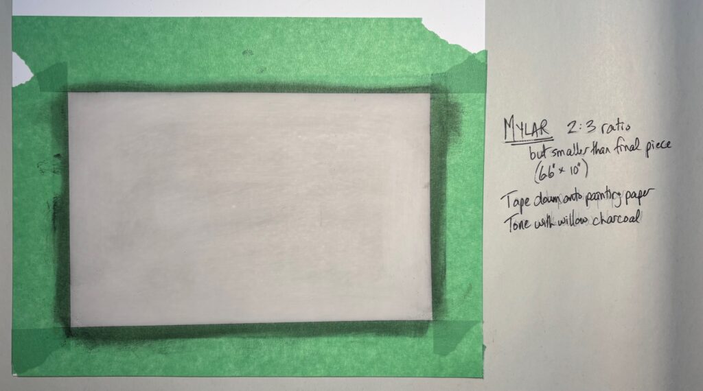
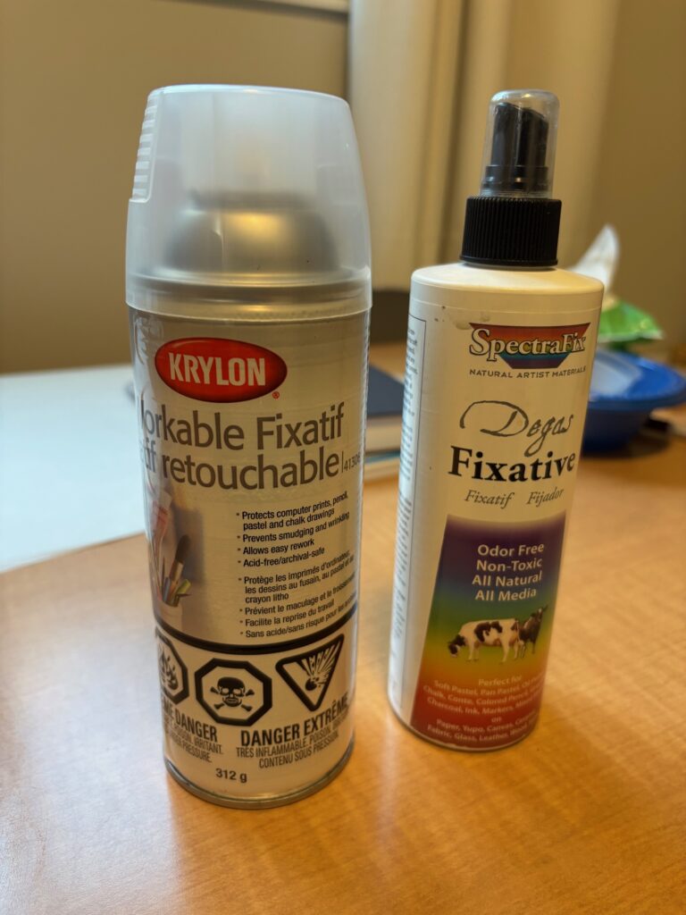
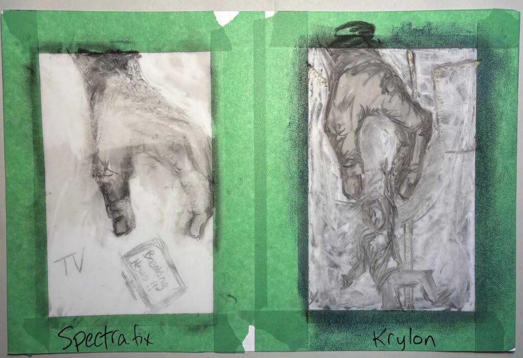
MATERIAL TRIALS: discussed 2 things with Linda Jan 29th: 1) mylar sheet 20″ width so dimension smaller than 22 x 30 is acceptable. Will plan on 20 x 30 for at least the first piece. Could also have access to wider (40″) through classmate for next project, or make a diptych next time; 2) what fixative? She thought Krylon workable fixative (spray outside as toxic to breathe) or the less toxic casein-based Spectrafix could both work. Suggests trial both and test fastness by light rubbing against newsprint. See below the series of tests and investigations into media and substrate for project 1:
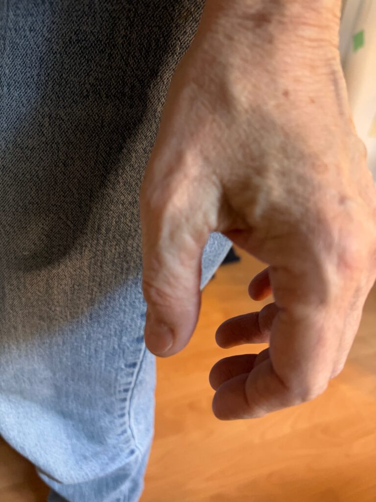
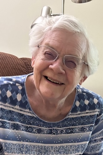
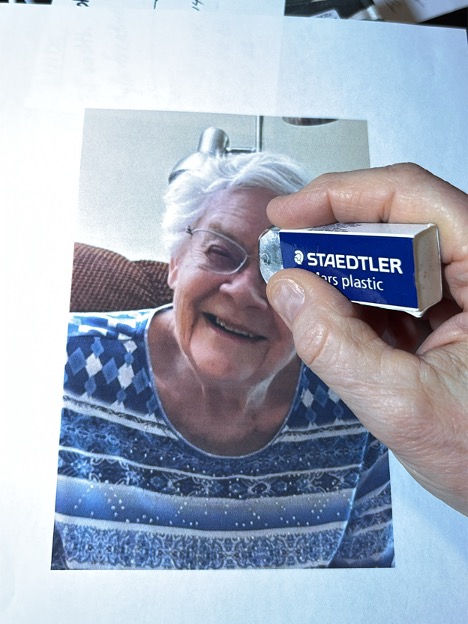
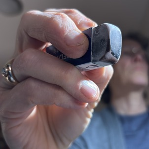
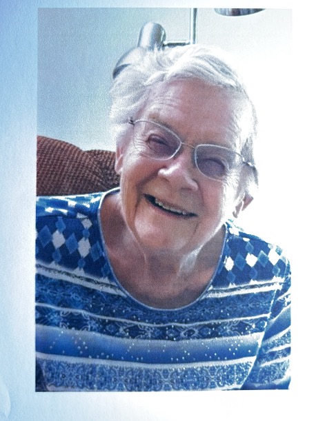
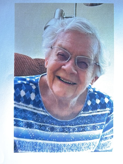
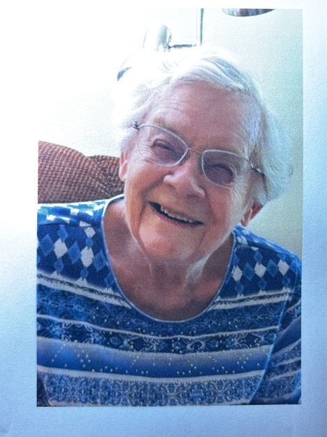
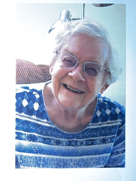
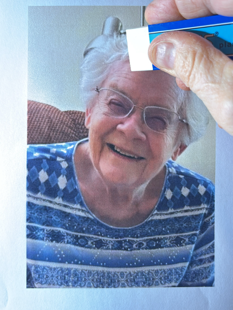
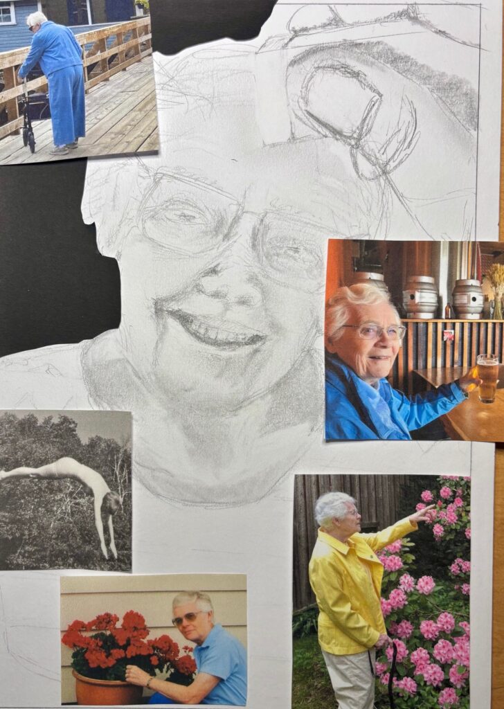
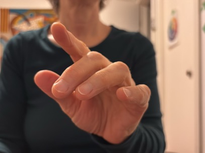
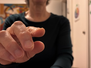
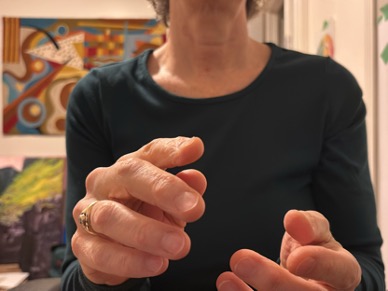
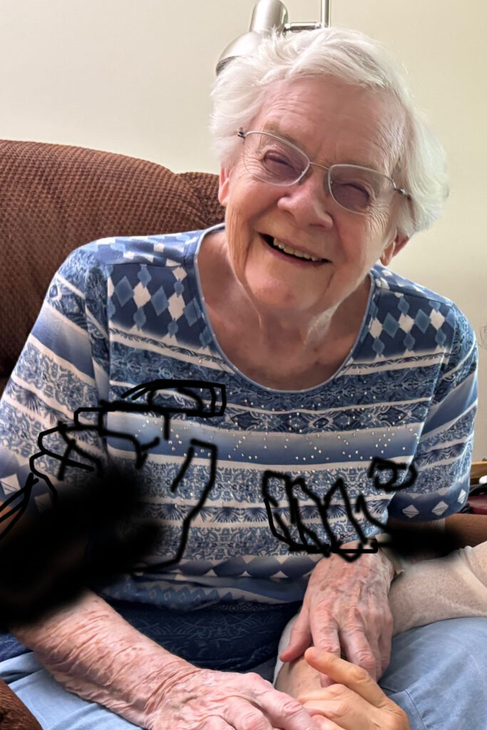
Shifting ideas: Considering not only the hand in the frame, but the context… wondering about starting with raw material a photo portrait of my Mom, with a hand looming in the foreground holding an eraser, evoking vision loss by erasure marks on her face and/or her surroundings. It is an interesting echo of my liked and disliked drawings — Rapt has the face with hand and pencil extreme foreground, and Unremembering has erasures. See below – a recent portrait photo of Mom, and various photo trials with foreground hand holding eraser, poised either entering or emerging from the scene (very useful to use Stop Motion app to capture many versions of the hand position, from which I can select interesting frames…). Next step — some composition drawings that emerge from these photo prompts… I need to play with the images to decide whether the hand with eraser works best emerging from or entering into the scene. I don’t want to personalize or own the hand as it is not me erasing my mom’s vision, but the fate of her eye disease.
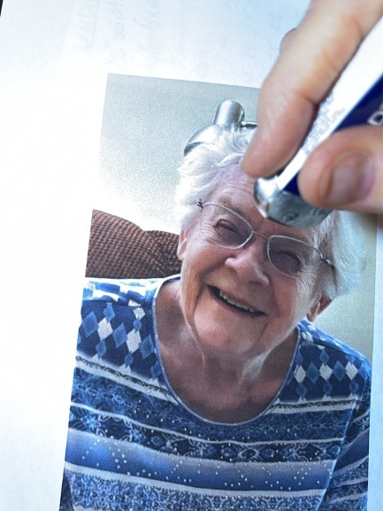
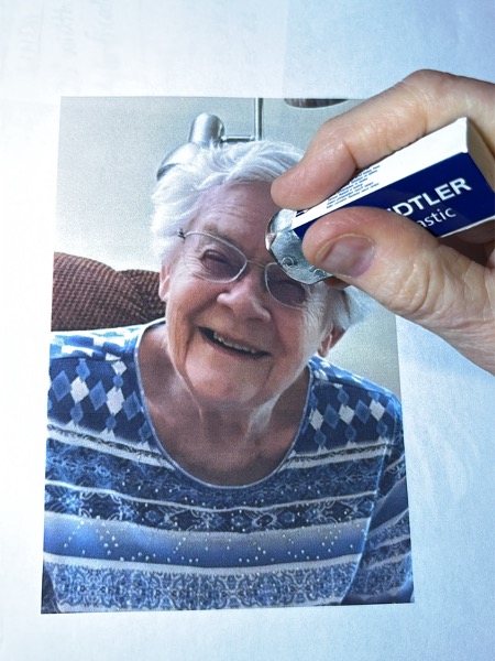
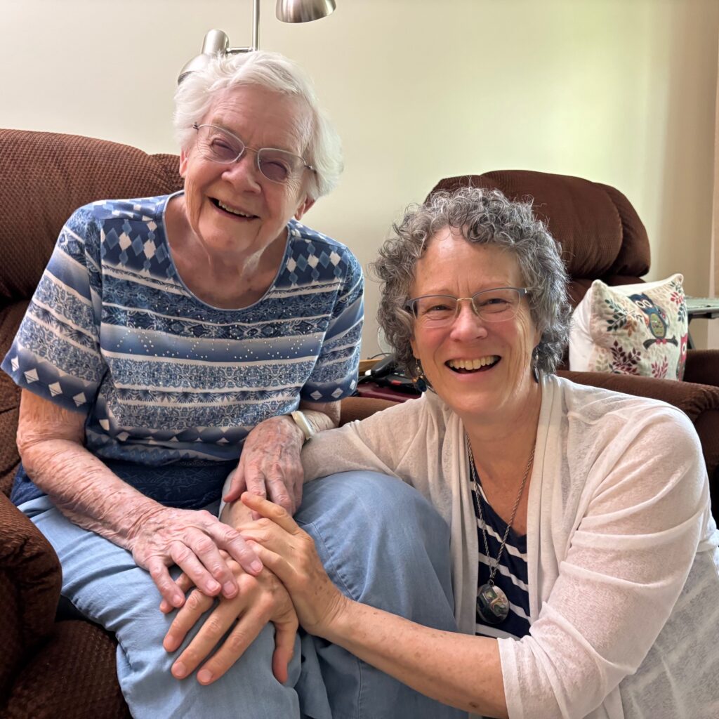
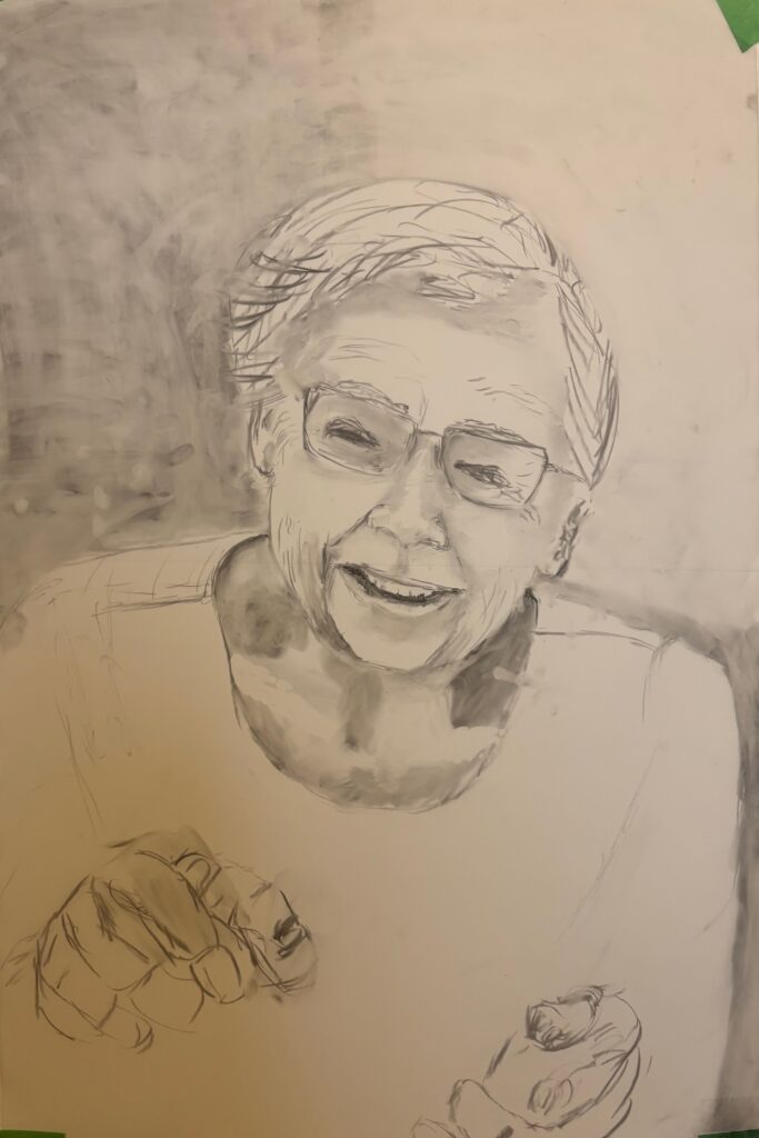
Work in Progress review with Linda on Feb 5th, with the image immediately above: We discussed substrate — I took some fine-quality drawing paper home to allow me to switch streams if I find mylar is too eraser-y, but Linda thought I could get the effects I wanted by just using lighter touch and kneadable erasers instead of hard vinyl ones on the mylar. Also discussed inclusion of vignettes versus inclusion of hands and Linda recommends consideration of a set of hands that obviously connect anatomically to Mom, plus or minus additional “helping hands” appearing in the photo. Linda also suggested omitting the hand with eraser upper right, as the erasure marks themselves give that information. We discussed the idea of a light flare coming from the right across her face (as in some of the photos above) being possibly portrayed by taking advantage of the luminosity of the mylar, perhaps through back-lighting… ADDITIONAL NOTE ABOUT MATERIALS — I used Krylon fixative on the above charcoal sketch before taking it to class, and again before bringing it home and found this is working to keep the work stable on paper.
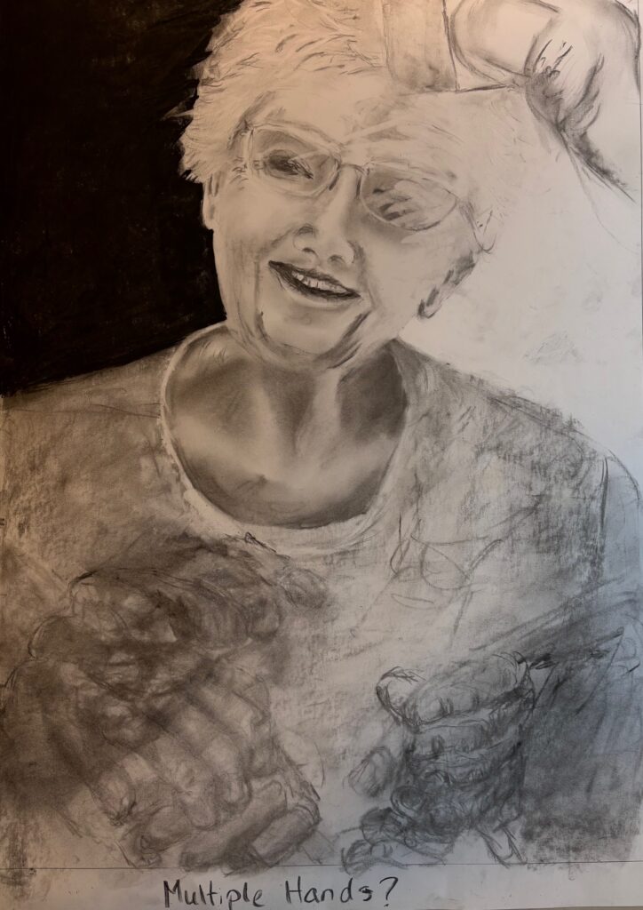
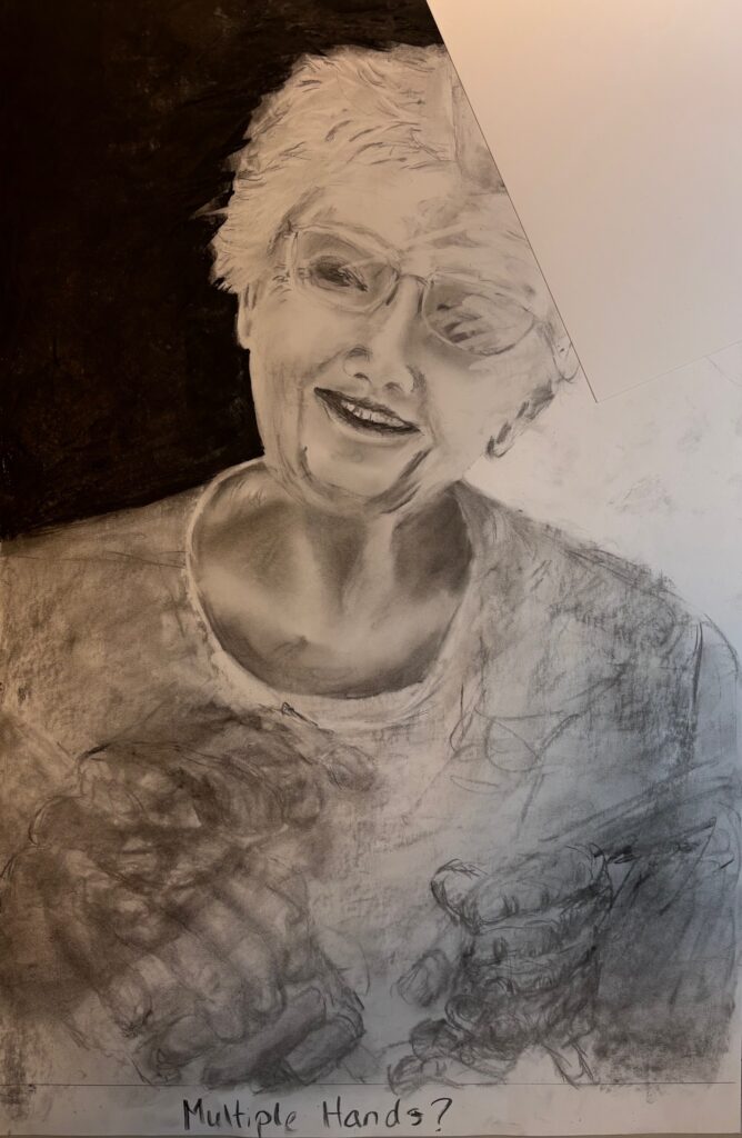
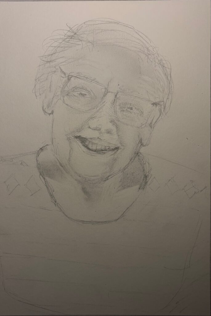
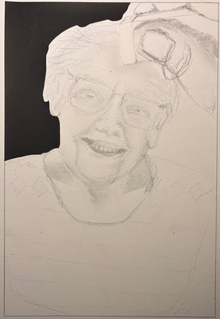
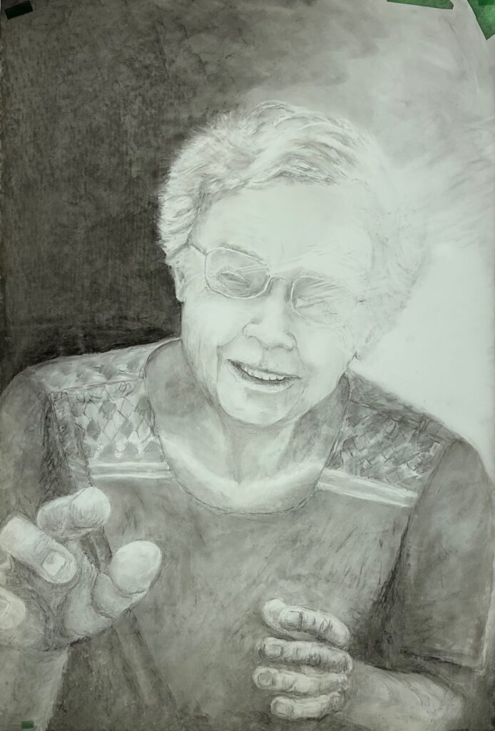
Deciding about hands, and starting to refine the drawing on full-size sheet of mylar:
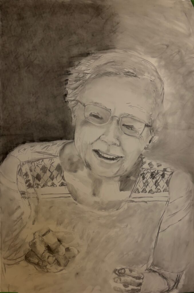
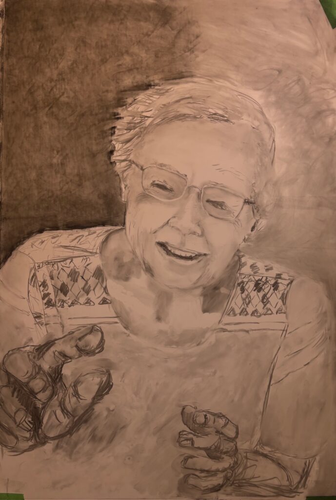
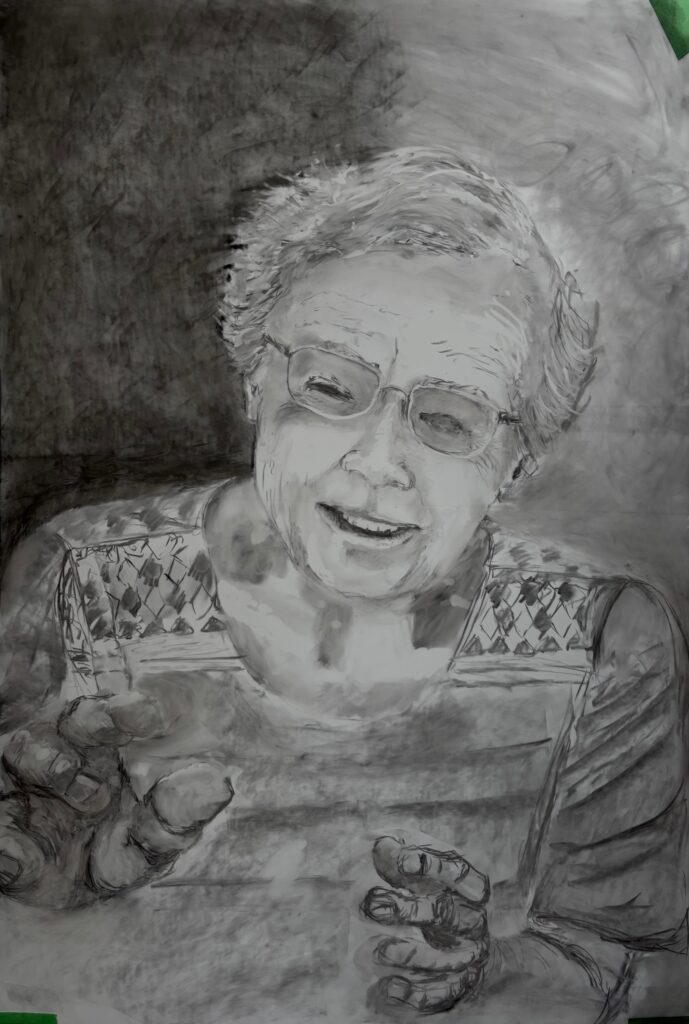
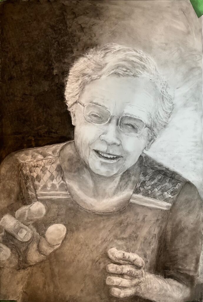
Next, a couple of weeks to complete the drawing. Also deciding to trial a lightbox backlit presentation, see if I can play up the flare on the left side of her face. Ordered a large lightbox and obtained black framing mat to cut to size… see below, multiple versions with comments about changes along the way. I have been surprised by how poorly the mylar accepts charcoal. I can’t obtain deep black and this effect is exaggerated with the lightbox. The box is dimmable so I’ll use the lowest setting, and keep playing with black chalk, other ideas for dark values. Ink seems too abrupt a transition.
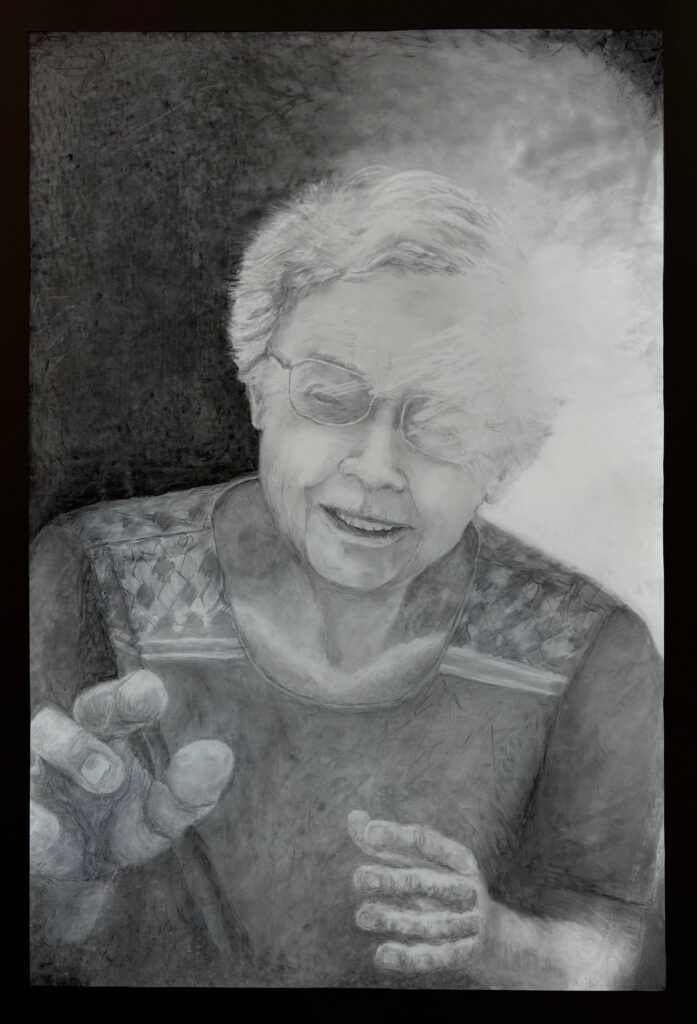
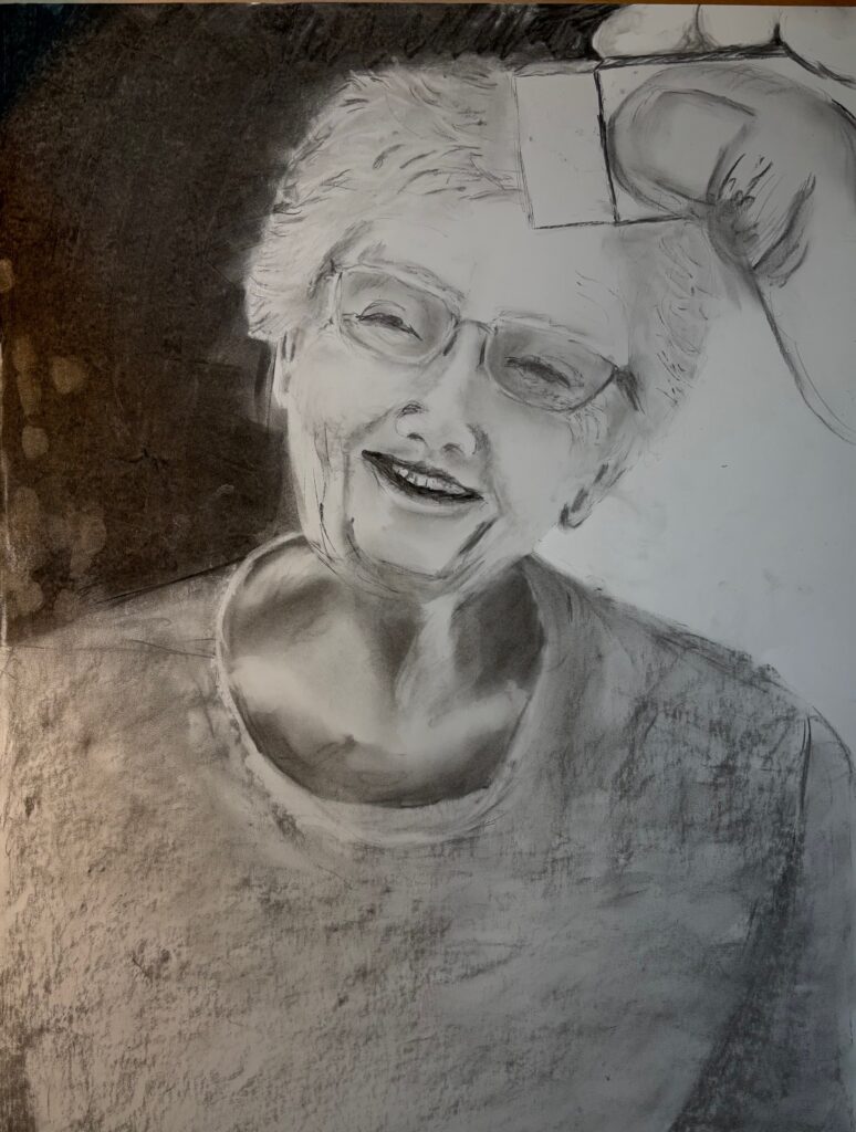
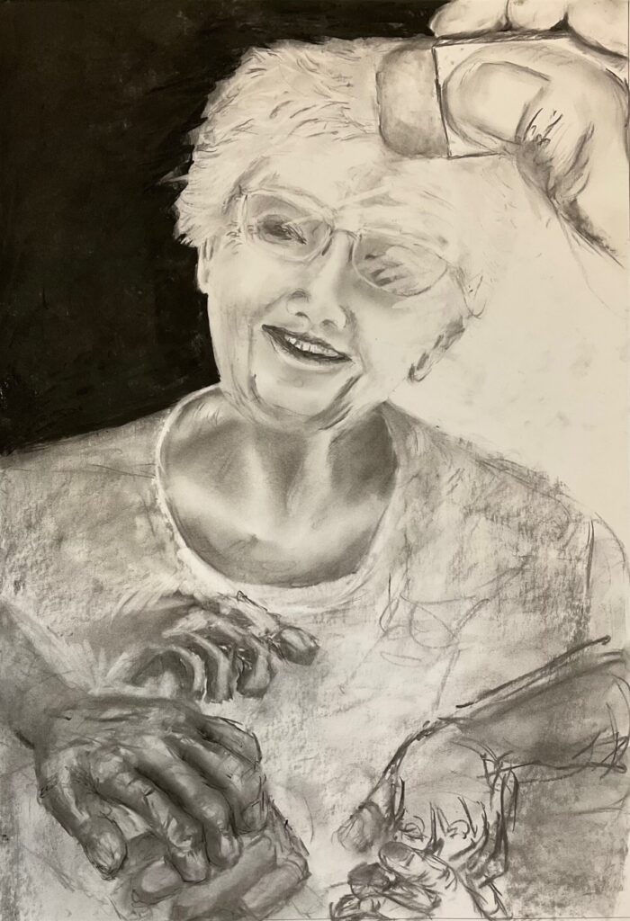
Here are my final reflections on the piece, comments about how I incorporated elements from my previous drawings and built the new piece around my theme of Letting Go:
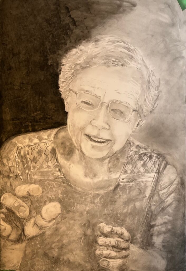
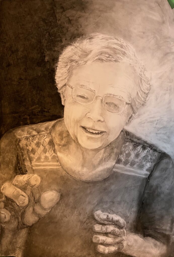
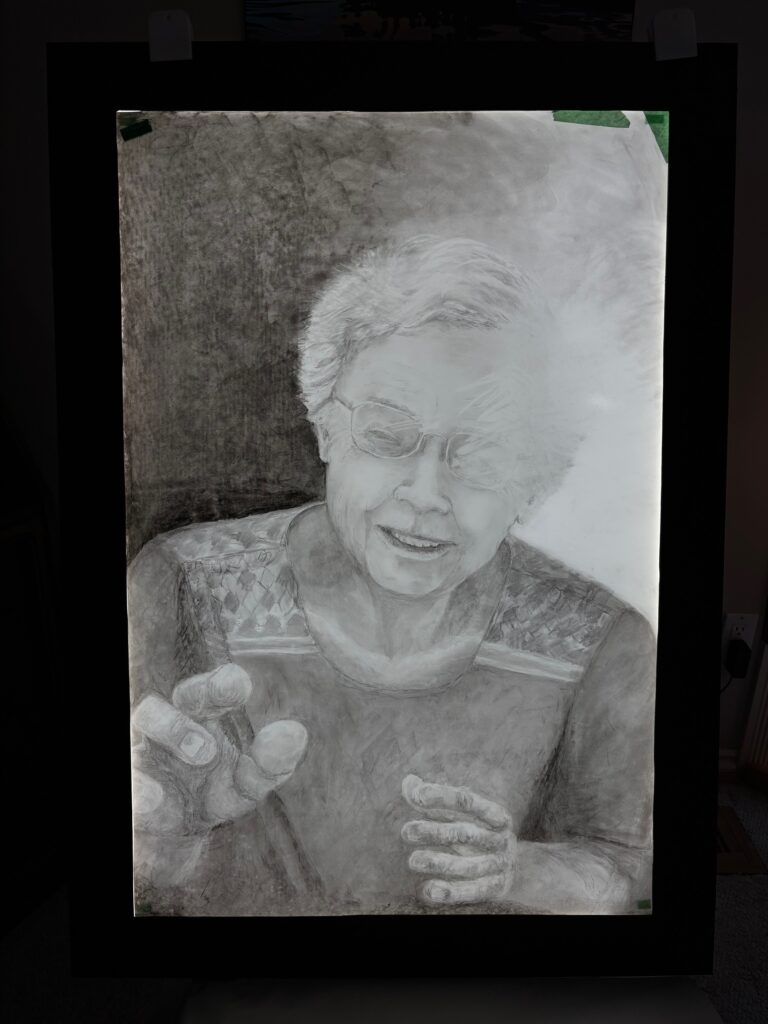
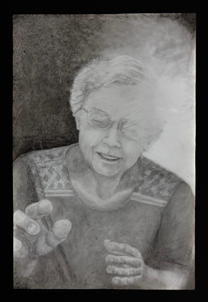
The title of my piece is When Hands Become Eyes. 20″ x 30″ Charcoal on mylar, displayed on lightbox.
From my previous drawing “Rapt”, I borrowed the general composition, that of a head and shoulders portrait with an extreme foreground hand reaching out of the scene to the viewer, almost to the point of meeting the picture plane. Rapt was a self-portrait. The new drawing is a portrait of my mother.
From my previous drawing “Unremembering”, I borrowed the device of visible erasures that effaced part of the scene, with the intent to advance the story of the scene. In the original work, the erasures represented the fading of memories over time, while in the new piece the erasures reference the advancing blindness of the subject.
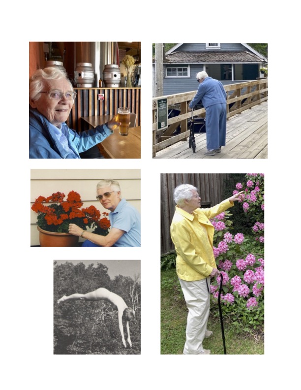
My theme this term is “Letting Go”. My mother, Donna, began to lose her sight two years ago and now has less than 5% remaining. She lives nearby so I have closely witnessed the process as she replaces vision with touch. Her hands navigate, verify, find the food on her plate. The walker in her hands turns into a course-correcting tool as she negotiates her memorized environment. Her world will go dark, but not yet. For now, she experiences sunlight and other light sources as blindingly white, creating an intrusive flare that further troubles her vision.
This portrait is intended as a tribute to her resilience in letting go of vision, inventing new ways to “see” her world. The flare that currently rules her vision is potentiated by the lightbox. Darkness waits in the margins. She smiles still, not as often as she used to, and the pose seen here as she leans into her world is classic Donna.
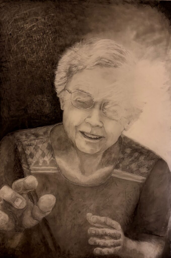
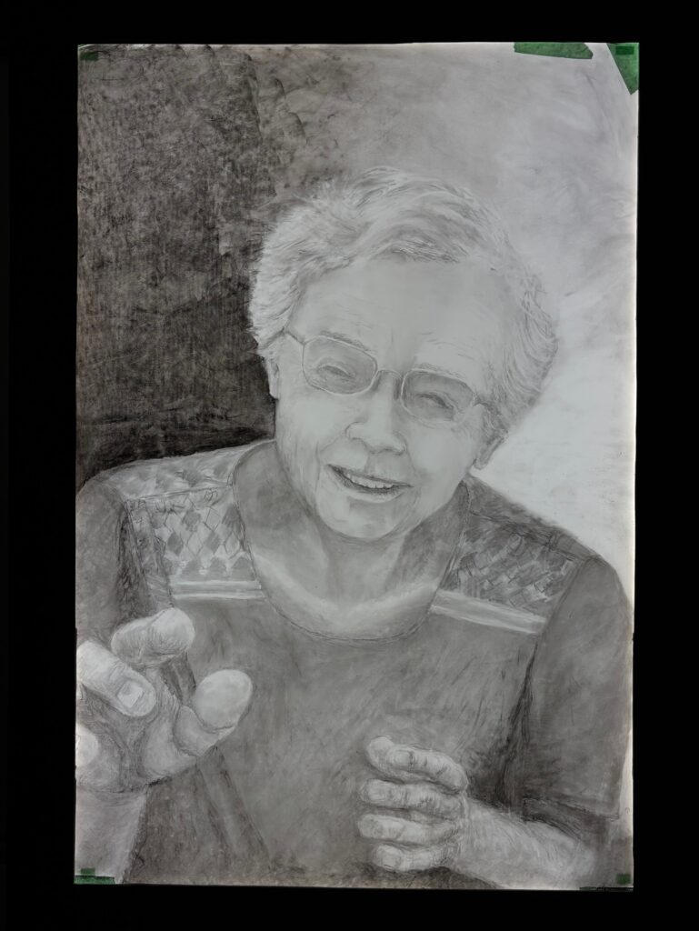
Notes from Critique Day — see below, two images, one with final work backlit in the studio lighting, the second at home with warmer ambient light and no backlight. Helpful feedback in class. Some key ideas : 1) perhaps the LED backlight is too cool a tone for the feeling I want the piece to generate… trial with no light and/or with gel filter over the lightbox to add warmth. 2) the smile she is wearing softens the bleakness of the onset of blindness. 3) there is a sense of gestural movement in the hands, in part because one hand so foregrounded and the other further back. 4) the title is helpful to hone in on the message.