ASSIGNMENT C: Process, Research, and Reflection.
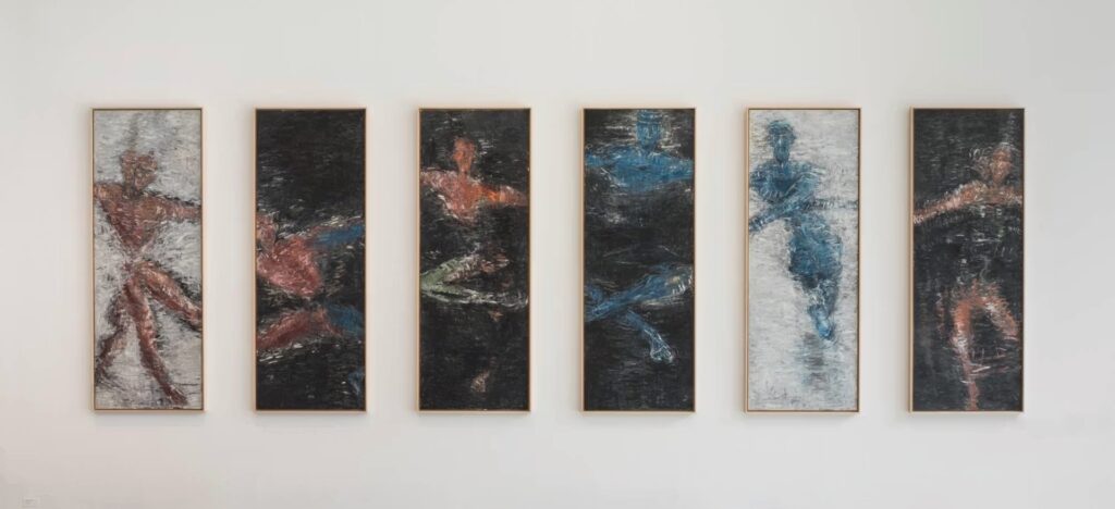
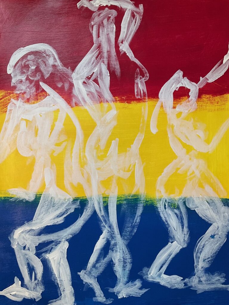
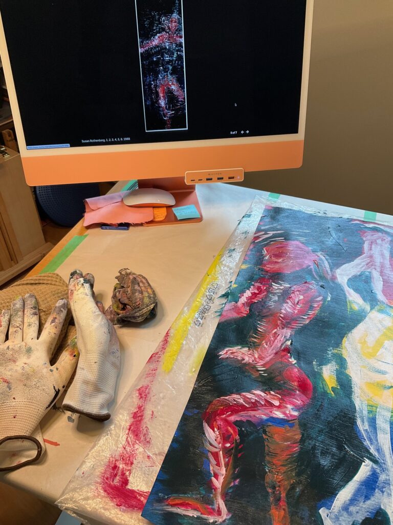
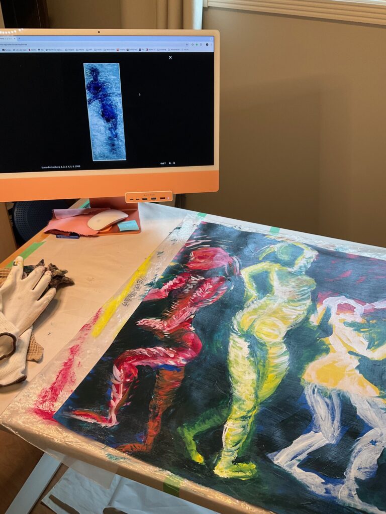
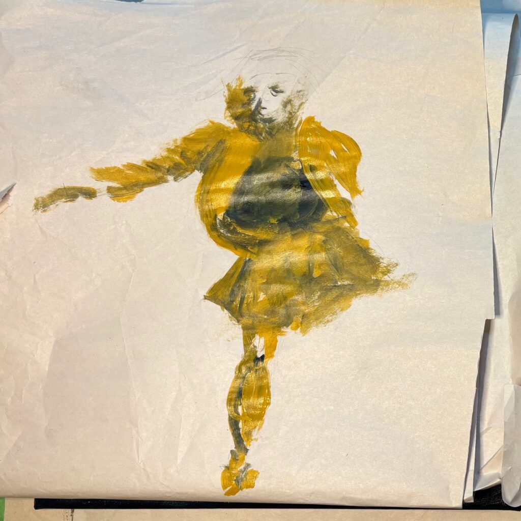
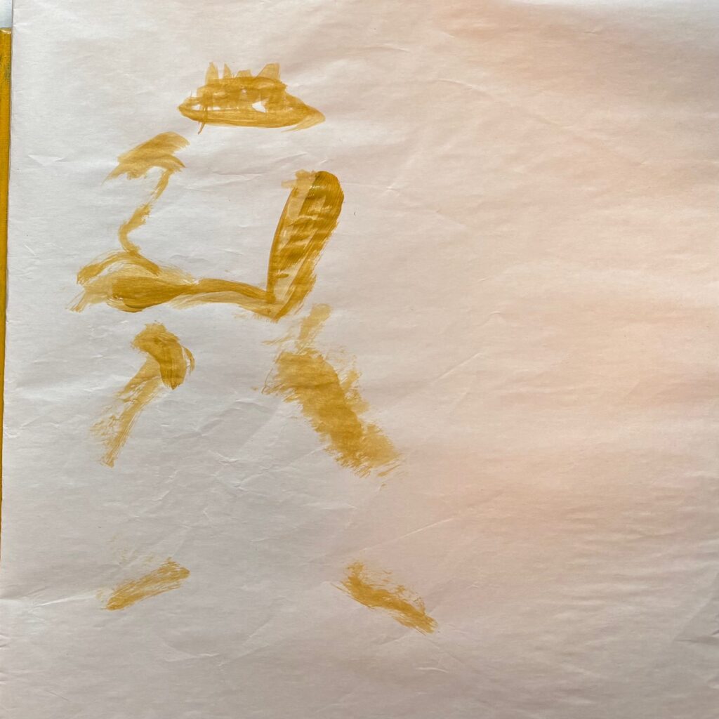
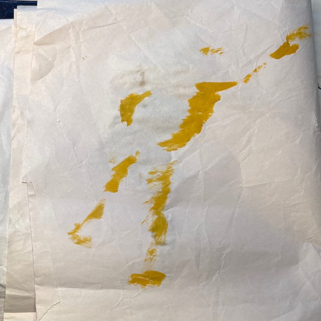
Rothenberg’s dancers (1, 2, 3, 4, 5, 6) inspired me to see if I could catch some sense of the movement in her figures. She uses short layered directional brushstrokes (often spiral or back-and-forth) in the core of the figures and at the edges, often extending out into space beyond the figure. Also, the figures are loosely defined, at times their edges bleed into the background or vice versa. For my technical play, I painted a 20″ x 26″ page in primary colour bands then made 3 gestural figures (one-minute views from an online model shoot) in white paint. I kept one or another of Rothenberg’s dancers up on my computer screen for inspiration while I created a red, yellow then blue version of my gesture drawings, much coarser strokes than hers but aiming to borrow some of her movement sense.
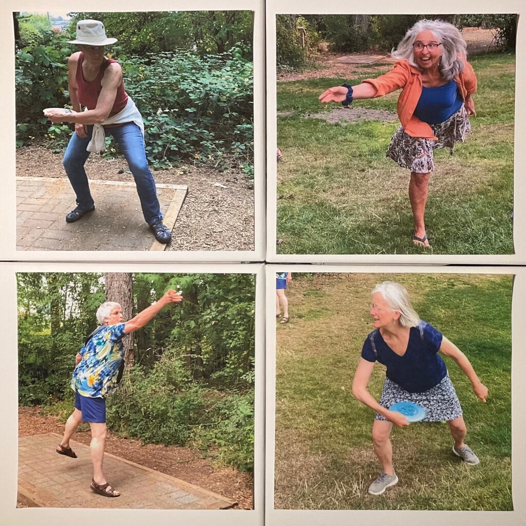
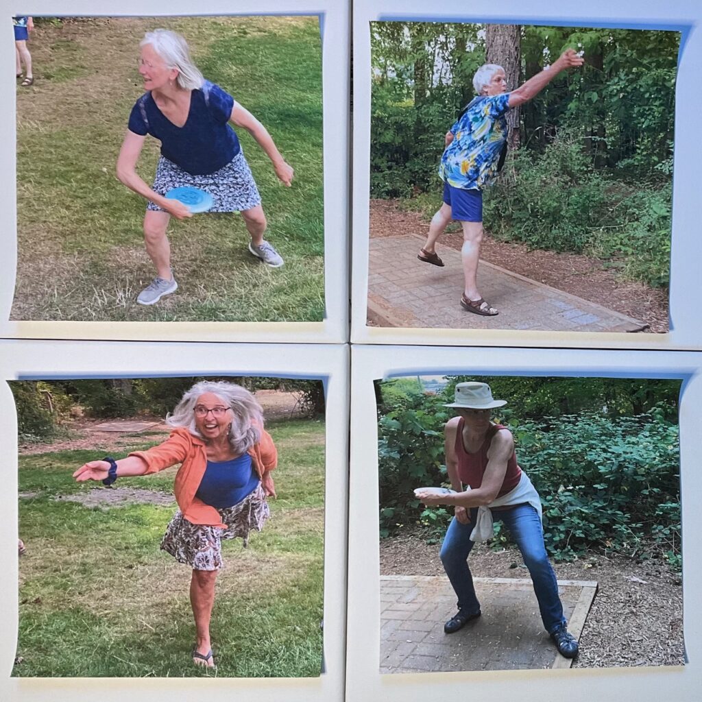
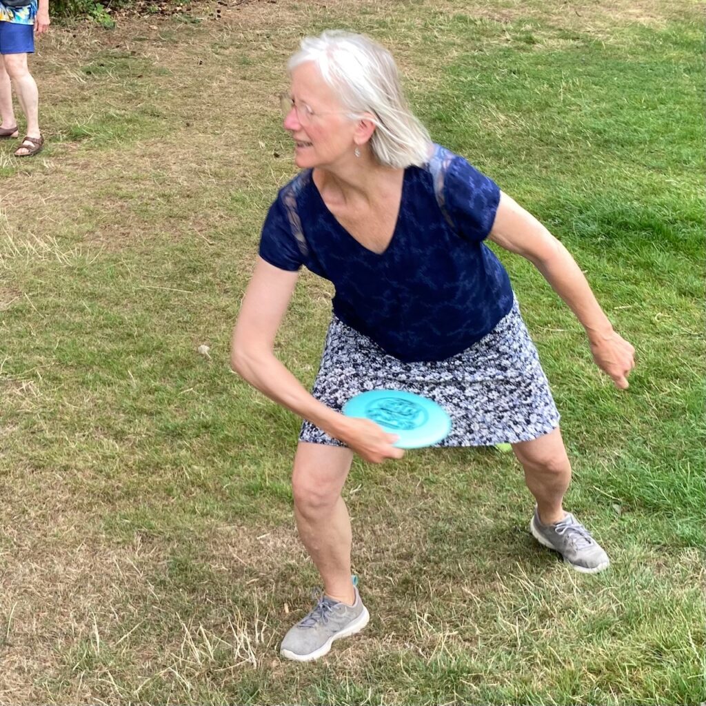
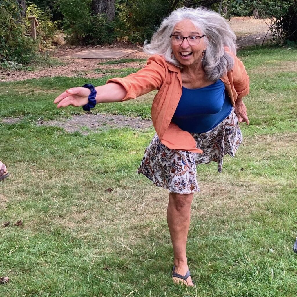
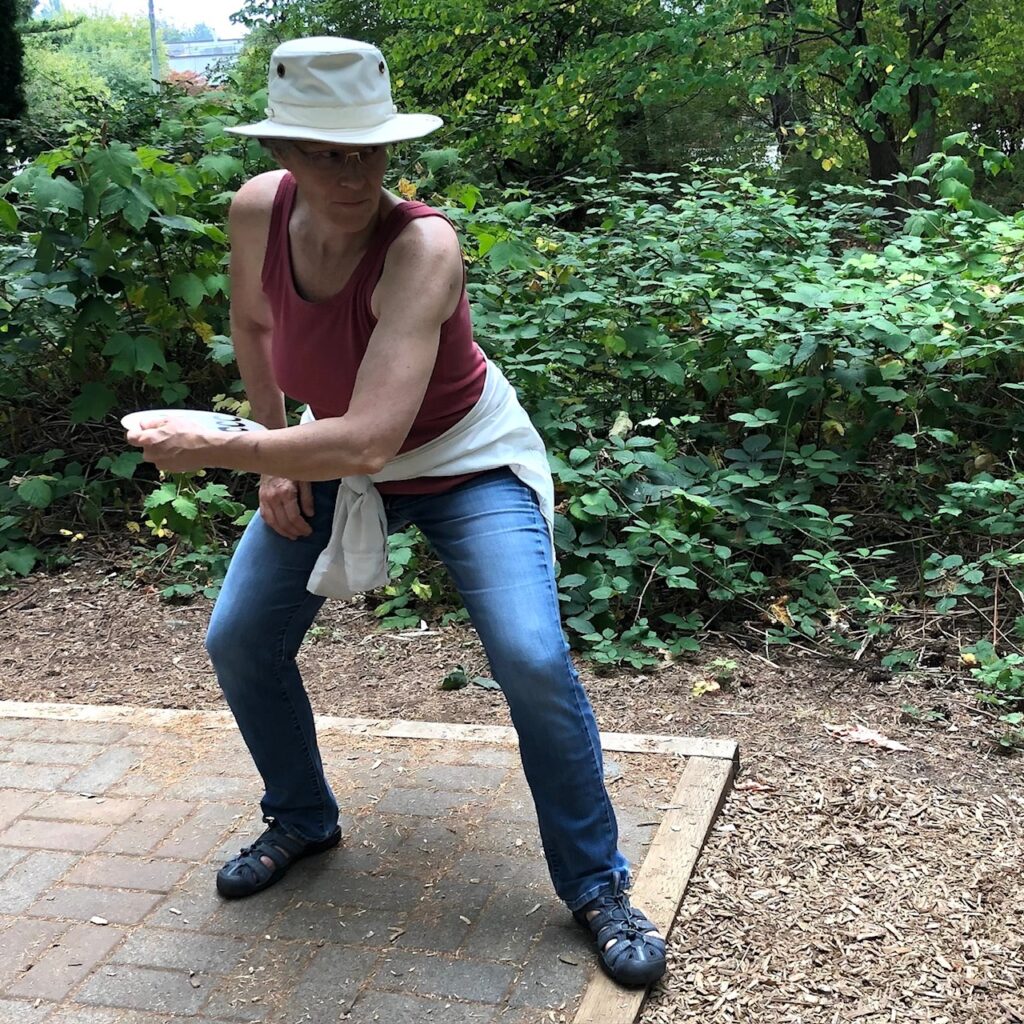
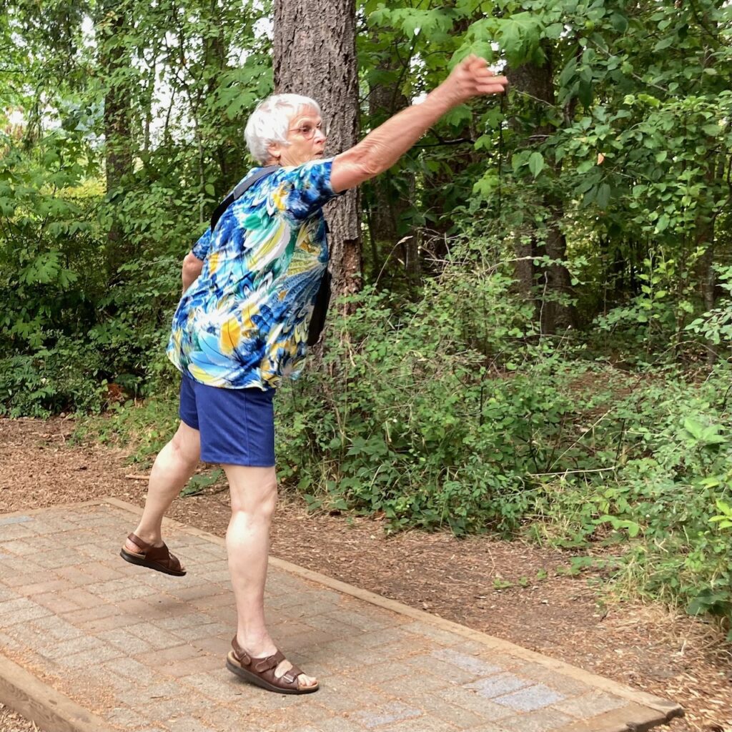
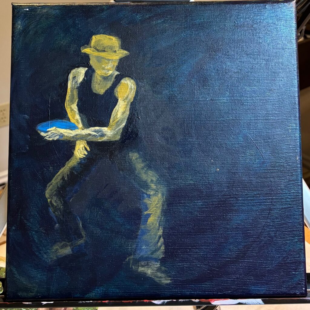
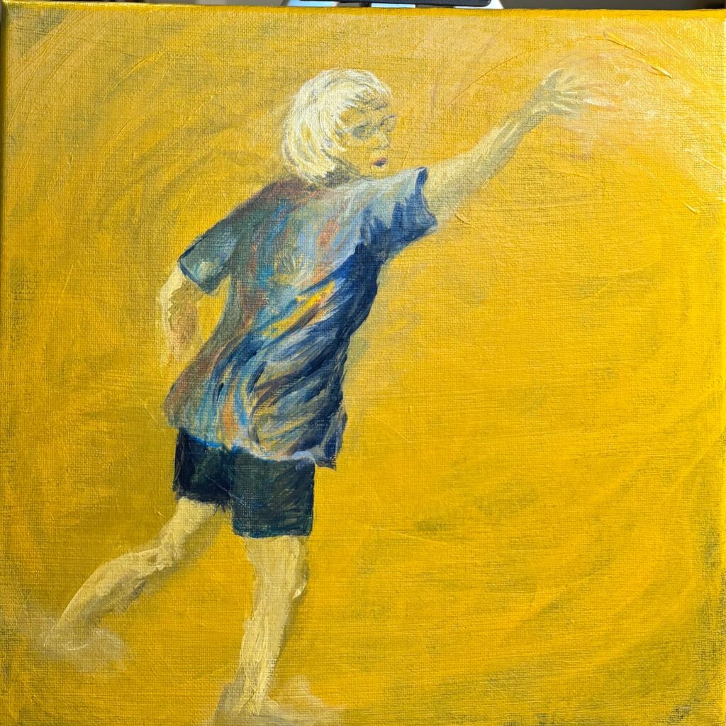
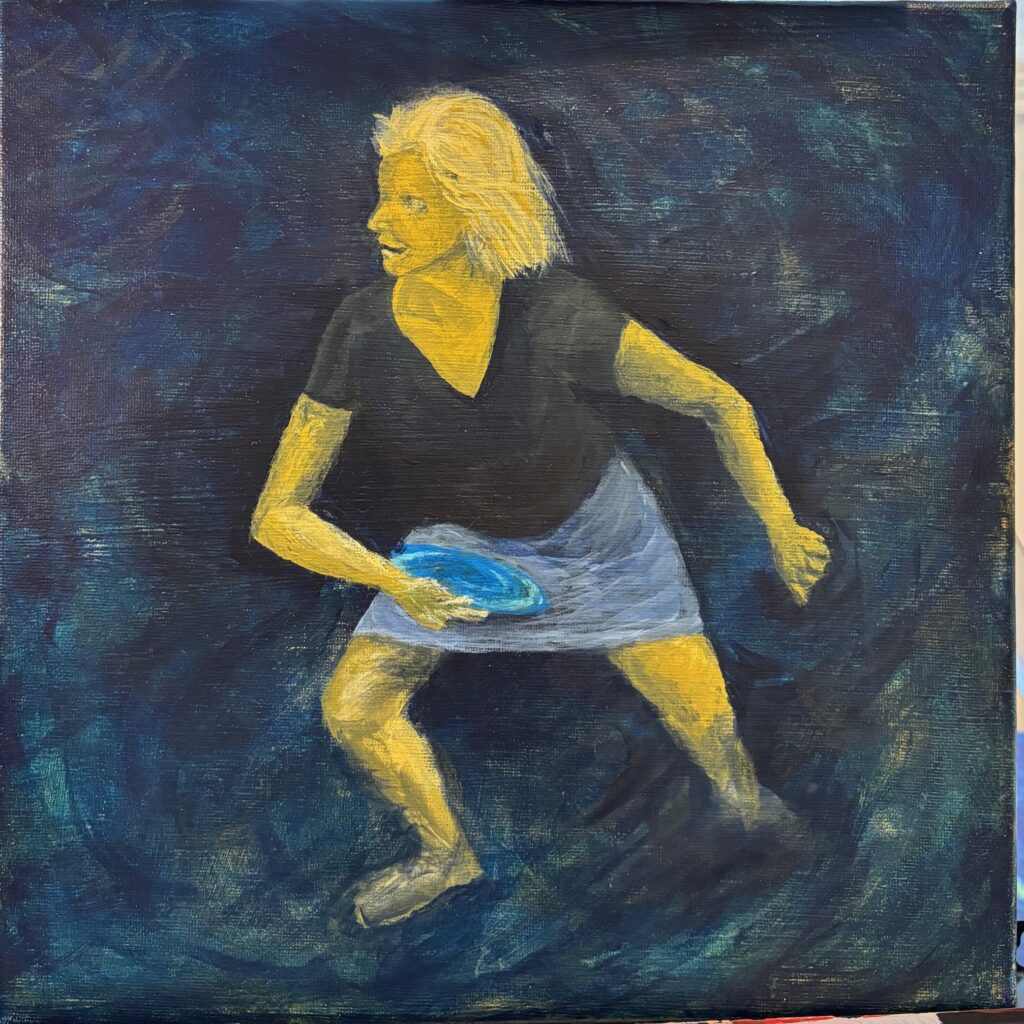
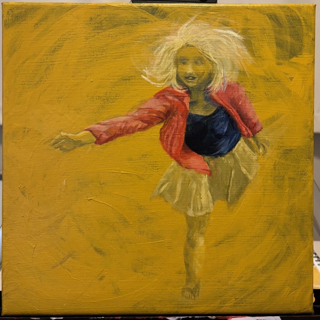
A few years back I gathered with some friends to try out disc golf — several of us took photos and they ended up with those coiled tension / release poses, like a dancer or a spinner. Decided to crop the photos and see how they fit. I have 4 small canvases, each 12 inches square, and would like to try making a multi-piece work as shown below…
More brainstorming on how these images relate / connect; what colours and why; how am I juxtaposing techniques here? See below my thoughts on paper…
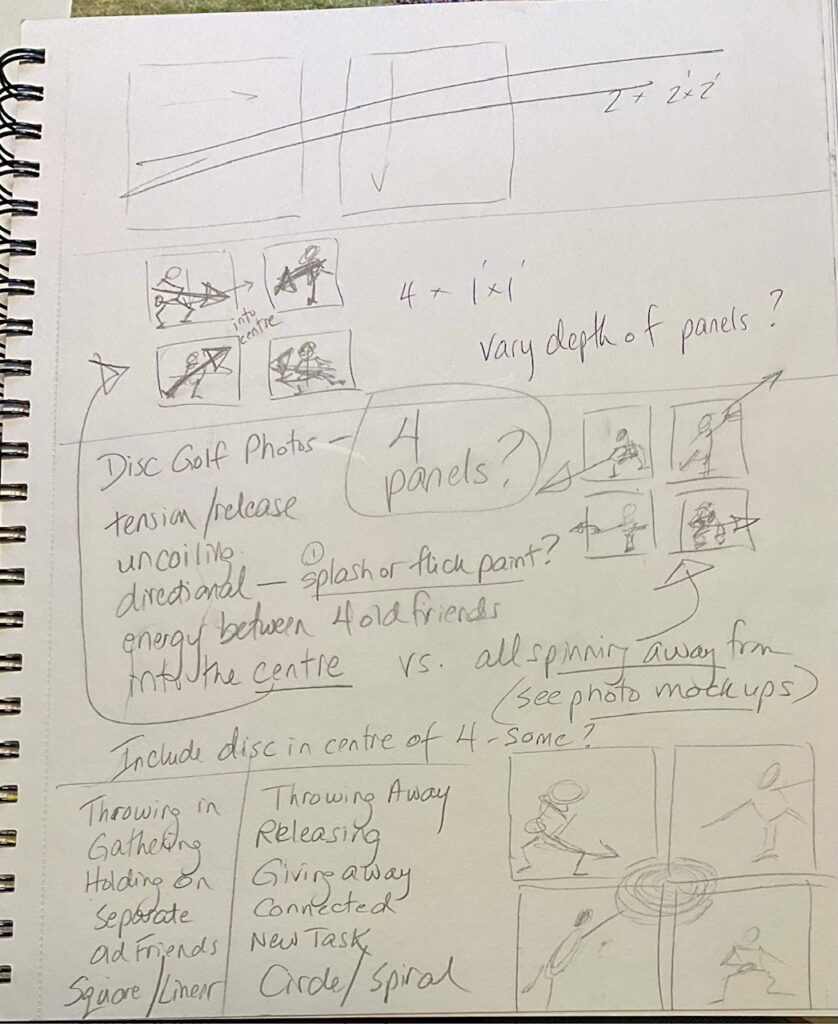
Colour / Technique
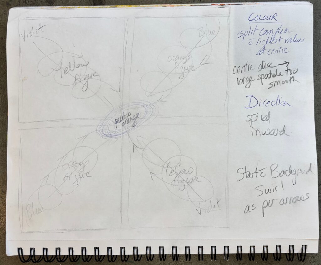
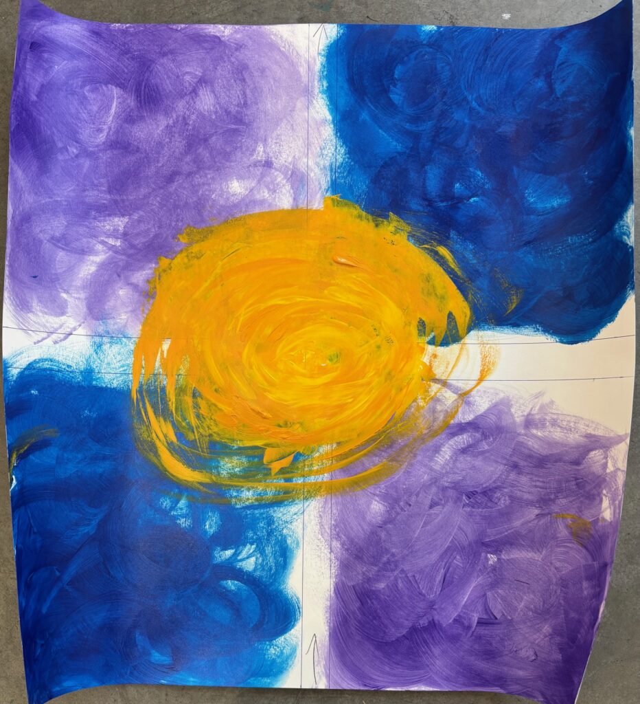
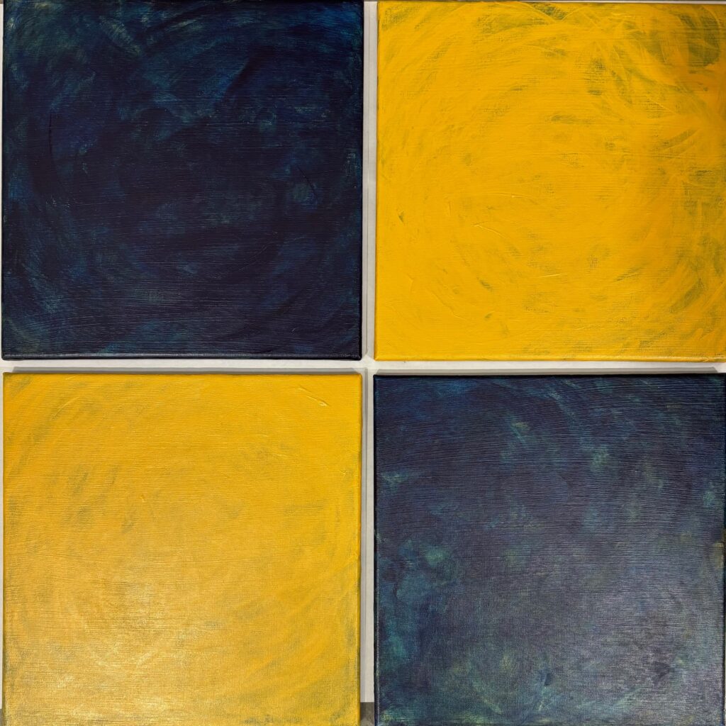
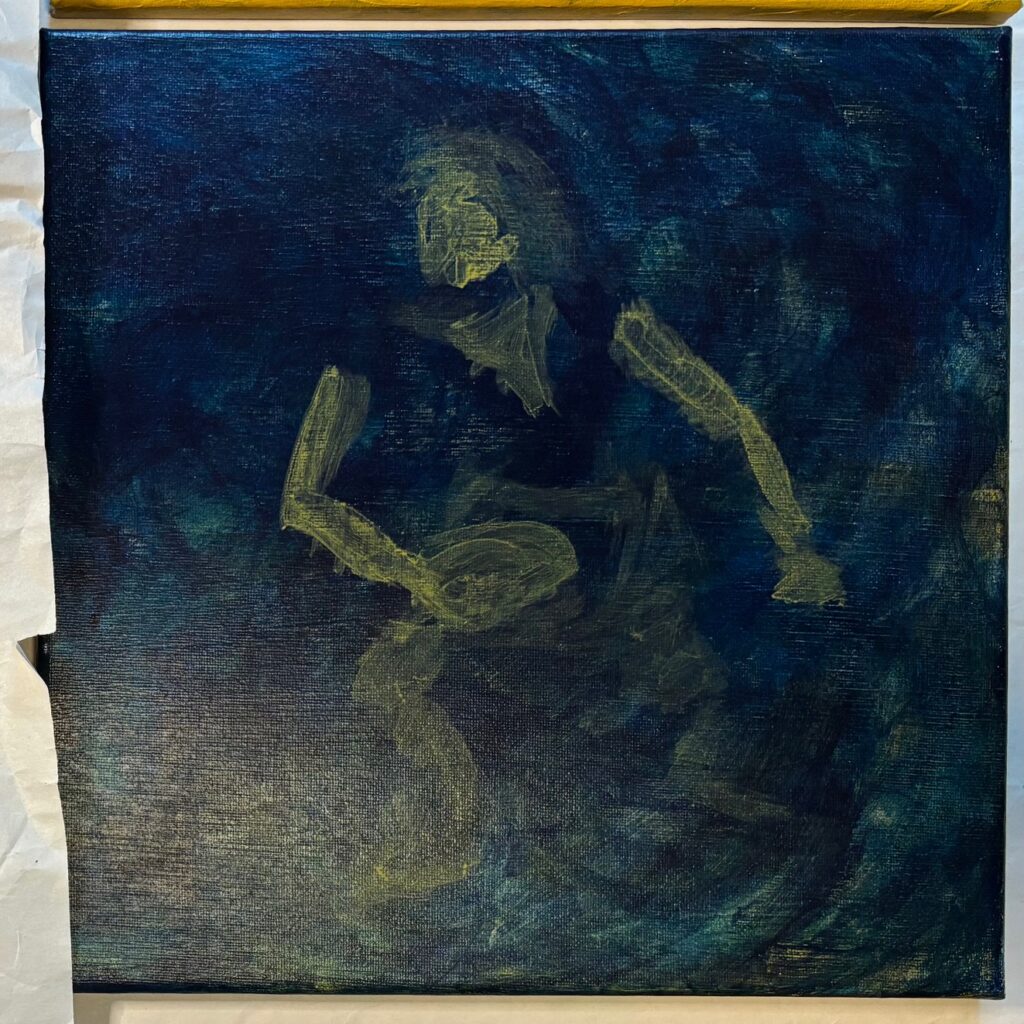
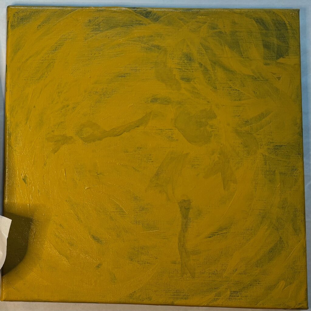
Working plan for paint application (interesting to see if it goes as planned!!) : 1) large brush swirling application for background, removing as well as adding the surface colour with dilute paint and covering same ground repeatedly. 2) Switch to med brush size for gestural drawing (2 min) each figure, in colour barely different from background. 3) Switch again to small size applicator (brush and/or palette) for shadows in grey blue (on the yellow panels) or highlights in yellow (on the grey blue panels). 4) Final spatter / flick paint to make drip trail that crosses between panels?? (Risky!)
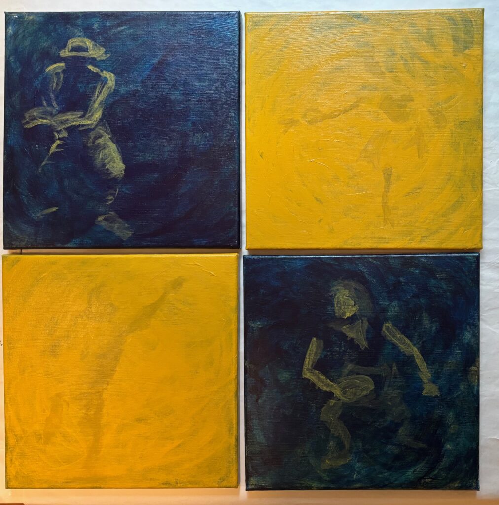
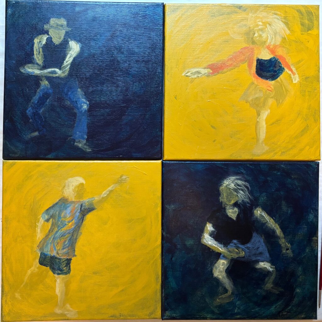
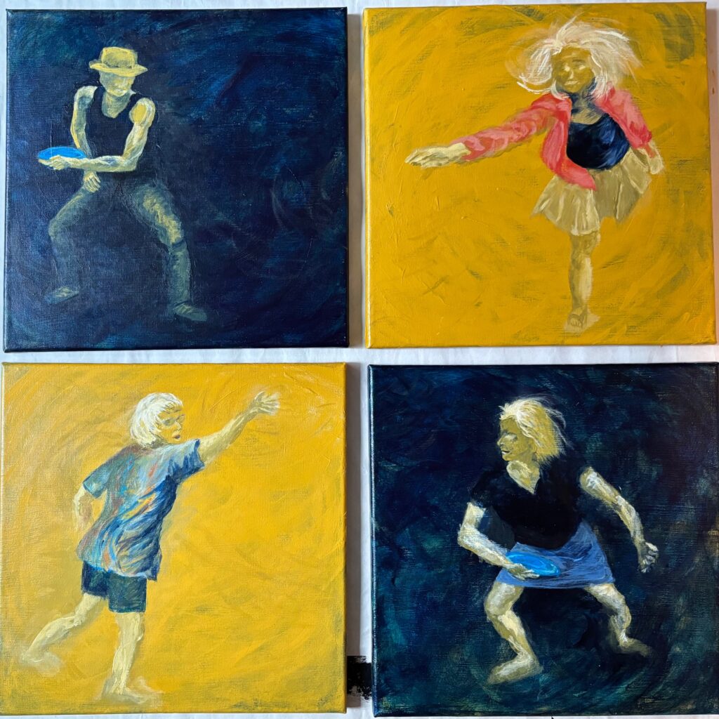
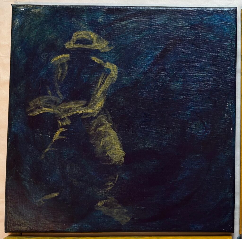
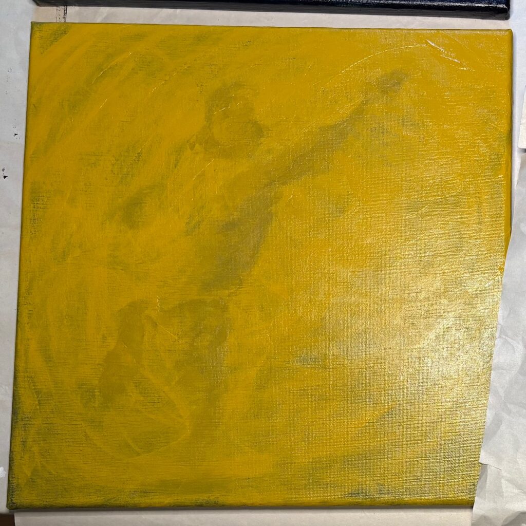
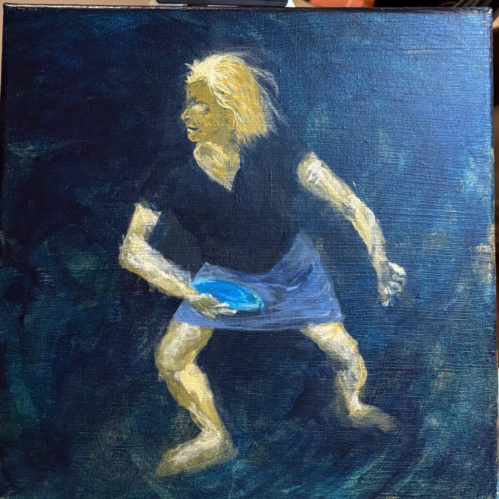
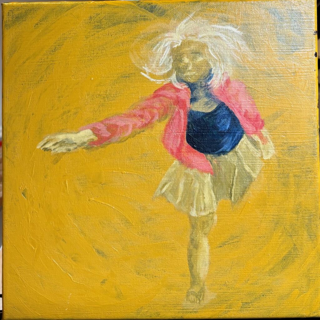
Each column below shows a figure progressing from photo to gesture on paper to gesture on painted panel to more fleshed-out figure
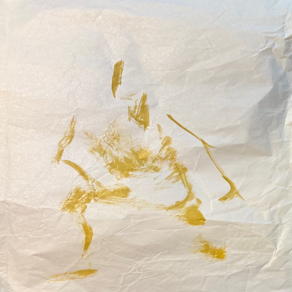
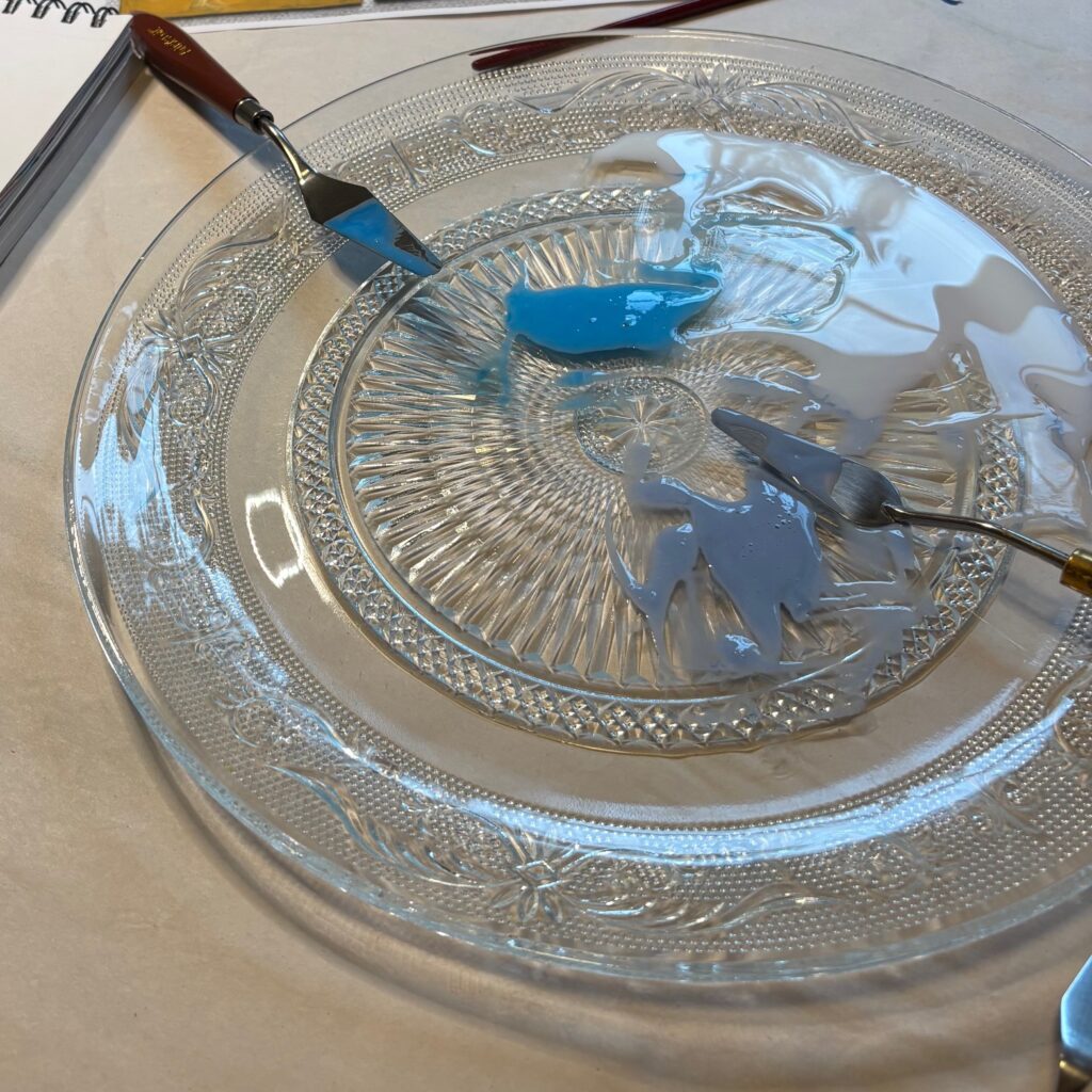
Further activating the figures — trial spatter paint. I mixed acrylic medium with two colours (phthalo + white; payne’s grey + white) and trialed spatter technique (shaking, tapping, running my finger across the loaded bristles) with a few different brushes on plain paper and over a photograph of my work in progress. Learned it is really hard to control direction — perhaps I would need a larger canvas to use this effectively? The photo I used is small (perhaps 15 to 20% of full size) so doesn’t give accurate scale of the drops to the figures, but still not convinced. I do like the bumpy texture that results, though. See below…
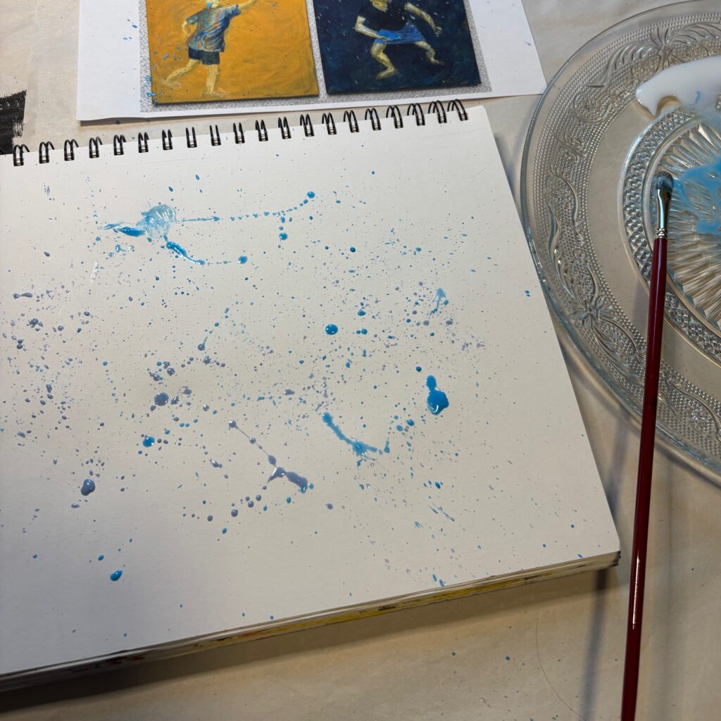
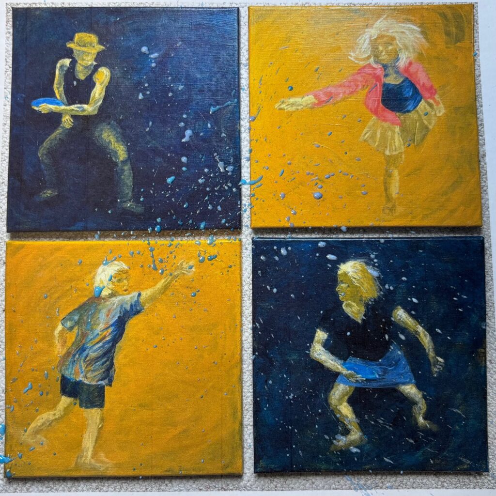
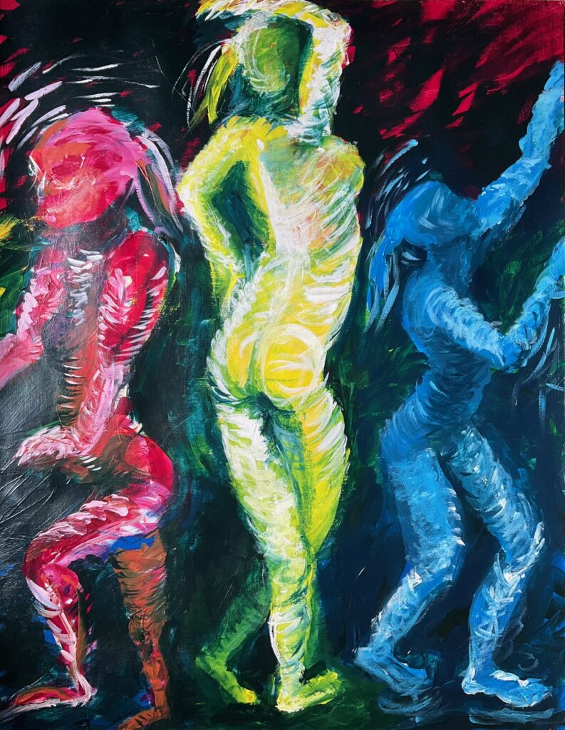
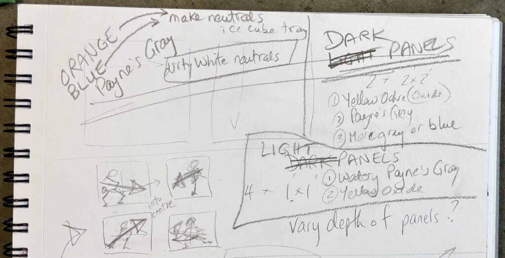
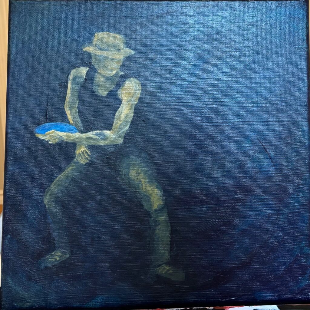
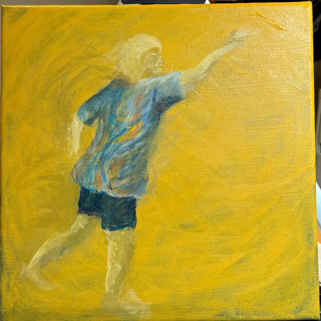
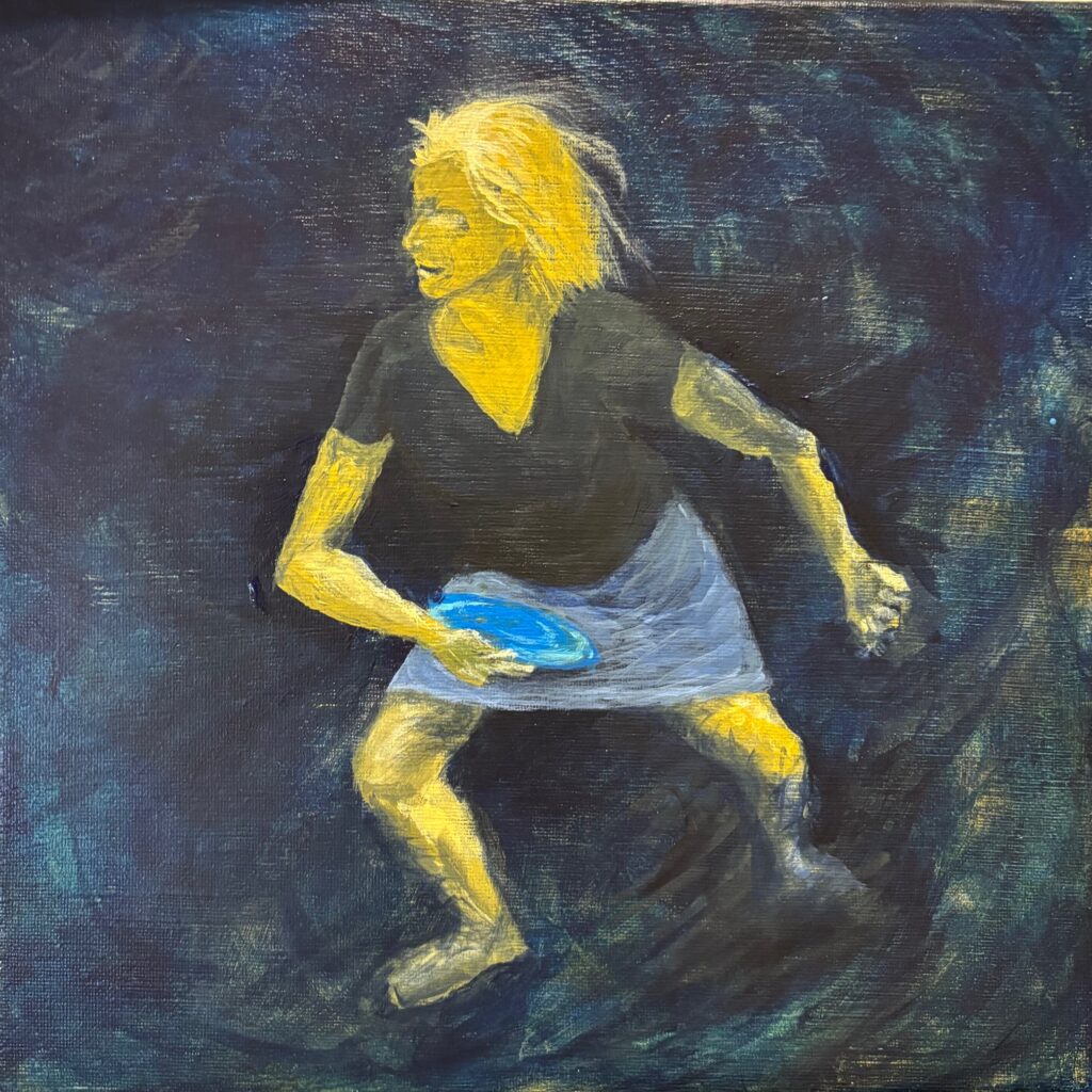
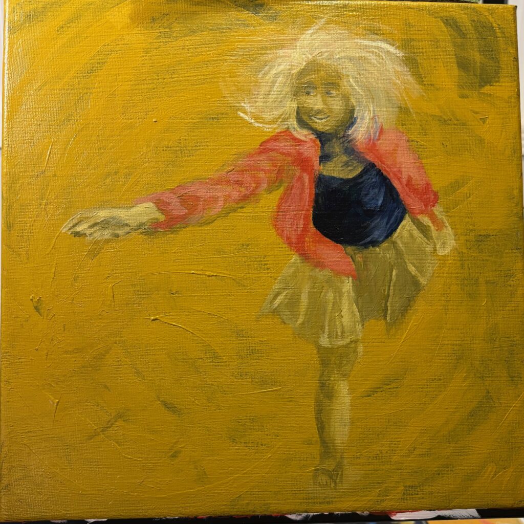
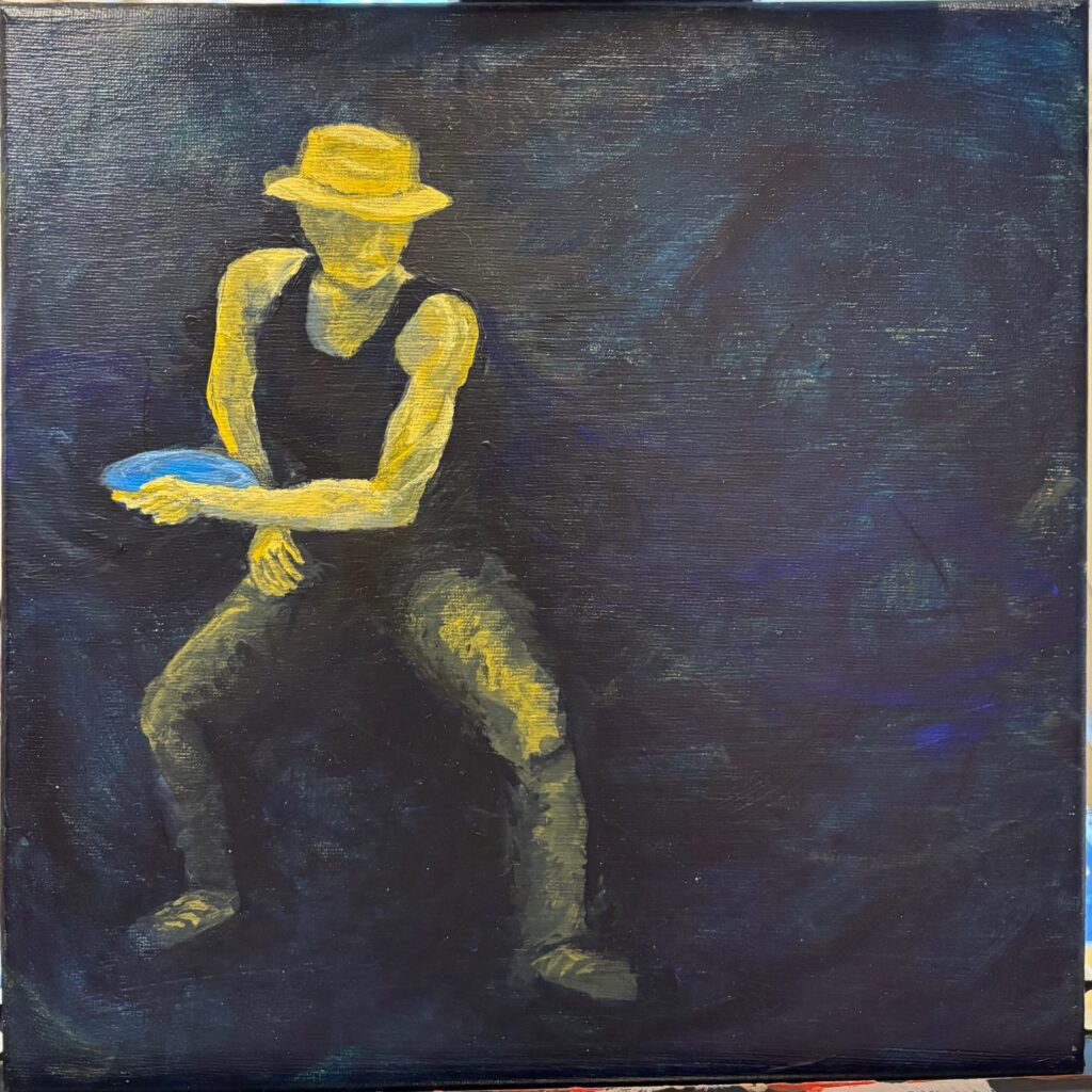
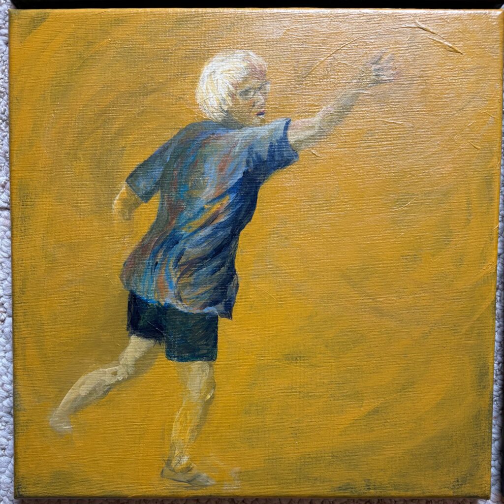
Decided to go with deepening contrast rather than splatter. The two dark panel figures have more downward weight, grounding themselves as they wind up getting ready to throw the discs. The two light panel figures have upward movement, up onto toes, at the end of their unwind as the discs are already gone. I’d like the colours and definition to reflect these contrasts…
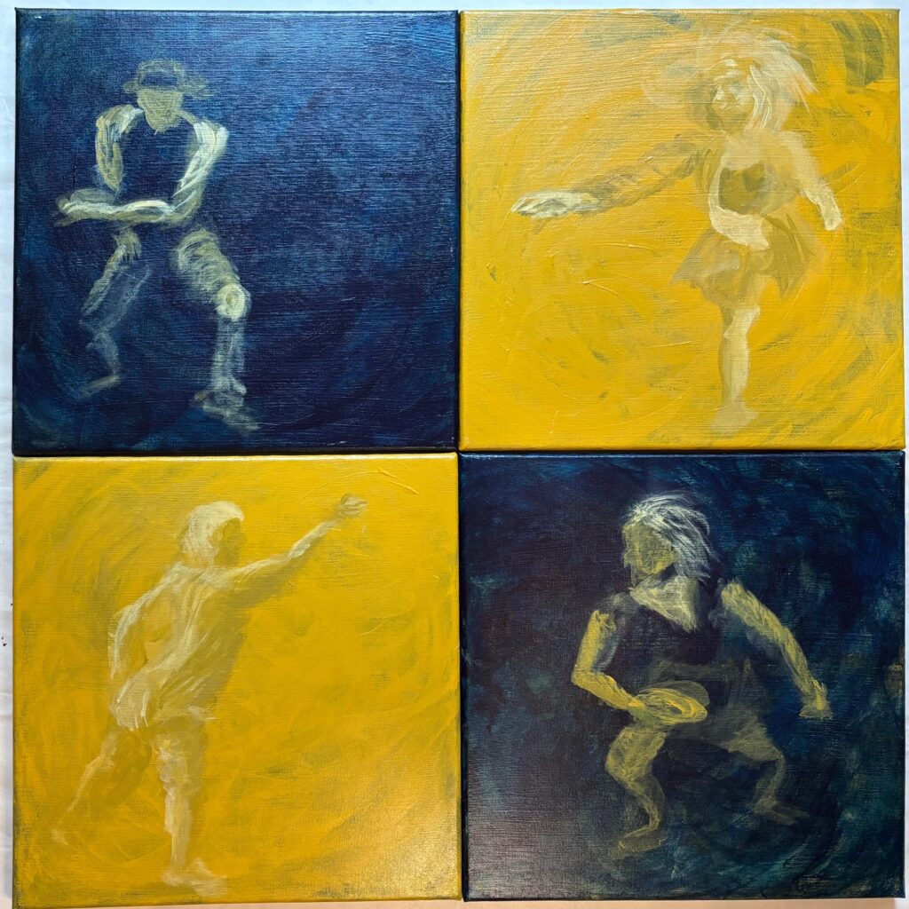
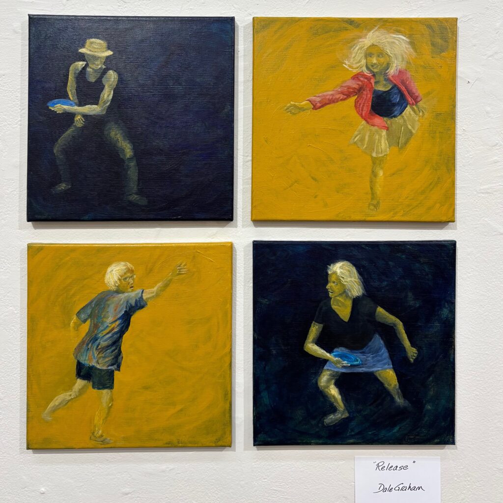
FINAL SET OF PAINTINGS TO TAKE TO CRITIQUE October 2:
Comments summary from peers and instructor at critique:
- Cohesive composition, underpinned by harmonious colours across the 4 panels, and by the gestural movement of the figures towards centre, that keeps the eye moving around the between them.
- dynamic / lots of movement — supported by the energy of the poses and how hair is shown
- interesting “push and pull”, “dark and light” relationships between the figures and between figures and their background
- appreciation for fabric wrinkles/details in multi-coloured shirt and red shirt
- appreciation for decision to use four panels and place them in relationship
- guesses about the meaning — fun memory, close friendships
- light/shadows work well in some places (strengths are the jeans in top left panel, the leg skin emerge from dark bottom right panel) and other places not well enacted (examples the face under hat brim not enough shadow, the mouth bottom right figure a too-dark slash, the hands often not well realized)
- Elizabeth suggests don’t up the highlights, rather increase the darks / work the shadows more. Increase the sense the figures are dissolving into the background. Consider blurring