Organization for Unit 2:
- Page One STILL LIFE (3 versions).
- Page Two MODEL STUDIES (in class work)
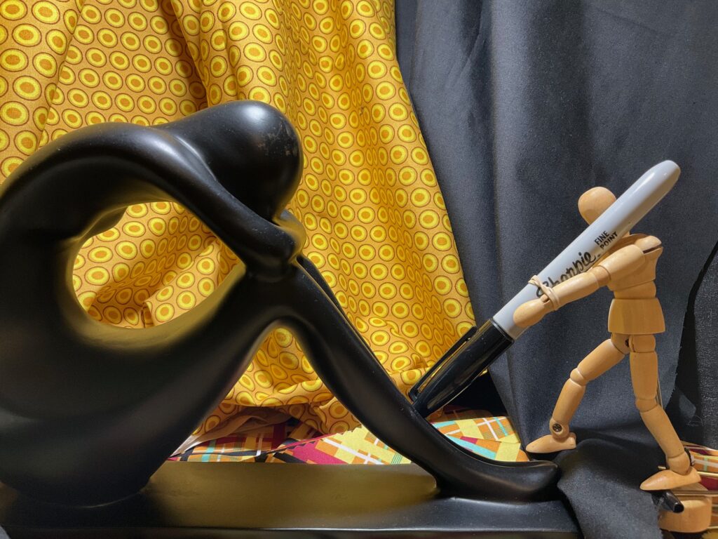
STILL LIFE SET-UP – Design still life station at home, recording images and notes during ideation and throughout the process of painting three versions of the the still life. Pay attention to lighting. The first two are to be quick studies (20 min to 3 hours), the final one a more polished piece (1 – 5 hours).
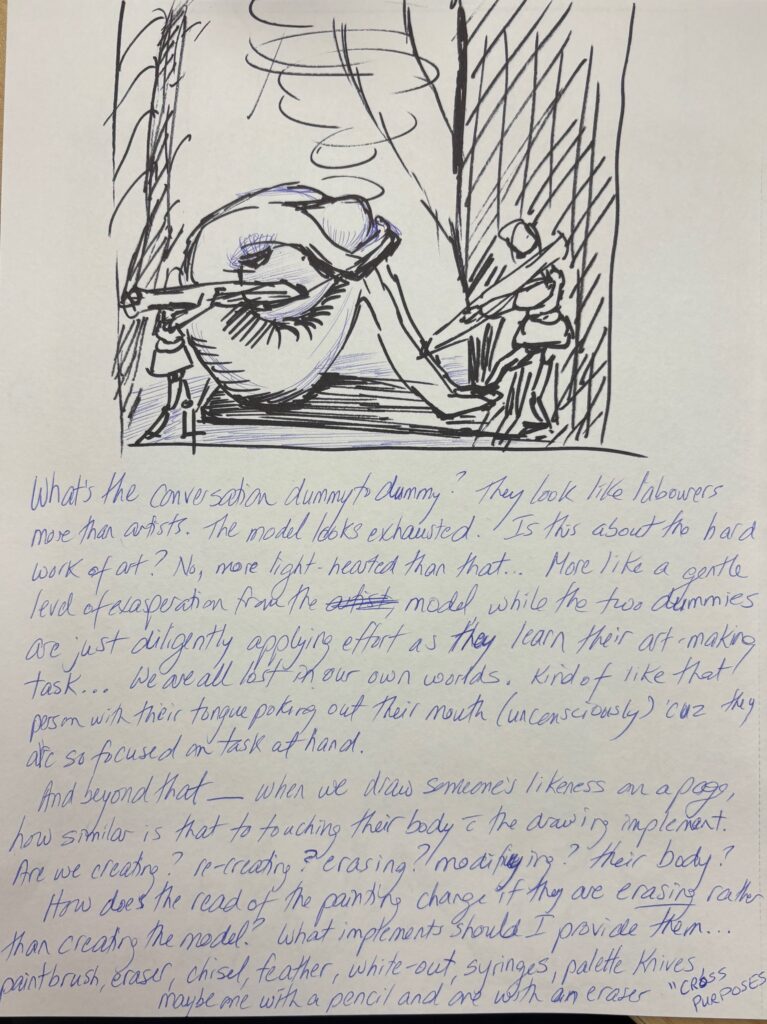
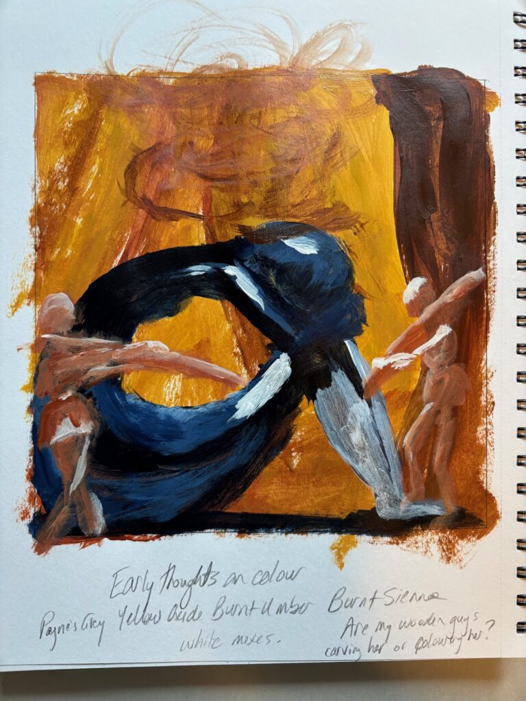
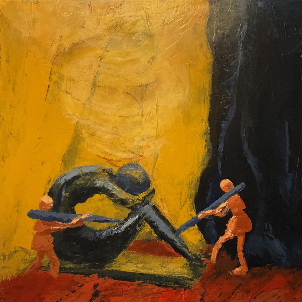
VERSION 1: “So Tired” — I got focused on the colour scheme as noted above (Payne’s Grey, Yellow Oxide, Burnt Umber and Burnt Sienna +/- white) so went ahead to select a particular cropping with direct overhead spotlight to make that painting first (will backtrack to monochromatic version next one). I got interested in using trowels and palette knives on canvas for this one, after initial undercoat of Payne’s Grey applied with large brush. I quickly learned that an 8-inch trowel is tricky on my somewhat-baggy canvas surface. I ended up with my hand behind the canvas to stabilize it while applying paint to these large areas (the background fabric in yellow and grey) but it was still very uneven — probably a better technique on a board or at least a tighter canvas than I had.
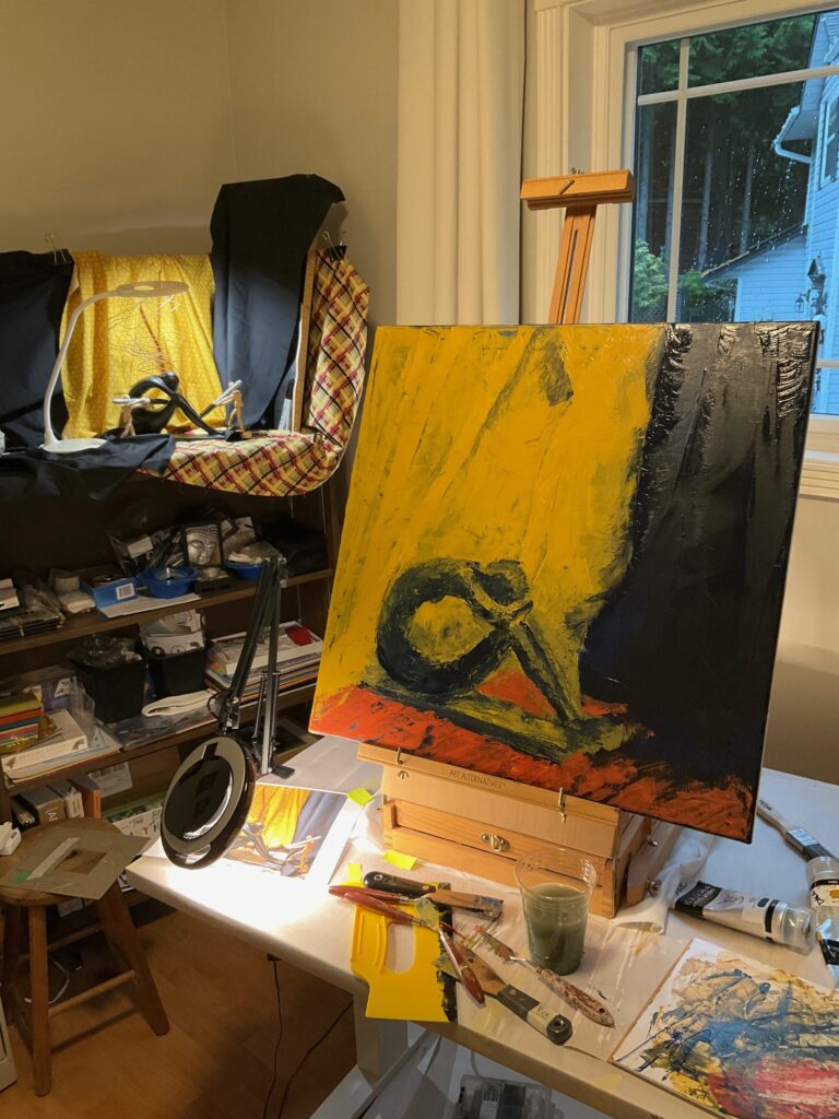
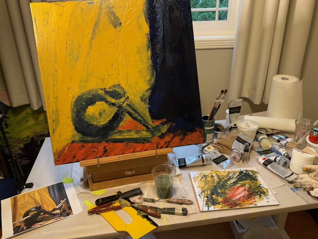
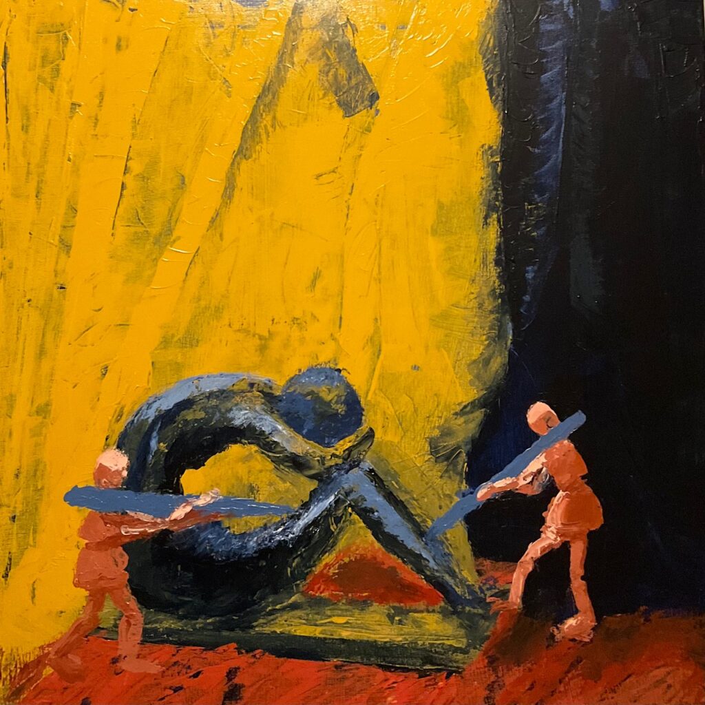
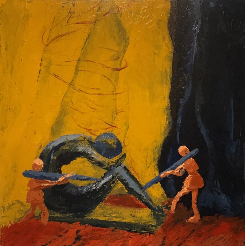
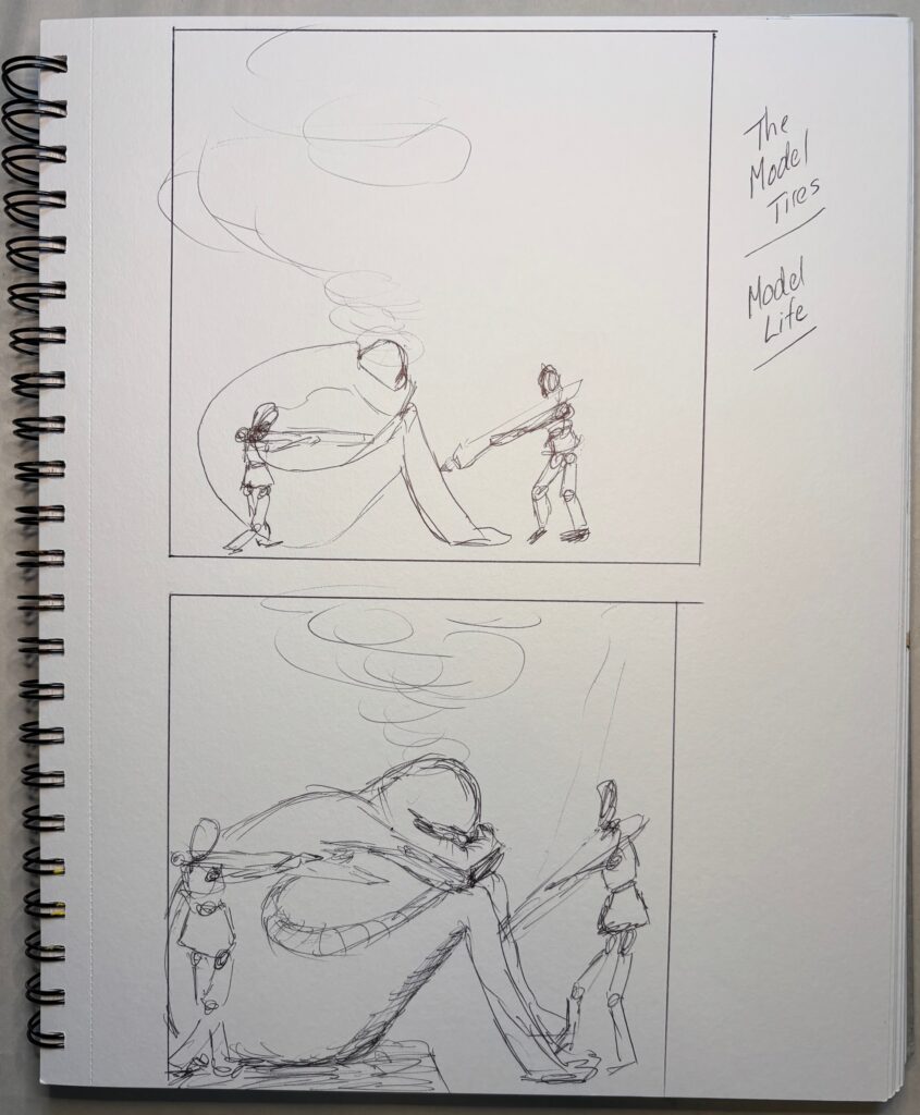
Learning from first version — as noted above, I had trouble with large trowels on the slightly baggy canvas. I tried switching to smaller (2-inch) trowel but then the drapery had a strange bamboo-like segmented appearance. Will try on board (or a canvas that is stretched much more taut) next time I try large trowels. Also — used palette knives for the smaller figures but even so, the tool was quite coarse for the way I’d imagined the wooden figures would look. Got a little too fussy trying to make details that would make sense of these small figures, paint got globbed on, bumpy, hard to control. Palette knives several sizes worked well for the larger statue. I went back in to background area with smaller palette knives to add some depth and contour. Then tried adding an ill-defined version of the wire shapes over the statue’s head. Initially, brown/red lines as shown above in final panel, with small paintbrush. Then went back in to soften and make more ethereal with very watered-down yellow oxide +/- white or payne’s grey, this applied with a fingertip. See below for final version… time to leave this first version and move on…
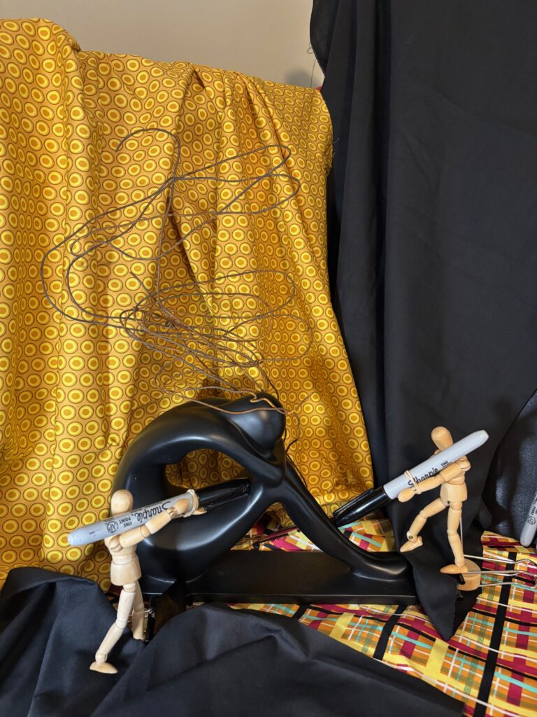
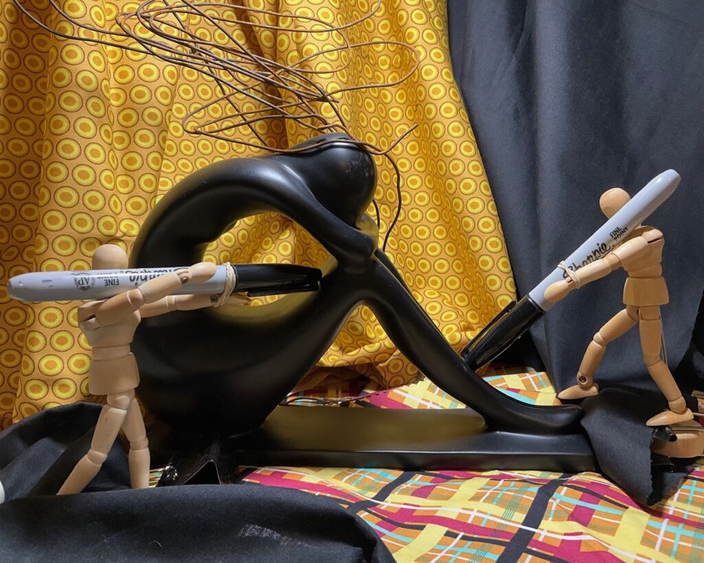
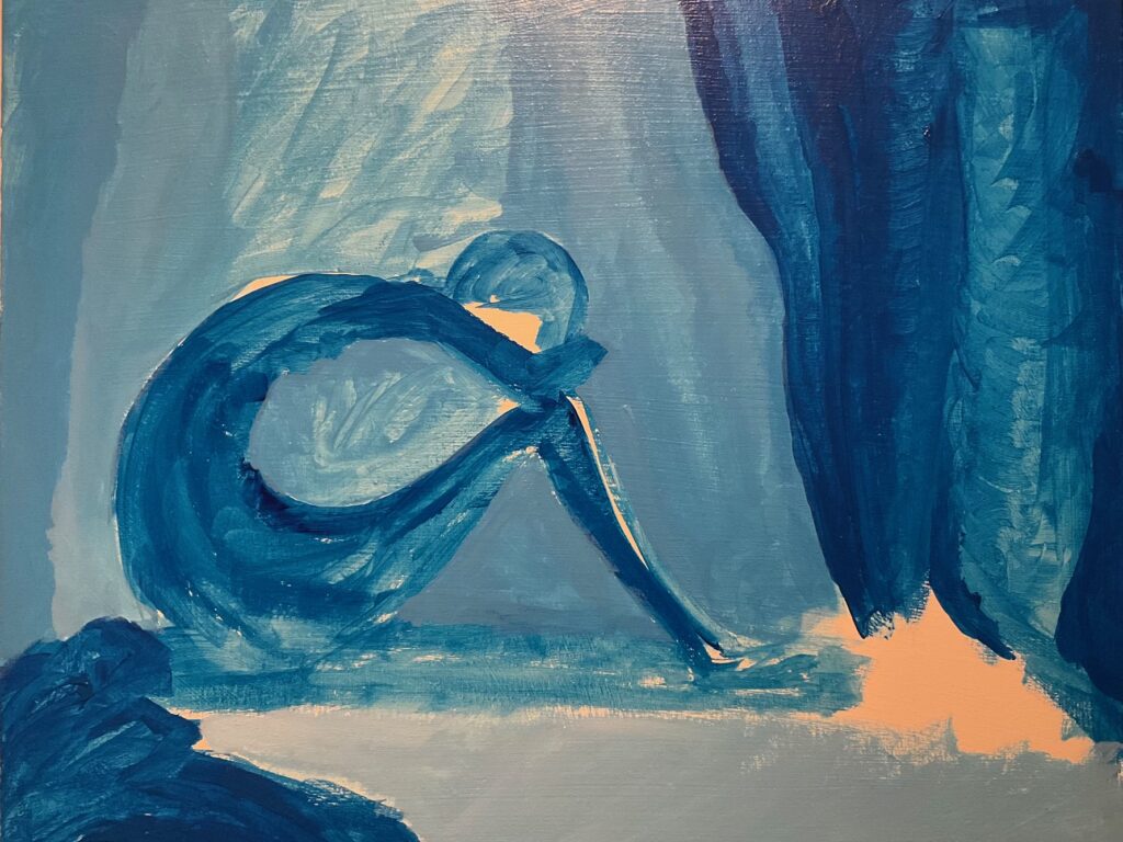
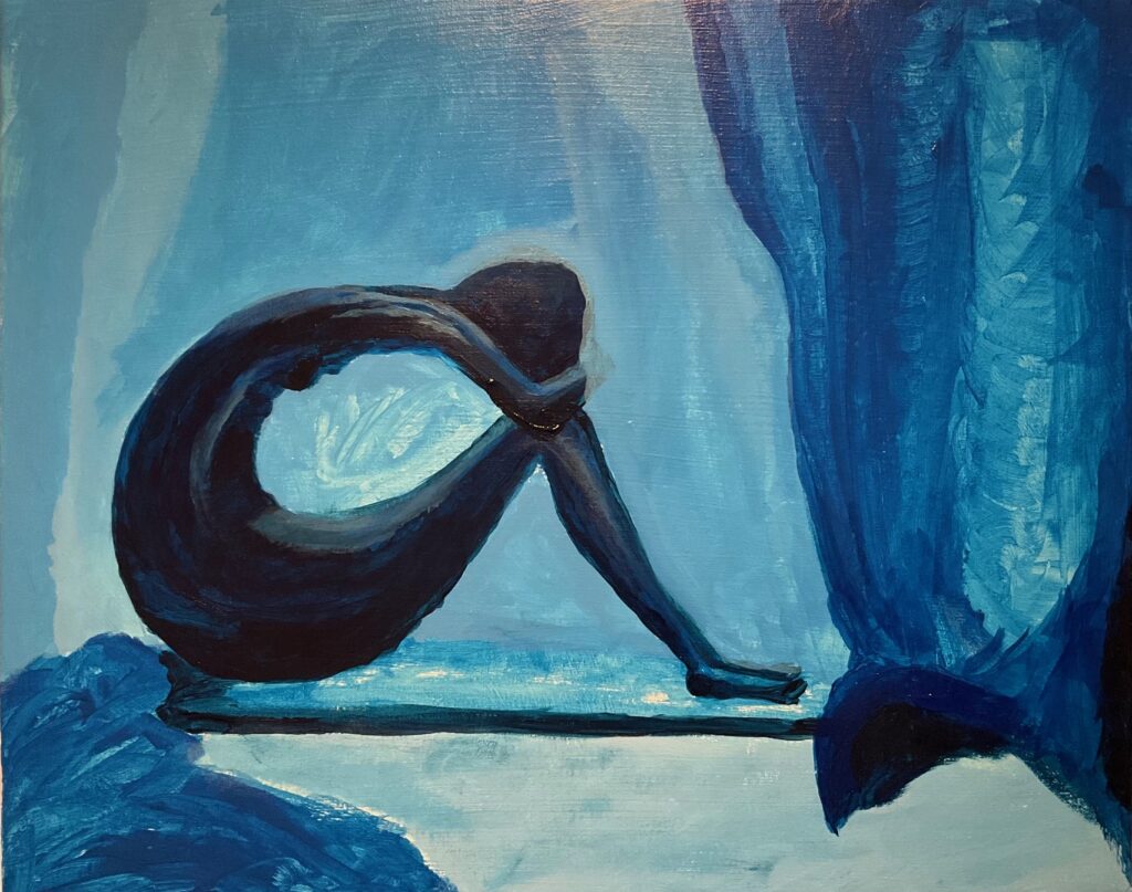
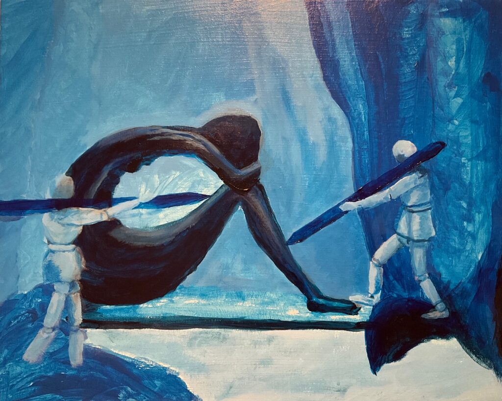
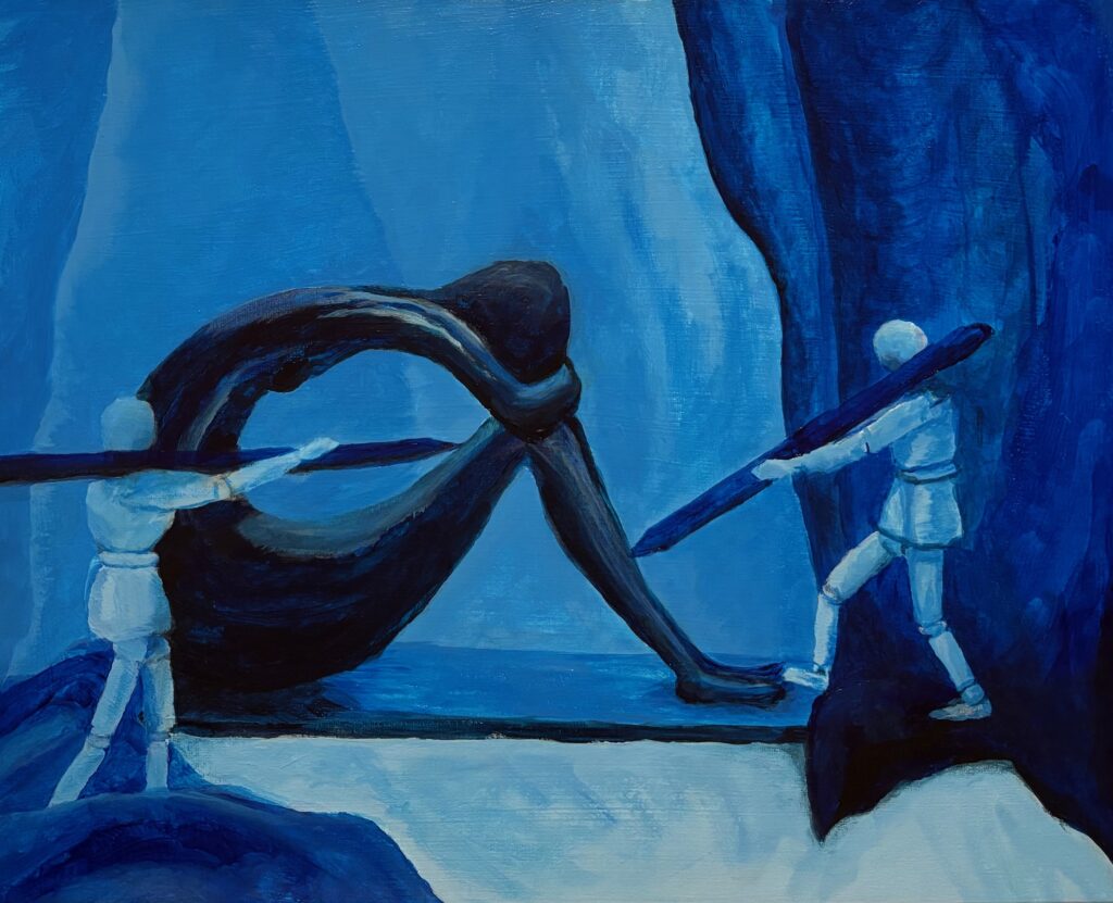
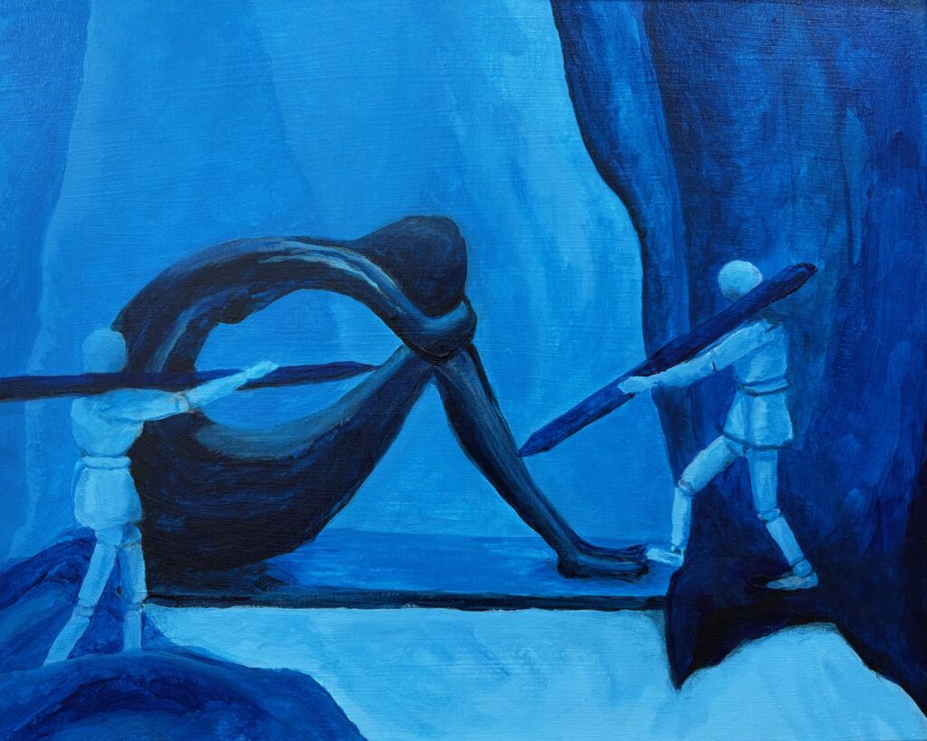
VERSION 2: “So Blue“. Settled on monochromatic blue for this version, and I want to dig into sad mood for the model. A similar crop for the figures but a landscape orientation giving much less background, much more about the figures. See working photo crop below. I used 16 x 20 canvas, phthalo blue +/- white and black, and took a stab at wet-in-wet blending, also making use of the acrylic paint extender to lengthen the time the paint was blendable. I used 2 brush sizes, small and medium, and blended also with my fingertips and with a cloth. Also decided to omit the “cloud” over the statue’s head, finding it was not so successful with the first one, and verges into a cartoon aesthetic.
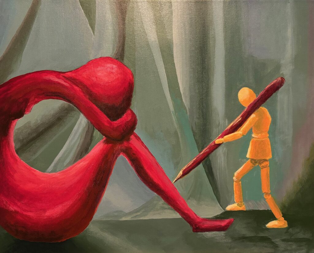
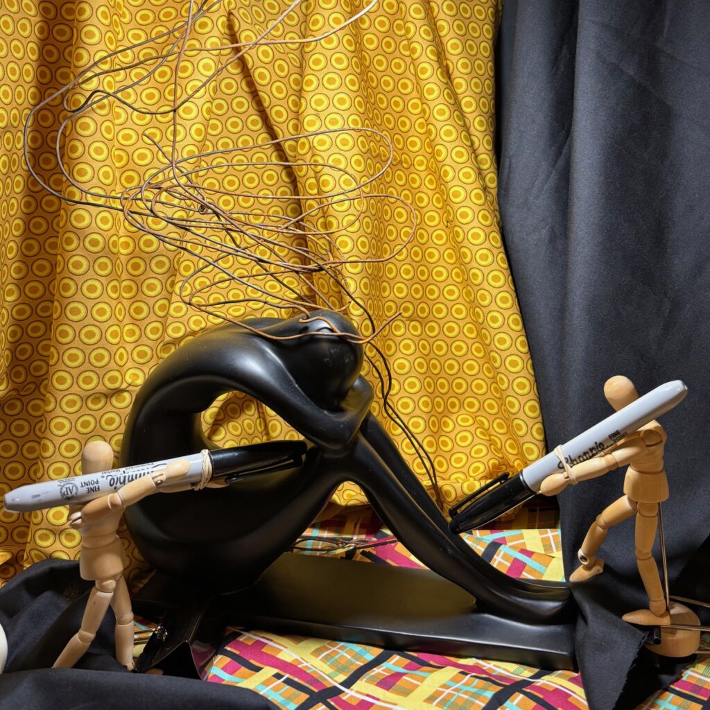
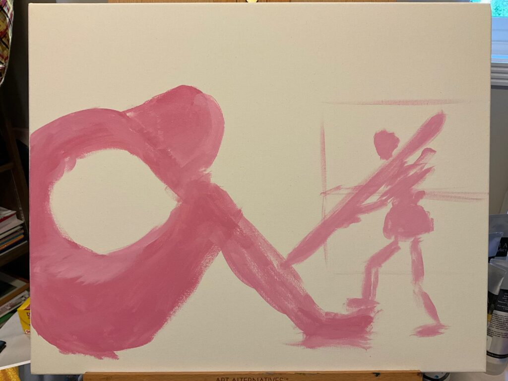
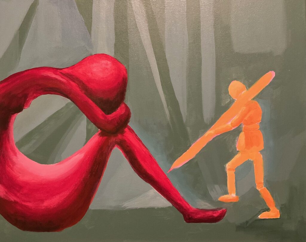
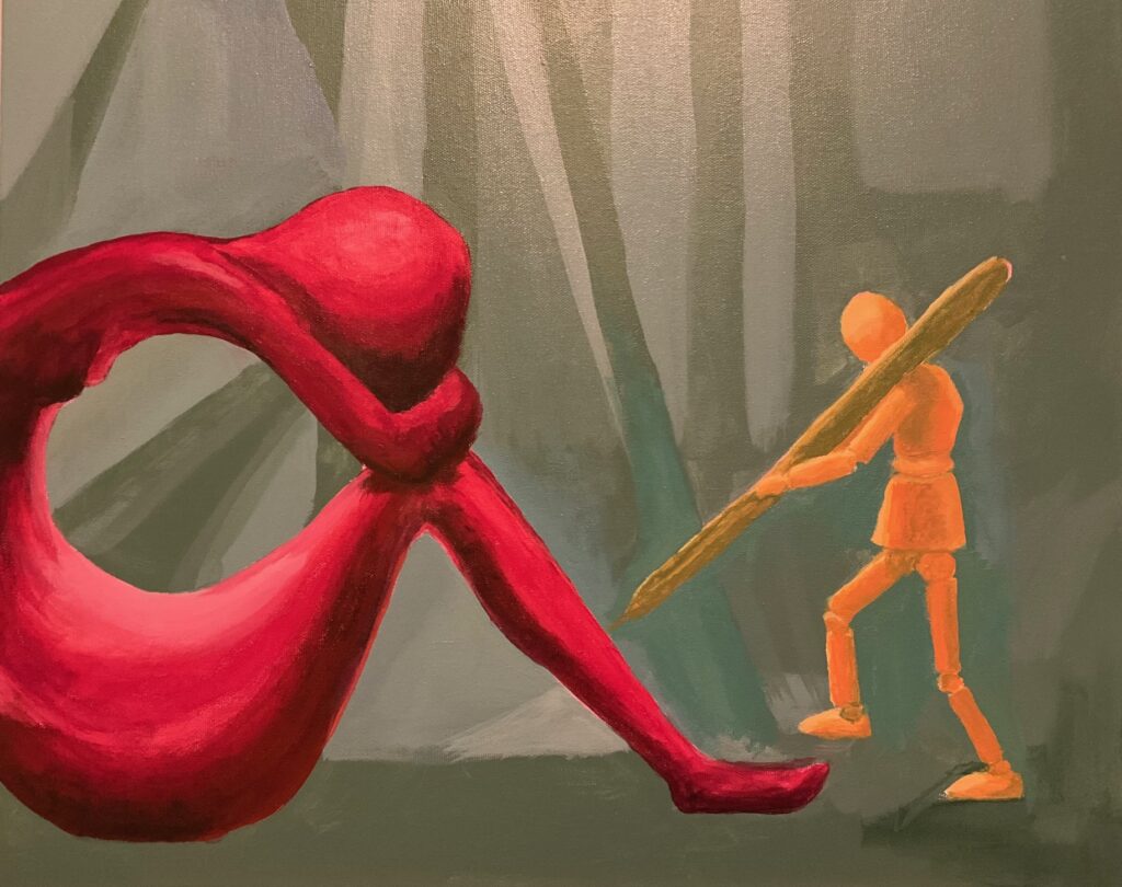
VERSION 3: “So What”. I’d like to attempt a more abstracted version of the still life for this one. I see a set of geometric shapes that are simplified in the statue and the wooden dummy, but distorted in the drapery and table surfaces (imagining Metzinger cubist ideas, as shown below, although I have the disadvantage of no real shapes in my background, just drapery).
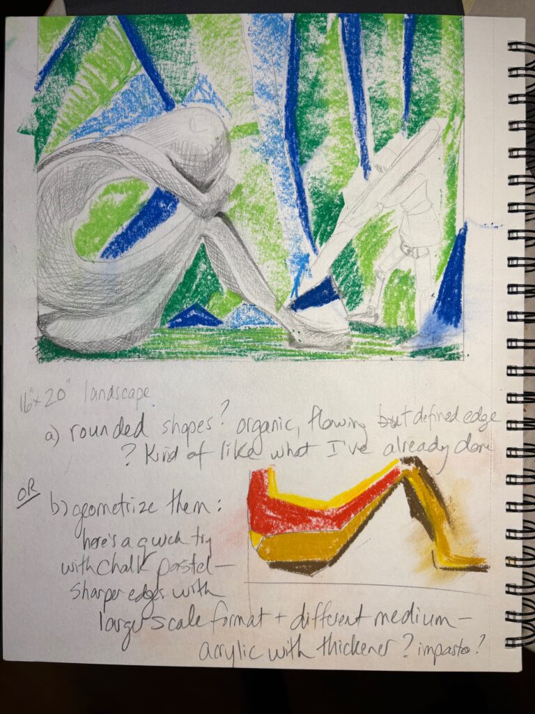
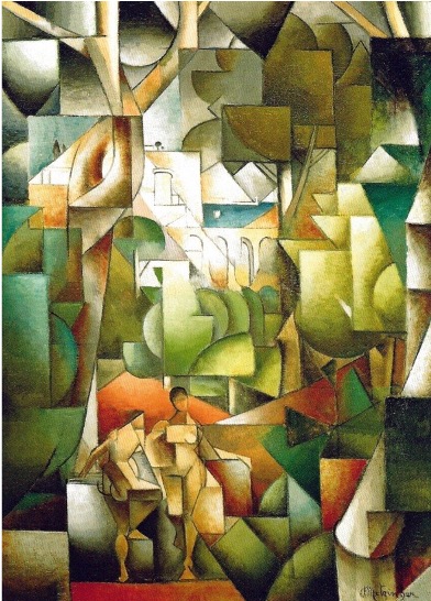
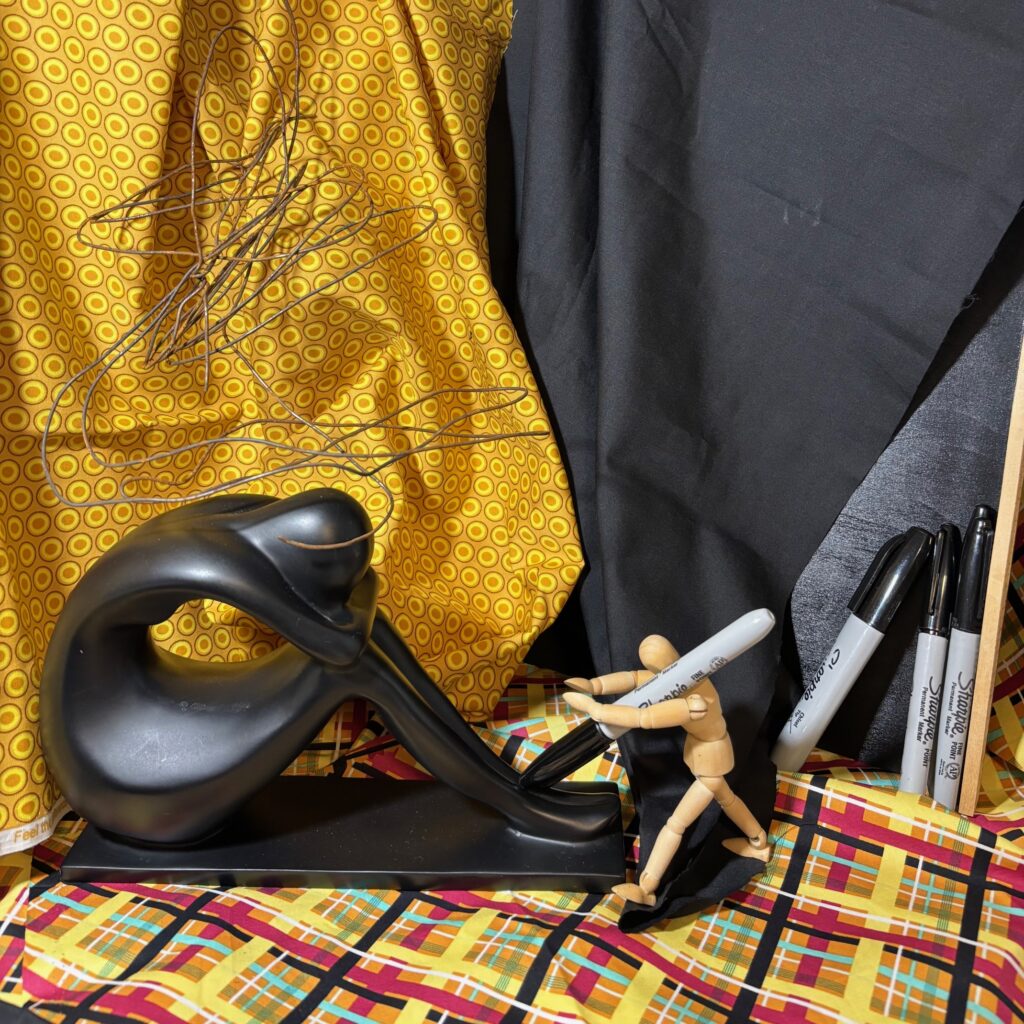
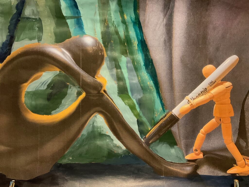
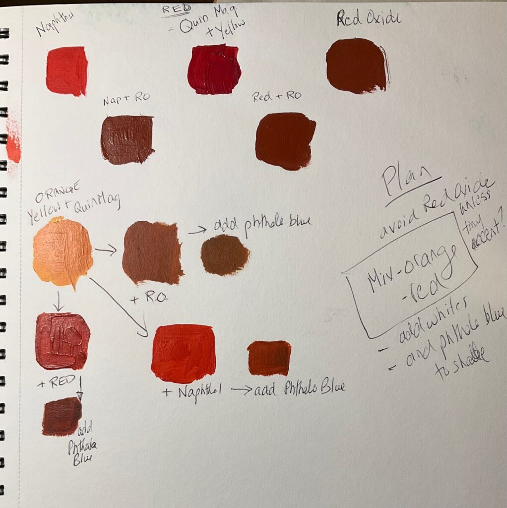
It will be a challenge for me and I think I will reduce the number of items. One wooden dummy, one statue, one pen, and some drapery. I am thinking of split complementary– blue greens as the background, the figures in red/orange. Trying to decide if Metzinger-like background uses his geometric blocks or goes with more curvilinear shapes — so I painted out two different halves directly on to a printed photo of the still life. Preferred the geometric background, curvilinear blending on the figures. See below, a photograph of my planned composition/cropping and the background test runs.
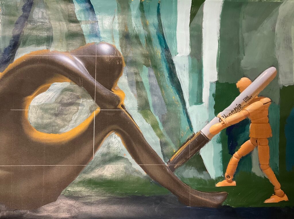
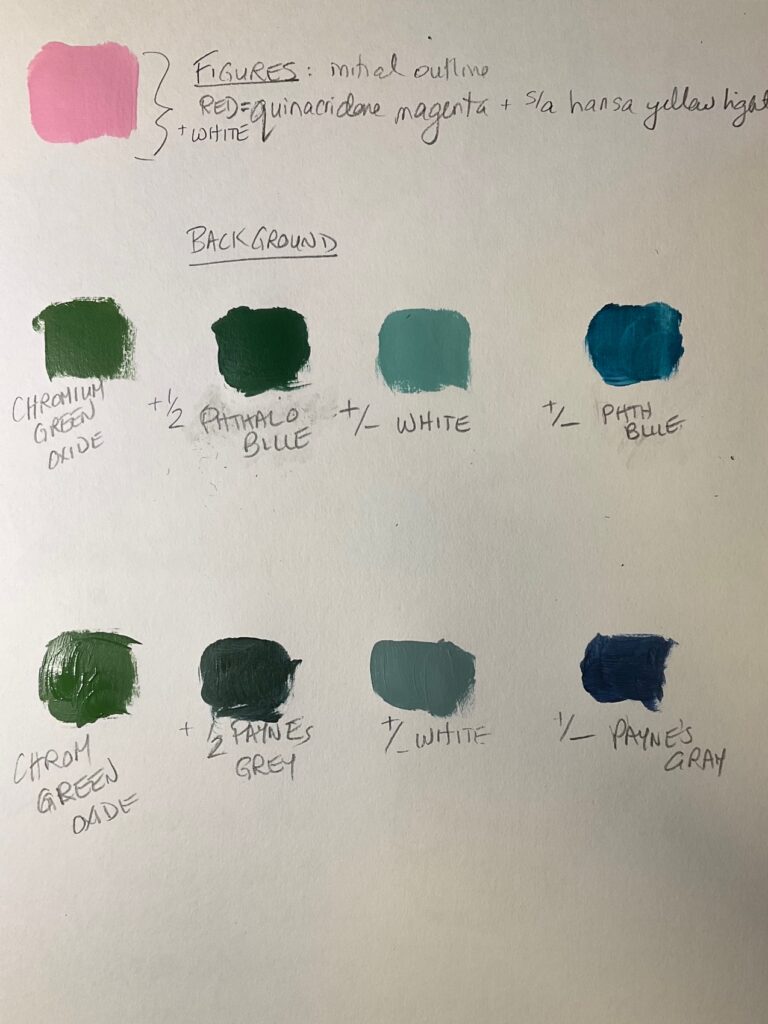
More work on colour palette for figures… then on to the canvas, work in progress below…
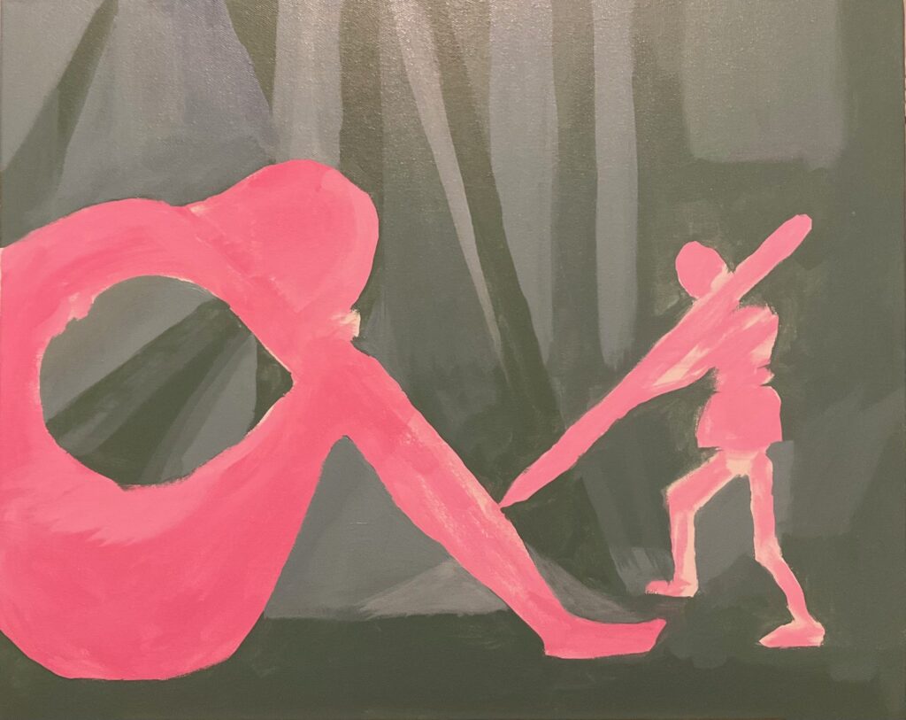
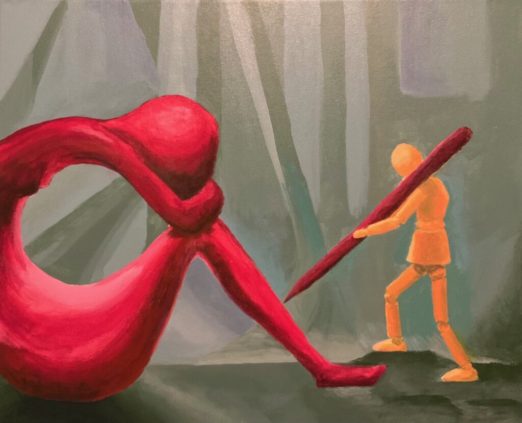
CRITIQUE SHOWING AND FEEDBACK: See below, photos of the 3 paintings at Critique. Feedback from peers and instructor: Version 1: appreciation for texture decisions., the white fog over the statue is too chalky. Version 2: good composition and cropping decisions, good range of monochromatic blues. Version 3: the cropping of the red figure is abrupt — consider including the whole figure, or soften her left edge or soften the bright highlights on her lap.
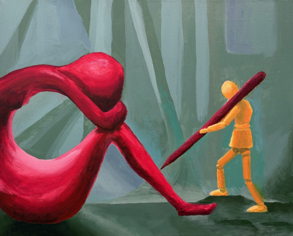
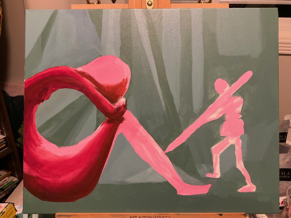
POST-CRITIQUE: I worked further on version 3, adding the intended shading to shape the background drapery in a geometric fashion, changing highlights on figures and pen, and incorporating touches of the red/orange into the background drapery for more cohesiveness. See below, final version: