Process Work for Final Painting
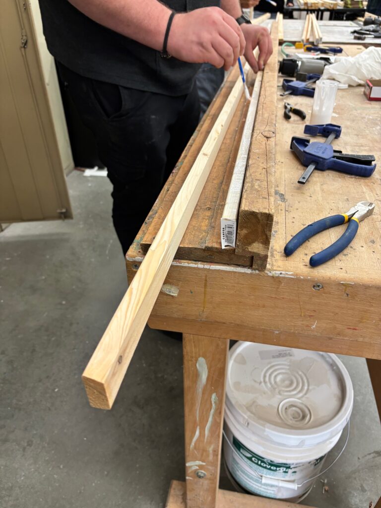
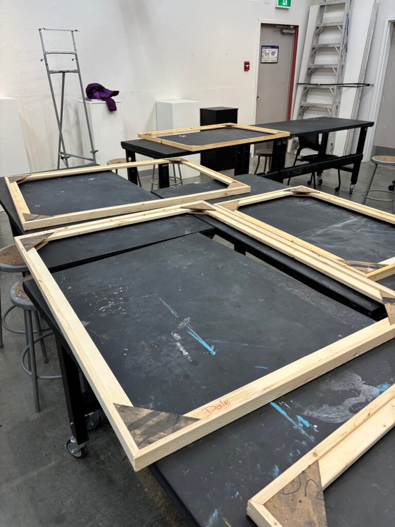
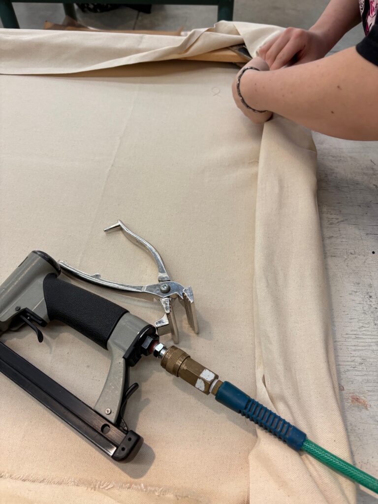
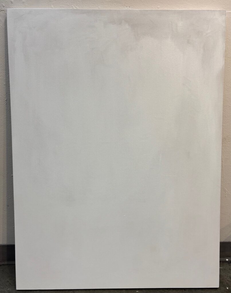
The Frame – a few images from the process of building frame, stretching canvas, and gessoing canvas. One moment of concern when I first brought the canvas home — it sat in car 4 hours and when I brought it indoors it had noticeably sagged. Was very relieved that it became taut again once indoors under warm and dry conditions. Dimensions 4′ x 3′
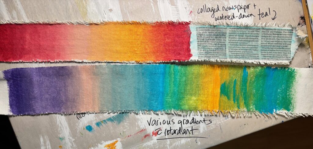
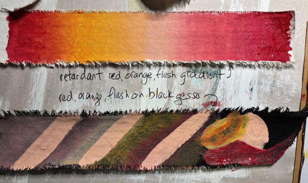
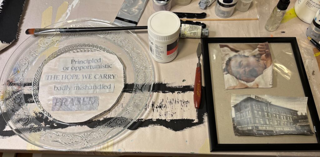
Technical exploration: I wanted to practice blending more continuous colour gradients with retardant, and to explore collage and/or acrylic gel transfers. Photos follow…
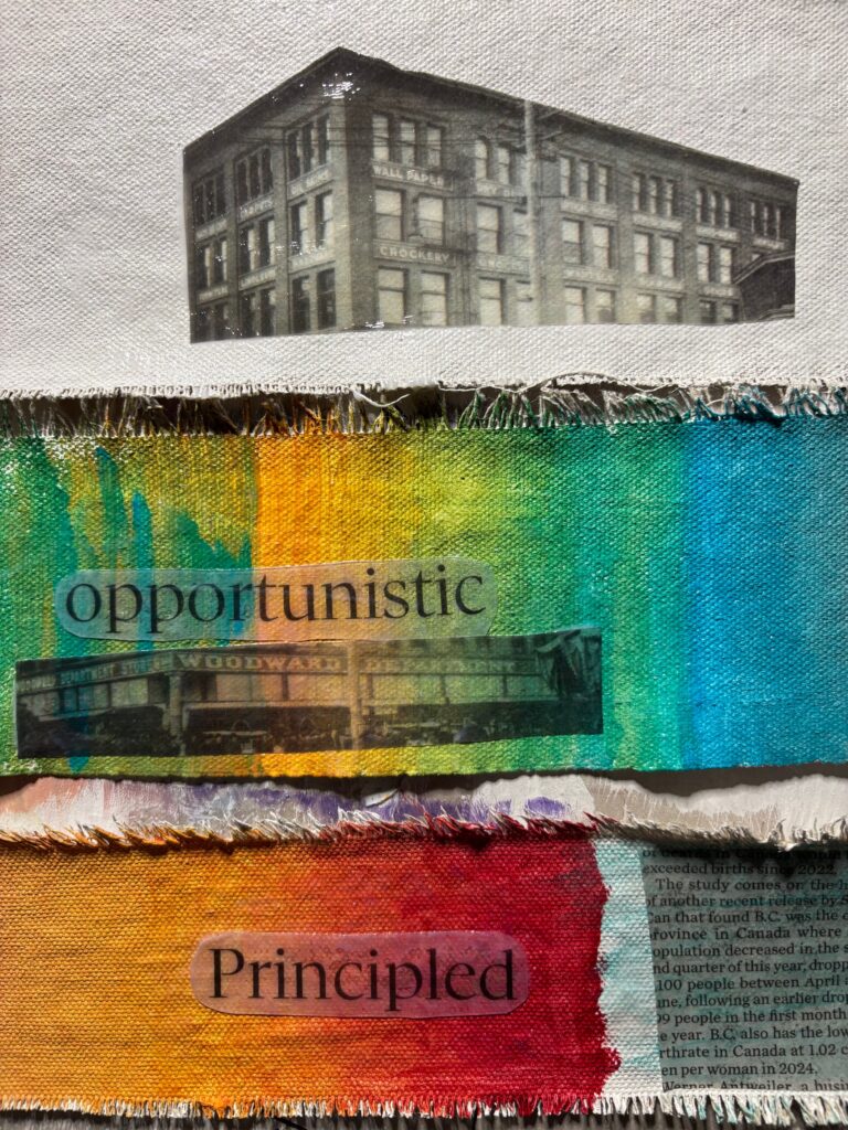
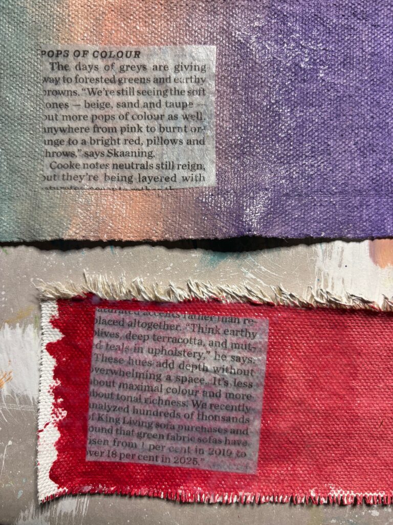


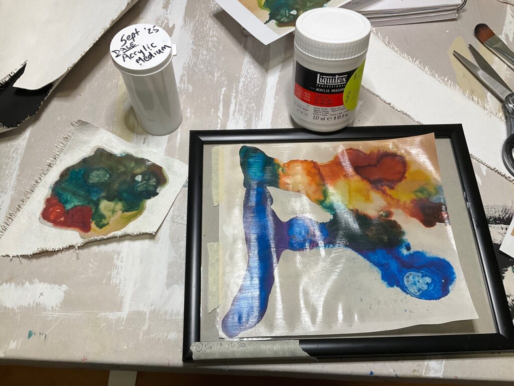

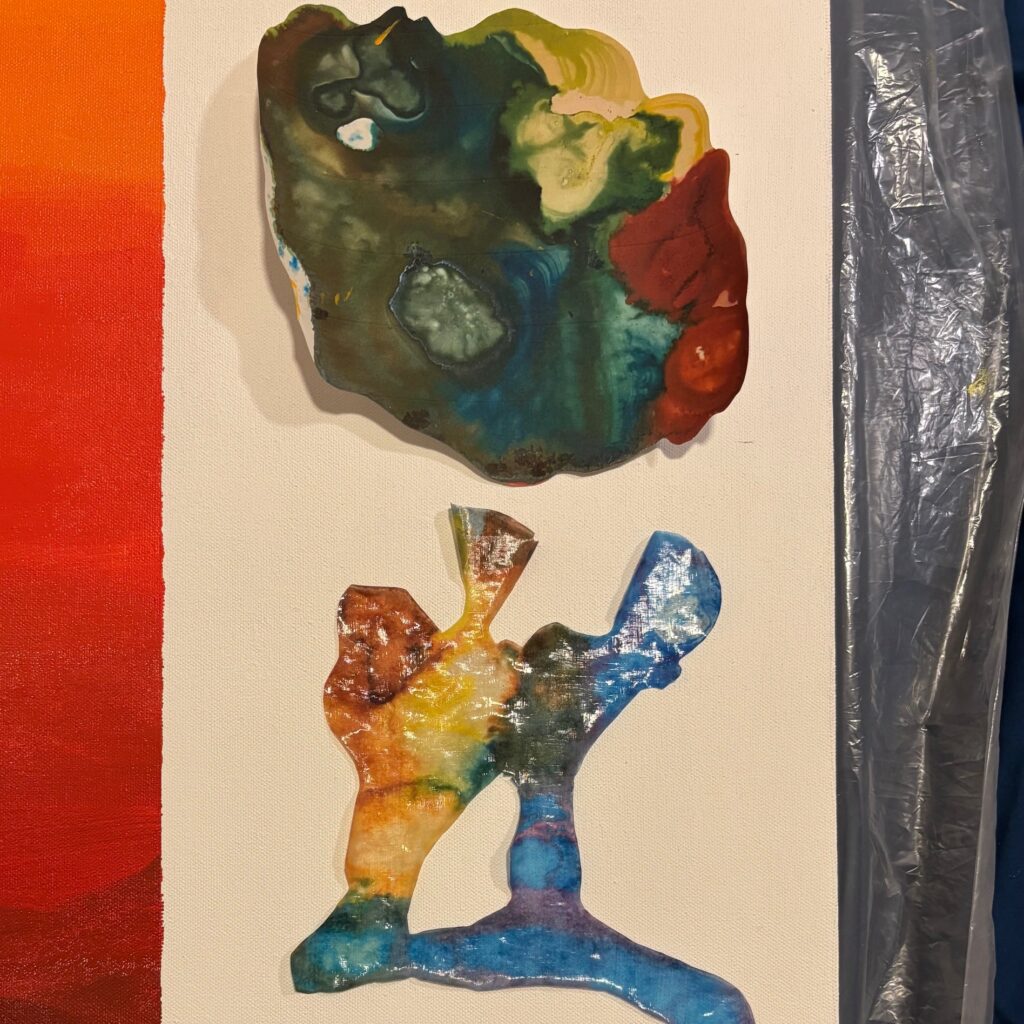
Composition and thumbnails: I brainstormed on paper about subject, orientation of canvas, composition and balance, see below. Discussed this with Elizabeth Nov 20…
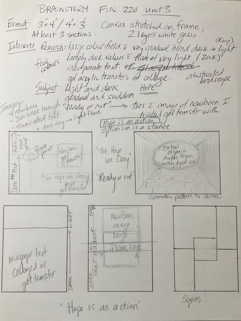
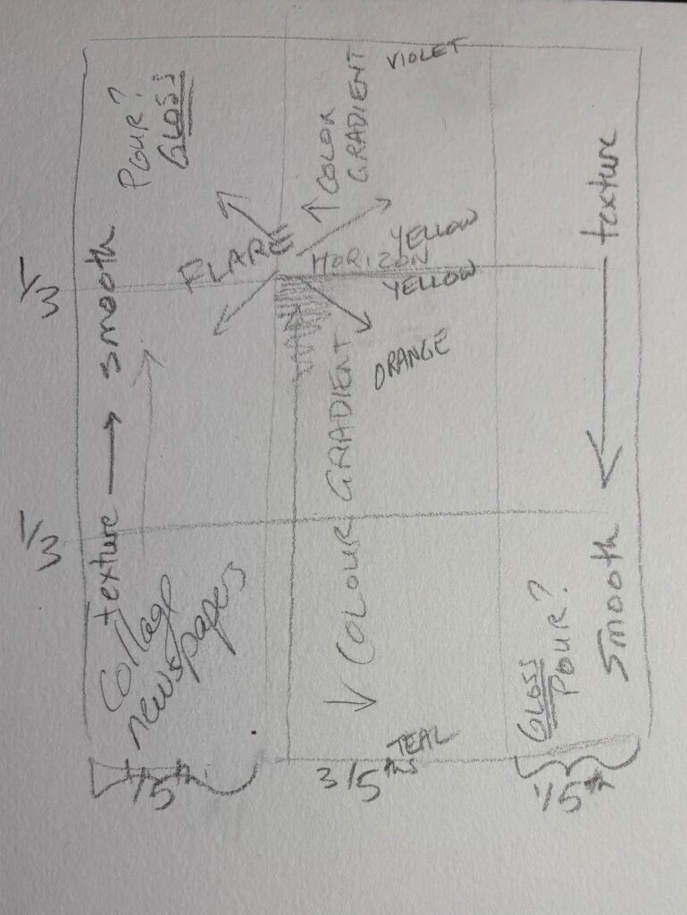
Thoughts from Elizabeth meeting… consider having a less detailed plan, allow more response to what is emerging on the canvas. Ideas for alternate transfer methods. Keep up the material trials. After percolating a few days, I came up with the theme “Not On The Same Page”, alluding to news coverage and riffing on competing world views. Developed a composition guideline, below, with lots of permission to adjust on the fly…
Painting in progress, and responding to the painting:
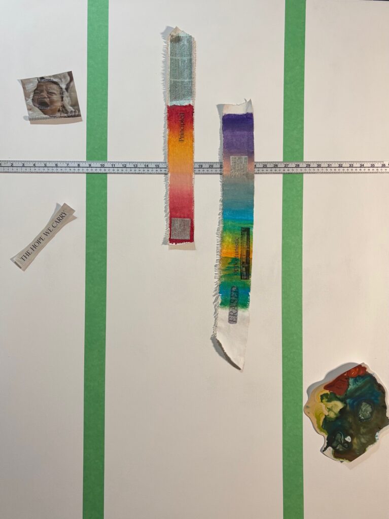
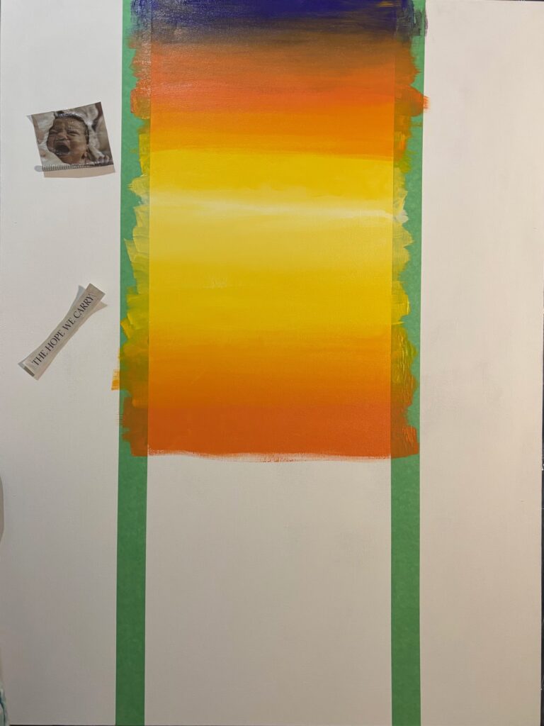
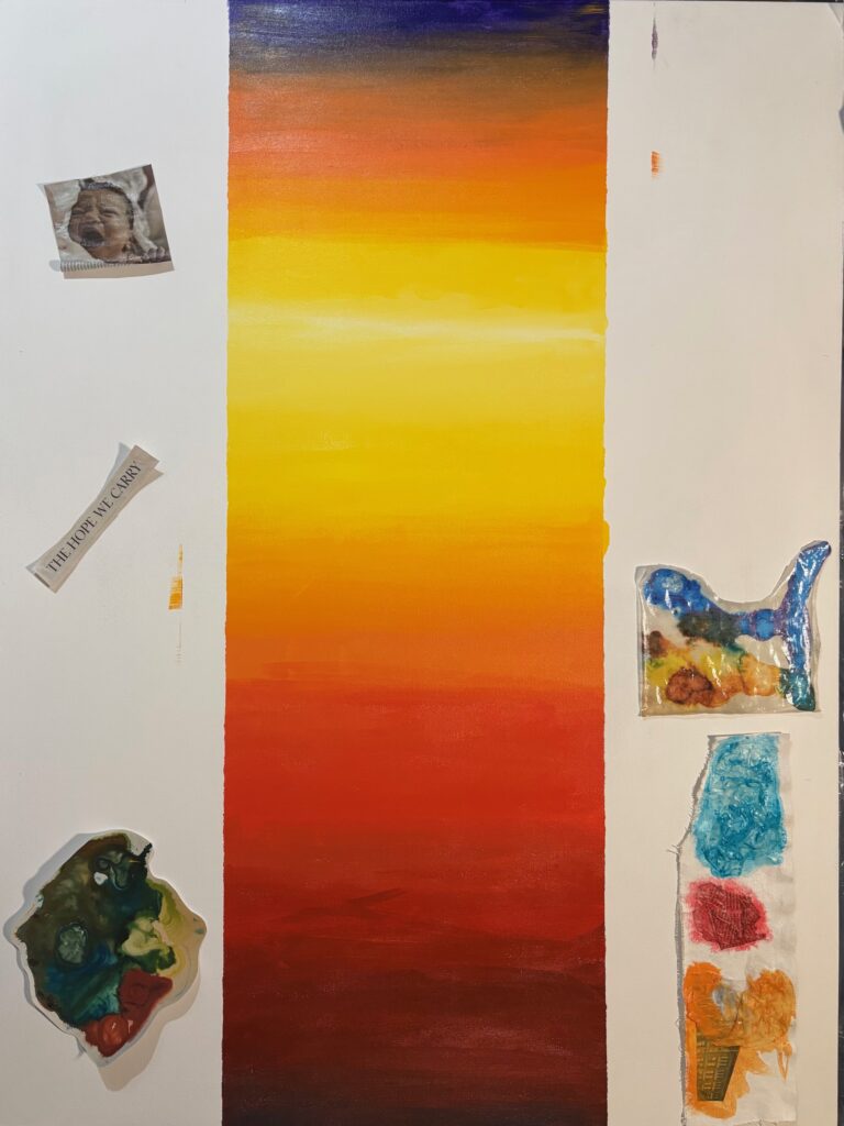

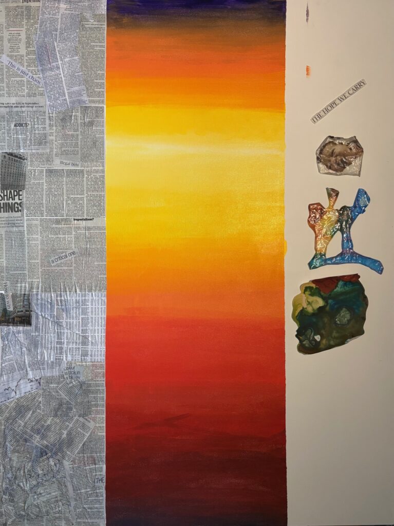


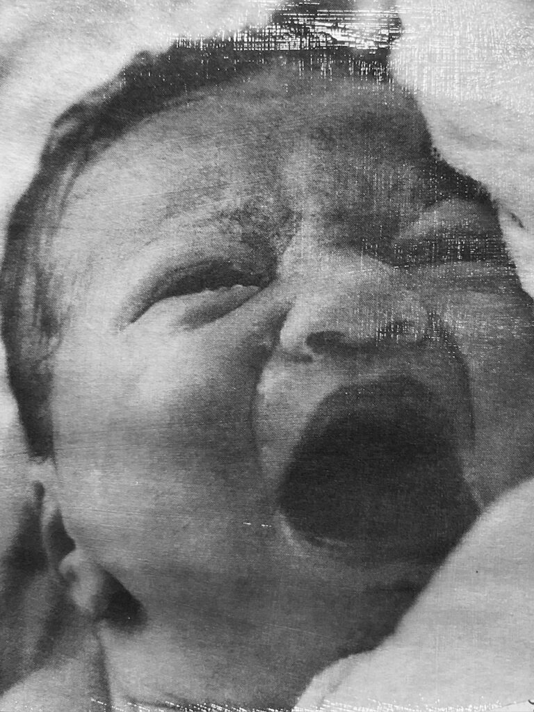
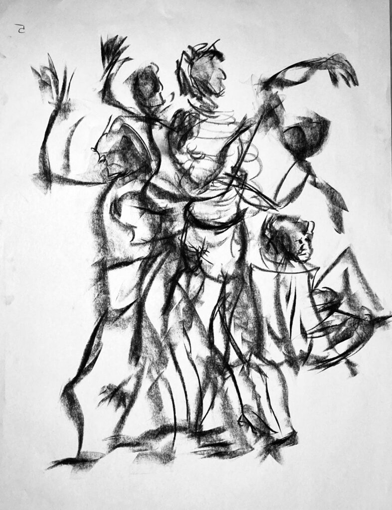
Before proceeding further with left panel, I need to nail down what happens on the right. I obtained new information about transferring images to canvas. It uses a single layer of medium to transfer the ink directly to the canvas so will be much less thick, and needs a laser printer not inkjet. It results in a flipped image left to right, so I will need to plan for that. I’m increasingly interested in a third panel with images of people, some individuals dimly seen and some loosely-rendered crowds, not starkly visible but peaking through a painted treatment for that panel. I’d like that panel to be ultramarine-violet based (the colour at the top of my rainbow strip), dark values and impasto at the top, transitioning downward to smooth very light values at the bottom. I looked through my set of charcoal figures from past Life Drawing sessions, plus one photo from the newspaper that I had made a gel transfer already and photographed the transfer to give it a weird sheen. See below, the three images I selected (they will be flipped left to right on the canvas) and my brainstorming about how they fit and where… note they will all be flipped right to left.
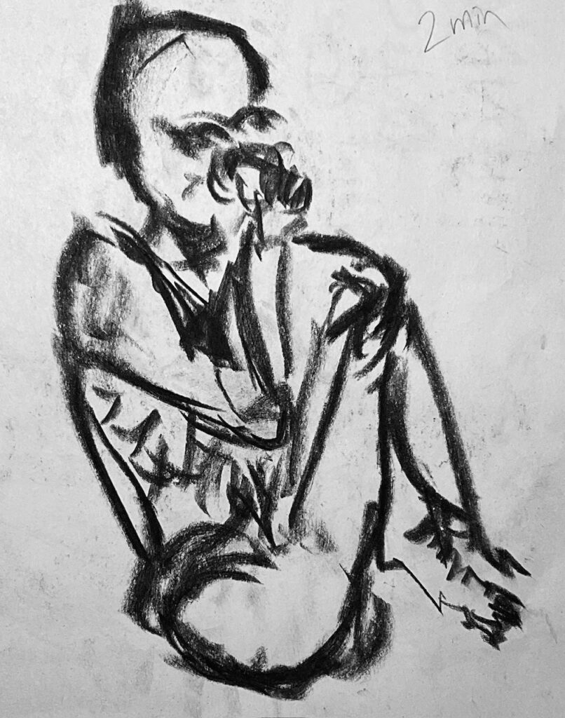
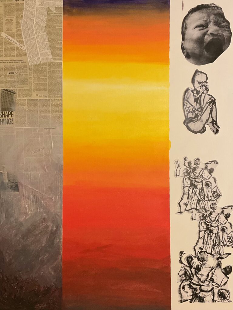
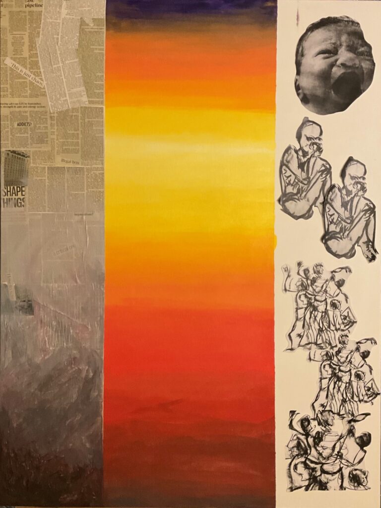
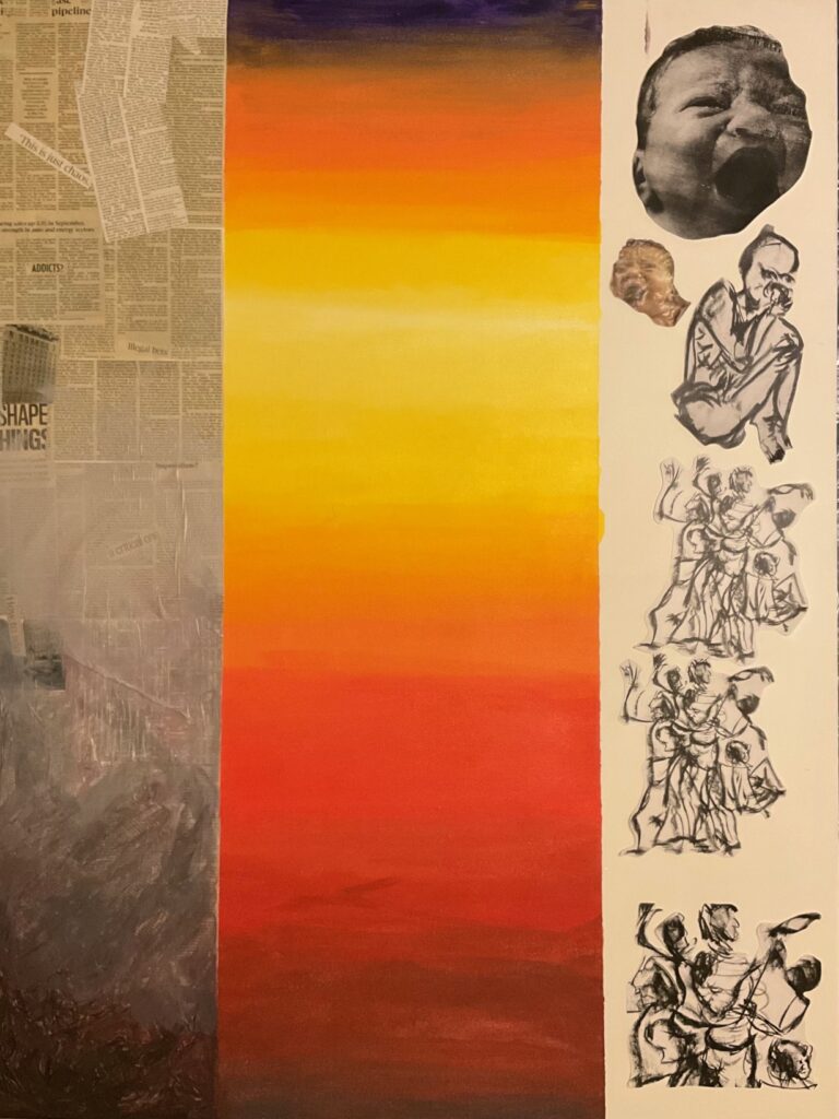
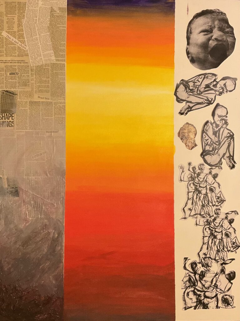
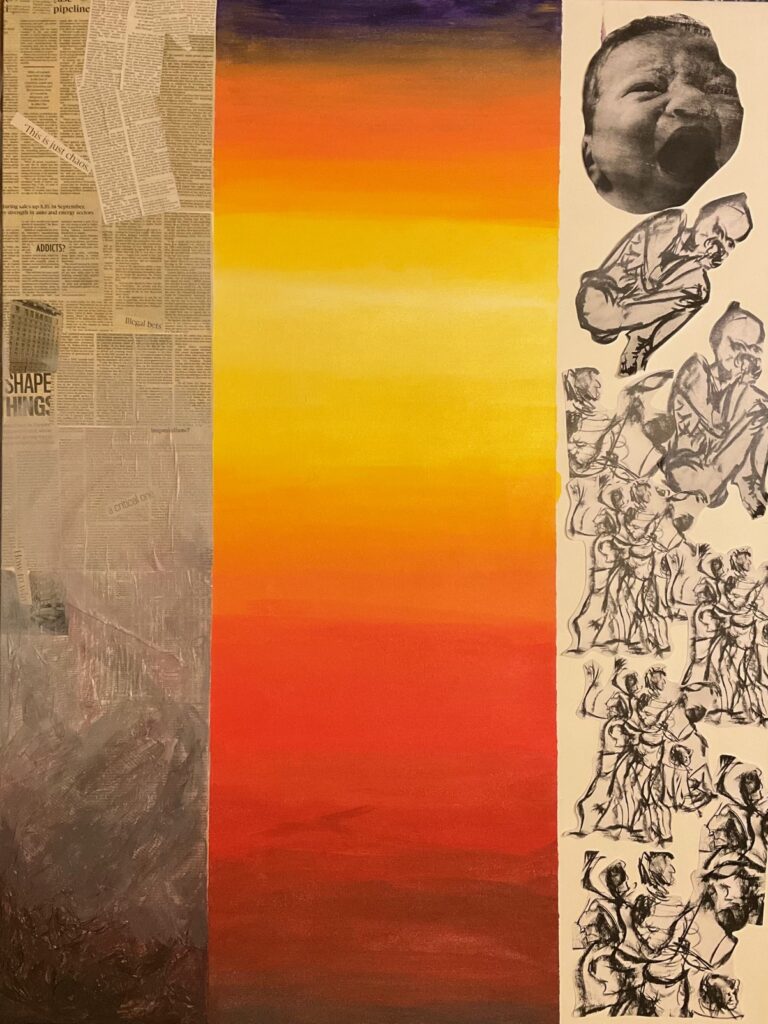
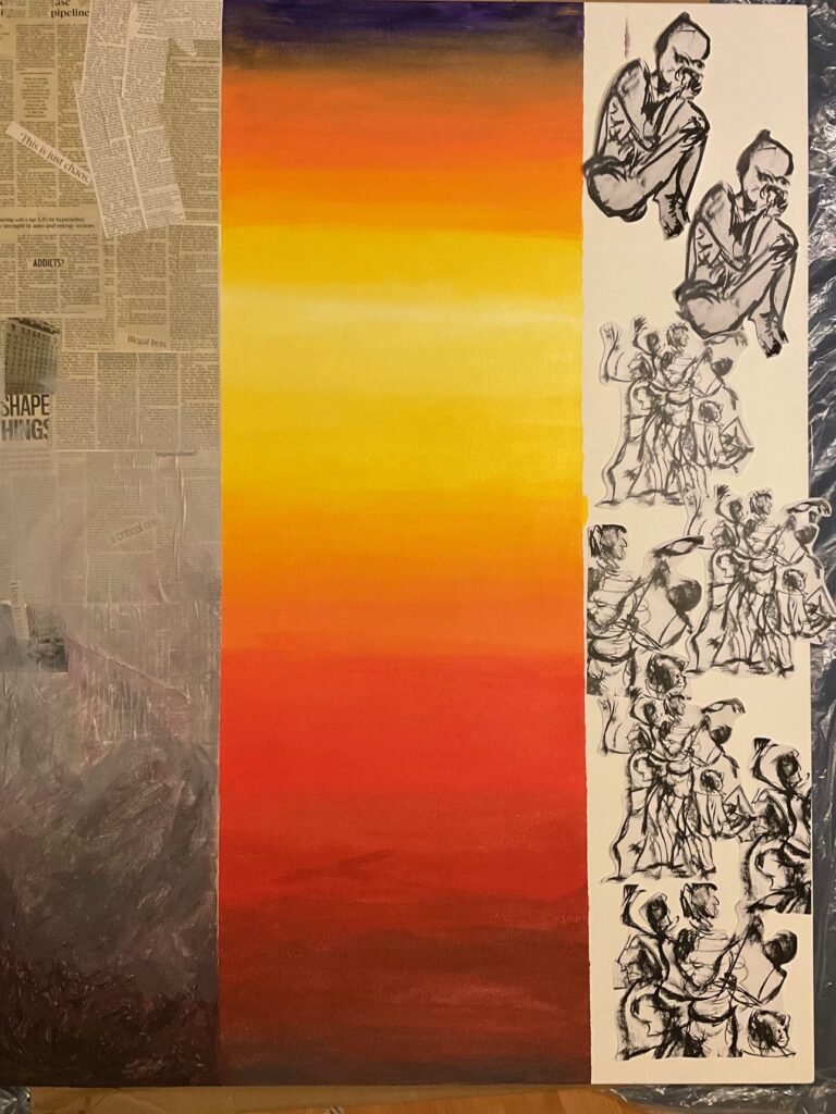
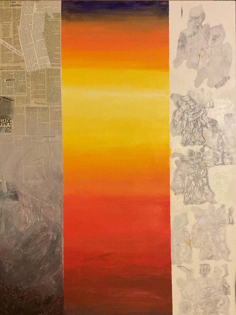
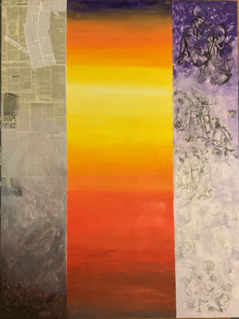
Nov 27: I took the painting above right to class to discuss with Elizabeth. Her comments:
- upper left newsprint stark and prominent , consider including another building or other transfer.
- Debate R/L panels staying strictly light to dark values (reverse direction) which pushes into single-plane abstract, versus darkening out tops and bottoms both sides to give more of an architectural quality, as if the two sides are walls or sides of a doorway, through which the colourful centre is viewed.
- If L panel moves strictly dark to light, I need to shift my current lightest spot upward and include more middle values.
- I’d like to include colours from the central panel out into both side panels but nervous to spoil things… Elizabeth observed that thinned (with water) acrylic is easier to adjust after the fact (versus the use of medium especially thick shiny medium which gives irreversible texture to the surface).
Final week pre-critique: First step to complete left panel. Decided to first trial a simple gradient dark at bottom to lightest at top. Can more easily darken the top than vice versa if I don’t like how it feels. Next, added sponged-on sparse orange and red to right panel. Added the flare central left at horizon line, extending the light rays into left panel. Living with this for a few days to see what’s next…
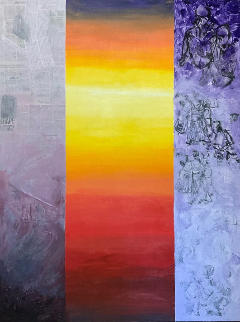
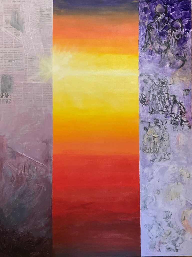

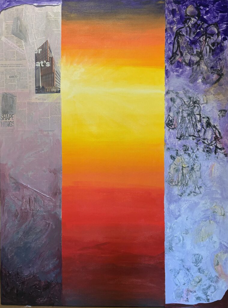
I liked both side panels getting dark at their tops and bottoms but still unsure which colour — it is more about the value I think. Decided to try incremental changes with watered-down acrylic so I could reverse course if need to. Once that was done, went on to integrate the new building collaged into left panel with overpainting thin layers. Finally, tackled right panel to integrate it further into the whole composition… continued the horizon line into that panel and allowed several drips to bleed down, plus added multiple inferred diagonals with irregular bands of colour wash. Lots of applying and wiping off, and working both on and off the transfers (they accept colour faster than the canvas-only portions). One more 24-hour break before re-visiting pre-critique.
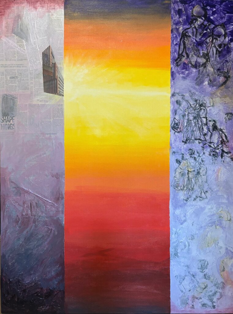
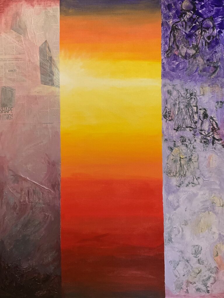
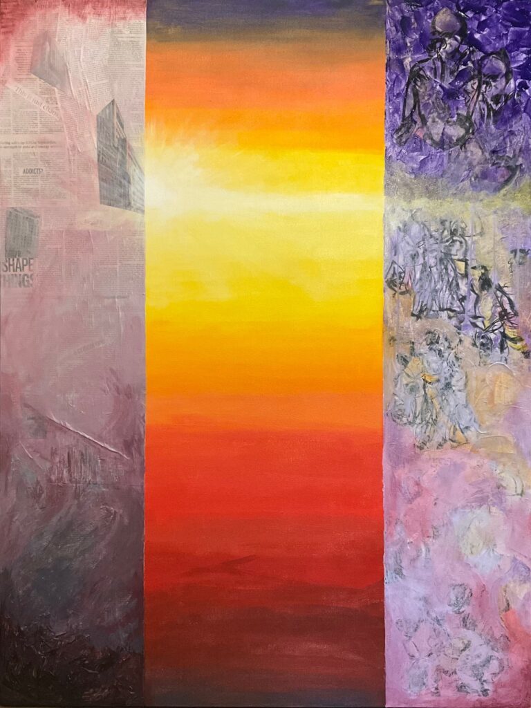
I settled on the title “Not On The Same Page“. My intention for the work is to present side by side images of three worlds that too often exist in silos with poor communication and limited understanding and insight: on the left, the world of the mind (words, news of the day, human constructs), on the right the world of the body, in the centre the natural world beyond humans. Final changes pre-critique: Was not enjoying the straight horizontal line in the right panel. Decided to soften and shift to diagonals the whole panel. See below, those changes and then an image of the final work in studio lighting at the critique.
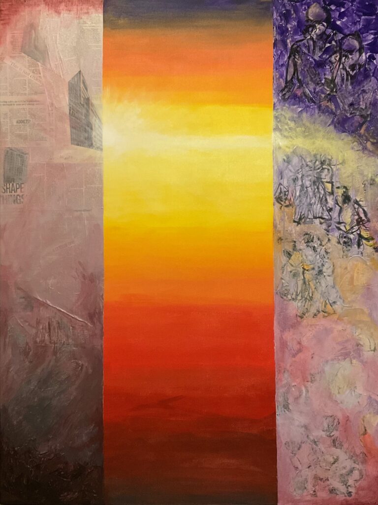
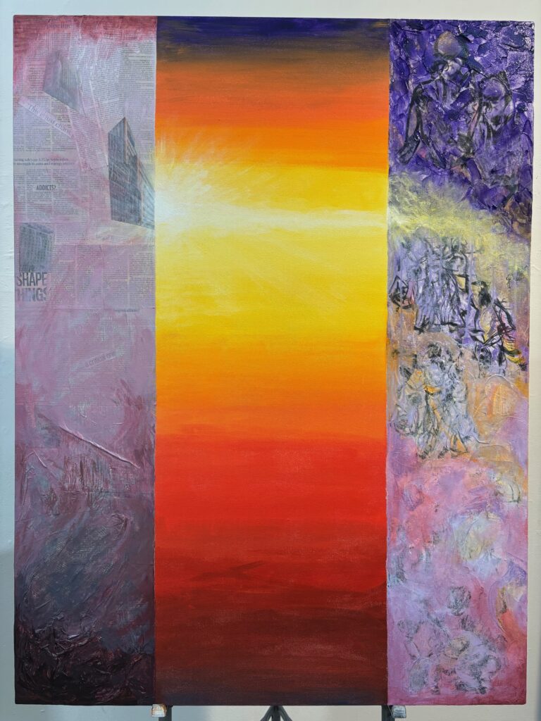
Notes and feedback at critique: Peers commented on strong use of colour; interesting figure/ground play with centre panel sometimes ahead sometimes behind; interesting use of collage, transfers and texture; and the extension of sun rays into side panels helping to unify the three panels. Some confusion about the theme or motivating idea, what is the relationship of the three panels, what is the story? Speculations included critique of contemporary society, and that the relative chaos of the side panels versus calm centre could be an observation on how destructive extreme views could be. One suggested the white line looked like a scar and the idea could be pushed by adding fraying suture lines. Elizabeth commented that the white paint over some figures lower half right panel, and sections of upper half left panel had a chalky appearance – consider integrating more colour even with these really light values to avoid the chalky effect. She also suggested the possibility that the centre panel might be more effective if it didn’t shift to the very dark values at the top of the strip, maybe maintaining yellows and oranges from horizon all the way to the top, to open up the space and invite the viewer in.
Further reflections: a few days later, I notice more and more the instinct to gesso over the canvas and start again. It is not a painting that I want to live beside, apparently. I think it was a vehicle for experimentation and it took me on a useful journey. I learned about collage both flat and bunched up for texture; use of thickening gel medium for impasto; trial of gel medium for transfers, and use of matte medium for transferring images from laser-printed paper to canvass; use of retarder to allow longer blending time and achieve a fairly continuous gradient of colour; and application tools brushes, sponges, rags, palette knives and fingers. The learning didn’t come together into a harmonious composition, in part I think because I was more interested in the techniques and the process than the final impression and wholeness of the work. Good learning.
