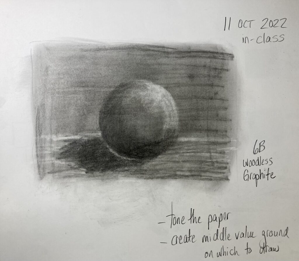
October 11 class: Form defined by light — negative space, value, and form exercises

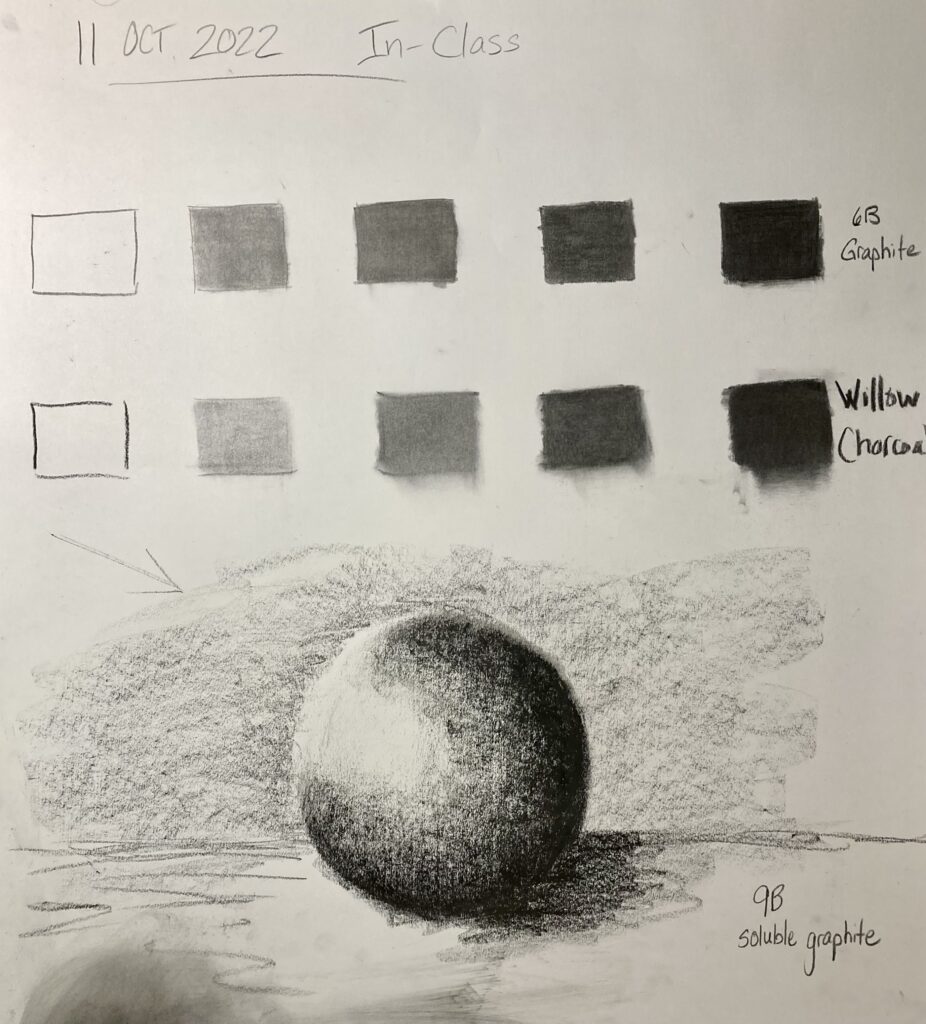
Form: Spheres: above with 9B soluble graphite; below with 6B graphite
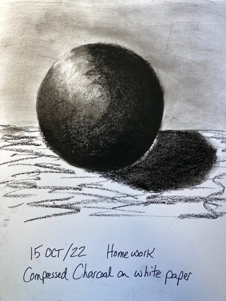
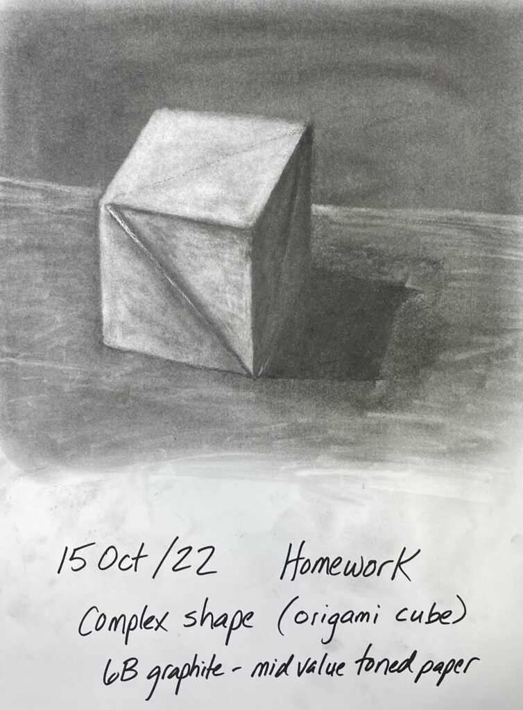
Work At Home 15 October. Repeat sphere shapes with charcoal, on white paper and on toned paper. Try more complex shape also on mid-value toned paper.


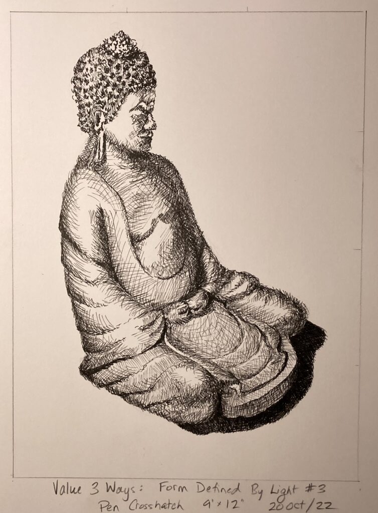
Sketchbook Exercise Unit 2: Value 3 ways.
see below, my home sketches of side-light Buddha statue — once with charcoal, once with graphite, and once with pen crosshatching. Very interesting exercise, difficult to achieve same value with the different media, but pleased with the range of darks to lights within each piece. Not so happy with how variable the drawing accuracy turned out!


STUDY 4: Form Defined by Light
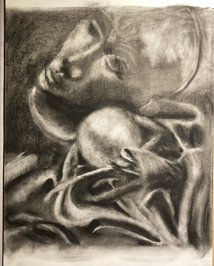
This was completed entirely in class time on October 18. Four thumbnails appear below. I chose #1 because I wanted to tackle a lot of drapery folds, and because I thought the spooky styrofoam disembodied head would be very evocative in a piece with a lot of dark values. After the thumbnails, a photo of the original still-life FYI. Finally, Study 4 itself.


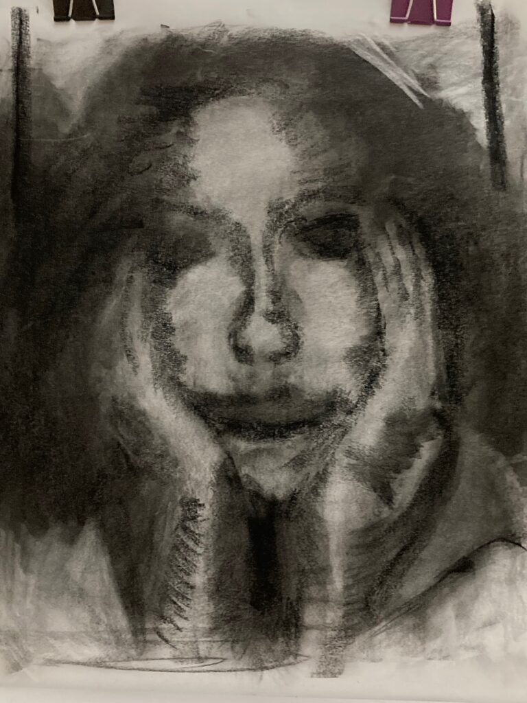
Artist Research Unit 2: Mary Borgman: posted October 21 in Assignments on Bright Space. Also posted immediately below for reference
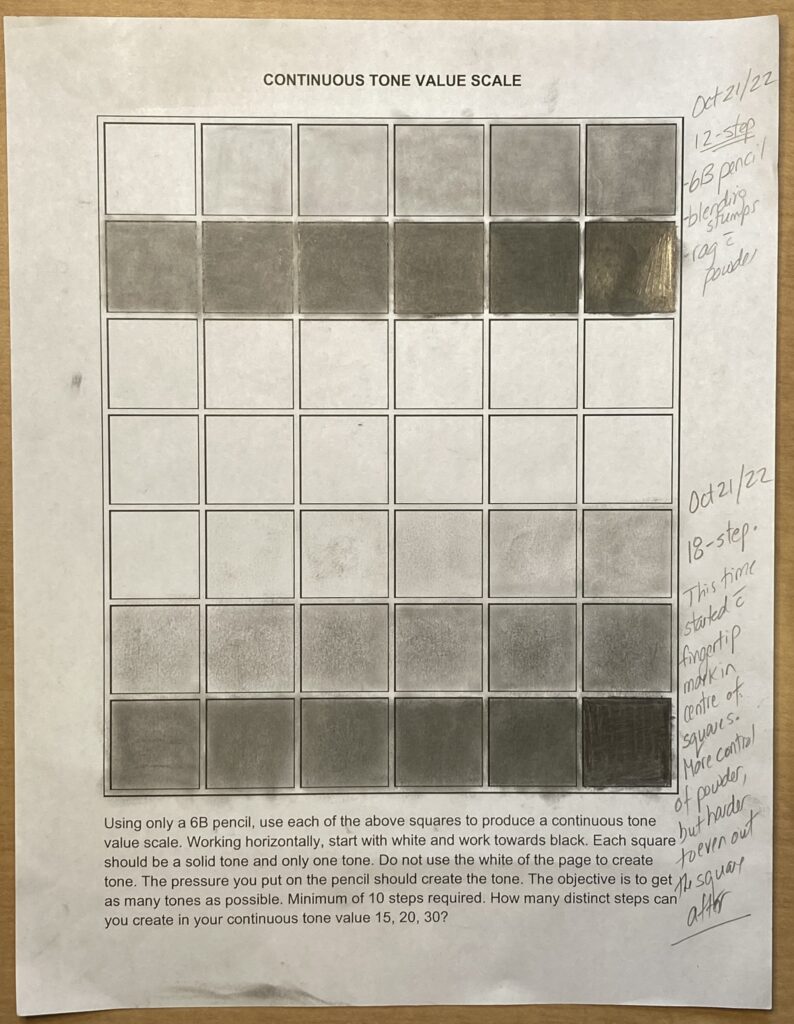
Sketchbook Exercise Unit 2: Continuous Tone Value Scale. See below.
I completed a 12-step version by drawing directly on the paper with 6B pencil, then using blending stump (or variations like Q-tip, small sponge on a wand). I started using 6B powder partway through the process, applying with small sponge or blending stump. Also used kneadable eraser to roll off or dab off excess graphite. In the end, the uniformity of tone in each square isn’t perfect but it is better in this progression than in the 18-step one.
Next tried 18-step version, starting this time with powdered graphite on finger tip. Found much more control to gradually increase value over 18 steps, but my finger created a circle inside each square, which later proved very difficult to even out to the edges of the squares. Probably would have been truer progression if I’d left the original circles. Squares 13 to 18 appear better graduated in real life than in the photo. There are also a few artifacts from my handling of the paper, for example darker marks centre of squares 3 and 5 were the result of resting the apparently graphite-y side of my hand on that spot… sigh.
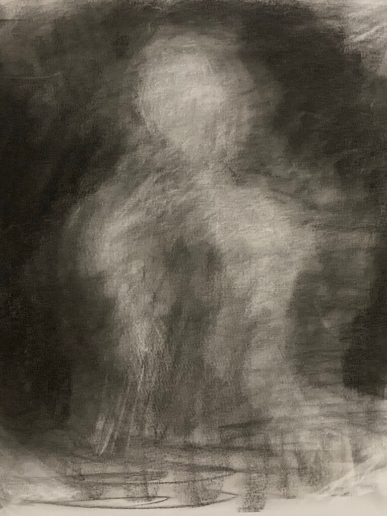
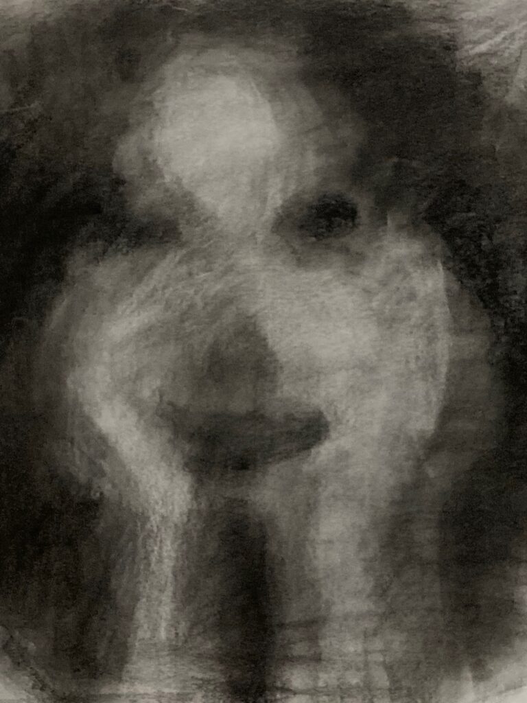
Sketchbook Exercise: Value to Express Mood. Completed 3 versions same still-life, over 3 days October 22 to 24. Side-lit with desk lamp to simplify shadows and bring out drapery effects. See below — the photo of the still life, then 3 versions with descriptors. And a final shot that shows all three side by side.


GENERAL TO SPECIFIC: In Class process on 25 October. See below: 3 shots in process plus final version( photographed at home, different lighting!)

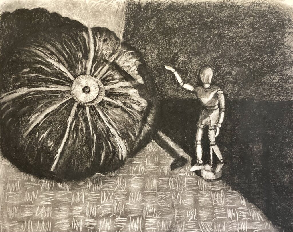
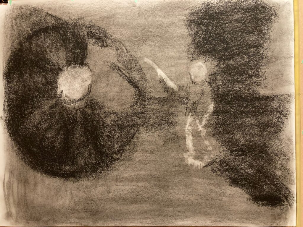
Portfolio Drawing 2: THUMBNAILS. See below. Analysis and discussion follows

THUMBNAIL ANALYSIS: I chose thumbnail 4. It has asymmetric balance in terms of the size of the figures, left being round and right being tall and thin. However, there is approximate horizontal symmetry in the large blocks of light value left, dark value right. — and there is a dark positive space item that emerges from the lighter left half, balanced by a light negative space object emerging from the dark right half. The first three thumbnails treated the light source differently, being filtered through vertical railings that made the figures striped and seemed to make for a confusing presentation. For the fourth thumbnail the angle is altered so the light source sends a single dark shadow cutting across the page, which dramatically changed the importance of the main figures in the still life.
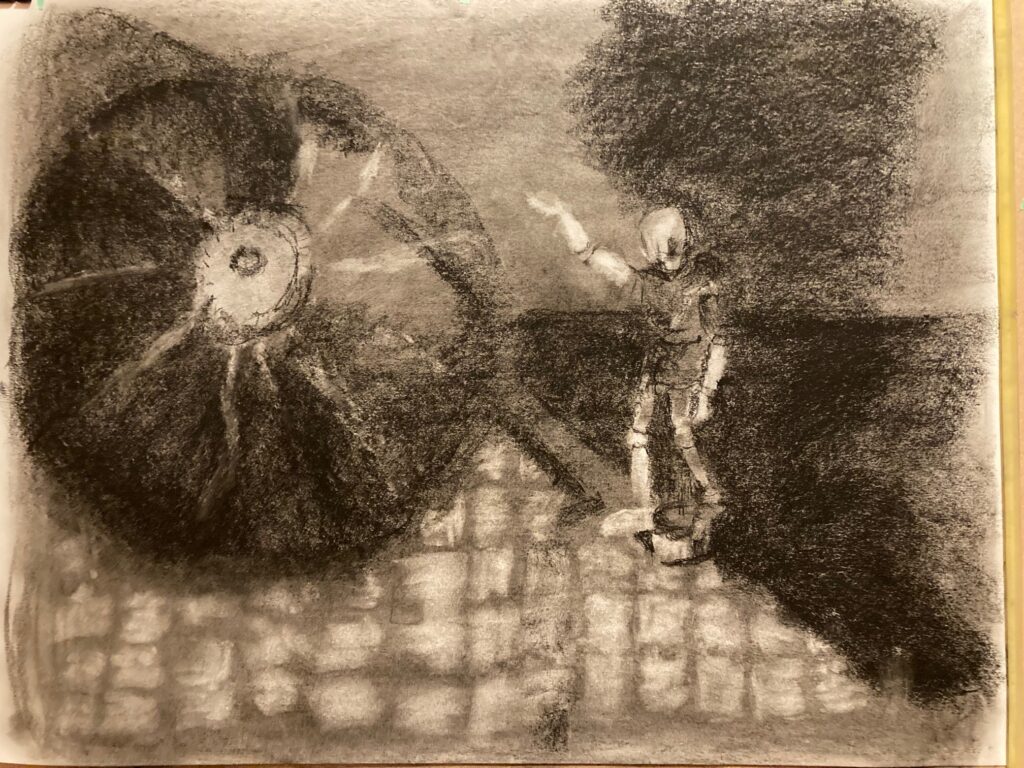
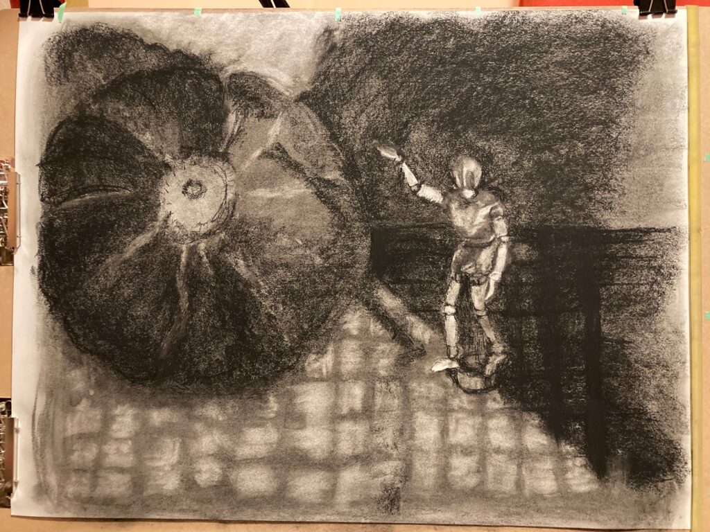
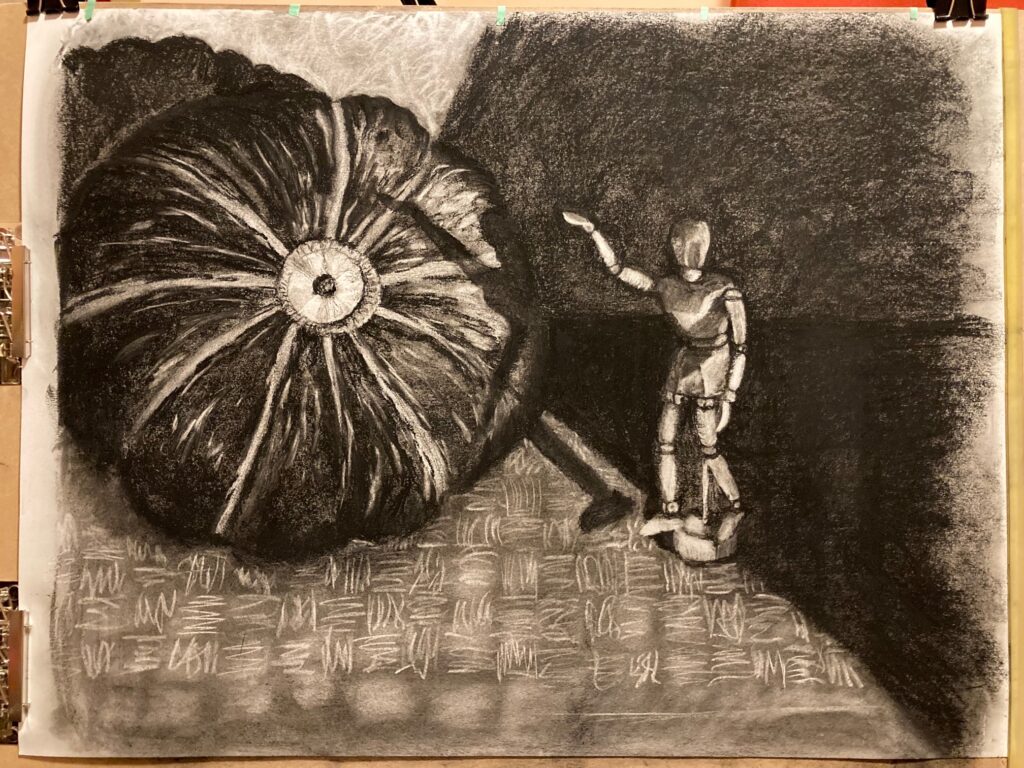
PORTFOLIO DRAWING 2: Work in Progress. See below, 6 images starting with mid-value toned paper (using compressed charcoal), then working from general to specific, refining general value blocks into details as I went.
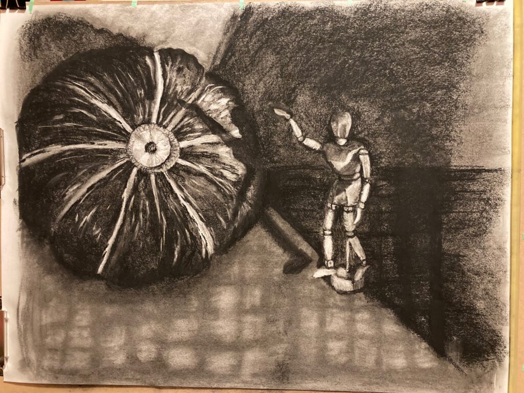
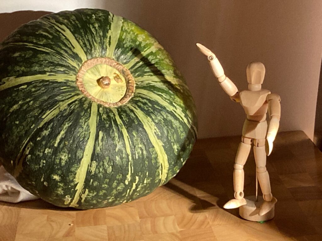
PORTOFLIO DRAWING 2: FINAL See below the final version of the piece. Following that, a photo of the still life for reference.