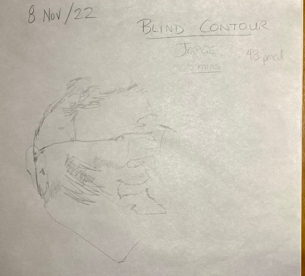
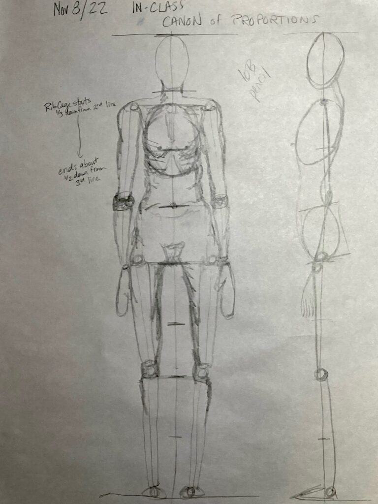
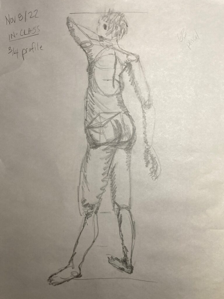
November 8th in-class work:
Figure drawings for canon of proportions, and portrait from live modeling each other
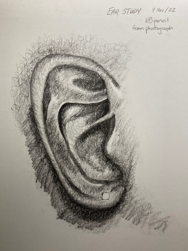
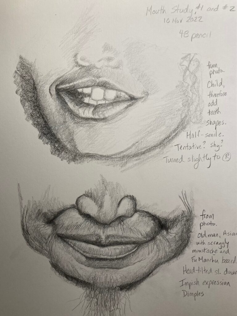
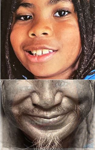
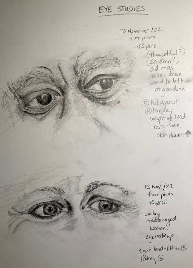
SKETCHBOOK ASSIGNMENT: Seven Studies of Facial Features.
Completed Nov 9 -13 at home. See below — the drawings and the photos they came from
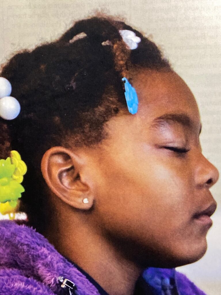
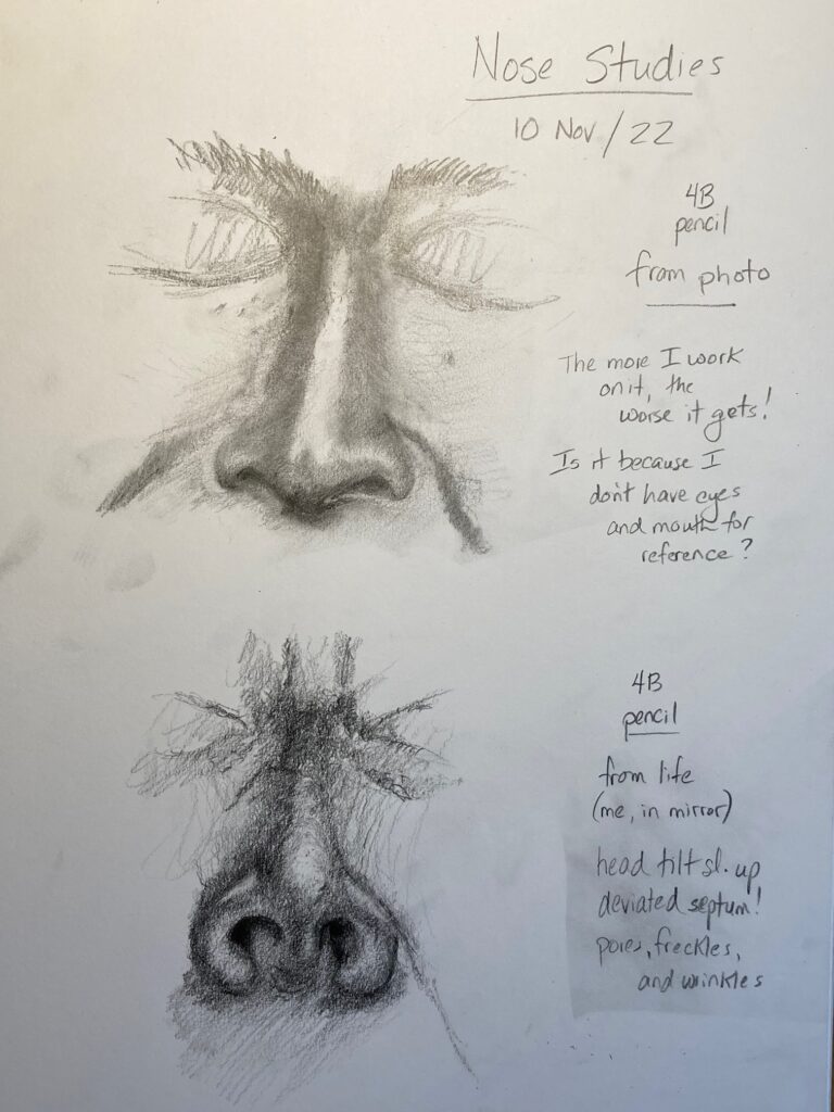
Nose studies Sources: top one from photo. Lower one my own nose in mirror. It seemed to me that noses are harder to render accurately in isolation from other features, compared to eyes, mouth, or ear….
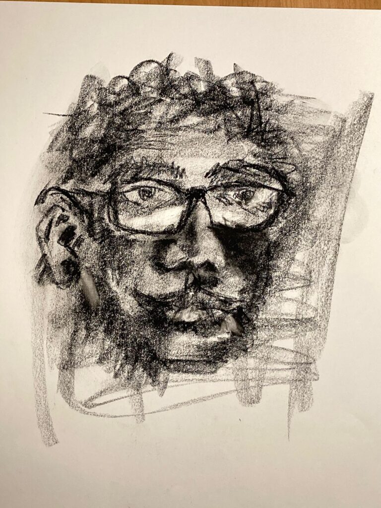
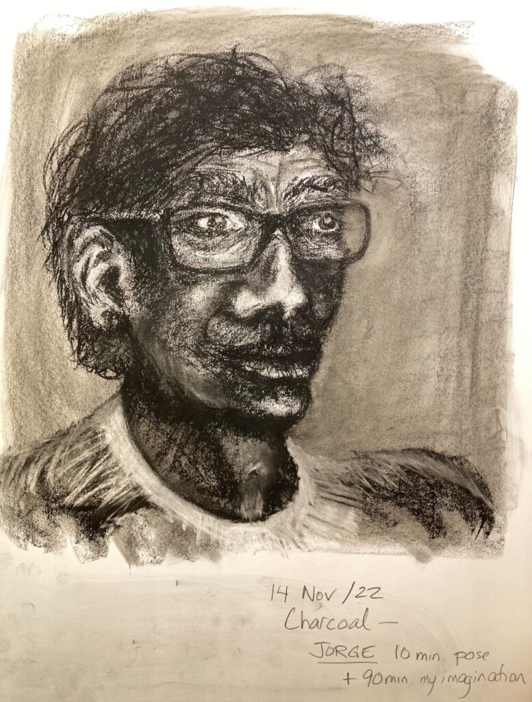
ADDITIONAL HOMEWORK: We were asked to “develop” one of the classroom portraits. I used the 10-minute charcoal study of Jorge, spent another 90 minutes at home with it but found it excruciatingly difficult to create a proportionate, appropriately-shaded face from my imagination rather than having a model or a photo to work from. At any rate… attached below is the result — not very successful!
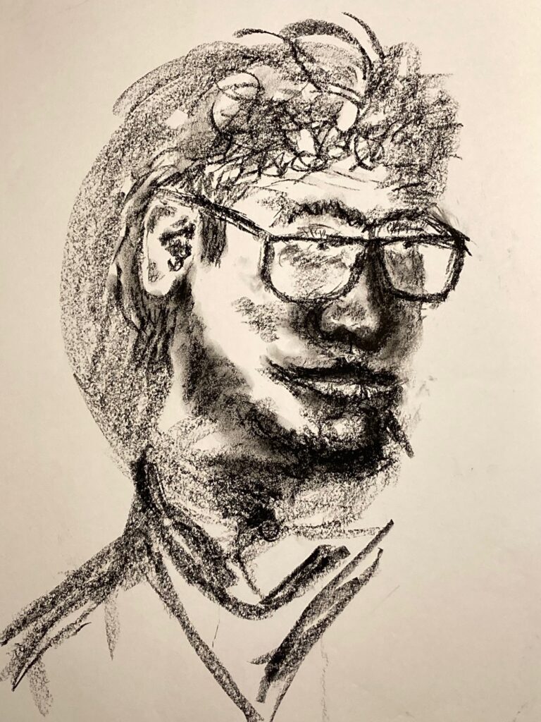
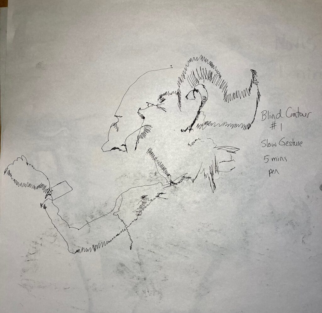
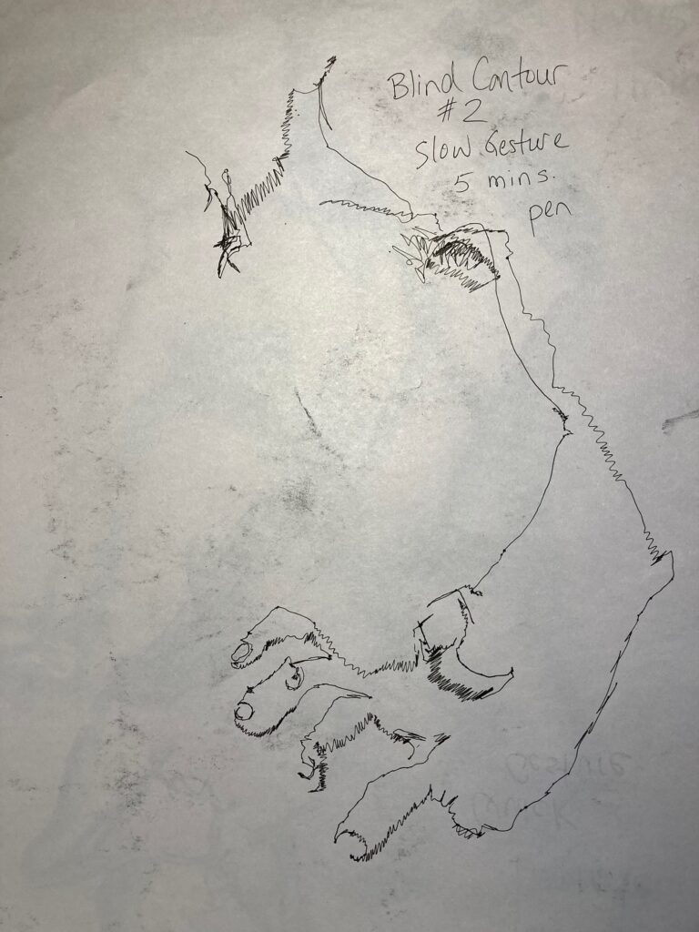
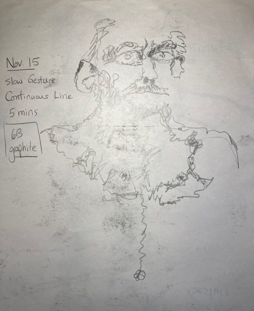
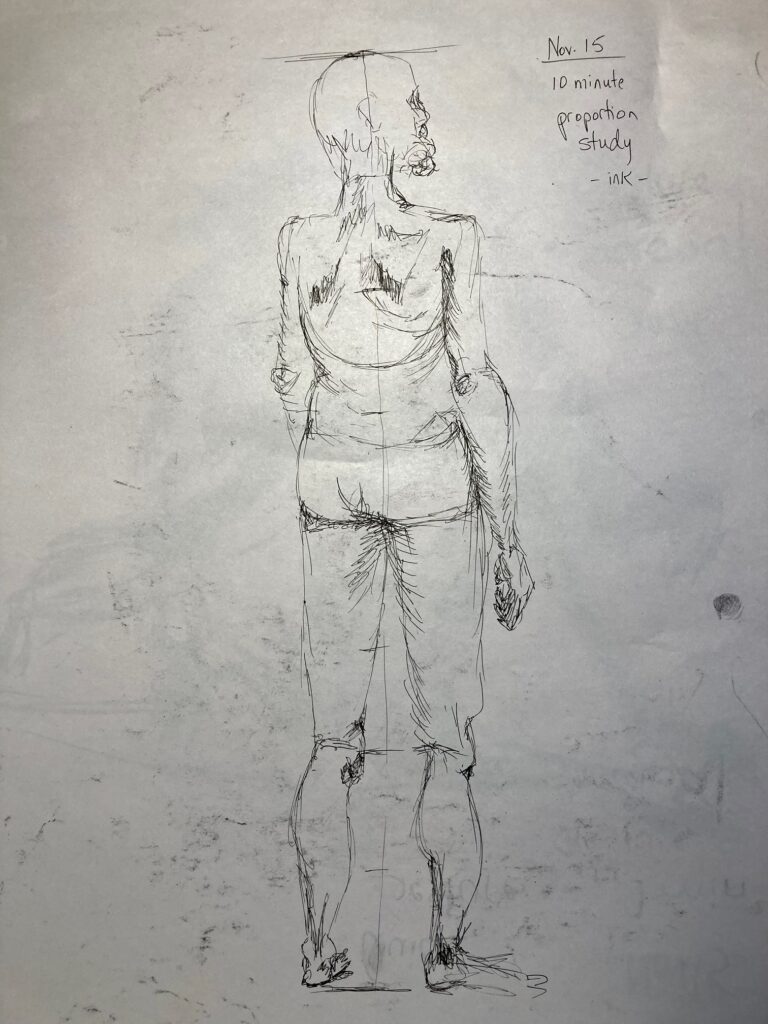
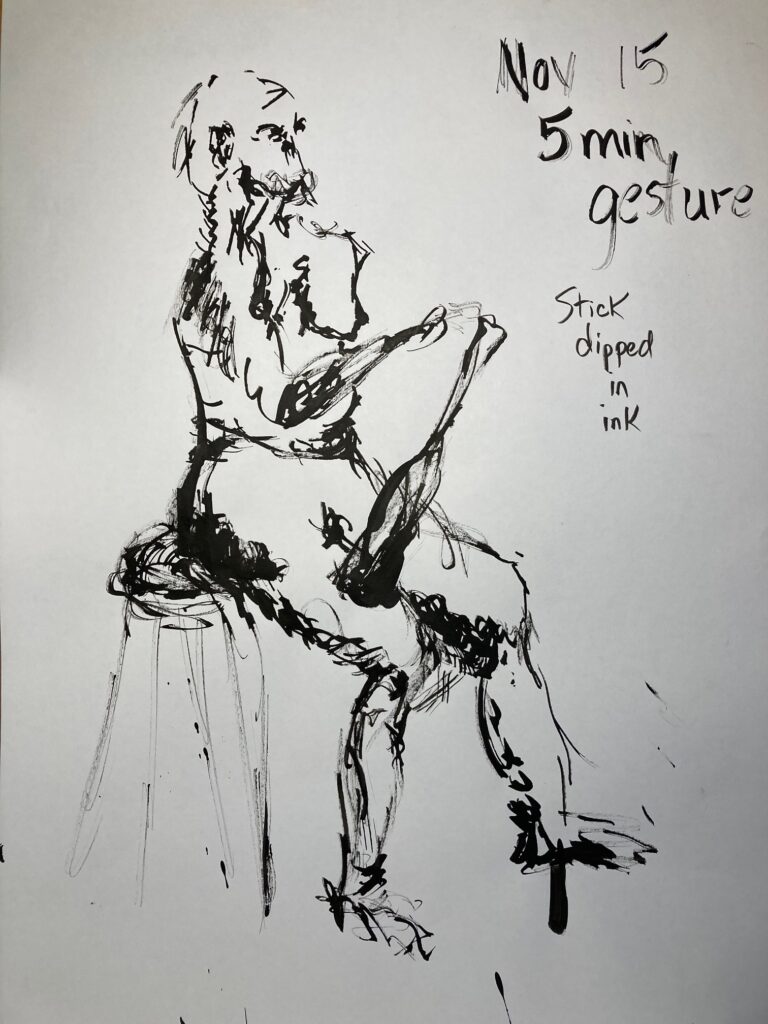
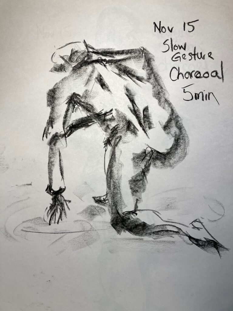
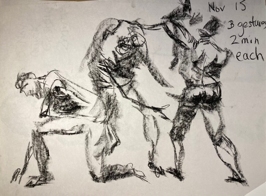
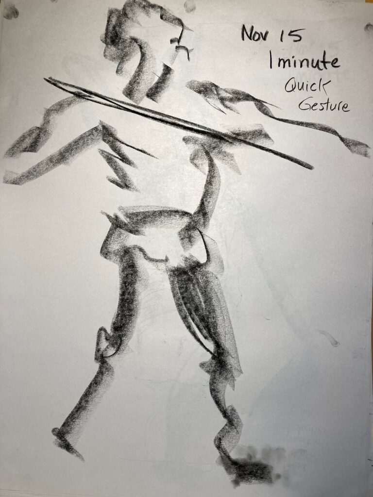
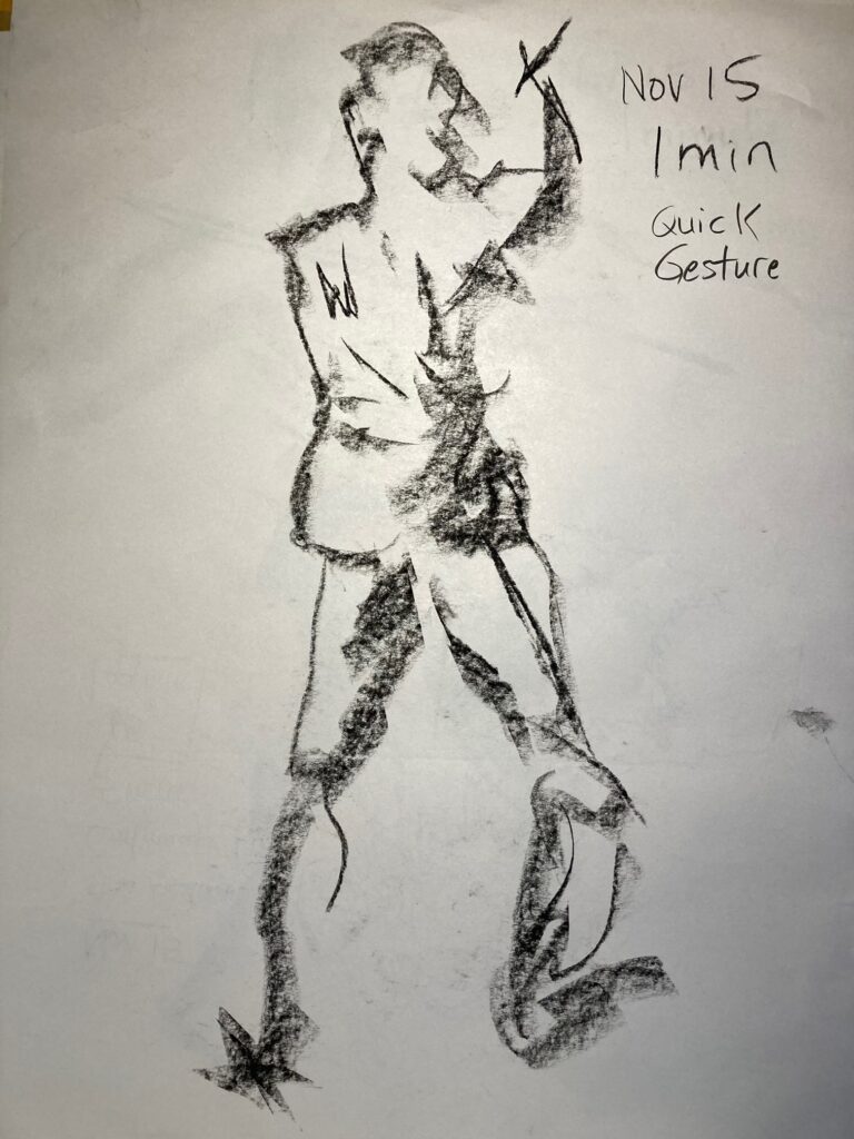
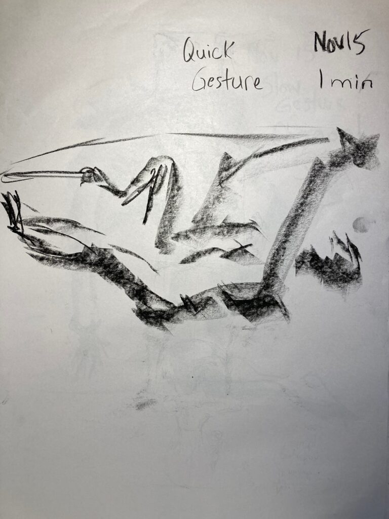
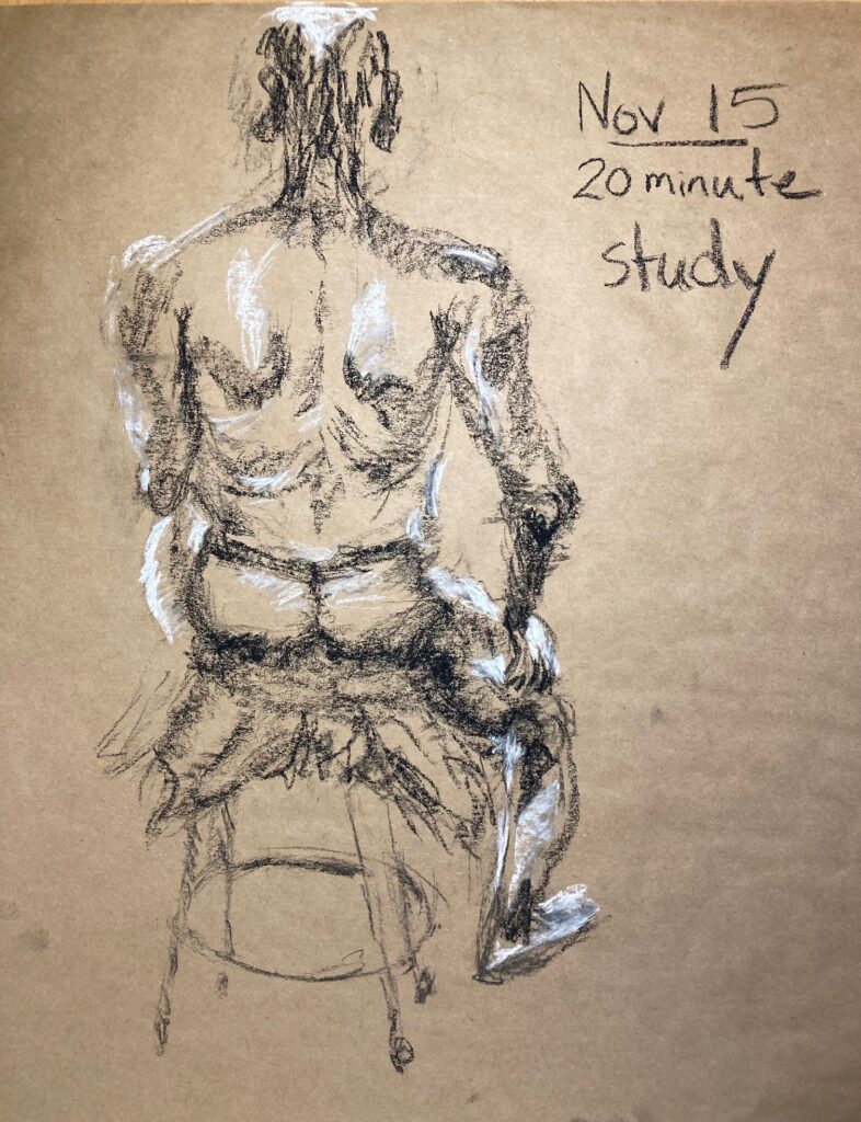
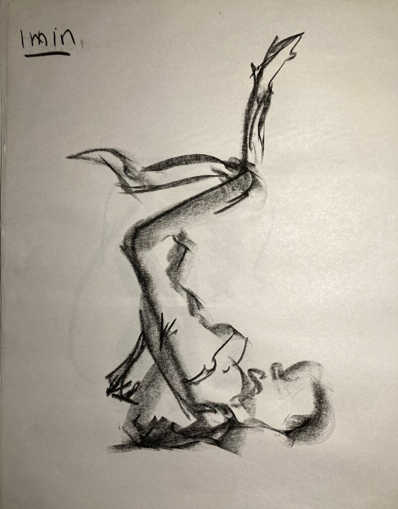
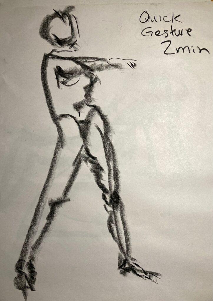
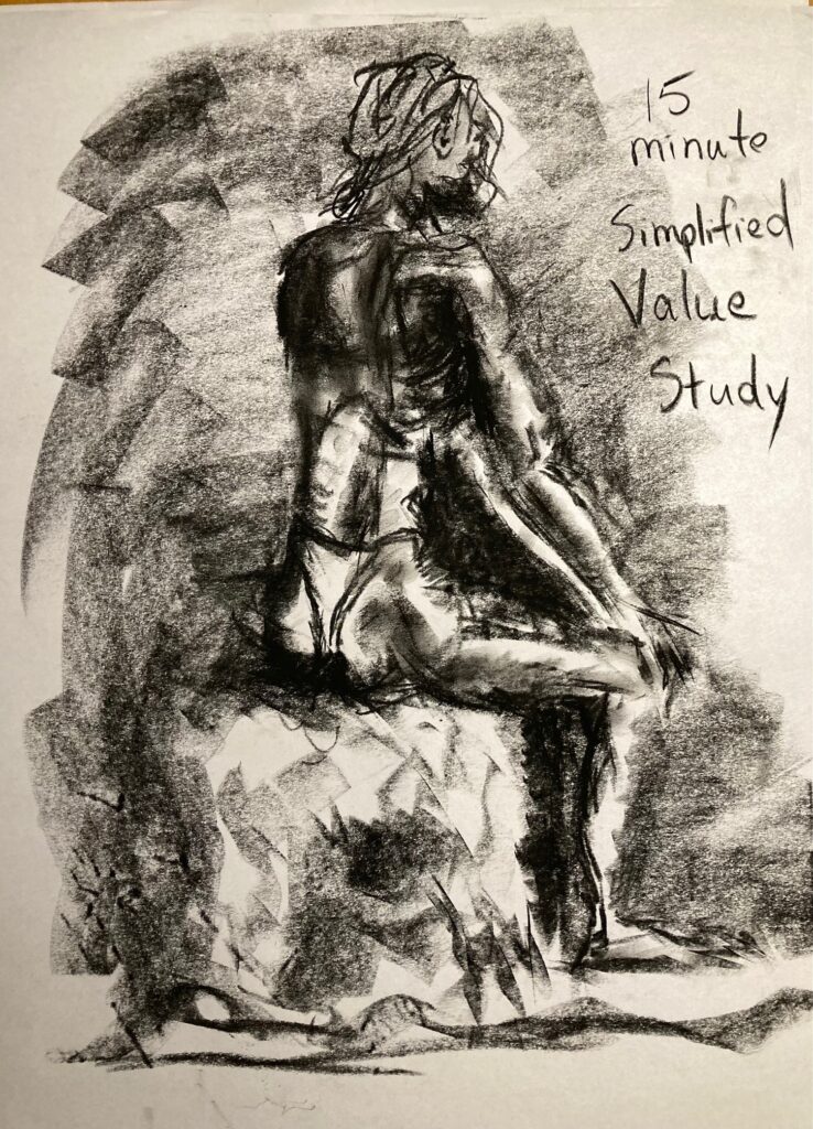
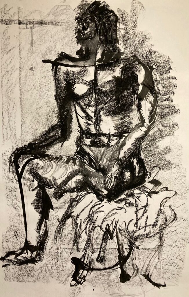
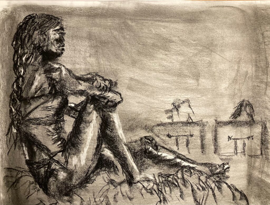
November 15 in-class Life Drawing: see below a selection of slow and quick gesture drawings. Each image captioned with info about media, length of pose, comments
BELOW: Slow Gesture Continuous Line. 6B graphite stick. 5 minutes
ARTIST RESEARCH UNIT 3: David Bailin
I submitted the pdf through Brightspace Assignments on November 22. Also linking here in case more convenient to have all in one place….
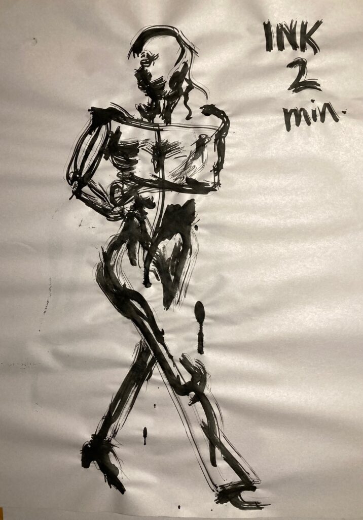
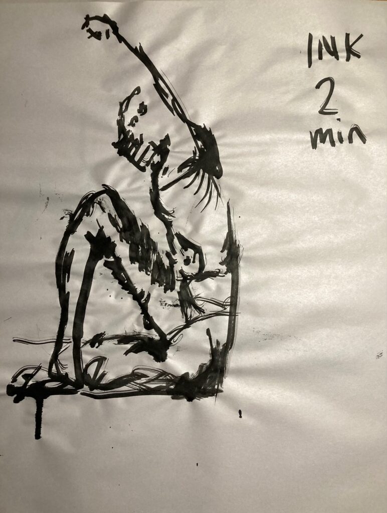
November 22 In Class Life Drawings: See below, captions have some added information about each
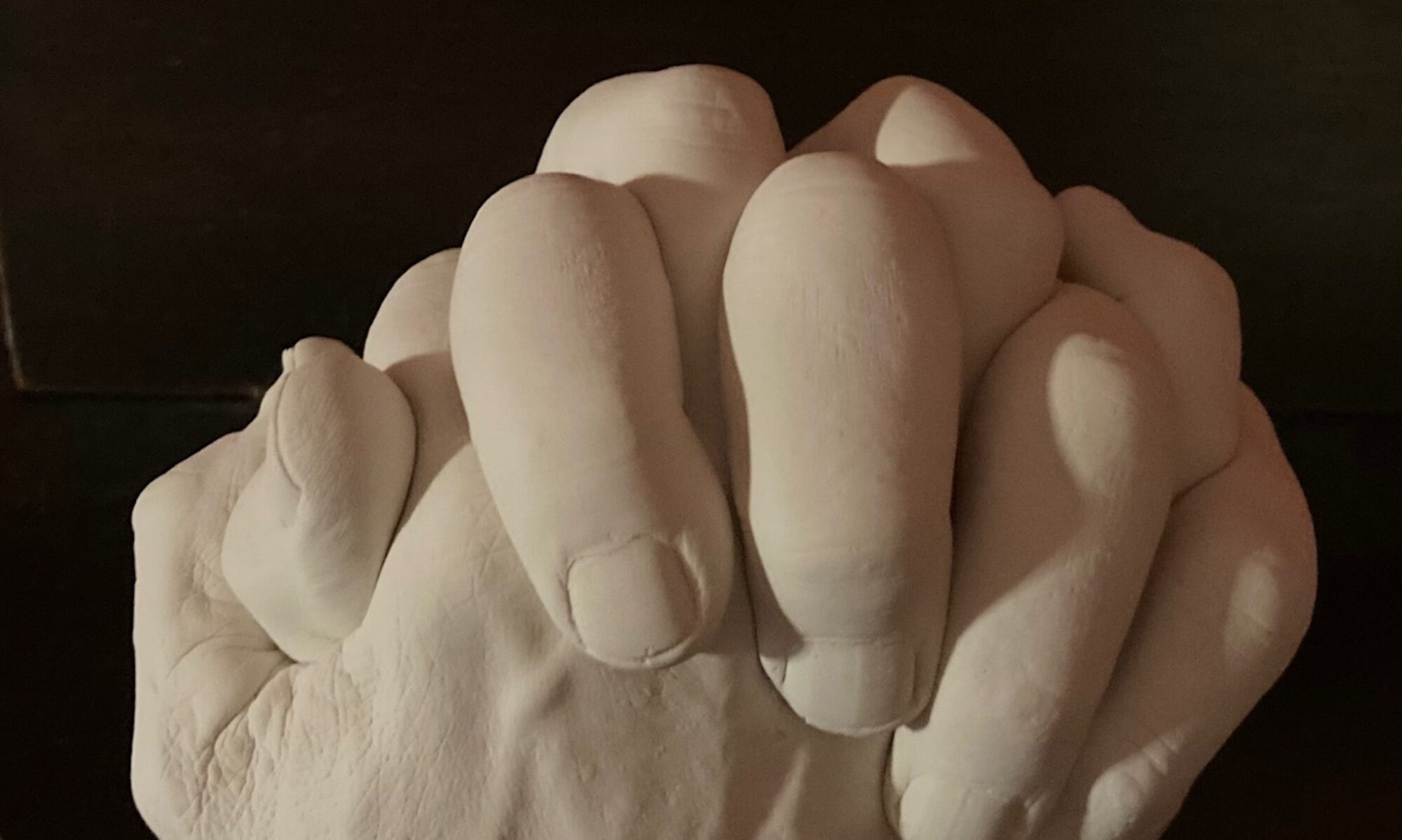
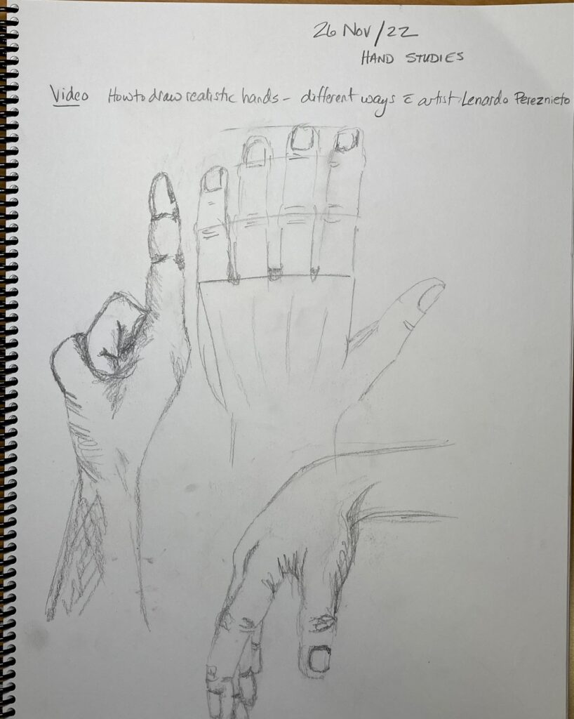
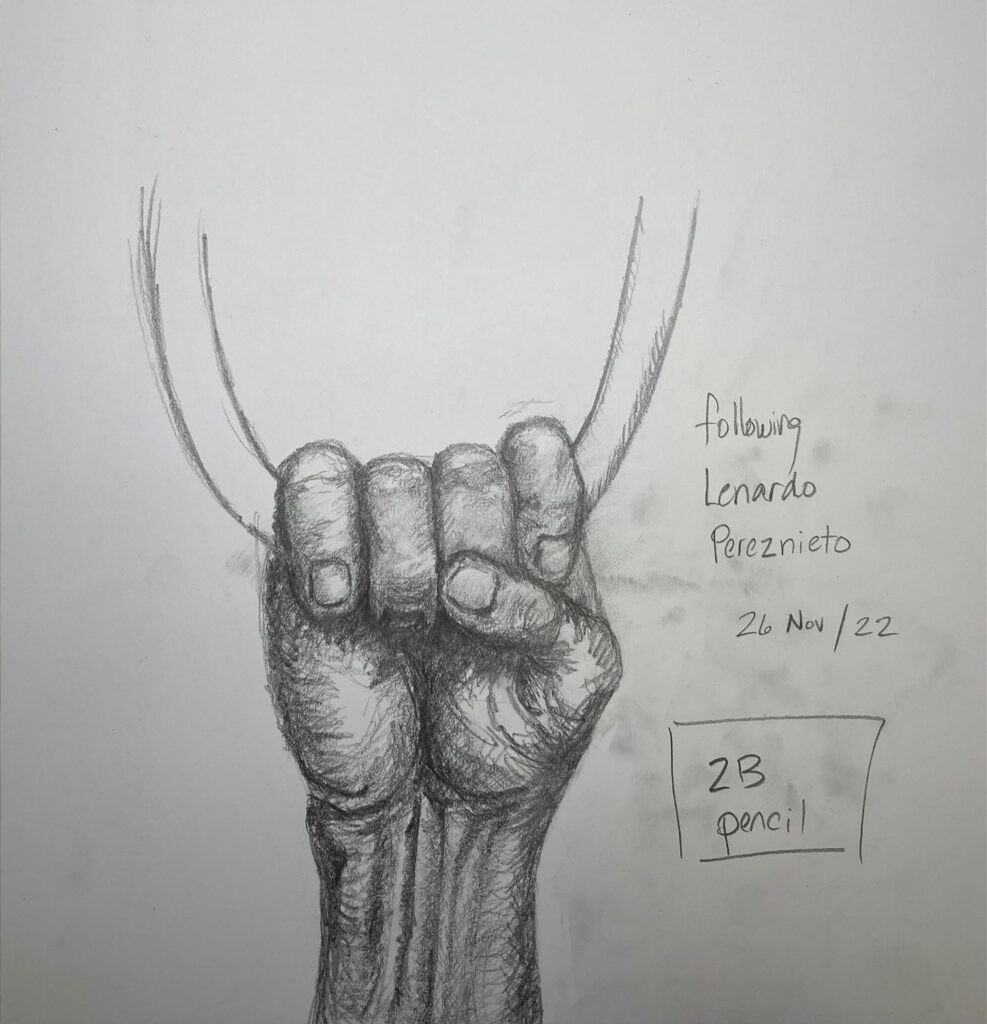
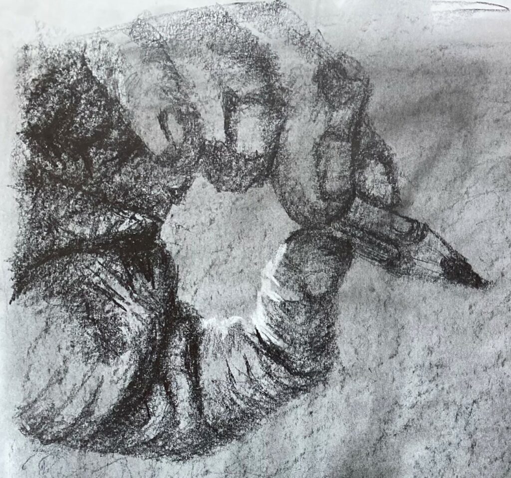
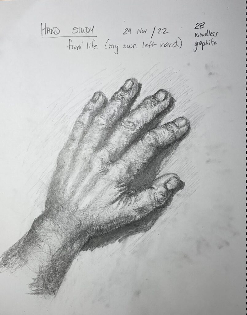
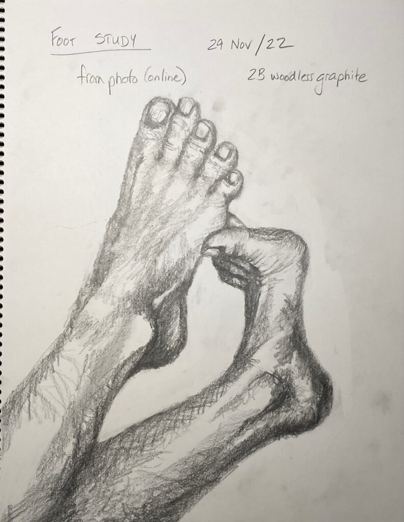
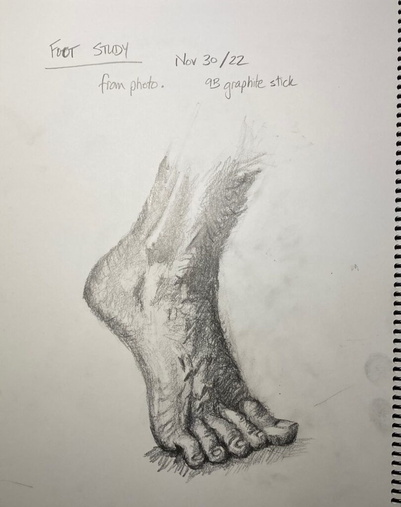
Hands and Feet: Sketchbook Assignment. See below, the exercises from online videos by Leonardo Pereznieto on drawing hands and feet, and additional drawings from life or photos.
SELF-DIRECTED PORTFOLIO DRAWING: Brainstorming.
Idea 1: Vision lost and gained. This started conceptually — wrote down ideas about vision loss (thinking of my Mom currently living with progressive Macular Degeneration, inspired by artist research on David Bailin who addressed his father’s memory loss in his drawings). Also about vision gained (thinking of me, working to learn a new WAY of seeing, to help me draw). See below, written notes and couple of thumbnails.
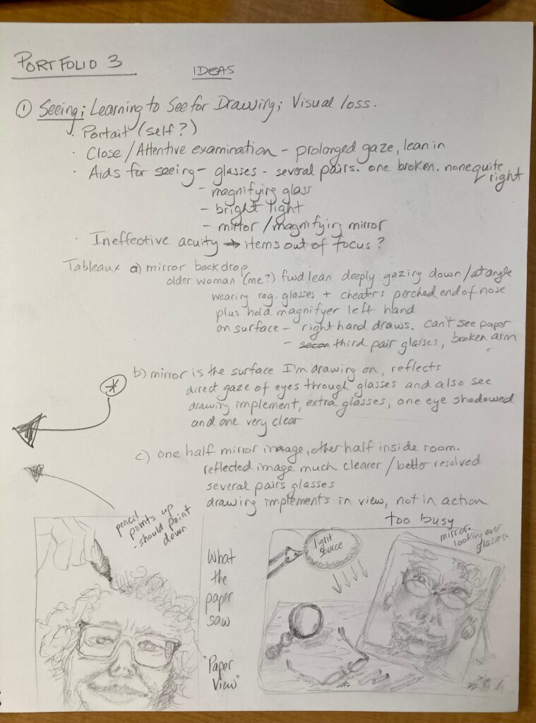
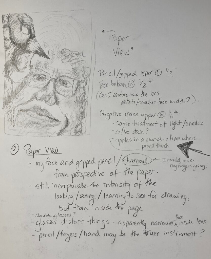
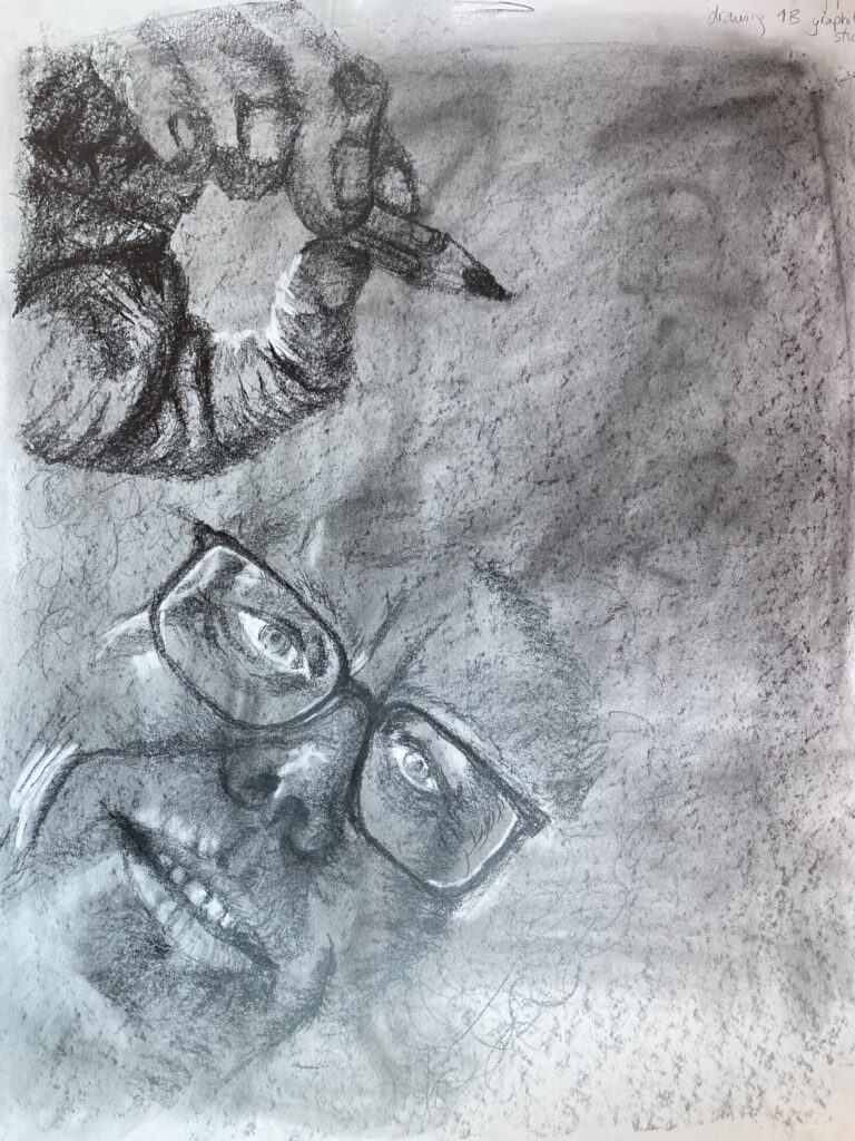
Idea 2: Paper View. The thumbnail I drew for idea 1 got me imagining what the paper was seeing as I leaned over it to draw. Here are a couple of sketchbook pages with penciled thumbnails and a few written notes on this idea:
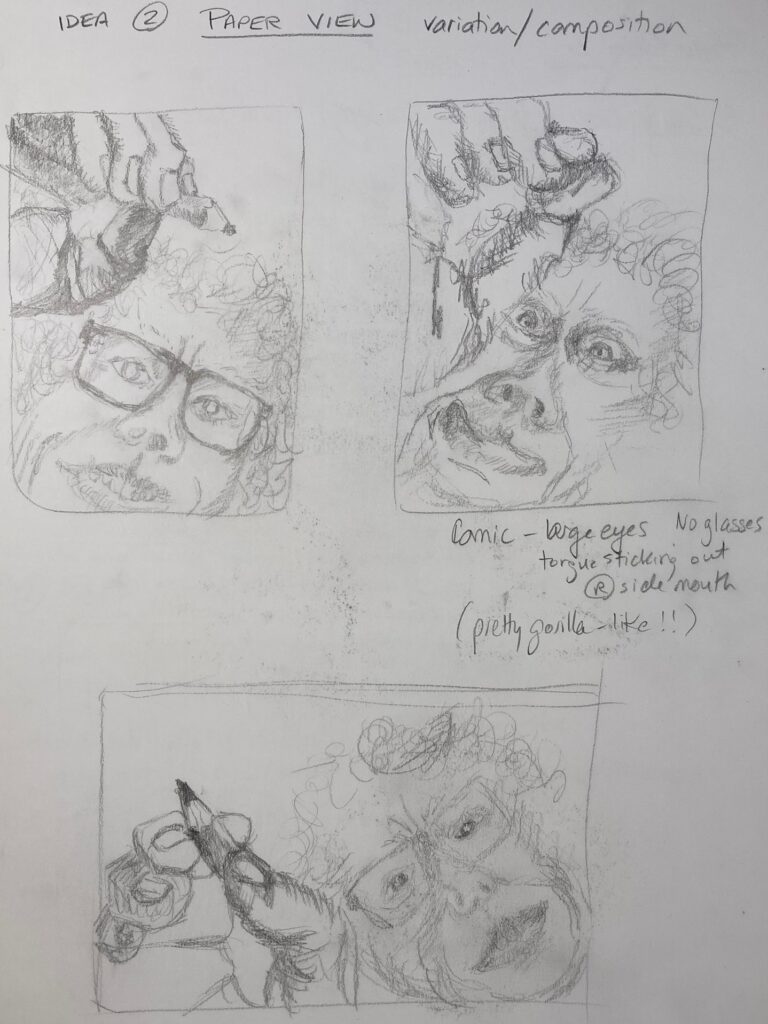
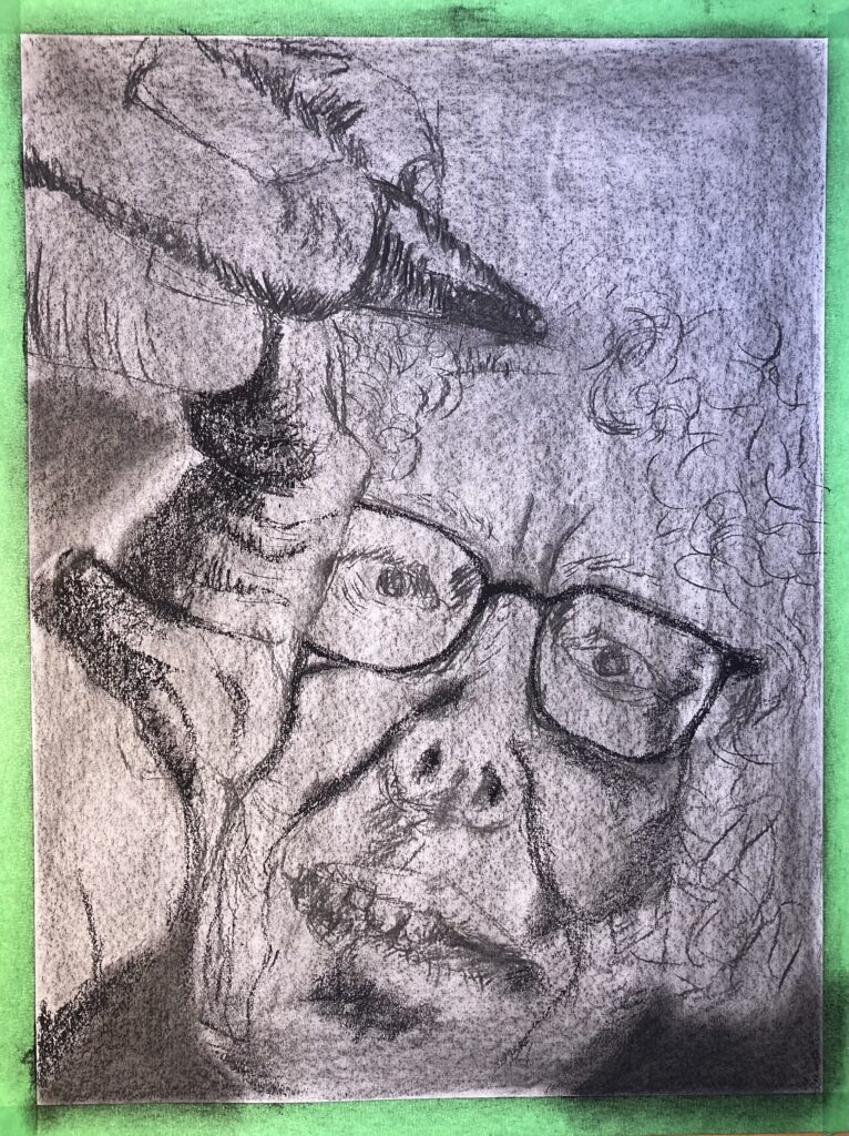
COMPOSITION TRIALS FOR IDEA 2: Landscape versus portrait: hands-down I prefer portrait because it positions the pencil at the apex of the drawing. I’d like the attention of the person in the picture, and the attention of those looking at the work. to be drawn to that point of contact pencil with paper. And I’d like the expression to be one of rapt attention. The idea is that the person is servant to the hand and pencil — in the landscape version, the person and the hand with pencil seem more like equals. Comic versus serene/attentive: the comic one doesn’t resonate with my motivation for the work. I wanted to try it because I found David Bailin’s use of humour really effective, but maybe next time or for a different idea…
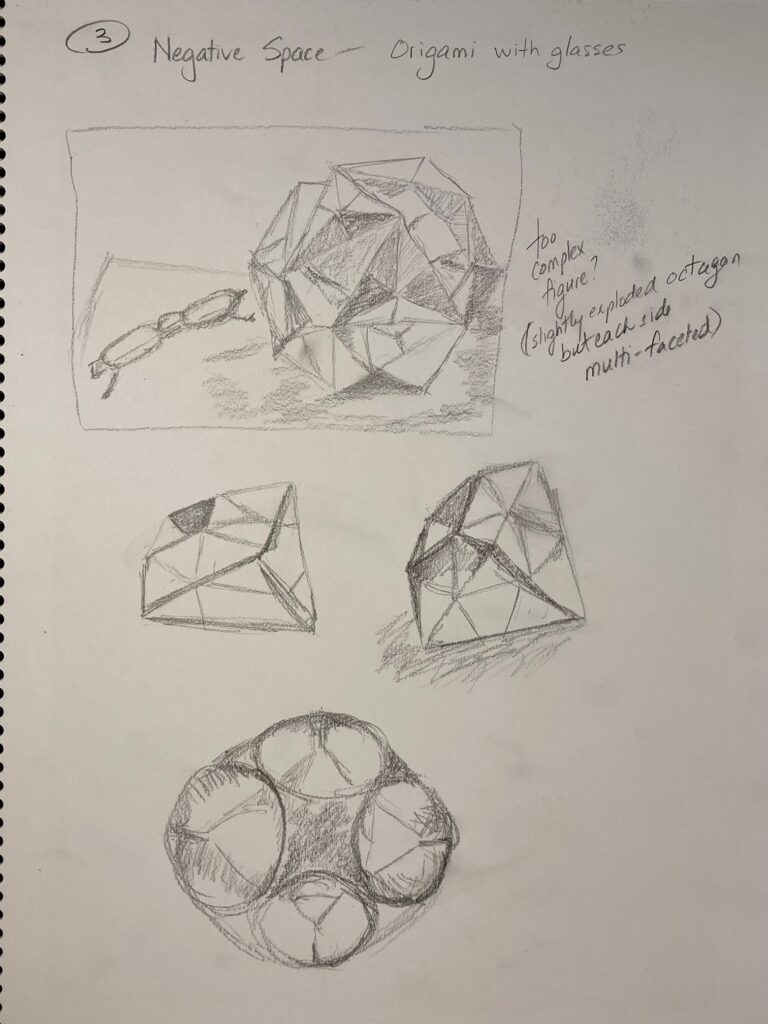
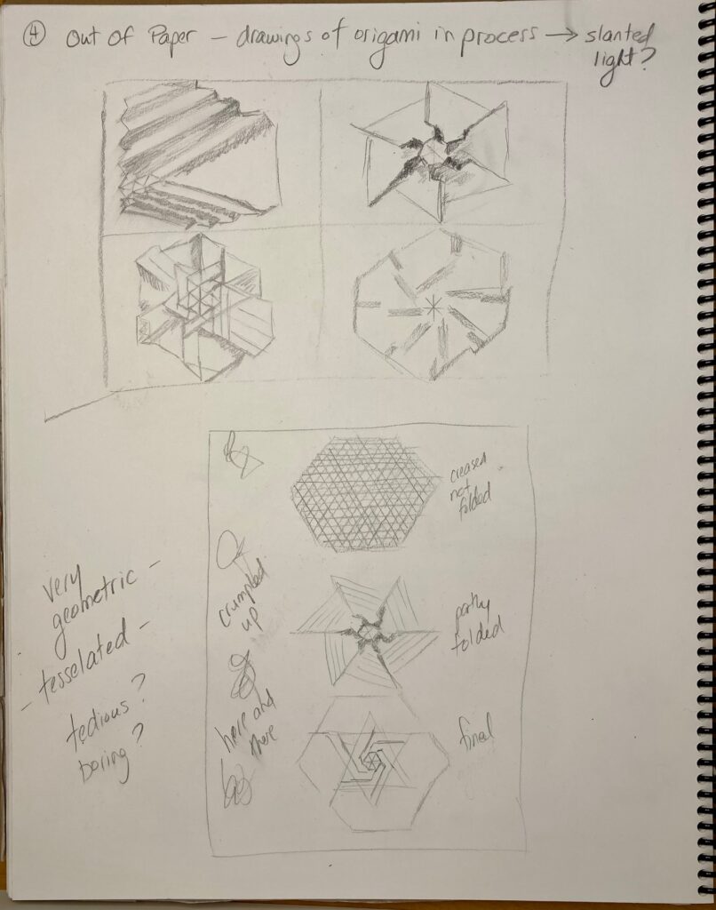
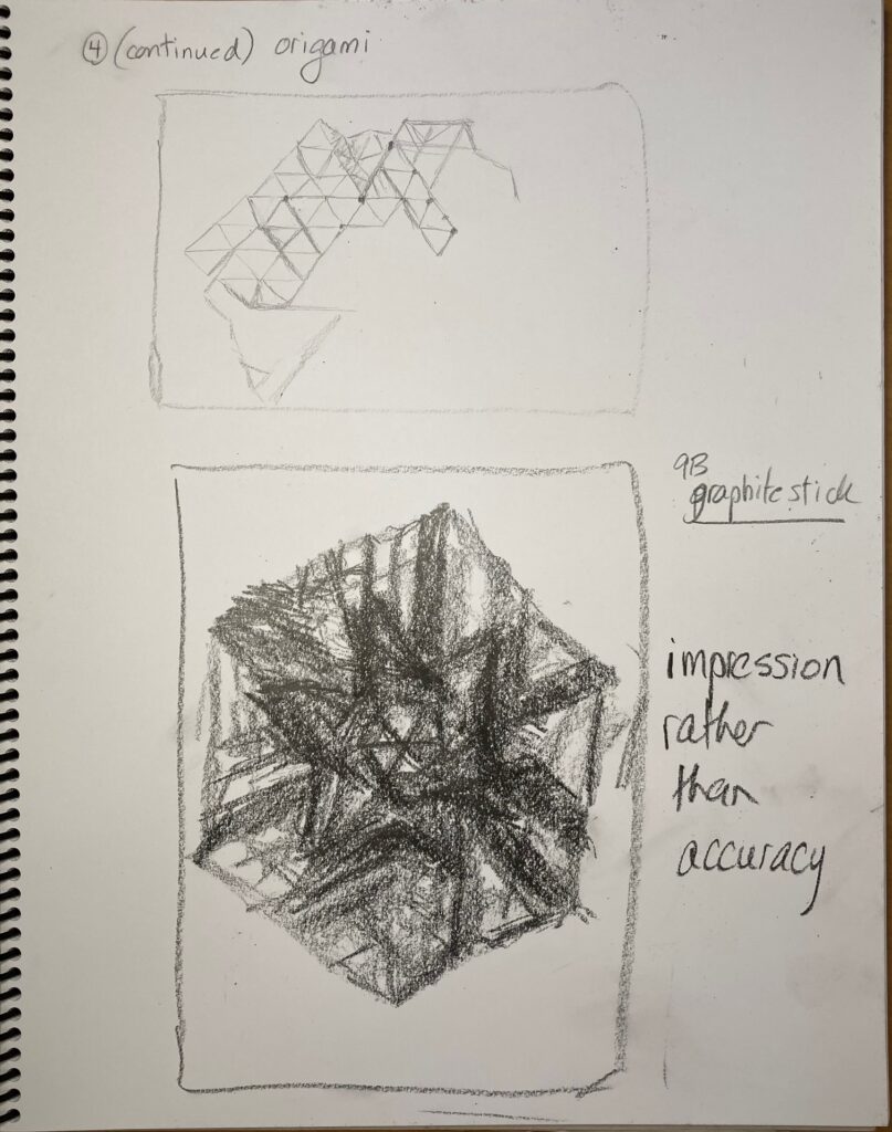
IDEA 3: Out Of Paper. I have a lot of origami, geometric shapes mostly, around my office. I’m attracted to the idea of drawing them, trying to capture their 3-D complicated selves, with all their interior space trapped inside the paper I folded them from. SO I just started drawing ideas – tried completed shapes, then shapes in the process of being folded, then started a very technical version then an impressionistic version — but really stumbled on the limits of my patience and my technique to enact these exactly geometric figures with all the perspective issues. Something to return to when I have more time / patience / skills??
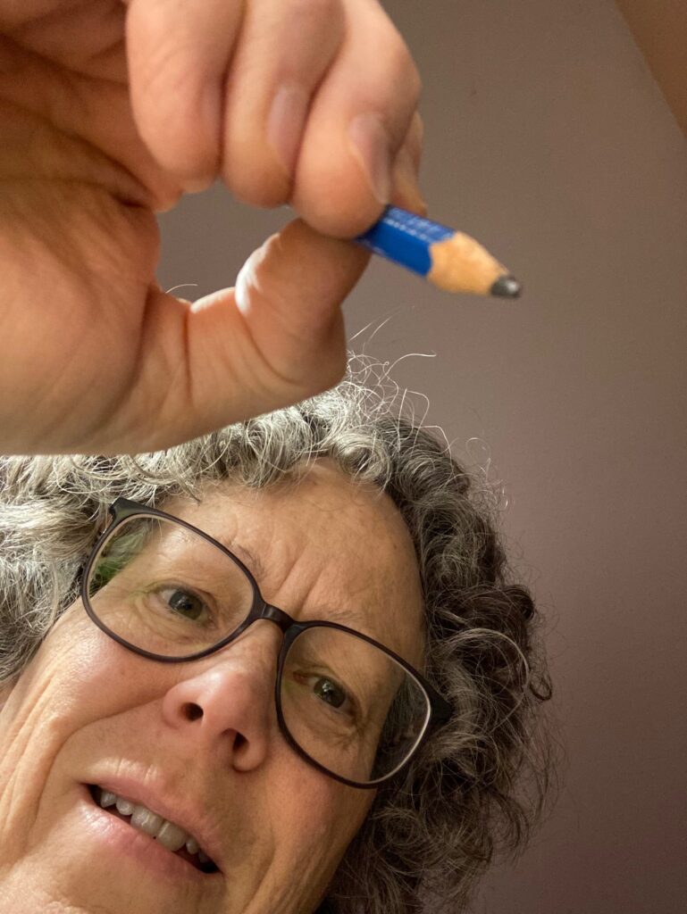
NEXT STEPS — I am most interested in Idea 2. Consult with Linda on Nov 22: not sure how to deal with mirror images, which is what I need to draw from if using my face and my hand as the model. The right/left-handed thing is tricky. And I’m not sure how to capture consistent lighting. Photograph like the one below could be a lighting aide —
FURTHER NOTES: November 26. Discussed with Linda in class Nov 22. Okay to use mirror for self-portrait and to use photos to capture consistent lighting of hand/face. Considerations from her — what proportion of drawing is negative space? How treat the negative space?
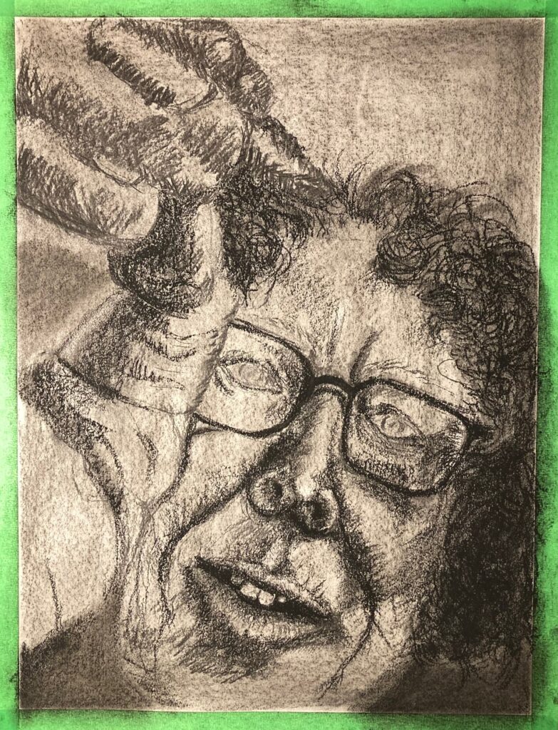
See Below: two larger-format trials: one in graphite (9B stick on paper toned with 6B dust) and one on paper toned with compressed charcoal, initial marks by willow charcoal to get proportions right, and starting to add some darker marks with compressed charcoal. See notes on composition with each.
DOCUMENTING PROGRESS — Nov 26 through Dec 6th: see below
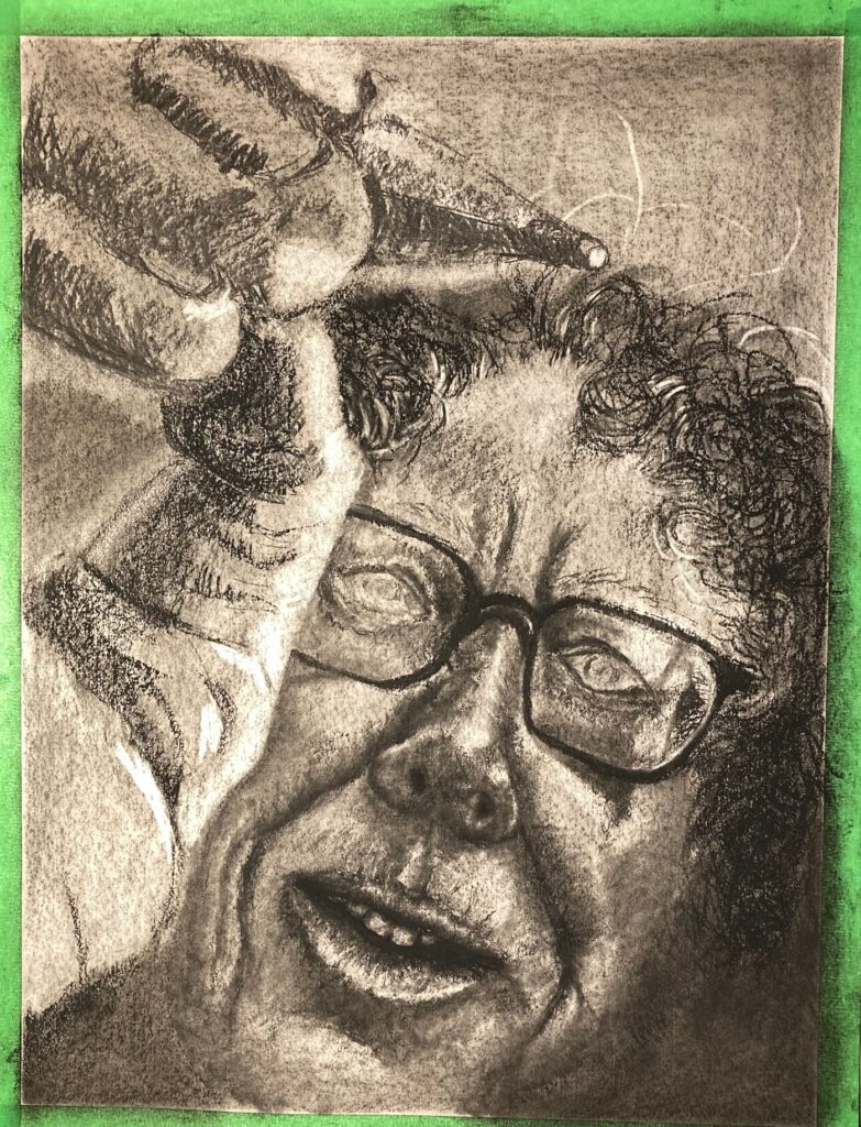
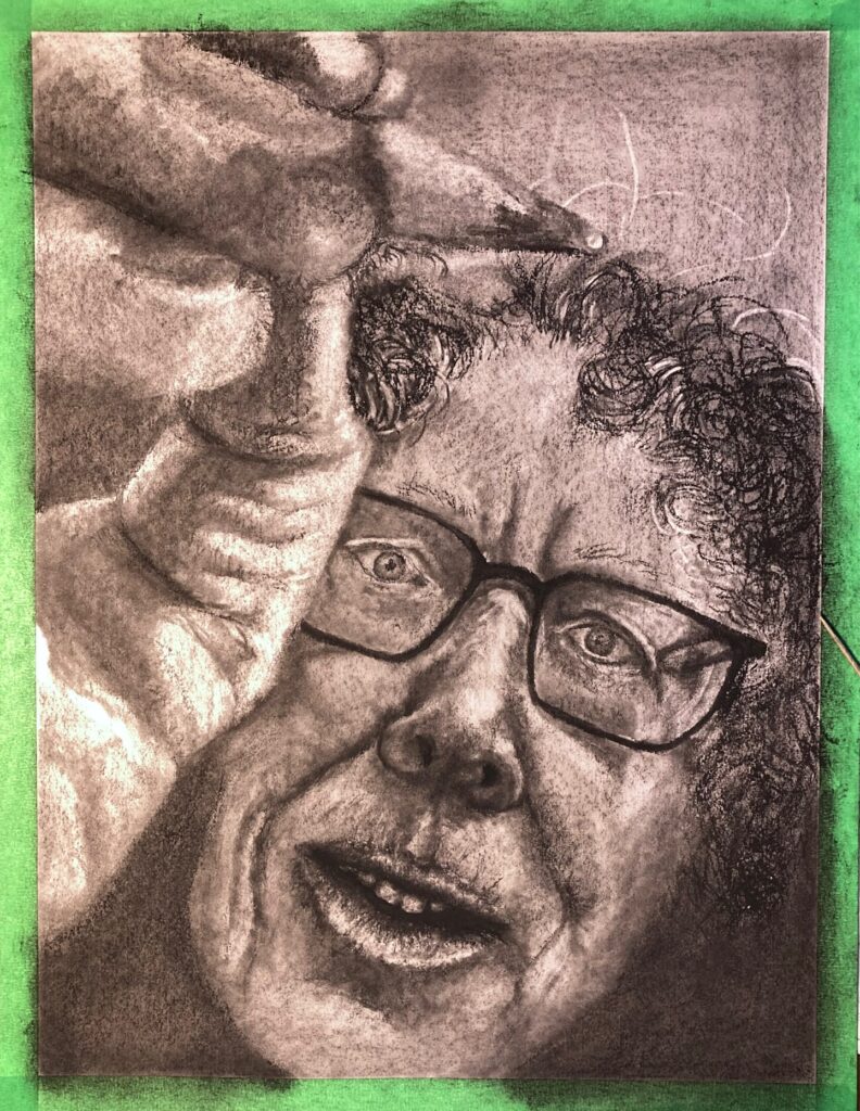
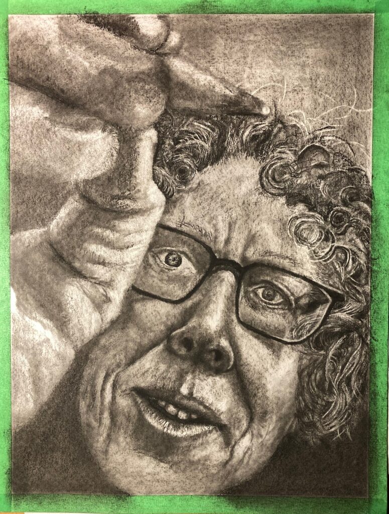
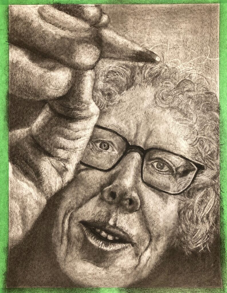
NOTES ON FINAL IMAGE (prior to in-class critique): So much different with the green tape removed from the edges!! This was taken in natural light instead of my LED-lit office space. I like it better. Facial features — i think eyes and mouth are a little too small. The eyes are distorted somewhat (made smaller) by the glasses but should still have taken more space on the page, I think. Will be interesting to see what emotional tone people feel from the work…