In-Class Model Studies October 25: Primary Colours


In-Class Model Studies November 1: Secondary Colours


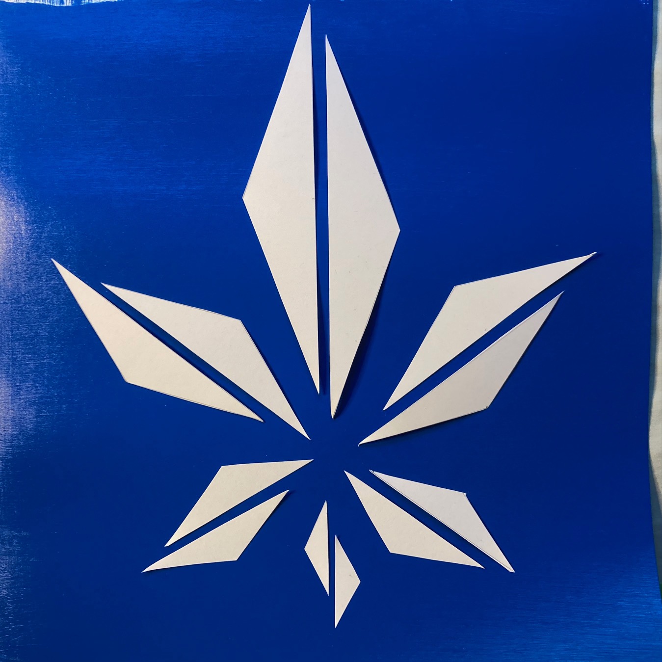
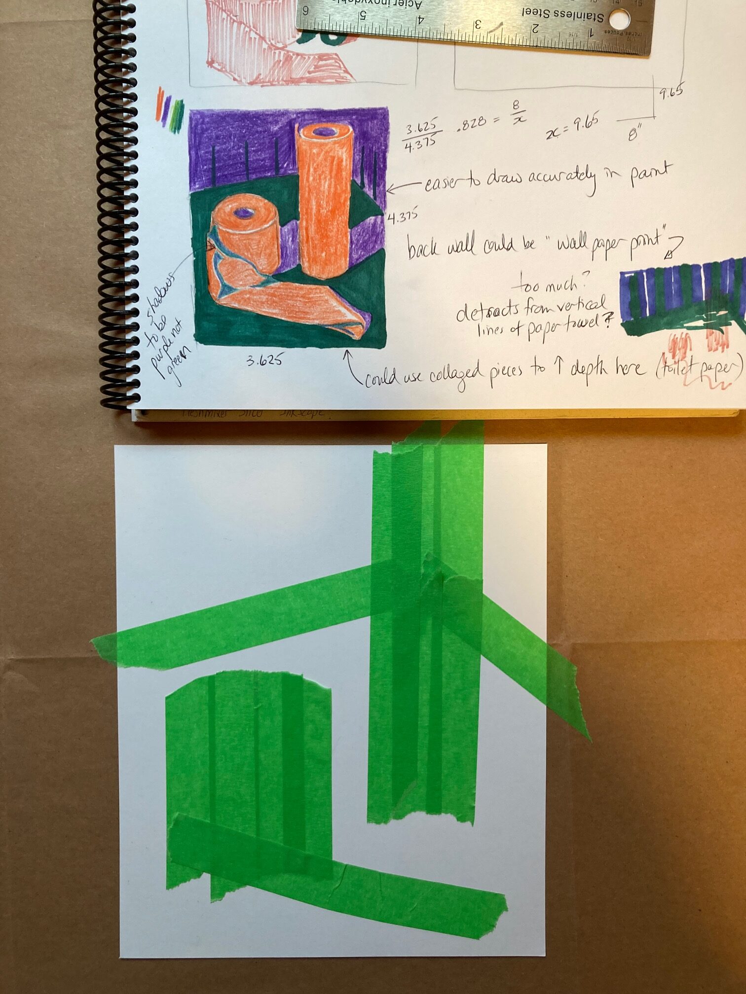
Assignment A: Colour Wheel


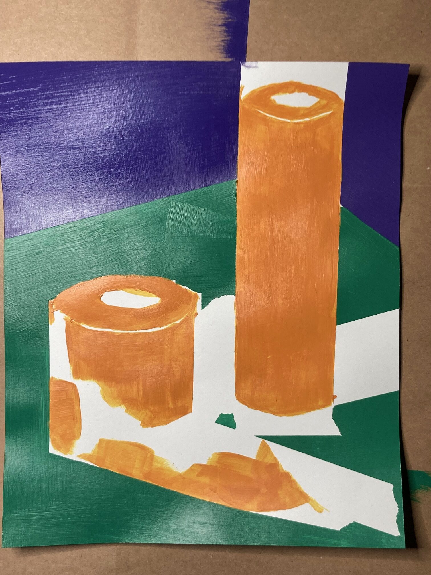
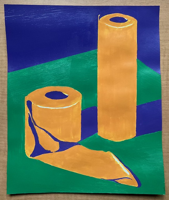
Assignment B1: Primary Colours, Symmetrical Composition


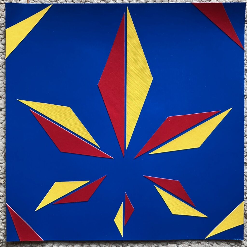
but also… I had an extra blue-painted background square and leftover scraps of yellow and red, so I set a challenge to work with the existing scraps, no further shaping allowed, to see if I could imply symmetrical shapes. Worked quickly, maybe 30 minutes, compared to the several hours spent on the version above…
Discussion in class — these pieces are not symmetric — I misunderstood the concept. I had thought they needed to be right/left mirror images, and I had intentionally stretched that concept by sliding the half-diamond shapes against each other and adding slightly asymmetric corner triangles, intending to create more movement in the piece. From the peer review and instructor feedback, I’ve learned that the top and bottom symmetry of the piece is also a factor. Although, on reviewing some of the student examples, I find some of them to have quite different weight top and bottom halves — so, something for further discussion…
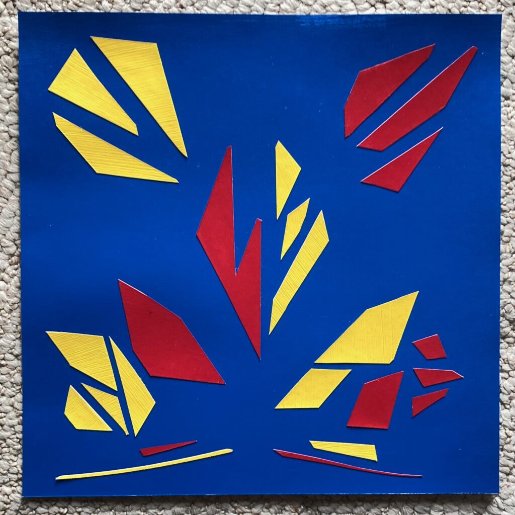
Assignment B2: Secondary Colours, Asymmetric Composition


Assignment B3: Tertiary colours, Movement
Starting point blue-violet ground with blue-green sky. The other tertiaries seemed to map on to the colours of the northern lights, did some looking around online and found the image of a church in Finland backed by mountain shapes and northern lights. Played around with how to make the movement of the northern lights visible, ending up with a generally diagonal pattern plus some offshoots. Then decided to experiment with foreground people and background moon. Captured several of these steps in the process below…

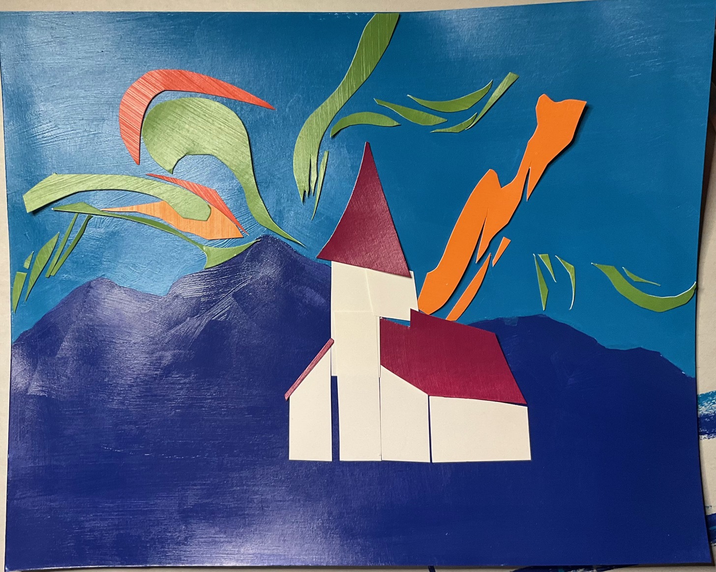


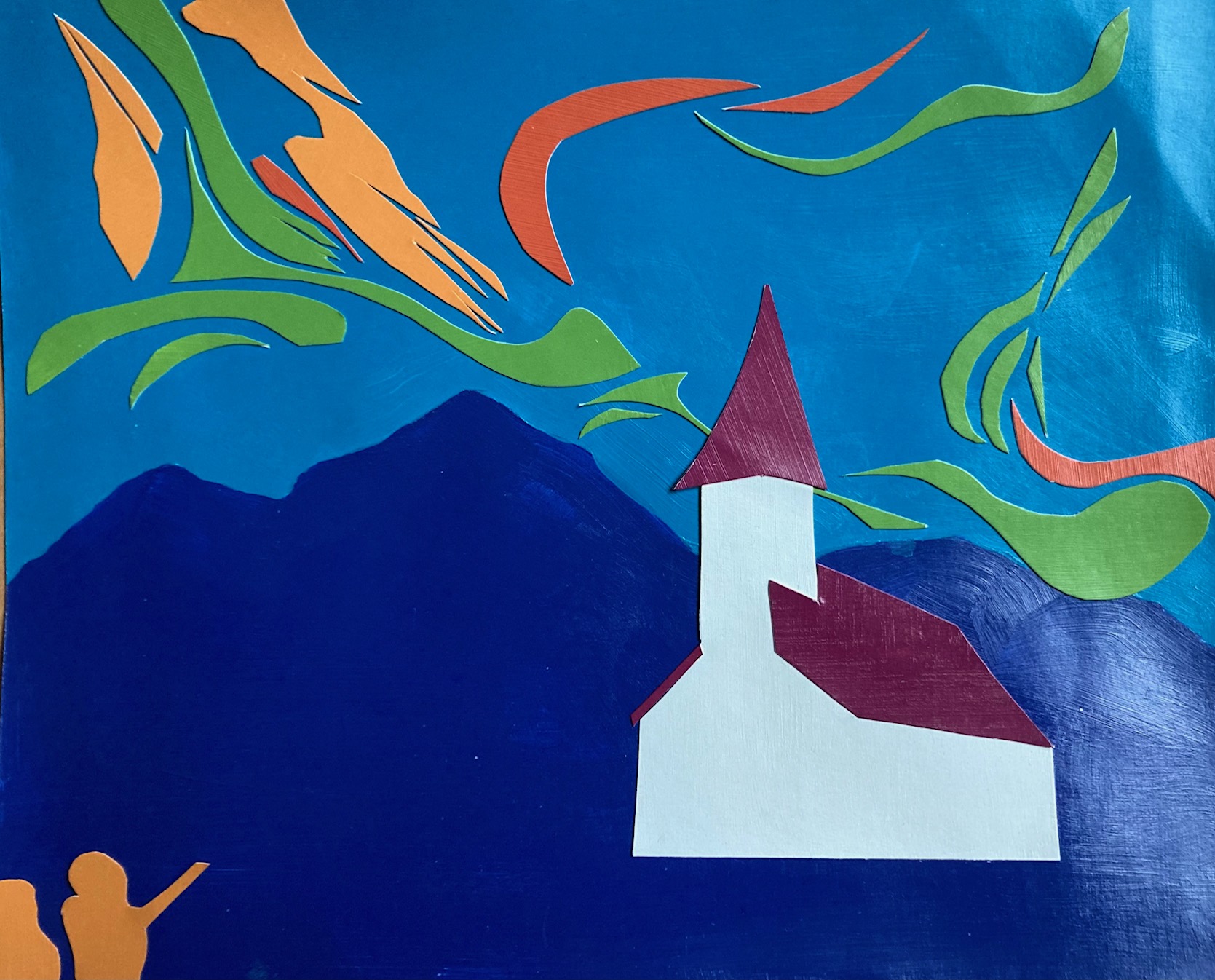

Reflections — the initial church is more quirky and pleasing, with the gaps between white scraps giving it some defining architectural lines, but too late to change as I cut and glued down the single shape of painted white. Still not sure about the moon (taped in place above), though I think I like it. Will decide then take the whole thing to the informal critique, get some thoughts from others…
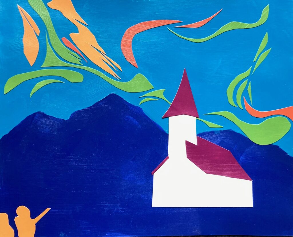
Final version, above. Took this one to class, deciding to leave off the quarter moon. Good discussion in class about composition – positives for the quality of colours, feeling of movement across the sky (people saw northern lights, clouds, the wind), the perspective in the church, the way the blue-violet reads as mountains and foreground. Some discussion about the people – they work. But would have worked without them too.