See three different pages for Unit 2. The first is Artist Analysis, the second is List Paintings, and the third is Model Studies.
Artist Style Analysis: We were provided with 45 images, all from different artists, and asked to select and further research two of them. I chose Ann Craven and Eleanor Ray, both painting landscapes. Here is the PDF with style analyses completed:
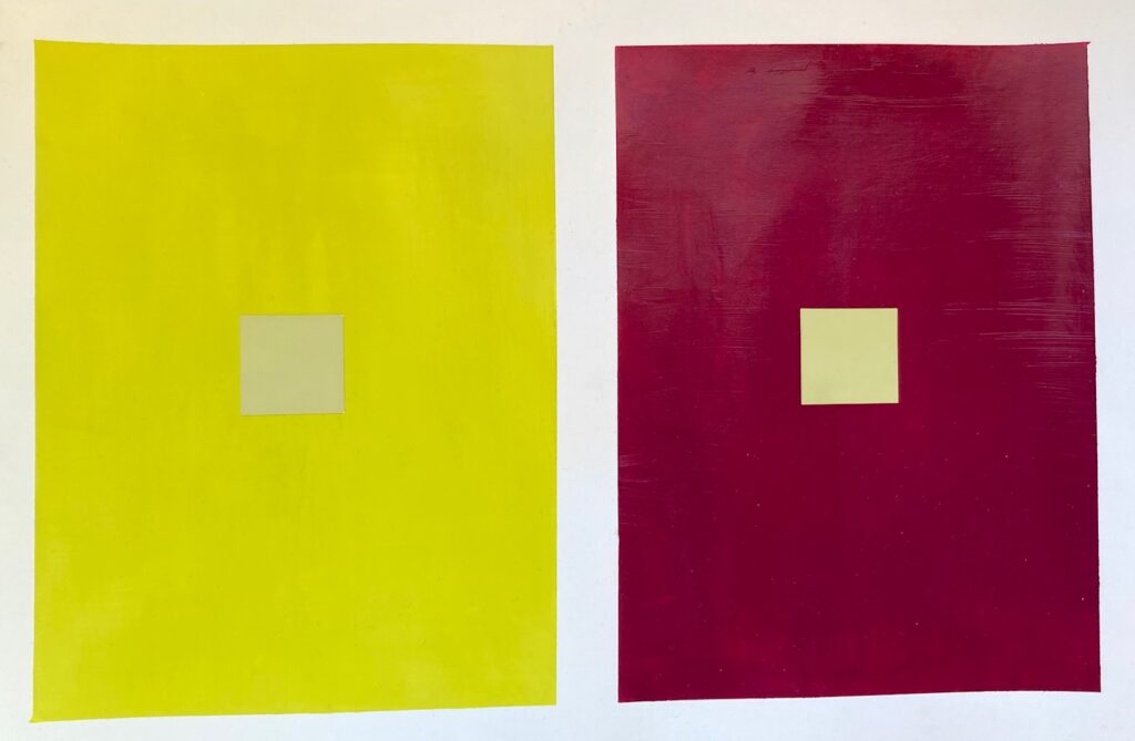
COLOUR INTERACTIONS: Digital The first week we generated digital versions of Josef Albers’ Interactions of Colour trick: Make two fields of colour and apply a small area of a third colour in each field, with the aim of getting that third colour to look like a different hue in each context. Here are my four trial runs at it…
COLOUR INTERACTIONS: Painted. Four small painting projects this week. First, make a painted copy of the one of the digital studies of last week. Then, a second version of that study with some added colour bars/swatches to further push the illusion of a change in hue. The next two exercises worked with simulated transparencies, in which shapes of different colours are painted on a page such that they overlapped. The overlapping portions are painted with a hue that is a mixture of the two parents, experimenting with the proportions in the mix to get the best illusion of transparency. I think I repainted each overlap zone at least twice, and in one case 6 times, to get a colour that seemed to work! The final exercise was meant to include repeated shapes that shifted in their degree of “transparency” across the page.
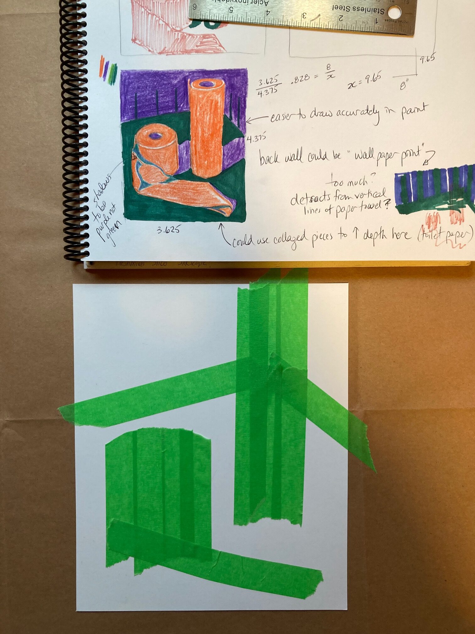
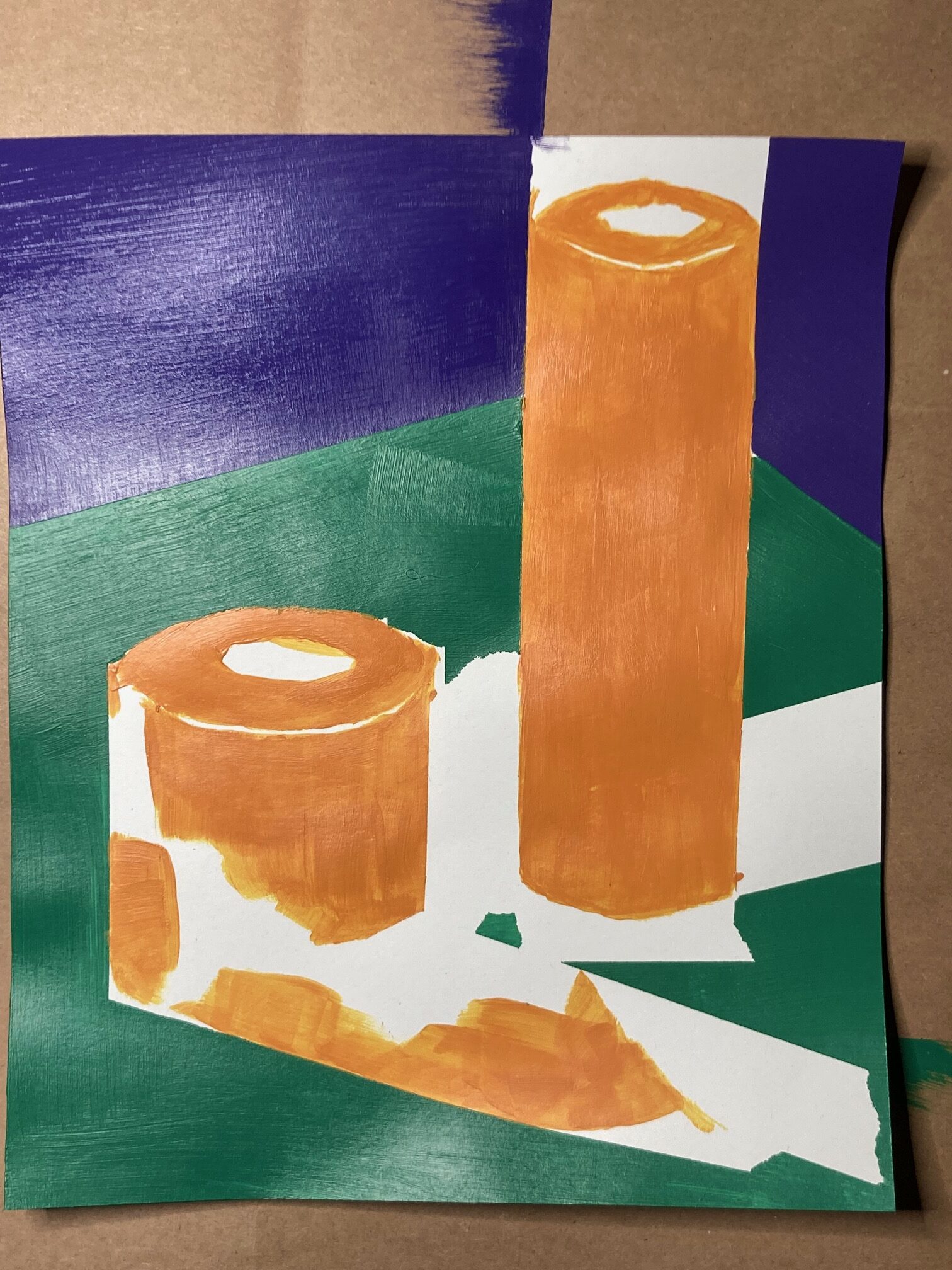
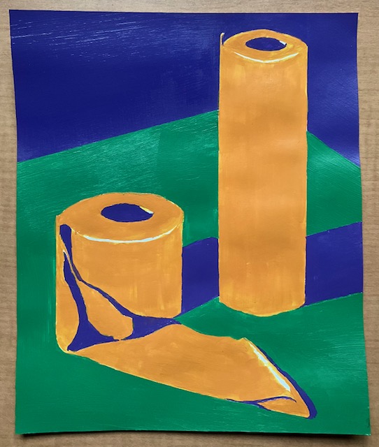
PAINTING GLASS OBJECTS (Simulated Transparency): This week painting a glass object positioned in a still life with colourful objects through it. Note the change in hue (sometimes lighter, sometimes darker) when the object is seen through glass rather than directly, and learn about the distortion of the object as it is seen through glass rather than directly. I am very slow at mixing and applying paint so I completed a small portion during class and did the remainder at home with a reference photograph to get the lighting. A huge amount of trial and error. See below — the reference photo and a couple of in-process photos, then the final version.
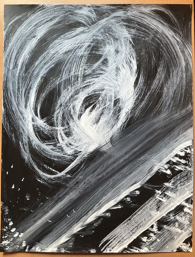
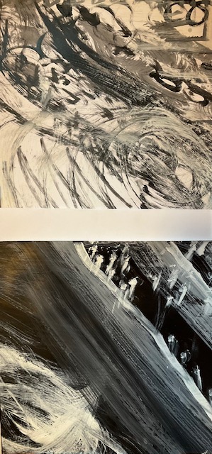
Glazes (Actual Transparency): On a gessoed paper I made a white/grey/black underpainting, abstract swirls. Once dry, applied yellow glaze, then blue, then red, allowing drying time with each. In the end, I preferred the painting after only two glazes, but I am glad I went on to do the red layer to get better information about how the glazes mix with each other, obtaining intermediate oranges, greens, and violets. See below, the penultimate and the final versions…
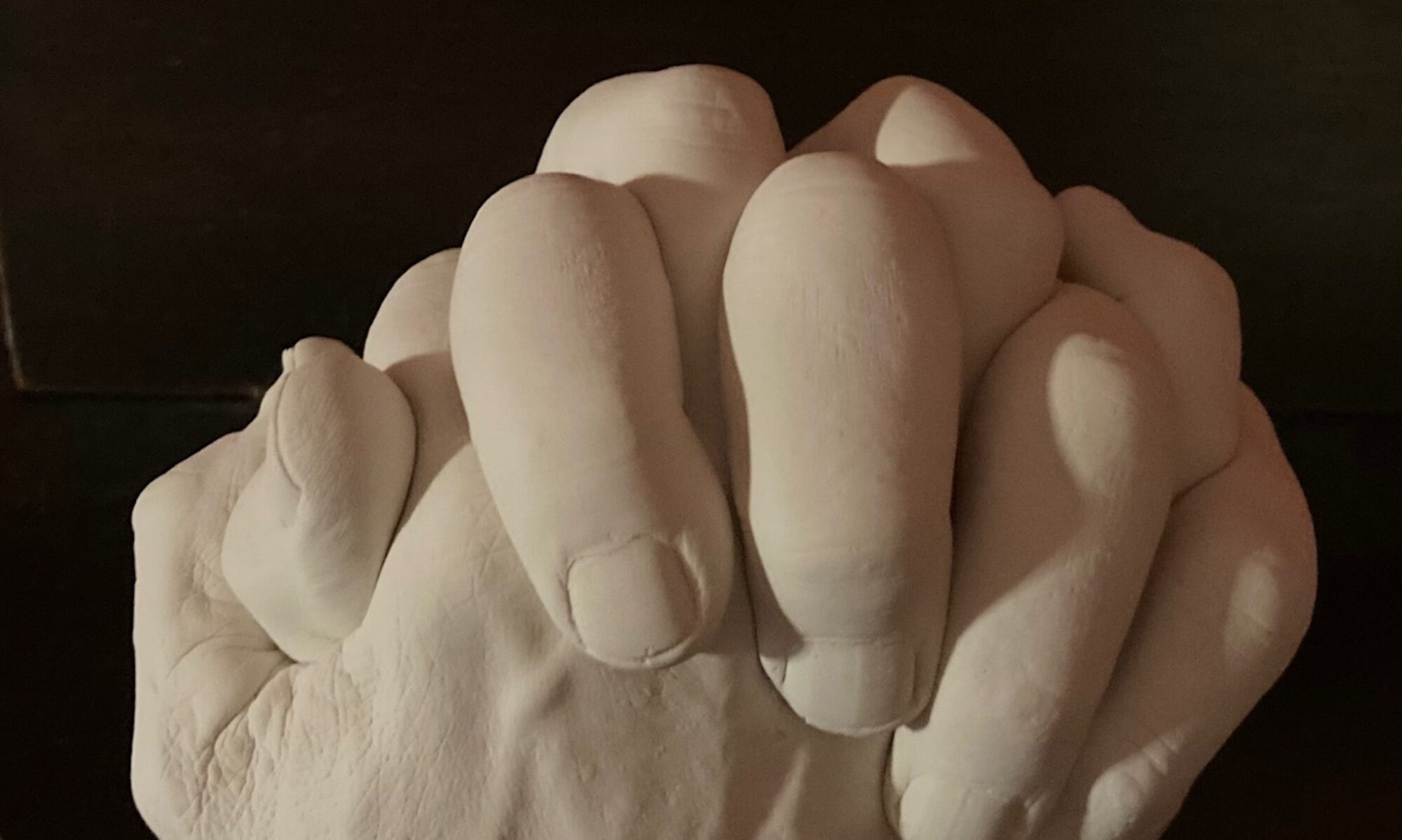
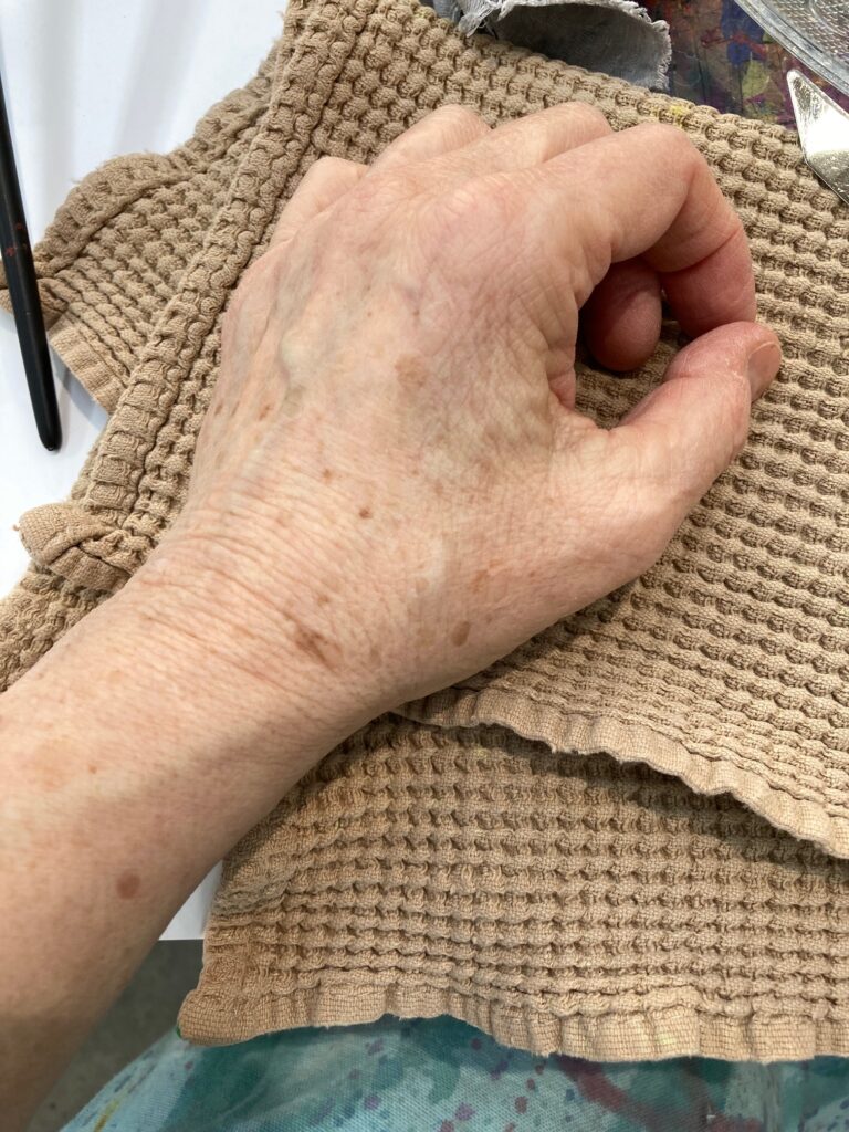
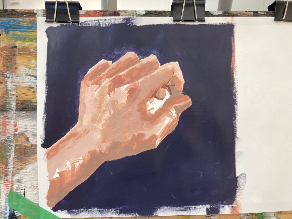
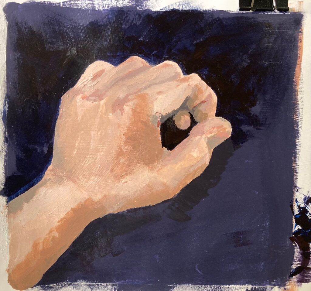
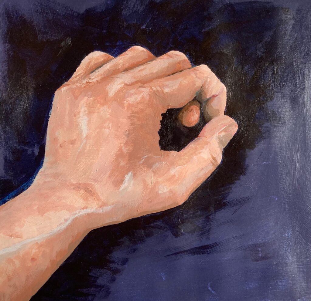
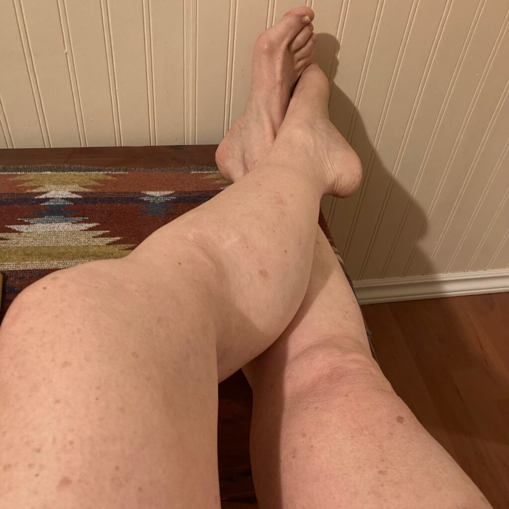
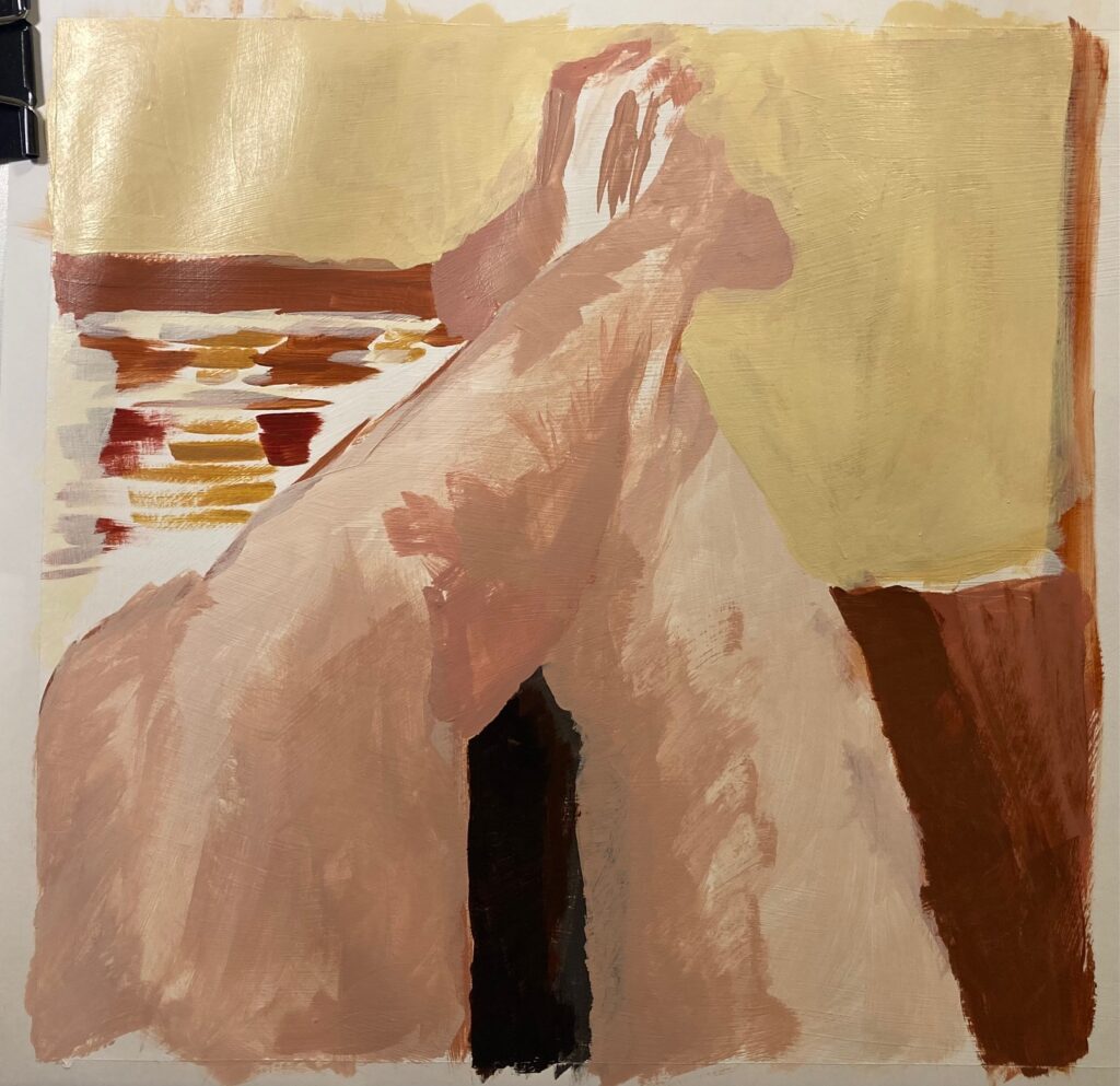
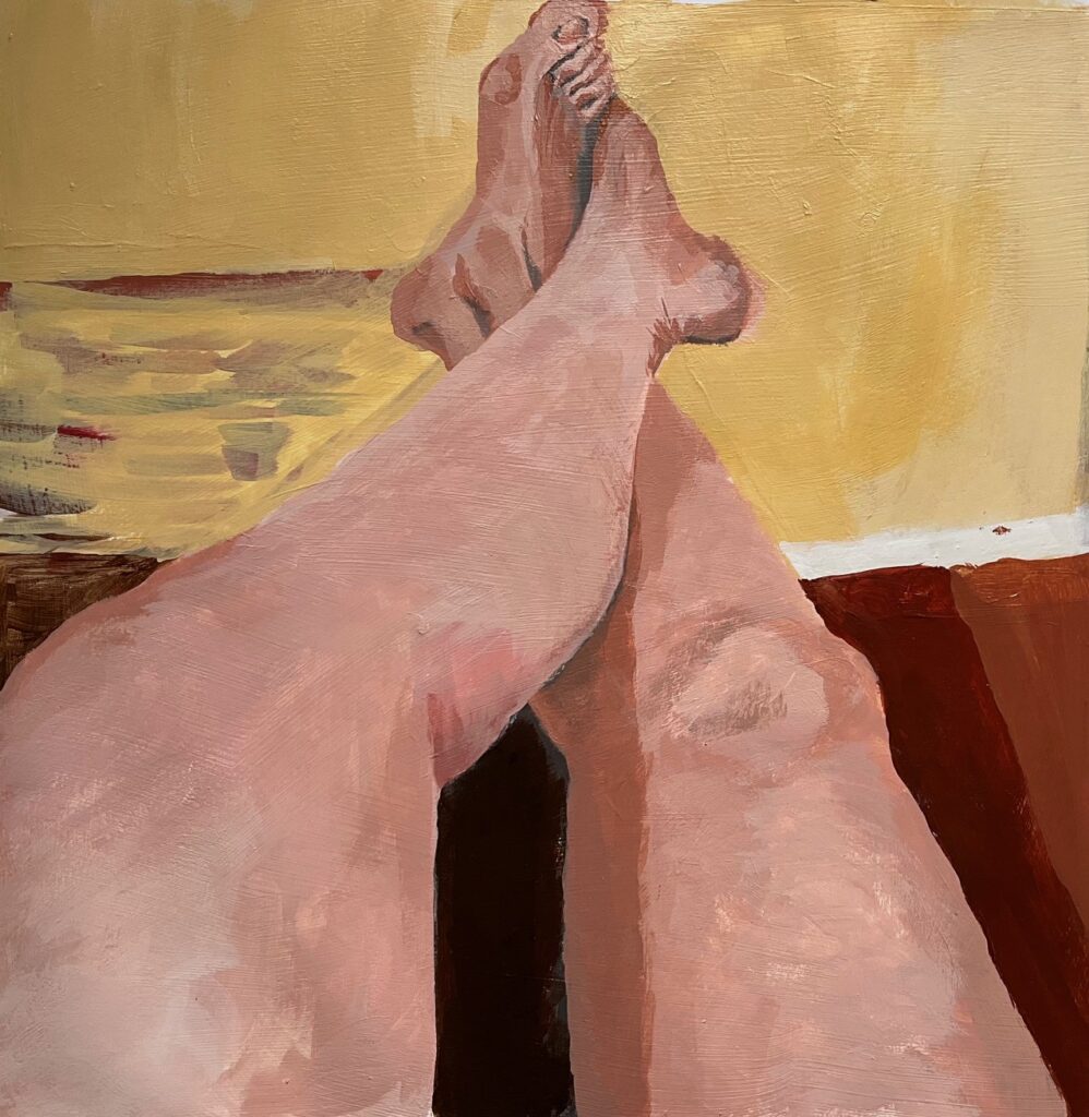
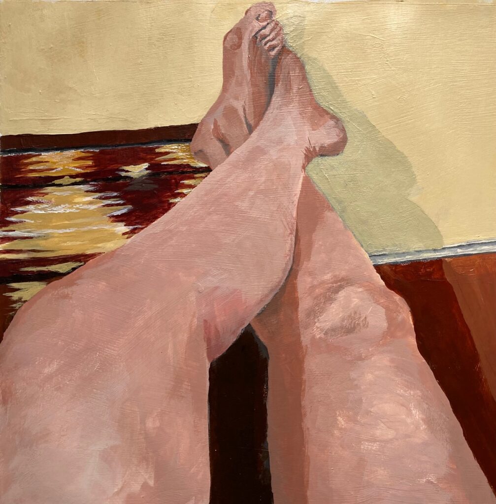
Earth Tones and Skin: This week we were to start in class and complete at home, a painting of our own hand, after tutorial on mixing skin tones. See below — a reference photo for my hand (to preserve the in-studio lighting) and several iterations on the way to final. Also, at home we were to paint a different body part with focus on skin tones. I chose a foreshortened view of my legs stretched out in front of me, propped up on a bench that was covered by a colourful woven cloth. Again, a couple of views in progress plus the final.
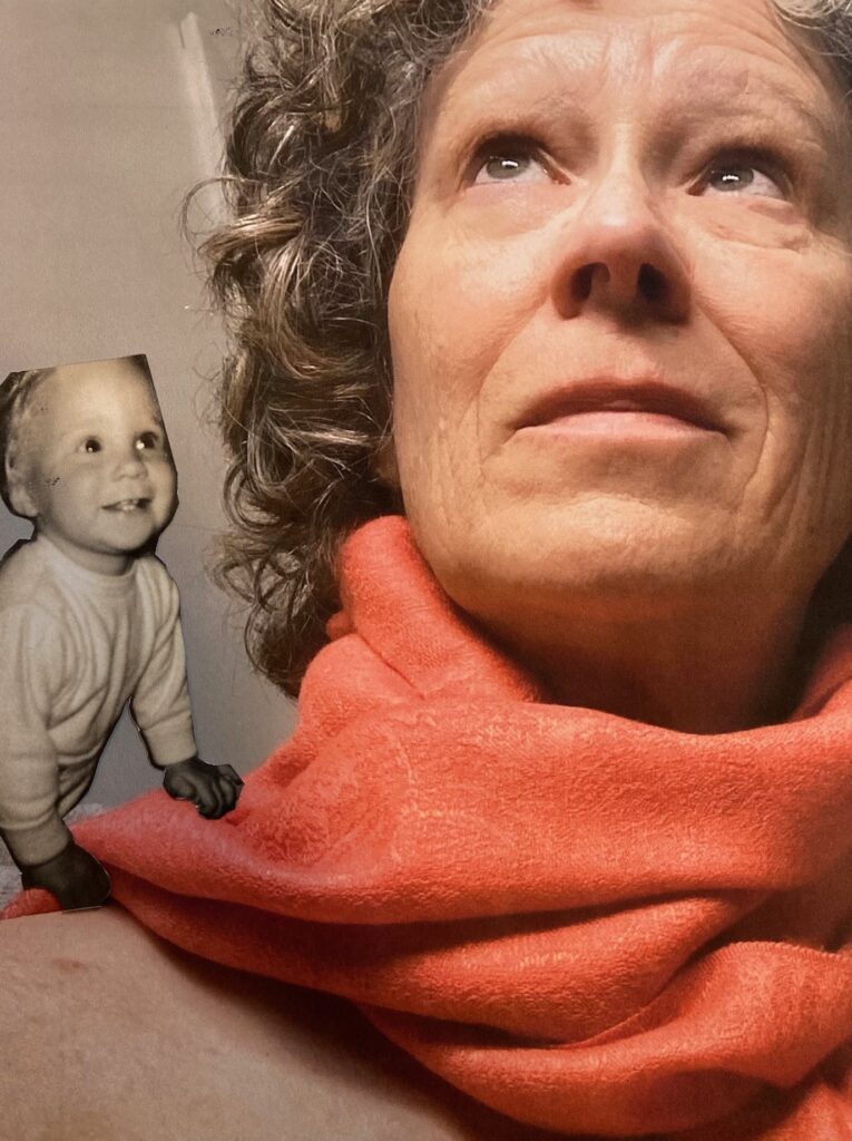
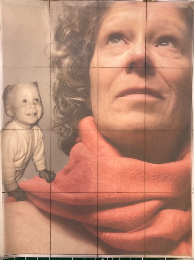
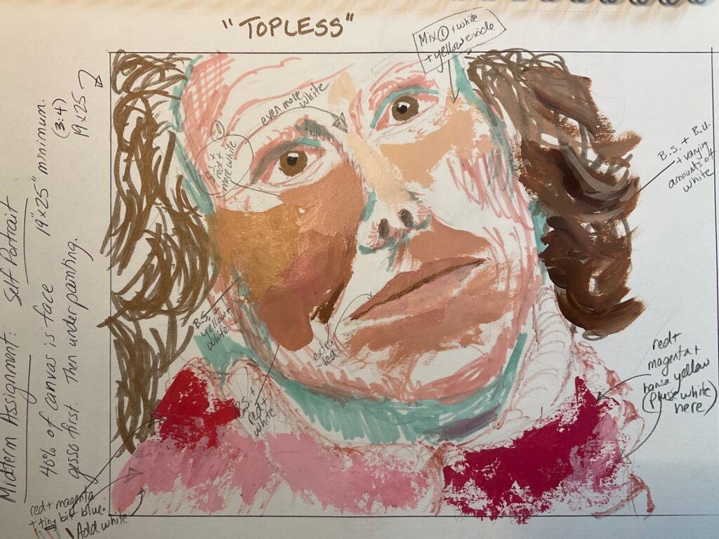
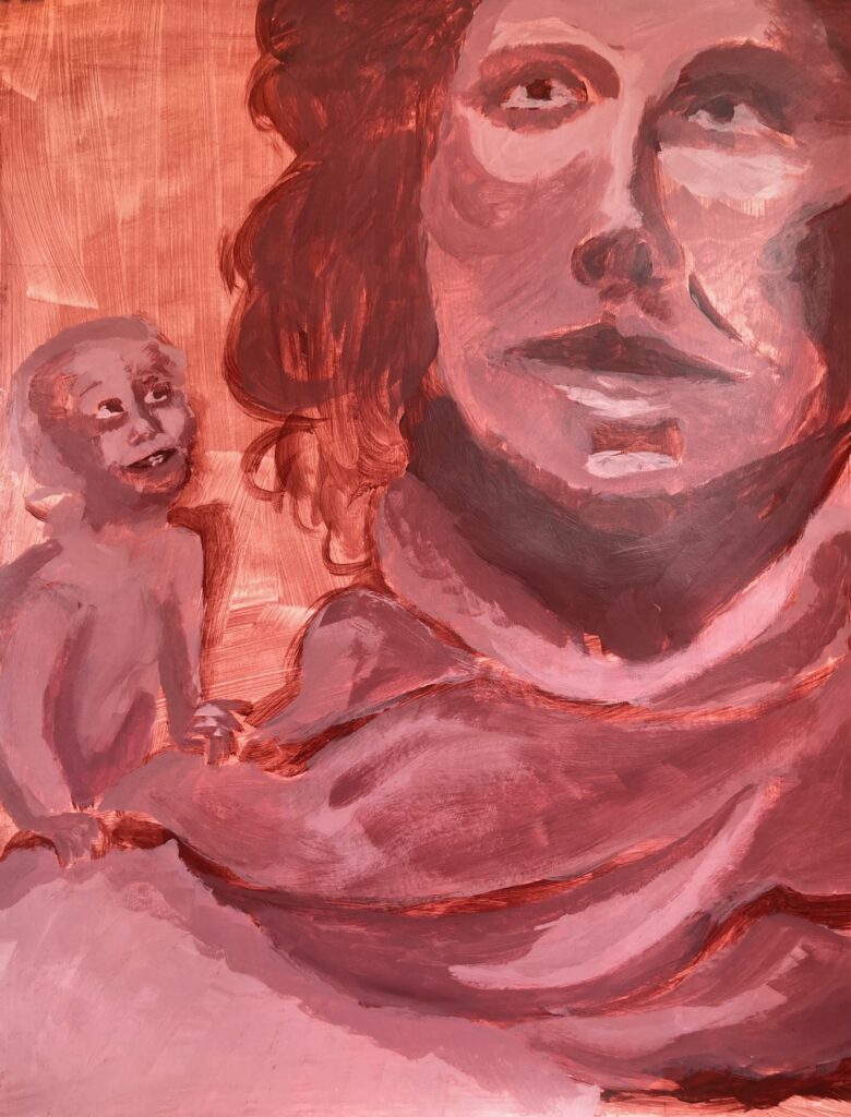
Self Portrait: For this assignment we were meant to undertake a creative self-portrait, an invitation to include a narrative or context that provokes interest / personality. The face is meant to occupy at least 40% of the scene, with a focus on mixing colours for convincing skin tone. We were asked to include an underpainting of a dark colour mixed with white for monochromatic value range. I chose to use the red-brown colour of burnt umber mixed with quinacridone magenta. Below are images for my brainstorming ideas, some reference photos, and several stages of the work in progress. My theme was “topless” — in the sense that the top of my head is missing, and that I’m wearing no shirt. The being on my shoulder started out as one-year-old me, from an old photo, but over time morphed into the mischievous imp of the final work, an eager foil to the preoccupied adult. Undecided on the title at this point — Considering “Topless”. Considering “Imp”. Considering “Mischief”.
old B&W image of 1-year-old me was the model for my shoulder imp, though she morphed into a new creature along the wayused a grid over the photo to scale up to large paperpaint-mix trials, on an earlier version of the poseunderpaintingstarted with mixed-down version of the underpainting colour as my background, later added much darker valuesthis version going to the critique. stay tuned.
Critique Day — took a photo in studio lighting, see below. Group discussion as follows: On initial viewing with no input from me and no title provided, people commented on the warmth of the colours, the uncertainty of the relationship between the two figures which left people curious (which was attractive) but also confused (which was more offputting). The small being was described as fairy-like, not of this world, like a character from a. magic realist CanLit source, one person wondered if it was a younger version of me. People wondered why the big figure appeared disengaged from the small being which was earnestly engaged. Technical feedback — eyes well realized except too uniformly light in shade, make upper eye darker; liked the shift to light-coloured background top of canvas; what if the background was a cooler shade maybe green or blue; nostrils needed more gradated shading, too suddenly and deeply black; also too black in shadows of neck and in upper eye socket. Hair working even though lacking detail it still conveyed depth. Scarf well conveyed.
FINAL VERSION, STUDIO LIGHTING. Working title: “Curiosity”
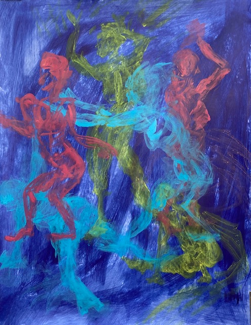
In-Class Model Studies November 8: Tertiary Colours
Movement, Tertiaries, 5 min eachSplit Complementary, 40 mins
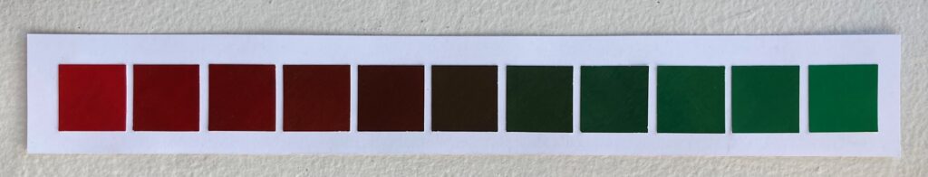
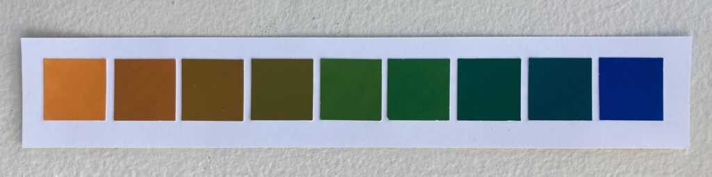
Complementary Colour Scale:
I was debating whether to use orange-blue or red-green pairing of complementary colours for my final work, so I made a version of the colour scale for each pair. Took them in for Elizabeth to see in person as my photos don’t seem to capture the colours accurately, but here are a couple of photos anyway:
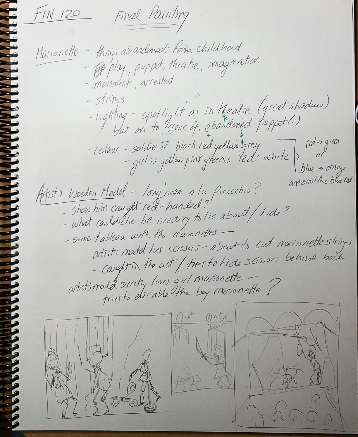
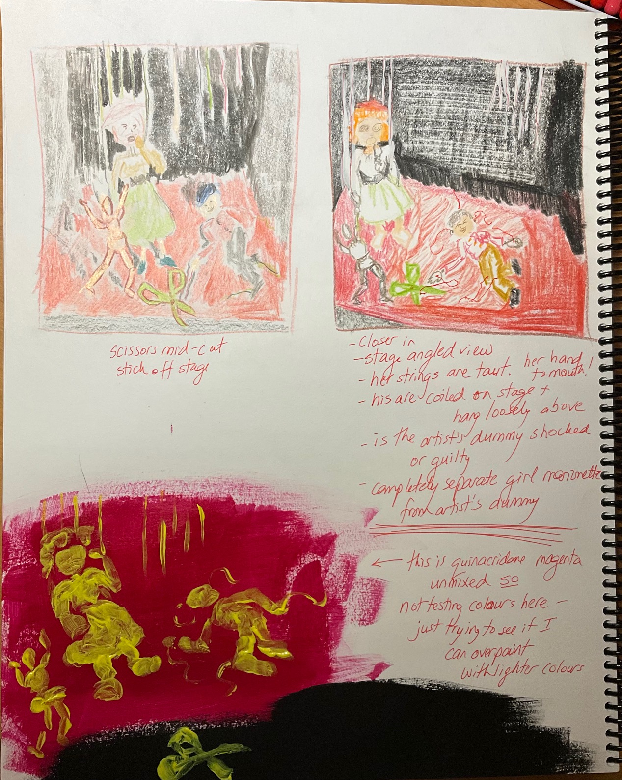
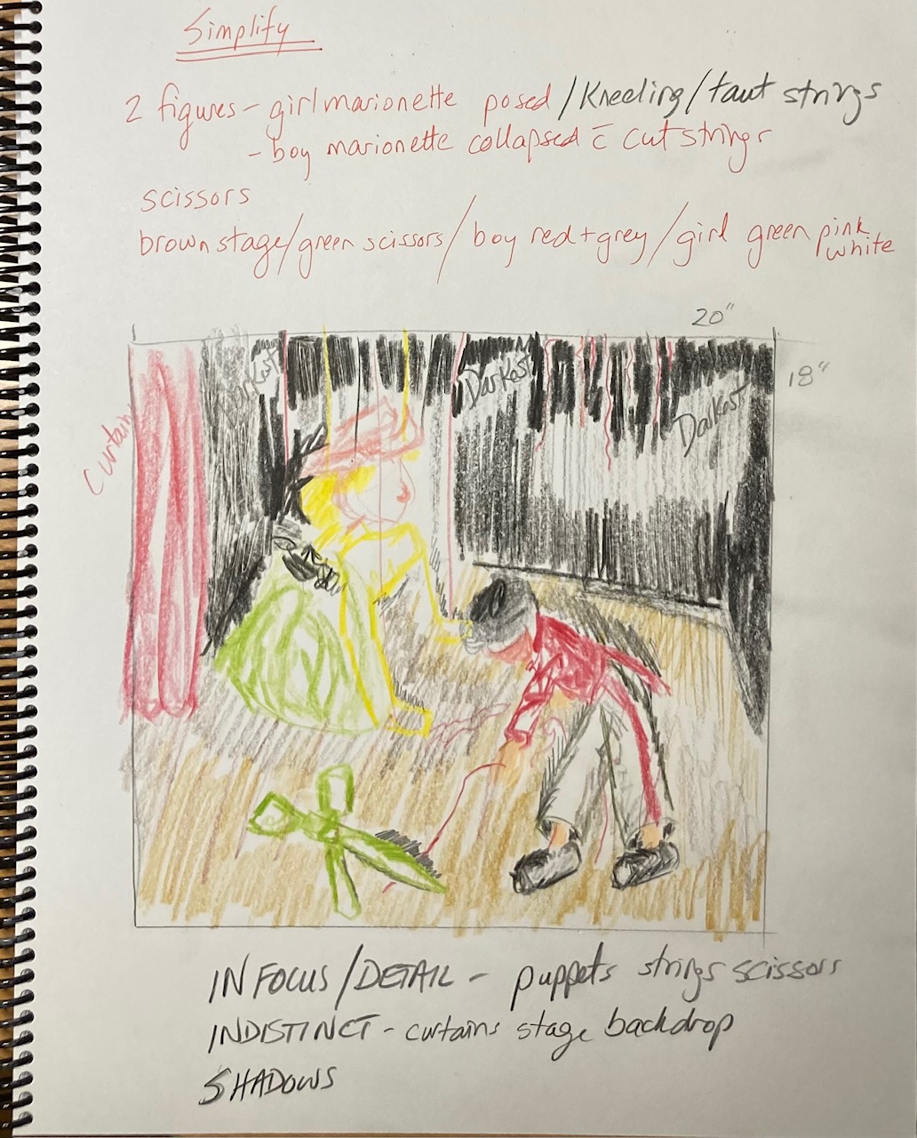
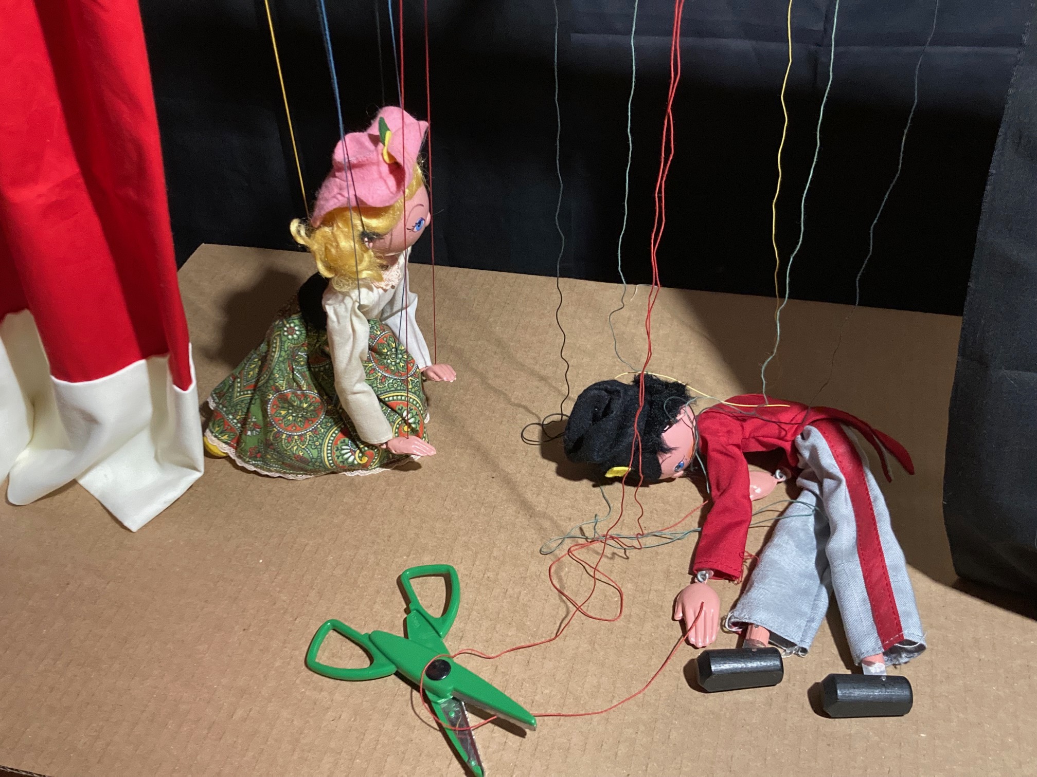
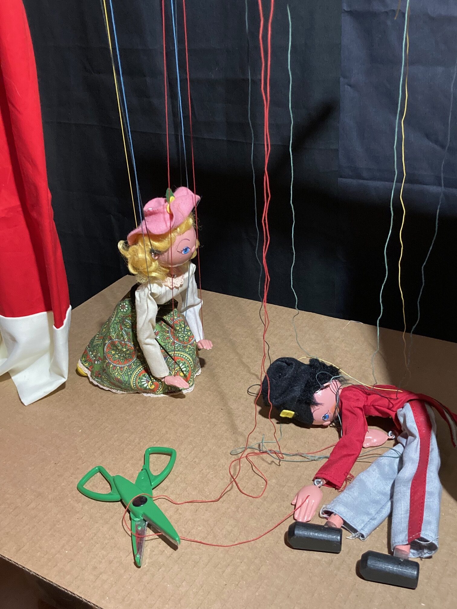
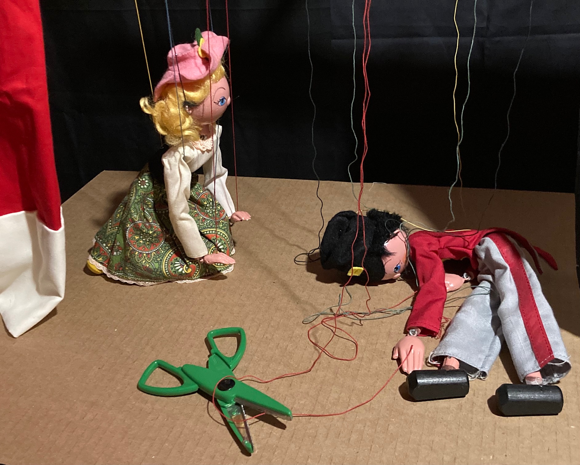
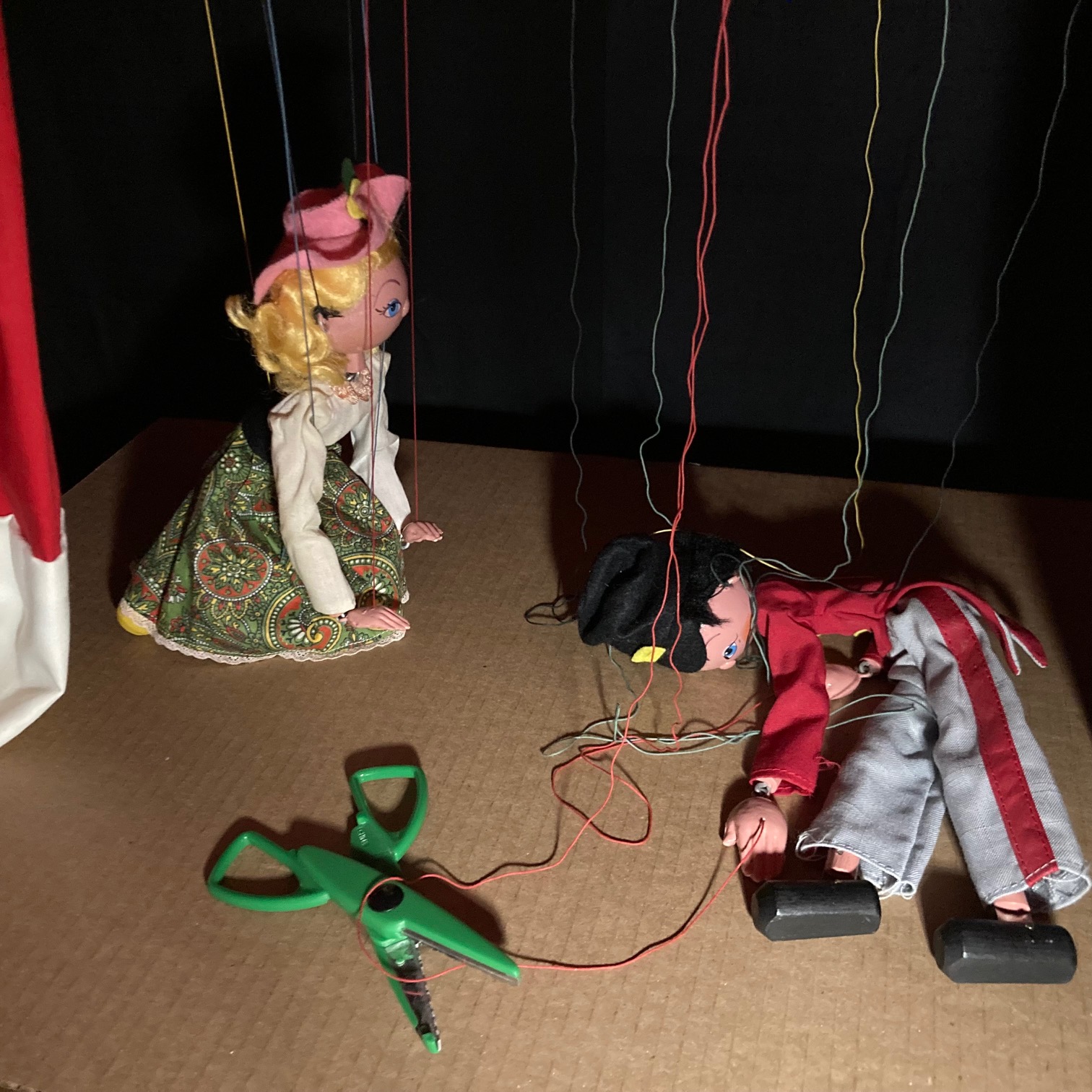
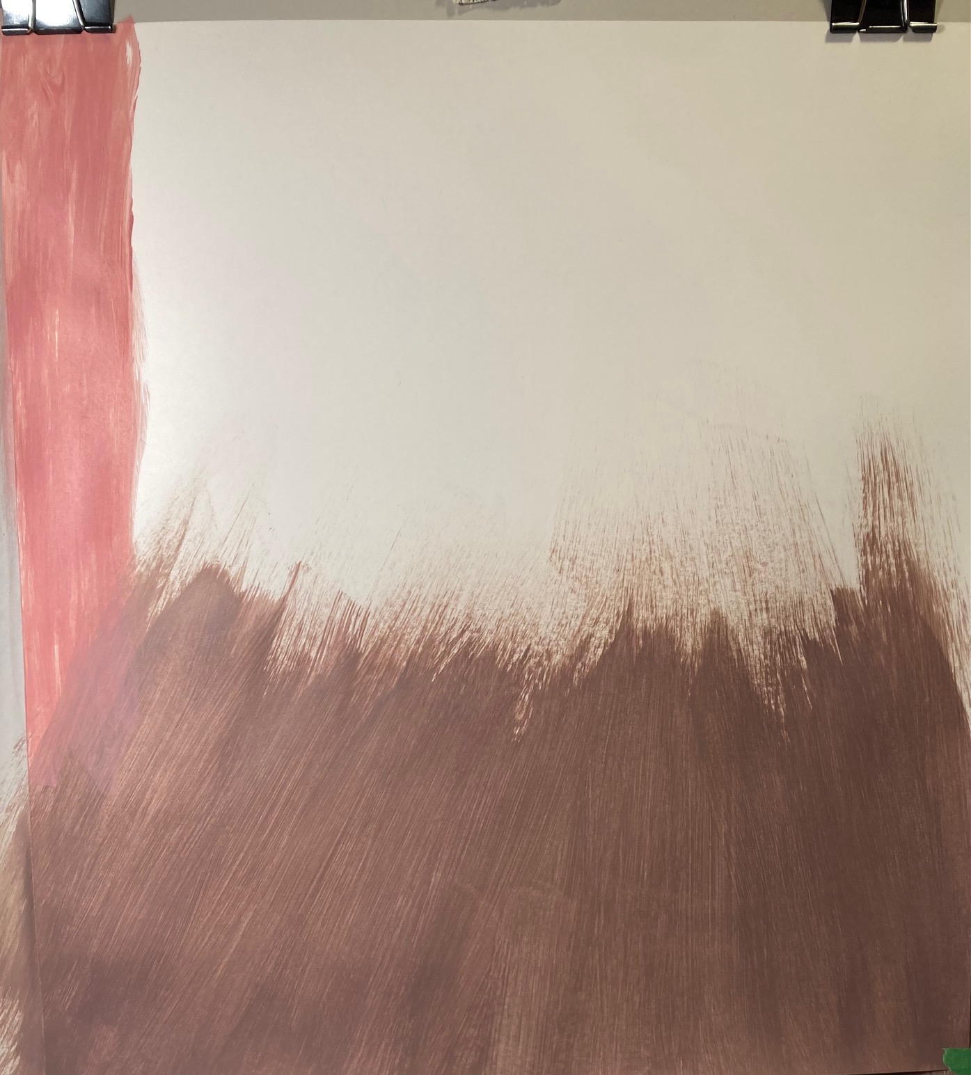
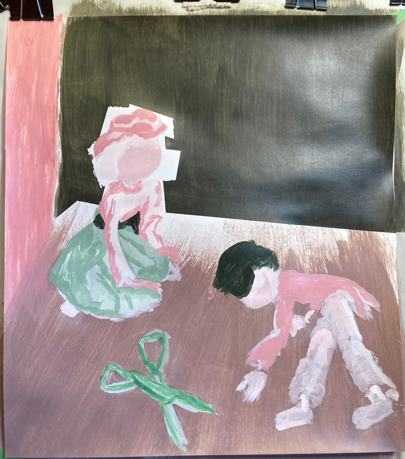
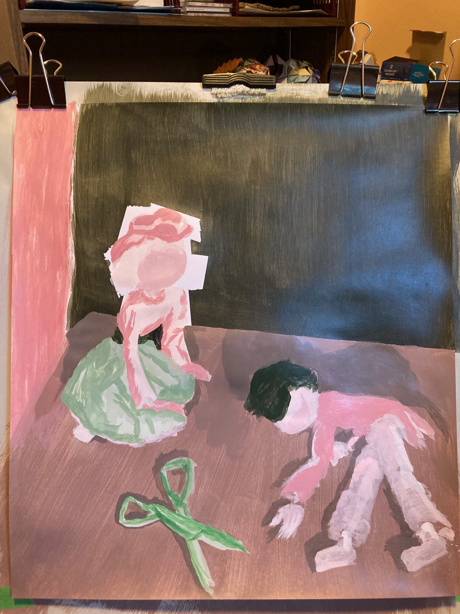
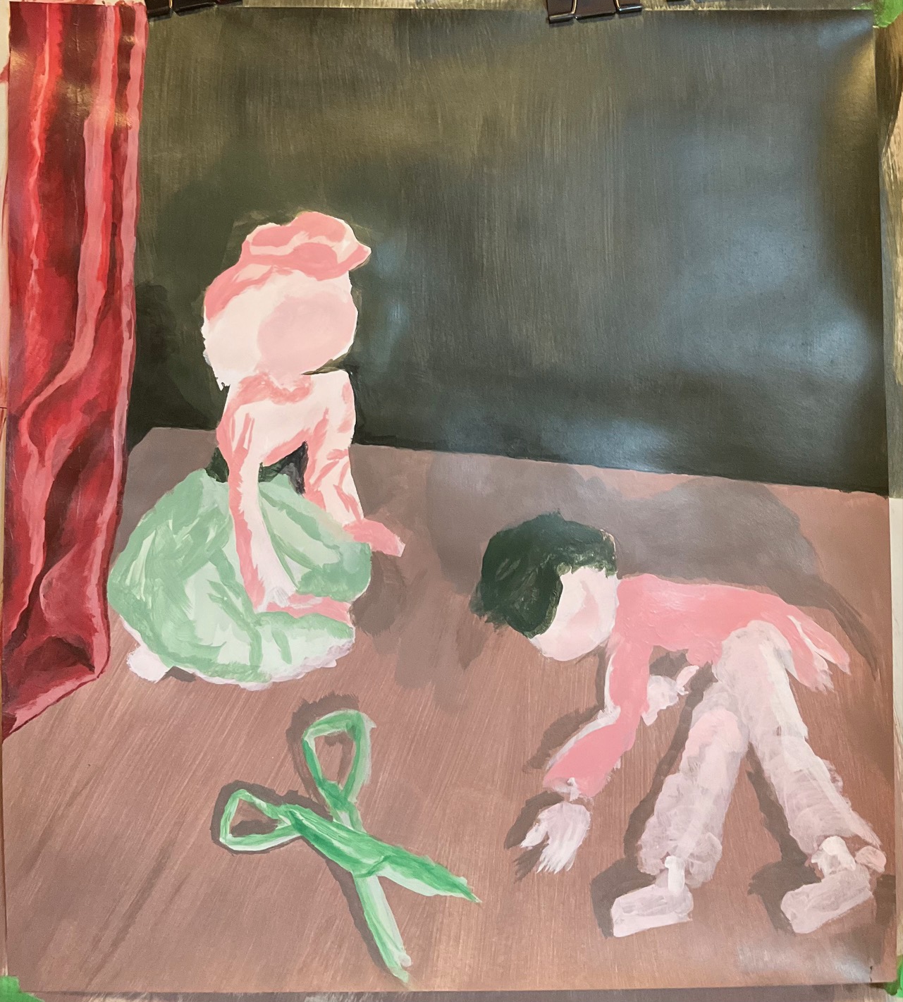
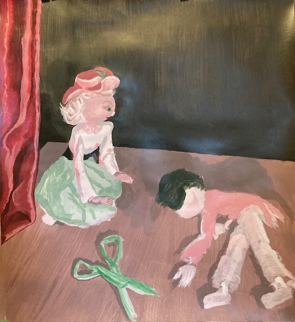
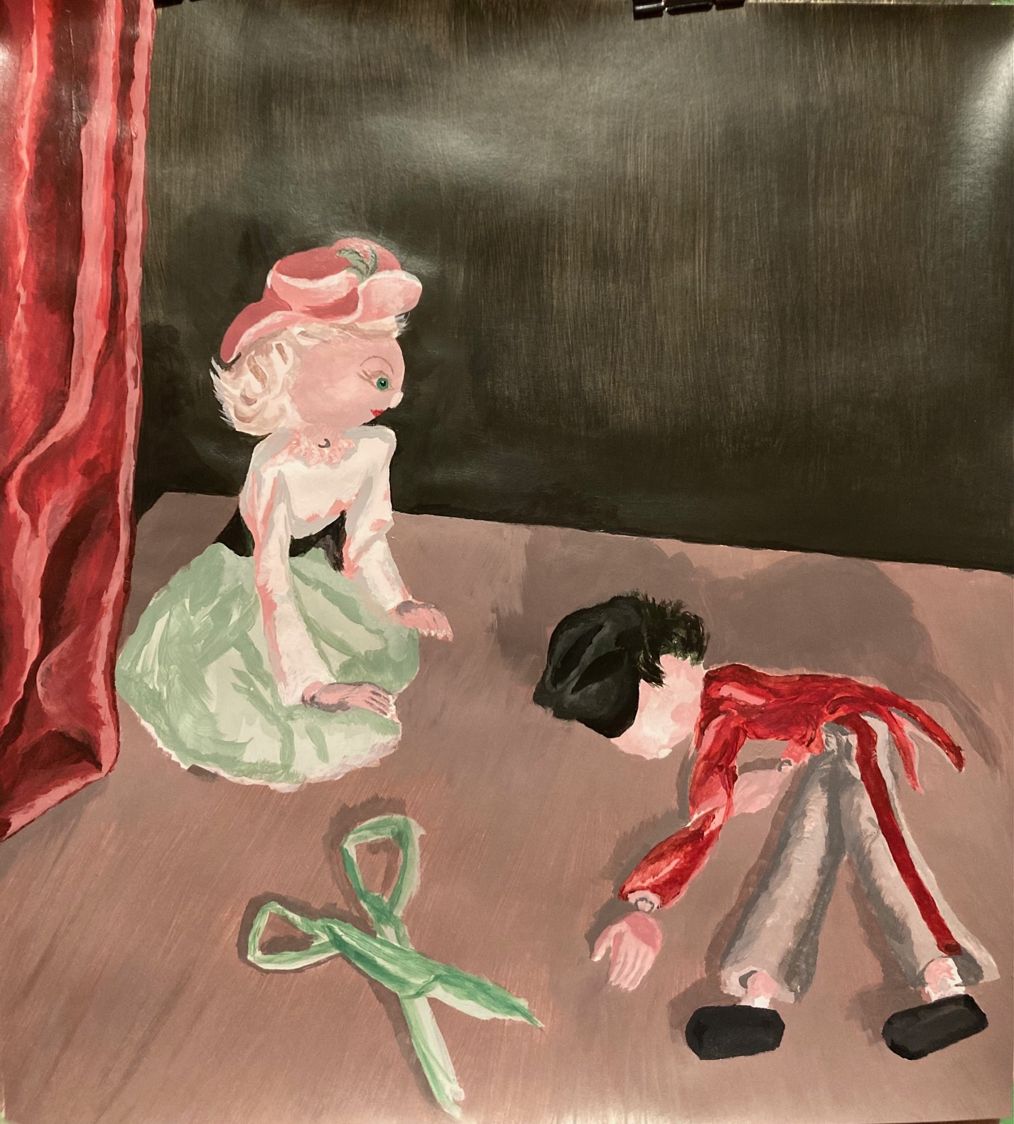
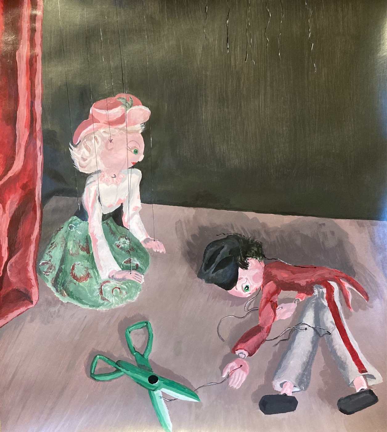
FINAL PAINTING UNIT 3: We were asked to paint from life, a still life or a scene, indoors or outdoors, something meaningful to us. For colour, we were to pick a complementary pair and then mix all our neutrals from those two colours, with small amounts of white and black permitted. I chose red and green, as it best suited my subjects, which were childhood marionettes I found at the back of my closet — a soldier in red and grey, and a maiden in green and pink. As you will see below, I brainstormed on paper first, then set up a marionette “stage” in my office, testing out various lighting options, and looking for a scenario that would be playfully dramatic… here goes…
This was the reference photo I settled on. I used it to check that I set up my “spotlight” the same each time.
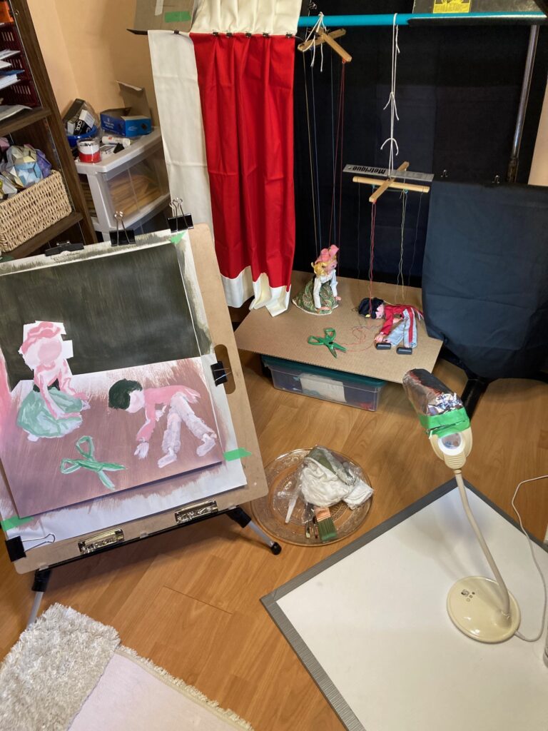
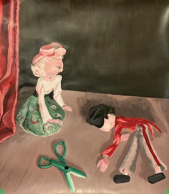
Now I had to think about how to paint it. Settled on 18″ wide, 21″ high. See below an image of the set-up with my easel and the “staged” still-life. Sat on the floor on a meditation bench for much of the painting, to keep at same level. Also limited the lighting so I could keep the spotlit stage lighting with minimal conflicting light sources — the disadvantage was painting on dimly-lit paper, though in some ways helped me to think in broad contrasting colours for my initial layers. At the end I needed to light the room to see details, and sat up at my desk for best view of the paper. Used the photo to help me with shadows at that point.
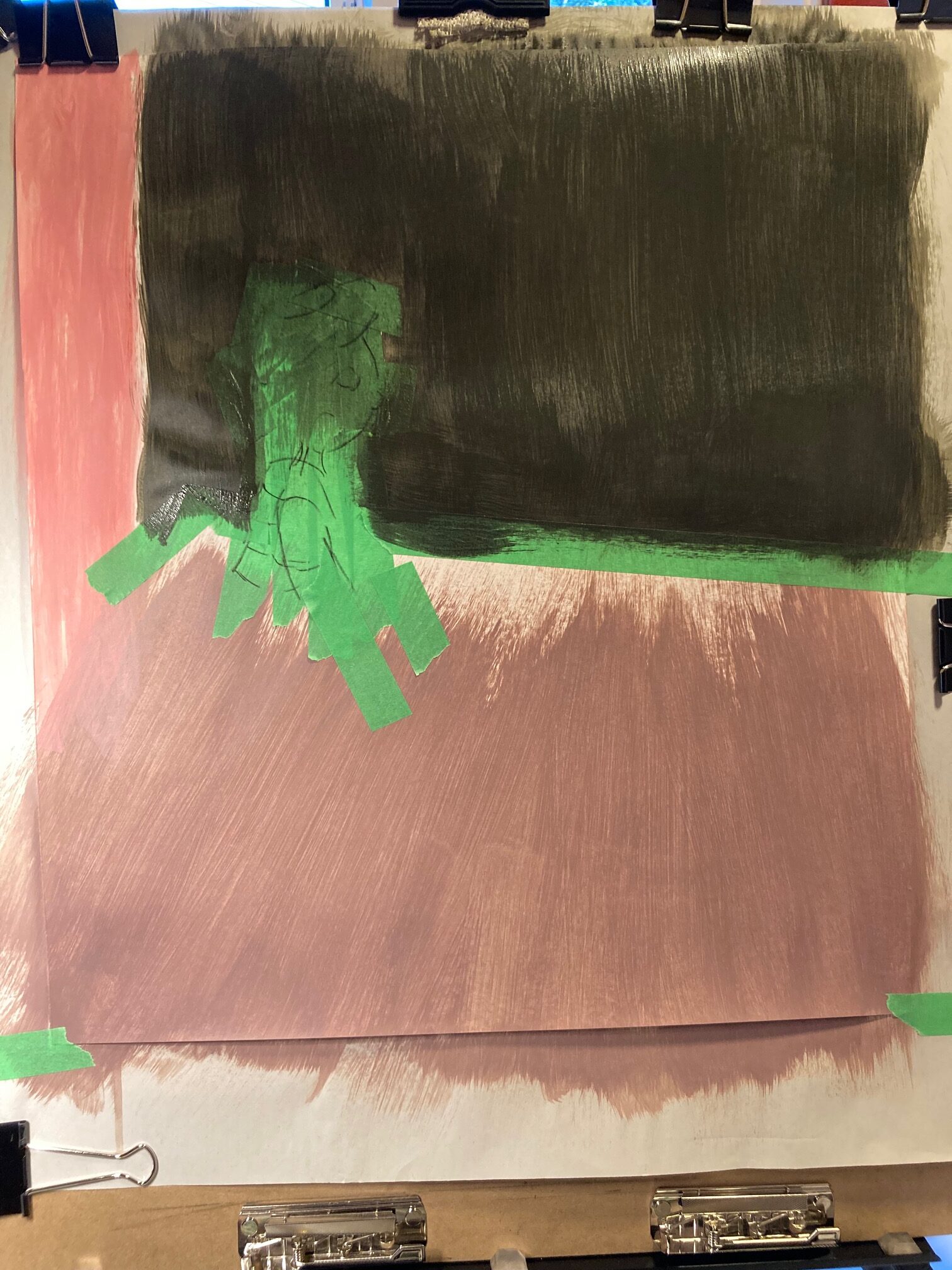
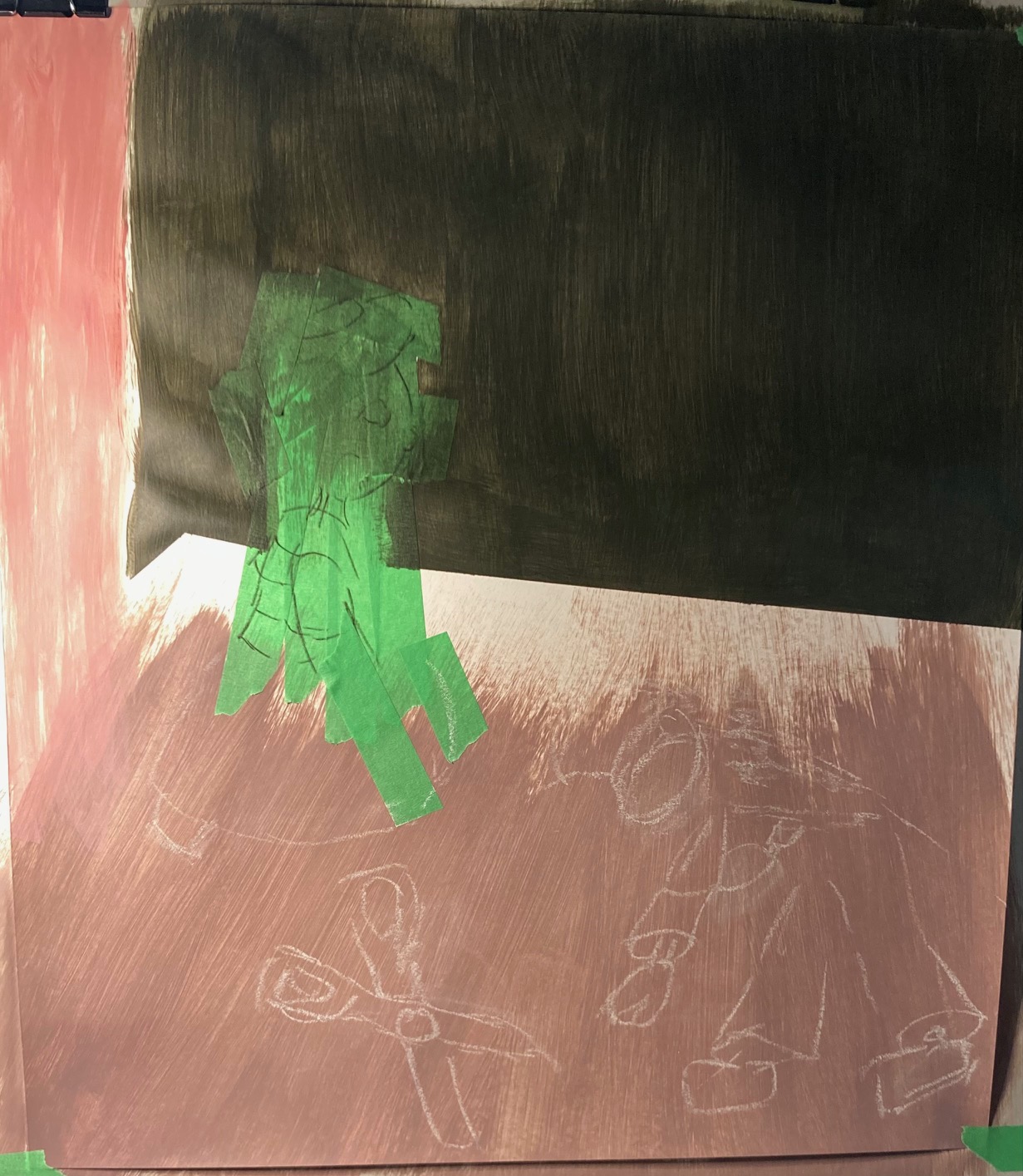
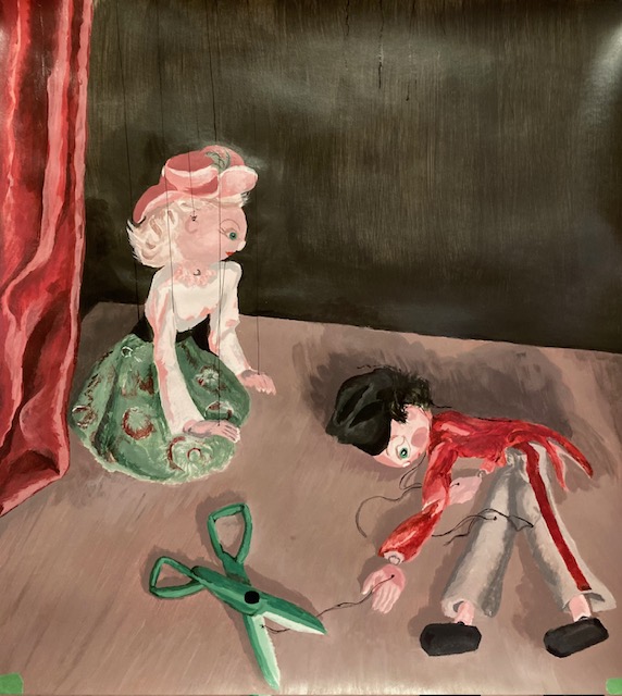
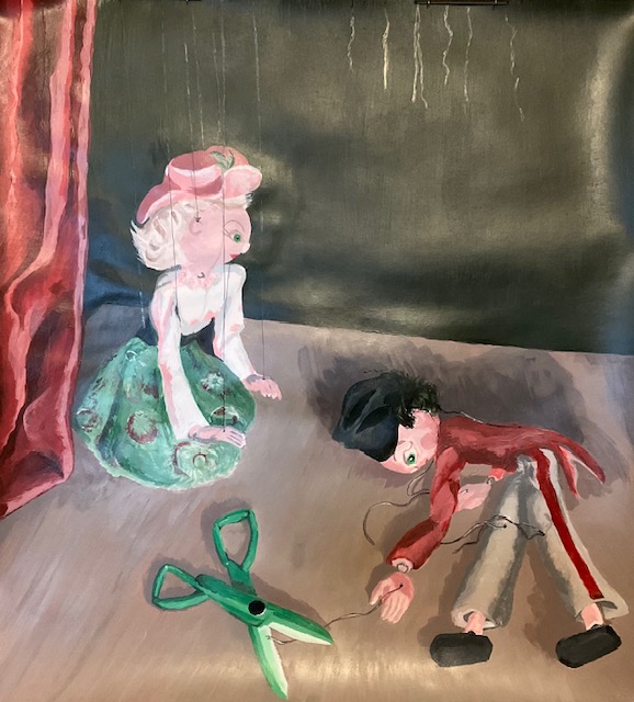
Decided to use pale and washed-out versions of the 3 background colours to begin — light brown “stage floor”, dark green/black backdrop, and red curtains (ignore the white trim in the photo). The puppet on the right will not show all its strings, they will hang as if cut with the scissors. We shall see if it works. I did a few tests to ensure I could paint the strings over top of the very dark background. Fingers crossed, should work. And now… some process shots over about 7 days of painting, a bit at a time…
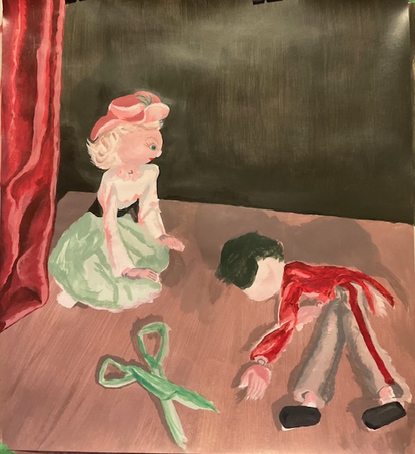
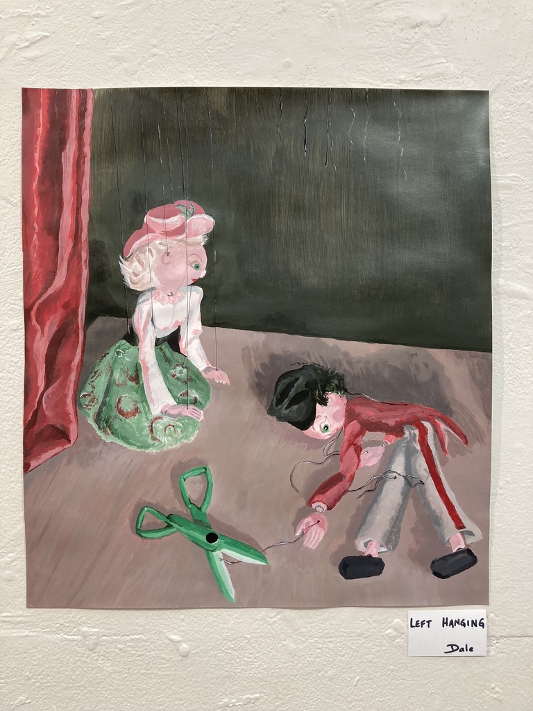
test swatches for stringsfirst take on the strings.second take on the strings — highlights, allow them to be thicker and better seenFINAL – to critique today…FINAL VERSION – hung for the critique
Comments and suggestions from the critique: appreciation for the texture of the strings, needed to touch them to see if they were actual threads; appreciation for the narrative, several people gave their imagined storyline for the scene; appreciation for the smooth colour transitions and for the choices about the dramatic lighting. Things to improve or consider — vary the texture on the black backdrop; try a white border to add to the sense of framing a stage; consider different colour for the scissors (a neutral? or a metallic quality?) to mess with the really even amounts of red and green I’ve used, stretch beyond that harmonious 50/50 ratio.
INTENTION AND REFLECTION: I titled the work “Left Hanging”. My intention with the work was to present a provocative yet ambiguous scene, dramatically lit, with implications of disaster or murder or lost love or lost childhood or… or… or… (whatever else the viewer could imagine!). I used the marionettes to abstract from direct human parallels, allowing viewers to exercise their emotions by proxy — I guess this is what puppetry has always done. In terms of colour theory, I chose to limit my palette to the complementary colours red and green, and all the neutrals in between, with additions of white for lighter tints and black for darker shades. In the end, I used a thread of pure-black india ink for the puppet’s strings, and embellished it with light and dark grey highlights, mixed from black and white only — every other item on the page included red and green in varying amounts. I used a “harmonious” mix of roughly 50/50 red/green in the finished appearance of the work, which in retrospect is a strange choice for a scene that I intended to be dramatic and provocative. I learned a lot about mixing tints and shades — much harder than I realized to reproduce from one time to the next, and it would have been impossible to keep every iteration of my colours. As I was working through the project, I might need to add more shadows on the stage, the clothing, or a face, but couldn’t develop the same tint or shade I had the last time. For the stage, it changed from being a fairly consistent colour (like a brand-new stage!) to a mishmash of streaks and colours that aimed generally to have the right mix of shaded and lit areas, looking in the end more like a worn wooden floor might look, not a bad effect as it turned out. It would likely have been a good idea to do more of that with the backdrop wall as well. Next time!
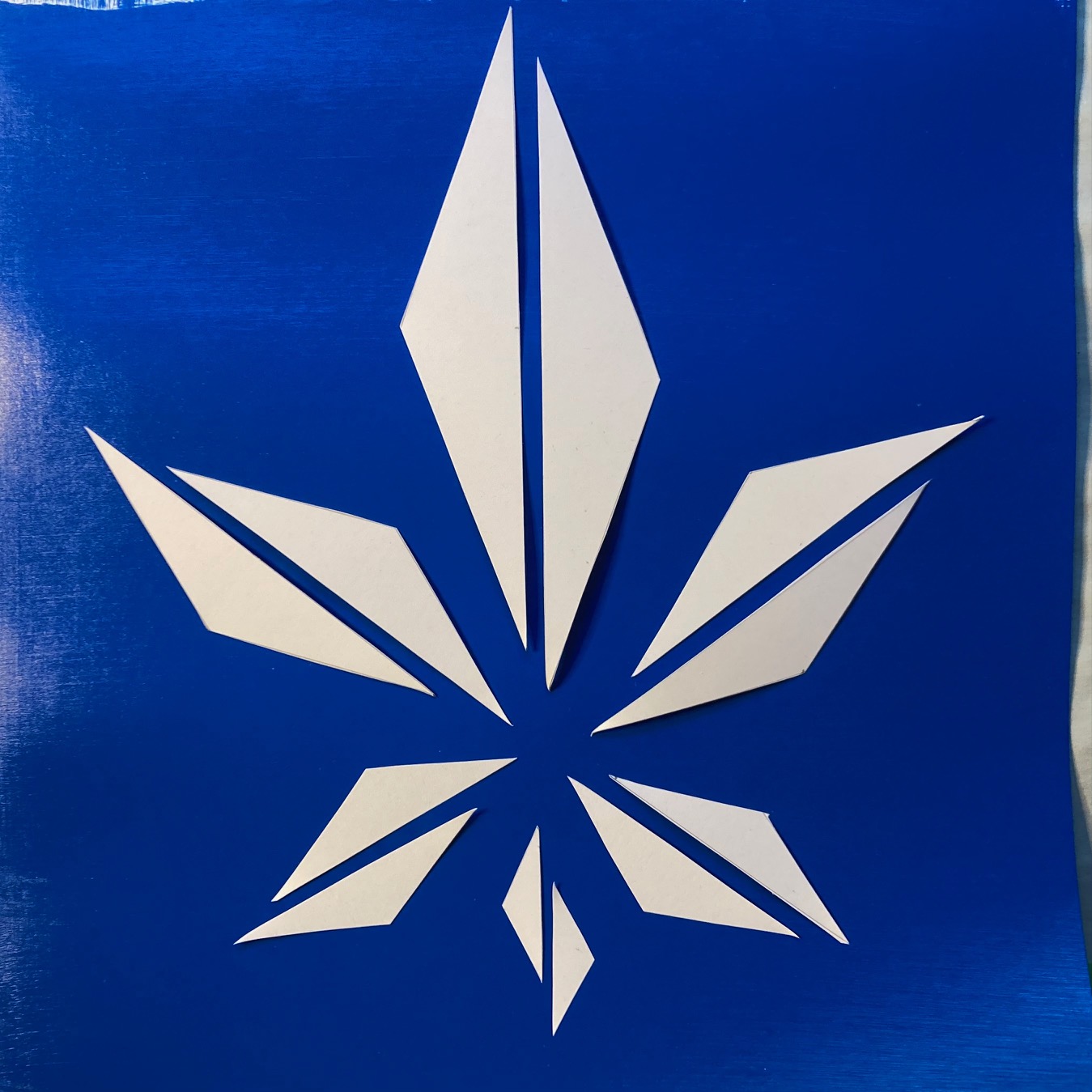
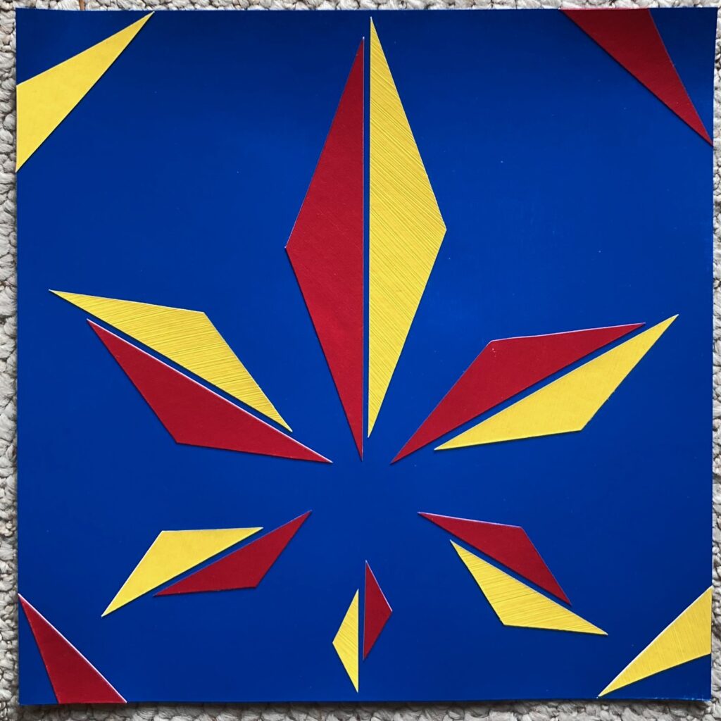
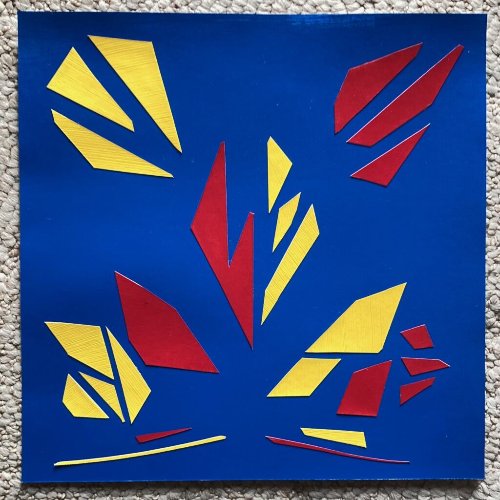
but also… I had an extra blue-painted background square and leftover scraps of yellow and red, so I set a challenge to work with the existing scraps, no further shaping allowed, to see if I could imply symmetrical shapes. Worked quickly, maybe 30 minutes, compared to the several hours spent on the version above…
kinda fun!
Discussion in class — these pieces are not symmetric — I misunderstood the concept. I had thought they needed to be right/left mirror images, and I had intentionally stretched that concept by sliding the half-diamond shapes against each other and adding slightly asymmetric corner triangles, intending to create more movement in the piece. From the peer review and instructor feedback, I’ve learned that the top and bottom symmetry of the piece is also a factor. Although, on reviewing some of the student examples, I find some of them to have quite different weight top and bottom halves — so, something for further discussion…
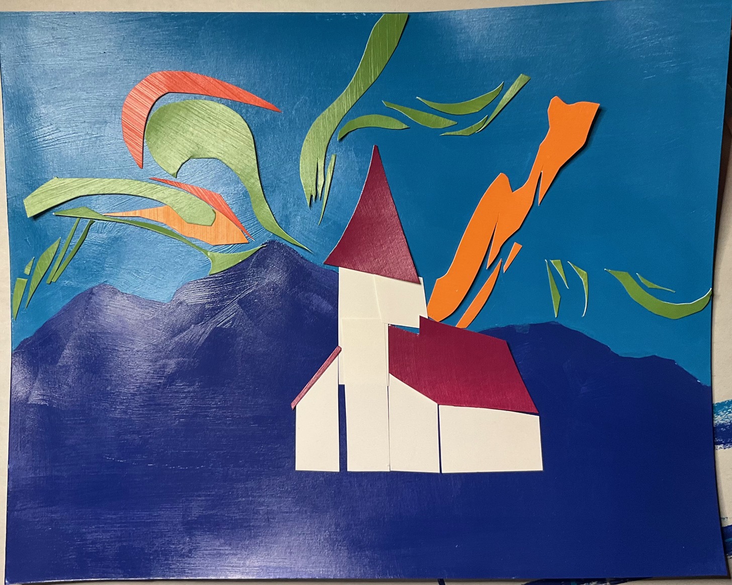
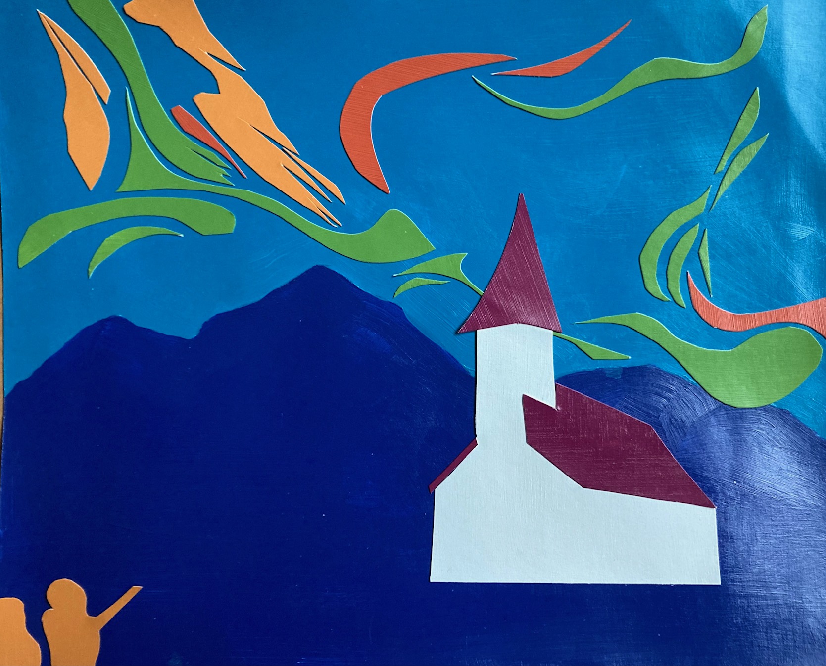
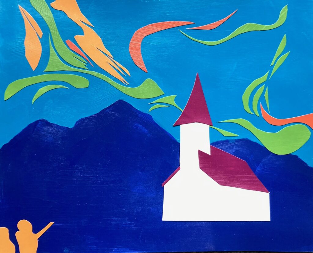
Starting point blue-violet ground with blue-green sky. The other tertiaries seemed to map on to the colours of the northern lights, did some looking around online and found the image of a church in Finland backed by mountain shapes and northern lights. Played around with how to make the movement of the northern lights visible, ending up with a generally diagonal pattern plus some offshoots. Then decided to experiment with foreground people and background moon. Captured several of these steps in the process below…
mockup marker + scrapsplaced, not gluedrealign northern lights for more movementtrial peoplemove peopletrial quarter moon
Reflections — the initial church is more quirky and pleasing, with the gaps between white scraps giving it some defining architectural lines, but too late to change as I cut and glued down the single shape of painted white. Still not sure about the moon (taped in place above), though I think I like it. Will decide then take the whole thing to the informal critique, get some thoughts from others…
Final version, above. Took this one to class, deciding to leave off the quarter moon. Good discussion in class about composition – positives for the quality of colours, feeling of movement across the sky (people saw northern lights, clouds, the wind), the perspective in the church, the way the blue-violet reads as mountains and foreground. Some discussion about the people – they work. But would have worked without them too.
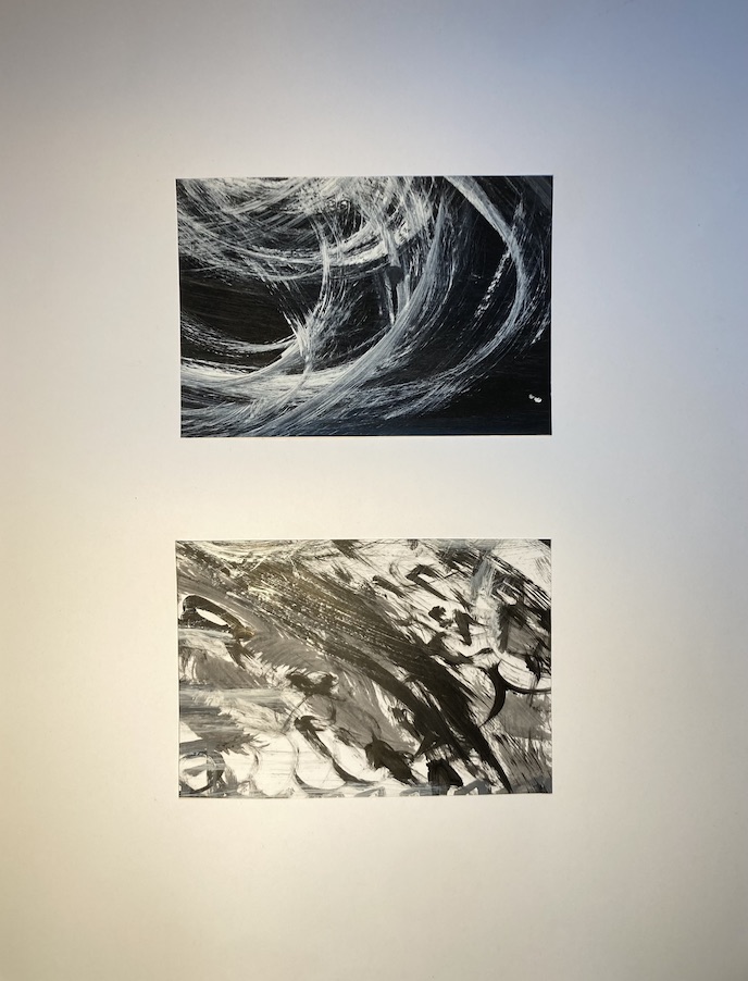
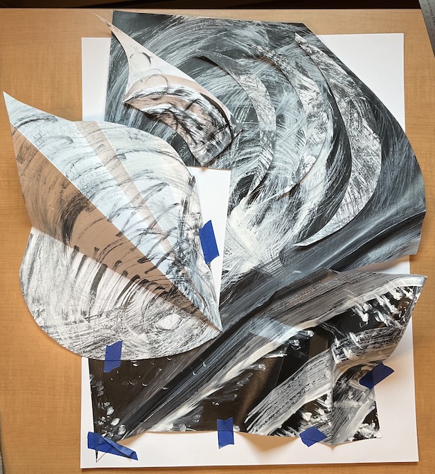
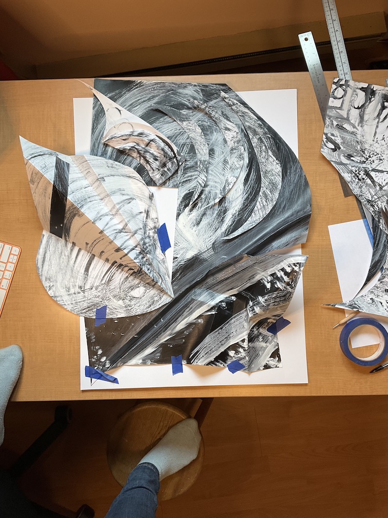
Step 1: In-class make two experimental abstract works to collage from, using black and white acrylic paint on 20 x 26 white paper. Painted one sheet entirely black, allowed to dry. Mixed a variety of grey values, made a range of marks, textures, and shapes on the white and the black sheet.
Step 2: Create two cropped details. At home, I made frames of a few different sizes and shapes to test run cropping ideas before settling on rectangles approx 6 by 9. After cutting those out I tried several arrangements. See the process below:
large crops – approx 1/4 of canvassmall crops 6 x 9small crops – alt arrangementsmall crops – alt arrangementdecided on crops — cut out — try various orientationsFinal Cropped Pair
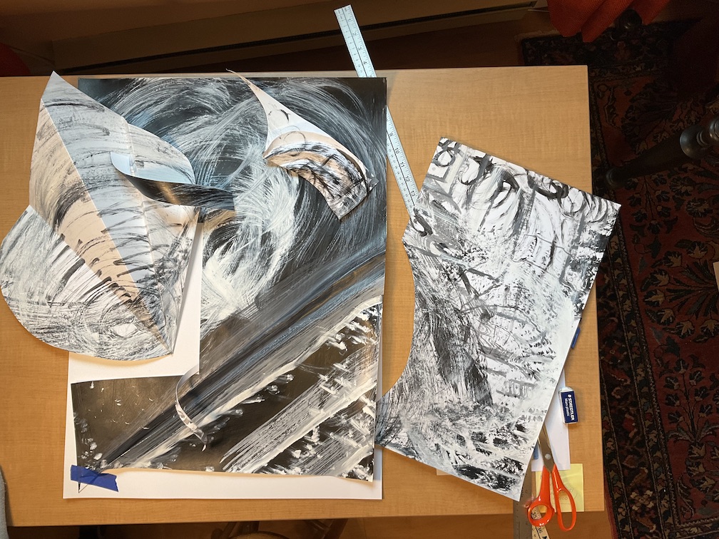
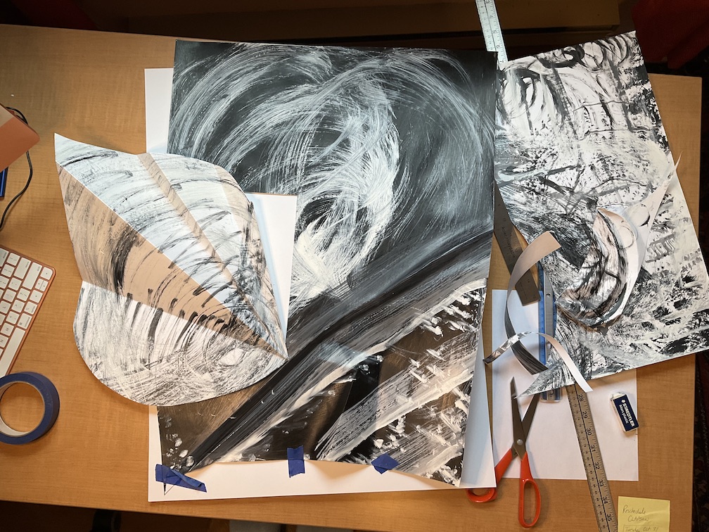
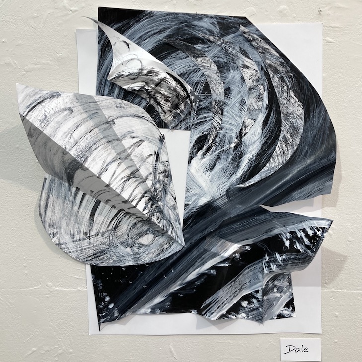
Step 3: Create one abstract collage from scraps of the original paintings.
creasing, bending papermore creasingtry adding crescents of white on blacktested out black rectangle on left side — rejected
Just before taking work to class for informal critique, I added another white triangle shape — similarly shaped to the one in the centre of the piece, but this one horizontally oriented, traversing the 3 crescent shapes. I never took a photo of that version — during the informal critique with the class, I confessed it was a late-minute addition and I was not at all sure about it — when I removed it for the others’ comments and ideas, it seemed that everyone thought it was better without, including me. So, the work was finalized as the image below… Another comment during critique was to reconsider the upper left area, perhaps removing some/all of the white “horn” that extends off the smaller curved shape… food for thought.
Final Version
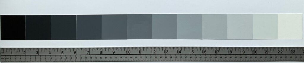
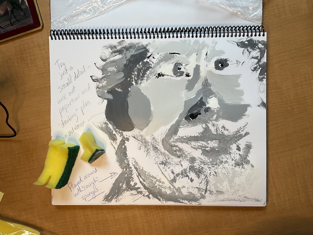
UNIT 1 Assignment B: Grey Scale. **will submit the hard copy of this item to the instructor as well as posting it here.
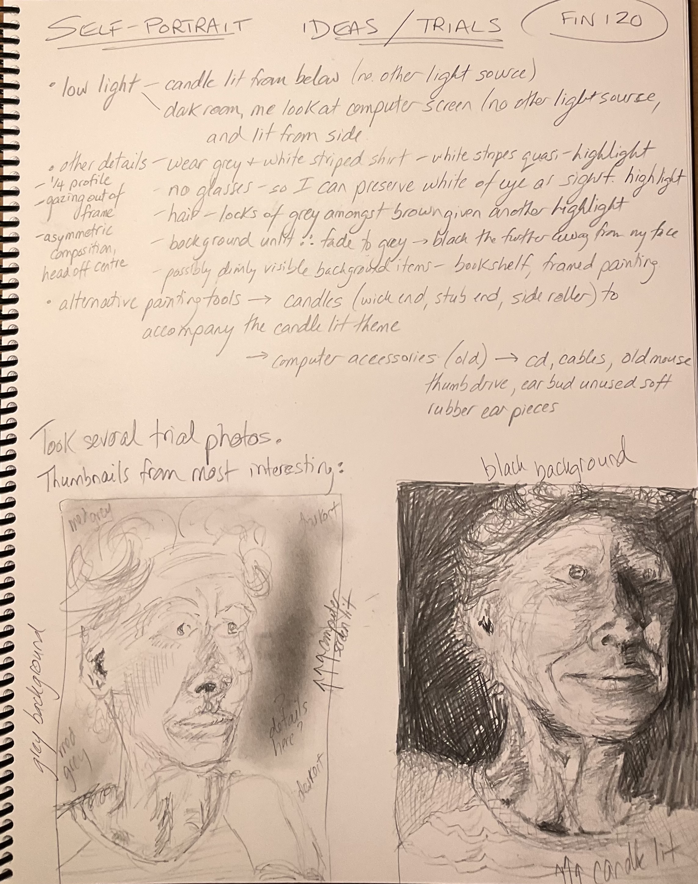
UNIT 1 Assignment D: Self Portrait. — ideation and trials
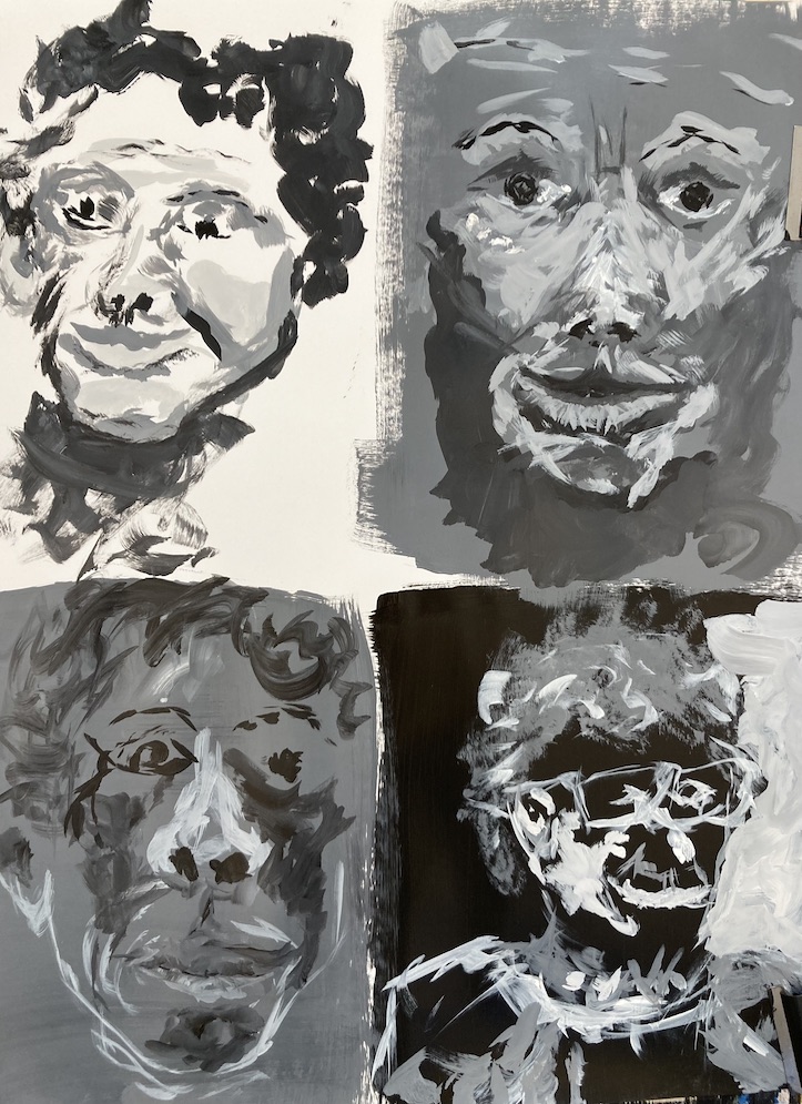
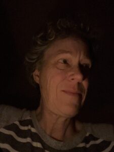
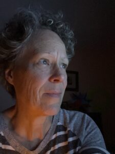
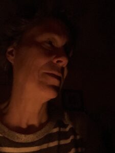
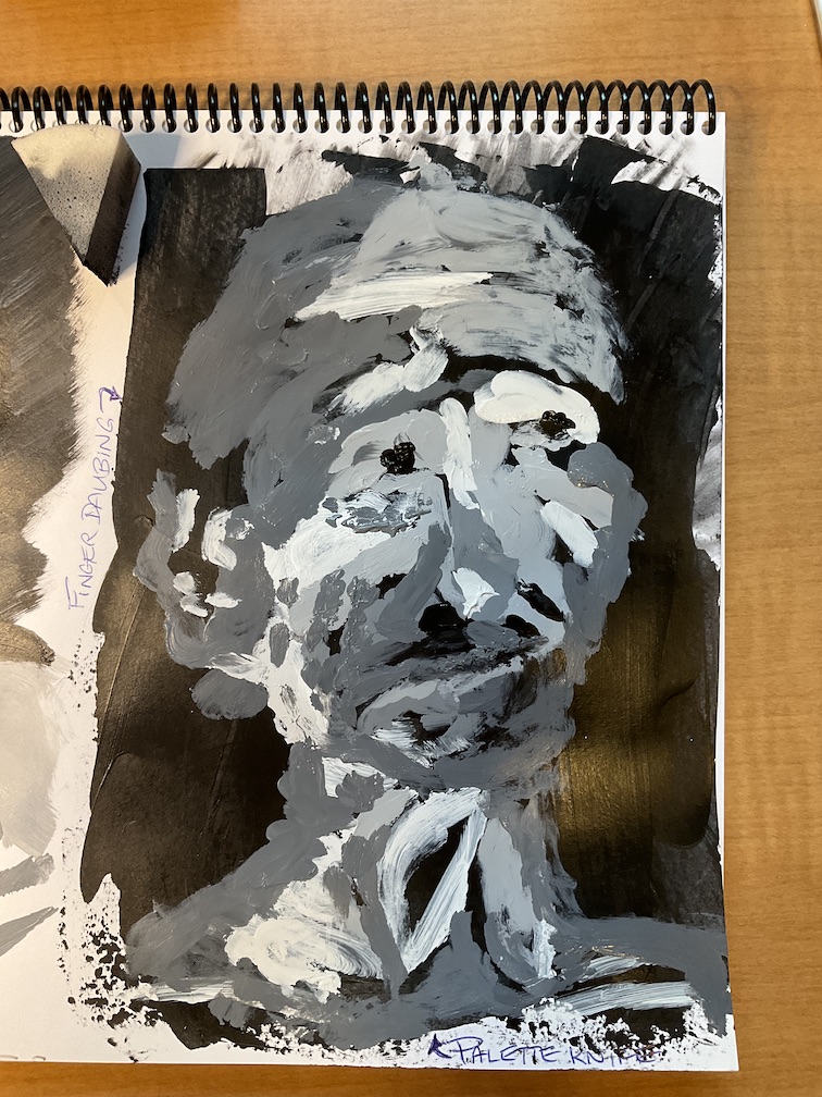
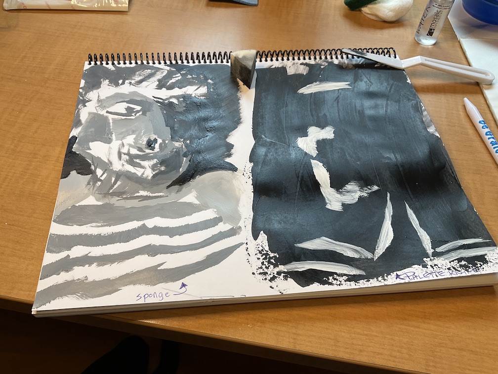
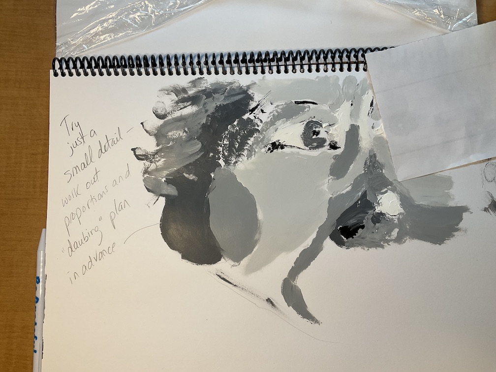
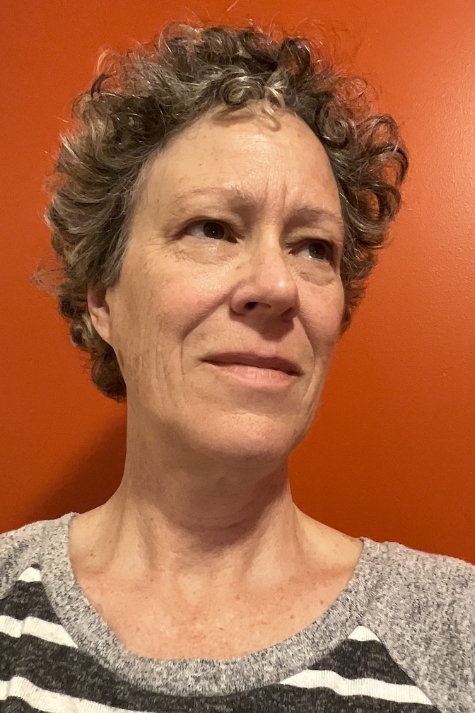
First take: In class, using brushespossible photo – lit from belowbrainstormingpossible photo – side-lit by computerpossible photo – candlelit from belowfinger daubs over palette knife blackfinger daubs and smears on whitefinger daubs plus coarse spongeReference photo – final choice
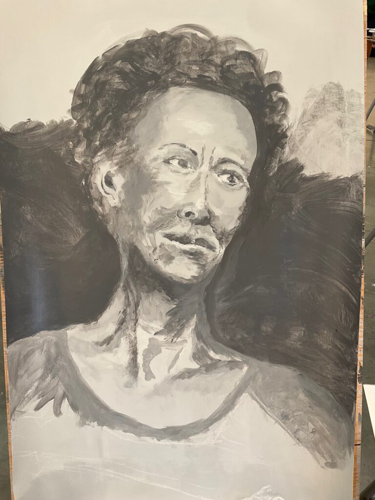
Self-portrait in process:
27 Sept in-class29 Sept 1 Oct
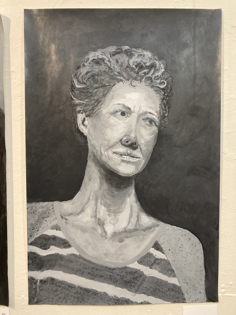
FINAL to critique 4 October
General Info picked up during class critique: consider using horizontal paint strokes for background, to set up a contrast with a vertically-oriented portrait subject (especially if using a landscape format for a portrait, with correspondingly more background involved). Consider that painting is about shape, versus drawing that is about line. If there are areas in your painting that you’ve rendered as lines, try breaking the lines up into constituent shapes, remove shapes / sections within the lines.
Feedback specific to my painting from class critique: my figure has a candid, relaxed feeling. The viewer picks up a narrative in the painting. Positive comments about the hair depiction, the interacting shapes in the hair. Shadows under the chin, highlights forehead and lips and nose, and the shapes of the collarbones are strengths. Areas for improvement – add form/value to the figure’s left shoulder, address the relatively glassy right eye, make it more similar to the left eye.
My own feedback, several days post-critique — pleased with my composition, the shape and coloration of the negative spaces, and some of the ways I have implied form by blends and shifts in value. Key things I’d like to improve next time: 1) better proportions — shorter neck, larger space nose to lip, shorter nose and mid-section of face/cheeks, larger eyes. Achieve this with more chalk sketching at the outset and repeat/check it as I go along; and 2) less abrupt value shifts in shadows under nose, left eye and left clavicle. Support this in part by finding a way to preview the painting in good lighting and at much greater distance than I have at home, a day or two ahead of finishing it, to allow time to review and adjust.
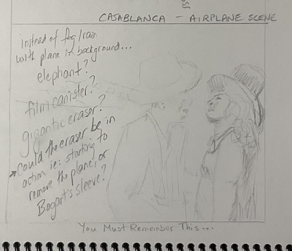
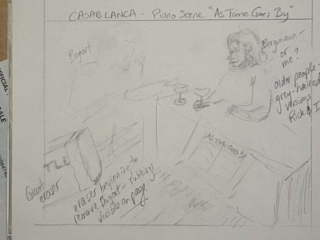
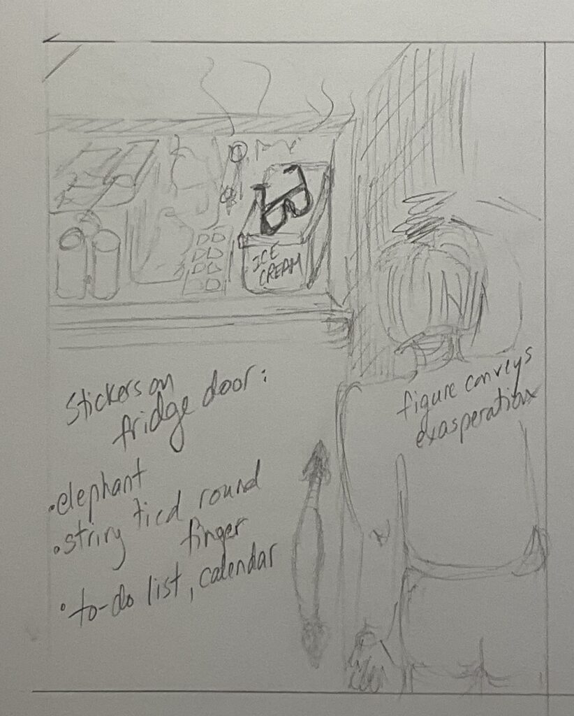
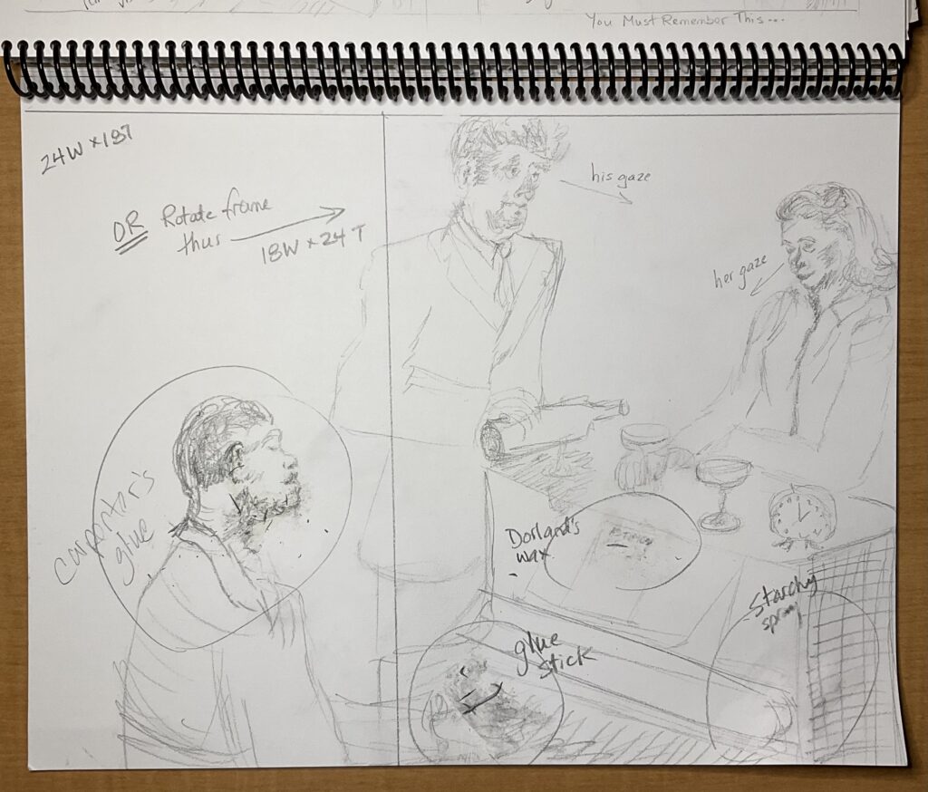
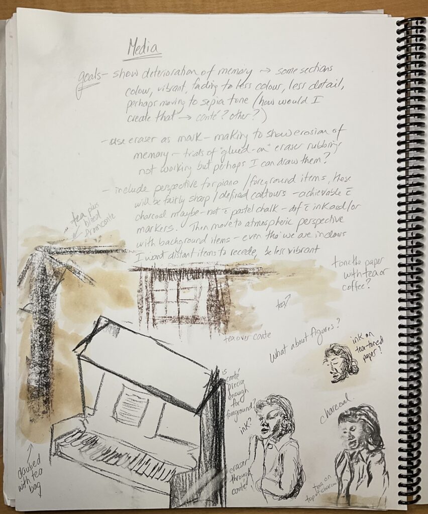
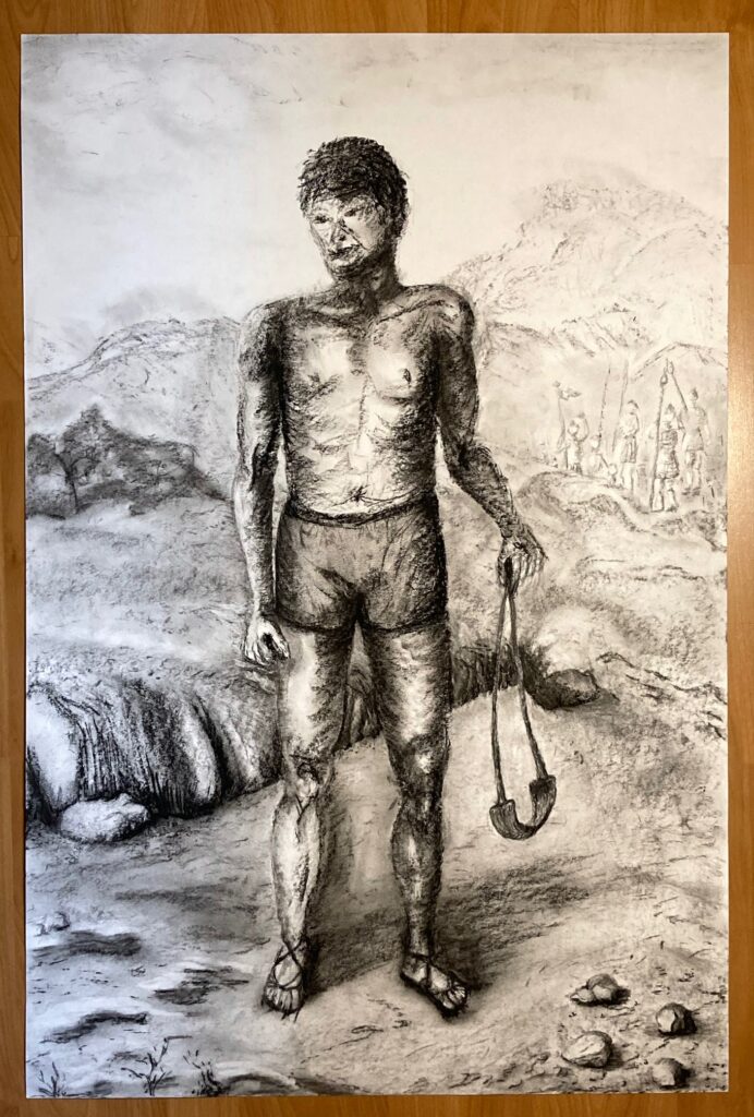
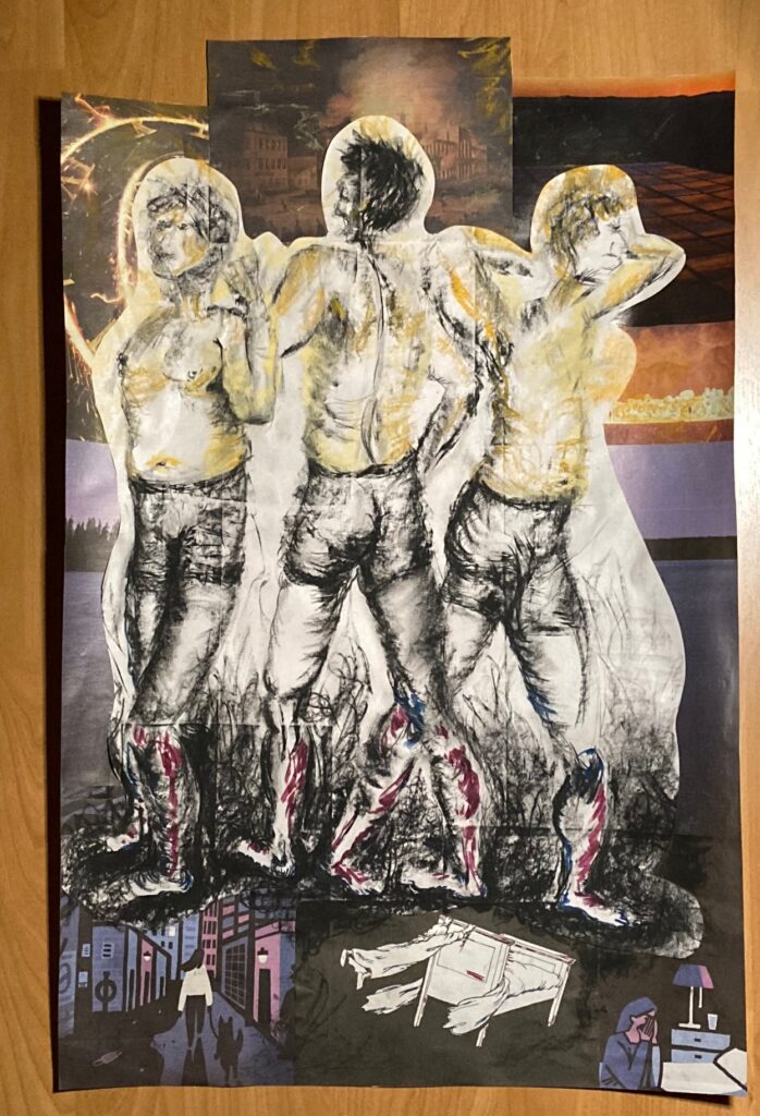
FINAL DRAWING PREP WORK: as of March 25th — here is a brainstorming ideas page, a gallery of 5×7 thumbnails that came out of those ideas, then three 10×14 sketches of the idea I like the most, to play with layout/cropping, types of media, and paper toning. Will likely need another test page to work out more of the background and how I will incorporate erasures, fading images, etc.
cropping/layout. Trial attaching eraser rubbings — not very successful. To come back to this. Perhaps draw them on, or research other glue methods.Testing out graphite and tea stains. Not liking the tea stains. Liking the graphite for the figures, with ink, charcoal, and pastels for darker values and small bits of intense colour. Not sure will keep the piano player — instead include more background furniture and room features that I can blur, erase, or alter out to play up the memory theme. Could put sheet music for “As Time Goes By” on the piano. instead
WORK IN PROGRESS: Don’t know if you wanted us to take photos in progress, but I did — so I include 3 of them here…
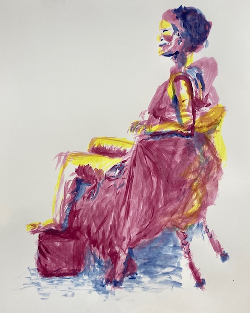
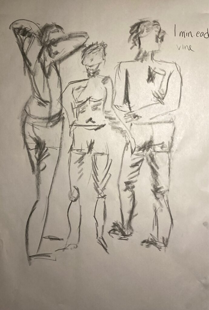
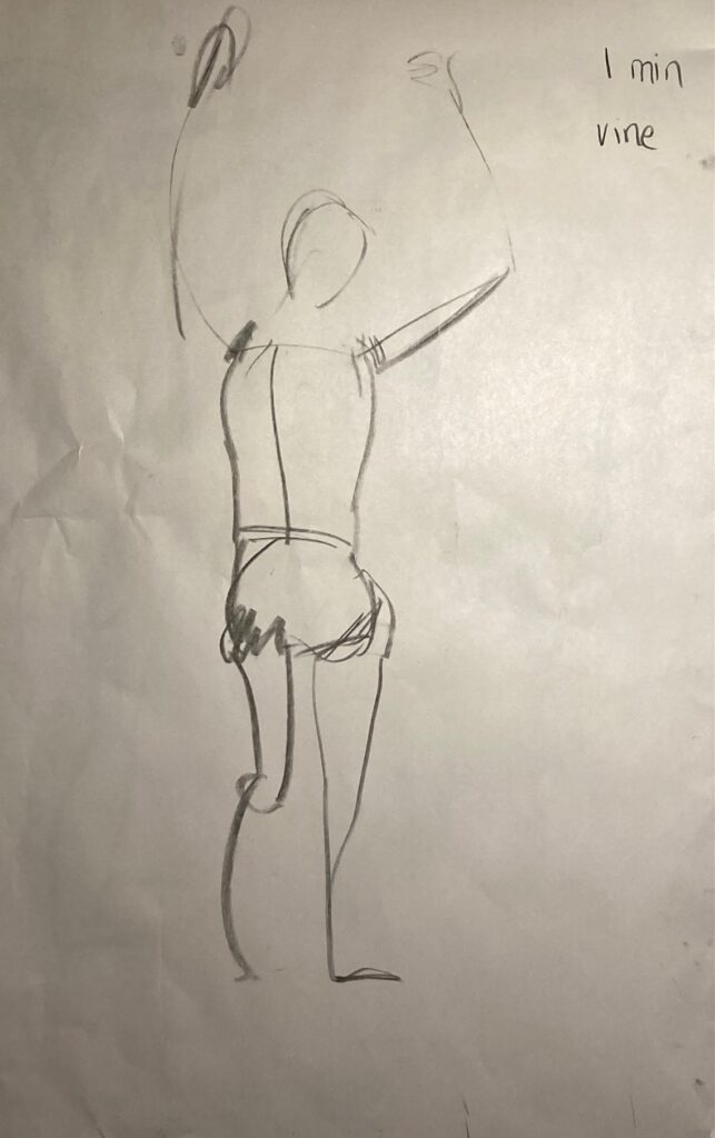
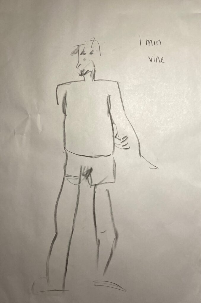
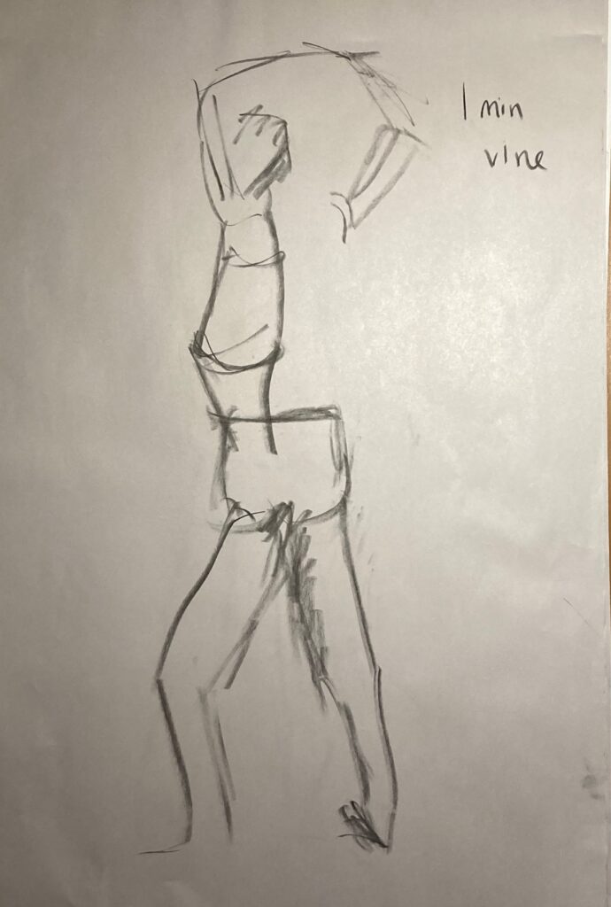
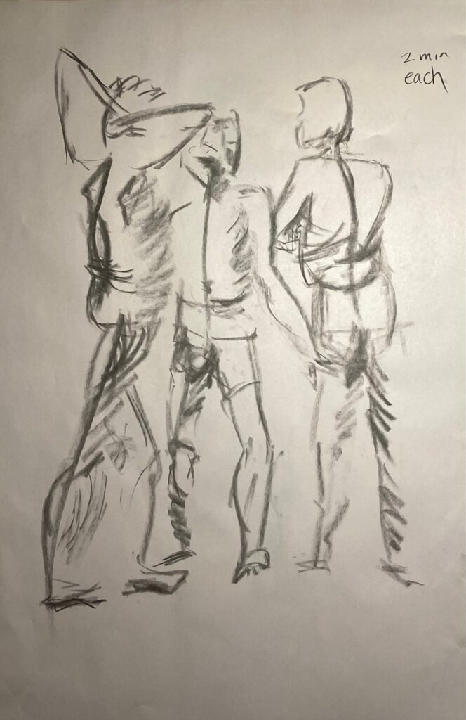
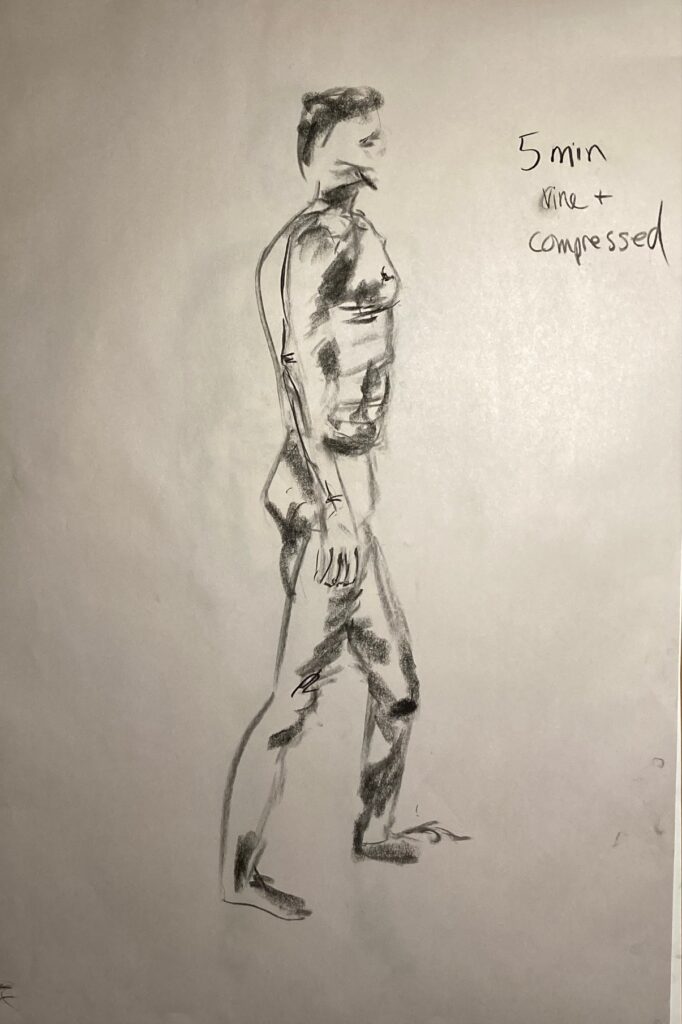
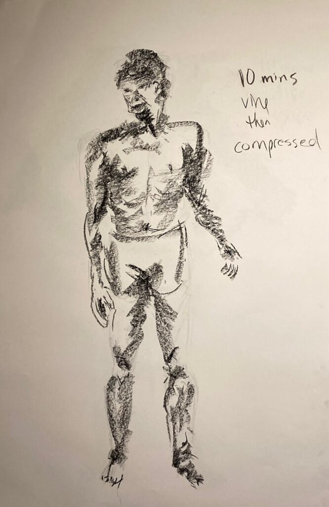
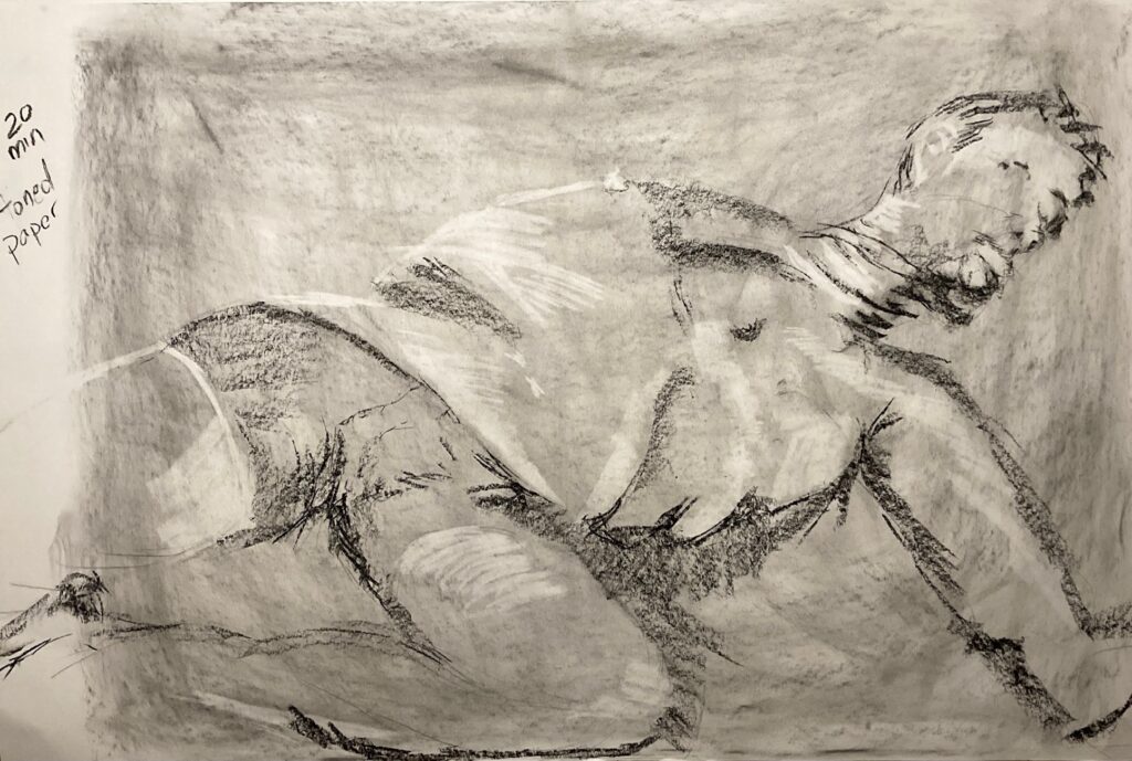
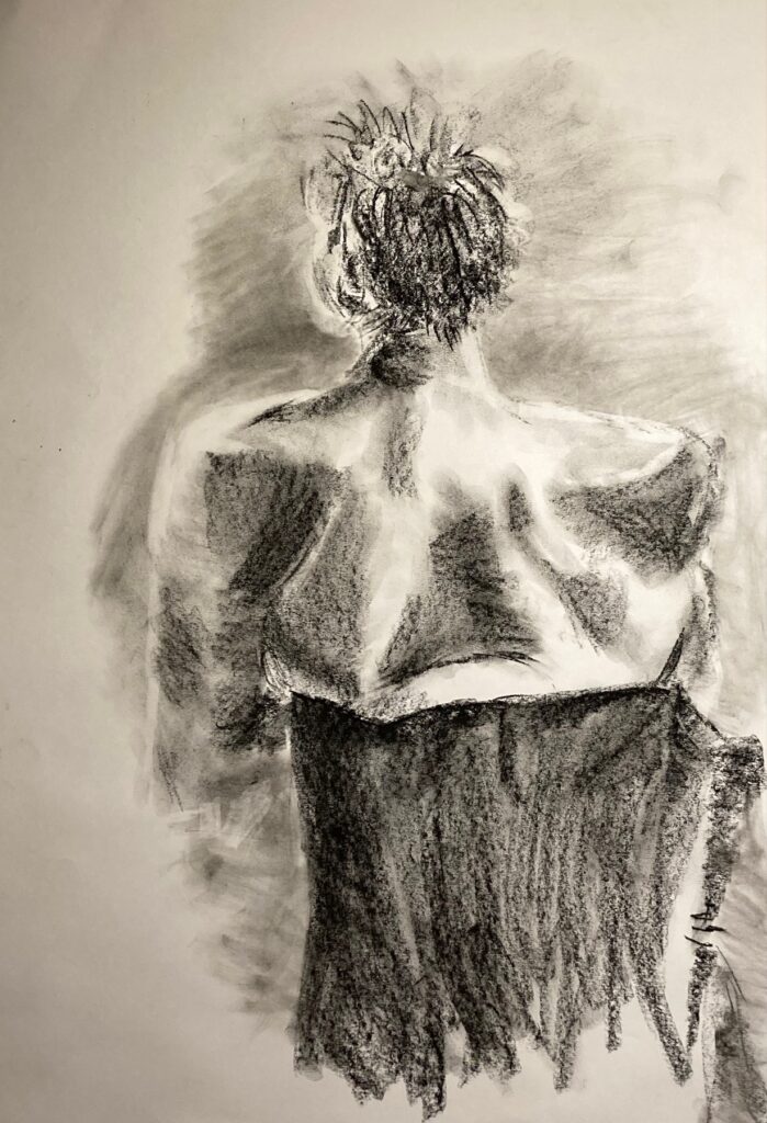
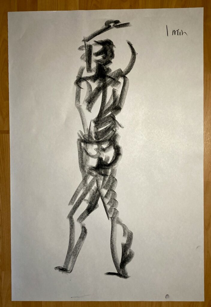
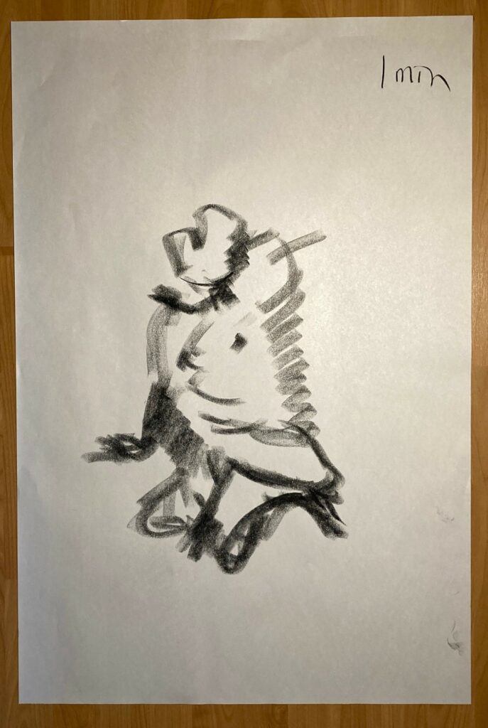
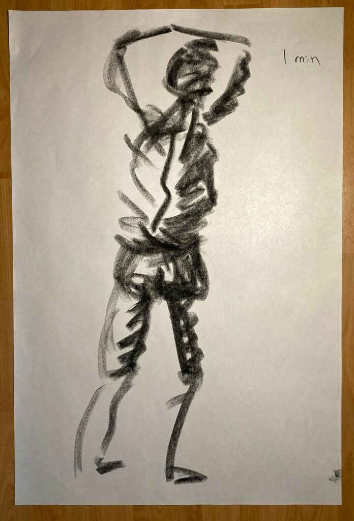
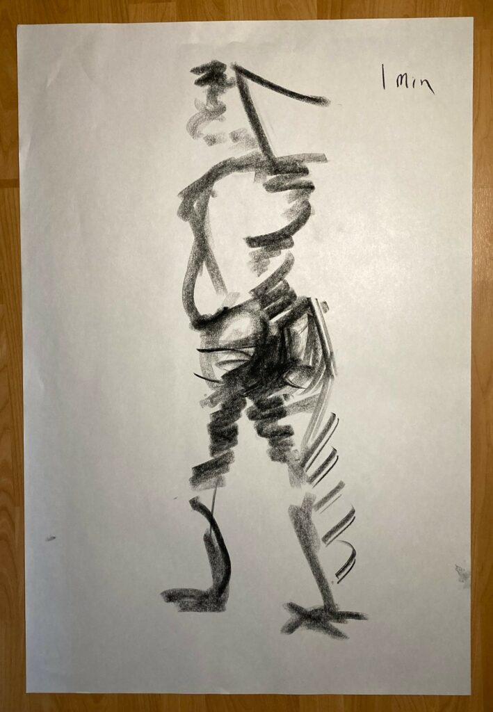
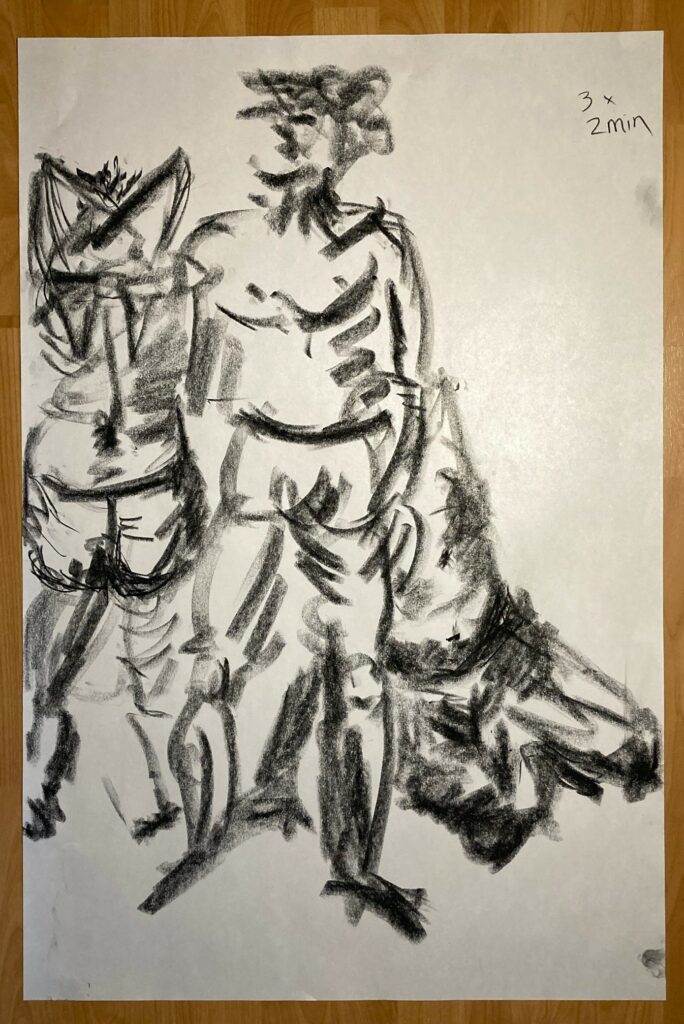
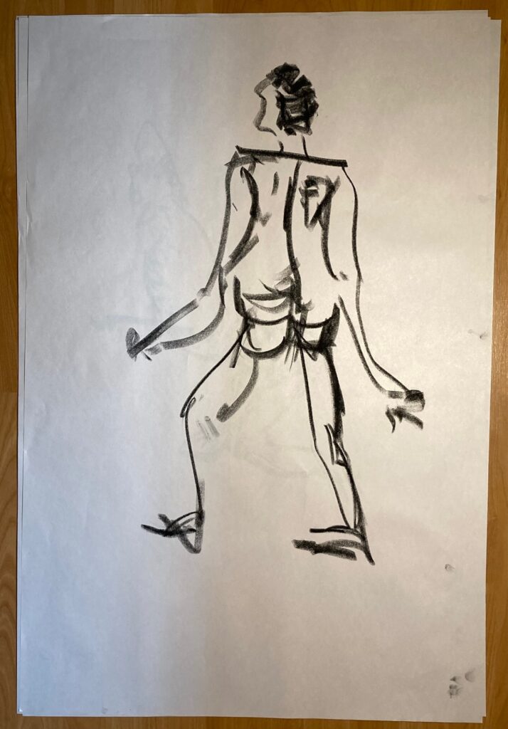
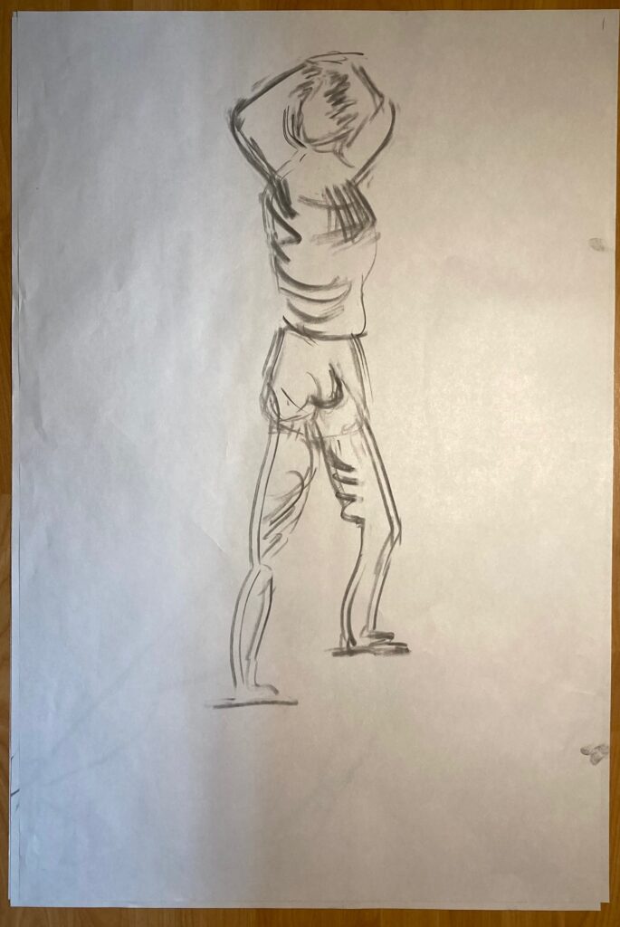
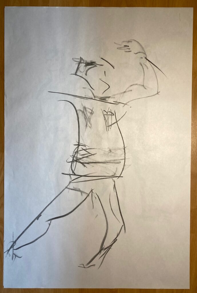
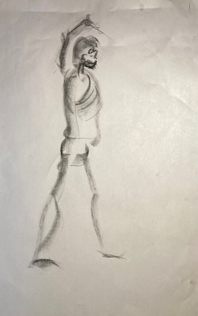
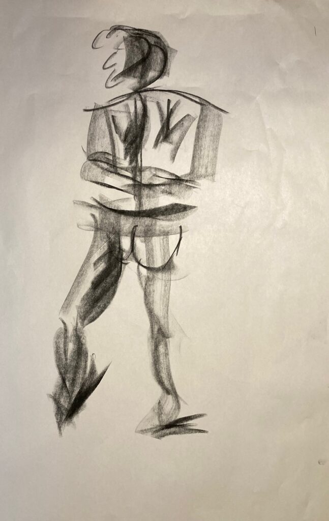
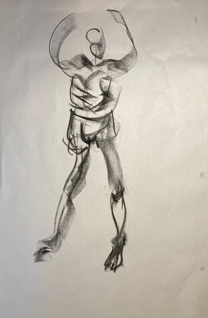
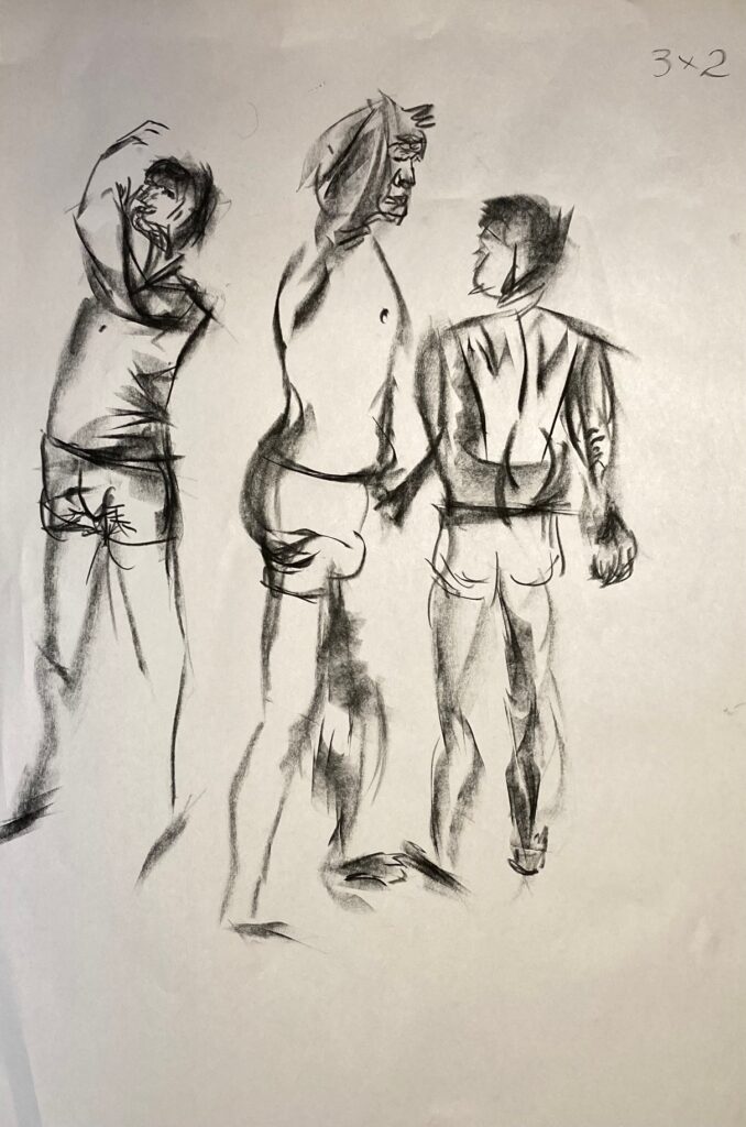
Model Drawings from Feb 28 (Day 1) : starts with gallery of 1-, 2-, and 5-minute gesture drawings, then some 10- and 20-minute figure drawings
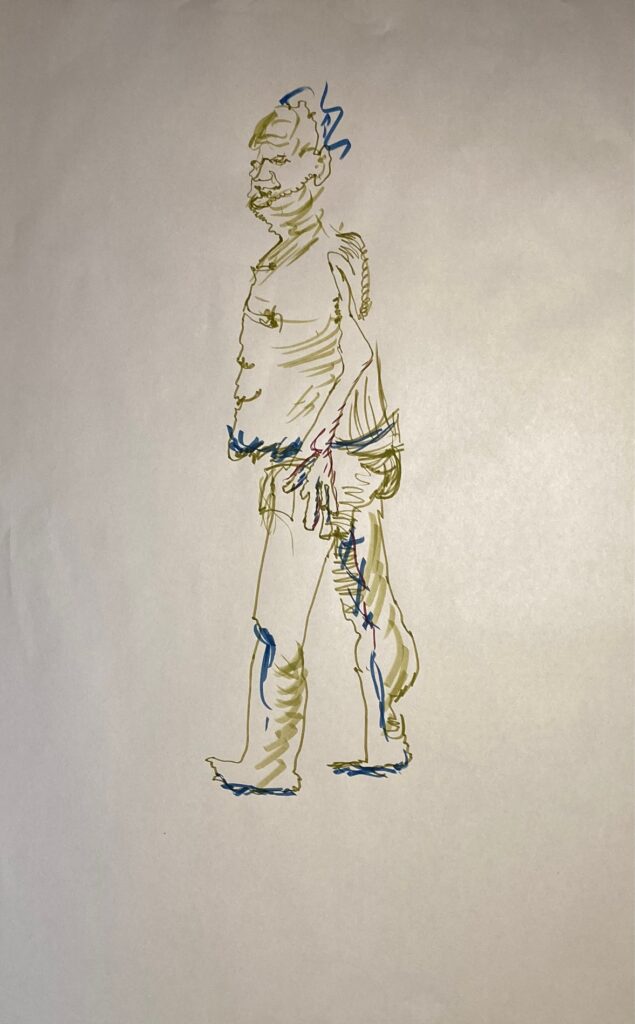
this one on toned paper
HOMEWORK for March 7: Atmospheric Perspective. Pick a figure drawing from Feb 28th class — draw a landscape/background around it, with a focus on atmospheric perspective
While it is unlikely that boxer shorts were in vogue during the days of David, it just seemed my fellow’s left hand was perfectly angled for a dangling slingshot, as he gazed in shock at the felled Goliath.
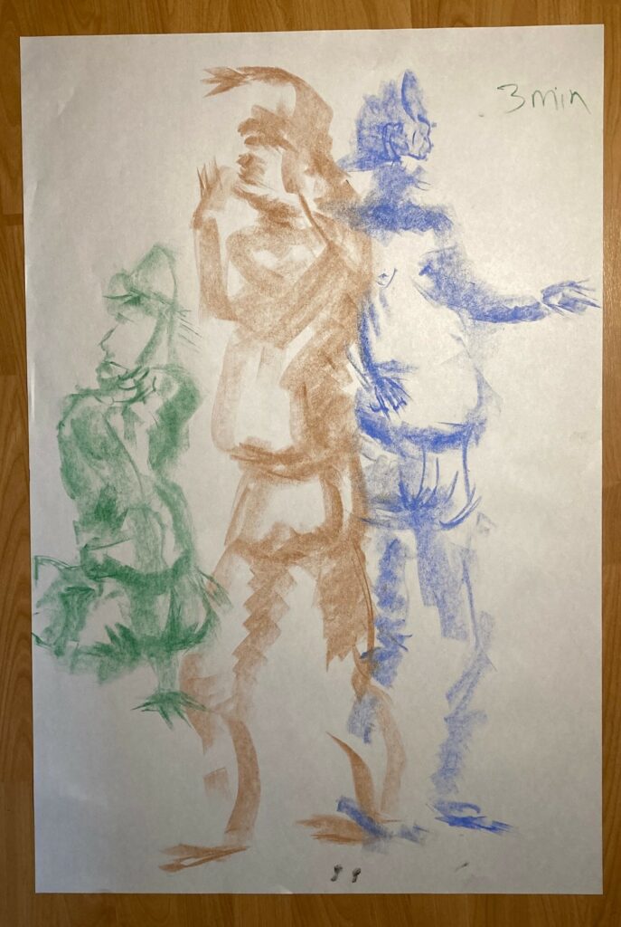
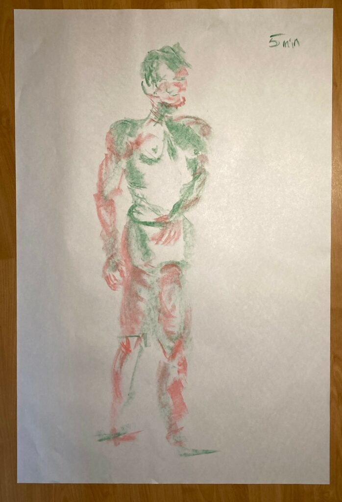
Model Drawings March 7th (day 2): soft pastel. Again, starts with a gallery of 1- and 2-minute gesture drawings, in black and white. Then some 2- and 5-minute gestures that add colour. Finally, 4 separately-posted longer colour drawings.
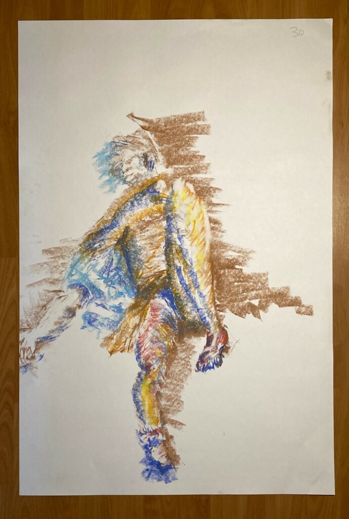
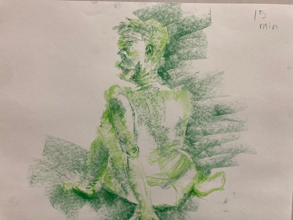
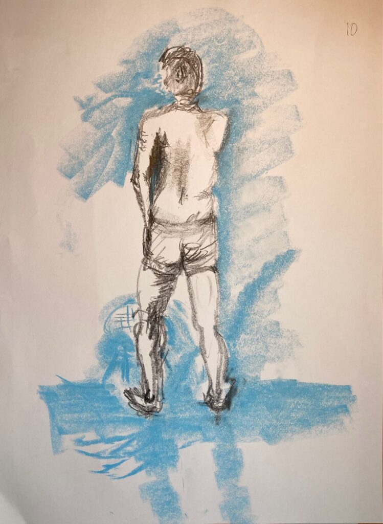
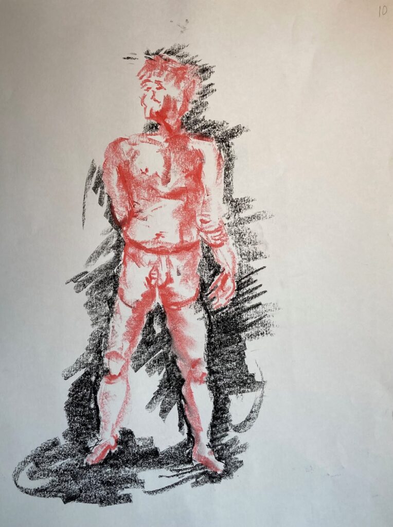
10 minute drawing. Use warm and cool tones15 minute drawing. 2 close tones.20 minute drawing. Warm and cool tones30 minute drawing, on brown paper
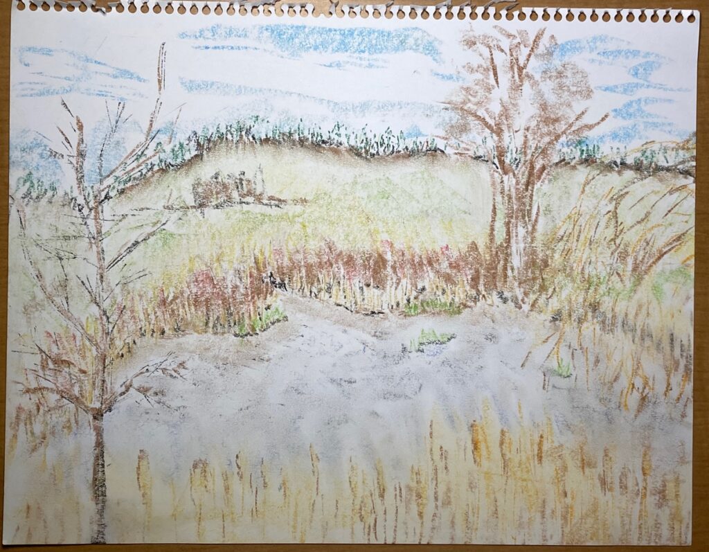
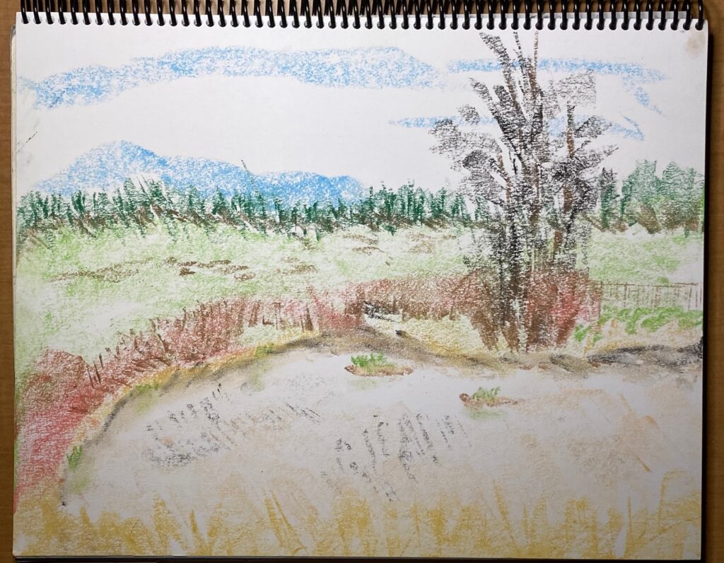
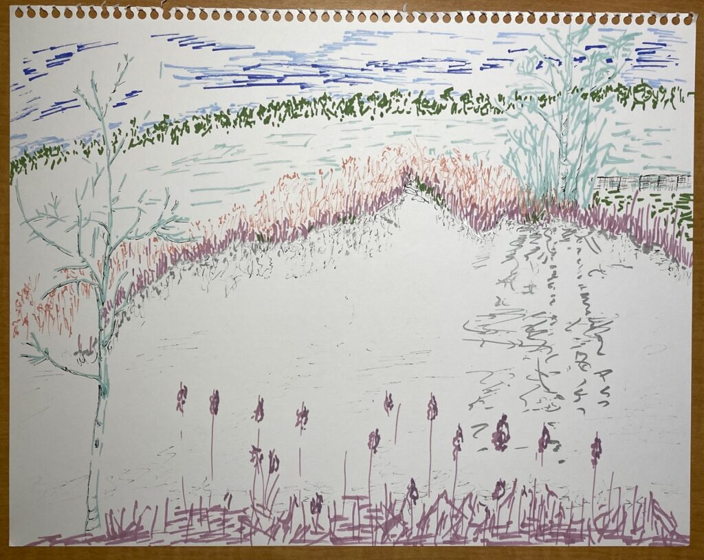
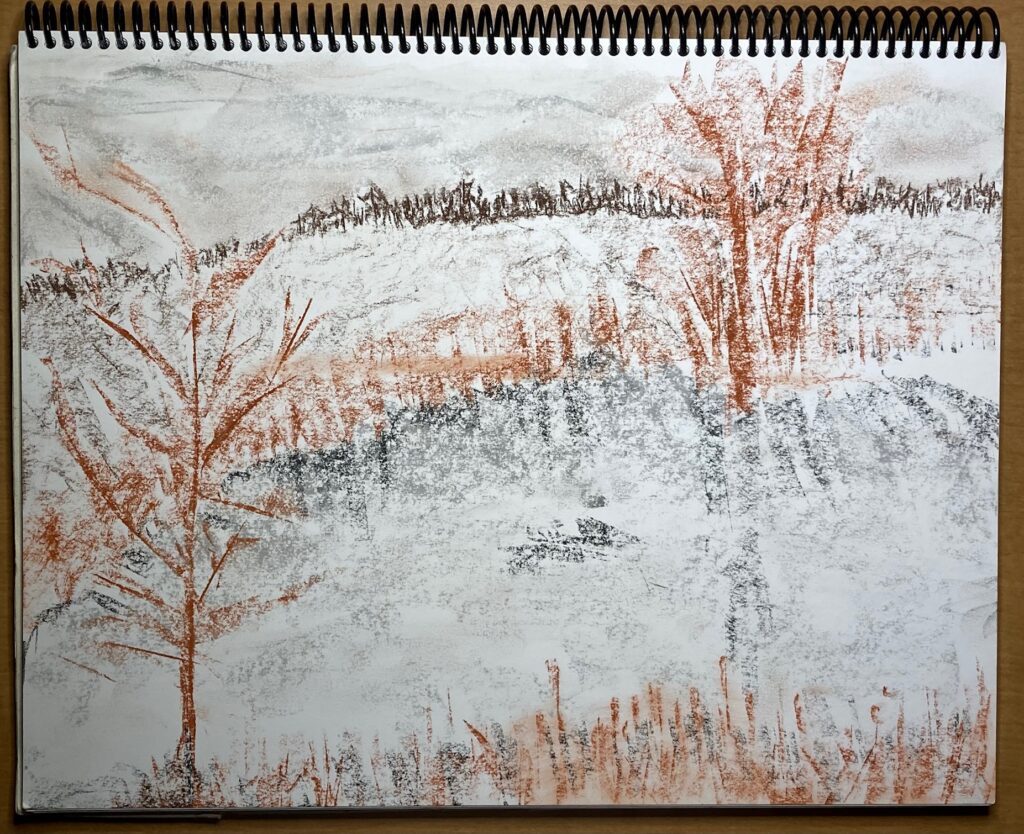
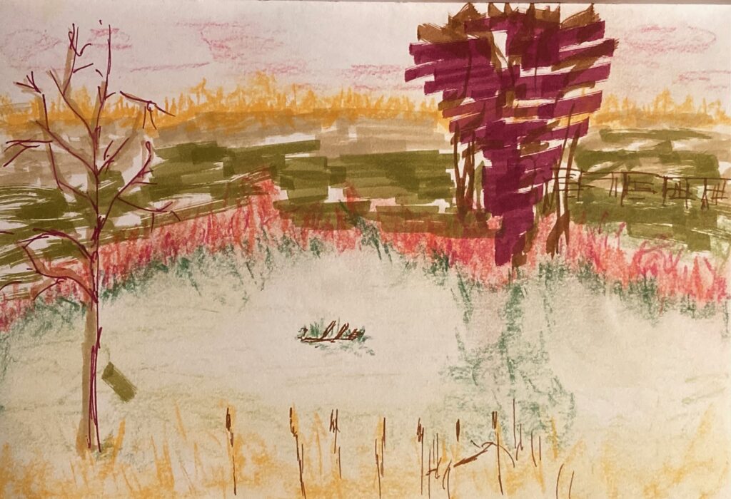
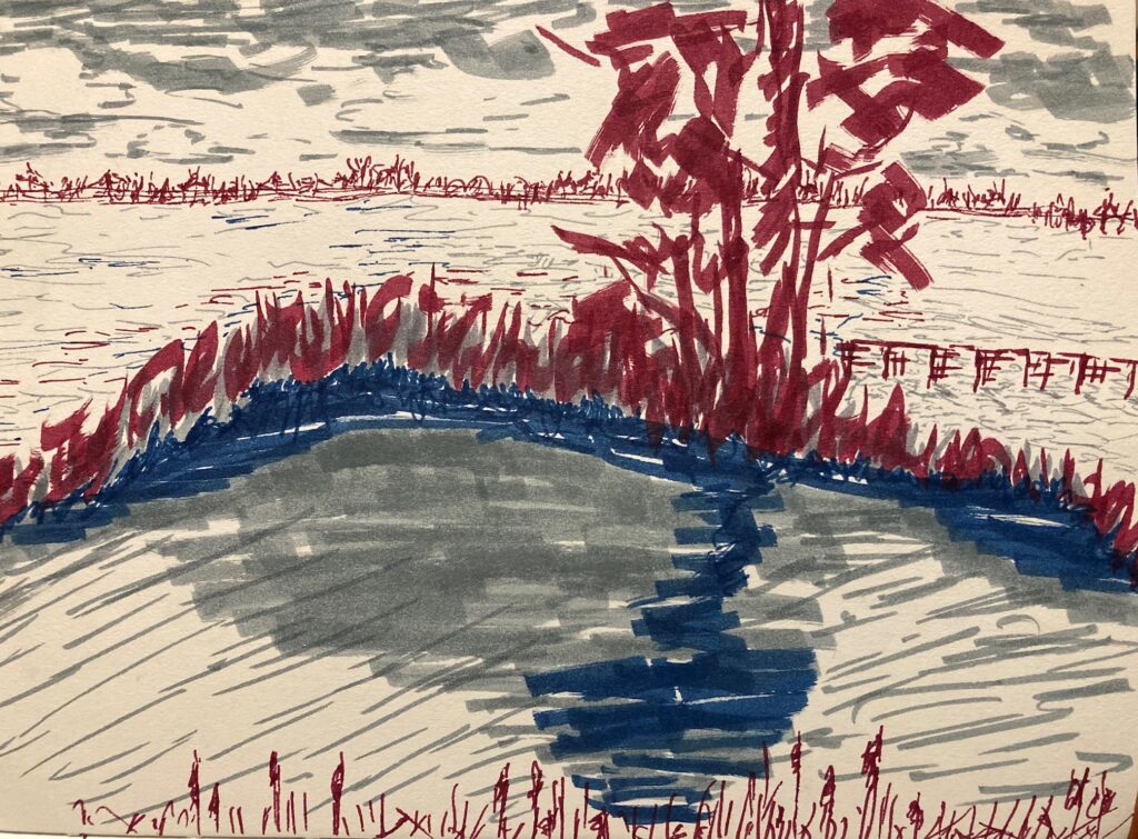
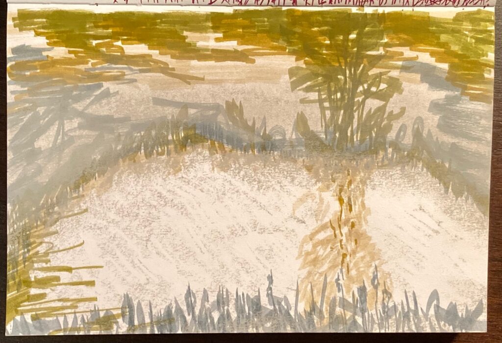
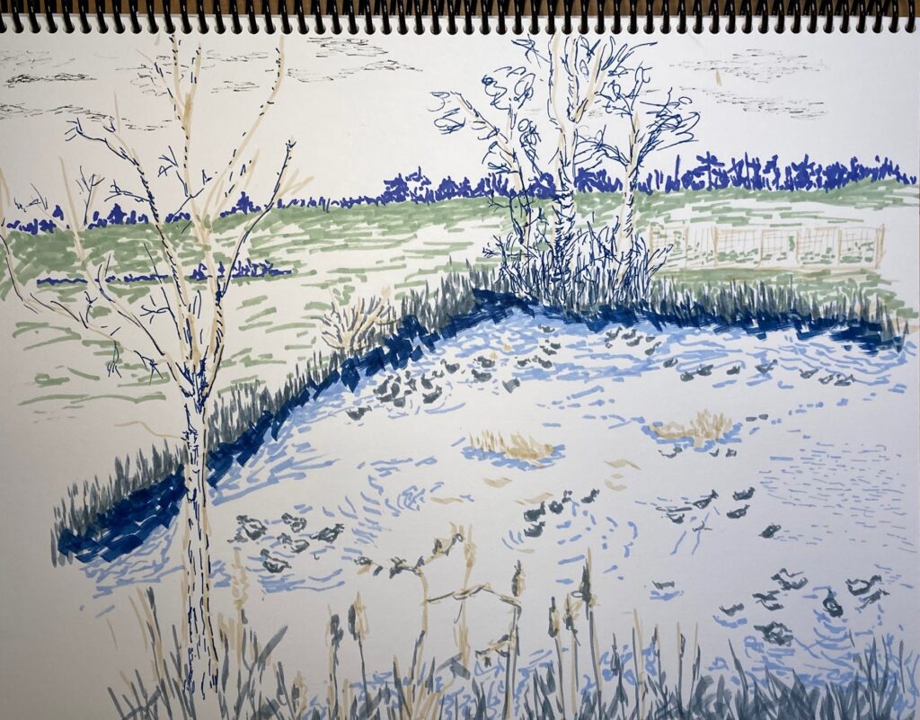
HOMEWORK for March 14: Using colour for quick landscapes. My local duckpond served as the scene — see 8 takes on it, posted below in order of sketching. Captions describe the time of day and other stuff…
ONE sunny afternoon. Pastels. Spent too long, very fussy and small tentative marksTWO: pastels. Same sunny afternoon, but drawn quickly and with more life.THREE: dawn. Very still. Markers, FOUR: same dawn. Conte black, brown, brick, white.FIVE: this one plus the next two are in small sketch book (5 by 8). and all drawn at dusk. Markers and pastels.SIX: Dusk. Three markers only — grey, red, blueSEVEN: Dusk. Markers first, pastel layered on top.EIGHT: very windy very cloudy afternoon. Tons of ducks. Markers, all shades of blue or grey except one beige
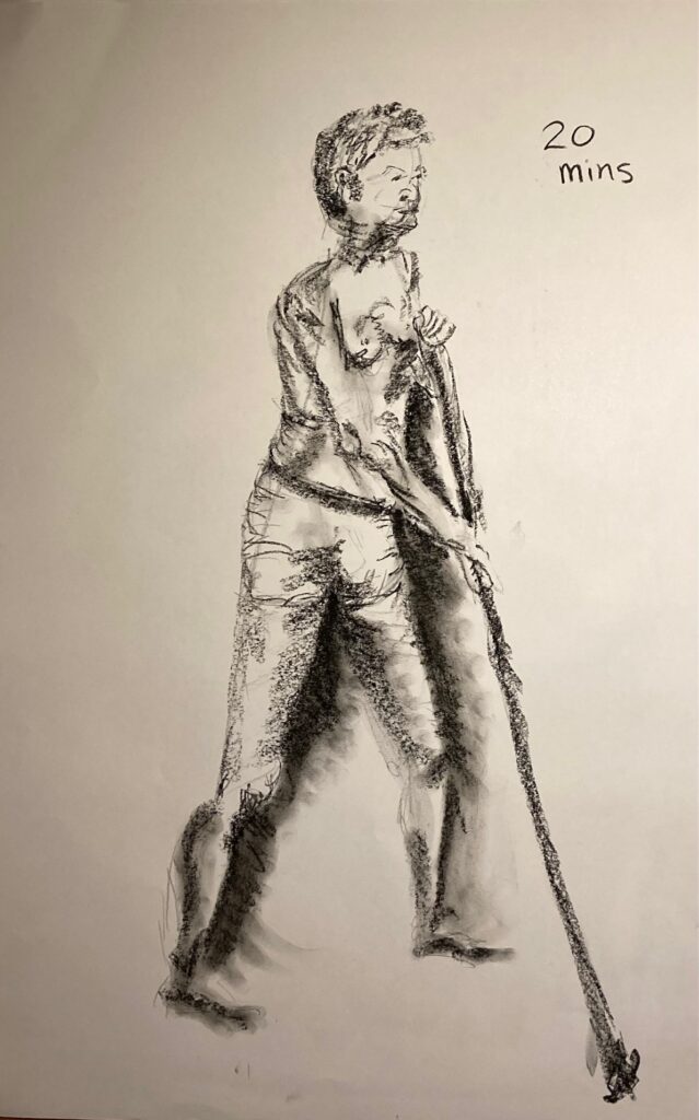
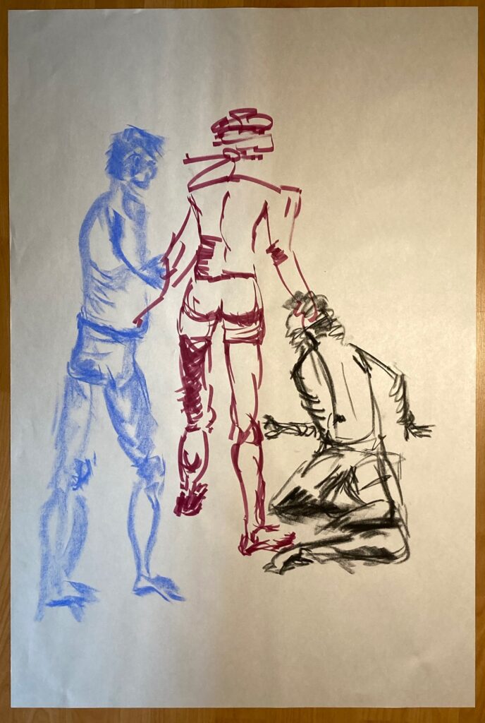
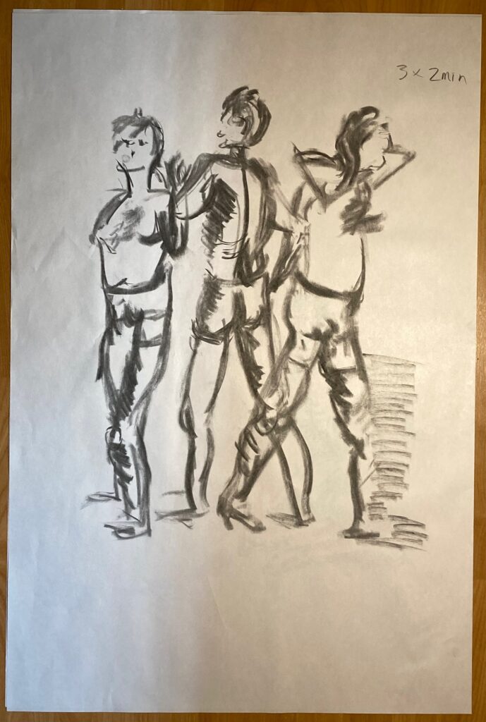
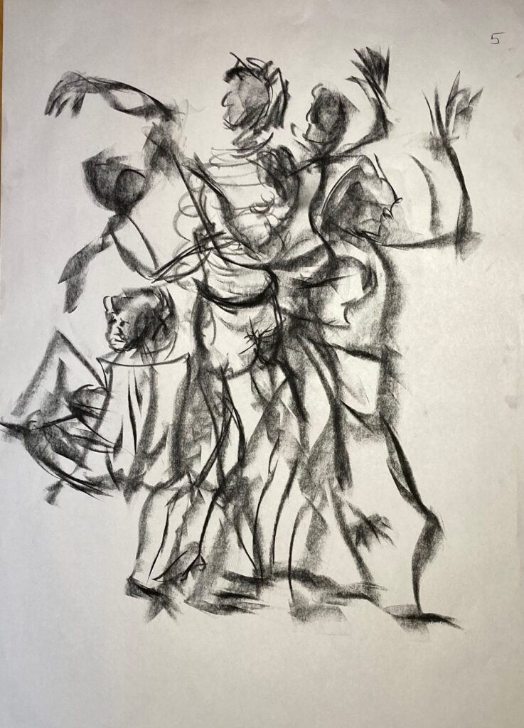
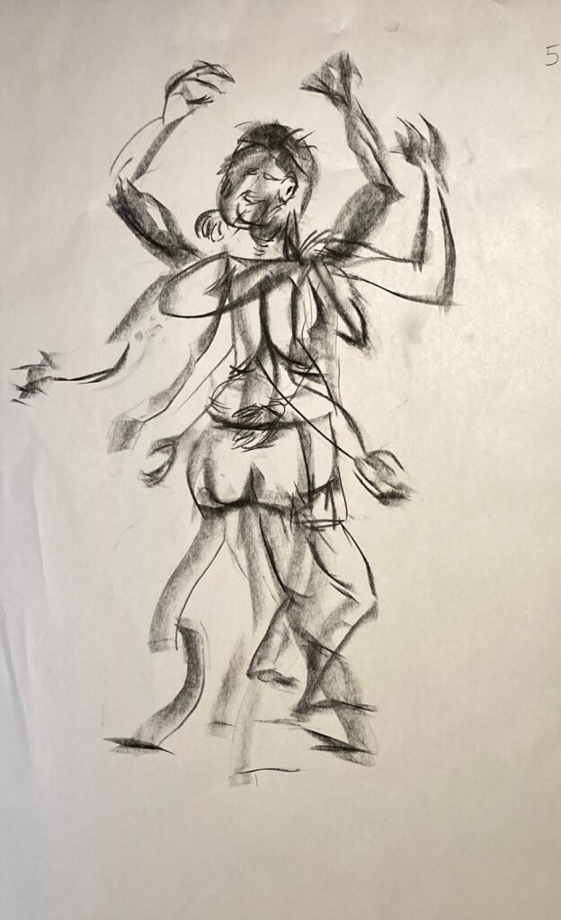
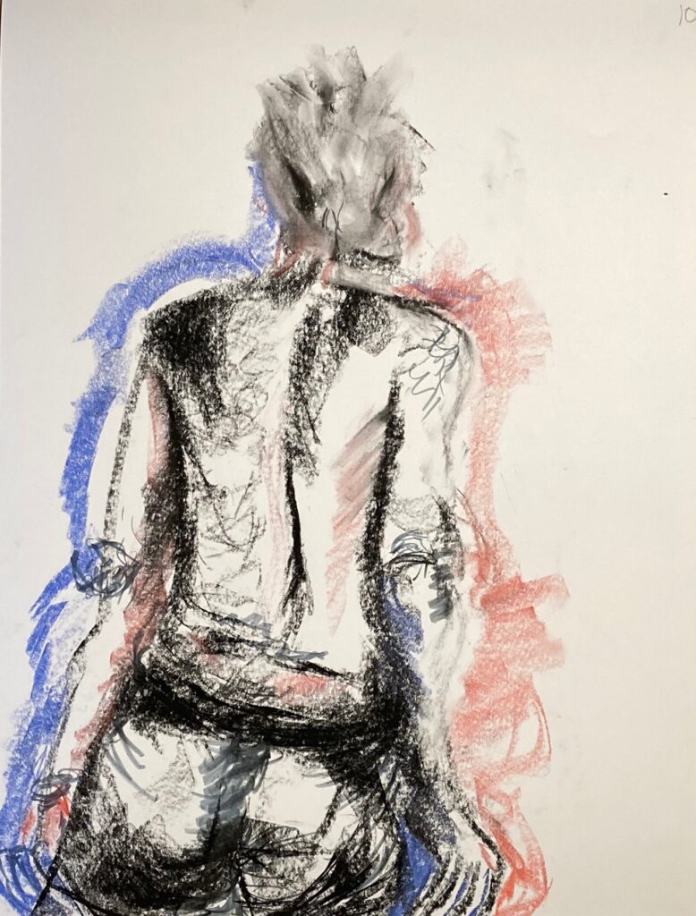
Model Drawings from March 14 (Day 3) : Gallery of warm-up quick gestures, 1- and 2-minutes, followed by longer poses and incorporating mixed media.
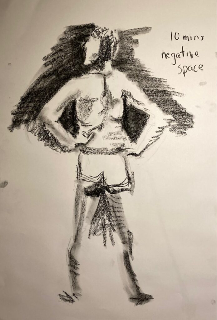
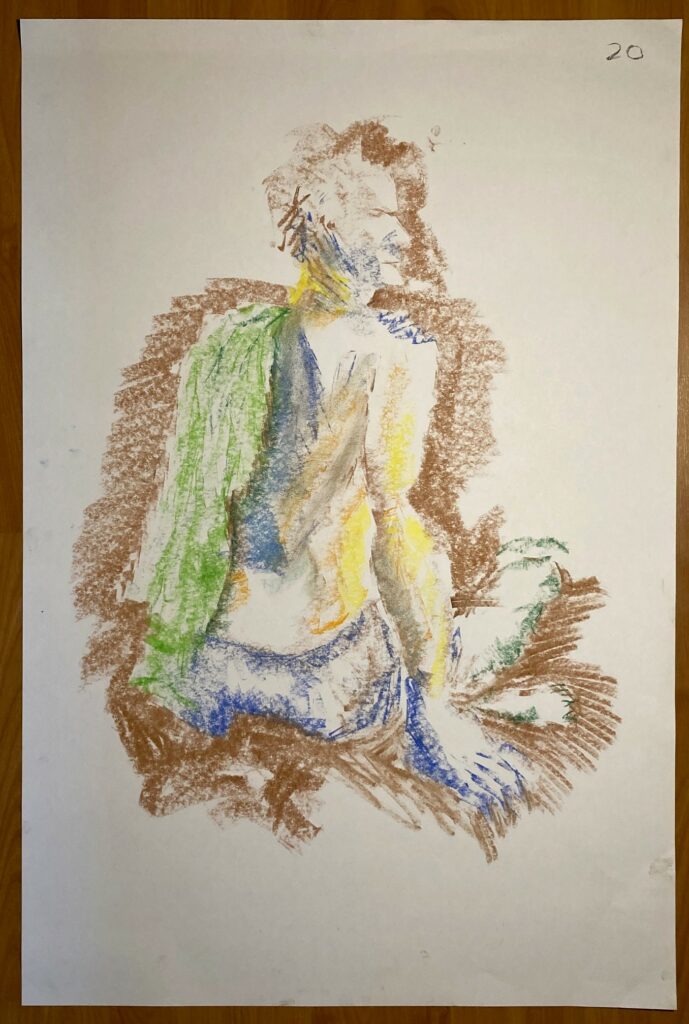
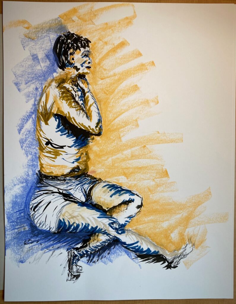
three times 2 minutesthree times 2 minutes10 mins, colour negative space10 mins, colour positive space15 minute, on brown paper30 minutes. Chalk and markers30 minutes. Black ink, coloured marker, chalk pastel
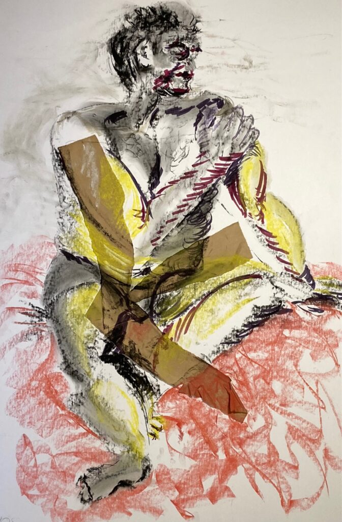
Homework for March 21: mixed media and collage added to one of the in-class figure drawings.
Model Drawings for March 21 (Day 4): Gallery of 1- and 2-minute gestures to start.
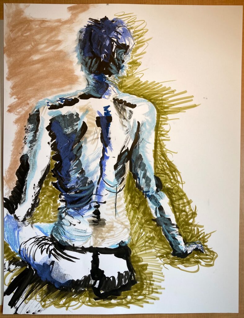
5 min blind contour5 min change positions5 minute slow-mo rotate10 min colour10 min colour on brown paper30 minute colour with collaged paper placed prior to starting the pose30 minute with collaged magazine and tape