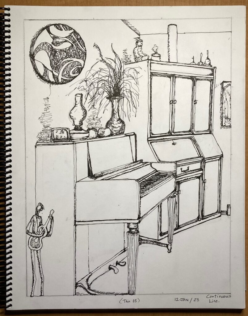
Continuous Line — first attempt. Did pre-sketch in pencil using sighting stick, then drew with thin black ink pen (05). Although everything is connected to everything else, I did lift my pen several times and in the end felt like I didn’t keep to the spirit of the assignment as well as I’d like. Will repeat later this week — thicker pen, no pre-sketchsecond attempt — thicker marker (Sharpie “Fine”) and no pre-sketch with pencil. Looser, and less accurate. More character, I think.
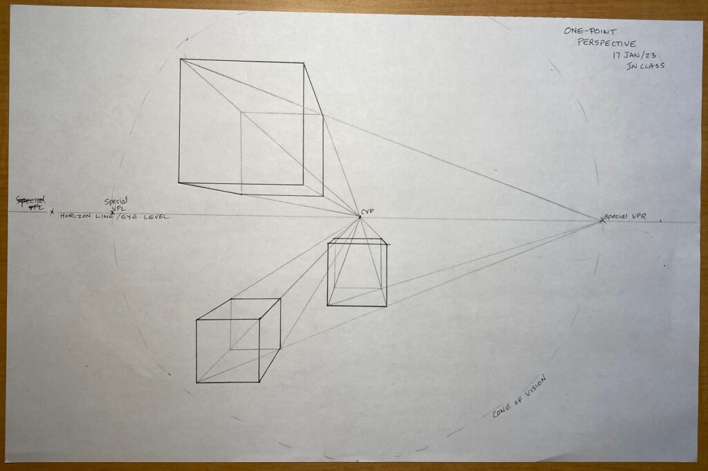
Jan 17: In-Class Perspective 1,2, and 3-point:
In-class 1-point perspectiveIn-Class 2-point perspectiveIn-Class 3-point perspective from aboveIn-Class 3-point persperctive from below
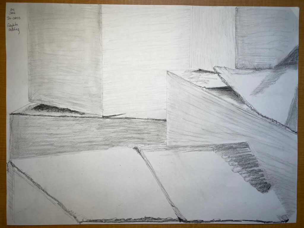
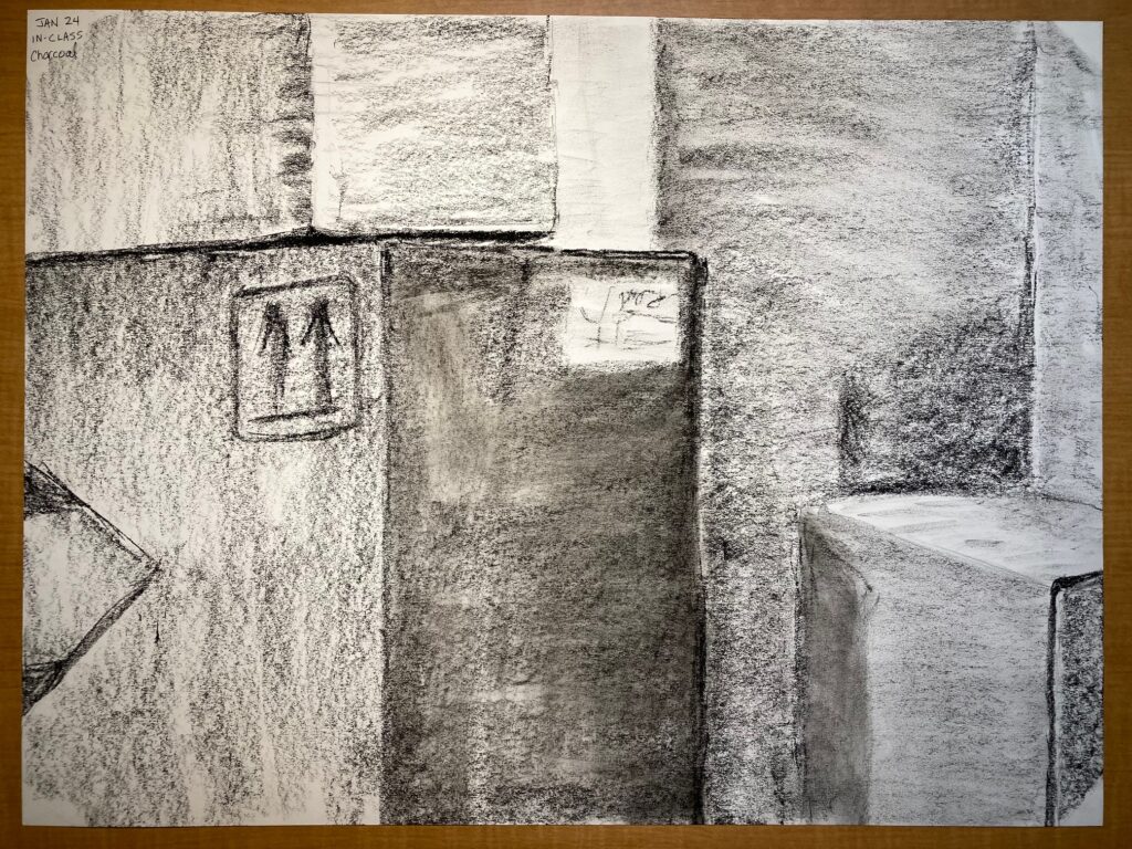
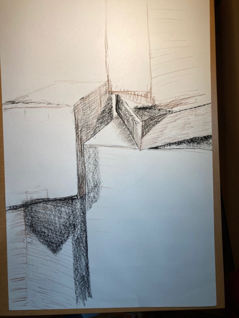
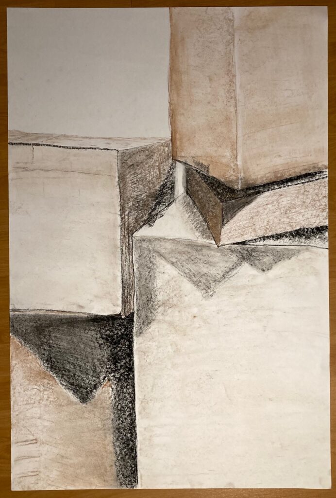
In-Class January 24: Perspective — Light and Shadow
In-class Drawing 1 18 x 24. graphite shading 35 minsIn-class Drawing 2 18 x 24 charcoal shading 30 minutesIn-class Drawing 3: 24 x 36 Work in progress. 40 minutes. I have retained a photo of this set-up and will work further on it. Struggled to generate an accurate line drawing on a page this large– was seated at donkey, I think I need to use easel next time to be able to step back and scale things better… no more donkeys for large format!!Drawing 3 completed at home — approx 30 minutes more. Needed to redraw some boxes. Since class I obtained pastel chalks that are in brick format not pencil — much easier to use to add colour on large paper
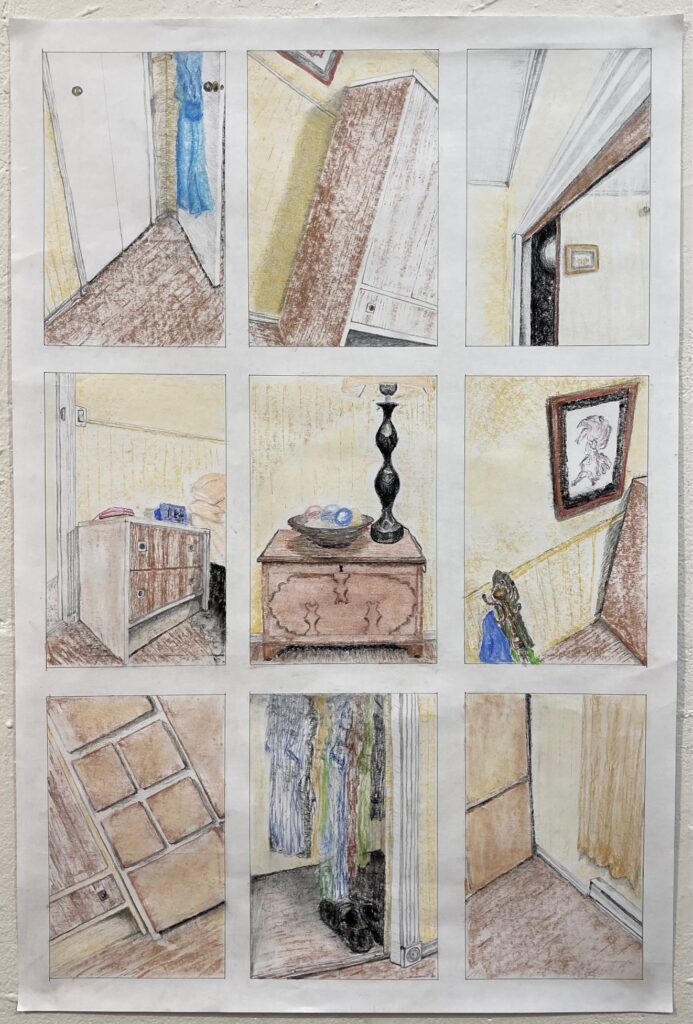
Homework for Jan 31: Spatial Complexity
9 perspectives on a bedroom.
In-Class Exercise January 31: Group Drawing
My panel in the group drawingThe final Group Drawing: bottom left corner for my panel. I wish I’d communicated with the artist about the panel immediately to my right — she included more of the floor in front of the door, mine would have matched better (and would be a more interesting composition) if I’d done the same, instead of sticking with the photo crop given us by Scott.
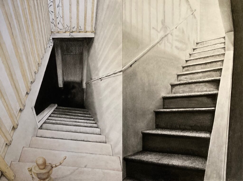
MID TERM PROJECT: Pair of Perspective Drawings: Feb 1 – 14
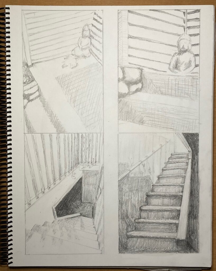
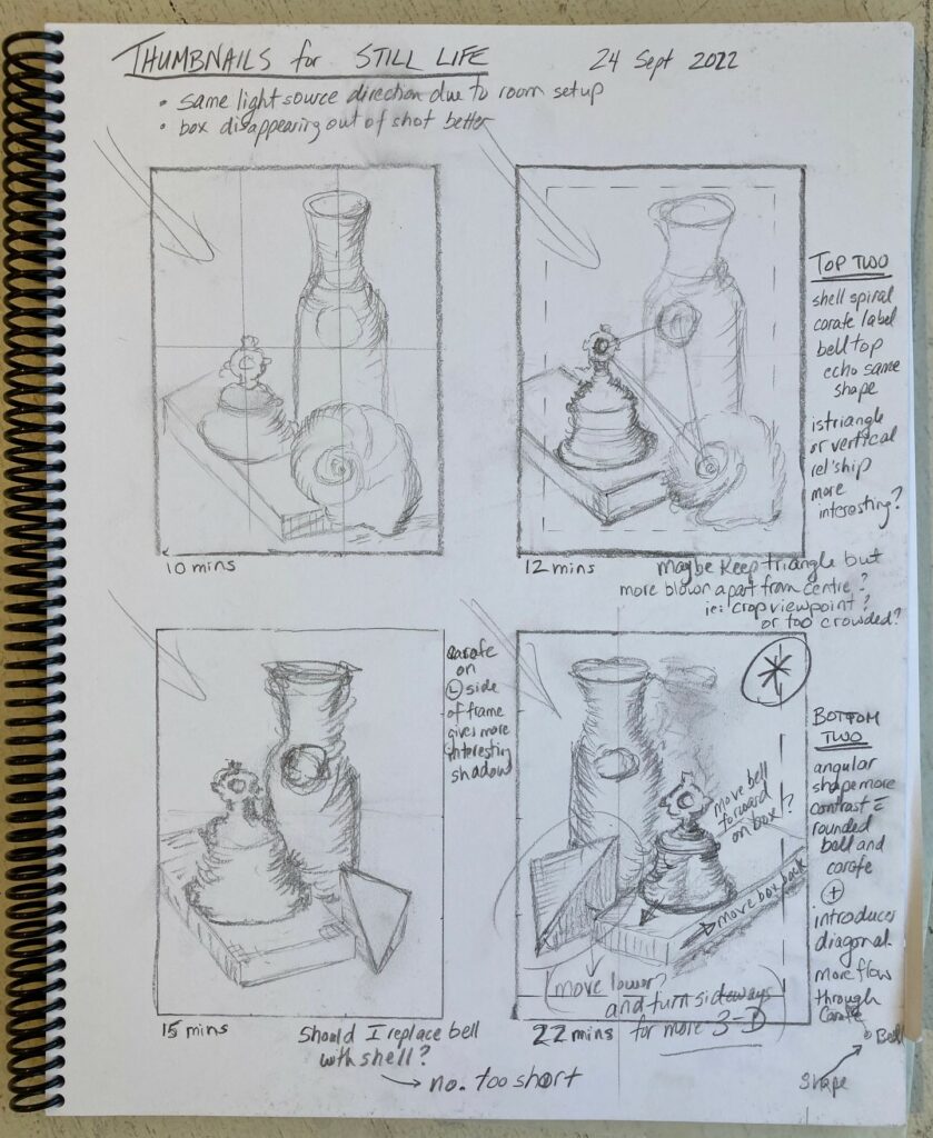
Early sketches included thumbnails 4 x 6 of three or four different ideas. See below
I liked the stairs in my house the best, so cut out the thumbnails and trialed different layouts before went on to make a pair of larger (6 x 9) sketches. See below, with comments:
two 6 x 9 sketches
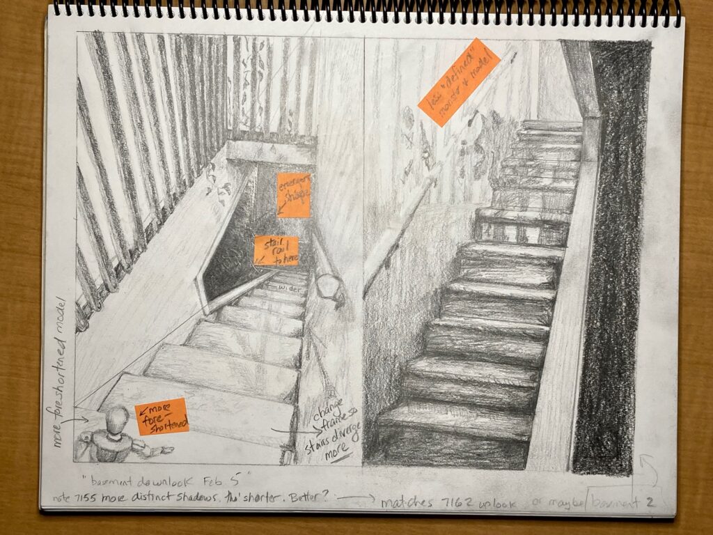
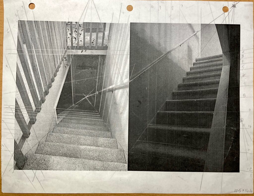
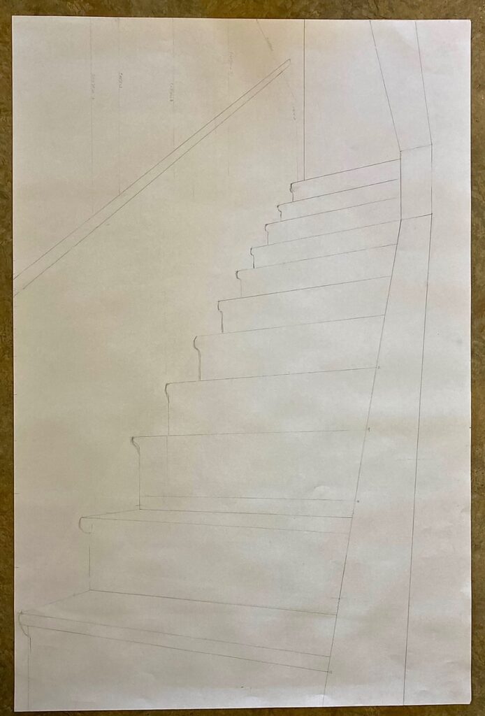
Decision made — technical work-up included rearranging cut outs, cut and pasting the two photos and marking them up to help me visualize vanishing points. See below, the reference photos for downview and upview, the marked-up reference photo, and the work in progress on the technical perspective undersketches….
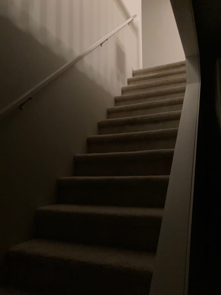
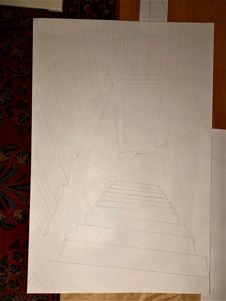
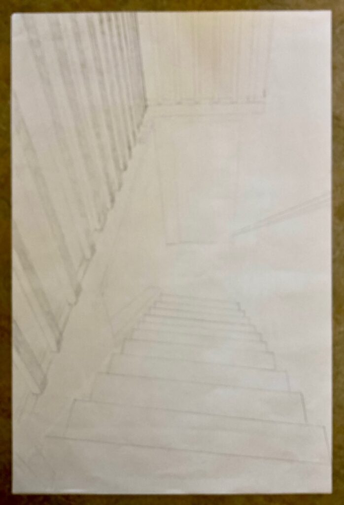
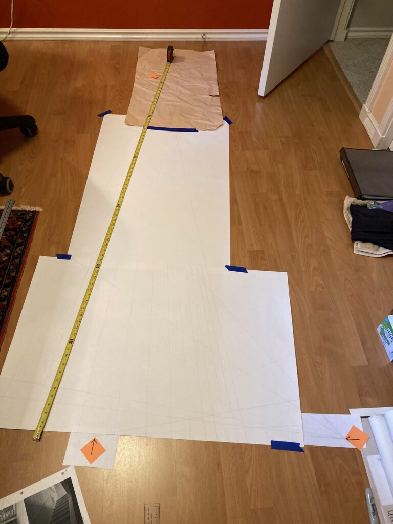
reference photo: panel one Downviewreference photo: panel 2 Upviewphoto mockup with added reference linesTech drawing 1 in processTech drawing 1 final, Feb 9. Quite light pencil marks so not easy to catch a good image, sorry.Tech drawing 2 in process: Left vanishing point was a long way away — used a 6-plus foot metal straight edge from my husband’s shop to mirror the measuring tape line,Tech drawing 2 final (Feb 10) — again, light pencil markings.
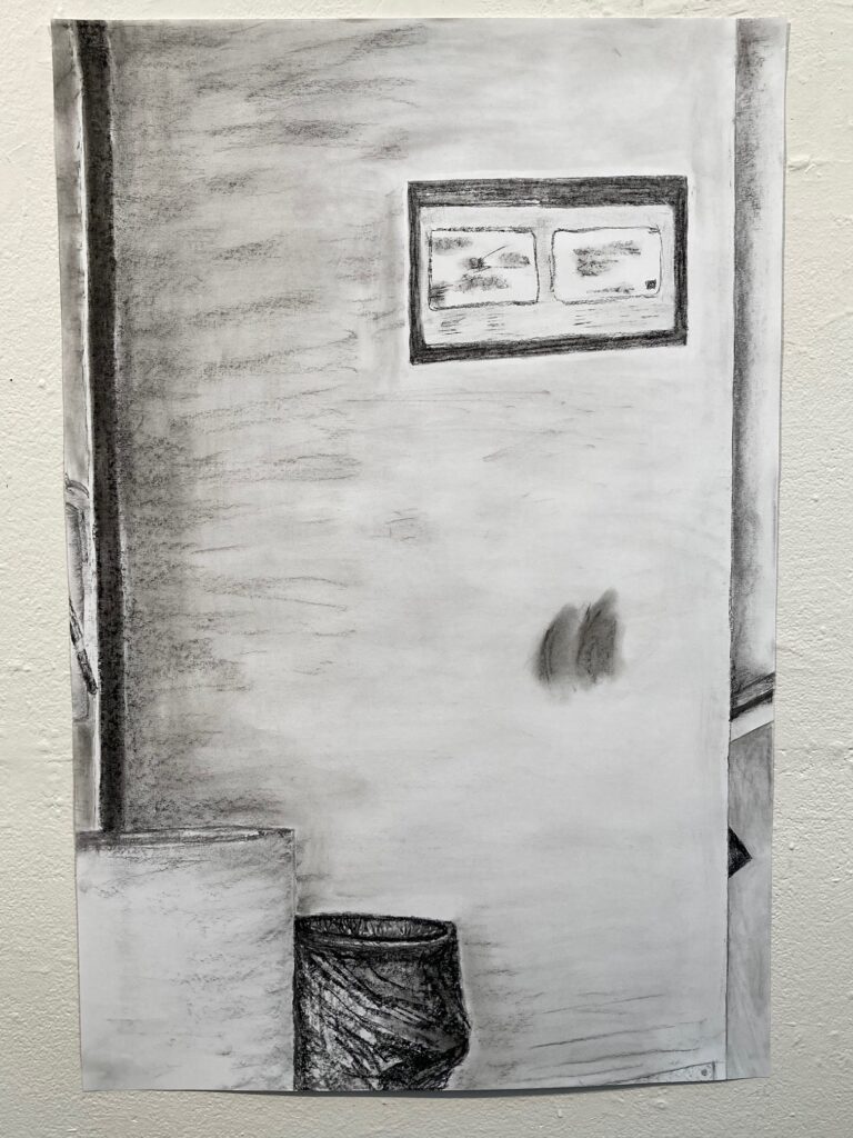
FINAL VERSION – most of the day Feb 11 and 12, and half day Feb 13 to complete shading:
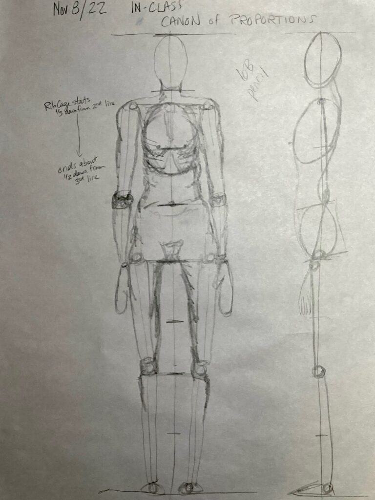
Figure drawings for canon of proportions, and portrait from live modeling each other
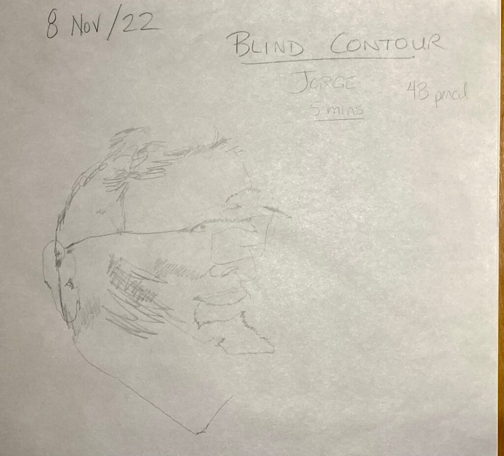
Canon of Proportionsthree-quarter turned figureJORGE: 10 minute portrait with subject stationaryJORGE: 20-minute study with subject moving
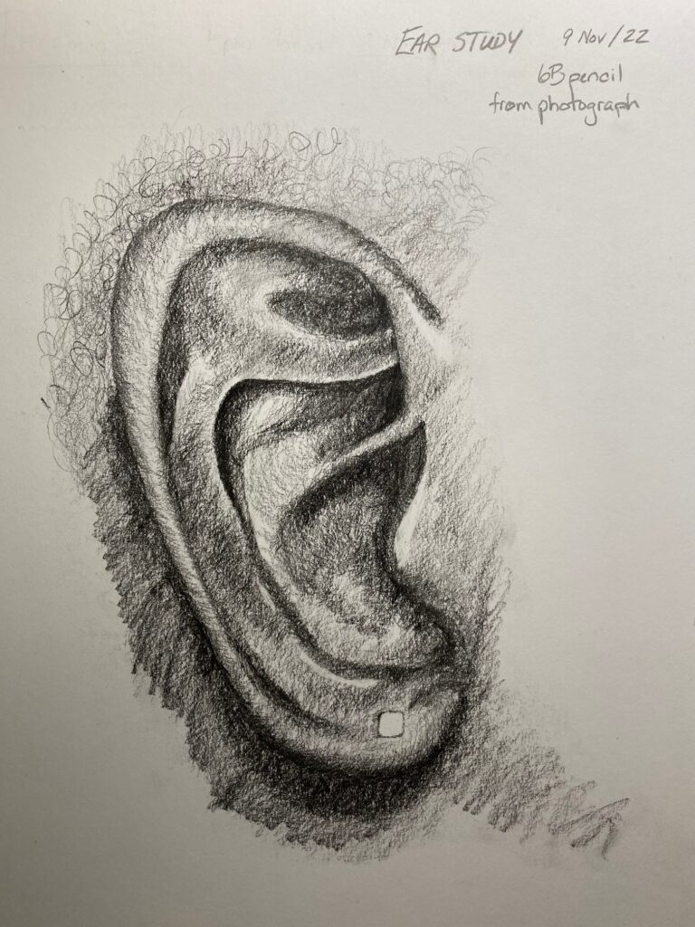
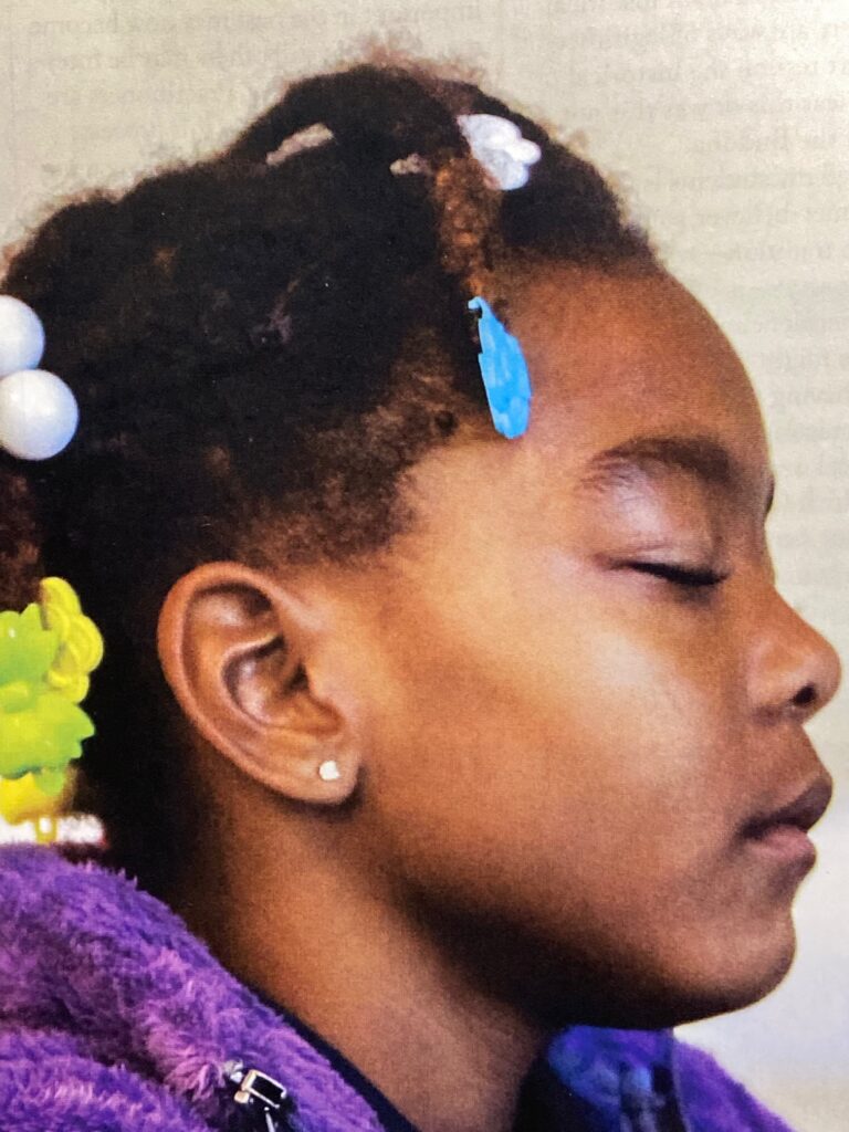
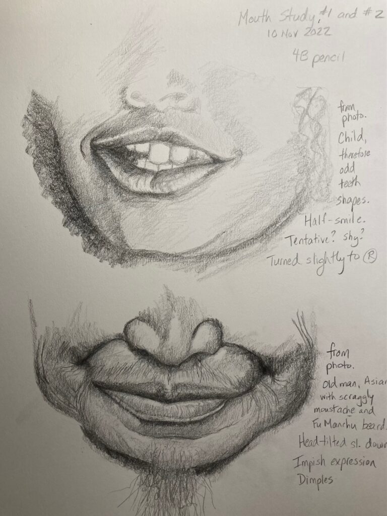
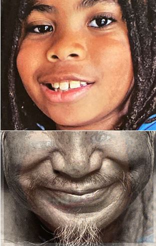
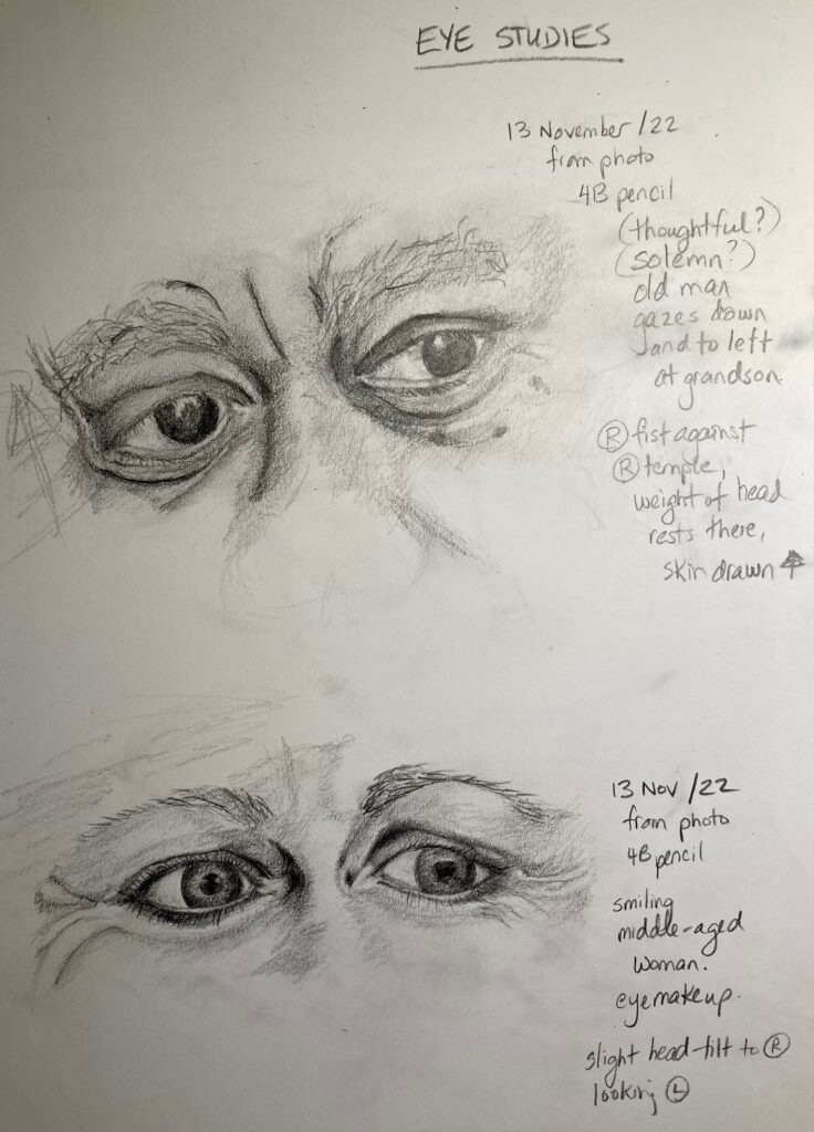
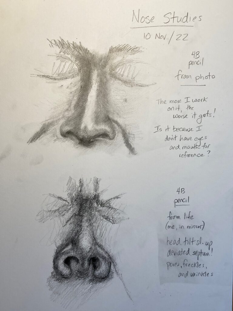
SKETCHBOOK ASSIGNMENT: Seven Studies of Facial Features.
Completed Nov 9 -13 at home. See below — the drawings and the photos they came from
Ear StudyEar Study PhotoMouth StudiesMouth Study photosEye StudiesEye Study photosNose Studies
Nose studies Sources: top one from photo. Lower one my own nose in mirror. It seemed to me that noses are harder to render accurately in isolation from other features, compared to eyes, mouth, or ear….
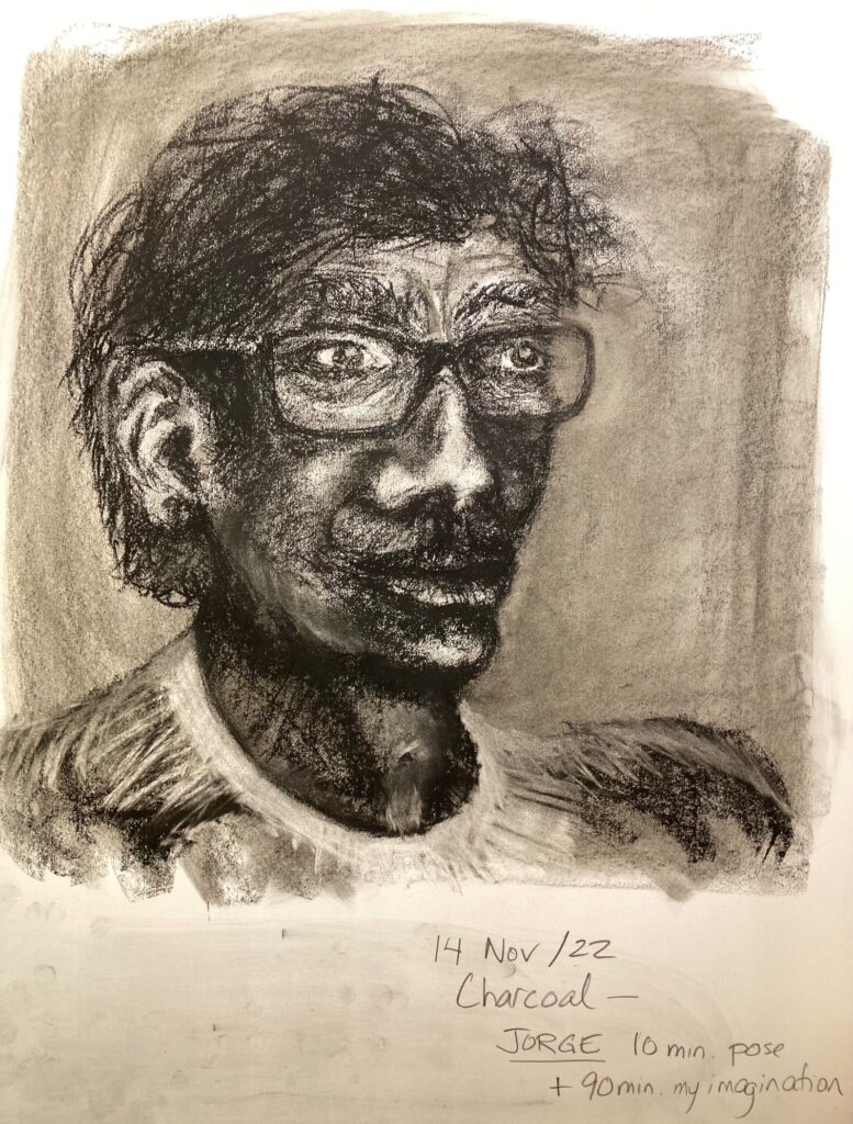
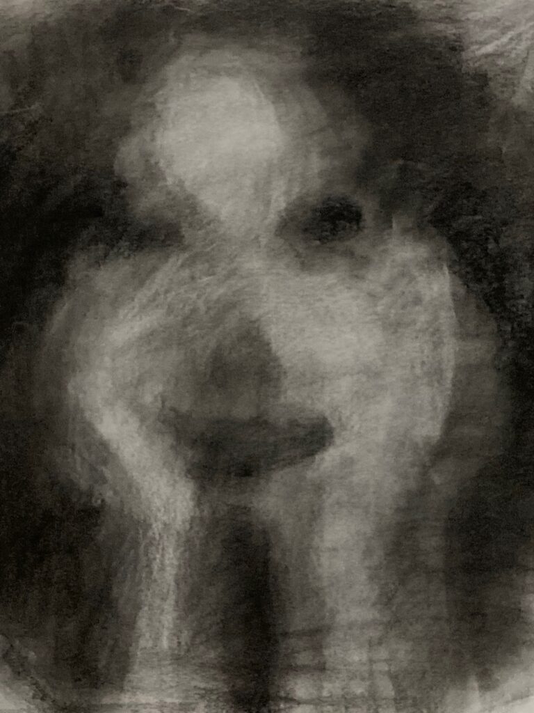
ADDITIONAL HOMEWORK: We were asked to “develop” one of the classroom portraits. I used the 10-minute charcoal study of Jorge, spent another 90 minutes at home with it but found it excruciatingly difficult to create a proportionate, appropriately-shaded face from my imagination rather than having a model or a photo to work from. At any rate… attached below is the result — not very successful!
JORGE — hugely altered!!! Perhaps if he were Cro-Magnon….. ??!!
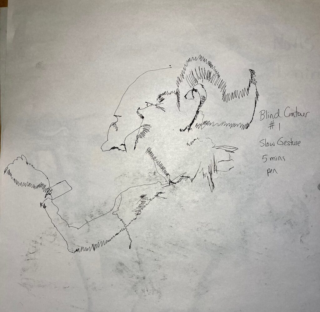
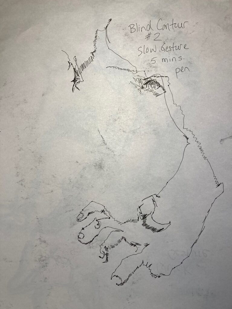
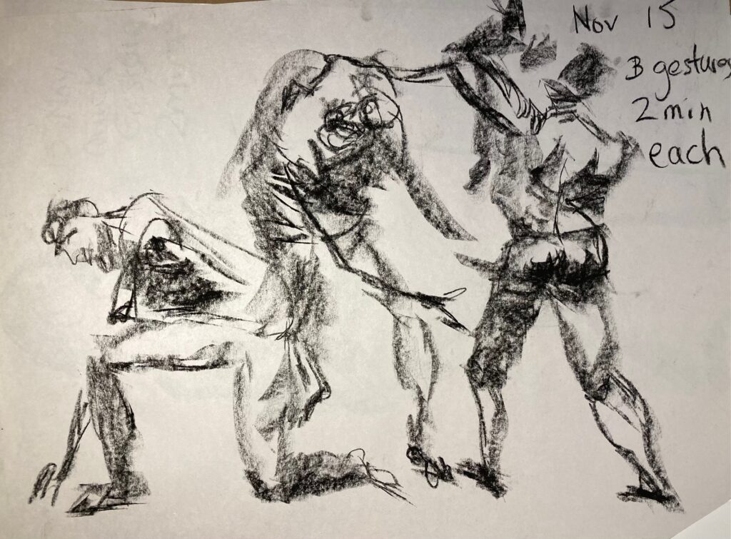
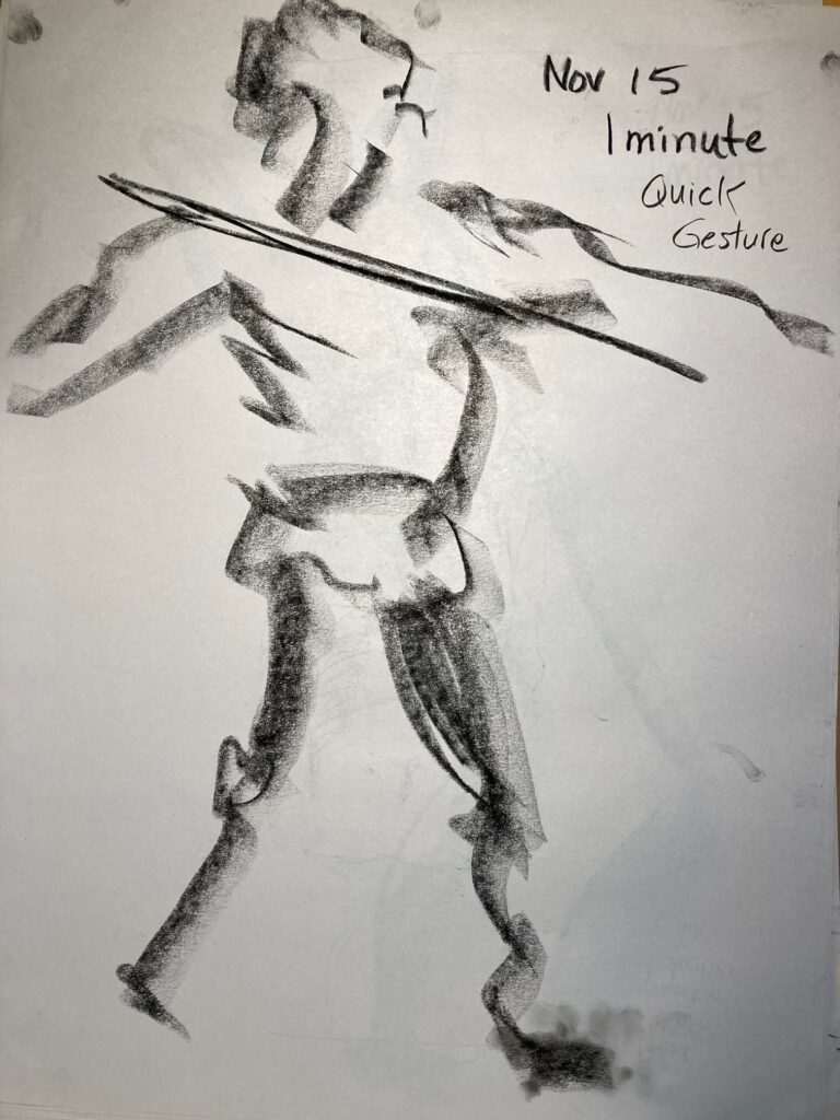
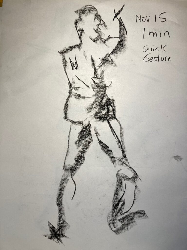
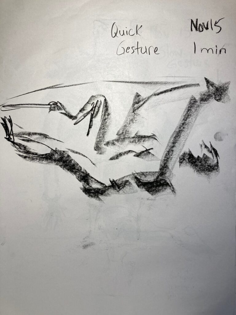
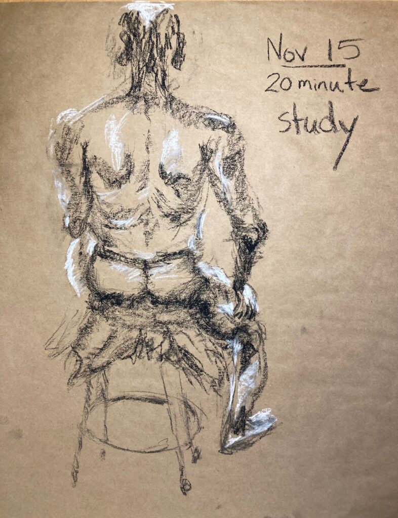
November 15 in-class Life Drawing: see below a selection of slow and quick gesture drawings. Each image captioned with info about media, length of pose, comments
#1 Blind Contour 5 minutes. Ink pen. #2 Blind Contour 5 minutes, Ink pen. More confident and detailed than the first one.
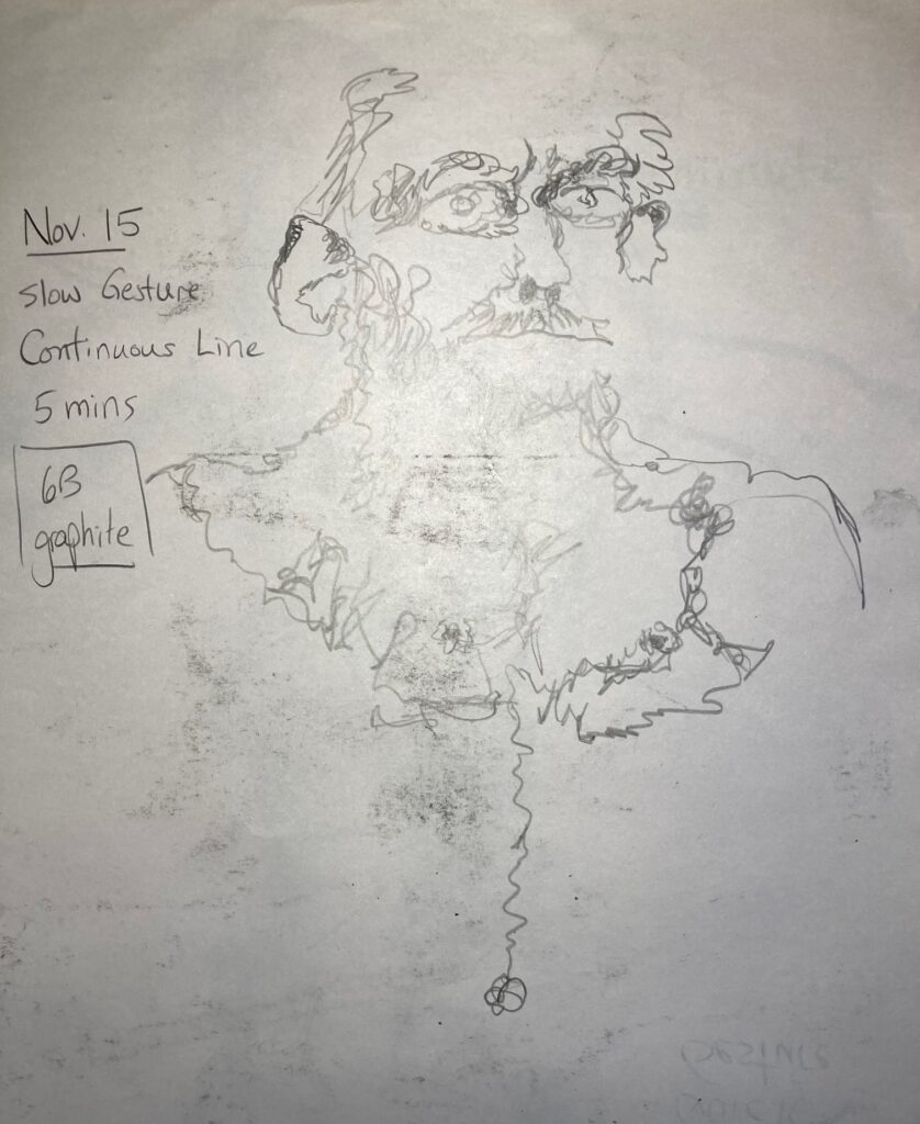
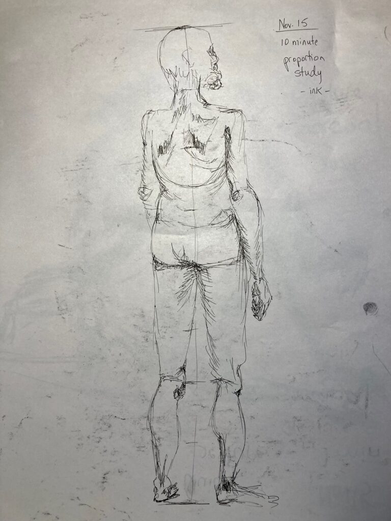
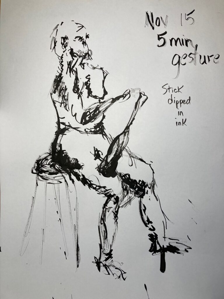
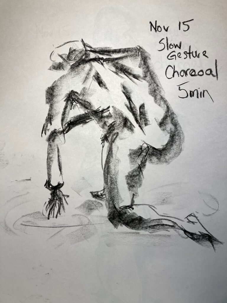
CONTINUOUS LINE SLOW GESTURE. 6B graphite stick. 5 minutes. I took the suggestion of fellow student Francis to use loops rather than back-and-forth movements as my continuous line – very useful! Proportion Study in ink. 10 minutesSlow Gesture with ink (stick dipped in ink). 5 minutes. Left arm MIA! Right hand holding juggling pin, not elongated drumstick!!Slow Gesture charcoal. 5 minutesQuick Gesture in charcoal. 3 poses, 2 minutes each, connected on pageQuick Gesture 1 minute in charcoal – this was first attempt.Quick Gesture in charcoal. 1 minute. This was third attempt — getting better. Right foot not quite grounded!Quick Gesture in charcoal 1 minute. This was fifth pose — more confident and better line weight (Figure is supine with a loop of rope connecting feet and hands)20 minute study seated model. Charcoal and white chalk on brown paper
ARTIST RESEARCH UNIT 3: David Bailin
I submitted the pdf through Brightspace Assignments on November 22. Also linking here in case more convenient to have all in one place….
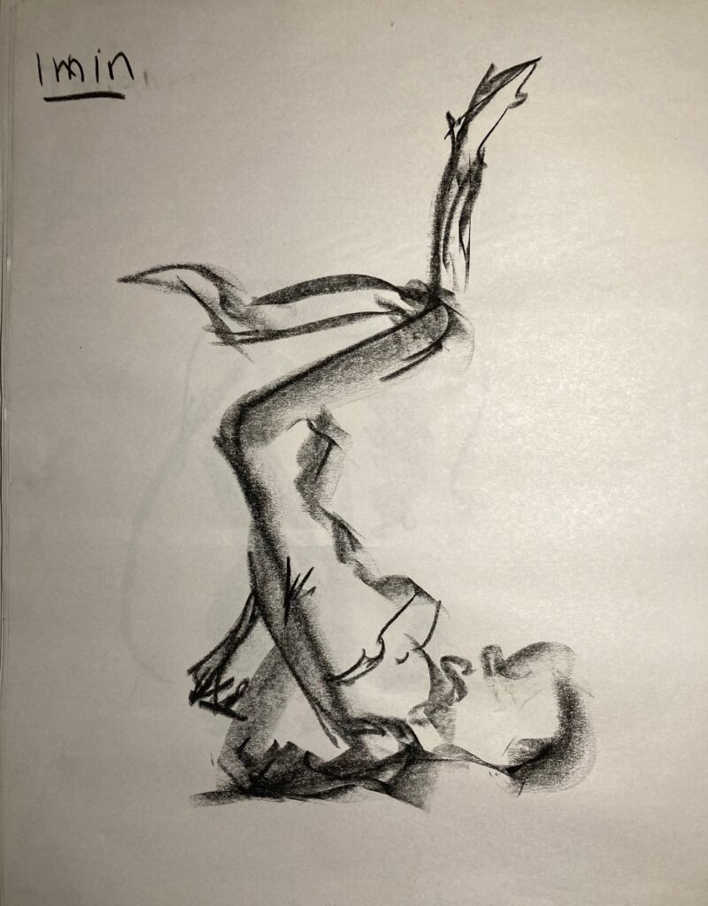
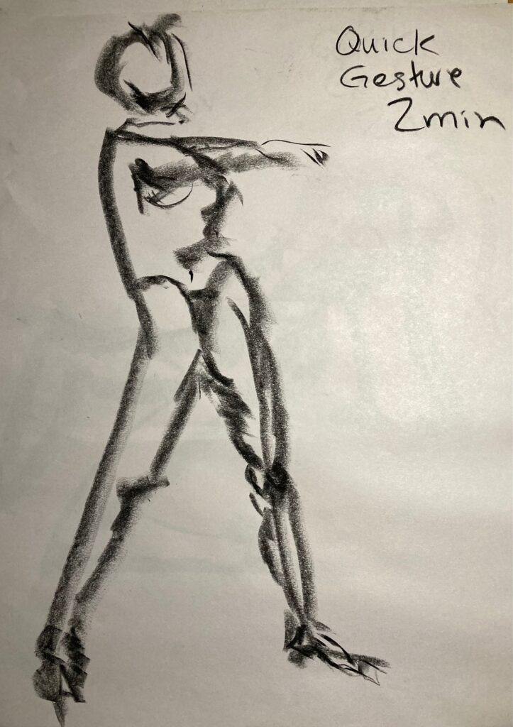
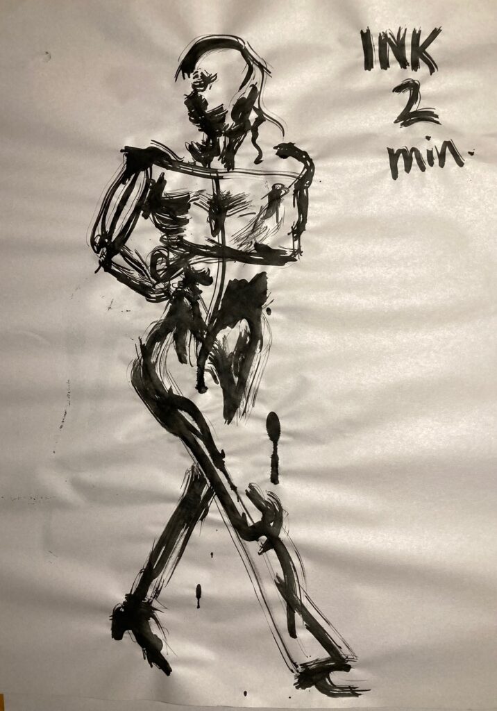
November 22 In Class Life Drawings: See below, captions have some added information about each
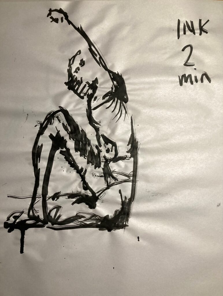
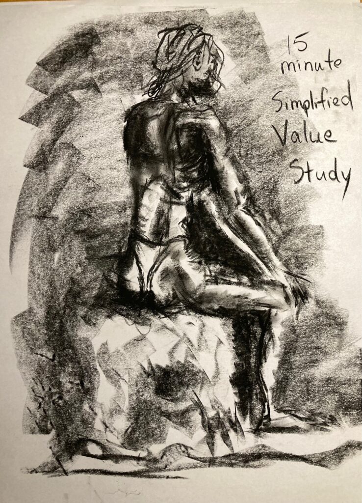
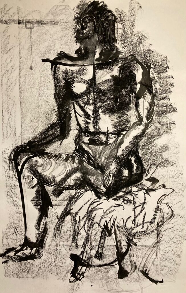
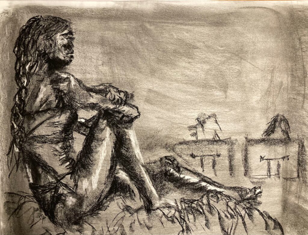
This was 4th or 5th in a series of 1-minute quick gesture drawings in charcoal2-minute quick gesture in charcoal – this was number 2 of 32-minute quick gesture drawing in ink (applied with stick). 2 minute quick gesture drawing in ink. The previous one captures more movement I think — but I found the energy line from belly button up through upraised arm also interesting in this one.simplified value study in charcoal — 15 minutes.Mixed media – charcoal, graphite 9B stick, ink applied with stick. This is 24 by 36 instead of 18 by 24 (all the rest) and I hadn’t tackled this size before. I was seated at a bench rather than standing at easel – and the combination of large format and my working position perhaps contributed to completely wonky proportions — tiny head, super-wide shoulders, overly-long torso, and never could capture left leg bent tight at knee and left foot resting against inner right thigh. Lessons for next time –stand rather than sit for larger format?Tonal study — charcoal – toned paper to mid-value. 30 minutes. I included a confusing shadow across lower back (diagonally down to right from mid-back bra-line) which came from a horizontal bar out of sight, behind the model. Given no context for the shadow, the drawing would make more sense if I omitted the shadow.
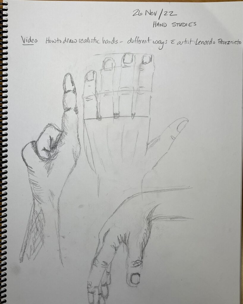
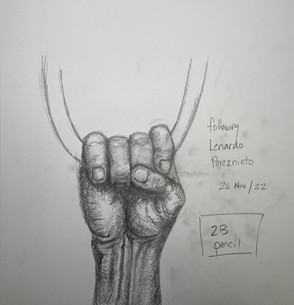
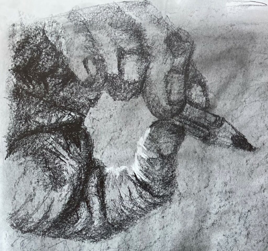
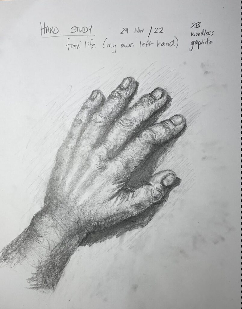
Hands and Feet: Sketchbook Assignment. See below, the exercises from online videos by Leonardo Pereznieto on drawing hands and feet, and additional drawings from life or photos.
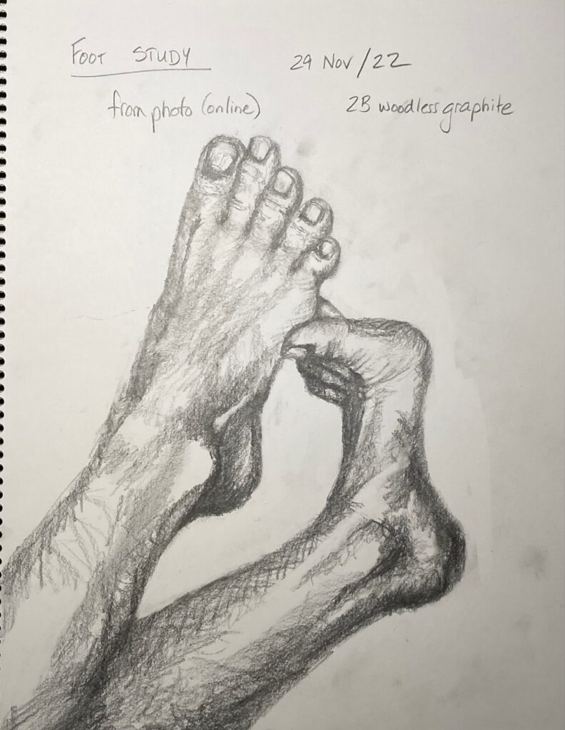
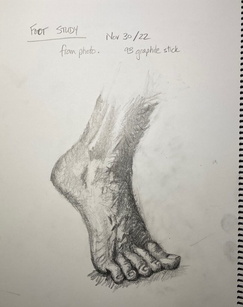
Hand study in 9B graphite. Nov 22Hand study 29 Nov. from life. 2B pencilFoot study Nov 29. from photo. 2B woodless graphiteFoot Study Nov 30. from photo. 9B graphite stick
SELF-DIRECTED PORTFOLIO DRAWING: Brainstorming.
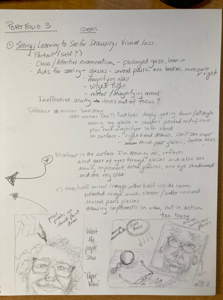
Idea 1: Vision lost and gained. This started conceptually — wrote down ideas about vision loss (thinking of my Mom currently living with progressive Macular Degeneration, inspired by artist research on David Bailin who addressed his father’s memory loss in his drawings). Also about vision gained (thinking of me, working to learn a new WAY of seeing, to help me draw). See below, written notes and couple of thumbnails.
BRAINSTORM IDEA 1
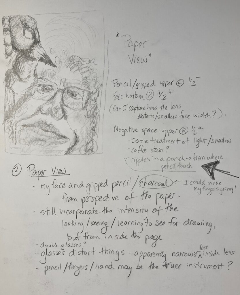
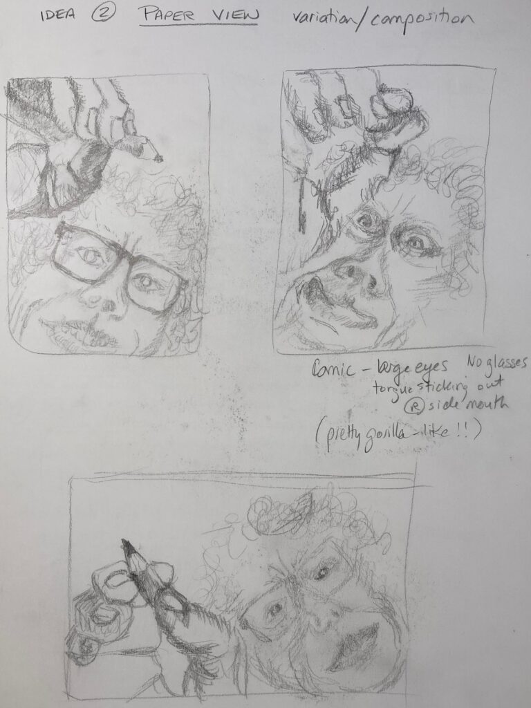
Idea 2: Paper View. The thumbnail I drew for idea 1 got me imagining what the paper was seeing as I leaned over it to draw. Here are a couple of sketchbook pages with penciled thumbnails and a few written notes on this idea:
BRAINSTORM IDEA 2 – part 1IDEA 2, PART 2
COMPOSITION TRIALS FOR IDEA 2: Landscape versus portrait: hands-down I prefer portrait because it positions the pencil at the apex of the drawing. I’d like the attention of the person in the picture, and the attention of those looking at the work. to be drawn to that point of contact pencil with paper. And I’d like the expression to be one of rapt attention. The idea is that the person is servant to the hand and pencil — in the landscape version, the person and the hand with pencil seem more like equals. Comic versus serene/attentive: the comic one doesn’t resonate with my motivation for the work. I wanted to try it because I found David Bailin’s use of humour really effective, but maybe next time or for a different idea…
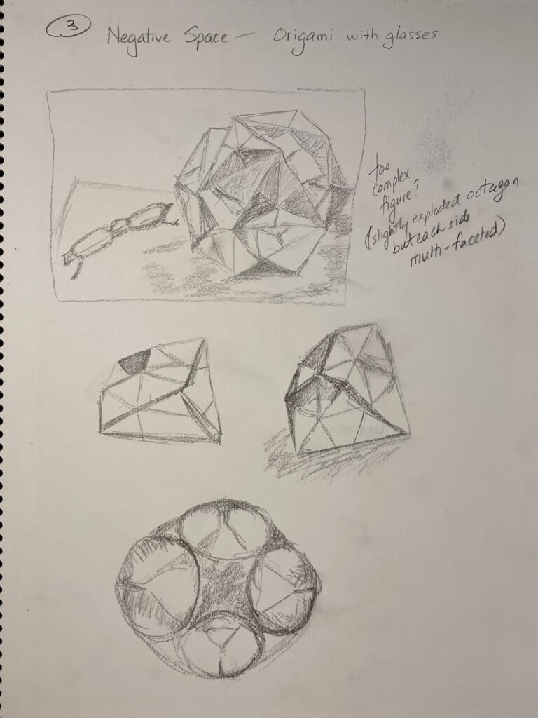
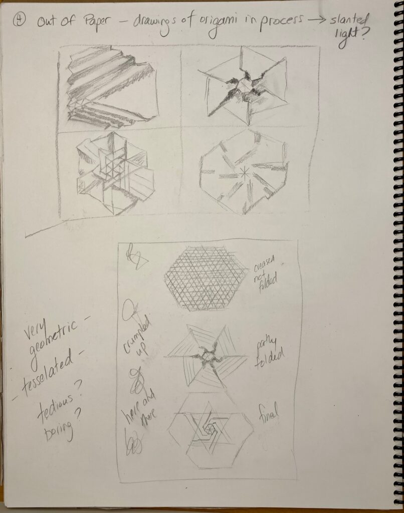
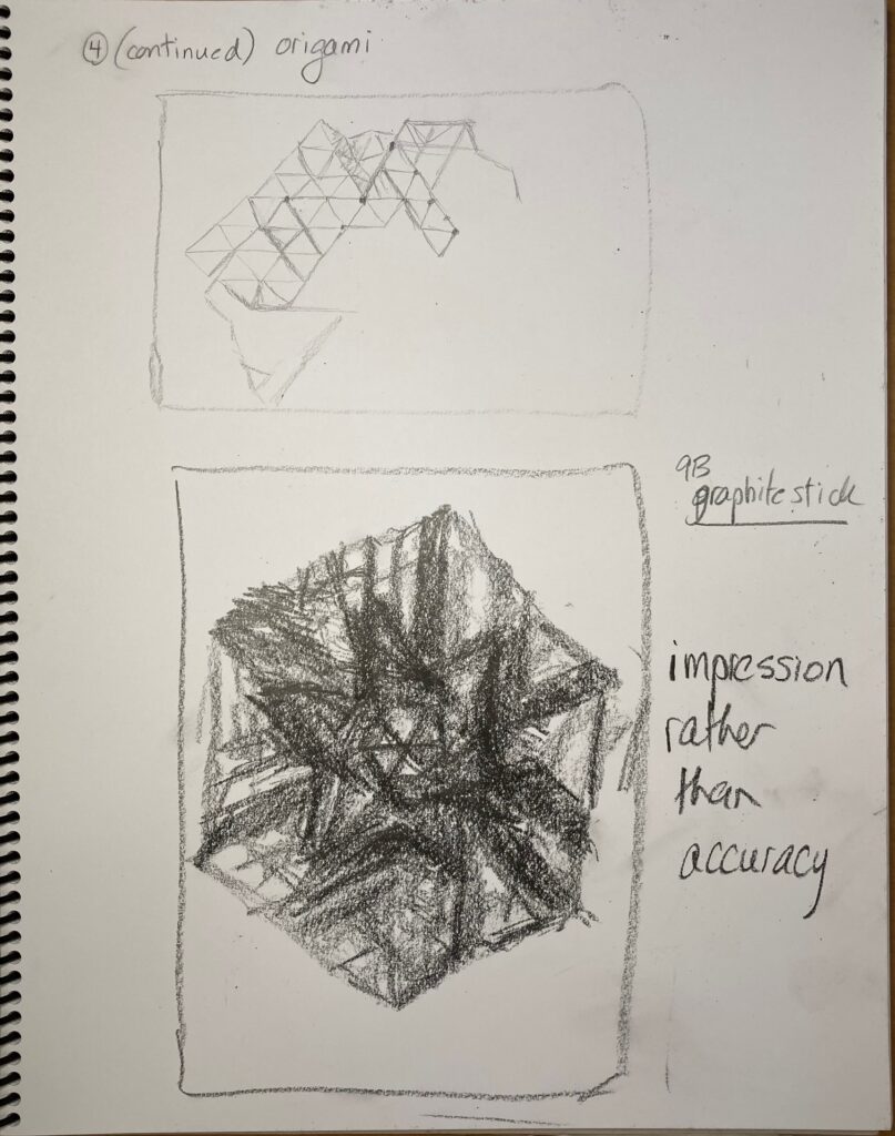
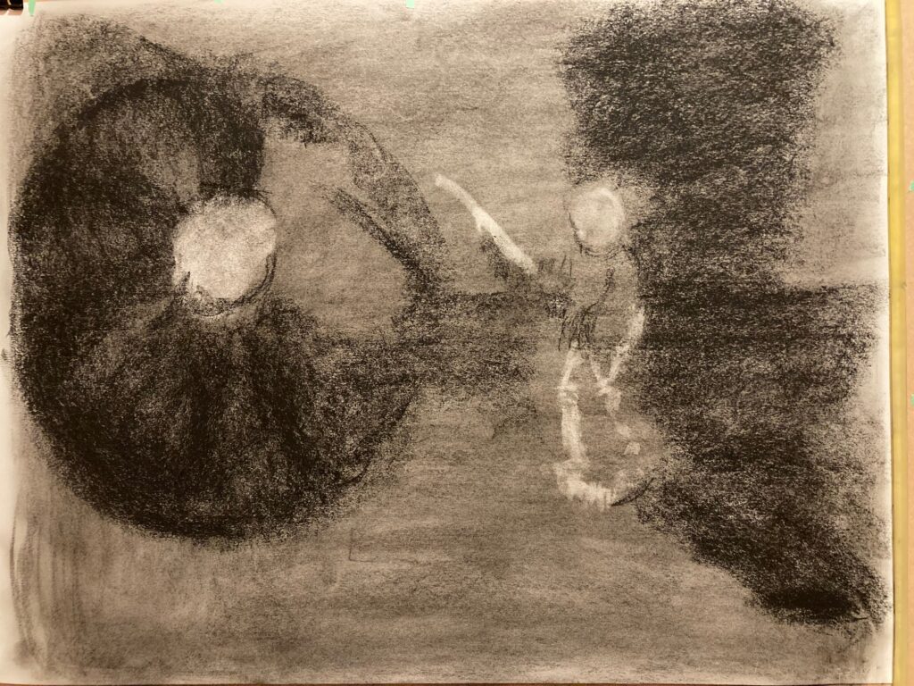
IDEA 3: Out Of Paper. I have a lot of origami, geometric shapes mostly, around my office. I’m attracted to the idea of drawing them, trying to capture their 3-D complicated selves, with all their interior space trapped inside the paper I folded them from. SO I just started drawing ideas – tried completed shapes, then shapes in the process of being folded, then started a very technical version then an impressionistic version — but really stumbled on the limits of my patience and my technique to enact these exactly geometric figures with all the perspective issues. Something to return to when I have more time / patience / skills??
Origami 1Origami 2Origami 3
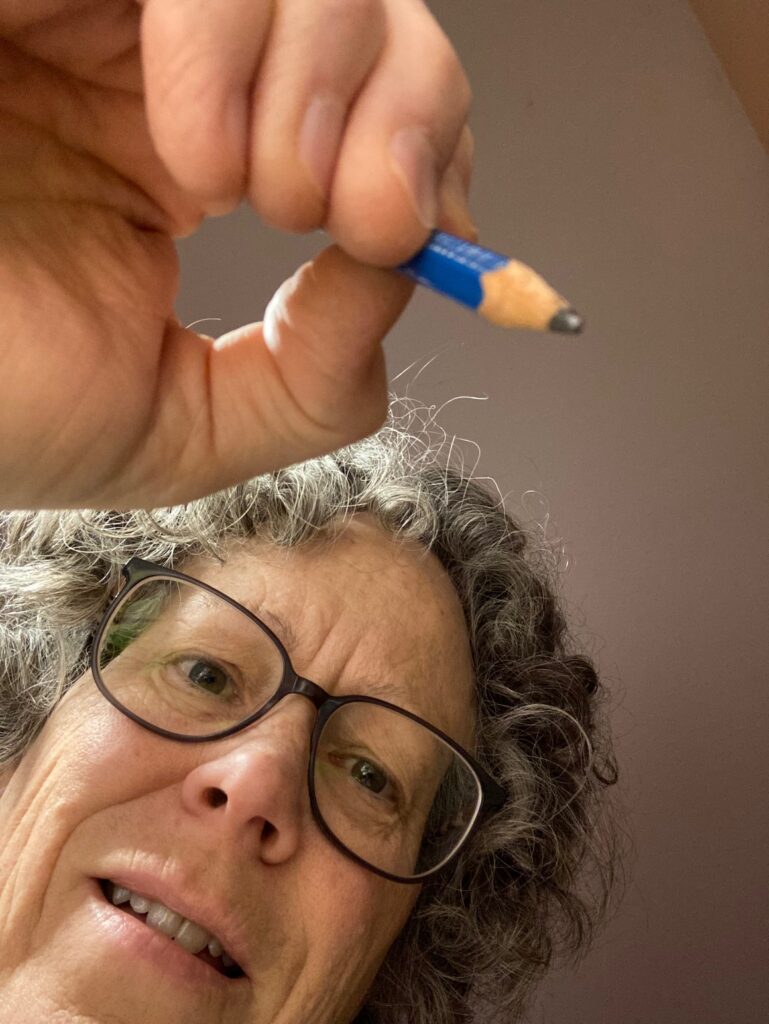
NEXT STEPS — I am most interested in Idea 2. Consult with Linda on Nov 22: not sure how to deal with mirror images, which is what I need to draw from if using my face and my hand as the model. The right/left-handed thing is tricky. And I’m not sure how to capture consistent lighting. Photograph like the one below could be a lighting aide —
Useful as a light/shadow guide? BUT I don’t want to draw from photograph…
FURTHER NOTES: November 26. Discussed with Linda in class Nov 22. Okay to use mirror for self-portrait and to use photos to capture consistent lighting of hand/face. Considerations from her — what proportion of drawing is negative space? How treat the negative space?
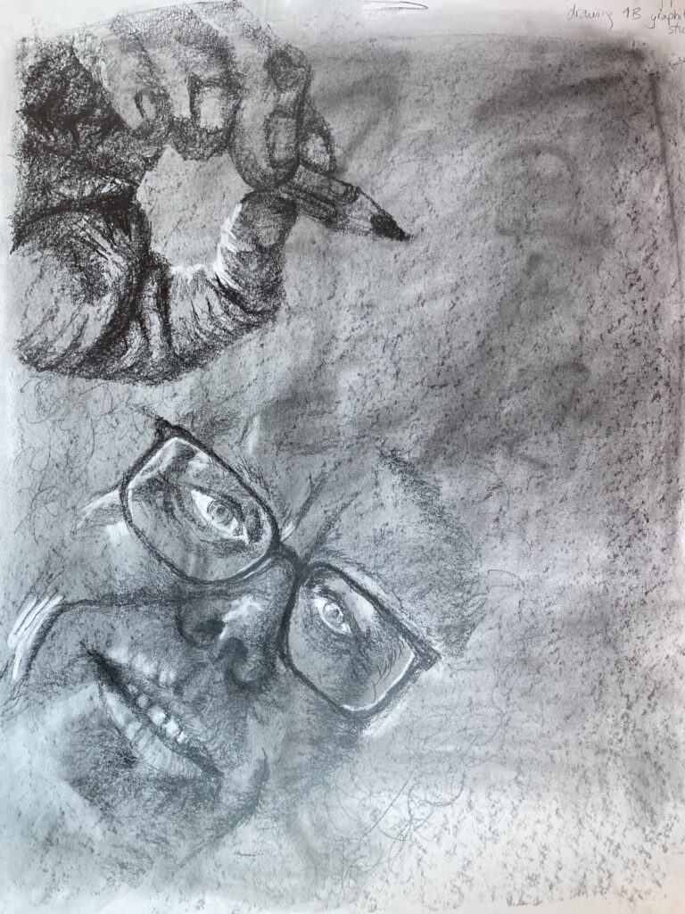
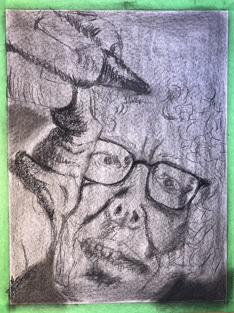
See Below: two larger-format trials: one in graphite (9B stick on paper toned with 6B dust) and one on paper toned with compressed charcoal, initial marks by willow charcoal to get proportions right, and starting to add some darker marks with compressed charcoal. See notes on composition with each.
GRAPHITE 18 x 24 trial: I find the toned background distracting with graphite, so would certainly need more work to even out / make interesting. The hair is not drawn in (which will enlarge the positive space) but even so there is significantly more negative space than in the next trial, and the hand and face seem less engaged in the composition when they are more remote like this….CHARCOAL 20 x 26 trial: zooms in tighter on hand, face partly obscured, and has smaller negative space — have started to treat the negative space differently in different parts of the composition (darkest at lower edge, and the idea is to grow lighter as move up to where the pencil touches the paper). I like the way the hand and pencil are really foregrounded (is that a word) and that the face fills more of the frame. Overall, prefer this composition.
DOCUMENTING PROGRESS — Nov 26 through Dec 6th: see below
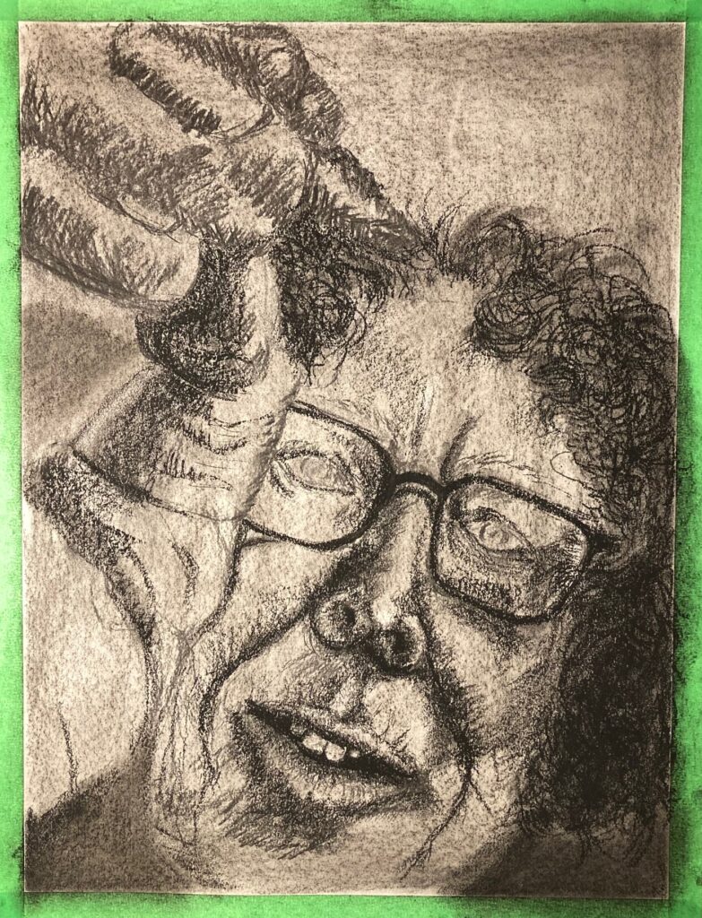
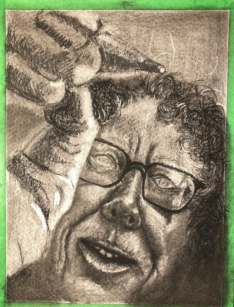
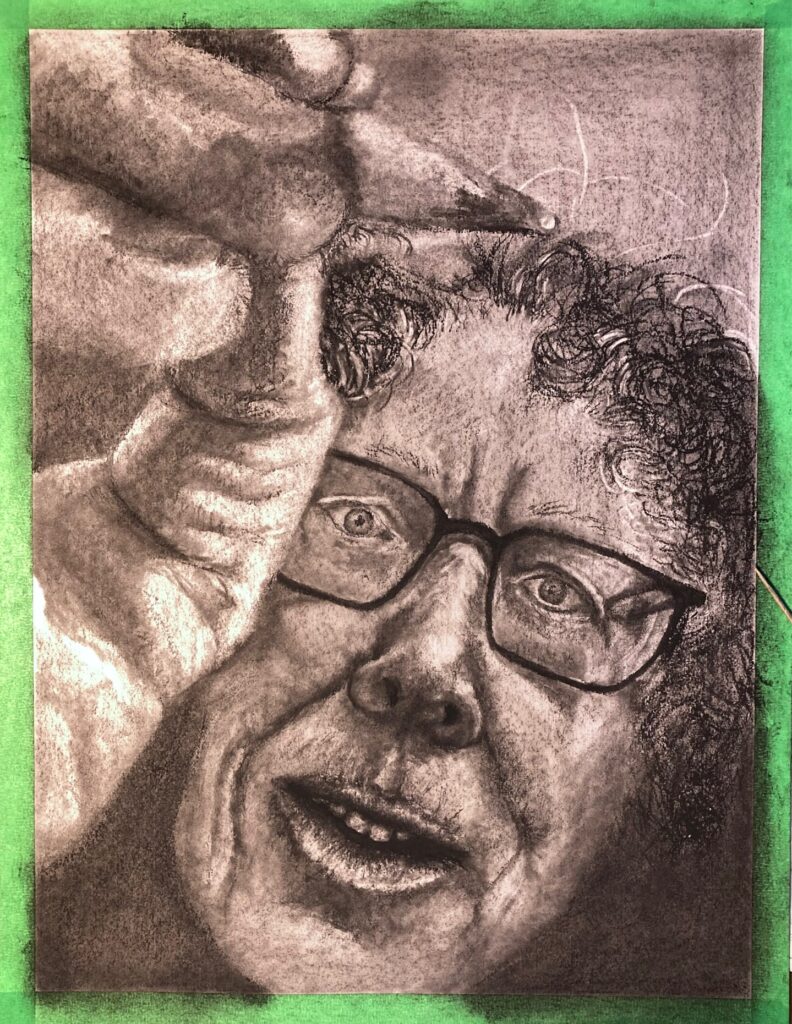
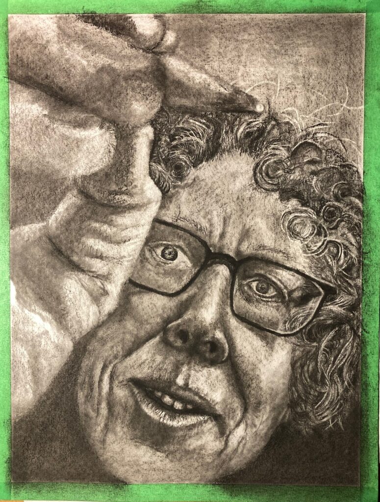
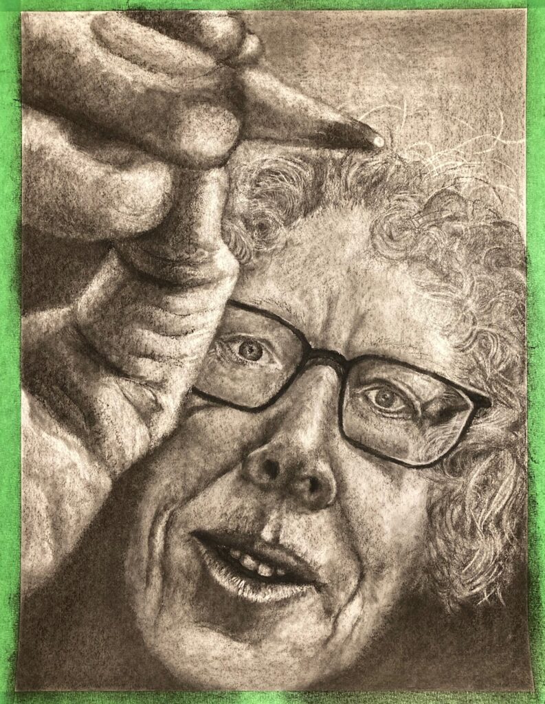
Nov 29. Adding dark values, not much erasing yetDec 2 Reoriented pencil so its point lands higher, above the head. Erasing more.Dec 3 Elaborating the eyes . Needed to look at the photo I took, hours after I took it, to notice that the subject is cross-eyed! Really not liking the hair and not sure what to do…Dec 4 Looked some on-line videos for ideas on hair — SO HELPFUL! So here I have created more depth and the hair looks more realistic — however the degree of detail looks goofy with the fuzzier hand… Dec 5: I asked 2 reviewers for comments on yesterday’s image. One thought I looked angry, one found the pencilwas lost in the hair. I took the plunged and rolled kneadable eraser all over my hard-won hair details, and over much of the face, to lighten the overall values and the emotional cast. Also narrowed the lower half of faceFINAL December 6. title of work: “RAPT”
NOTES ON FINAL IMAGE (prior to in-class critique): So much different with the green tape removed from the edges!! This was taken in natural light instead of my LED-lit office space. I like it better. Facial features — i think eyes and mouth are a little too small. The eyes are distorted somewhat (made smaller) by the glasses but should still have taken more space on the page, I think. Will be interesting to see what emotional tone people feel from the work…
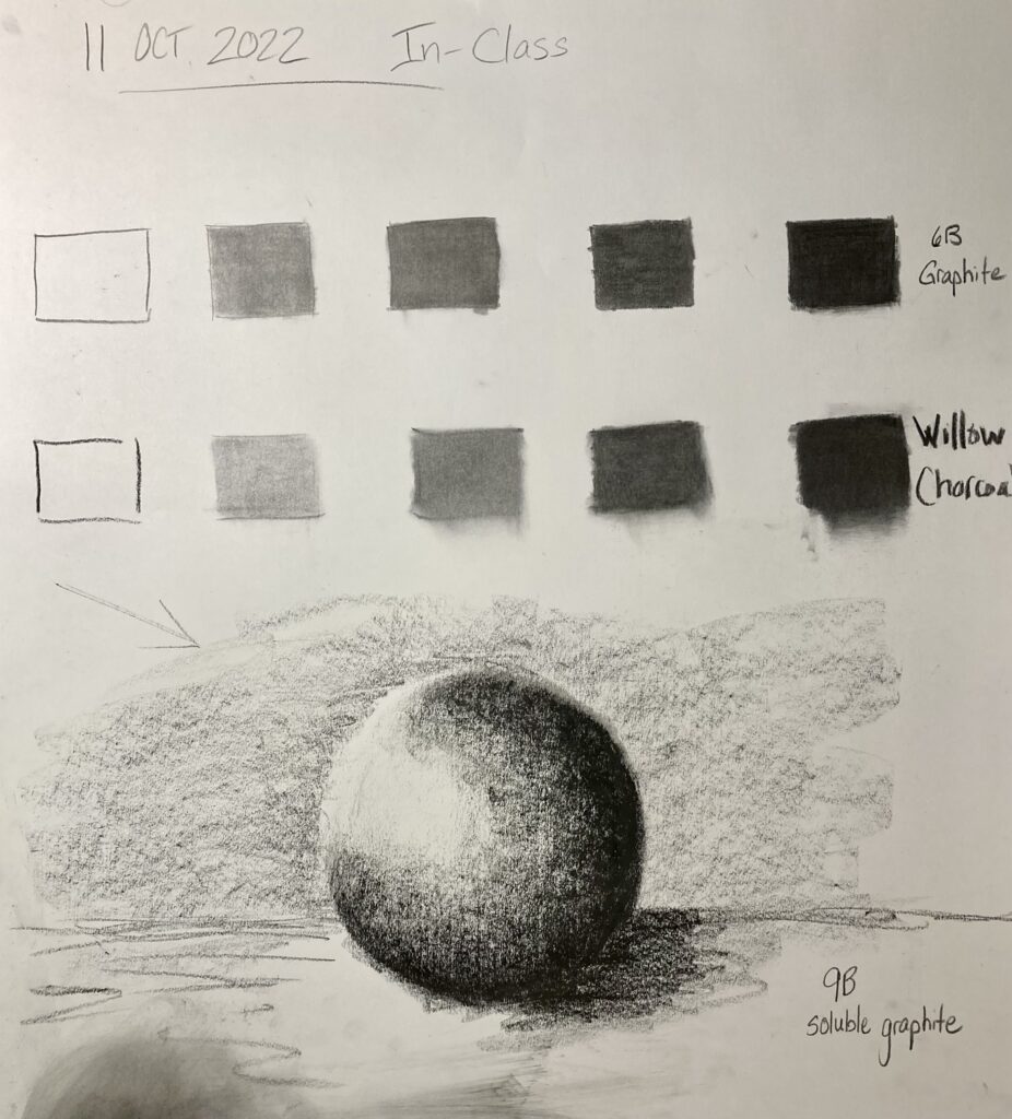
October 11 class: Form defined by light — negative space, value, and form exercises
Negative space: Compressed Charcoal, branch and leaves In-Class October 11Value scales: 1) 6B graphite 2) willow charcoal In-Class October 11
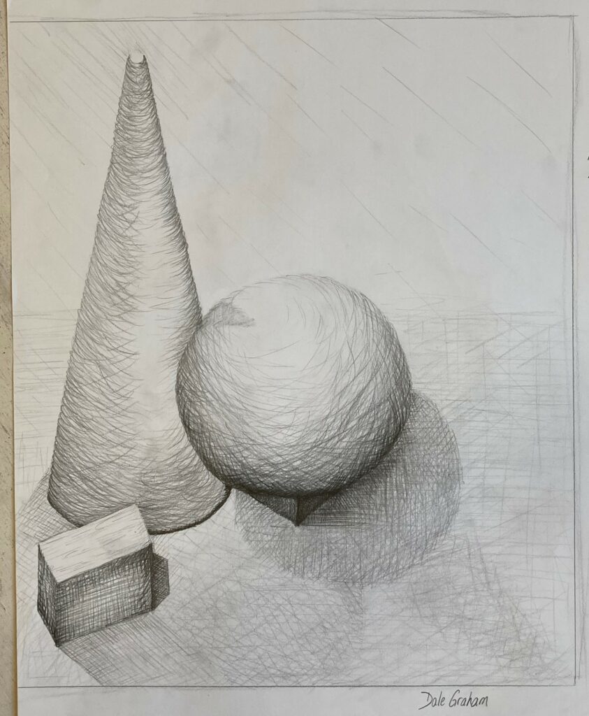
Form: Spheres: above with 9B soluble graphite; below with 6B graphite
Sphere on toned paper. 6B graphite in-class 11 October
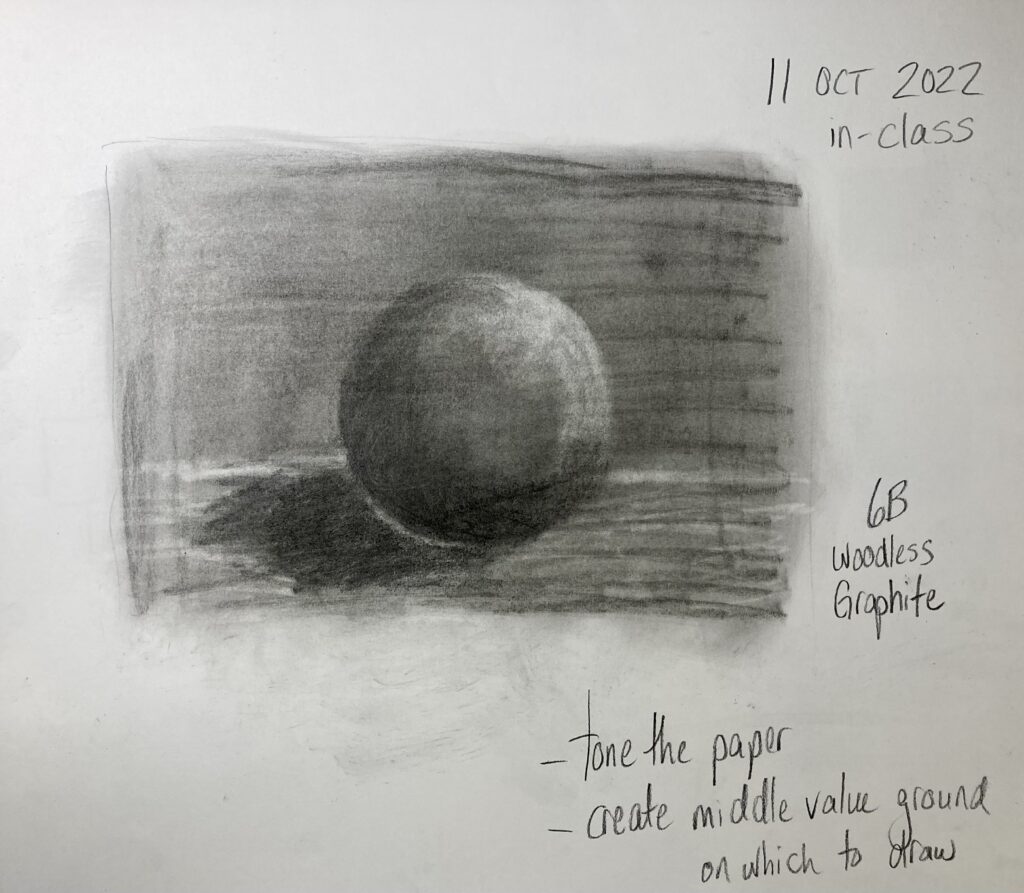
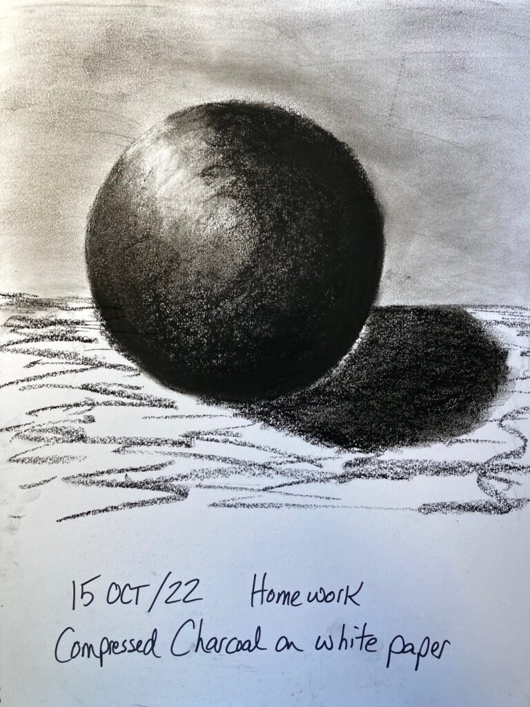
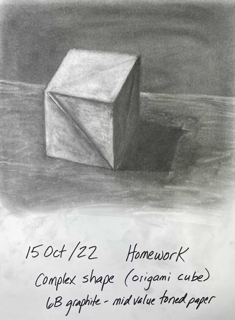
Work At Home 15 October. Repeat sphere shapes with charcoal, on white paper and on toned paper. Try more complex shape also on mid-value toned paper.
origami cube: model for complex shape
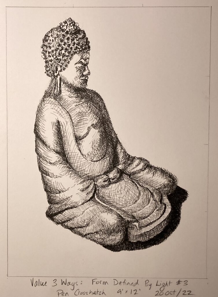
Sketchbook Exercise Unit 2: Value 3 ways.
see below, my home sketches of side-light Buddha statue — once with charcoal, once with graphite, and once with pen crosshatching. Very interesting exercise, difficult to achieve same value with the different media, but pleased with the range of darks to lights within each piece. Not so happy with how variable the drawing accuracy turned out!
Charcoal BuddhaGraphite Buddhapen crosshatch Buddha
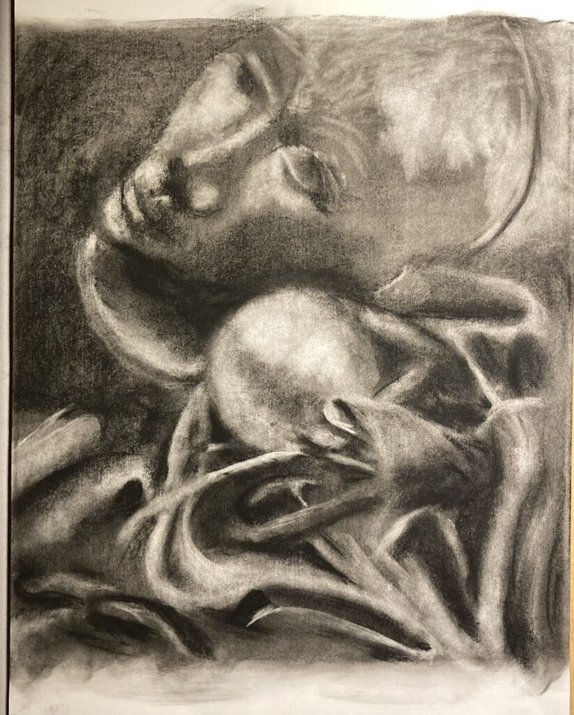
STUDY 4: Form Defined by Light
This was completed entirely in class time on October 18. Four thumbnails appear below. I chose #1 because I wanted to tackle a lot of drapery folds, and because I thought the spooky styrofoam disembodied head would be very evocative in a piece with a lot of dark values. After the thumbnails, a photo of the original still-life FYI. Finally, Study 4 itself.
Thumbnail 1Thumbnail 2THumbnail 3THumbnail 4Study 4: photo of still life modelStudy 4. Form Defined by Light. Charcoal on mid-value toned paper. 20″ x 18″
Artist Research Unit 2: Mary Borgman: posted October 21 in Assignments on Bright Space. Also posted immediately below for reference
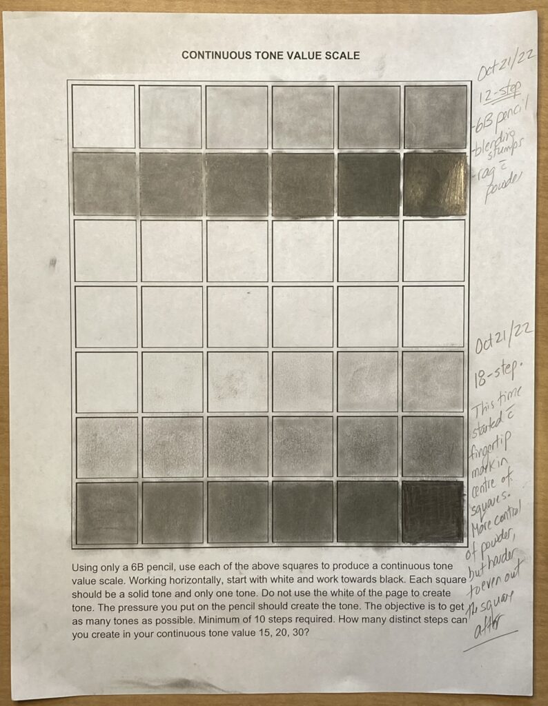
Sketchbook Exercise Unit 2: Continuous Tone Value Scale. See below.
I completed a 12-step version by drawing directly on the paper with 6B pencil, then using blending stump (or variations like Q-tip, small sponge on a wand). I started using 6B powder partway through the process, applying with small sponge or blending stump. Also used kneadable eraser to roll off or dab off excess graphite. In the end, the uniformity of tone in each square isn’t perfect but it is better in this progression than in the 18-step one.
Next tried 18-step version, starting this time with powdered graphite on finger tip. Found much more control to gradually increase value over 18 steps, but my finger created a circle inside each square, which later proved very difficult to even out to the edges of the squares. Probably would have been truer progression if I’d left the original circles. Squares 13 to 18 appear better graduated in real life than in the photo. There are also a few artifacts from my handling of the paper, for example darker marks centre of squares 3 and 5 were the result of resting the apparently graphite-y side of my hand on that spot… sigh.
Value scale continuous tone
Sketchbook Exercise: Value to Express Mood. Completed 3 versions same still-life, over 3 days October 22 to 24. Side-lit with desk lamp to simplify shadows and bring out drapery effects. See below — the photo of the still life, then 3 versions with descriptors. And a final shot that shows all three side by side.
PHOTO of the still life.High Key version, with 4B pencil. Successful in terms of keeping to high key values of the 4B pencil. Full key version with 6B pencil and stickLow key version with compressed charcoal. I erred too much into the higher key values. If I find the time, will rework this version and repost3 versions side by side.
GENERAL TO SPECIFIC: In Class process on 25 October. See below: 3 shots in process plus final version( photographed at home, different lighting!)
onetwothreeGENERAL TO SPECIFIC: In Class Charcoal 25 OCtober. FINAL
Portfolio Drawing 2: THUMBNAILS. See below. Analysis and discussion follows
THUMBNAILS 1 through 4 for Portfolio Drawing 2
THUMBNAIL ANALYSIS: I chose thumbnail 4. It has asymmetric balance in terms of the size of the figures, left being round and right being tall and thin. However, there is approximate horizontal symmetry in the large blocks of light value left, dark value right. — and there is a dark positive space item that emerges from the lighter left half, balanced by a light negative space object emerging from the dark right half. The first three thumbnails treated the light source differently, being filtered through vertical railings that made the figures striped and seemed to make for a confusing presentation. For the fourth thumbnail the angle is altered so the light source sends a single dark shadow cutting across the page, which dramatically changed the importance of the main figures in the still life.
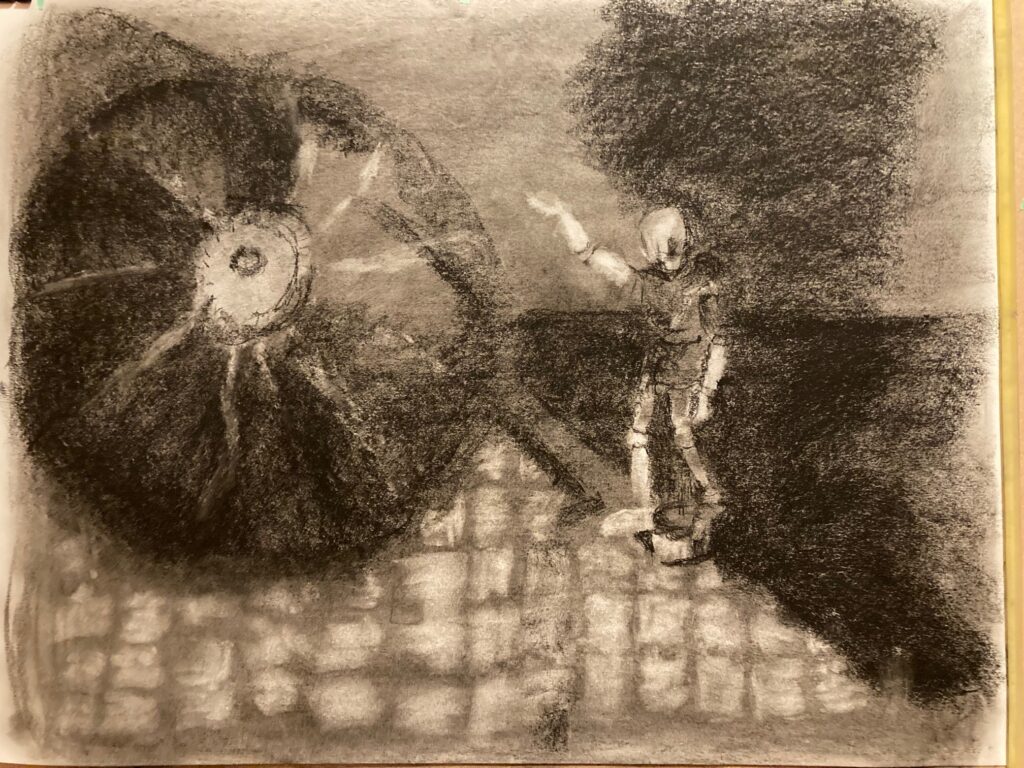
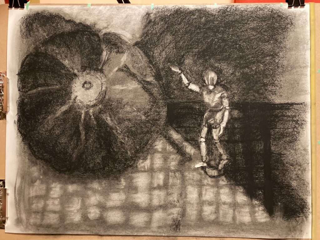
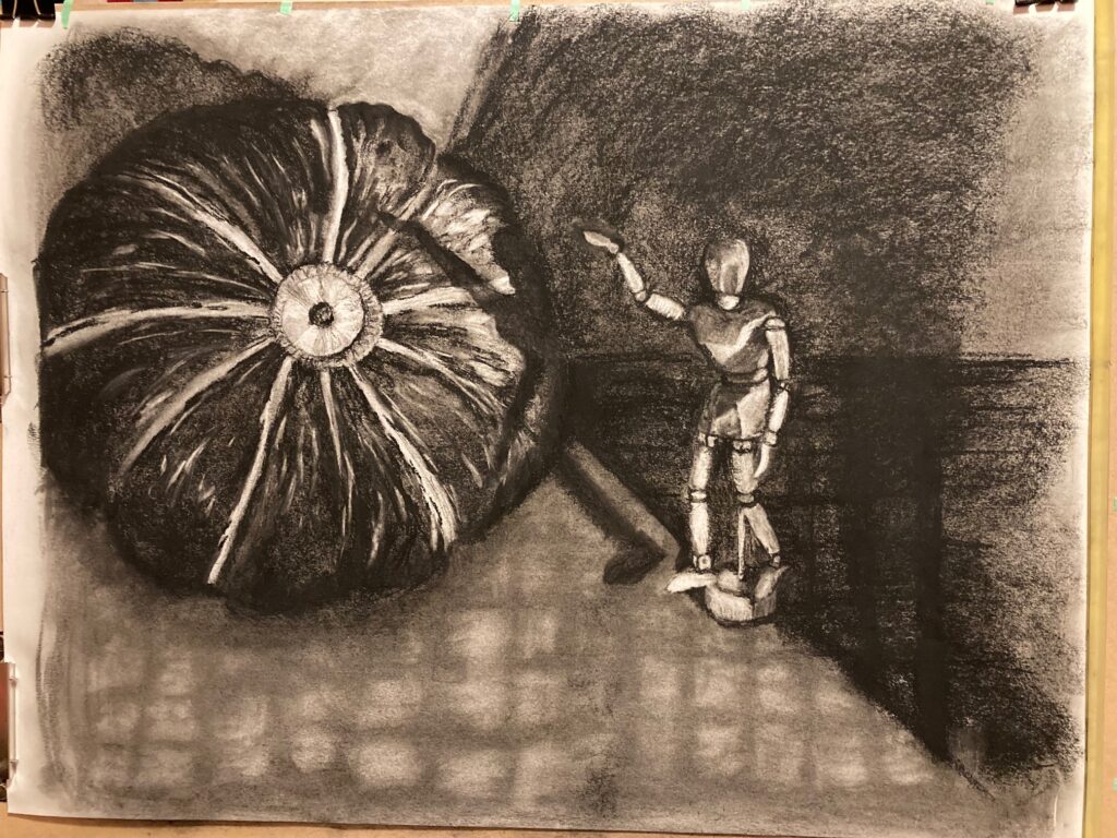
PORTFOLIO DRAWING 2: Work in Progress. See below, 6 images starting with mid-value toned paper (using compressed charcoal), then working from general to specific, refining general value blocks into details as I went.
WIP 1WIP 2WIP 3WIP 4WIP 5WIP 6
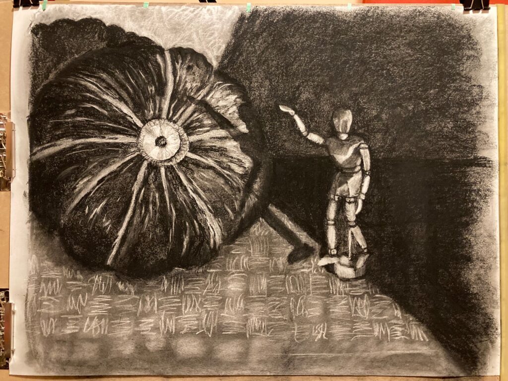
PORTOFLIO DRAWING 2: FINAL See below the final version of the piece. Following that, a photo of the still life for reference.
PORTFOLIO DRAWING 2: FINALSTILL LIFE USED FOR PORTFOLIO 2
Attempting also to post the items here on 5 Oct 2022:
Artist Research #1: BEILI LIU is posted on the FIN 110 Brightspace site, under Assignments. Here is the link to that posting . Also posting Artist Research #1: BEILI LIU directly to this site, immediately below:
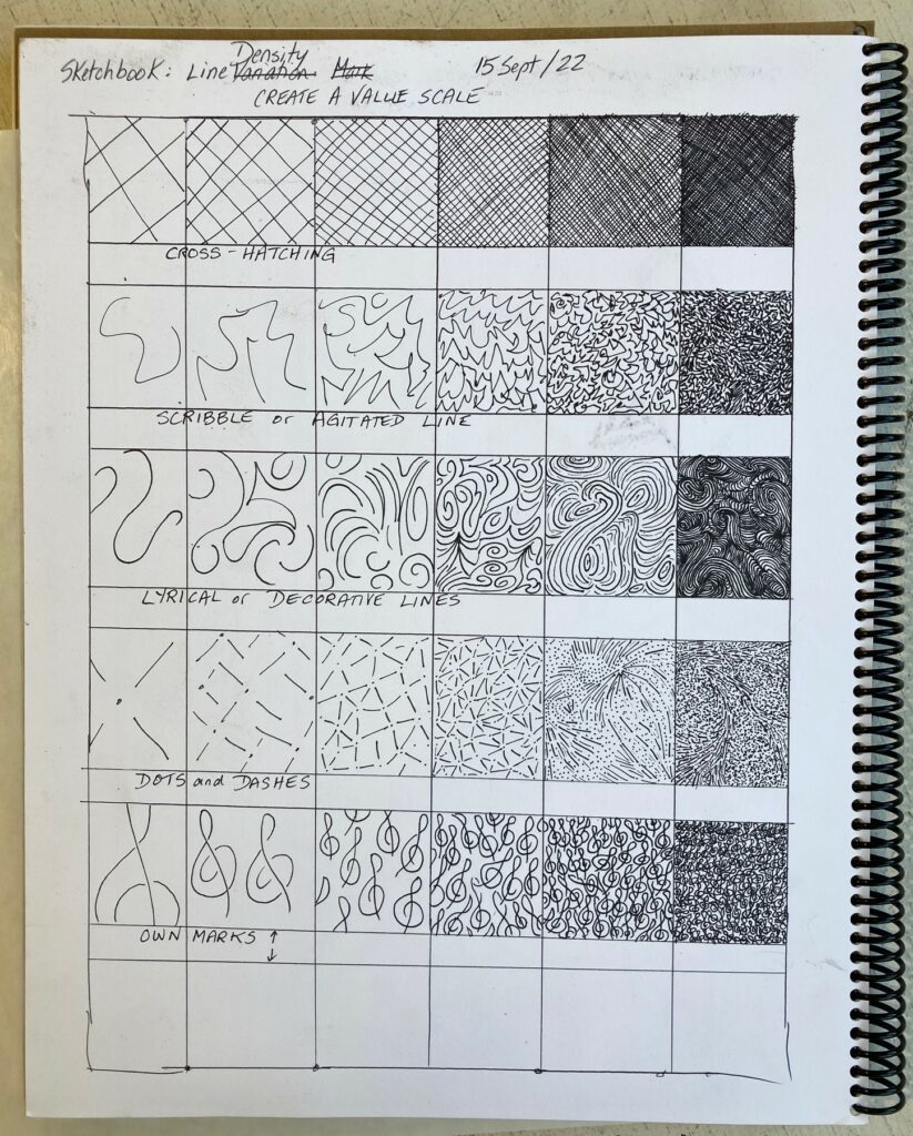
Unit 1 Sketchbook Exercises: Line Variation and Line Density
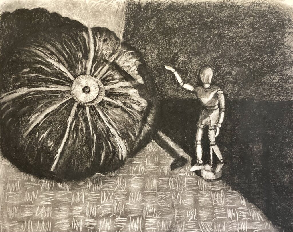
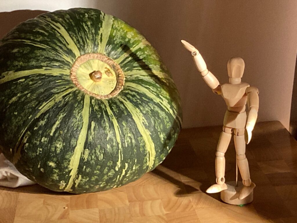
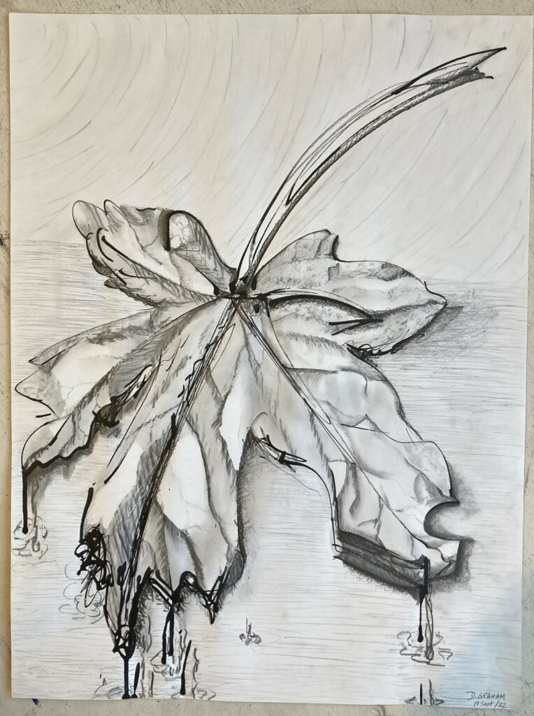
Unit 1 Sketchbook. Line Variation exerciseUnit 1 Sketchbook. Line Density exerciseUnit 1. Study 1. Leaf study, line explorationUnit 1, Study 2. Still Life. Contour and Cross ContourUnit 1 Study. Composition Shape and Space
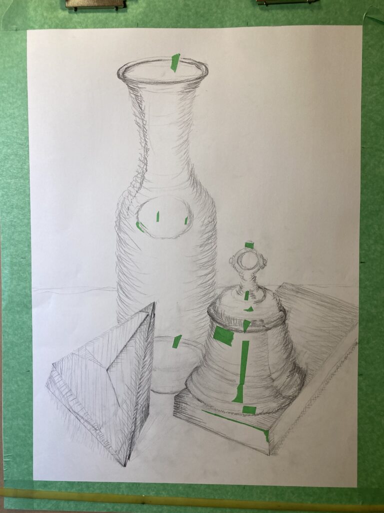
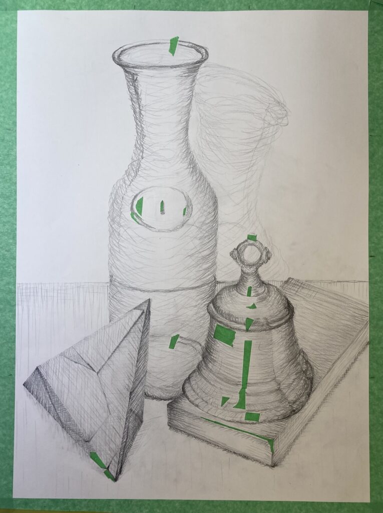
Unit 1: Portfolio Drawing One WORK IN PROGRESS shots see below– thumbnails, several stages of the drawing. The final work is with Linda at time of this posting — will photograph and post next week when it’s back in my hands.
Thumbnails for Portfolio Drawing 1: see annotated thumbnails immediately below. See also text box under the thumbnails for additional comments on the composition of each
Portfolio drawing 1__ annotated thumbnails
Thumbnails 1 and 2 have asymmetrical structure, a triangle shape with its apex to the right of centre. There are circular figures in each of the three main shapes, that draw the eye to move around the page from circle to circle. Thumbnails 3 and 4 are also triangular but with approximate horizontal symmetry. In 3 and 4, there is also a new shape — one of the trhee main objects (the moonshell) is switched to an angular object (6-sided form with triangular faces). I chose thumbnail 4 because of the potential for a strong diagonal line that starts the eye moving from the bottom left of the frame, in a series of zigzags to each circle in turn — top of the bell, label mid-carafe, top of carafe, shadow. See notes below directly on the thumbnail sketches, including ideas on thumbnail 4 about rearranging the objects and cropping the frame to improve the symmetry and rhythm for the final still life arrangement.
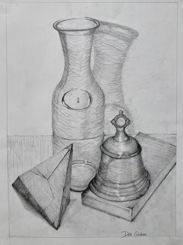
portfolio drawing 1_WIP_2hoursportfolio drawing 1__WIP_5hoursPortfolio Drawing 1. FINAL