Project 4: Independent Drawing. This is a self-directed assignment connected to my portfolio theme of Letting Go. Project Proposal, below, was submitted March 12.
(NOTE… all images expand on click except PDFs)
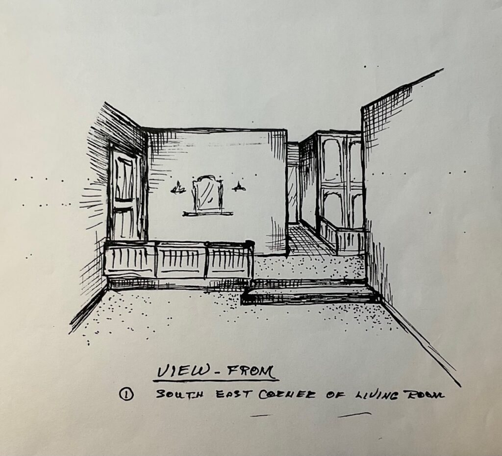
PROJECT-PROPOSAL-submit-March-9Raw material: images from my archives. Early ideas for composition… assuming piano drawn on reverse of translucent Mylar, plus or minus collaged items on reverse surface (the original receipt, the sketches by me and Dad), and the drawings of Dad and me would be in charcoal on the front surface of the mylar. A starting point…
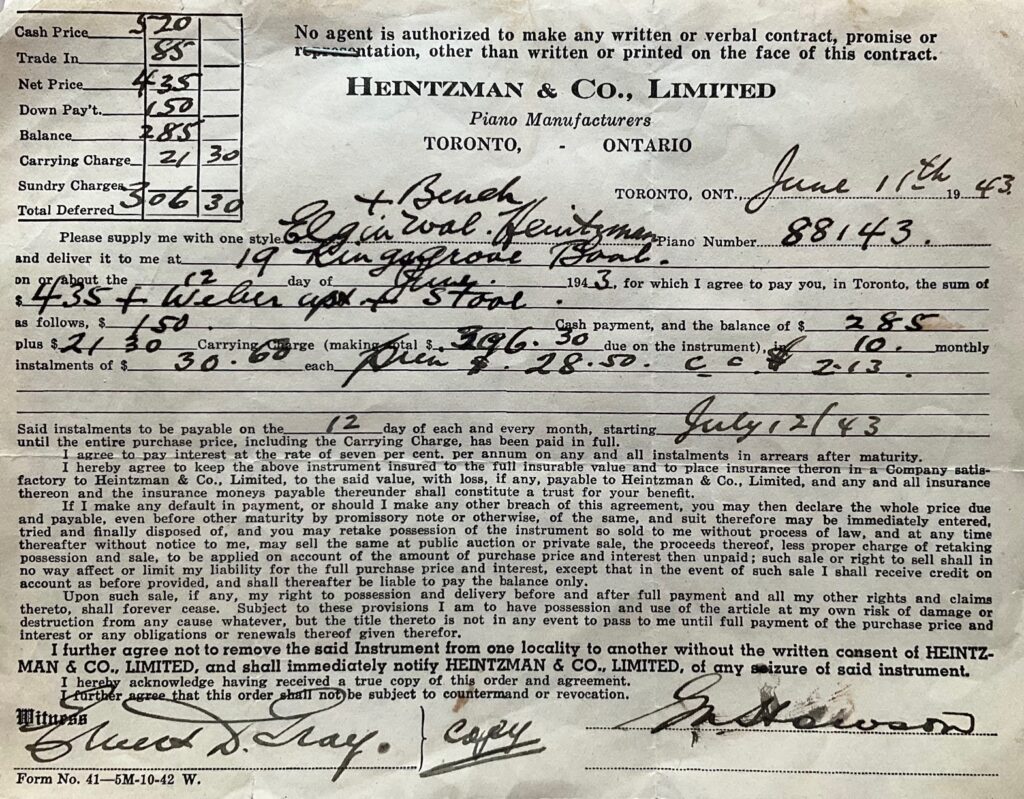
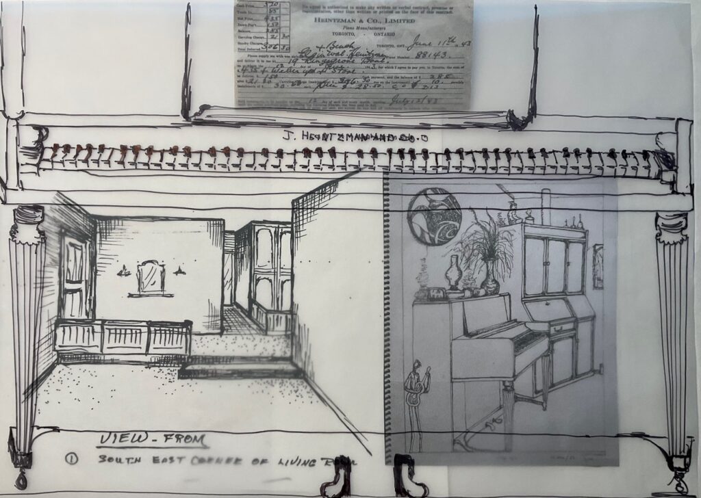
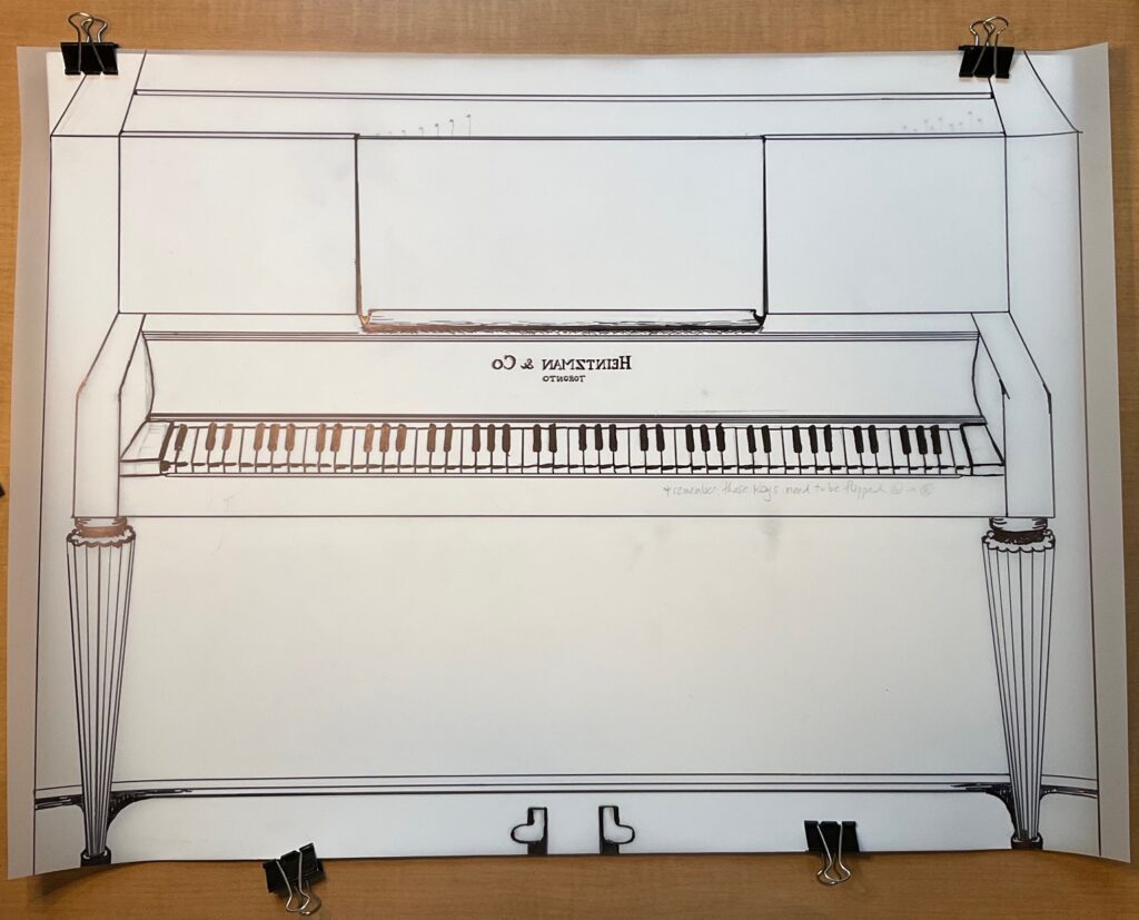
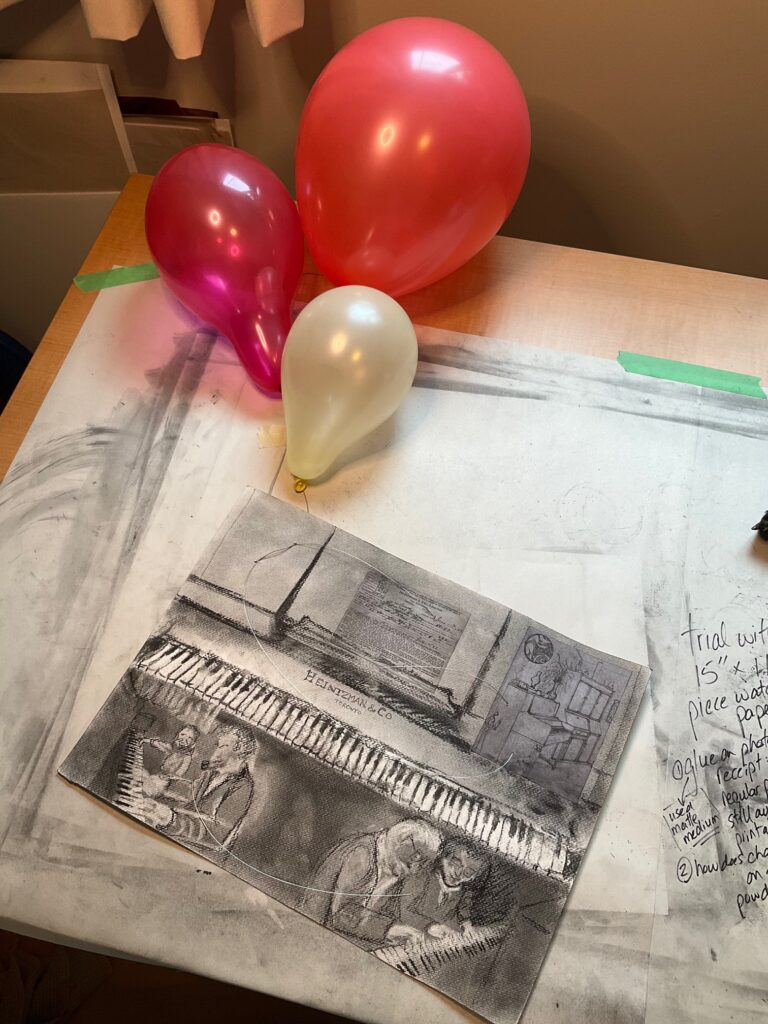
See below… a second set of trials, with mylar 20 x 27 (approx 1/4 of my proposed size). A whole bunch of things aren’t working… piano in perspective is difficult with it being gone and my photos aren’t from the right angle; I don’t feel sure the mylar will have enough contrast; not sure how/if to incorporate the archival items (original receipt, Dad’s and my line drawings)… starting to wonder about just drawing on paper +/- collage…
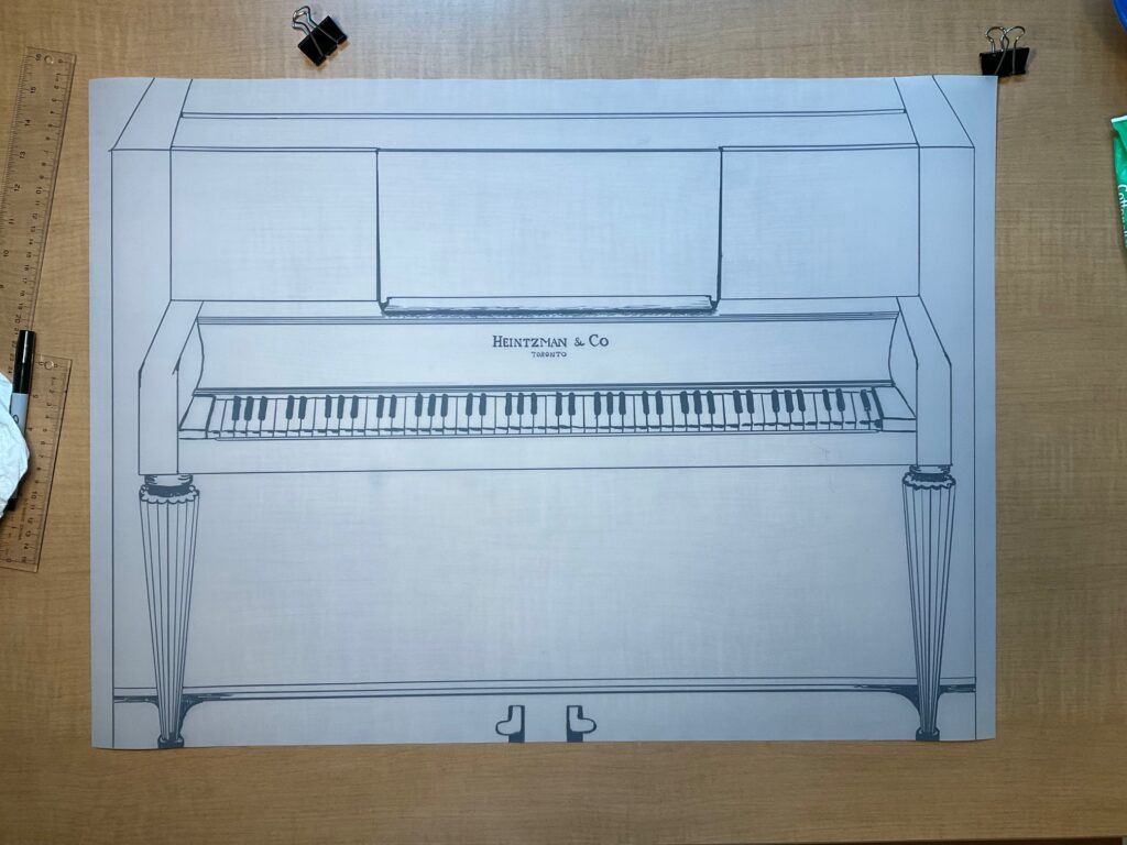
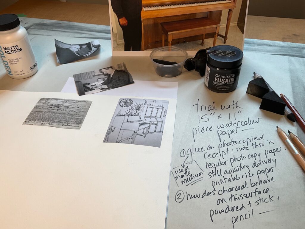
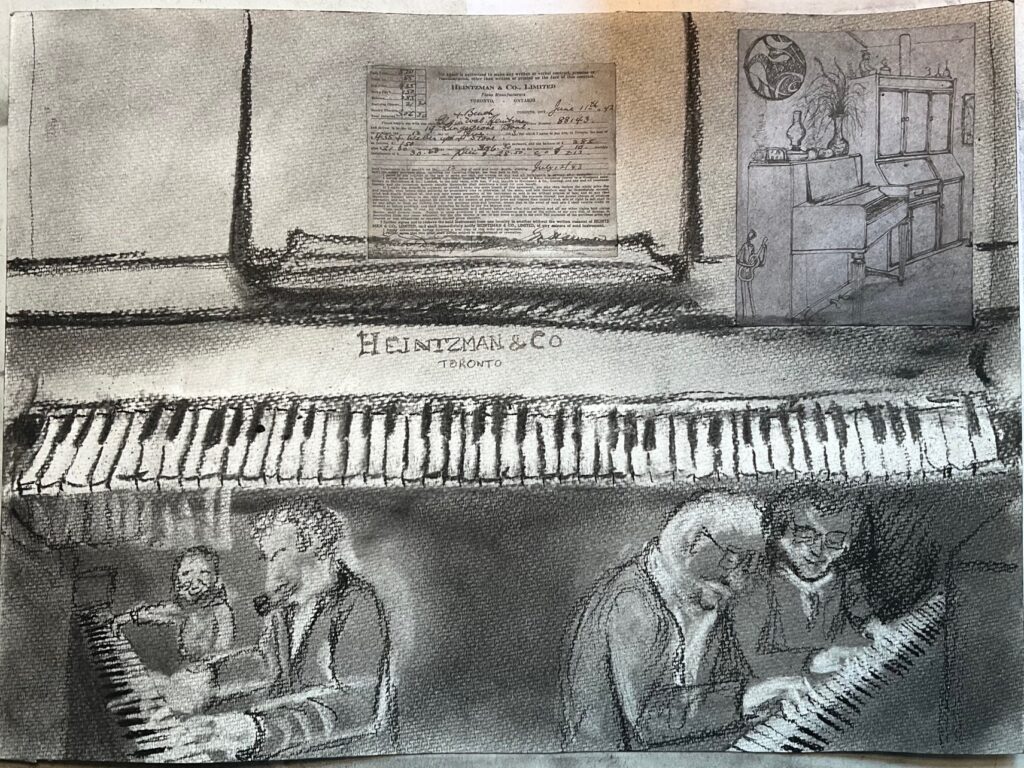
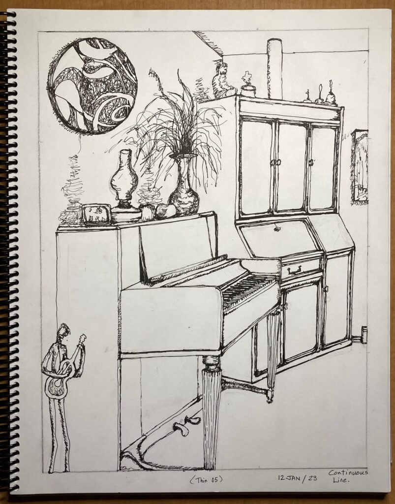
While I am not decided about the texture of the watercolour paper, I find this quick drawing to be freer and more interesting than the earlier attempts at architectural perspective. This page is too small for some of the details so things look cramped, but I think I can create contrast dark / lights so the scenes and the archived bits seem to emerge from within the piano. The glueing on with matte medium seems to work fine, though when I receive the printable rice paper will explore its colour match with the paper I plan to use (also note missing upper left Dad’s perspective drawing). One other thing to play with — does it work to incorporate piano wire, perhaps interconnecting the images and also playing with my original idea of lines up to balloons that are floating the drawing upward… titled something along the lines of The Unbearable Lightness of Letting Go the Family Piano… or just Letting Go the Family Piano
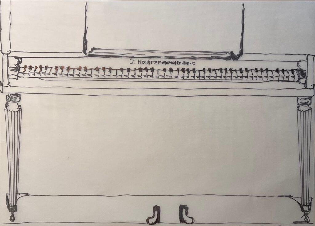
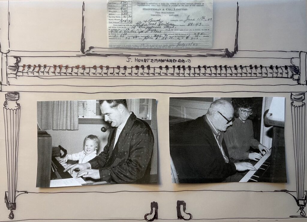
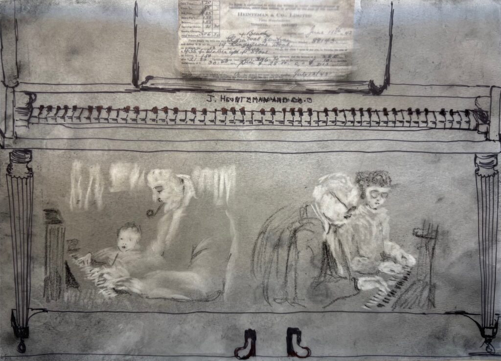
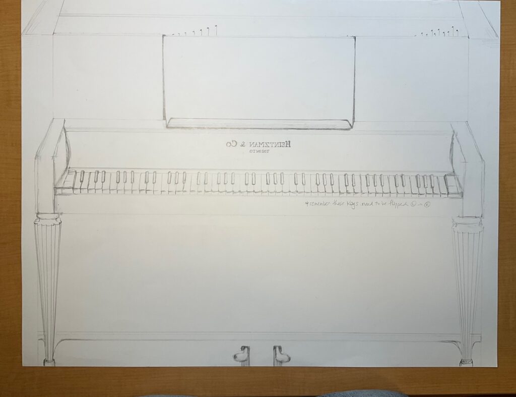
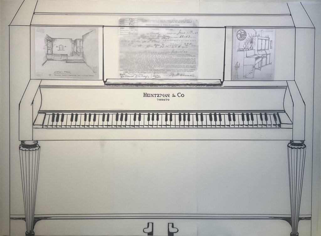
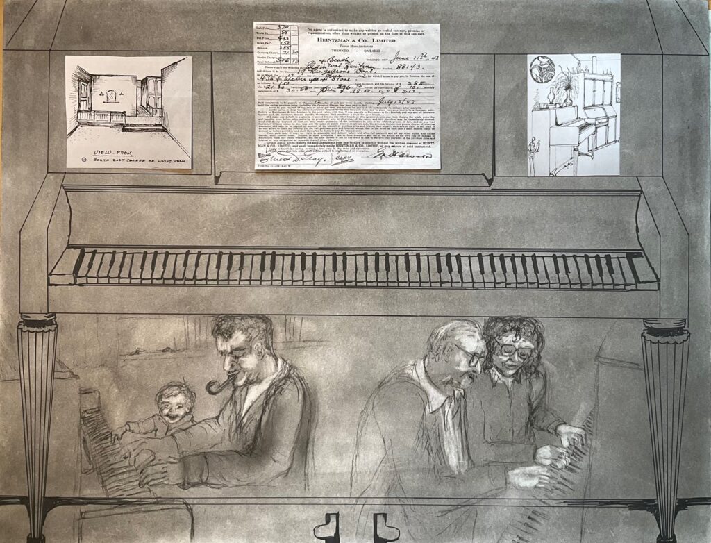
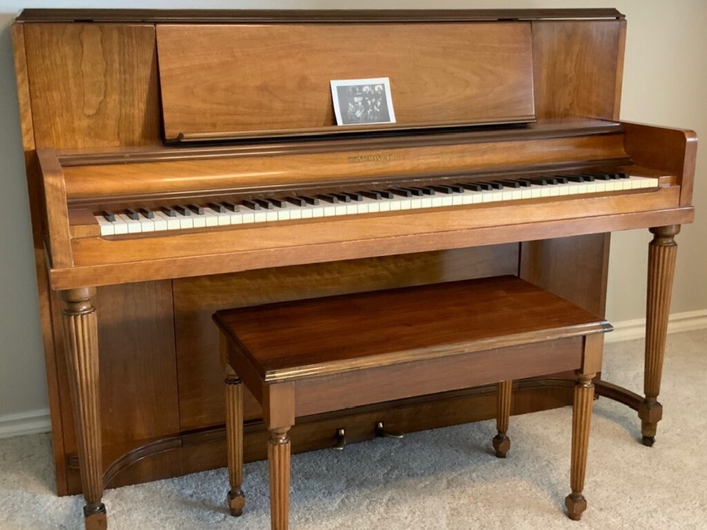
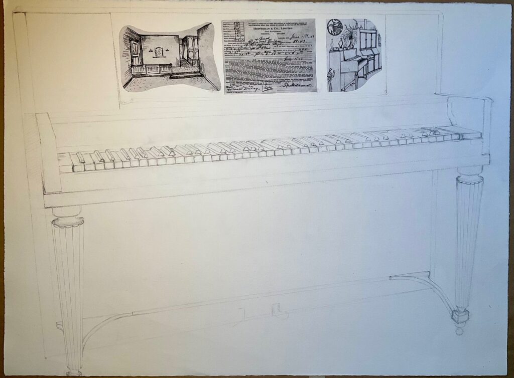
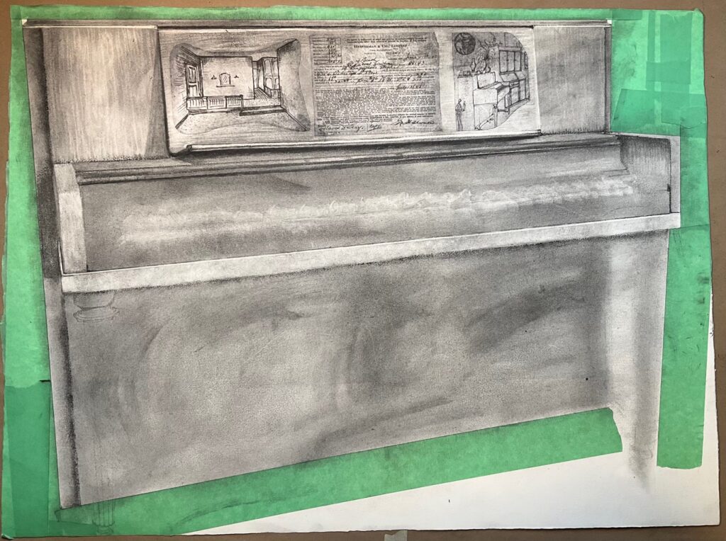
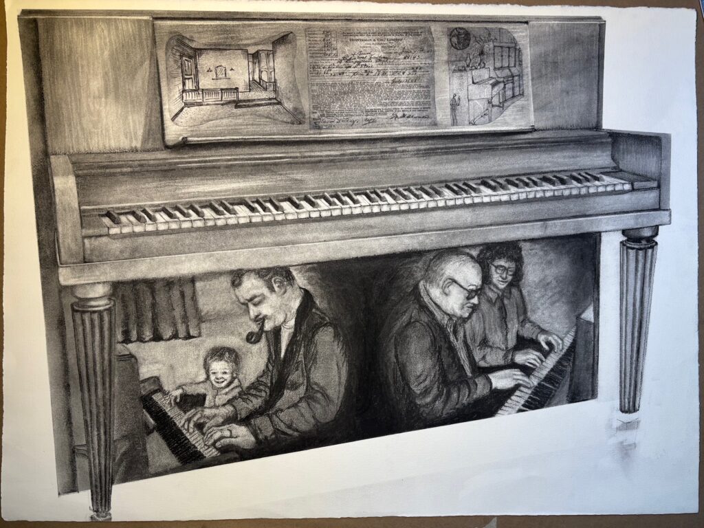
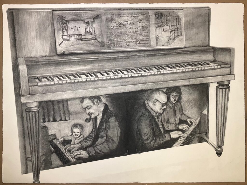
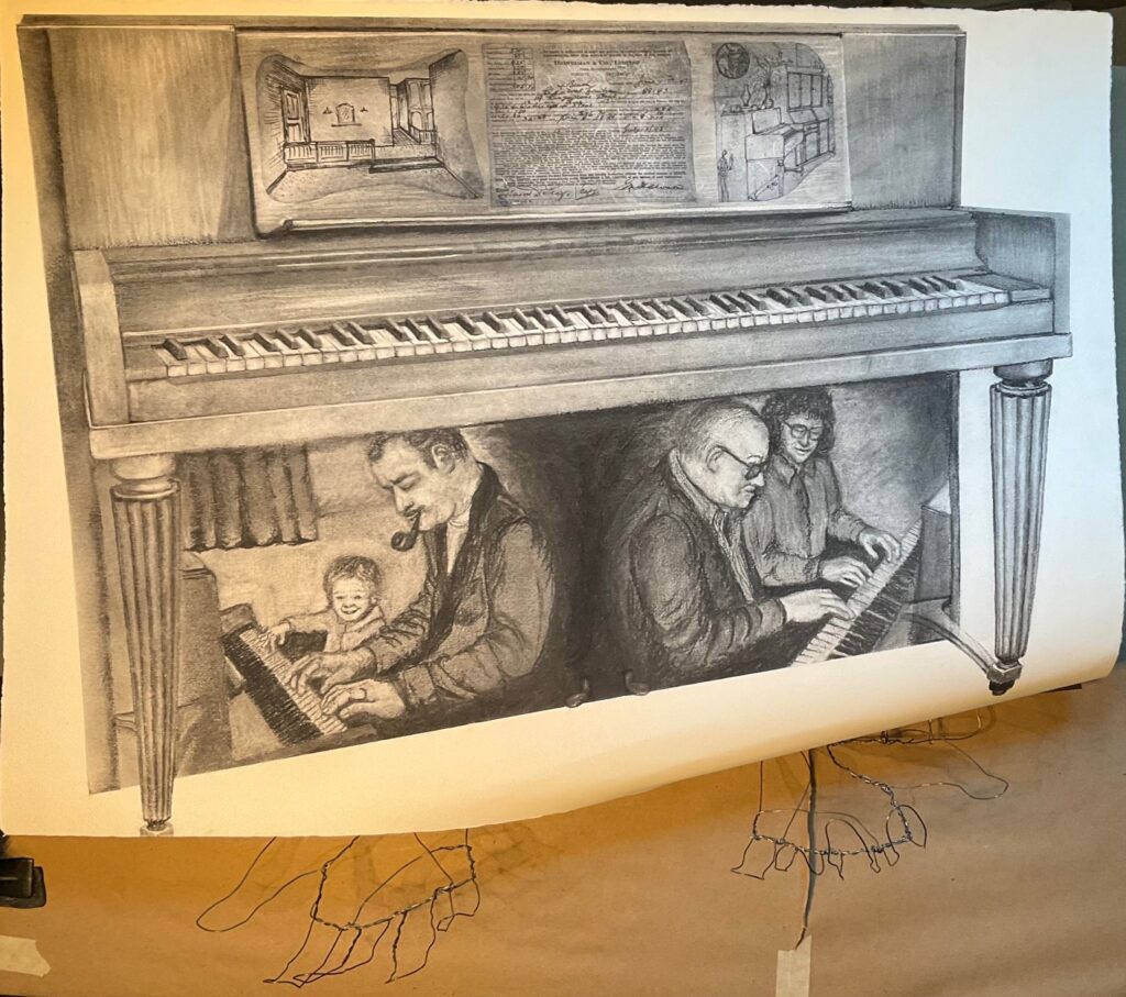
NEXT STEP — get on to the substrate I’m going to use. Decided against watercolour paper. Going with the slightly less textured drawing paper 22 x 30 available at NIC. Will give me some texture but not the waffle-ish texture shown above in my trial drawing. Needed to settle on a view of the piano — decided on slightly off-centre view, maintain top of piano level but show some receding perspective. See reference photo for piano below, as well as my guide sketch to figure out perspective, plus first three items collaged in place before adding any charcoal. I used mulberry rice paper for the collages – thin and translucent but also some inclusions of fibres that make the items less defined and stark. They will also be softened and recede somewhat under the charcoal, to the degree I layer over them.
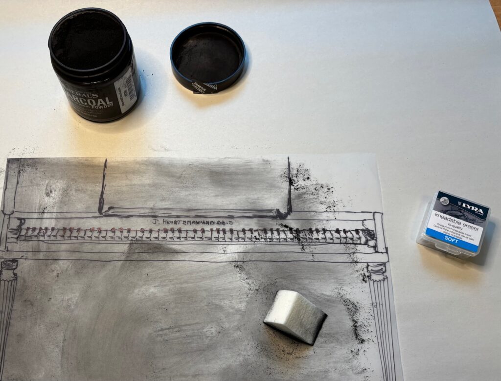
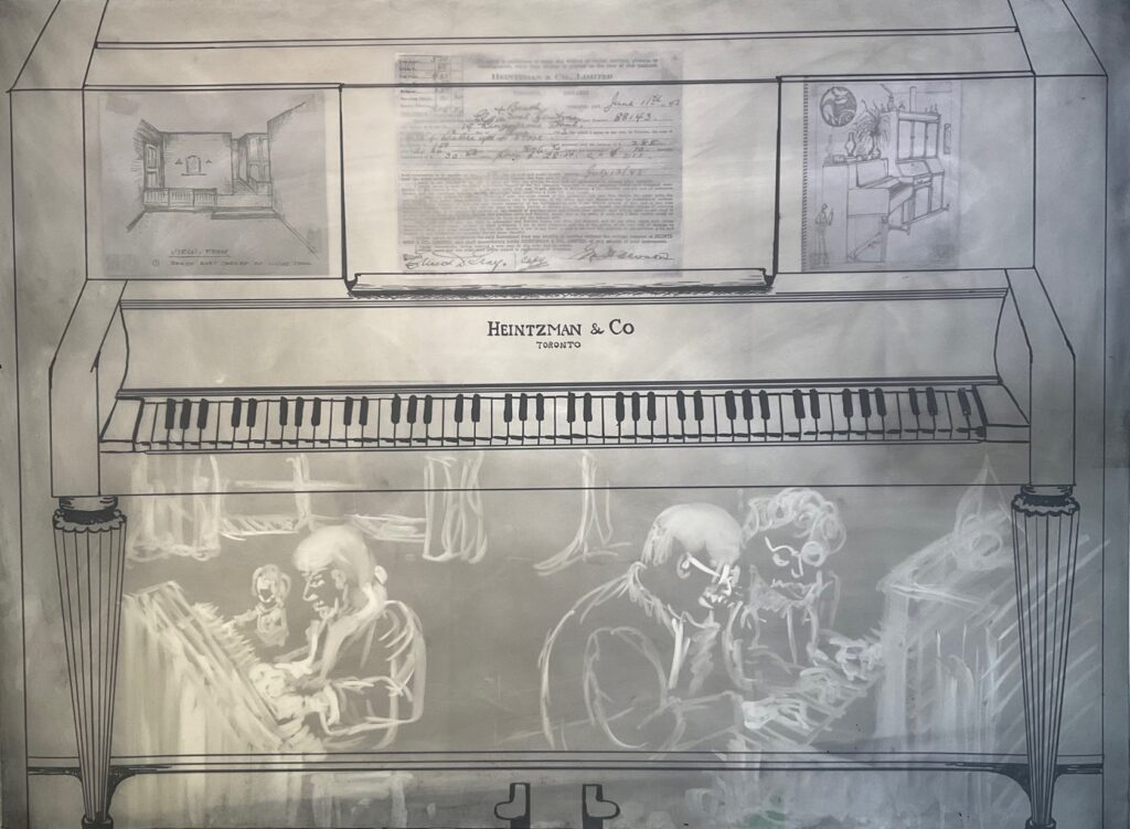
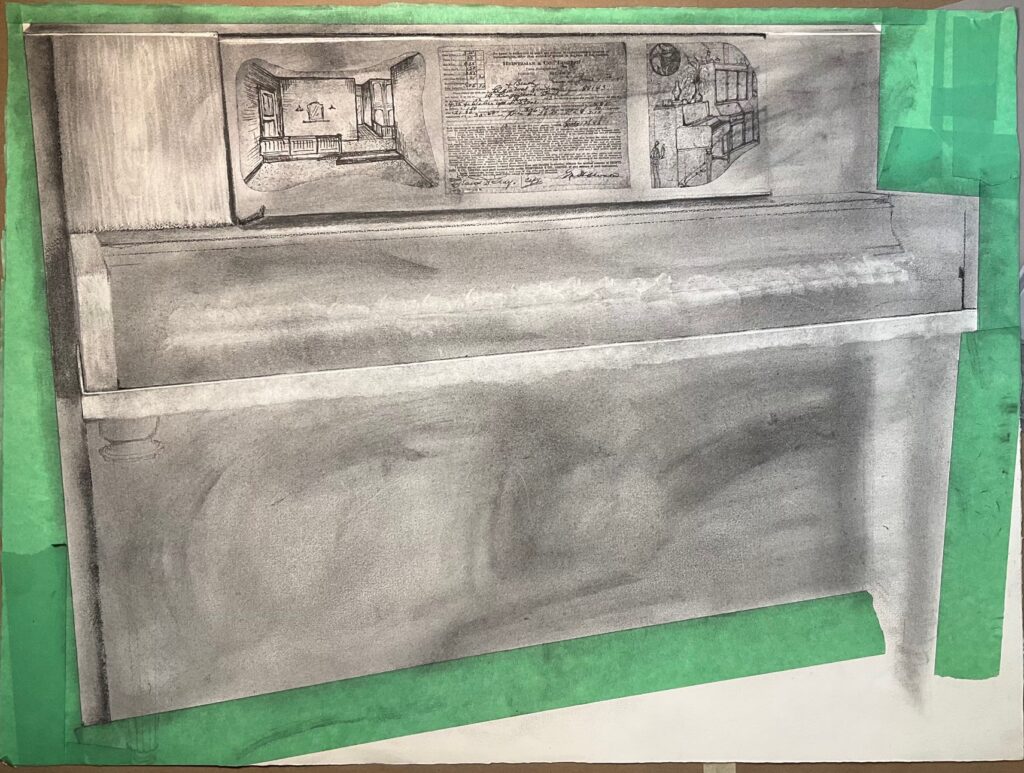
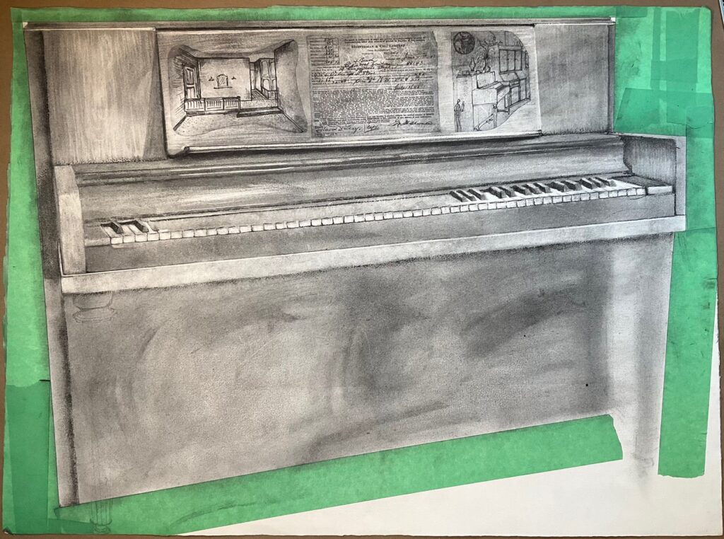
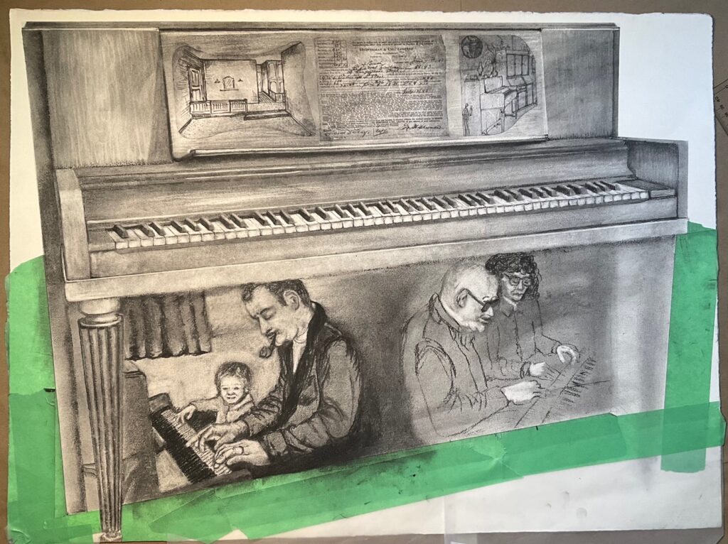
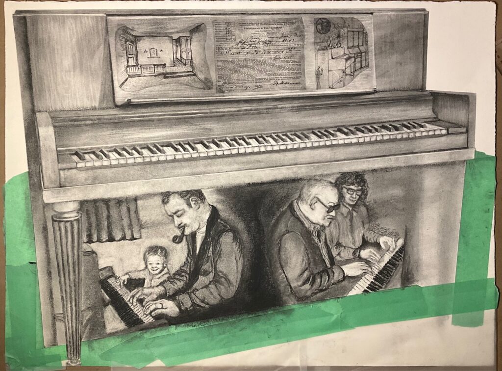
Work in Progress April 1 through 9th: images below, starting with my overlay of powdered charcoal which just about obliterated my under-drawing! However, gave me a chance to make a modified piano, looser overall and making different choices about the details I want to emphasize. The third image below is the version I will show at the April 2nd class for peer and instructor feedback on the work in progress.
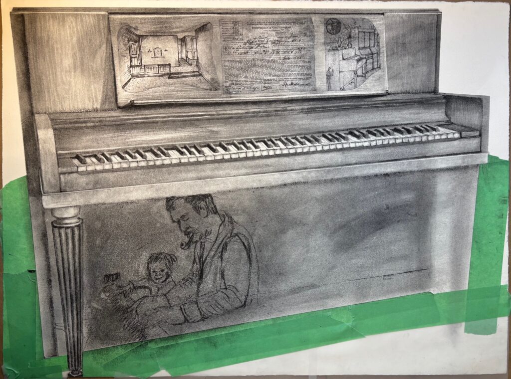
Work in progress final week: initial set below… completing the charcoal.

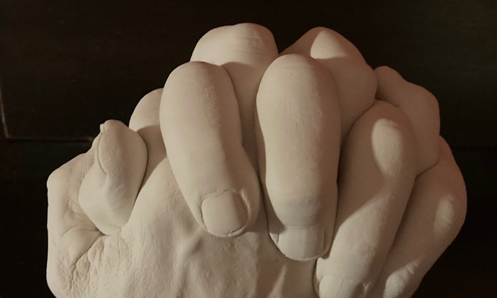
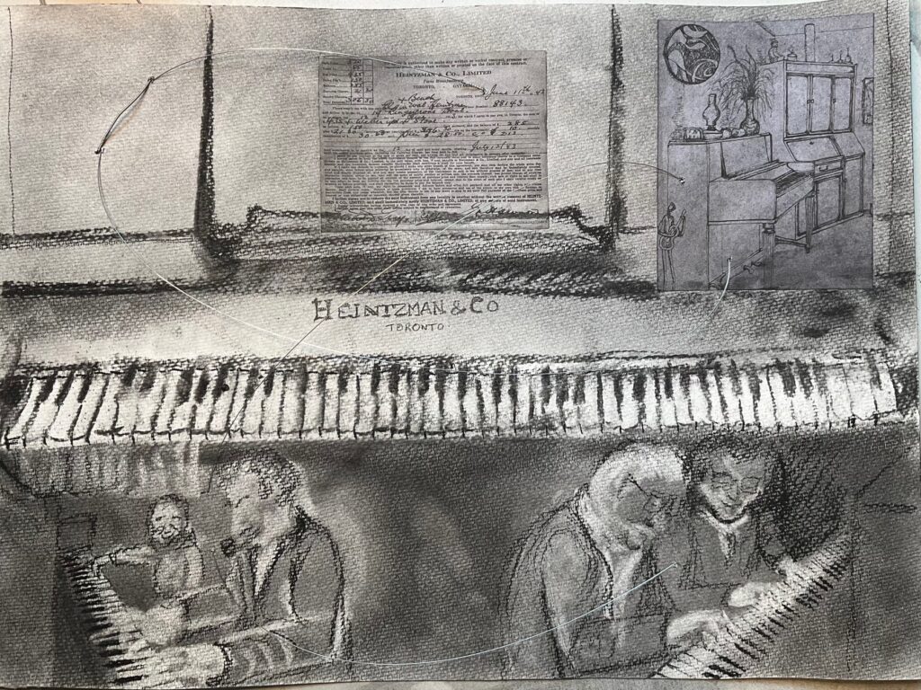
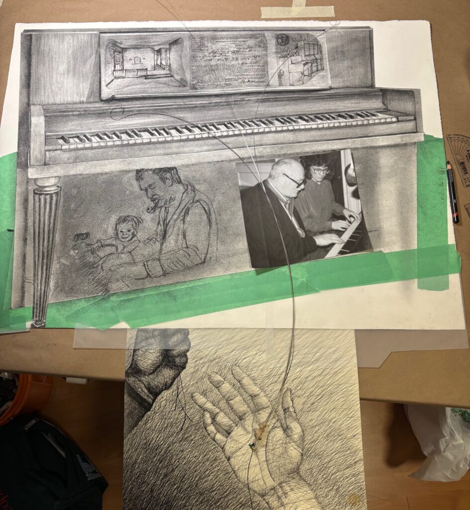
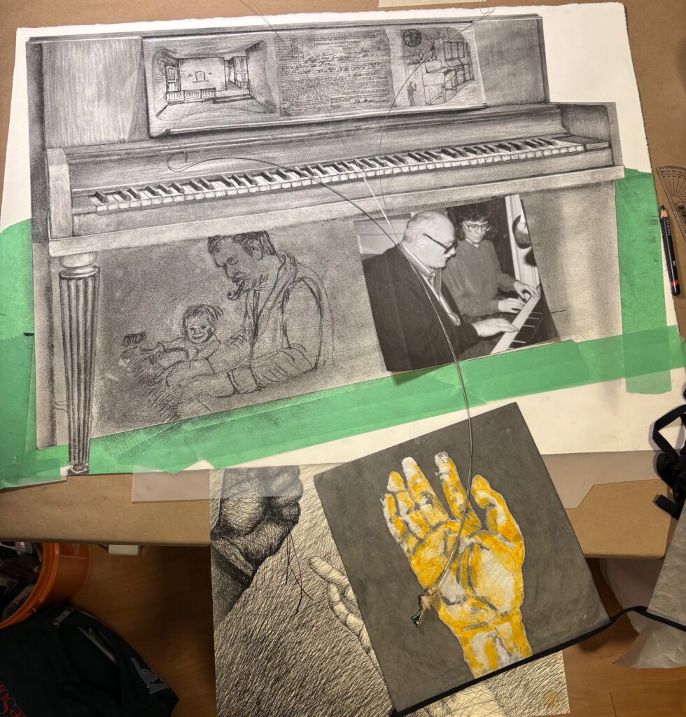
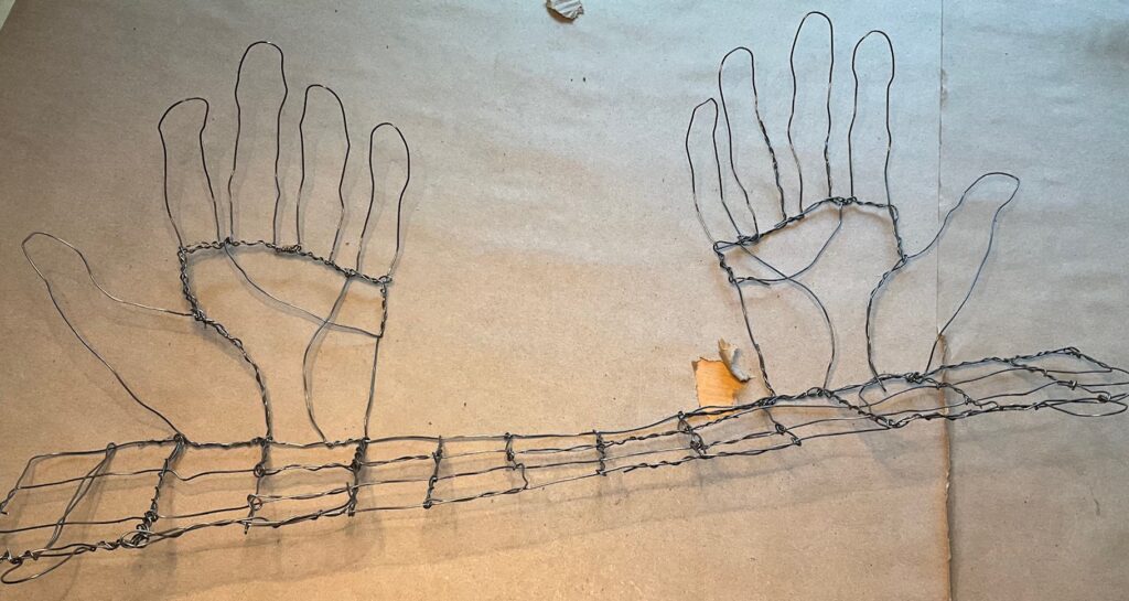
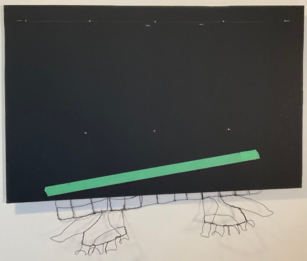
Below… brainstorming how to treat the white space… can I include wires, creating a set of hands below the work, in gesture that is releasing, cradling, treasuring? What if they are lit from underneath so the shadows come up on to the piece, animating the white border…
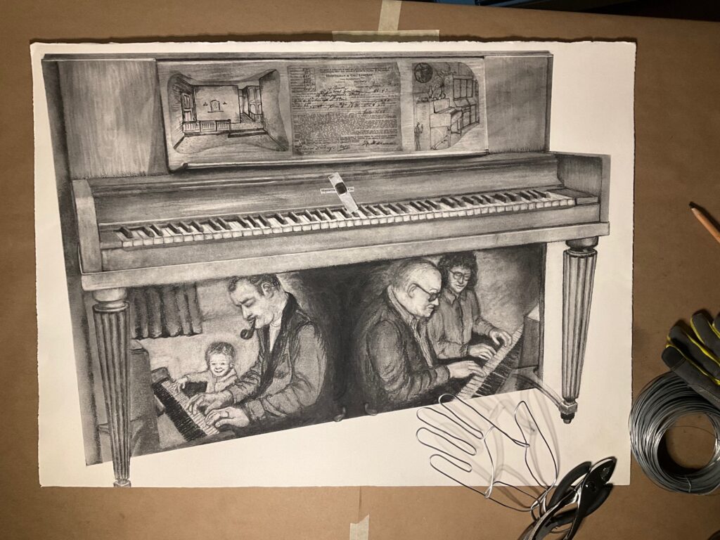
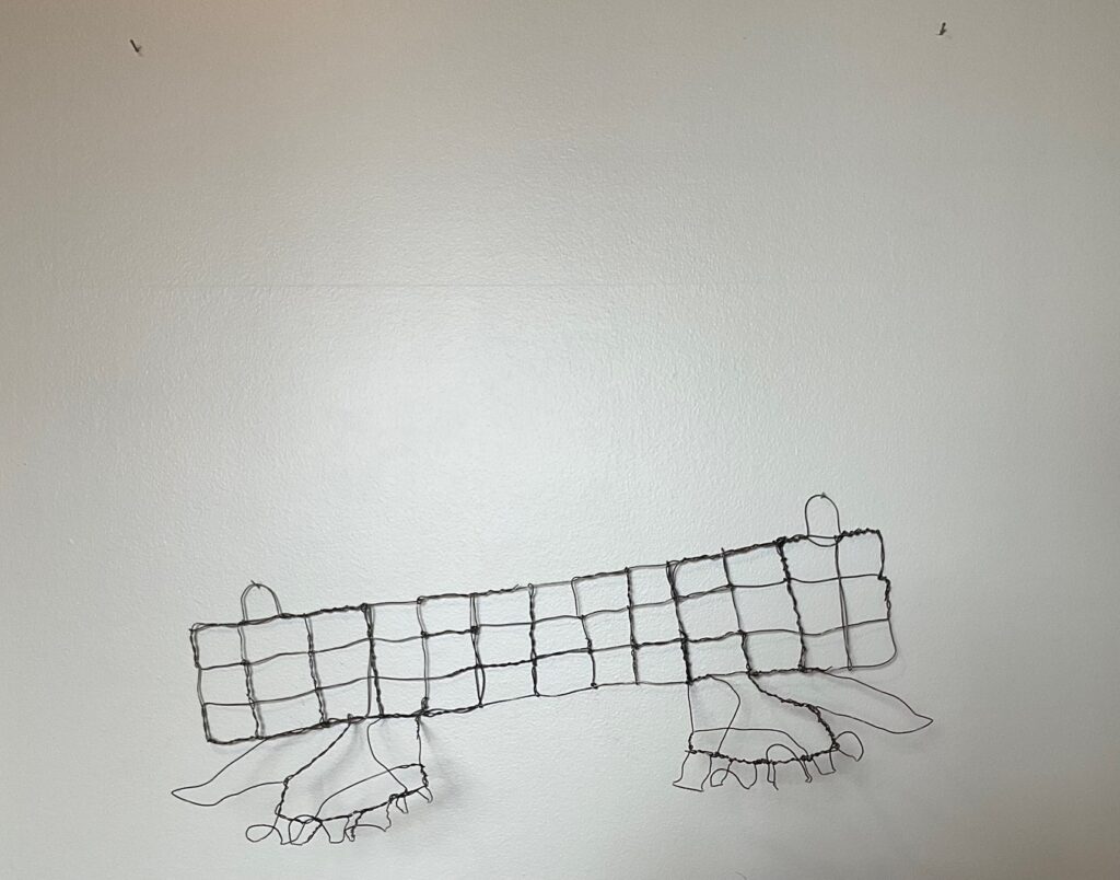
thoughts… the larger 3D hand is too busy and detracts from the work. The simple linear one is a better complement but needs more gestural character. Will try making a version where the hands are “attached” the wall along their pinky-finger border, and emerge with the thumbs closest to the viewer — Could I mount the paper several inches off the wall so centre of the palm meets the bottom of the paper, thumb curling forward? Obtained spools of black and silver-gauge wire today, halfway between the thickness of these trial hands…
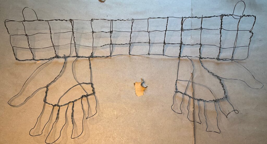
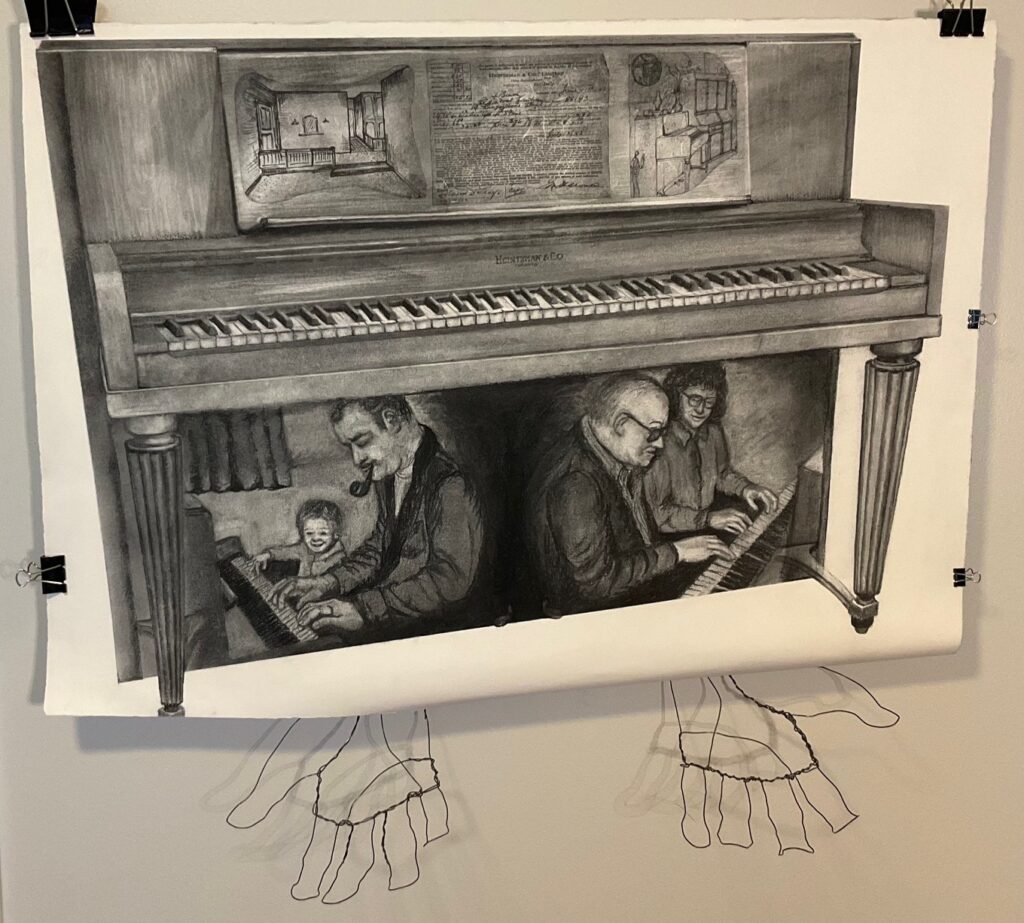
Overnight… decided hands better to emerge straight out from wall, as if giving away this drawing to the viewer. Made a wire mesh to mount them from, stabilize them, thinking I can attached it to the wall behind the work, bringing the paper forward 2 inches off the wall. See below – new hands and a mockup of the presentation…
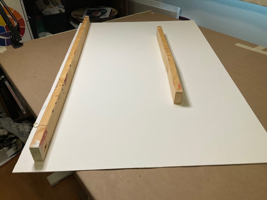
How to hang the piece: Used a piece of framing mat (cut the bottom angled up to right too allow edge to curl under). Nailed 2-inch space bars on the back, with 2 eye hooks for nail mounting. Will hang the wire sculpture under / behind this board, and tape the drawing on to the board for display. See set up below…
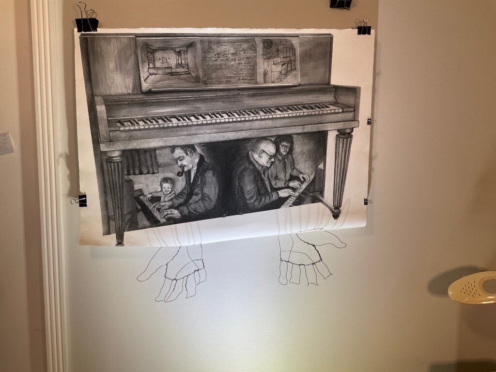
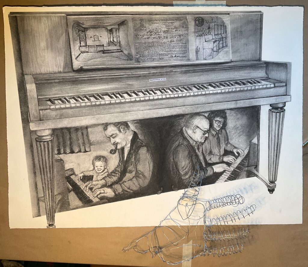
As seen above, I tried lighting the piece from below to get some hand shadows but I don’t find it effective. The hands make not-easily-understood elongated shadows that have a kind of creepiness to them. I could make a more distinct hand-shaped shadow by curling the fingers closer around the bottom of the piece but then they look like holding on to the piano instead of offering to give it away. Will stick with overhead lighting for critique tomorrow although might bring my floor spotlight along in case others want to see/discuss.
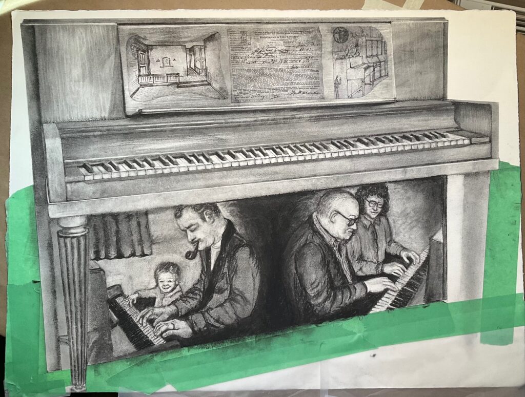
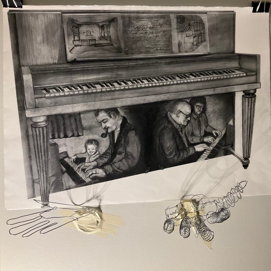
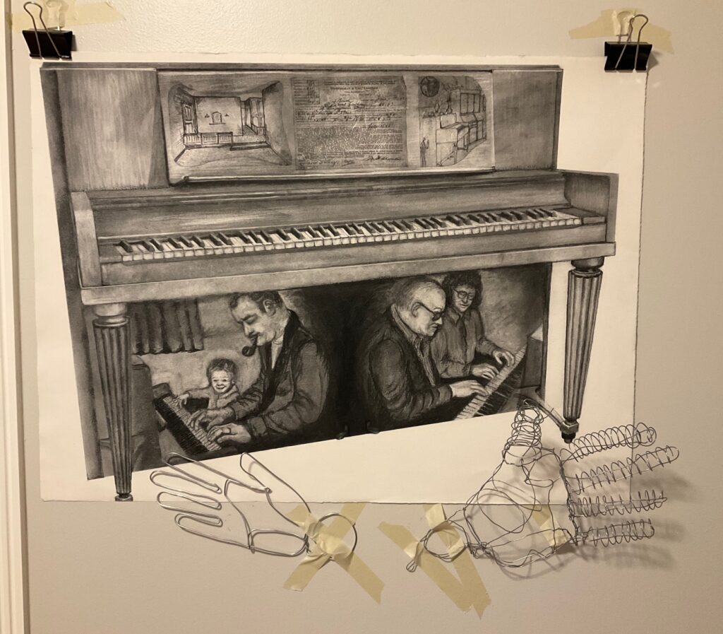
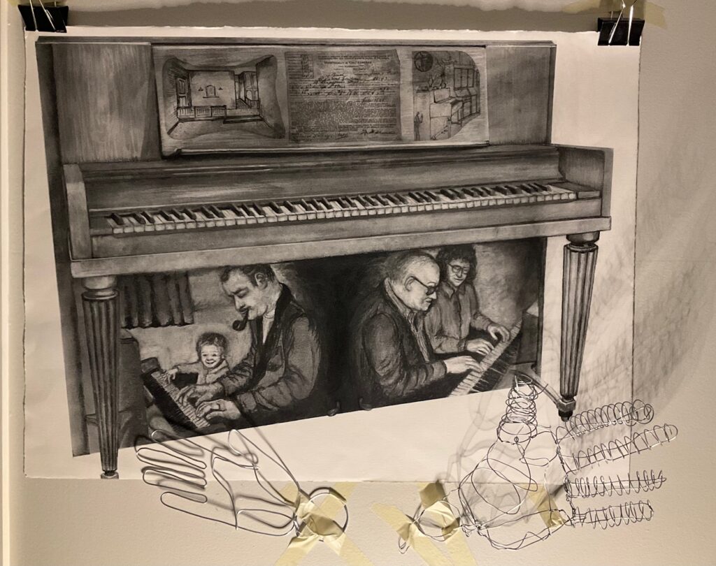
CRITIQUE DAY April 9th. See below, images with and without the wire hands.
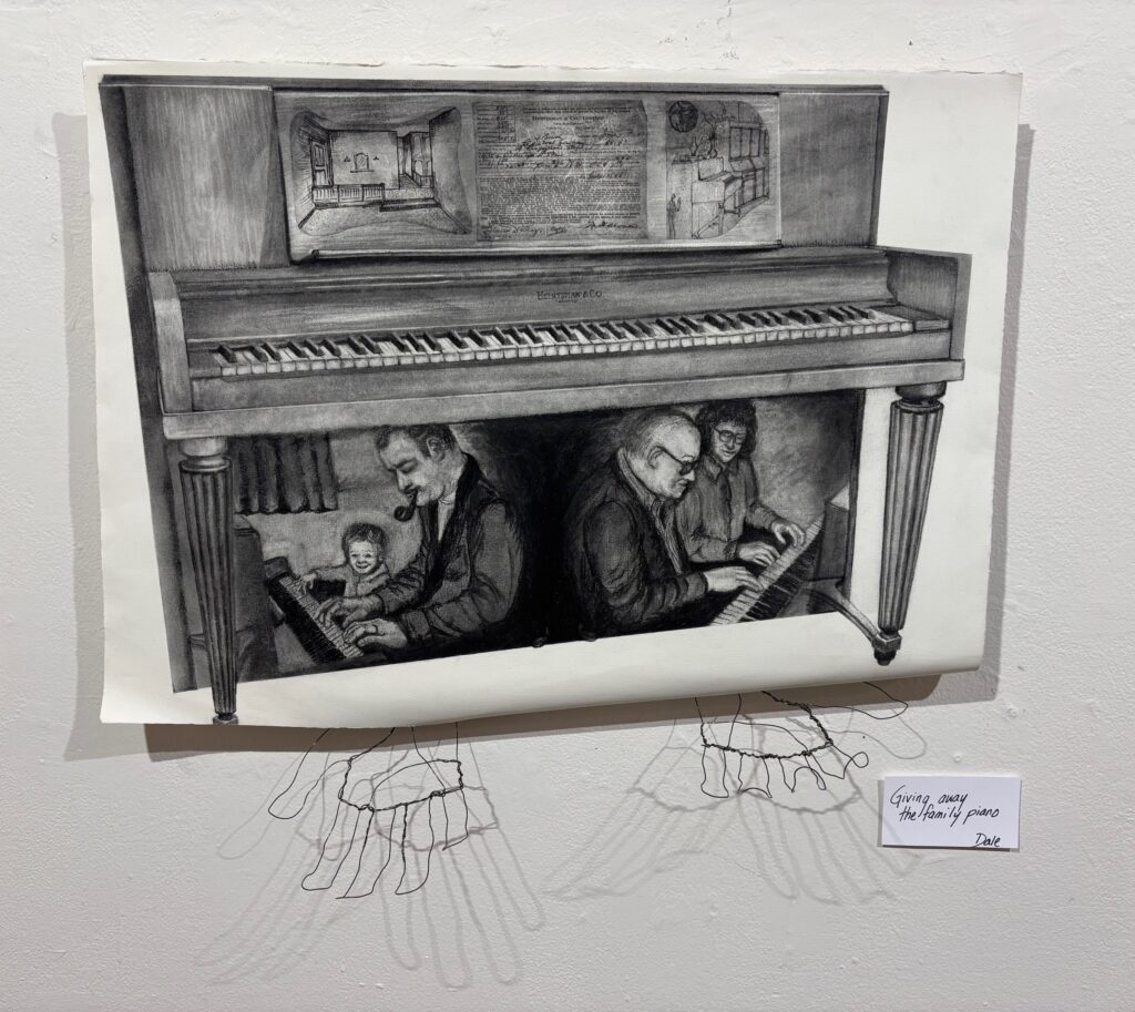
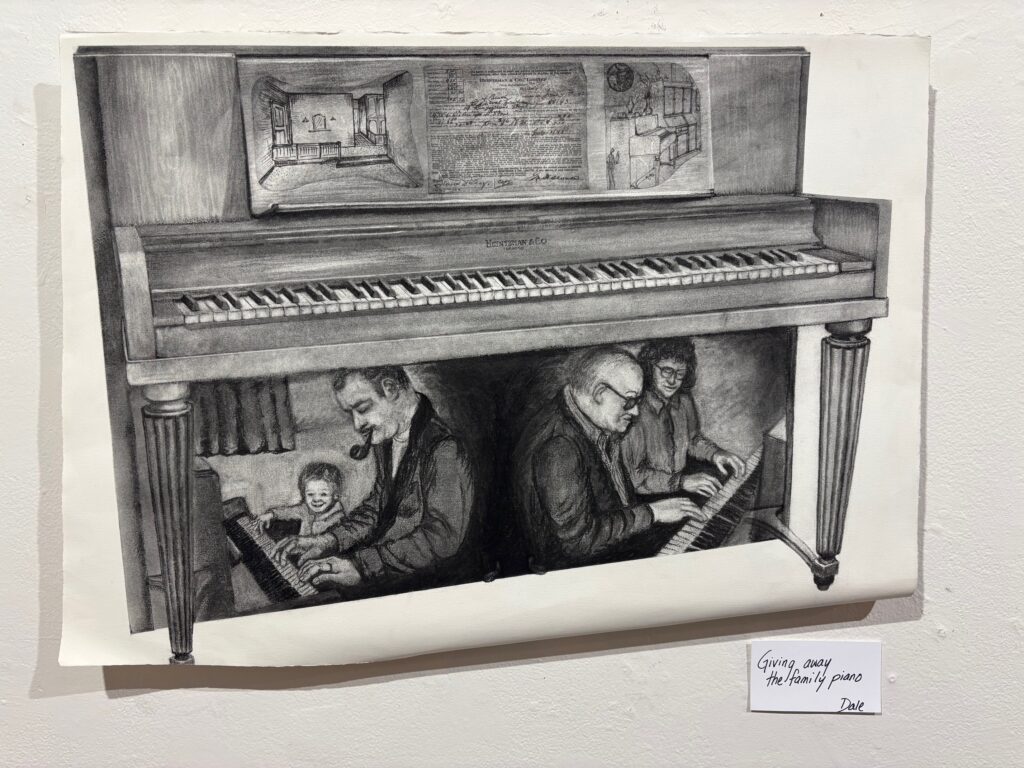
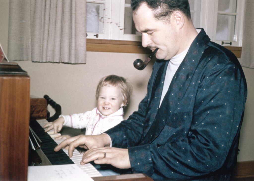
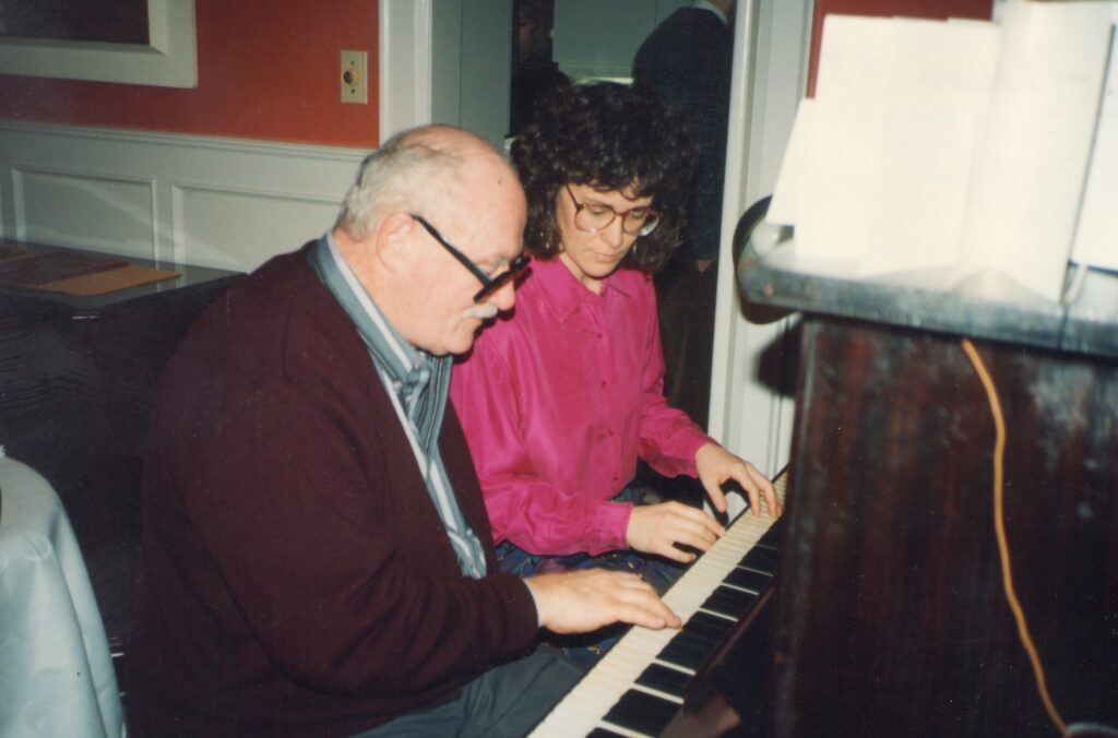
Feedback from peers and instructor at Critique: Lots of appreciation for the drawing in charcoal: specifically the use of shadow and contrast, the warmth and poignancy of the Dad/Dale scenes (people noticed the switch between 2-hands playing young Dad to the one-hand playing older Dad), the technical details like piano’s wood grain, the highlit reflections on piano trim, the receding perspective on the piano, and the organization into horizontal layers (top being the piano’s history including where it “lived”, middle being technically detailed piano keys, bottom being family stories). Viewers thought the amount of detail effectively communicated the depth of attention to and affection for the instrument and its memories. Also, people liked the piece being mounted a couple of inches off the wall, adding shadow to further frame the piece, and allowing the undercurl of the bottom edge.
However, there were definitely mixed reviews on the wire hands. Specific comments — they are creepy, they seem not detailed enough to match the detail of the drawing, they just don’t add to the presentation. One person liked the ambivalence of the gesturing hands, one seeming to hold on to the image and the other to be releasing it, and she thought this added to the story line. I was interested to note how relieved I felt when someone said the hands just aren’t working… it’s like I couldn’t give myself permission to just ditch my original idea of including wires. But the suggestion that maybe the drawing was enough on its own felt like… finally, permission!! I think it is a stronger piece without the wire sculpture.
Written Assignment: Artist Reflections… see PDF below. Note it is 2 pages.
Artist-Reflections-Project-4-DaleWritten Assignment: Artist Statement. I chose to write a statement for a body of work, the pieces I have done this term on the theme “Letting Go”. See PDF below (one page)
Artist-Statement-Dale