FIN 217 Unit 3
FIN 217 Unit 2
FIN 217 Unit 1
FIN 211 Unit 3
Project 4: Independent Drawing. This is a self-directed assignment connected to my portfolio theme of Letting Go. Project Proposal, below, was submitted March 12.
(NOTE… all images expand on click except PDFs)
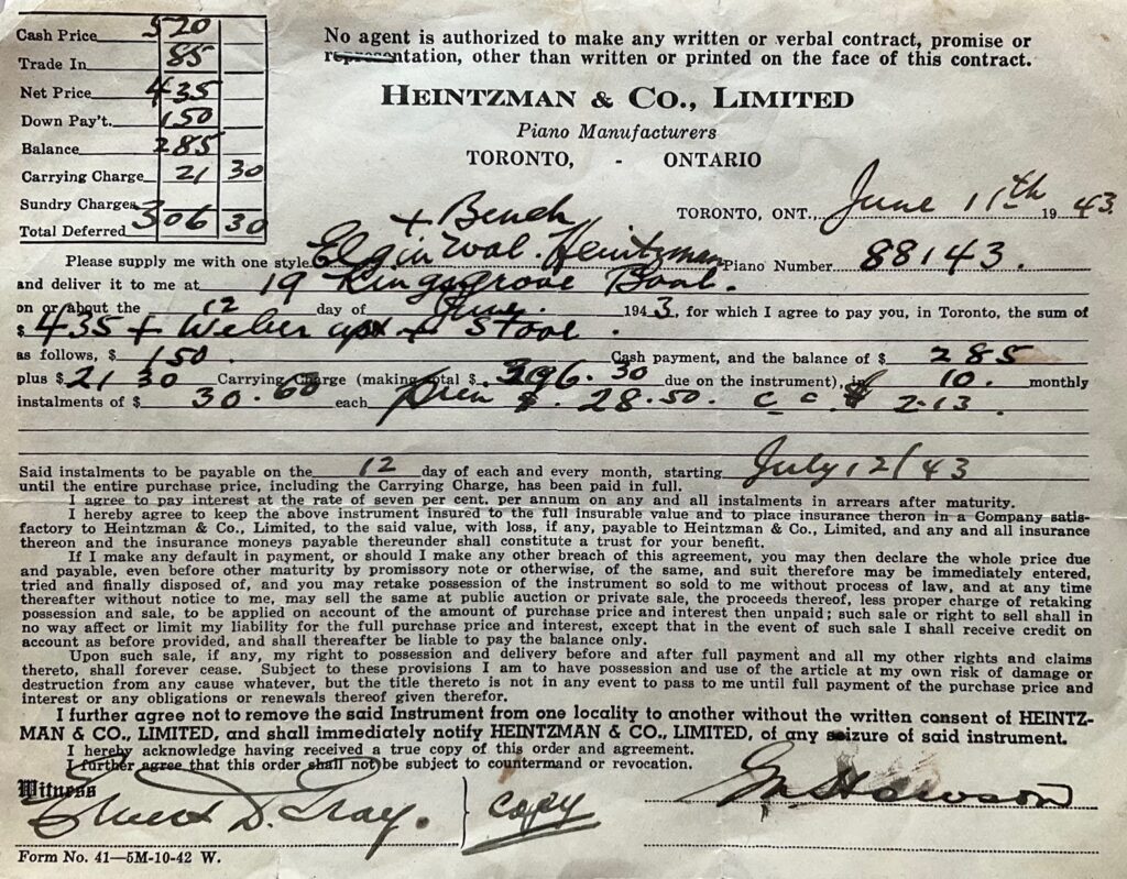
PROJECT-PROPOSAL-submit-March-9Raw material: images from my archives. Early ideas for composition… assuming piano drawn on reverse of translucent Mylar, plus or minus collaged items on reverse surface (the original receipt, the sketches by me and Dad), and the drawings of Dad and me would be in charcoal on the front surface of the mylar. A starting point…
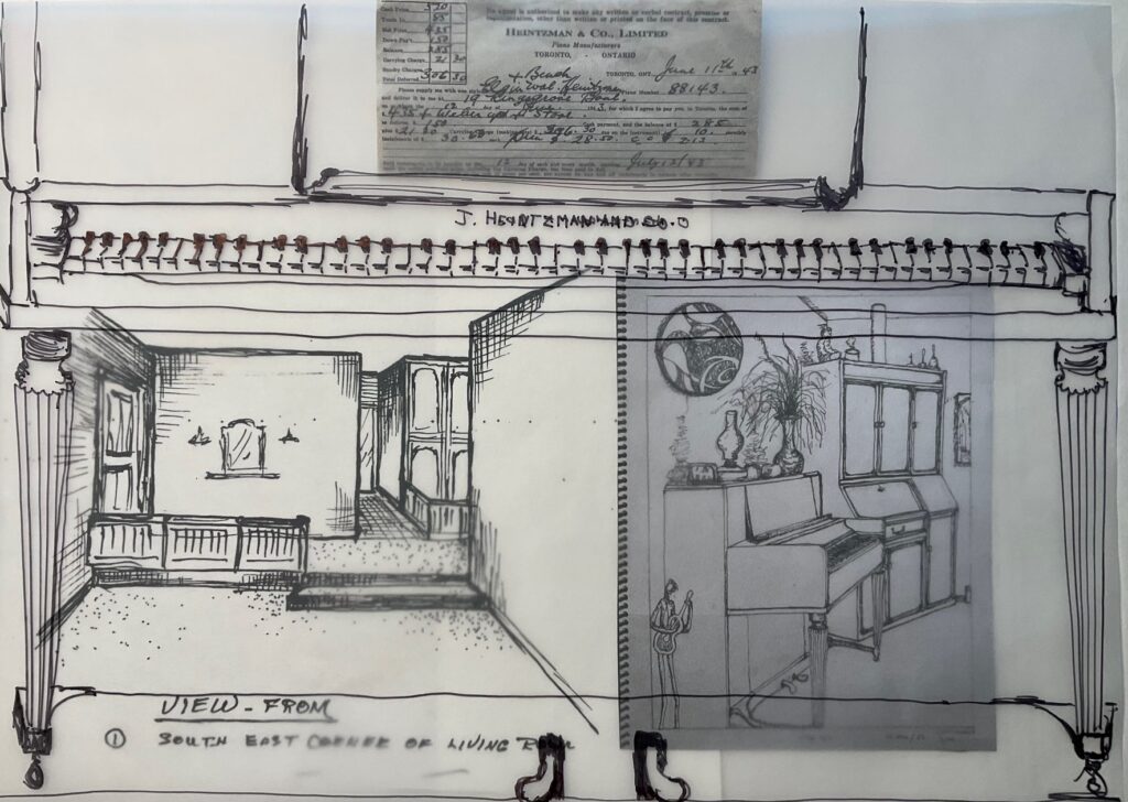
See below… a second set of trials, with mylar 20 x 27 (approx 1/4 of my proposed size). A whole bunch of things aren’t working… piano in perspective is difficult with it being gone and my photos aren’t from the right angle; I don’t feel sure the mylar will have enough contrast; not sure how/if to incorporate the archival items (original receipt, Dad’s and my line drawings)… starting to wonder about just drawing on paper +/- collage…
While I am not decided about the texture of the watercolour paper, I find this quick drawing to be freer and more interesting than the earlier attempts at architectural perspective. This page is too small for some of the details so things look cramped, but I think I can create contrast dark / lights so the scenes and the archived bits seem to emerge from within the piano. The glueing on with matte medium seems to work fine, though when I receive the printable rice paper will explore its colour match with the paper I plan to use (also note missing upper left Dad’s perspective drawing). One other thing to play with — does it work to incorporate piano wire, perhaps interconnecting the images and also playing with my original idea of lines up to balloons that are floating the drawing upward… titled something along the lines of The Unbearable Lightness of Letting Go the Family Piano… or just Letting Go the Family Piano
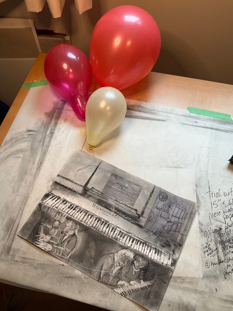
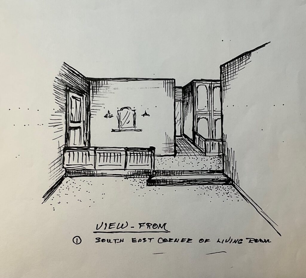
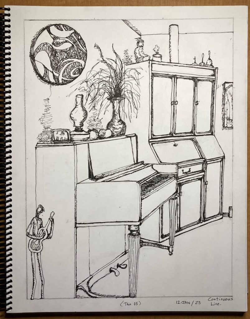
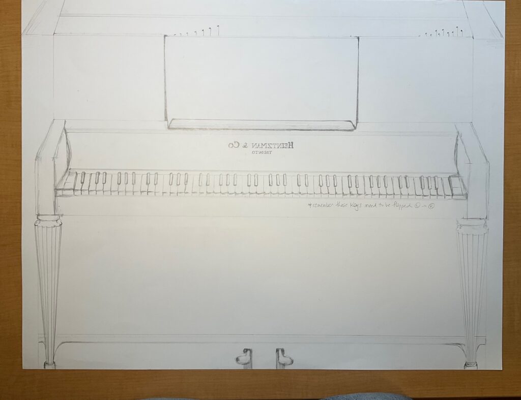
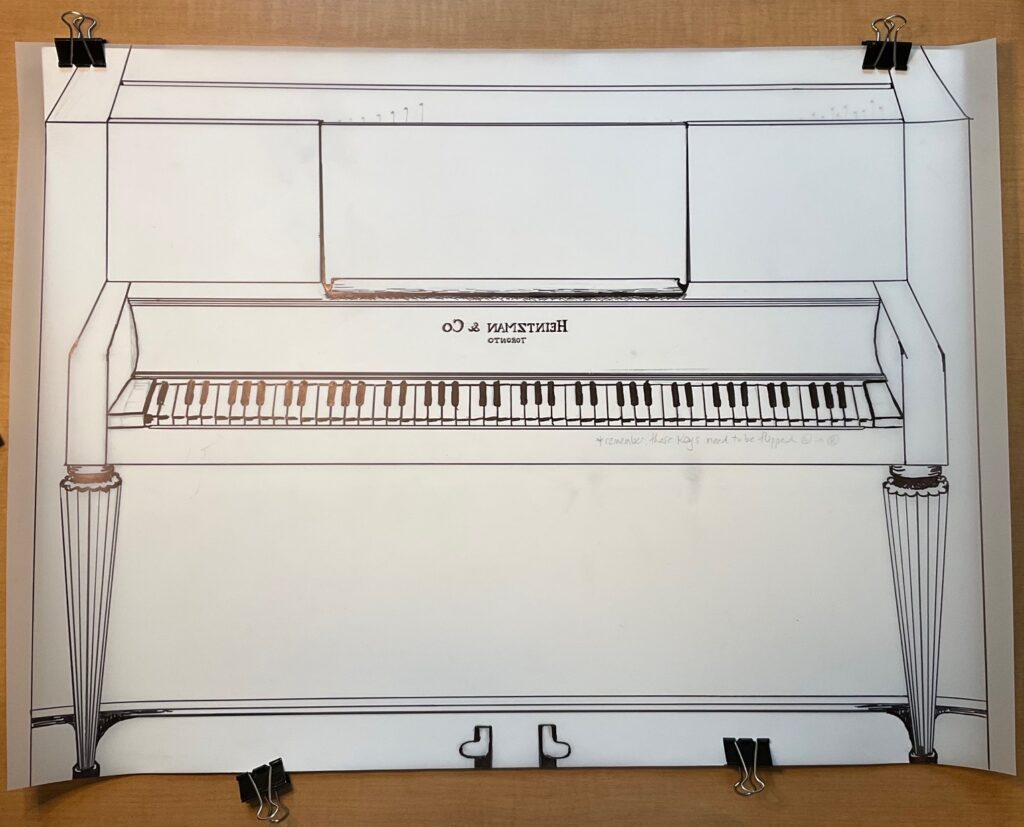
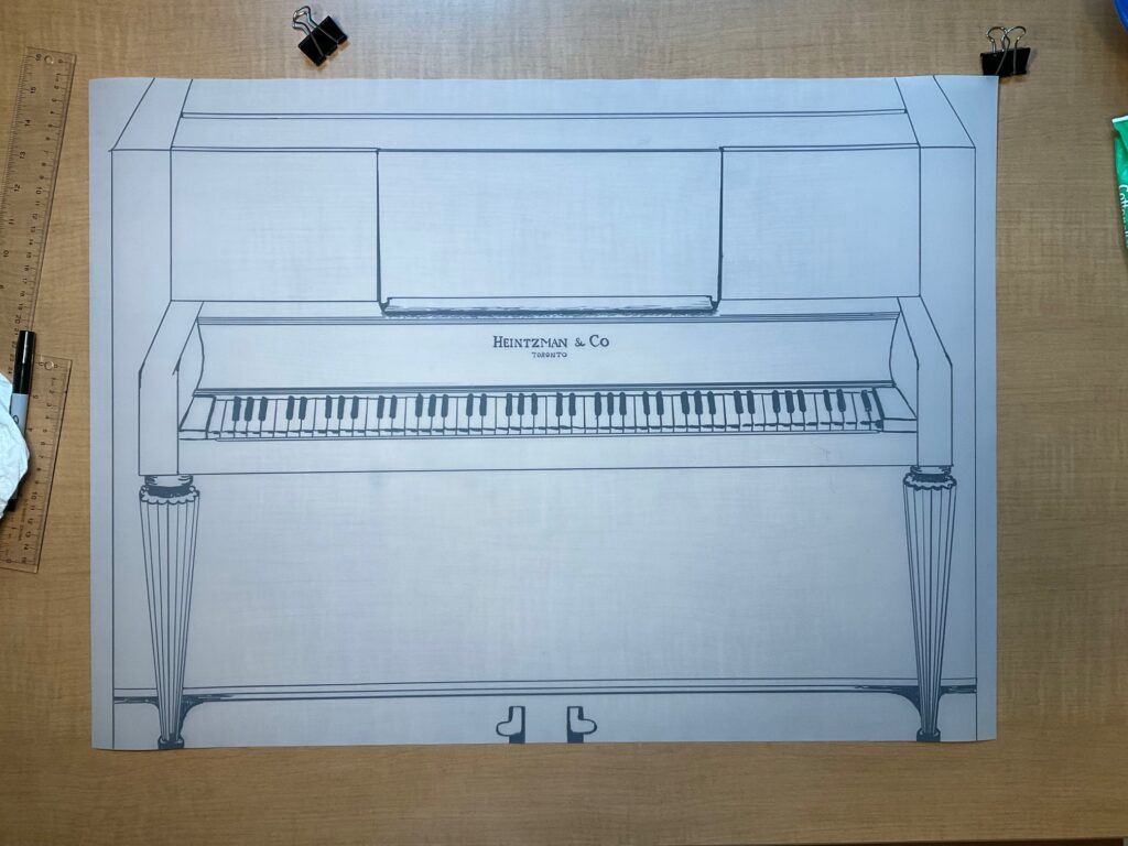
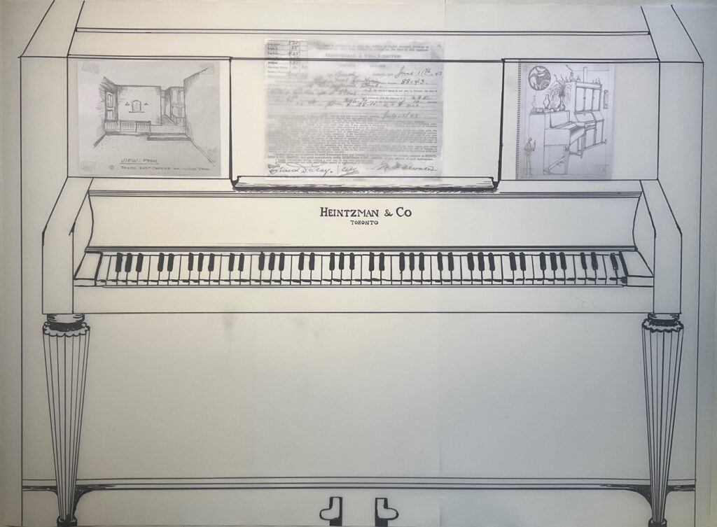
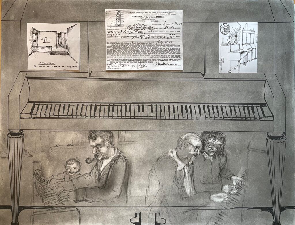
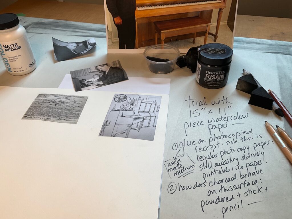
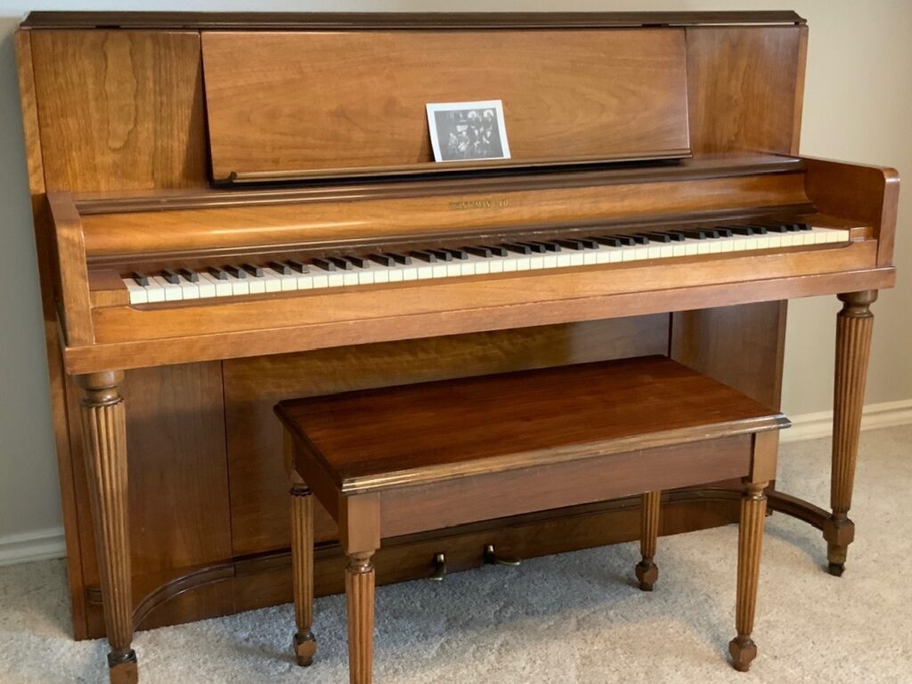
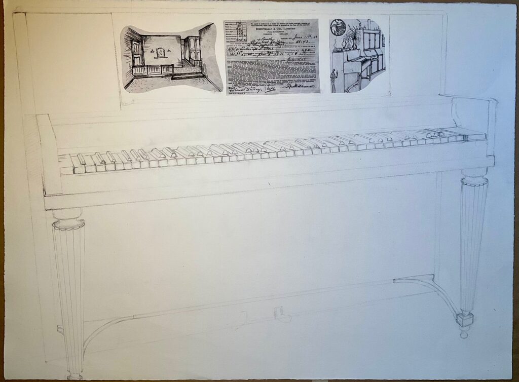
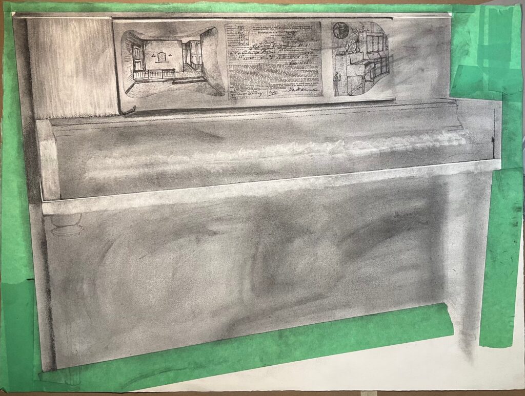
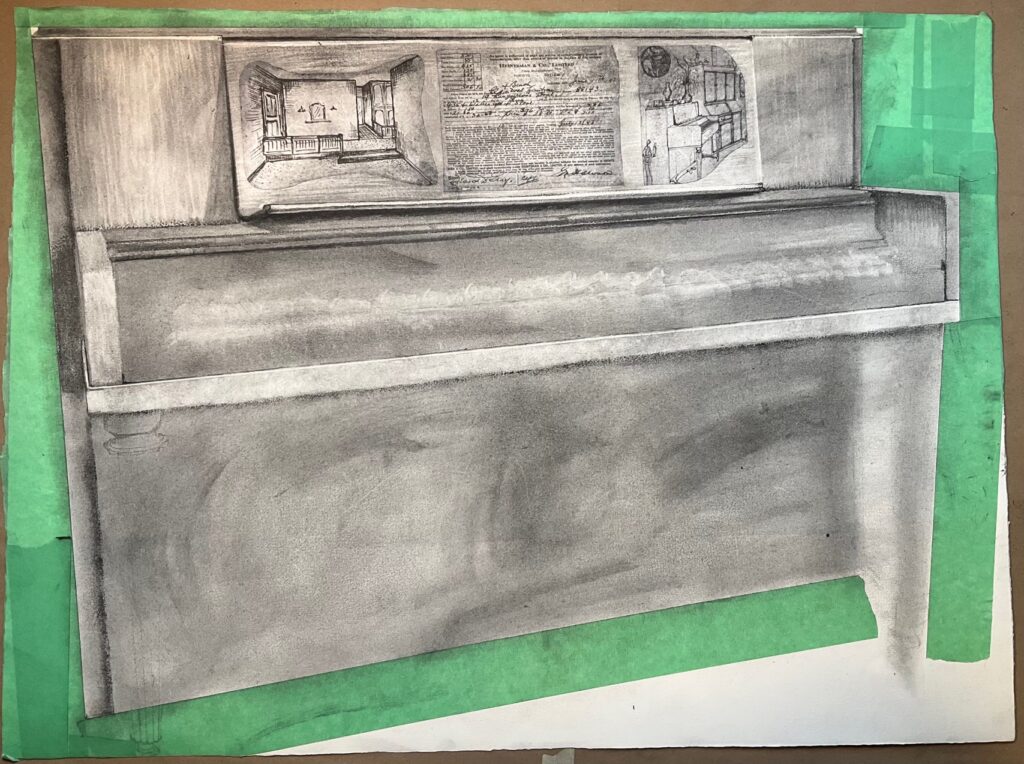
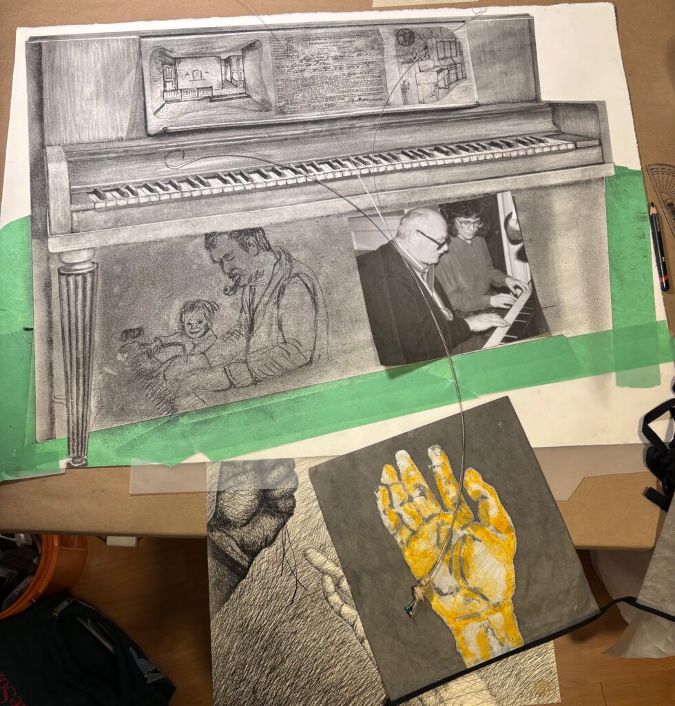
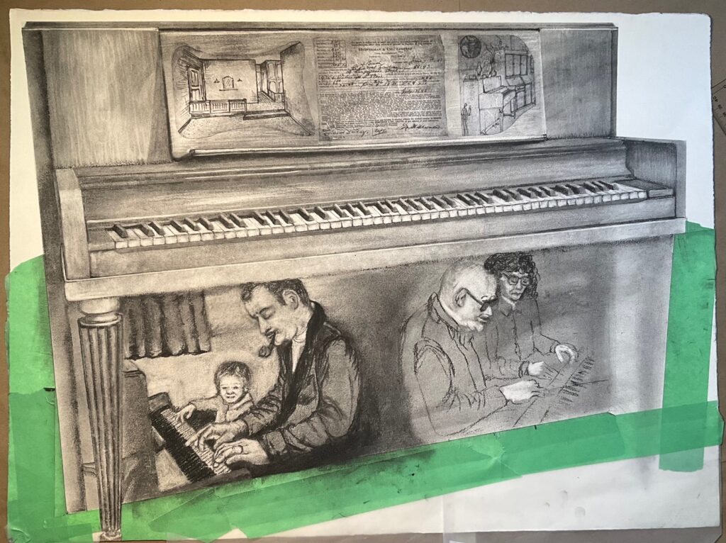
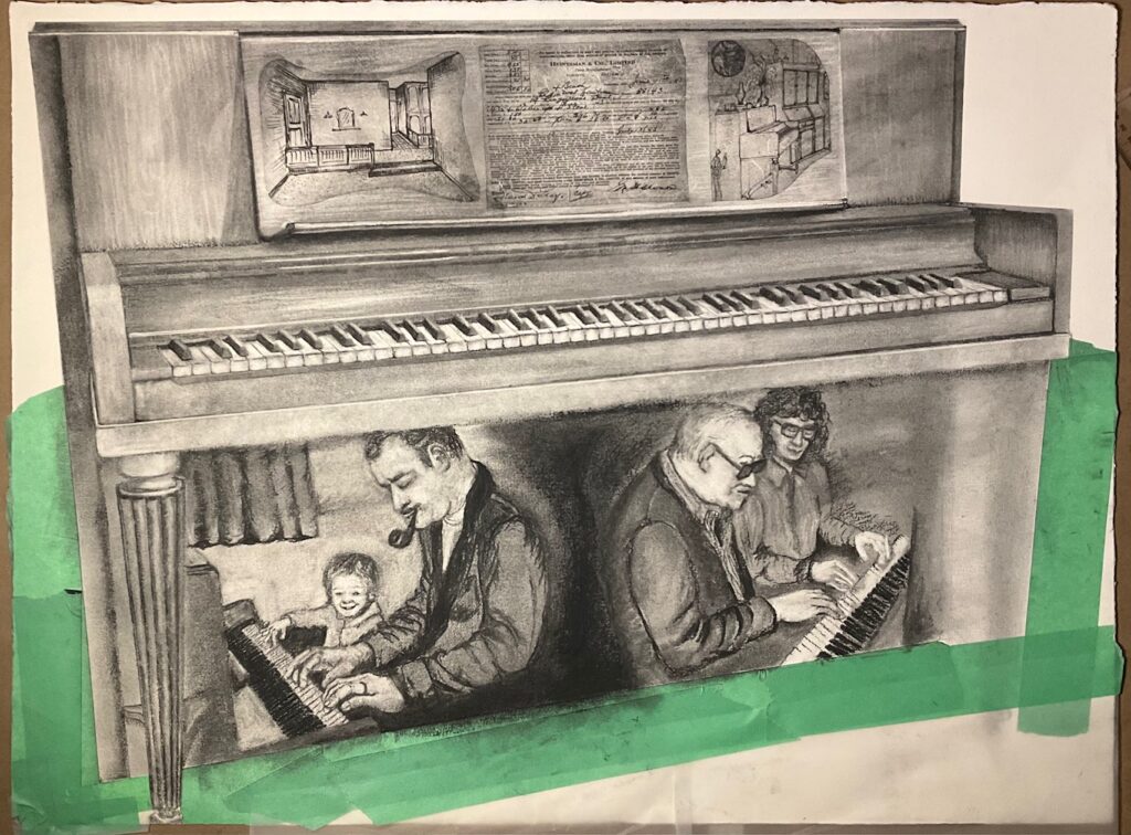
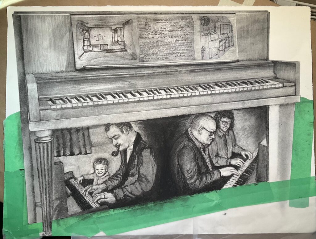
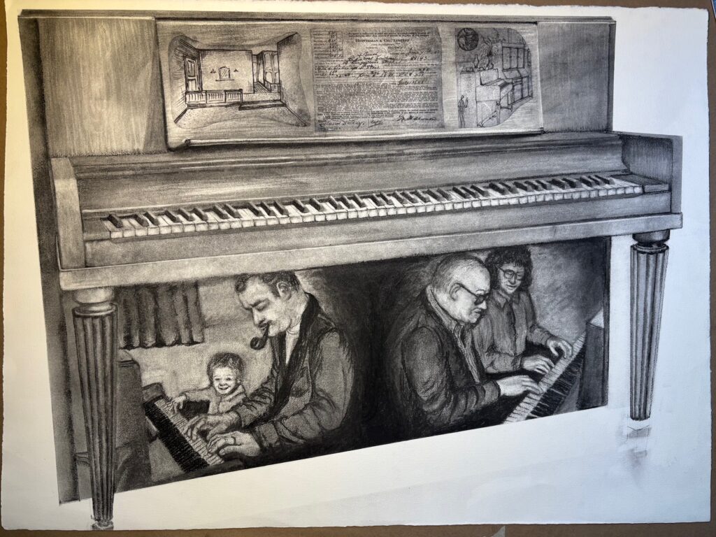
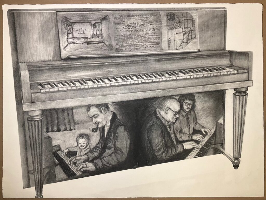
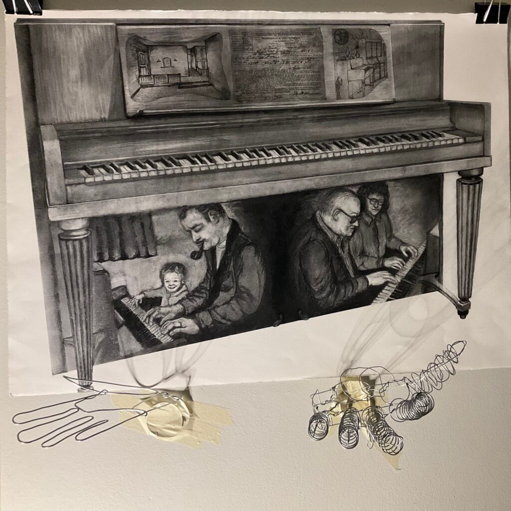
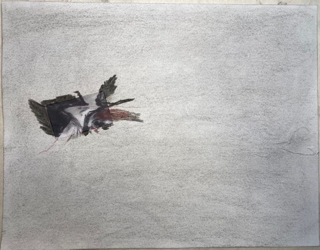
NEXT STEP — get on to the substrate I’m going to use. Decided against watercolour paper. Going with the slightly less textured drawing paper 22 x 30 available at NIC. Will give me some texture but not the waffle-ish texture shown above in my trial drawing. Needed to settle on a view of the piano — decided on slightly off-centre view, maintain top of piano level but show some receding perspective. See reference photo for piano below, as well as my guide sketch to figure out perspective, plus first three items collaged in place before adding any charcoal. I used mulberry rice paper for the collages – thin and translucent but also some inclusions of fibres that make the items less defined and stark. They will also be softened and recede somewhat under the charcoal, to the degree I layer over them.
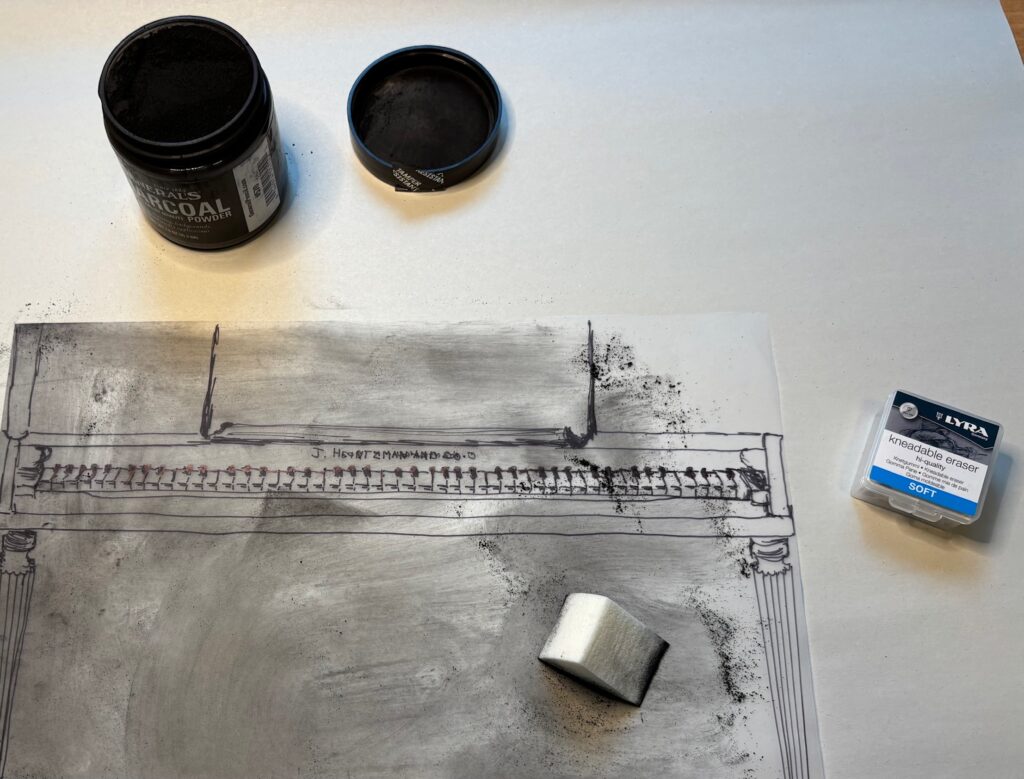
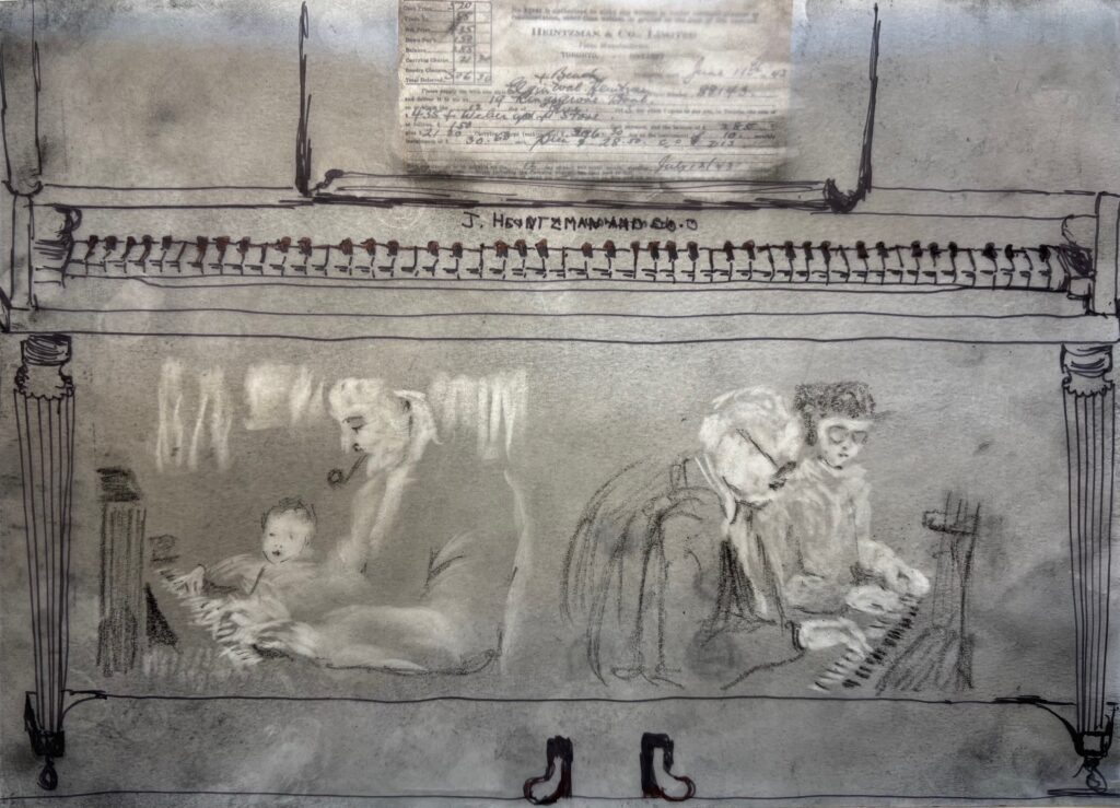
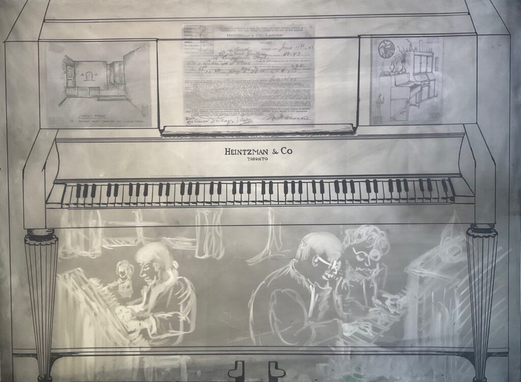
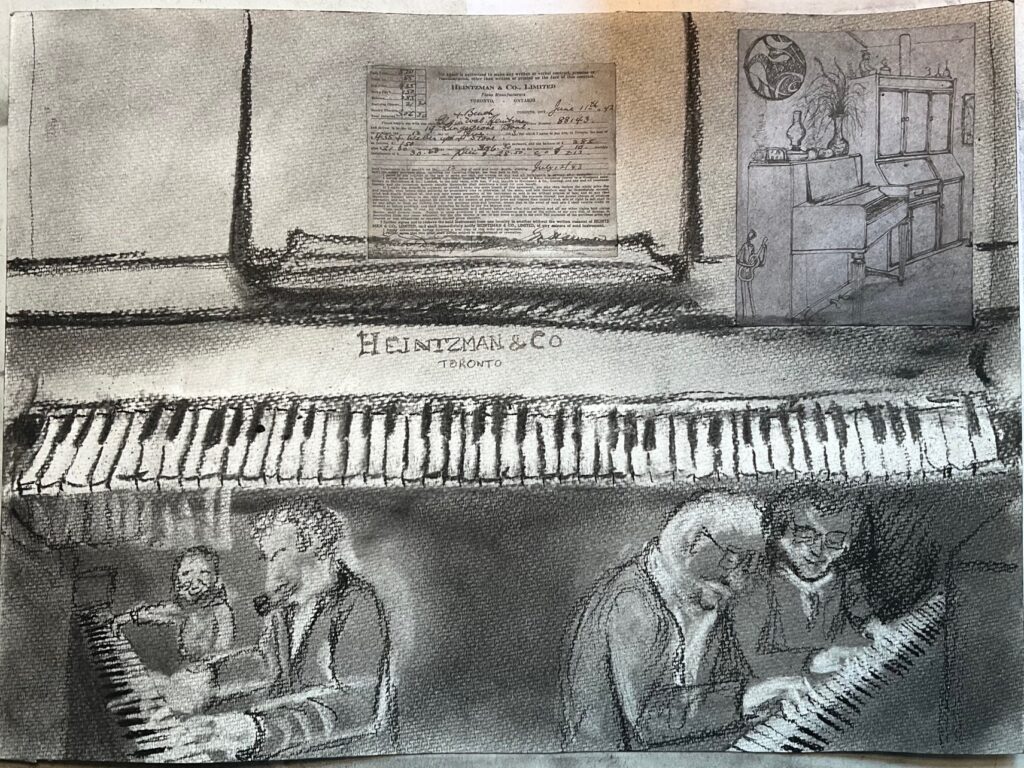
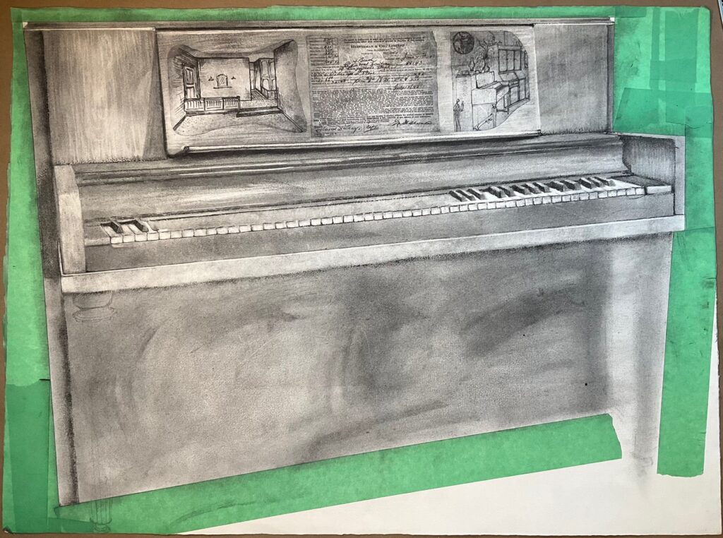
Work in Progress April 1 through 9th: images below, starting with my overlay of powdered charcoal which just about obliterated my under-drawing! However, gave me a chance to make a modified piano, looser overall and making different choices about the details I want to emphasize. The third image below is the version I will show at the April 2nd class for peer and instructor feedback on the work in progress.
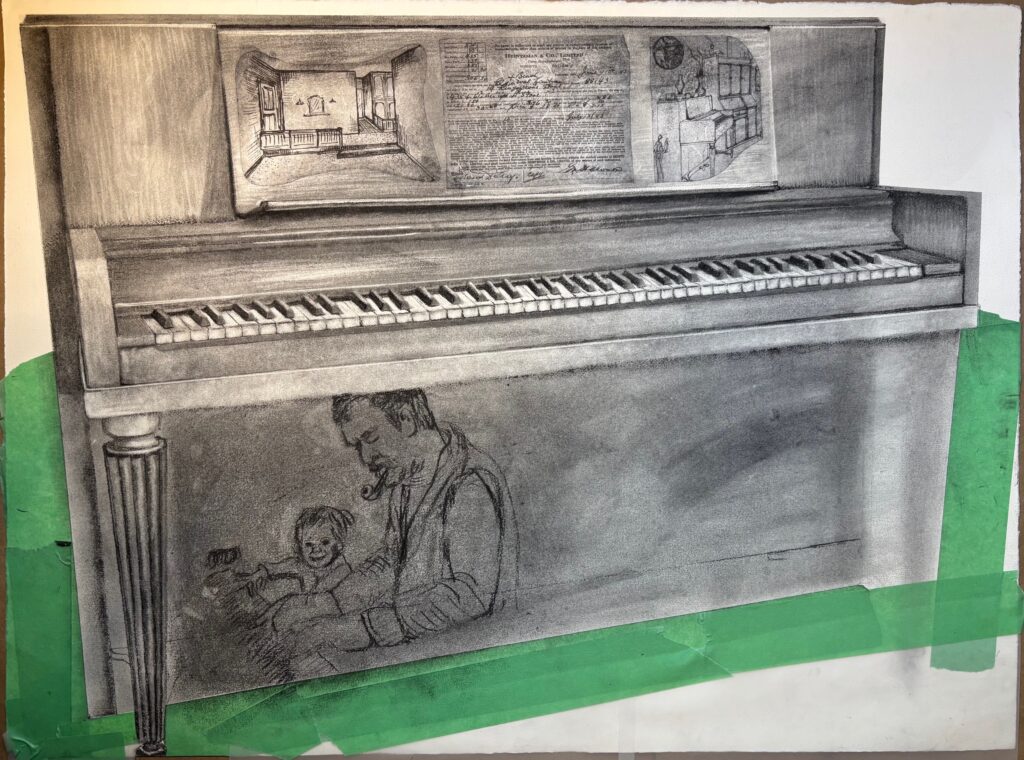
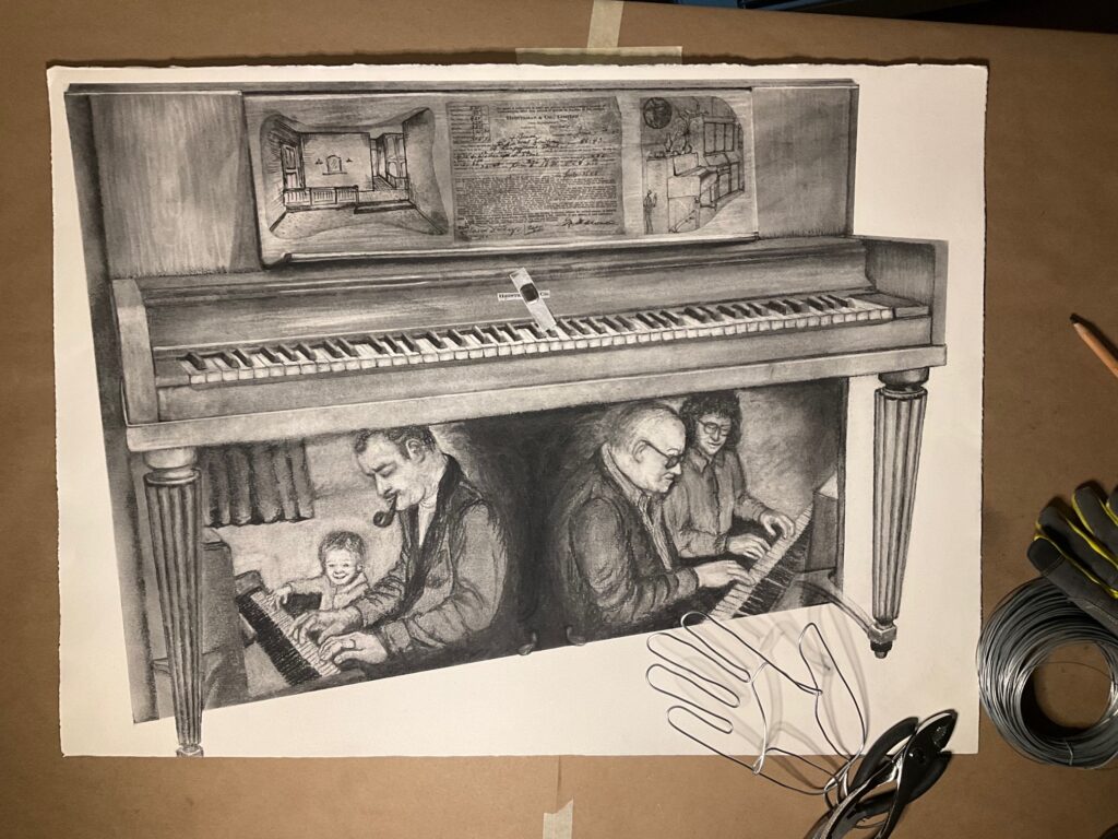
Work in progress final week: initial set below… completing the charcoal.

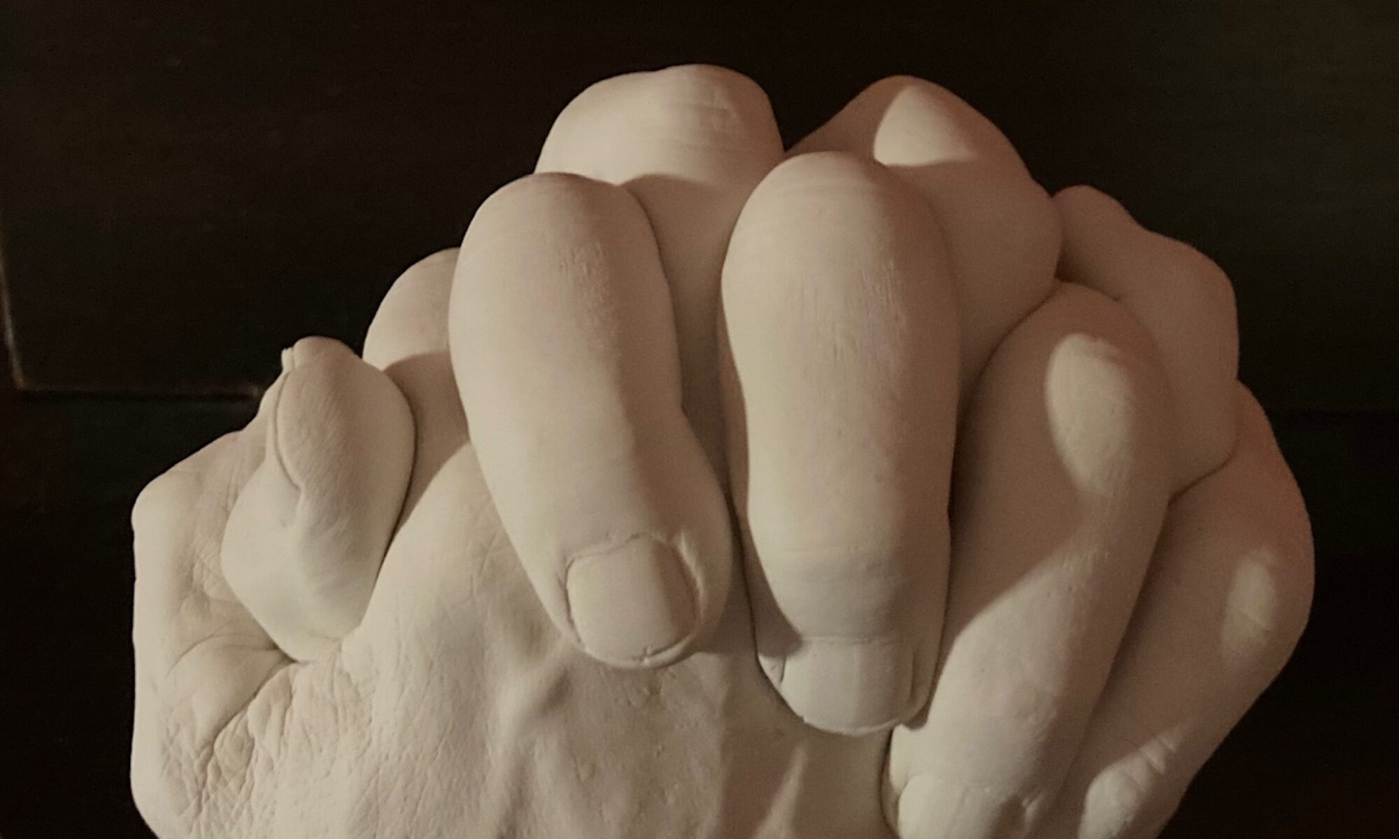
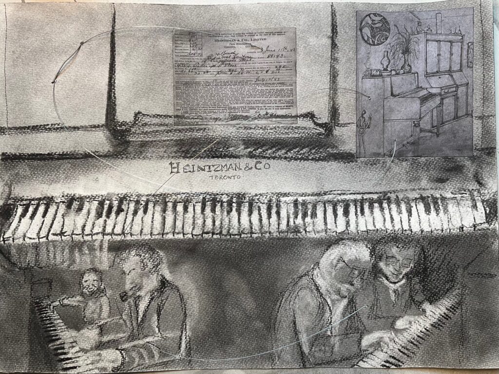
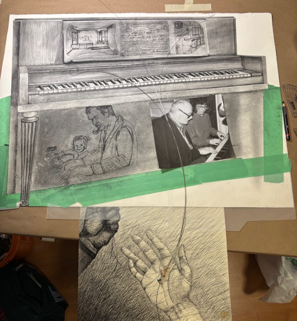
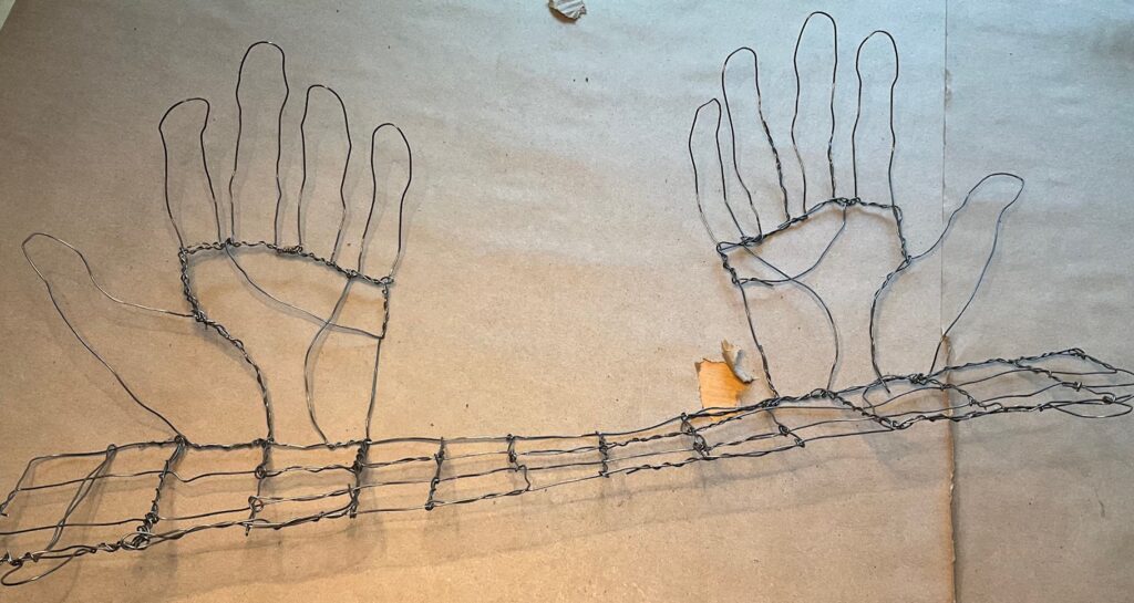
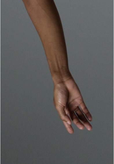
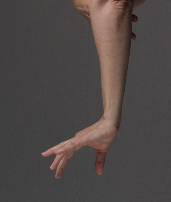
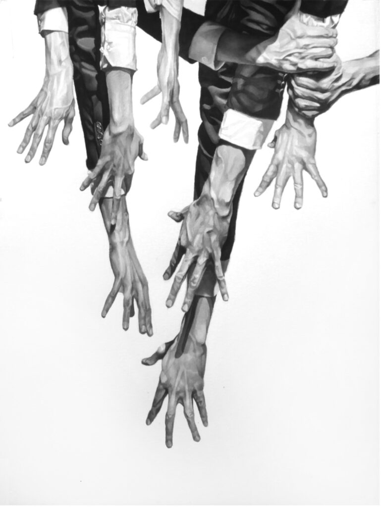
Below… brainstorming how to treat the white space… can I include wires, creating a set of hands below the work, in gesture that is releasing, cradling, treasuring? What if they are lit from underneath so the shadows come up on to the piece, animating the white border…
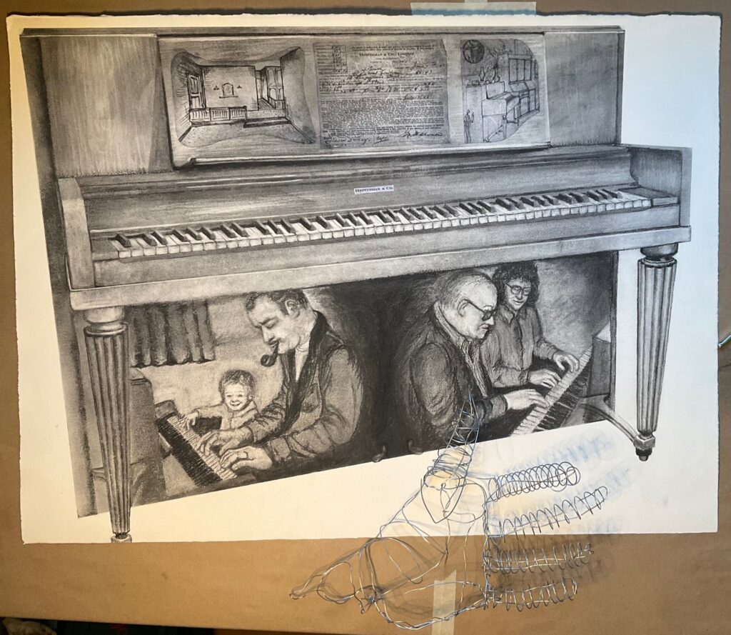
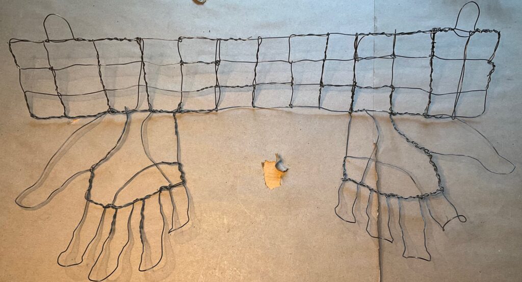
thoughts… the larger 3D hand is too busy and detracts from the work. The simple linear one is a better complement but needs more gestural character. Will try making a version where the hands are “attached” the wall along their pinky-finger border, and emerge with the thumbs closest to the viewer — Could I mount the paper several inches off the wall so centre of the palm meets the bottom of the paper, thumb curling forward? Obtained spools of black and silver-gauge wire today, halfway between the thickness of these trial hands…
Overnight… decided hands better to emerge straight out from wall, as if giving away this drawing to the viewer. Made a wire mesh to mount them from, stabilize them, thinking I can attached it to the wall behind the work, bringing the paper forward 2 inches off the wall. See below – new hands and a mockup of the presentation…
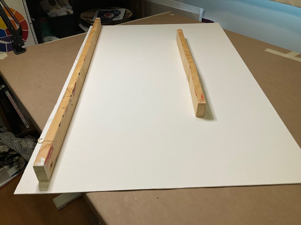
How to hang the piece: Used a piece of framing mat (cut the bottom angled up to right too allow edge to curl under). Nailed 2-inch space bars on the back, with 2 eye hooks for nail mounting. Will hang the wire sculpture under / behind this board, and tape the drawing on to the board for display. See set up below…
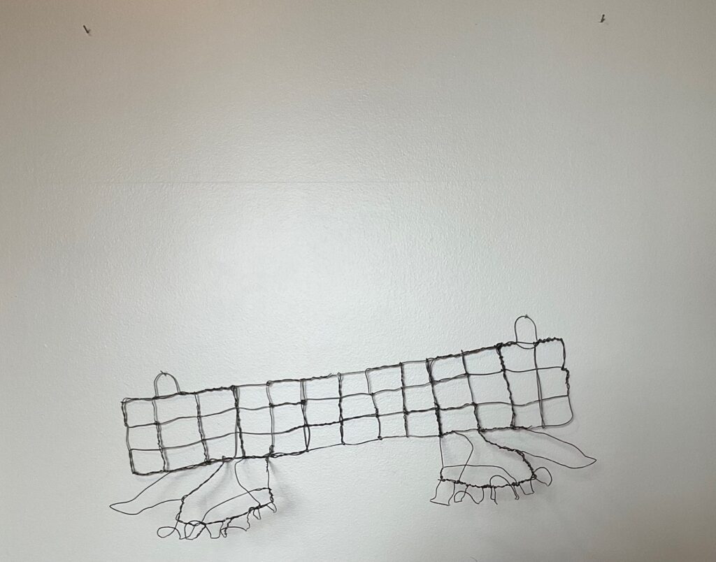
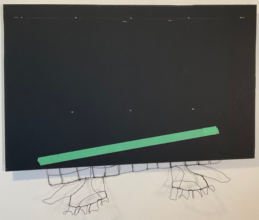
As seen above, I tried lighting the piece from below to get some hand shadows but I don’t find it effective. The hands make not-easily-understood elongated shadows that have a kind of creepiness to them. I could make a more distinct hand-shaped shadow by curling the fingers closer around the bottom of the piece but then they look like holding on to the piano instead of offering to give it away. Will stick with overhead lighting for critique tomorrow although might bring my floor spotlight along in case others want to see/discuss.
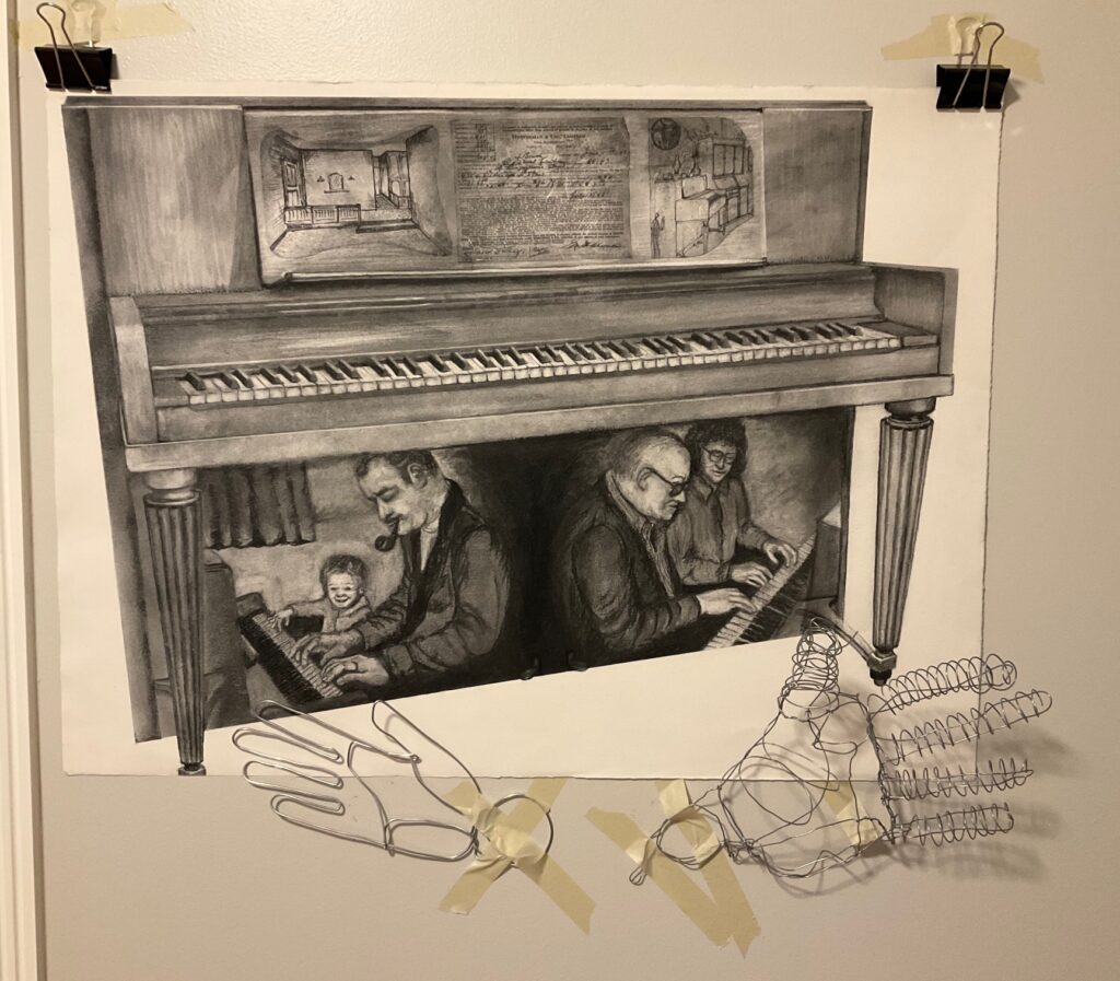
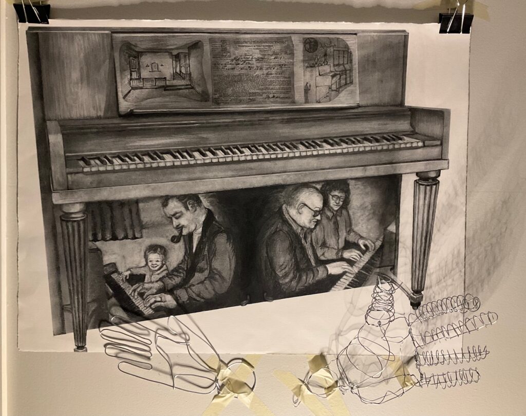
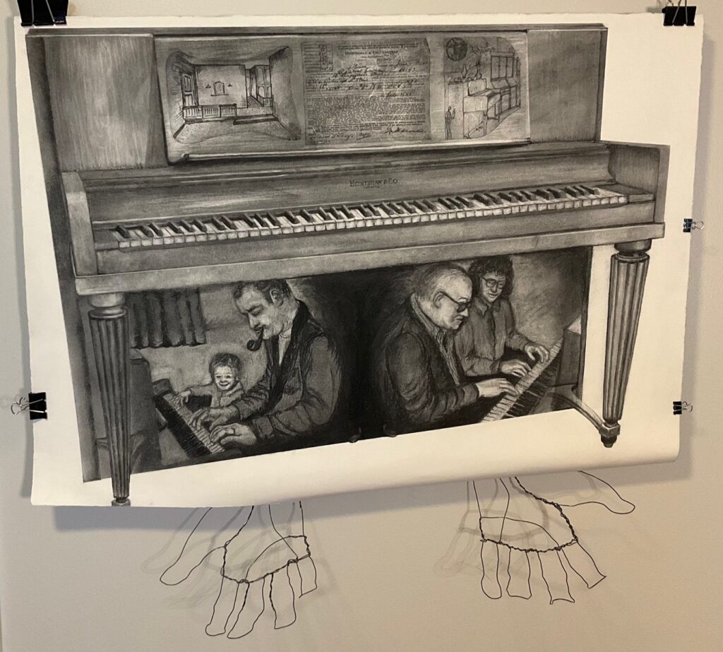
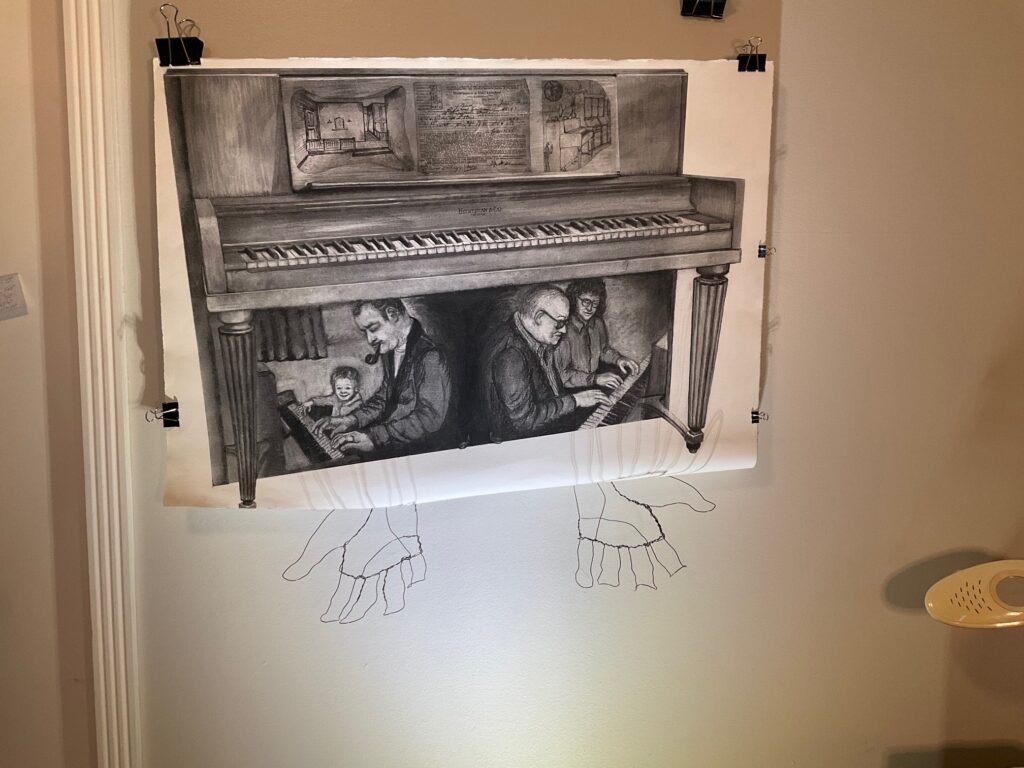
CRITIQUE DAY April 9th. See below, images with and without the wire hands.
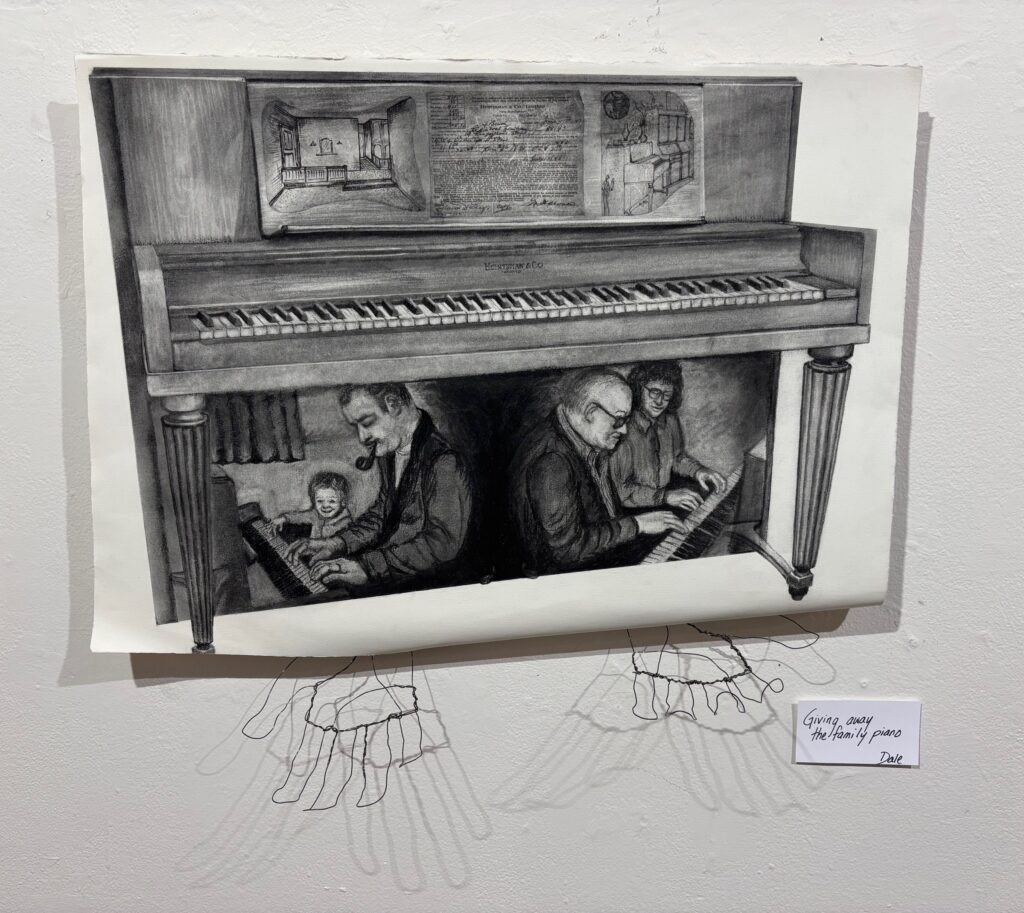
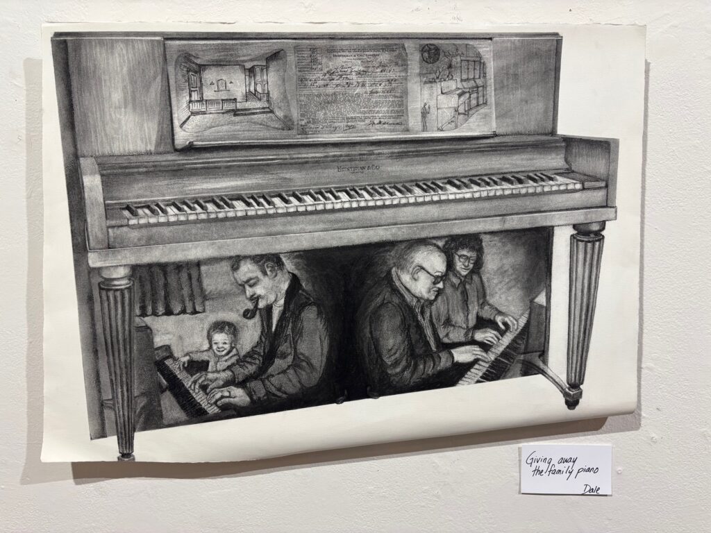
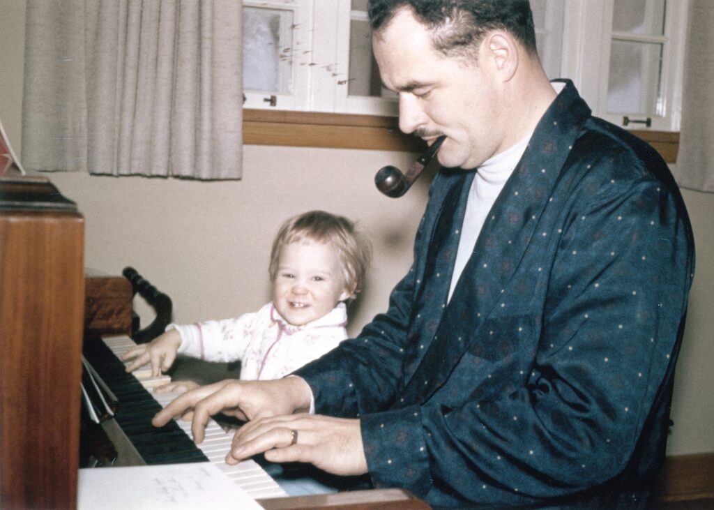
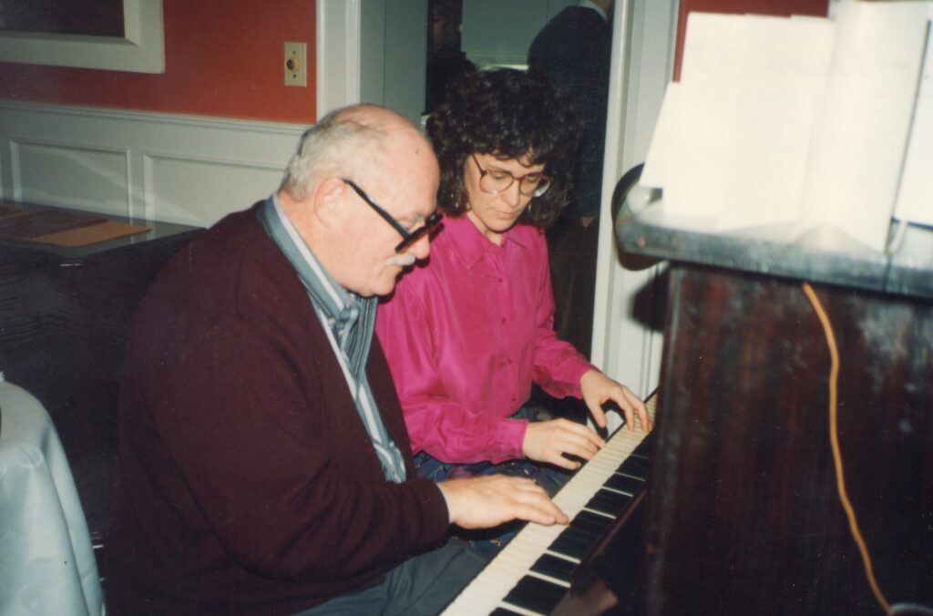
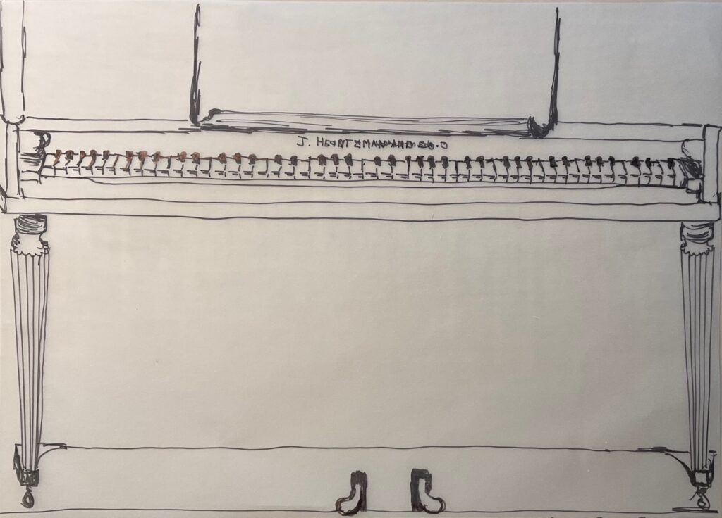
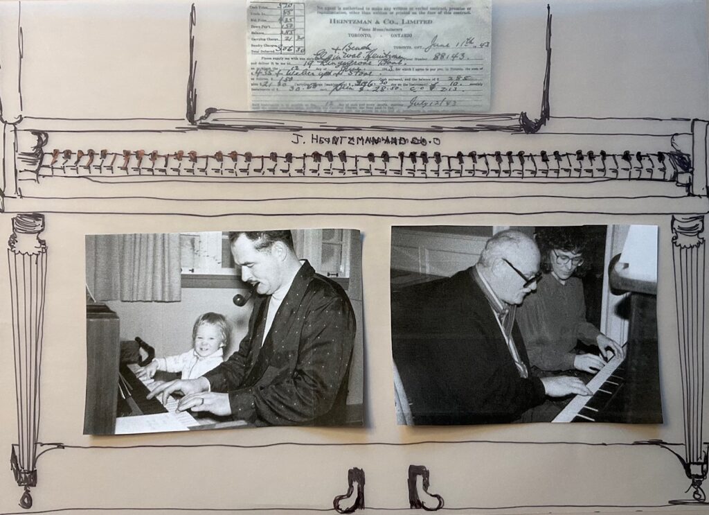
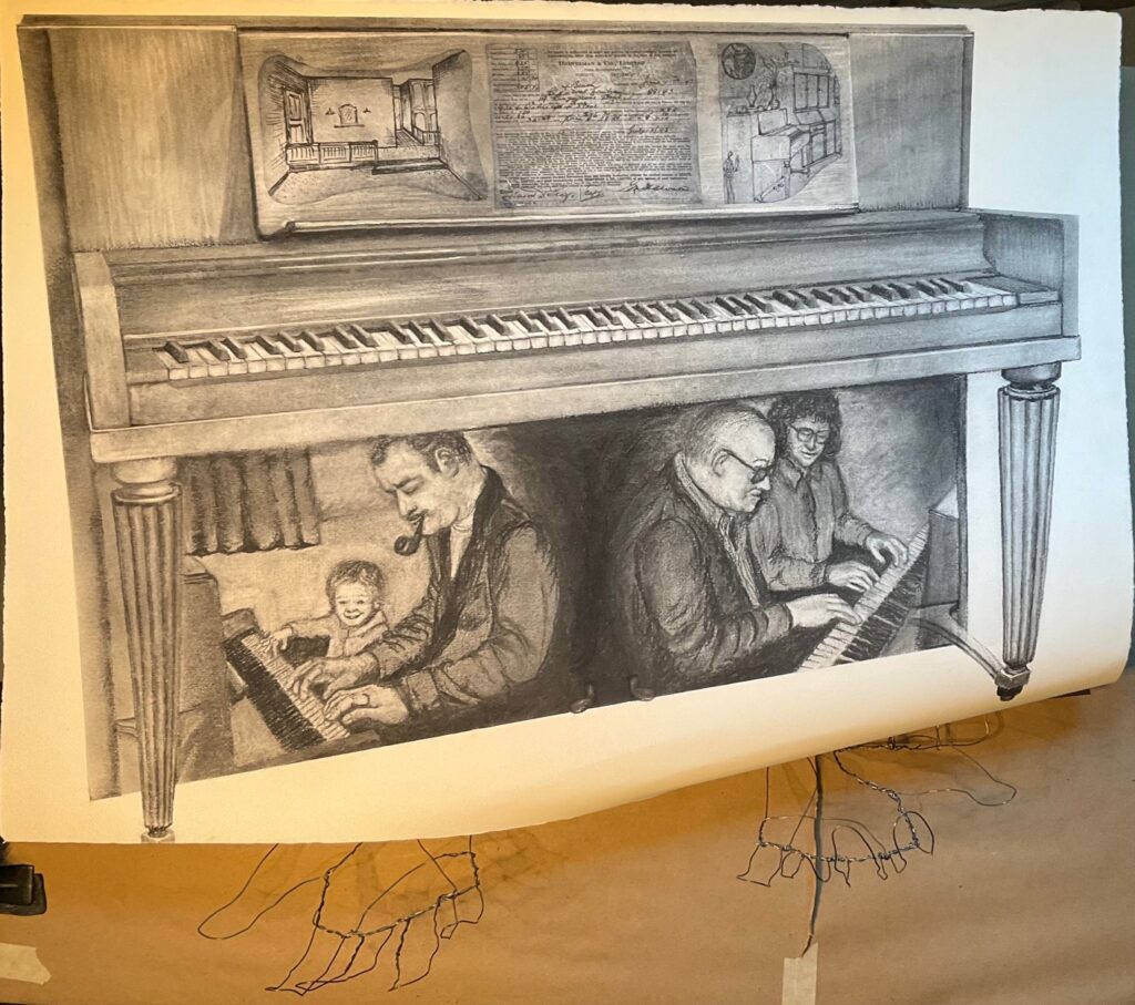
Feedback from peers and instructor at Critique: Lots of appreciation for the drawing in charcoal: specifically the use of shadow and contrast, the warmth and poignancy of the Dad/Dale scenes (people noticed the switch between 2-hands playing young Dad to the one-hand playing older Dad), the technical details like piano’s wood grain, the highlit reflections on piano trim, the receding perspective on the piano, and the organization into horizontal layers (top being the piano’s history including where it “lived”, middle being technically detailed piano keys, bottom being family stories). Viewers thought the amount of detail effectively communicated the depth of attention to and affection for the instrument and its memories. Also, people liked the piece being mounted a couple of inches off the wall, adding shadow to further frame the piece, and allowing the undercurl of the bottom edge.
However, there were definitely mixed reviews on the wire hands. Specific comments — they are creepy, they seem not detailed enough to match the detail of the drawing, they just don’t add to the presentation. One person liked the ambivalence of the gesturing hands, one seeming to hold on to the image and the other to be releasing it, and she thought this added to the story line. I was interested to note how relieved I felt when someone said the hands just aren’t working… it’s like I couldn’t give myself permission to just ditch my original idea of including wires. But the suggestion that maybe the drawing was enough on its own felt like… finally, permission!! I think it is a stronger piece without the wire sculpture.
Written Assignment: Artist Reflections… see PDF below. Note it is 2 pages.
Artist-Reflections-Project-4-DaleWritten Assignment: Artist Statement. I chose to write a statement for a body of work, the pieces I have done this term on the theme “Letting Go”. See PDF below (one page)
Artist-Statement-DaleFIN 211 Unit 2
** for Project 3: Model Studies, scroll to the bottom of this page then click on page 2.
Project 2: The Challenge. All ideation, process journals, work in progress and final piece are posted in the first section of Unit 2, starting immediately below.
Unit 2 project is titled “Challenge”. The work is to be thematically driven and is meant to explore alternative substrates and media that arise from and are intimately connected to my theme of Letting Go. Below I attach two PDFs: the first is a record of some of my brainstorming about this project, the second is my proposal submitted Feb 12 on Brightspace.
Brainstorming-project-2-proposal Project-2-ProposalFrom that starting point I made a bunch of material trials, varying substrate and media, and pondering my subject and theme. I assembled all the photos and brainstorming as of March 2nd into one pdf document, below. Note that there are 6 pages so keep clicking!
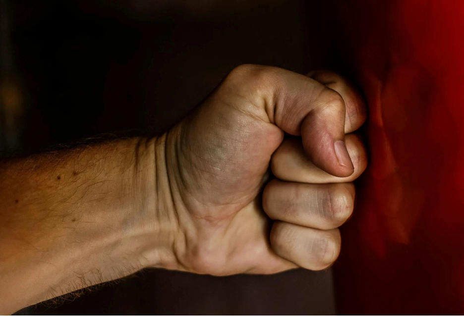
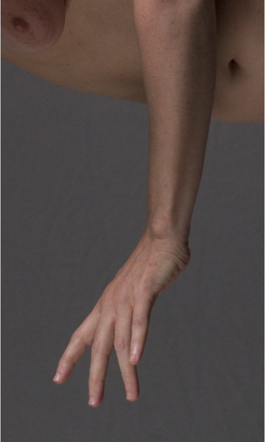
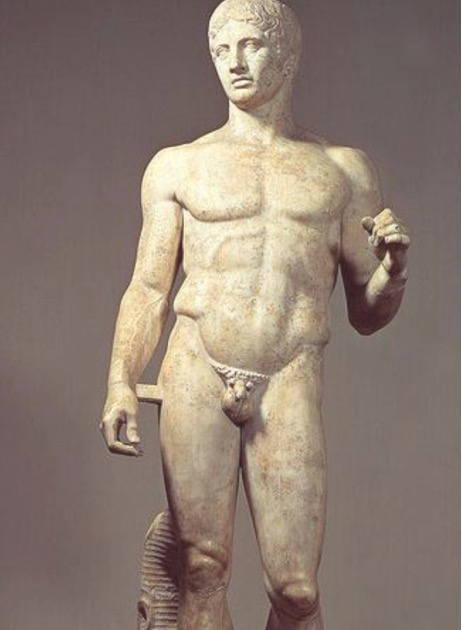
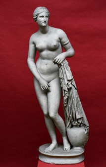
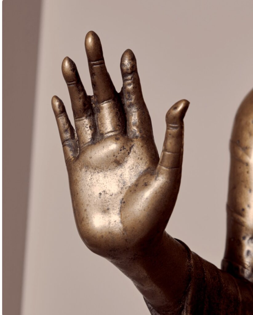
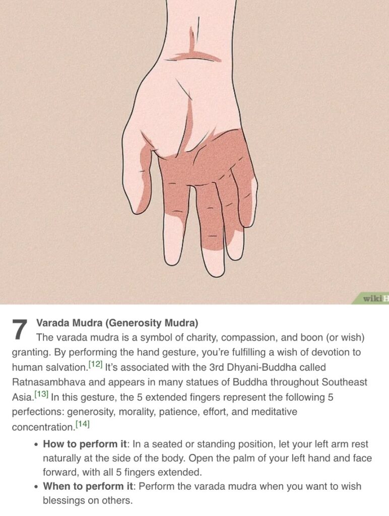
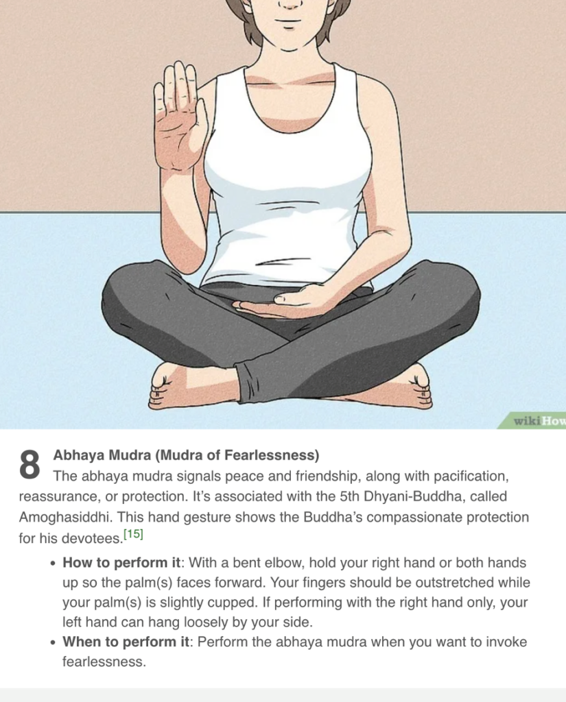
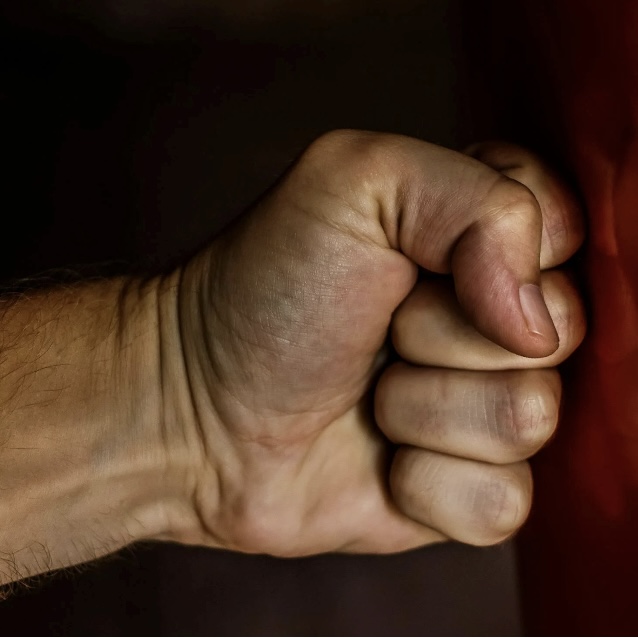
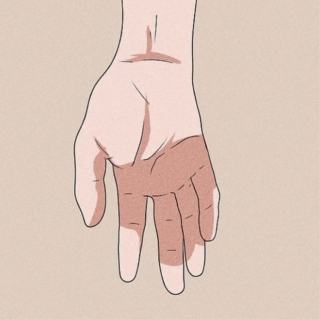
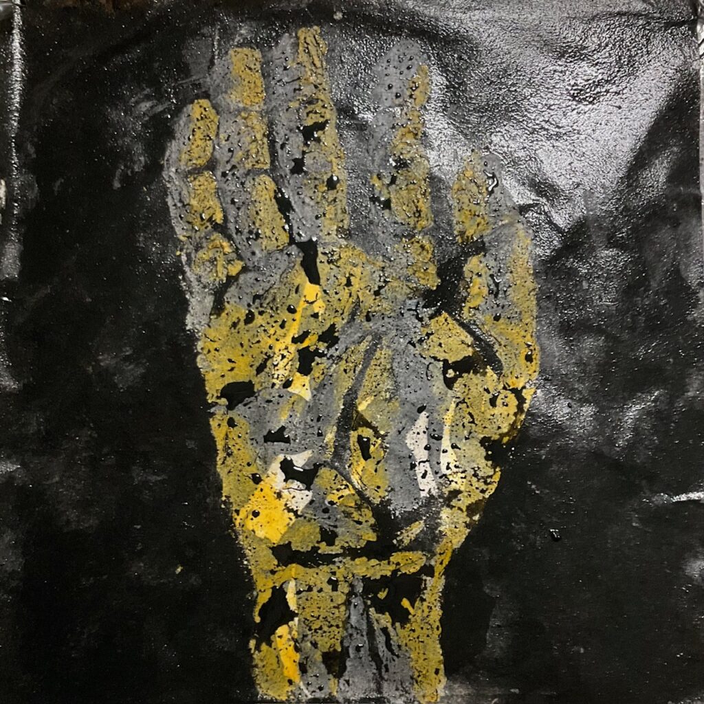
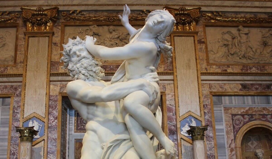
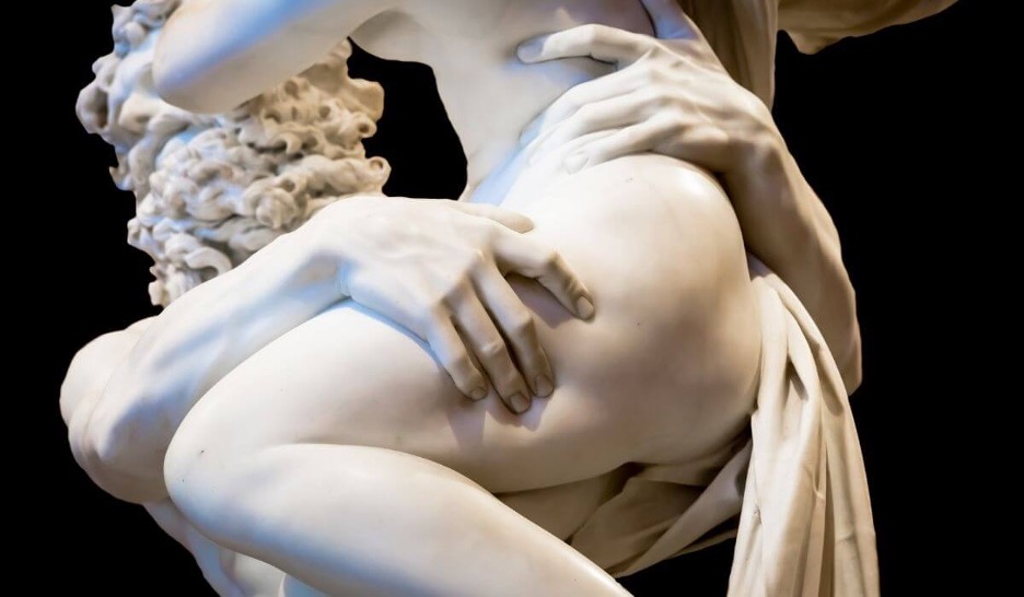
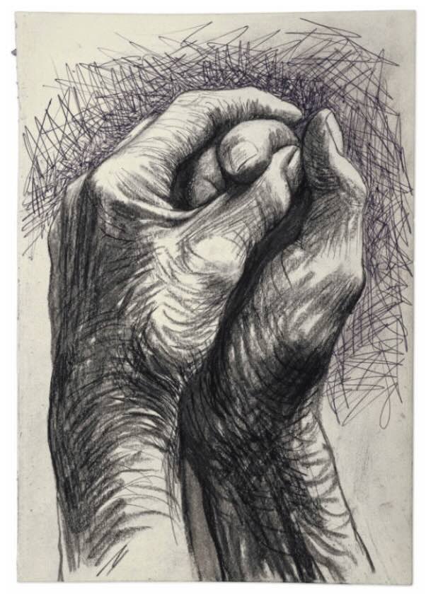
Material-trials-Project-2In my quest to find the best version of hands to draw, I searched 3 areas. One was an artist’s figure-drawing website (Croquis Cafe) with hundreds of model photos; the second was Greek sculpture because I find the hands so compelling; the third was an exploration of Buddhist art, specifically statues of the Buddha and the meaning attached to specific hand positions. Once settled on the most suitable position, I intend to use my own hand and arm as model to draw from. Below is a photo gallery of some of the options I considered:
Materials testing… made a trial with pure beeswax + turmeric, but it is near impossible to work with. I can melt it to spreadable consistency but it cools immediately to an unforgiving hard wax. So the Dorland’s works best for me to “draw” with.
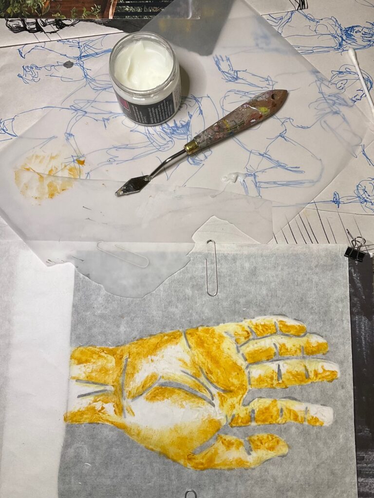
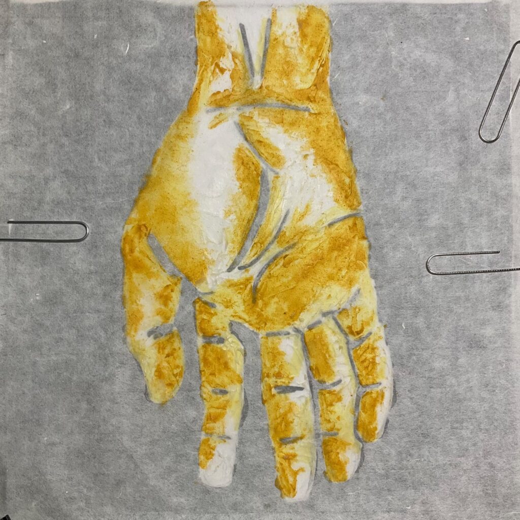
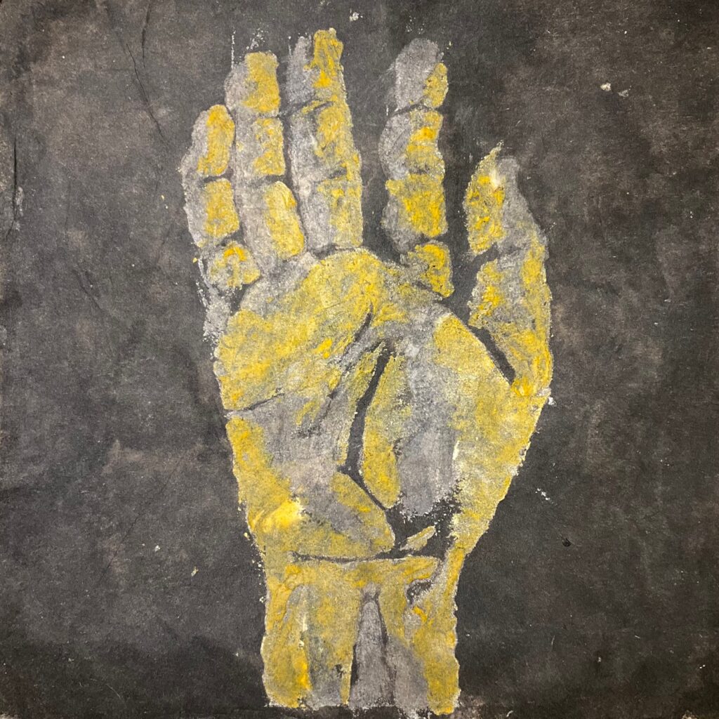
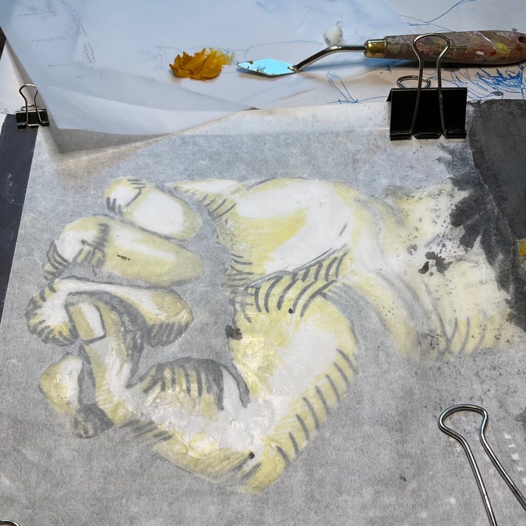
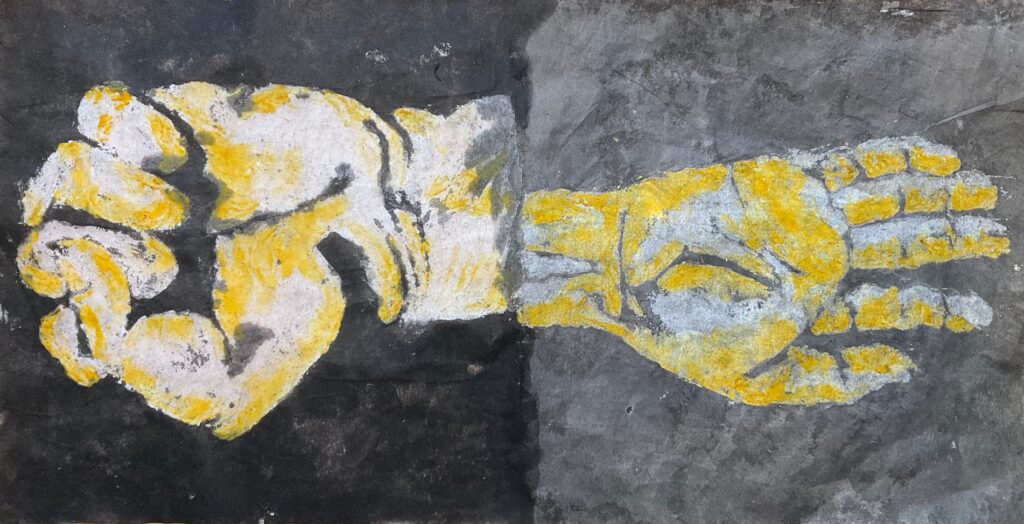
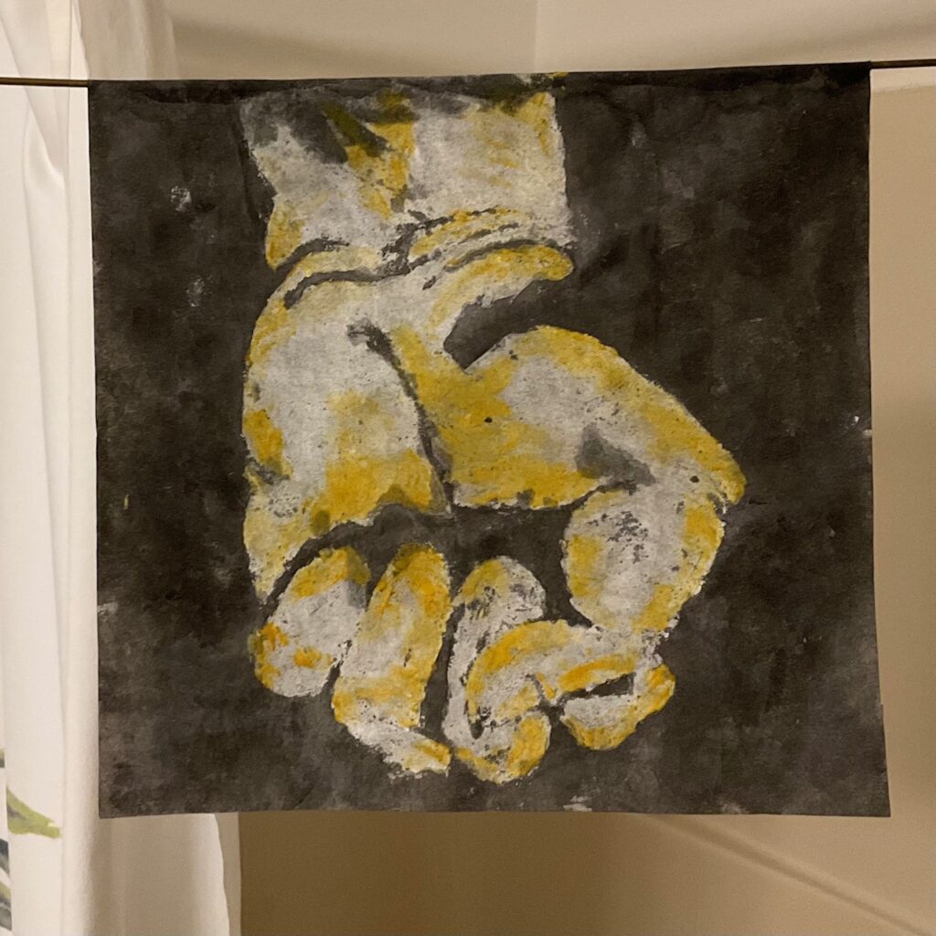
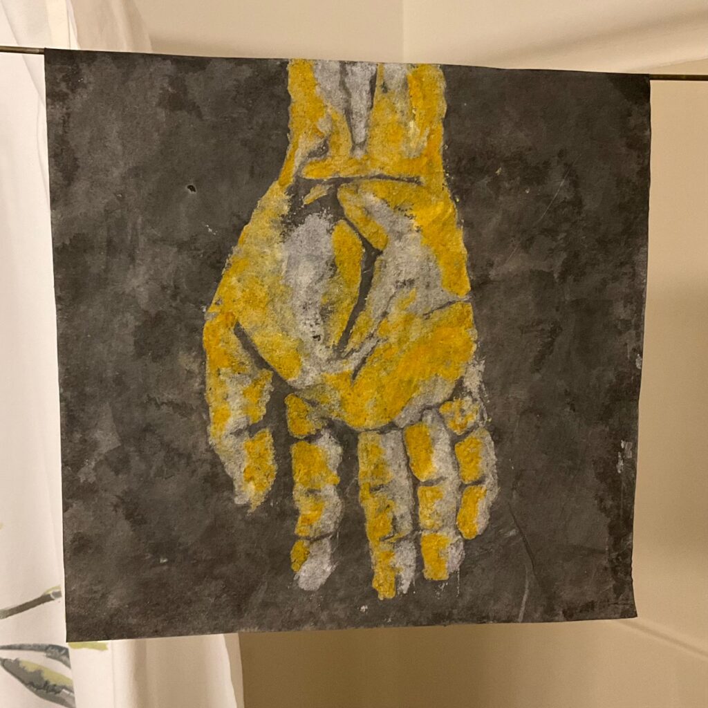
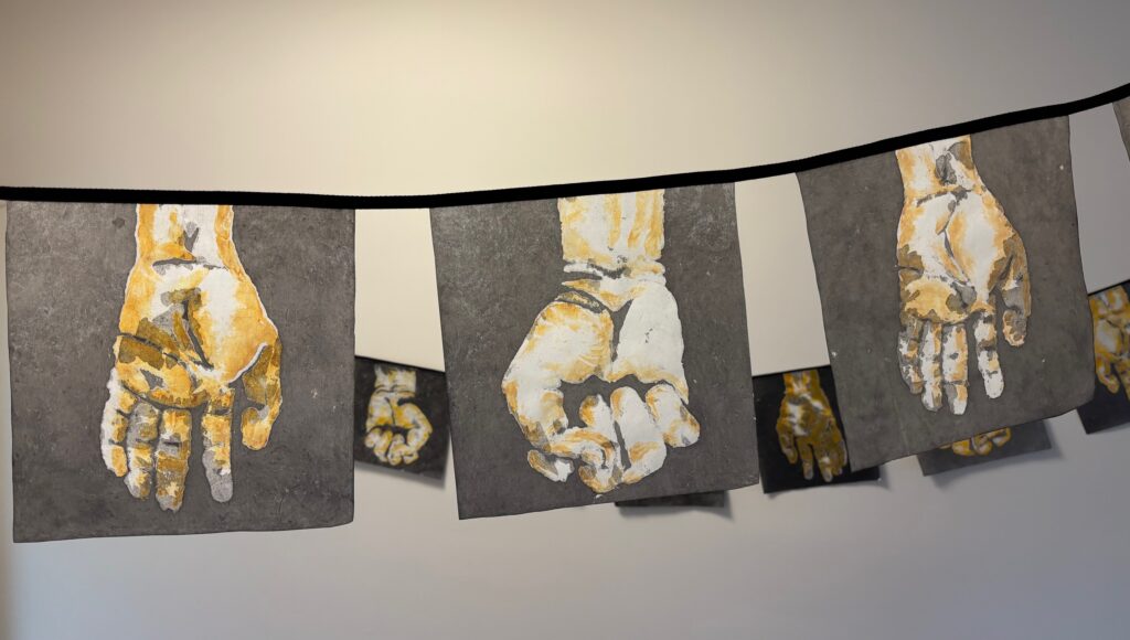
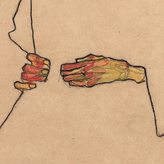
Settled on a fisted hand and a Varada Mudra hand (open, hanging down with palm visible). I have begun to imagine a display method inspired by Buddhist prayer flags: square pieces hanging suspended as if along a clothesline. Idea: make one square template for the fisted hand and one for the open-hand drawing, with the intention to draw one at each end of a rectangular piece of rice paper (by draw I mean the process described above, with wax resist, wax-with-turmeric resist, and dilute black ink). If I fold each rectangle in half over the “clothesline”, the front of the flag is a fist and the back of the flag is an open palm. Will draw multiples so there are many flags with varying version of grasping / letting go. See below, next step in realizing this plan — a couple of photos used along with my own hand to form the template drawings with simplified colour fields. After this… make first wax/turmeric/ink drawing to test the “readability” of the double-sided flag with my planned colours, may need to adjust values or lighting or adapt the plan if they aren’t comprehensible…
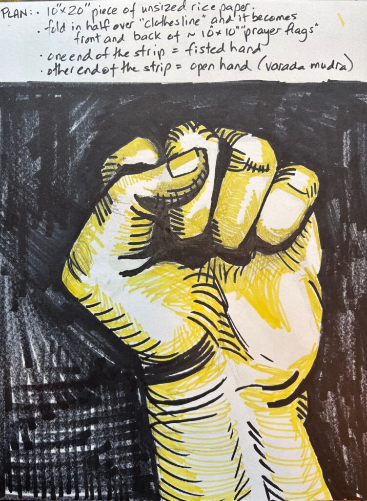
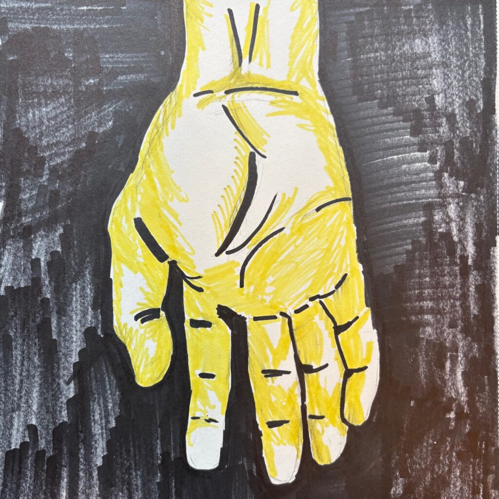
See below: first run with open hand… I applied yellow mix first then plain wax but it made for fiddlier drawing. For the fist I map out all waxed areas in plain wax first , then overlayed the yellow where I wanted it… certainly ended up with more white. Finished product first run below. Will alter proportions a bit on the fist for next time, help make the two hands seem the same person.
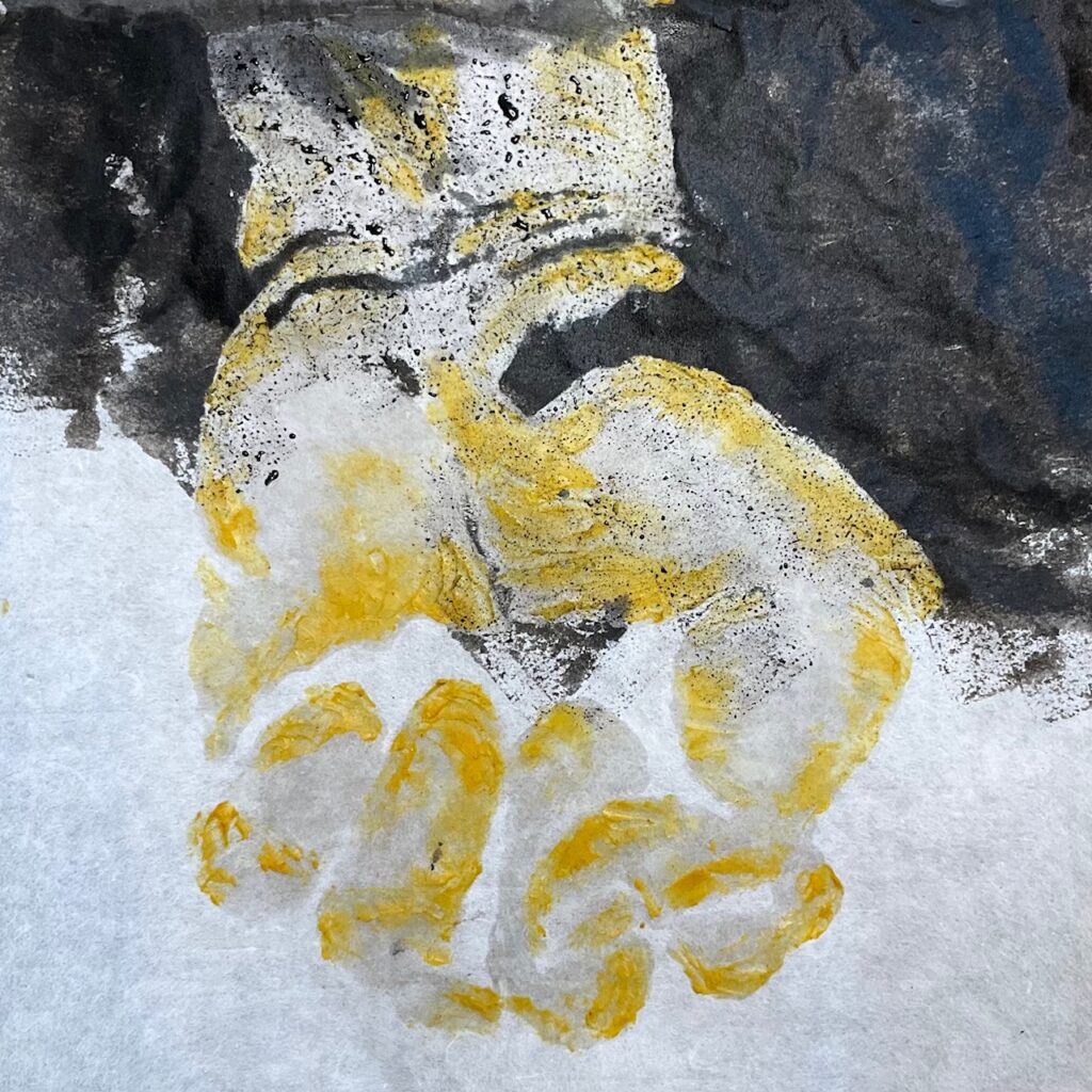
tried folding in half over a hanger — see below the “prayer flag” shape with fist one side, open hand other side. Will have to decide what to do about transparency… not showing in these images but if the flag is backlit there is an interesting / confusing sight of the two hands at once. Perhaps can play up the effect but also moderate so not too confusing…
March 12th peer feedback on work in progress:
- Make a lot of them! Far more powerful. So if I cut these double flags in half I automatically get twice as many flags to display.
- consider hanging on string (as per Buddhist prayer flags) but against a wall, single-sided, again for more impact. The gentle curve of them hanging from a draping line is attractive
- another option to hang around an object (example, cloakroom coat rack) so that you see through to the back side of the flags on the other side of the rack, plays up the transparency aspect
- Many version of fists or single version enacted many times? People had pros and cons for both. Several ideas about making a series that change position in sequence, then displaying so people see the change from open to closing and back again, multiple times. (not sure I have time to make enough of them to get this full effect). Others thought there is merit in the repetition of the same view of the fist but it being different every time because of my variable manufacture… this repetition and subtle variation conveys more of a meditative process, and perhaps an invitation to the viewer to a more subtle attention.
- Consider a stop-motion film to play beside the hands — whether they are alternating simple open/closed, or showing the progressive steps in between. This could be projected on the the work, played on the wall beside them. Many options…
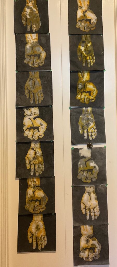
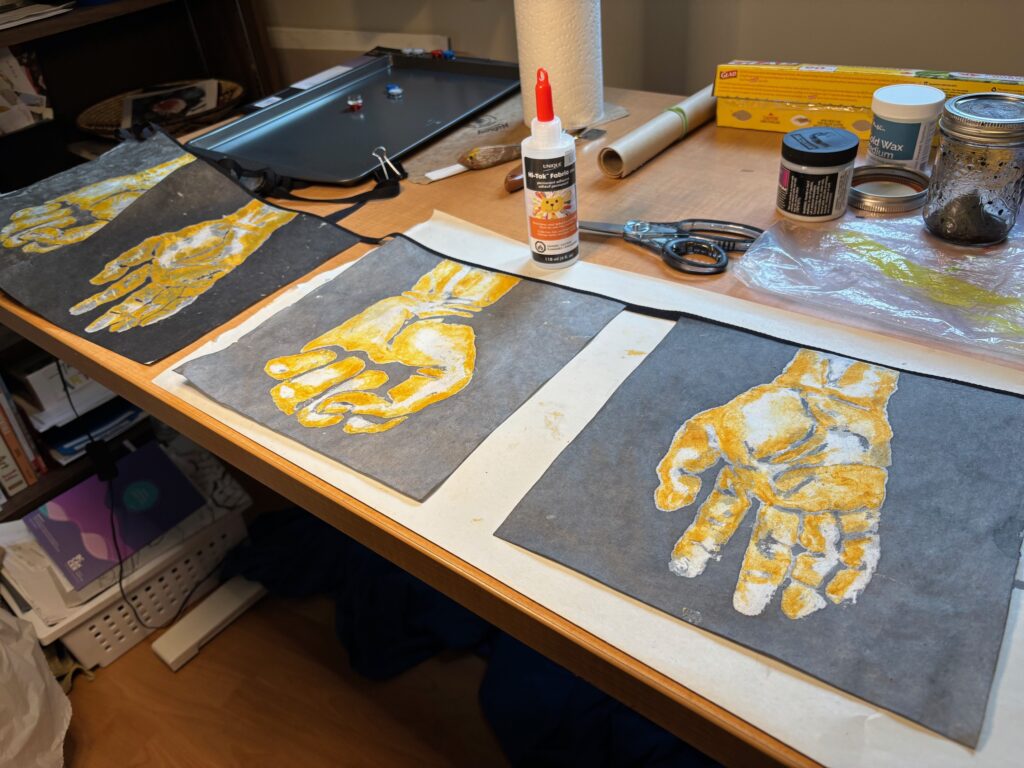
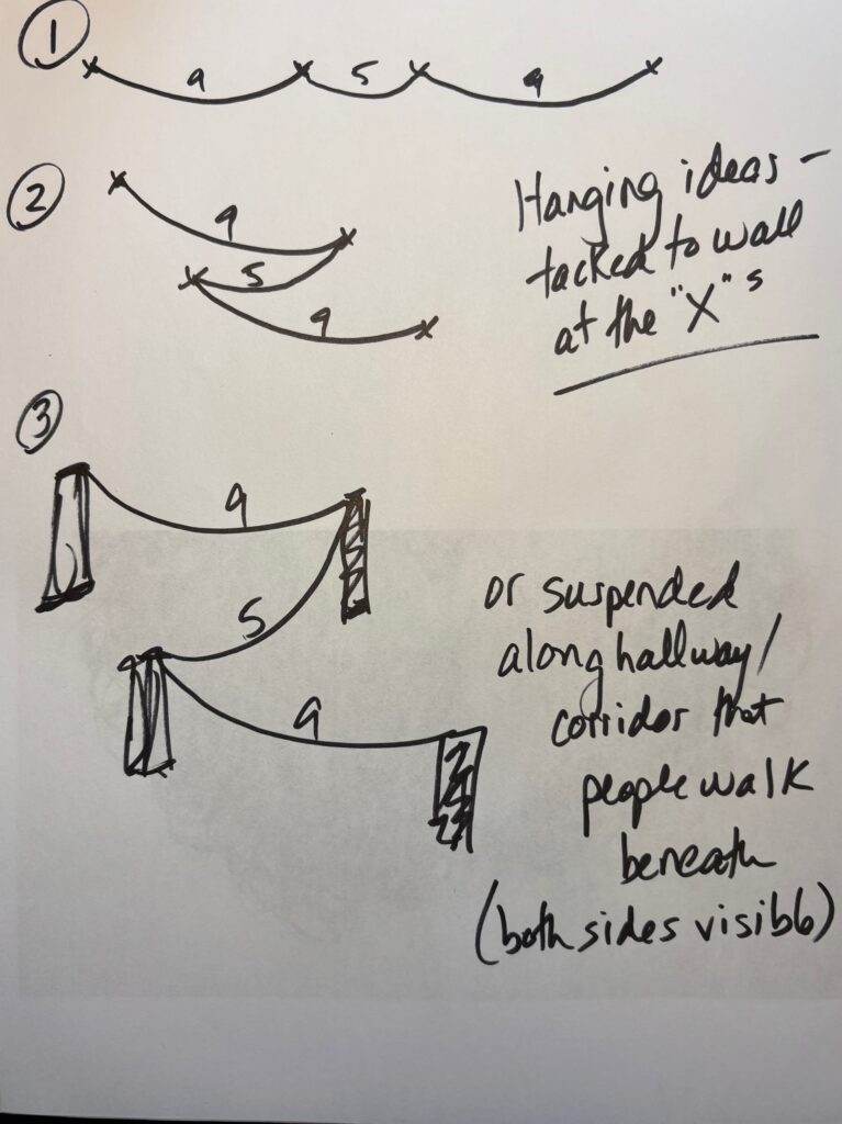
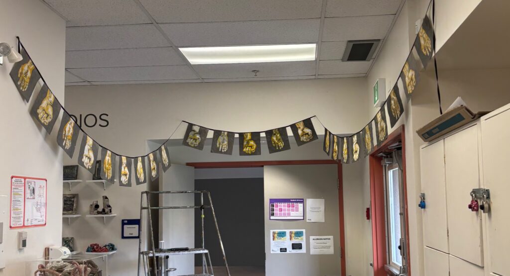
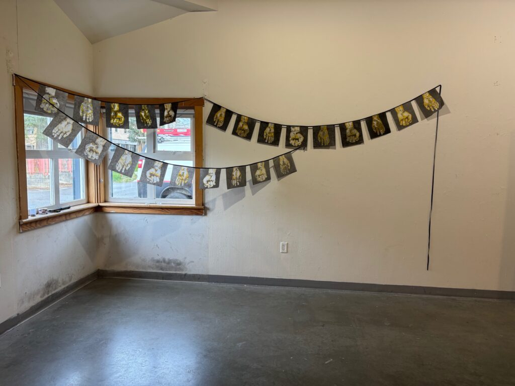
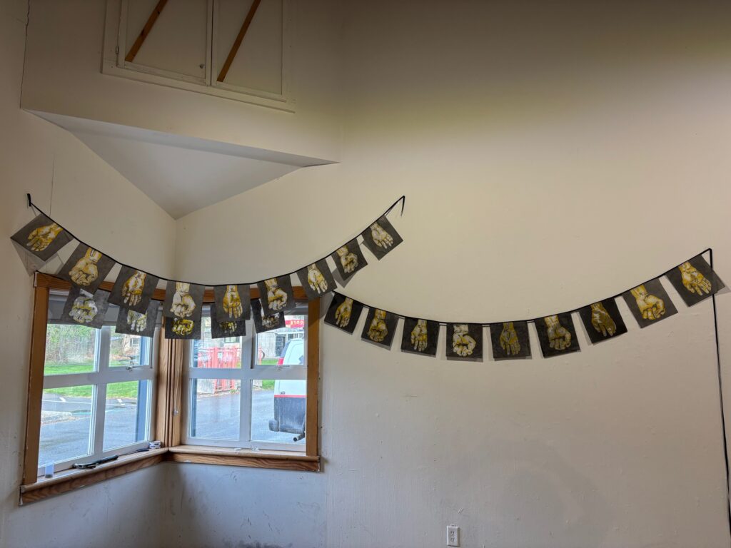
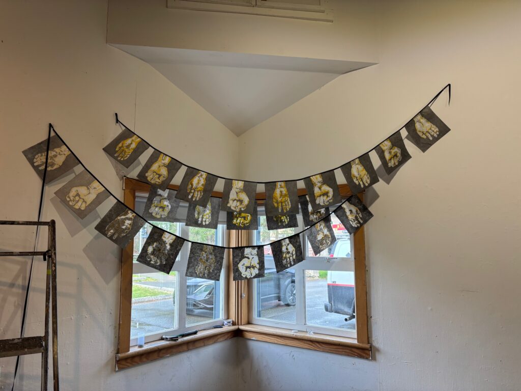
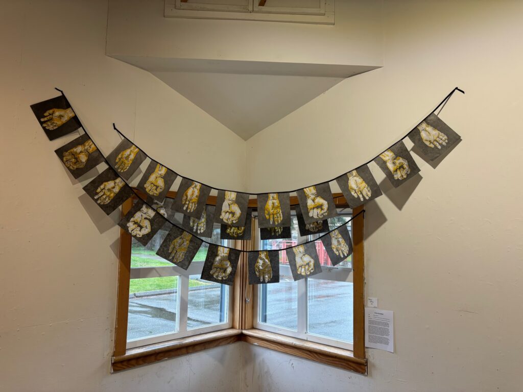
Made 23 of them . Decided to glue approx 2 inches apart on to black twill tape, but set them up in three groups (9, 5, 9 — I am liking the unevens) with a longer length of tape between the groups. Gives me some flexibility for hanging, options to make one long string with some graceful curves or doubling back so they hang in a “Z” shape, or perhaps in garlands overhead along a corridor or hallway… see some photos below of the glueing process and diagrams for installation ideas. Did a mock-up in my hallway at home — liked the both sides visible option better than I expected. A few images below, as well as a one-page summary of the process to take to critique on March 19…
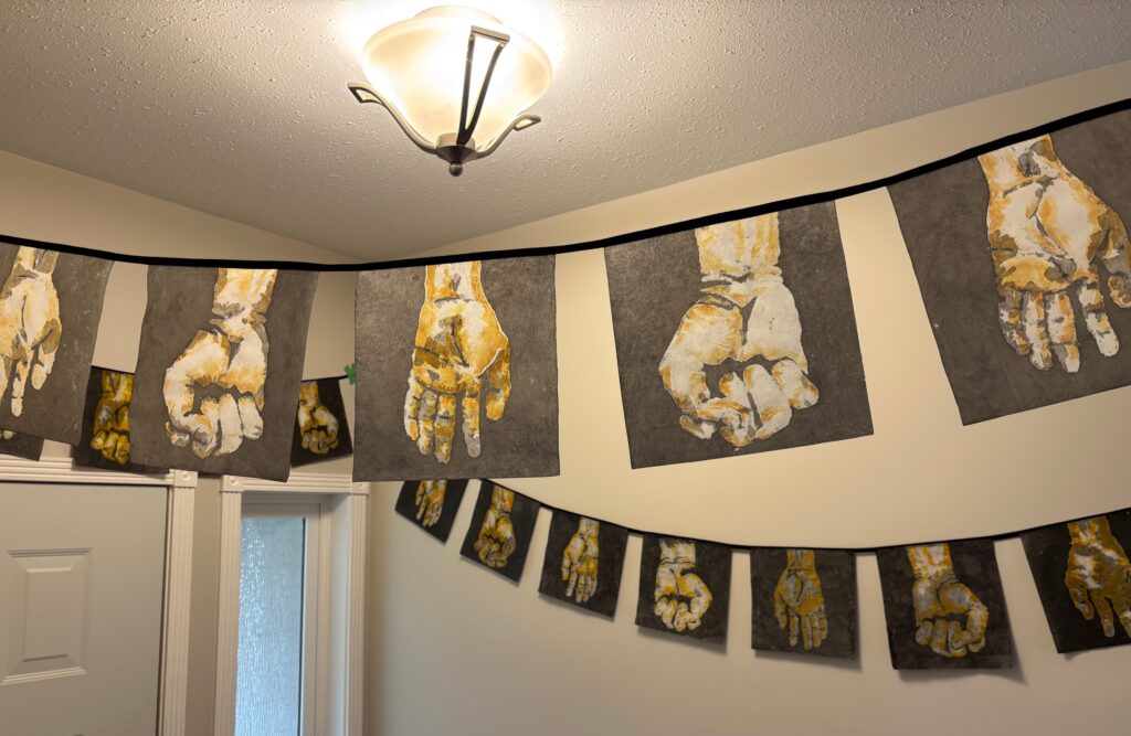
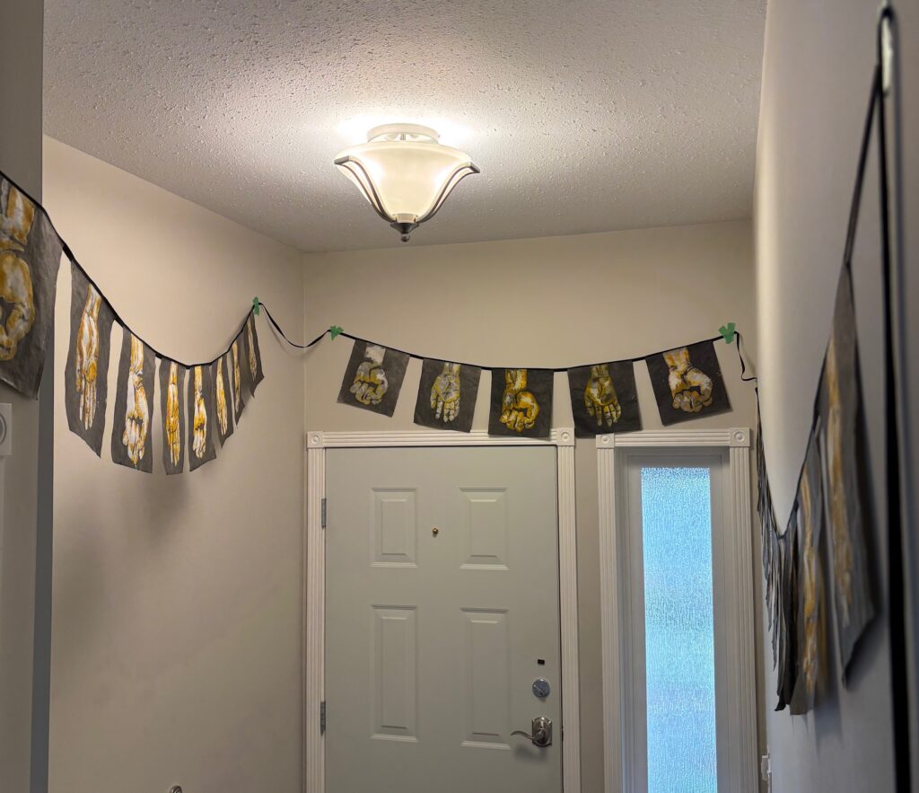
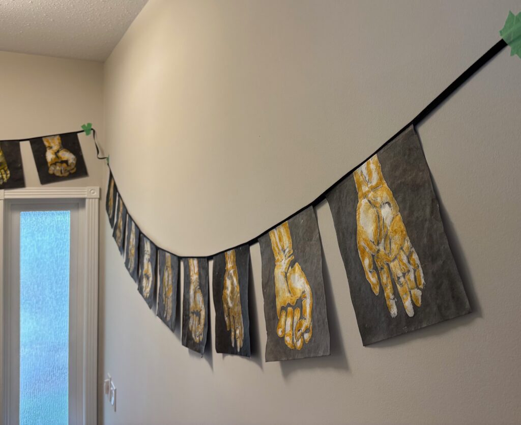
Critique March 19th feedback from peers and instructor included: hanging arrangement of flags effective due to overlapping curves and sense of depth; good choice for fingers-down position because if the fingers were pointing up the fist could read as aggression and the hand as a stop symbol; backlit from window works well; the window itself is unattractive with wide wooden framing and wide pane separators, but this is offset a bit by the way the colours match with the hand colours; the breeze from overhead fan adds movement to the flags with good effect; the decision to use just two versions of the hand position successful because so much variation between each version of the same hand position. And finally — add more hands, repetition really works and it would be even stronger with more. See below – four photos of trial hanging arrangements in situ, and the final version at bottom:
FIN 211 Unit 1
This unit is divided into two pages:
- Portfolio Theme Development
- Project 1: Transformation
PORTFOLIO THEME DEVELOPMENT
We are to bring 3 ideas and basic notes to September 15th class.
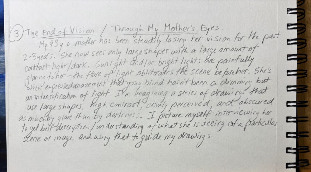
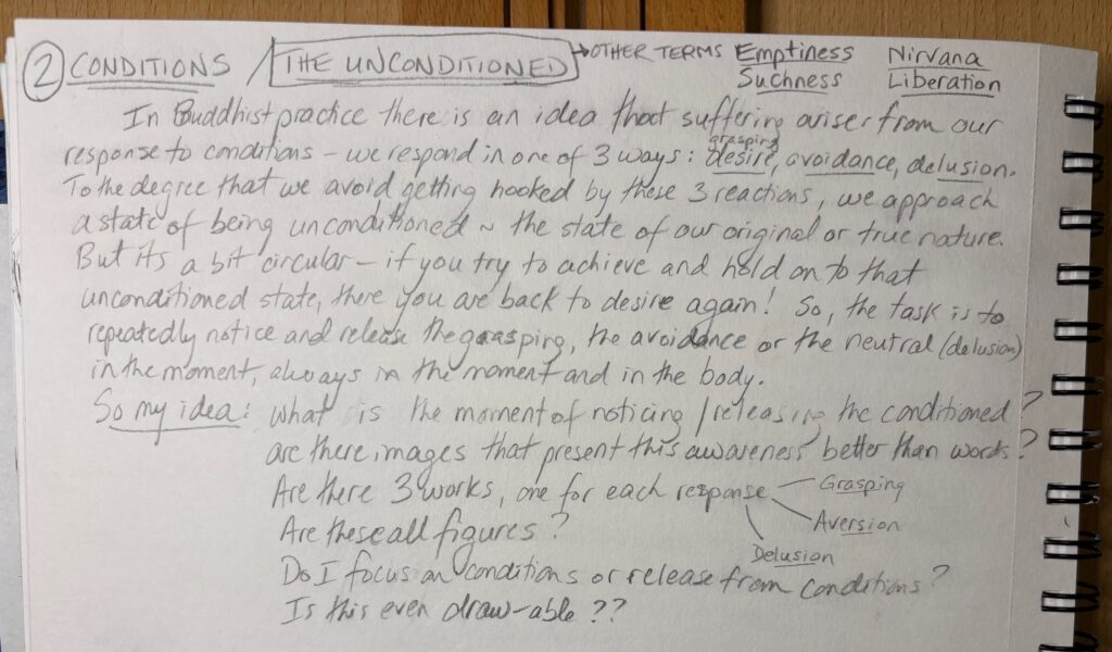
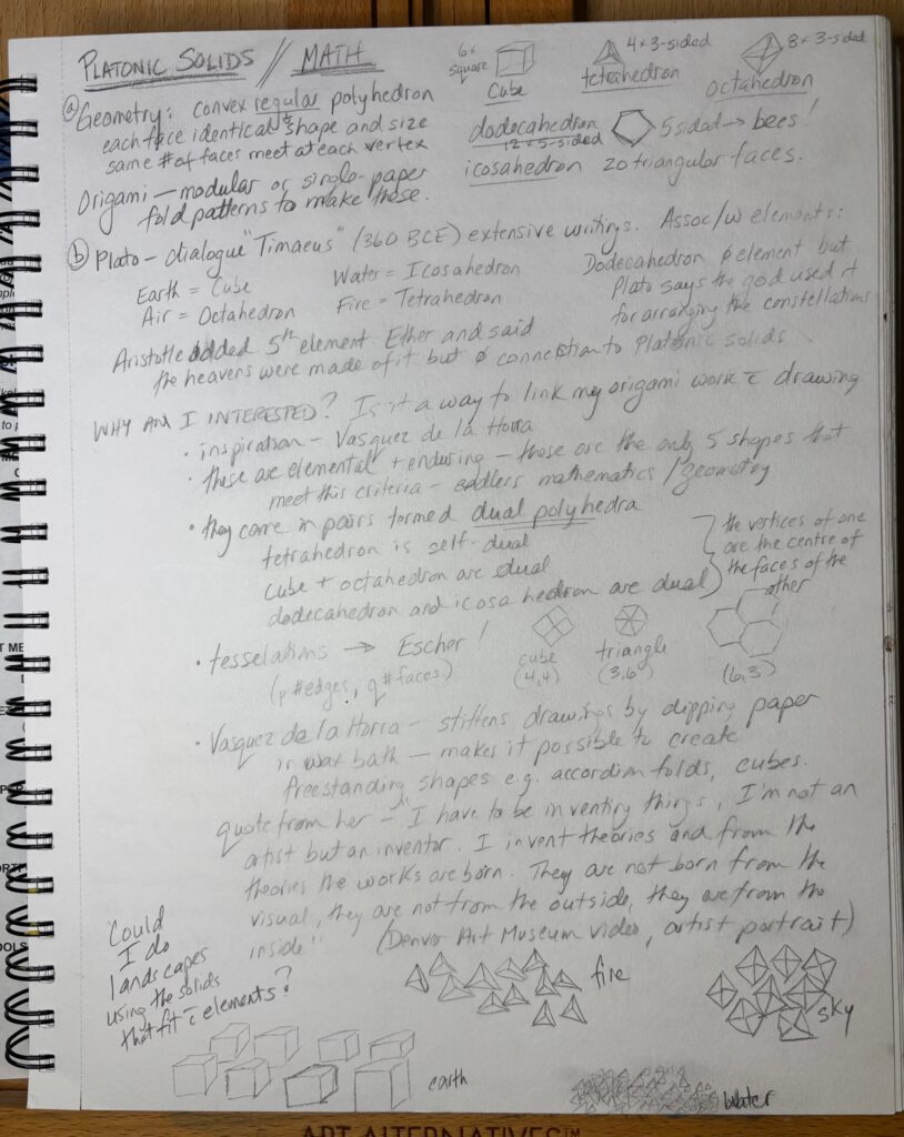
1) Platonic Solids; 2) Conditions and The Unconditioned; 3) The End of Vision. Handwritten research/ideas below, for Sept 15th class discussion. I wrote much more about option 1 than the other two but not because I think it is the strongest. Click on the pages below to enlarge for easier reading.
I missed Class 2 with a flu/cold so still haven’t shopped the above ideas out to the group. Meanwhile, more ideas are rolling around in my head. 1) HANDS. I am interested in the manual work of drawing, and in the way my hands translate vision into a new form, onto a new surface. The decision to draw something transforms and deepens what I see. Some images below that meld the Hands idea with my earlier thoughts about Buddhism and conditioned arising (Grasping, Aversion, Delusion):
Or… 2) Geometry in the natural world. No straight lines in the natural world. But could I build landscape from basic geometric shapes, rectangles and triangles. It’s a bit of a scale-back on my Platonic solids idea – I realized I don’t want to try to render complex 3D figures in 2D. But interesting to try to fit organic shapes into convincing / interesting arrangements of straight-line-based geometric shapes…
FEEDBACK and COMMENTS January 22 from peers and instructor:
- consider subsuming a few of the ideas into the overarching idea “Letting Go”. This could bring in my mother’s vision loss and also explore the Buddhist ideas about releasing Grasping / Aversion / Delusion as default response to the world.
- be more specific about vision – not just its loss, but the journey into replacing sight with touch – as your hands become your eyes.
- There is a lot of focus on process and less on meaning in my brainstorming – perhaps I could explore the ways mark making (the manual process of art) is meaning, at least in part.
- with geometry and origami as themes — could I make 3D drawings?
DRAFT SUMMARY for my theme, as at January 24th:
“Letting Go is my theme for this series of art pieces. I will visually investigate the journey from grasping to letting go to insight, with a special interest in visual metaphors based on the human figure”
“The Buddha taught that three human tendencies give rise to suffering: Desire, Aversion, and Delusion. In short, we want to get and keep the things we like, avoid or jettison the things we don’t like, and remain in ignorance about things that confuse or confound us.
“The Buddha also taught that suffering is optional. Recognizing these unconscious responses brings the possibility to let them go. We still experience things we like, dislike, and are confused about, but our actions and emotions aren’t hostage to them. We hold them lightly, and we notice how quickly conditions change. We learn to move in the world of what is instead of what we want there to be.
POWER POINT presentation for Jan 29 class: PDF below includes the slides and notes.
THEME-slide-show-notes-pages-for-WordPressFIN 210 Unit 3
Unit 3 postings are organized as follows:
- page 1: Artist presentation, Artist Research, and Technique Assignment
- page 2: Independent Drawing: Research, Process, Final Drawing, Reflection
ARTIST PRESENTATION: Immediately below is my powerpoint presentation in PDF form to show the slides and the notes.
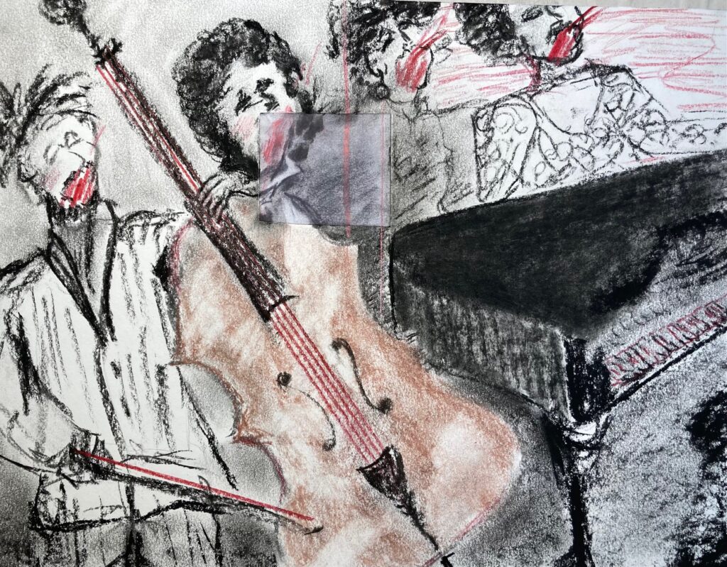
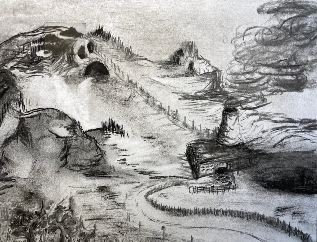
Unit-2-FIN-210-artist-research-EDITEDArtist Technique drawing: I selected a few Kentridge drawings that I might crop a small piece from and embed in my own drawing. Below, see a gallery of 4 pages of small trial croppings I made, aiming to reproduce the marks and colour/shading of his work.
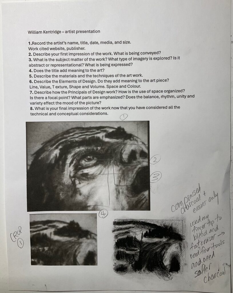
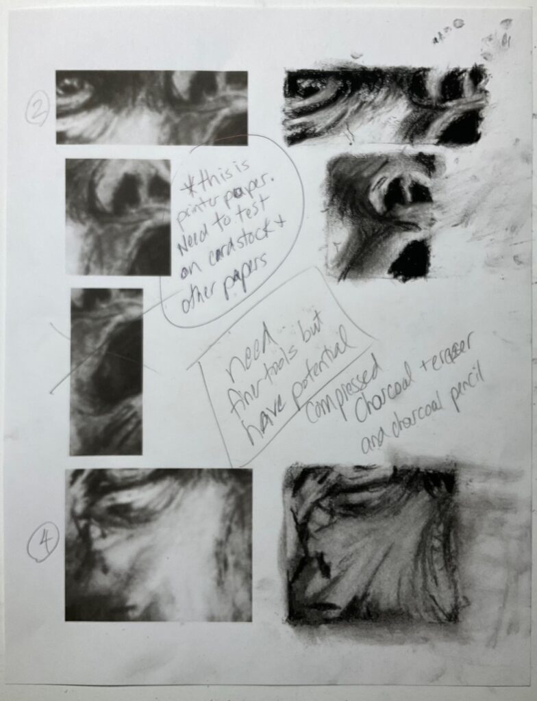
Next step: Now I have some idea about the mark making and what I could possibly emulate or at least riff on. Next step is thinking about which crop has most promise to develop into a composition that interests me… See below some visual brainstorming…
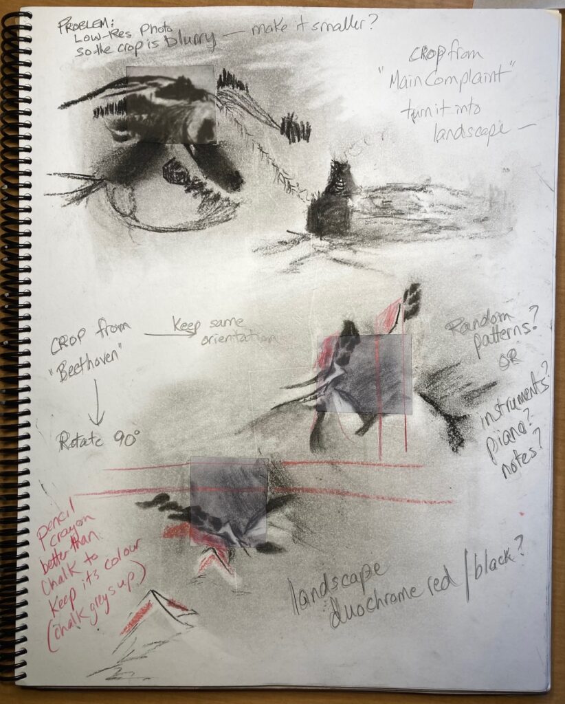


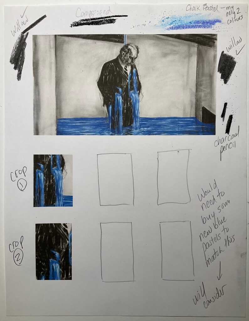
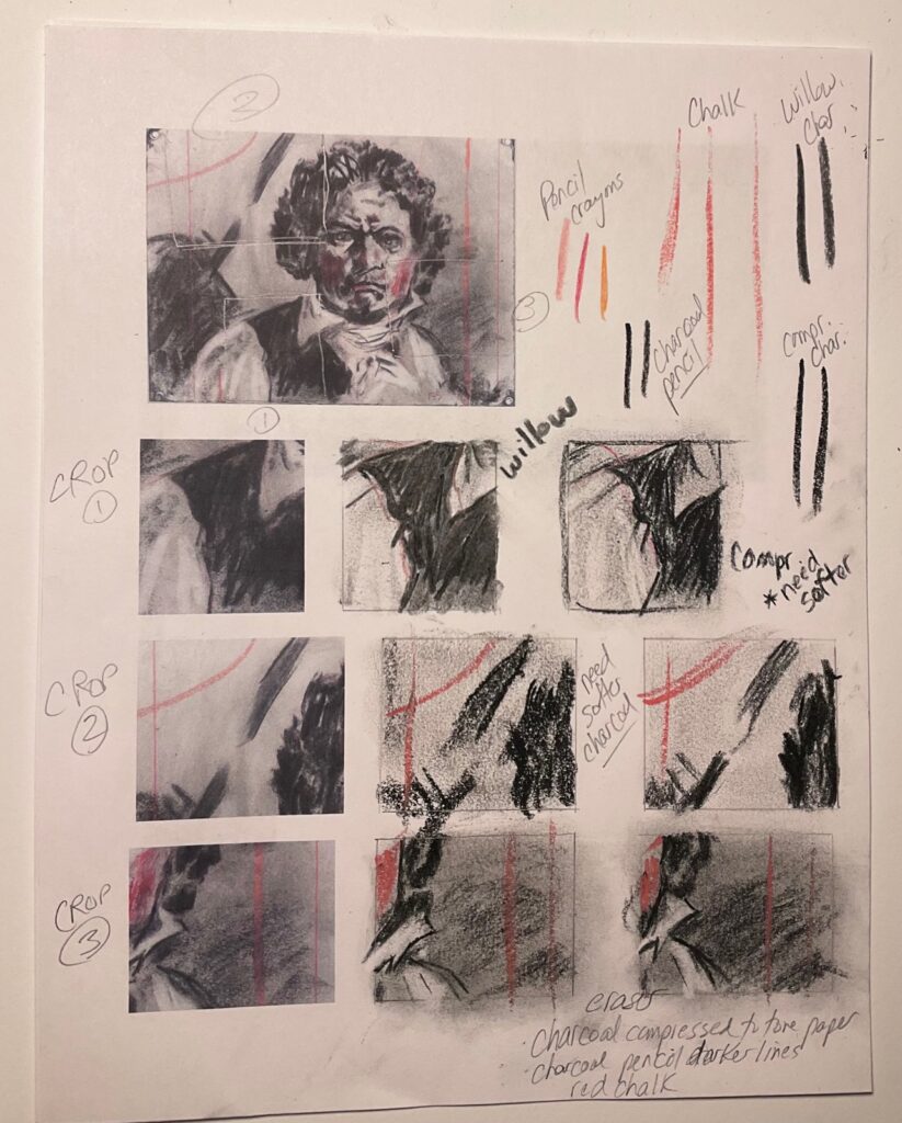
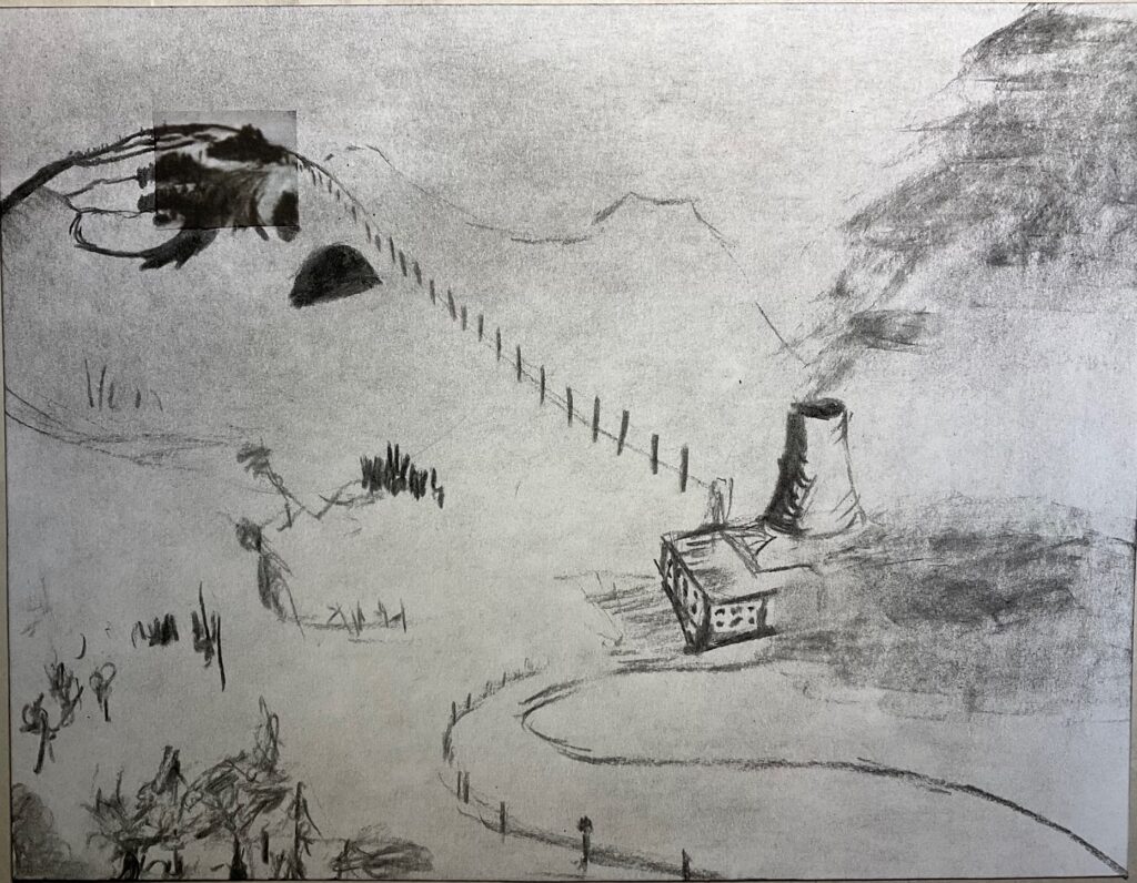
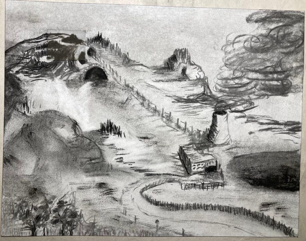
See below, a few versions of 8 1/2 by 11 extensions of the cropped fragments. The first one, from History of the Main Complaint, probably the most successful although some trouble blending the top edge of the crop with the sky because charcoal dust accumulated along the cut edge of the paper. The second two are crops from Beethoven, one turned into a landscape and the other a crowd of musicians. Used the wrong type of paper (a yellowish cast) for the musicians so it was particularly hard to get the grey tones to match the original. The landscape was just on copier paper so it was a closer match to the colour of the cut-out-bit from Beethoven.


FIN 210 Unit 2
The organization for the Unit 2 sections is as follows:
- Page 1: Four Model Sessions from classes: Sept 16, 23, Oct 21, 28
- Page 2: Anatomy Sketchbook Assignments
- Page 3: Model Studies and one Close-up Drawing in powdered graphite
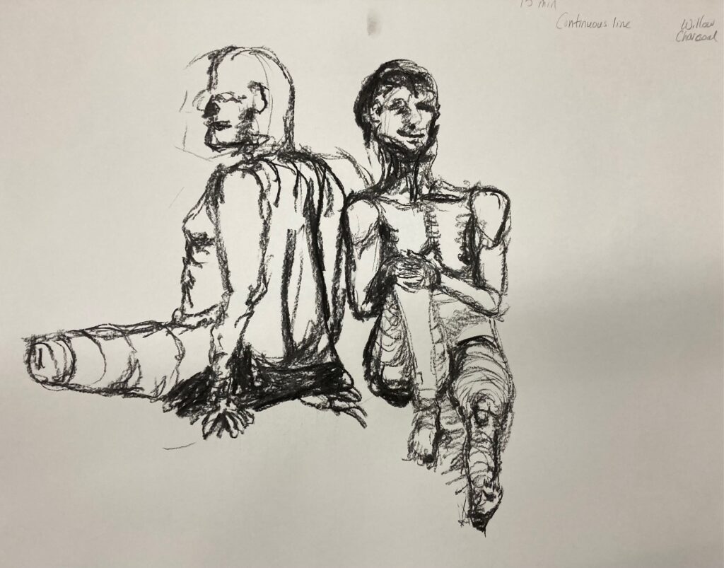
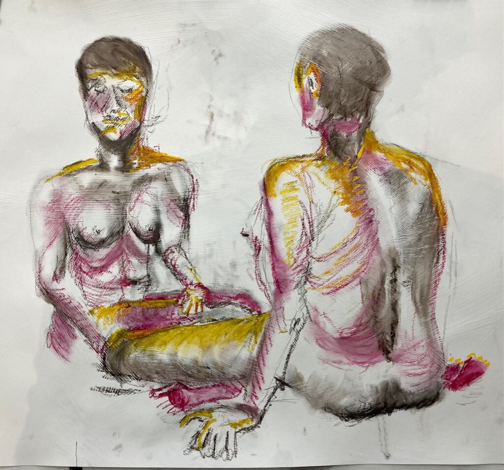
Class Two Sept 16: Figure drawing, starting with sticks and black ink, short poses, shifting to brush with ink, then chalk pastels for longer poses.
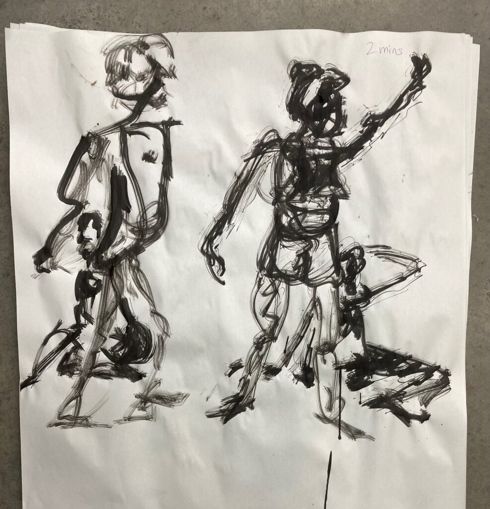

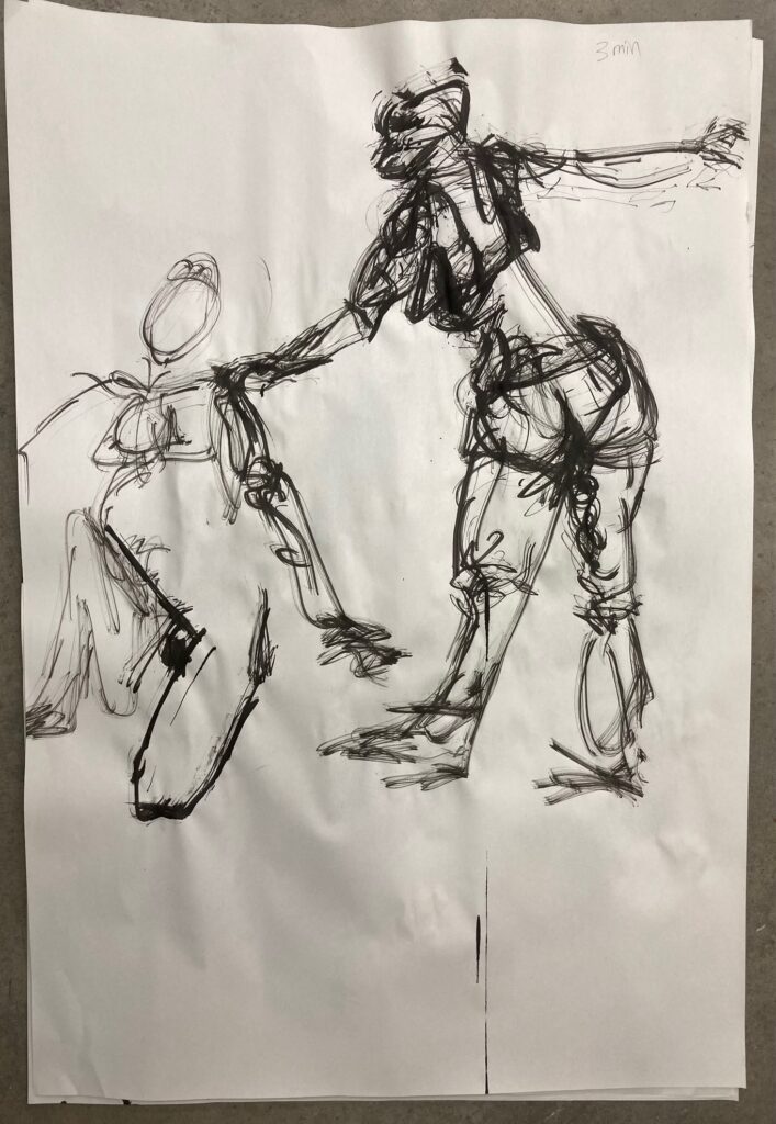
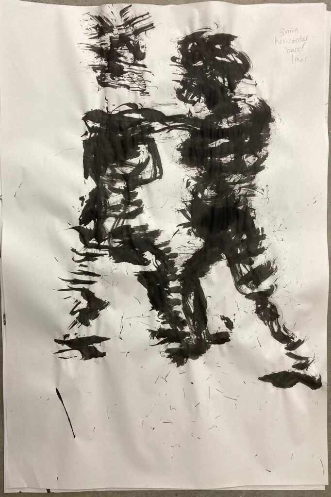
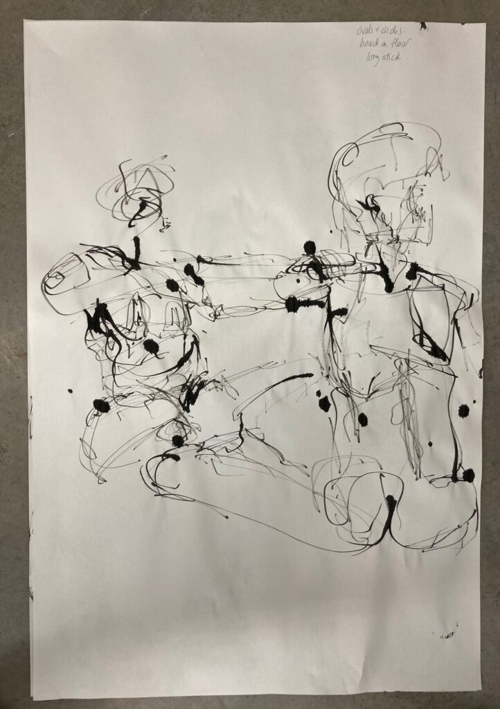
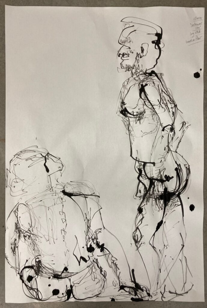
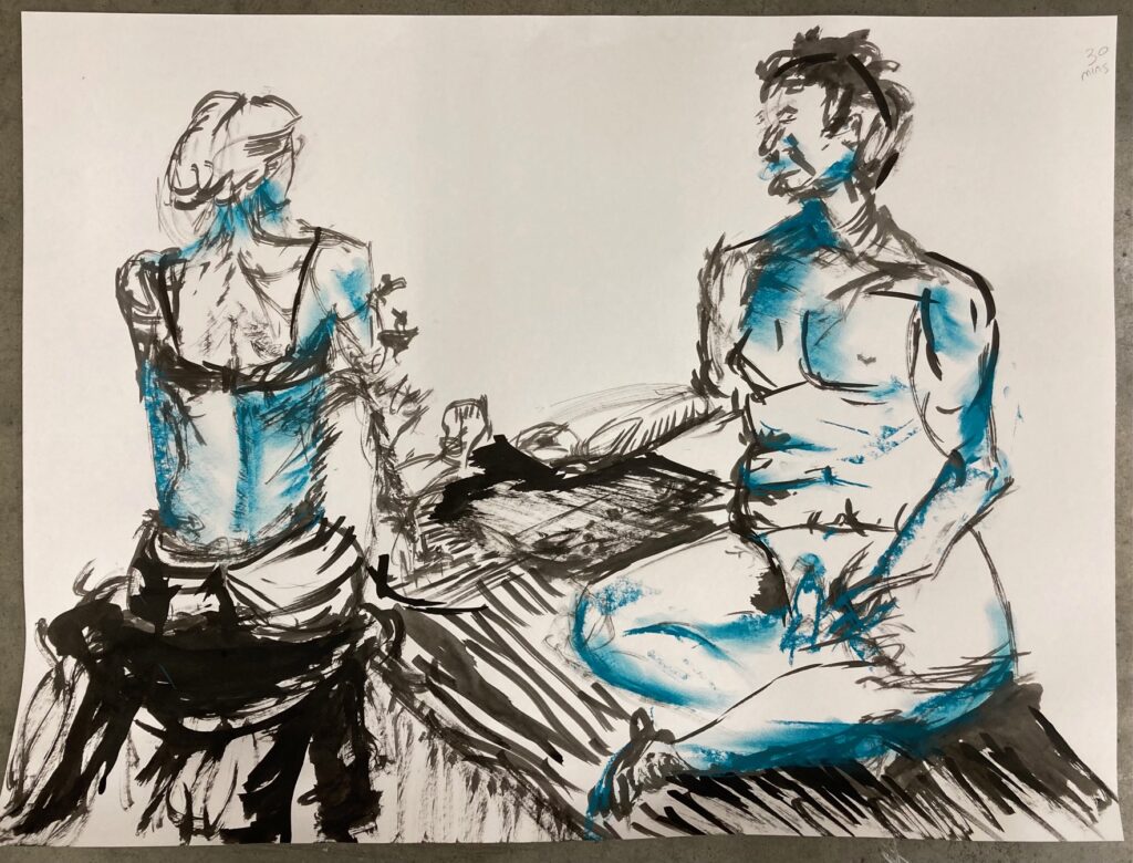
Class Three Sept 23: several 2-minute gesture drawings + two 30-minute poses

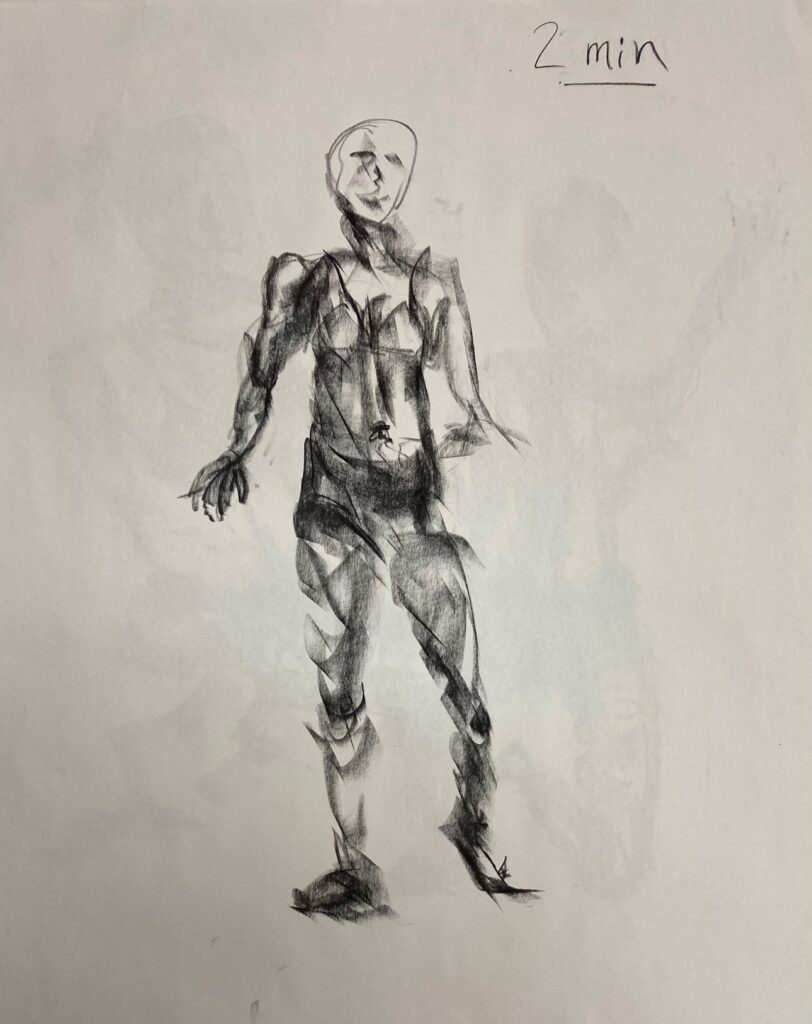


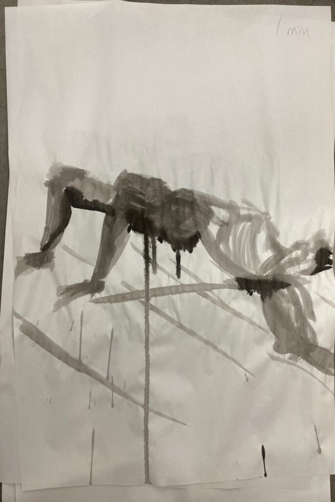
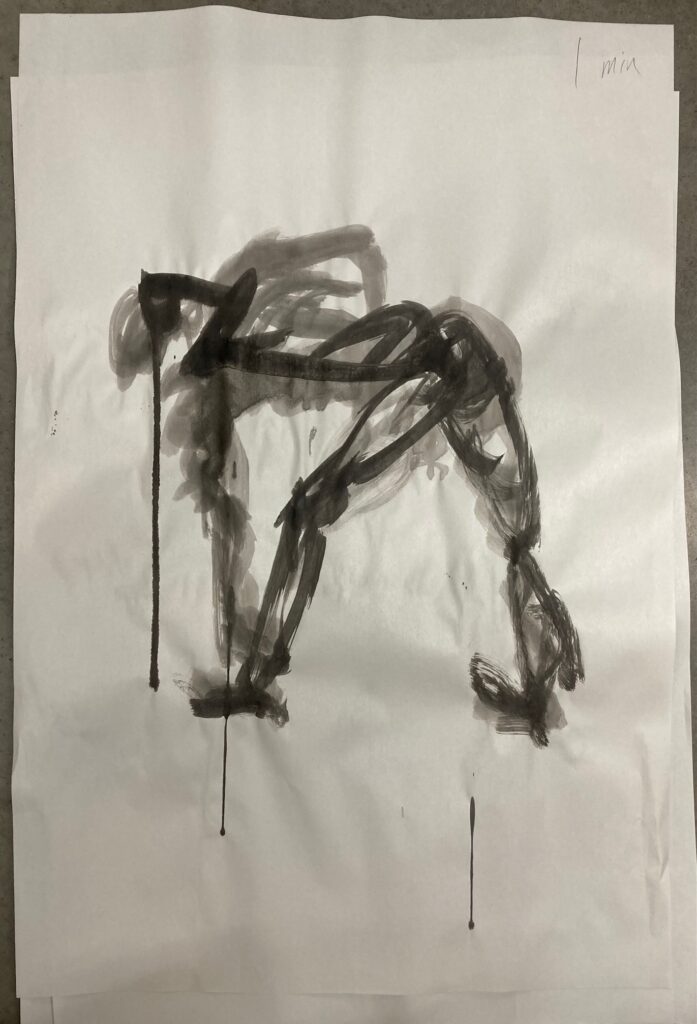
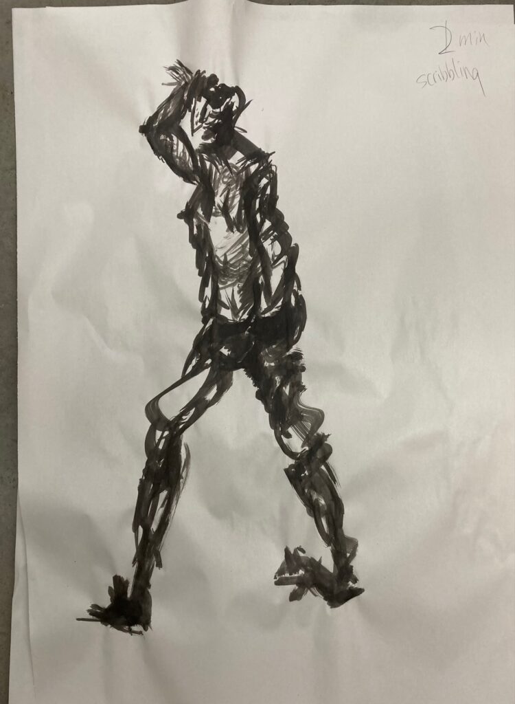
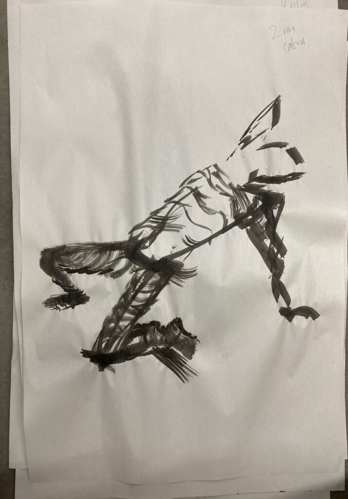
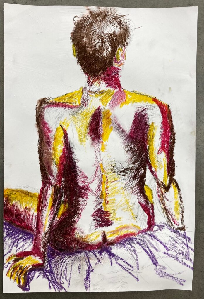
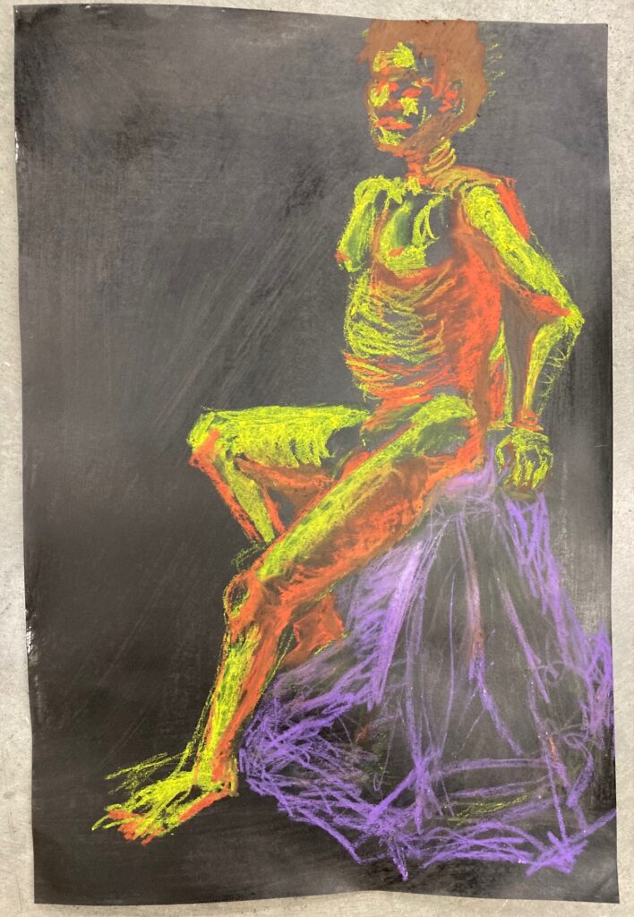
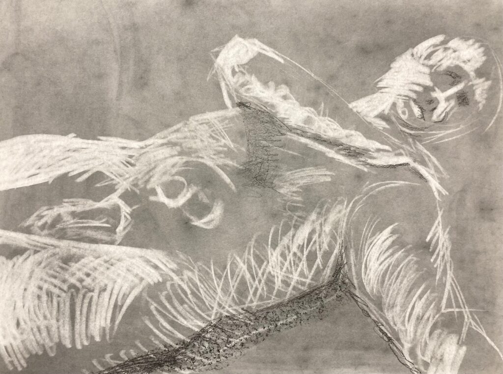
Class Five Oct 21: A series of one-minute and two-minute gesture drawings with ink on newsprint. Two 25-30 minute drawings on prepared paper with oil pastels. One 10-minute drawing on paper prepared with graphite, using eraser only.

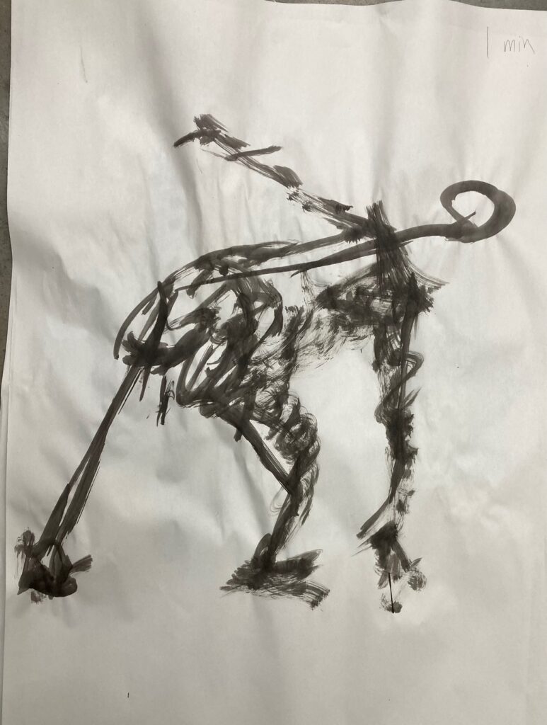
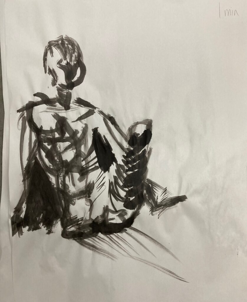
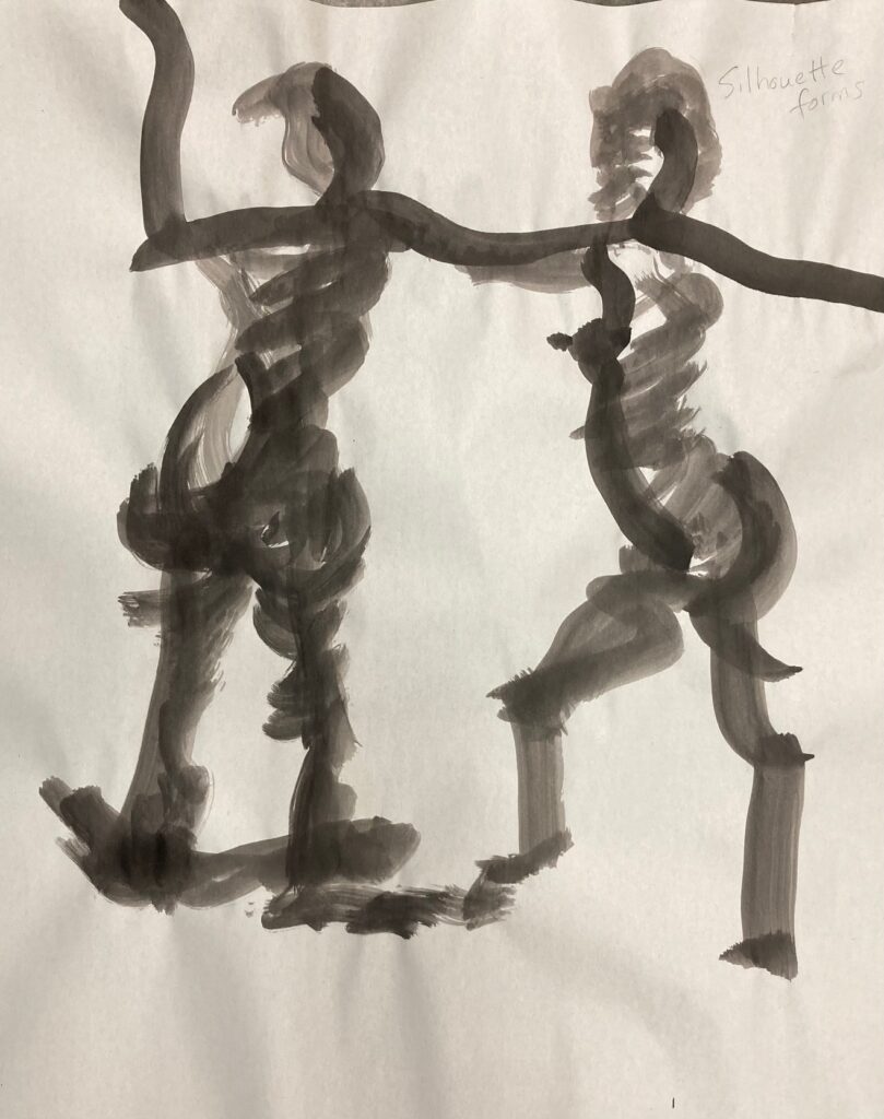
Class Six October 28: Two models today. Below are three 1-2 minute gesture drawings with ink and brush, and three 30-minute pieces in various media.


FIN 210 Unit 1
Unit One materials are organized into two sections: Section 1 includes all the blind contour drawings from class one, plus the drawing that I selected from that class to enhance for presentation at the second class. Section 2 is the Critique Drawing, including Research and Reflection and Work-in-Progress images.
SECTION ONE
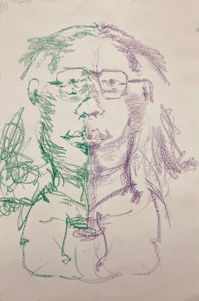
Class One: Blind Contour drawings, two hands at same time, faces. The first 4 below are the same classmate, wildly inaccurately rendered but interesting to see the evolution in mark-making over the four attempts. The next 2 are self-portraits – will pick one to enhance/complete for next week’s class.
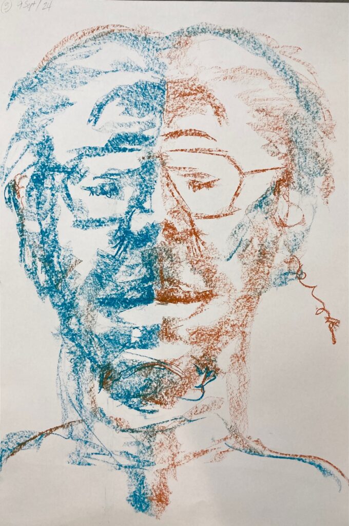
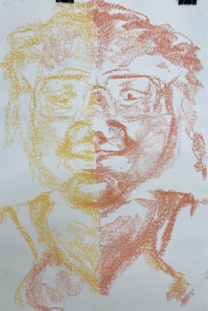
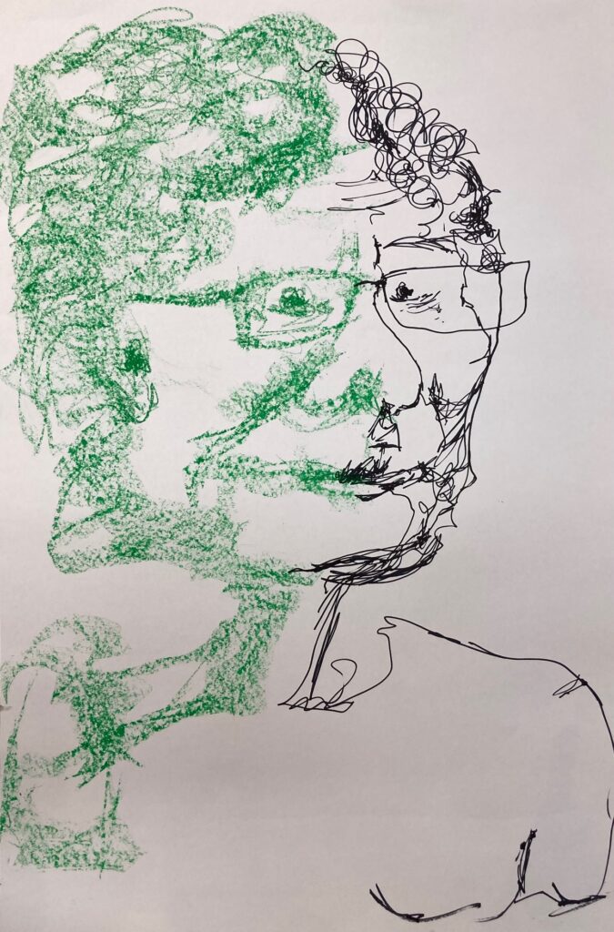
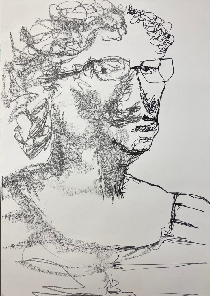
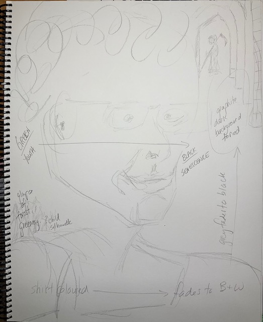
Week One Homework: complete a background for one of the blind contour self-portraits. I chose the one on the left (above) and went with the idea of aging or lifespan — below see sketchbook ideation, two images of the work in progress, and the final version to take to class Sept 16.
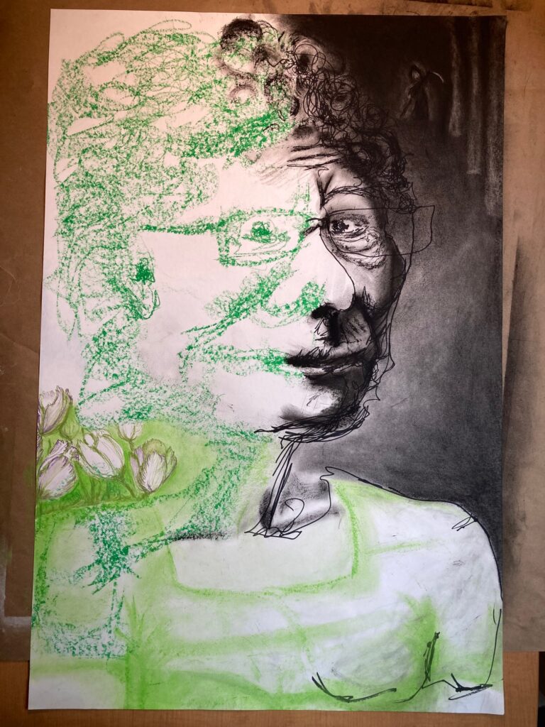
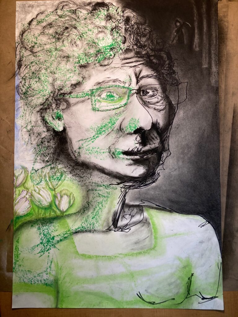
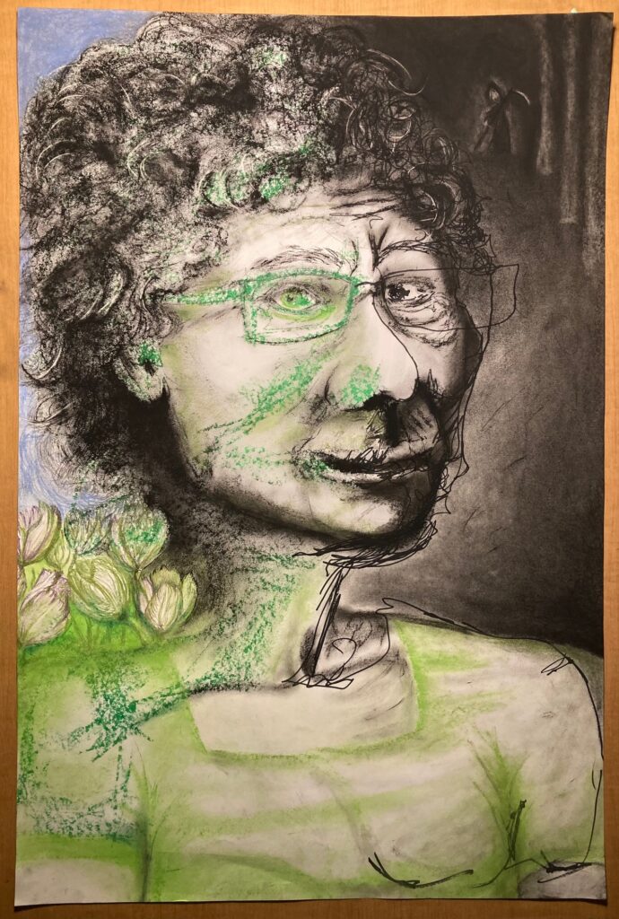
Feedback from class — bring the grey or the blue background in and around the flowers to better define them. Reduce / remove the green on the cheek and the nose, possibly the hair (moving beyond the original assignment, as these are the original marks).